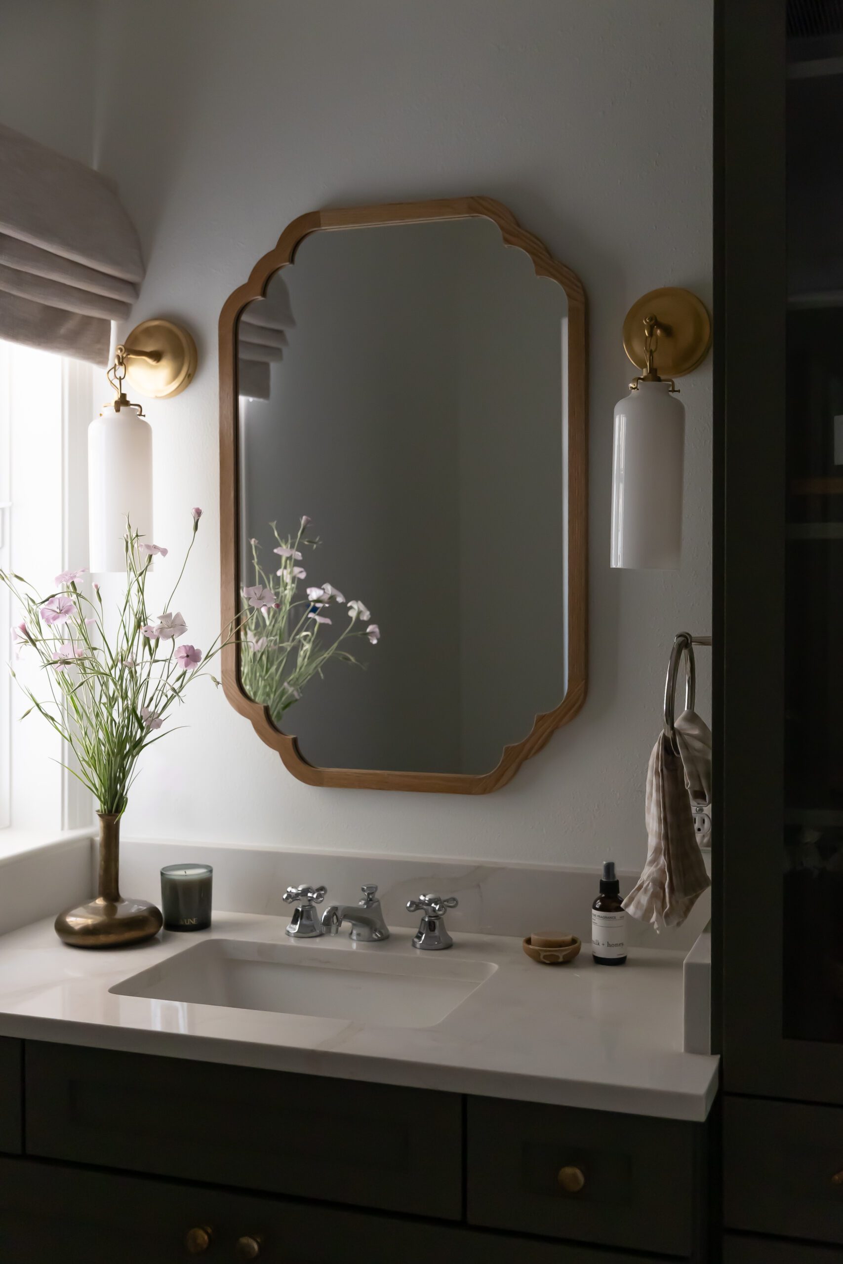
Custom Details Set This Tarrytown Remodel Apart
Audrey Scheck and her design firm are no strangers to creating beautiful, custom, functional spaces for their clients across the country, and when their clients came to them to help remodel their Tarrytown home, they knew just where to begin. The house, a traditional 1948 Bungalow style build, had a lot of potential in terms of space but needed some updating to meet the family’s goals and reflect their personal styles. Audrey and her team got to work on completely remodeling the kitchen, guest bathroom, and mudroom to create a charming space for a growing family.
Complete with all custom cabinetry, creative storage solutions, and a few charming original details (wait until you see the original tile in the guest bath,) this home is equally fresh and timeless. Scroll on to see more from Audrey’s project and shop the look below.
Design: Audrey Scheck Design | Photography: Cate Black
Creative Solutions in The Kitchen
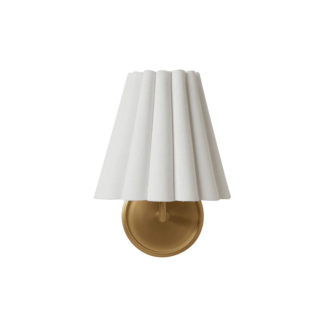
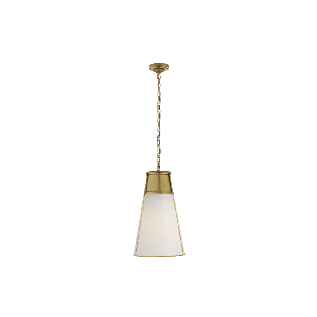
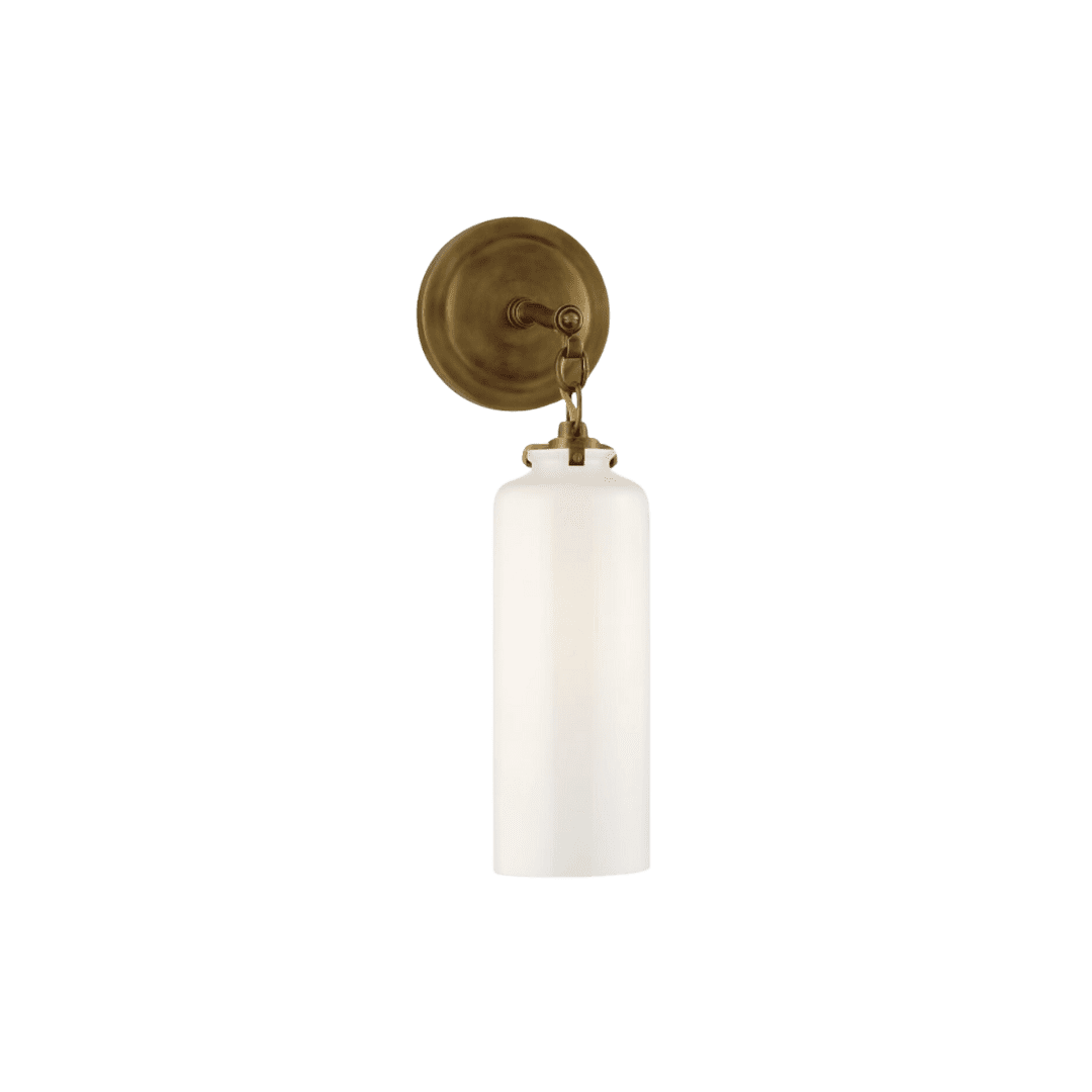
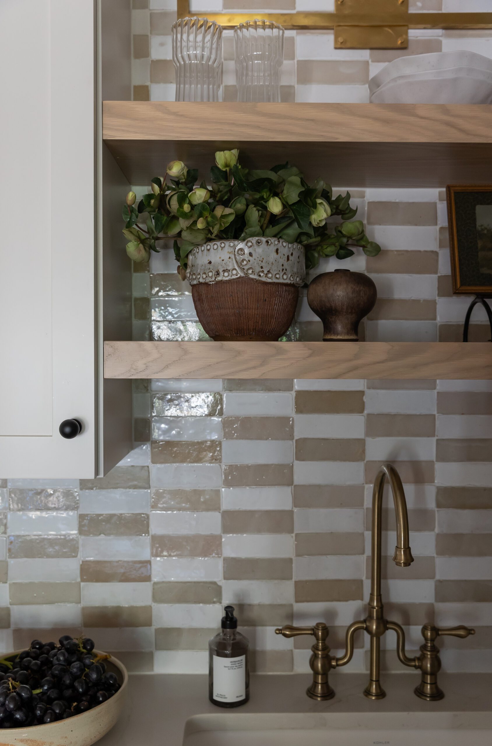
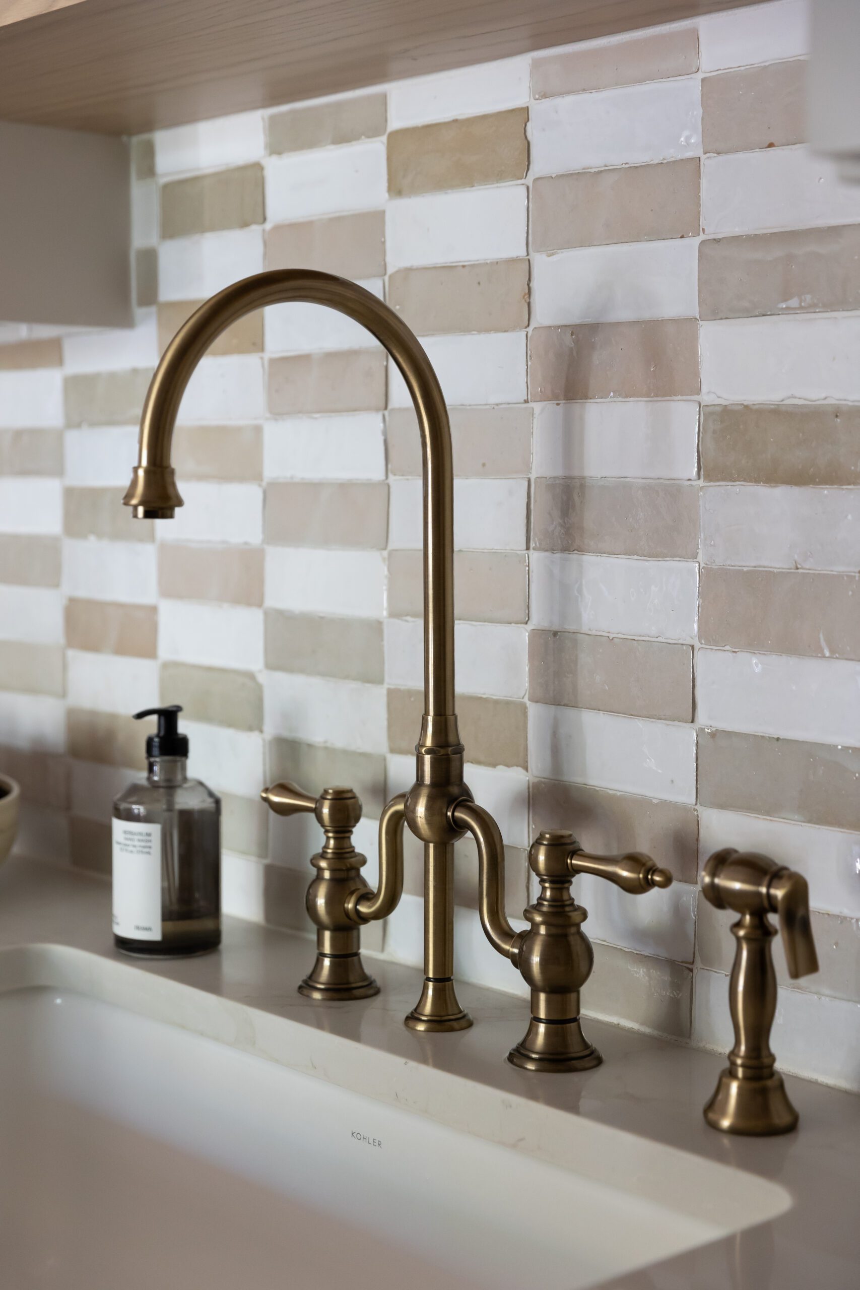
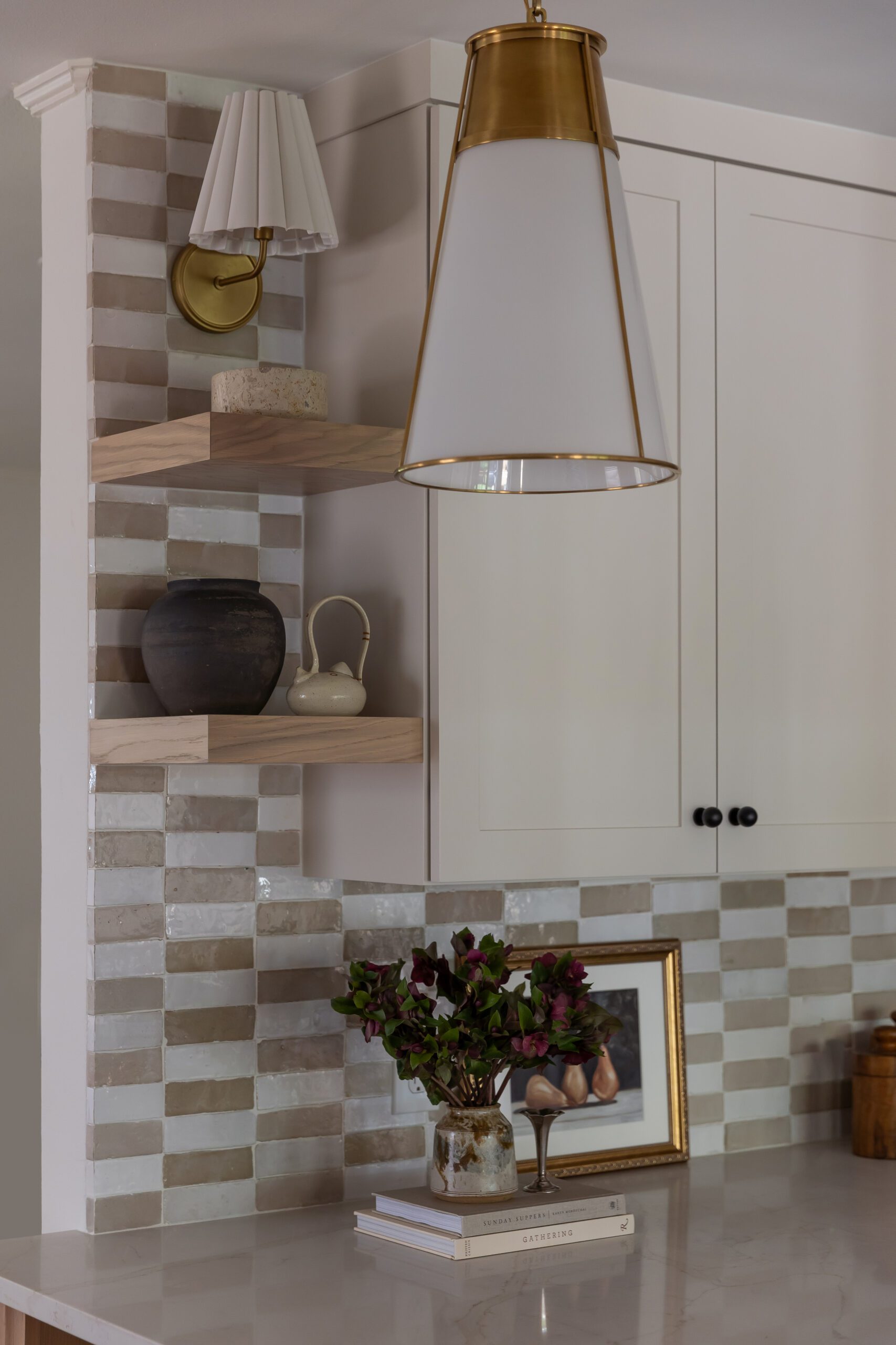
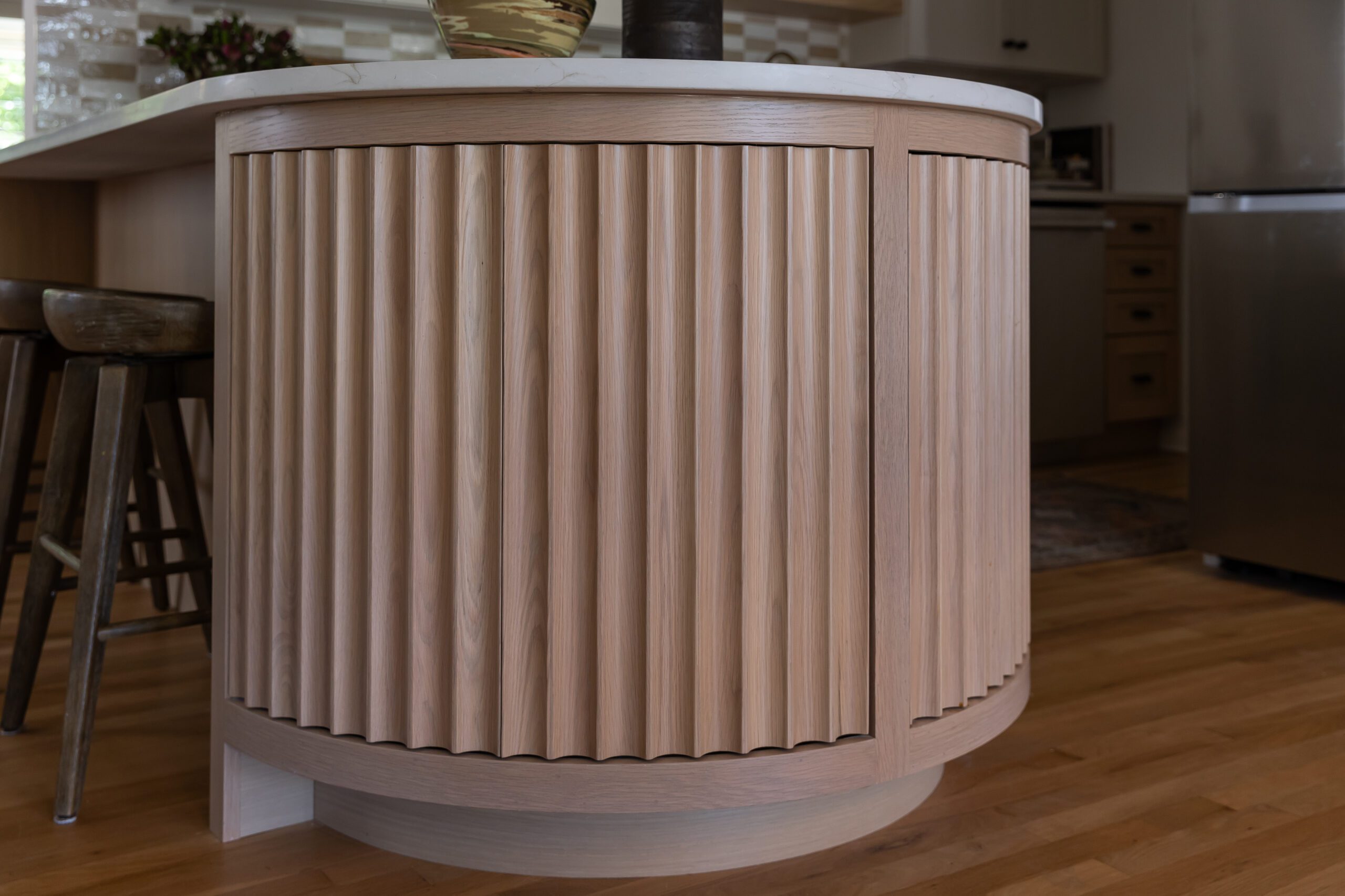
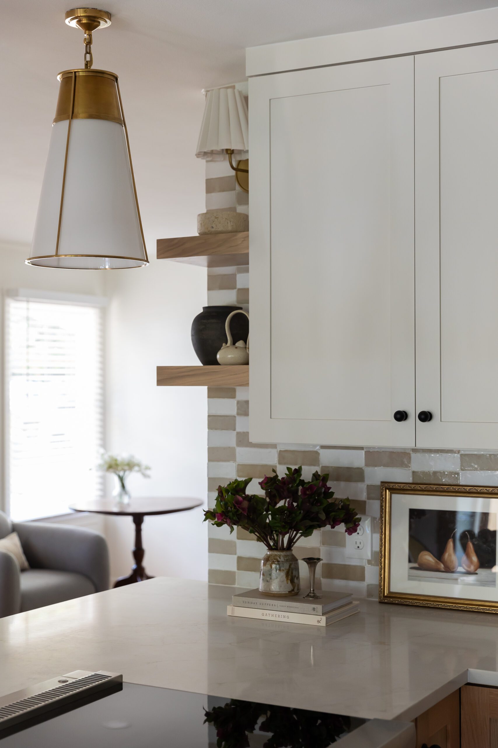
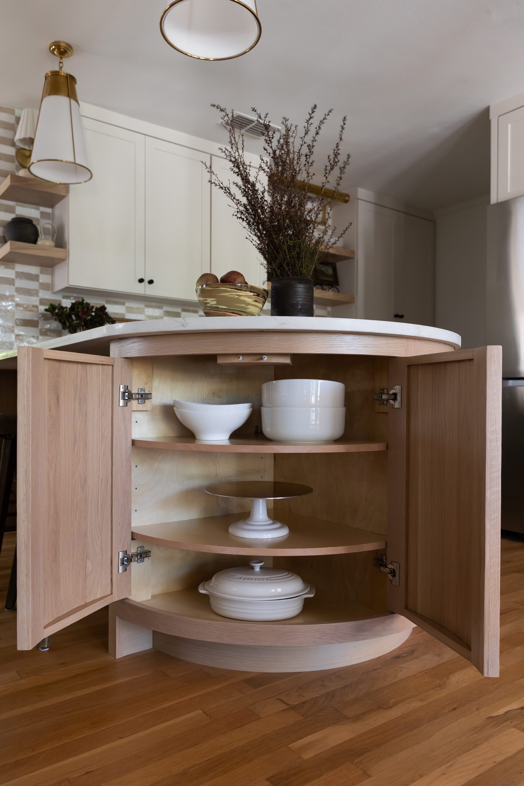
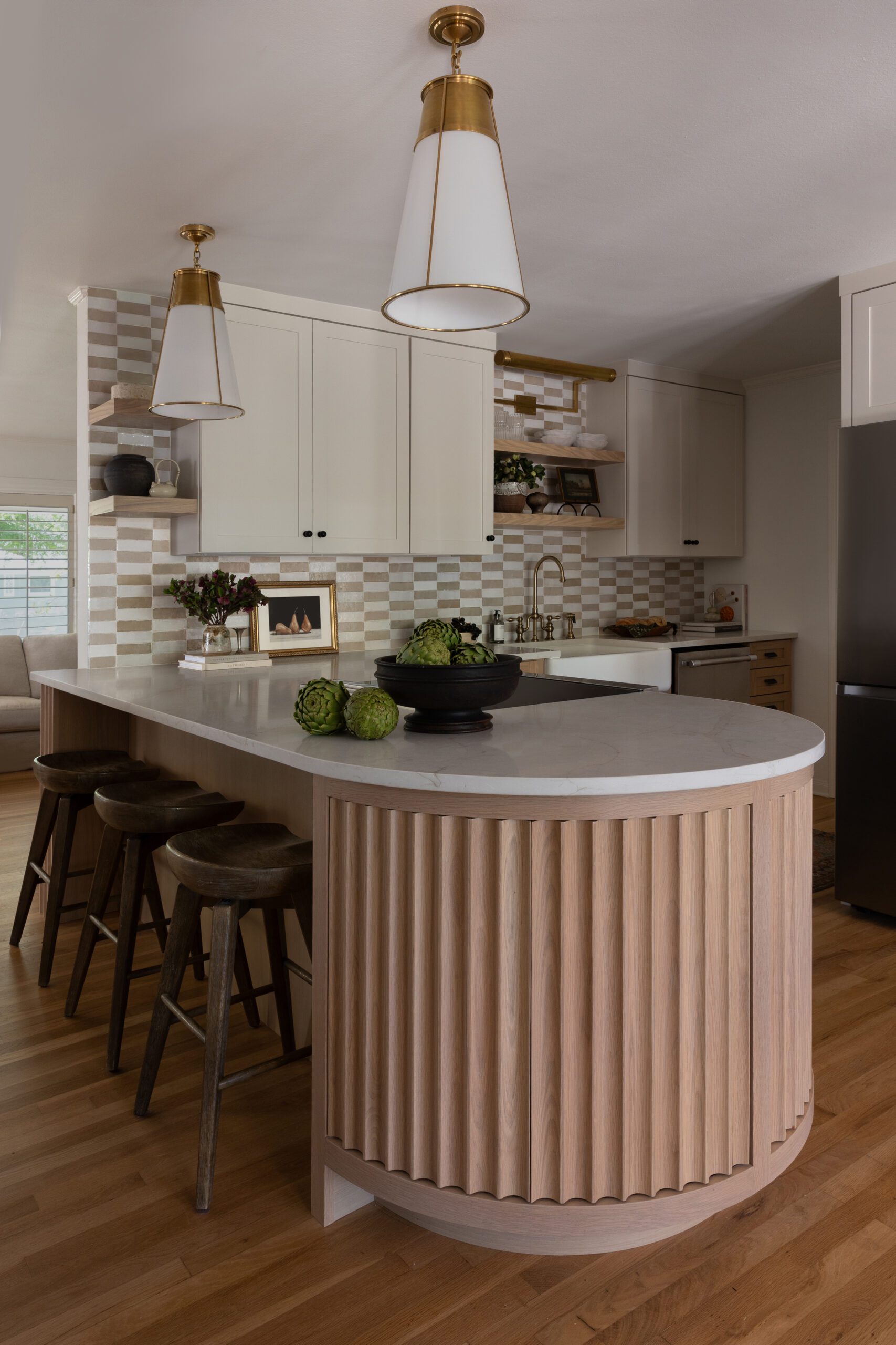
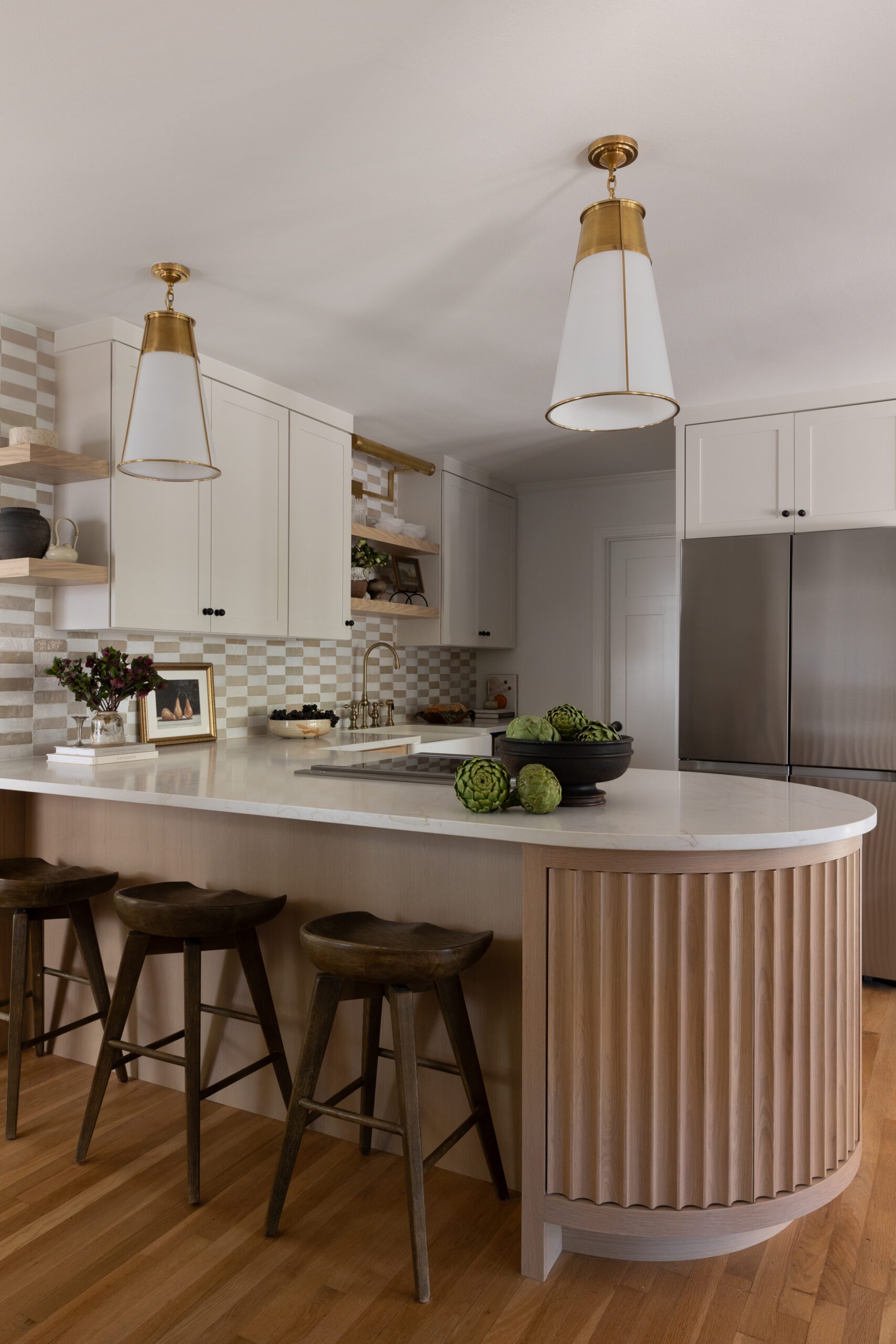
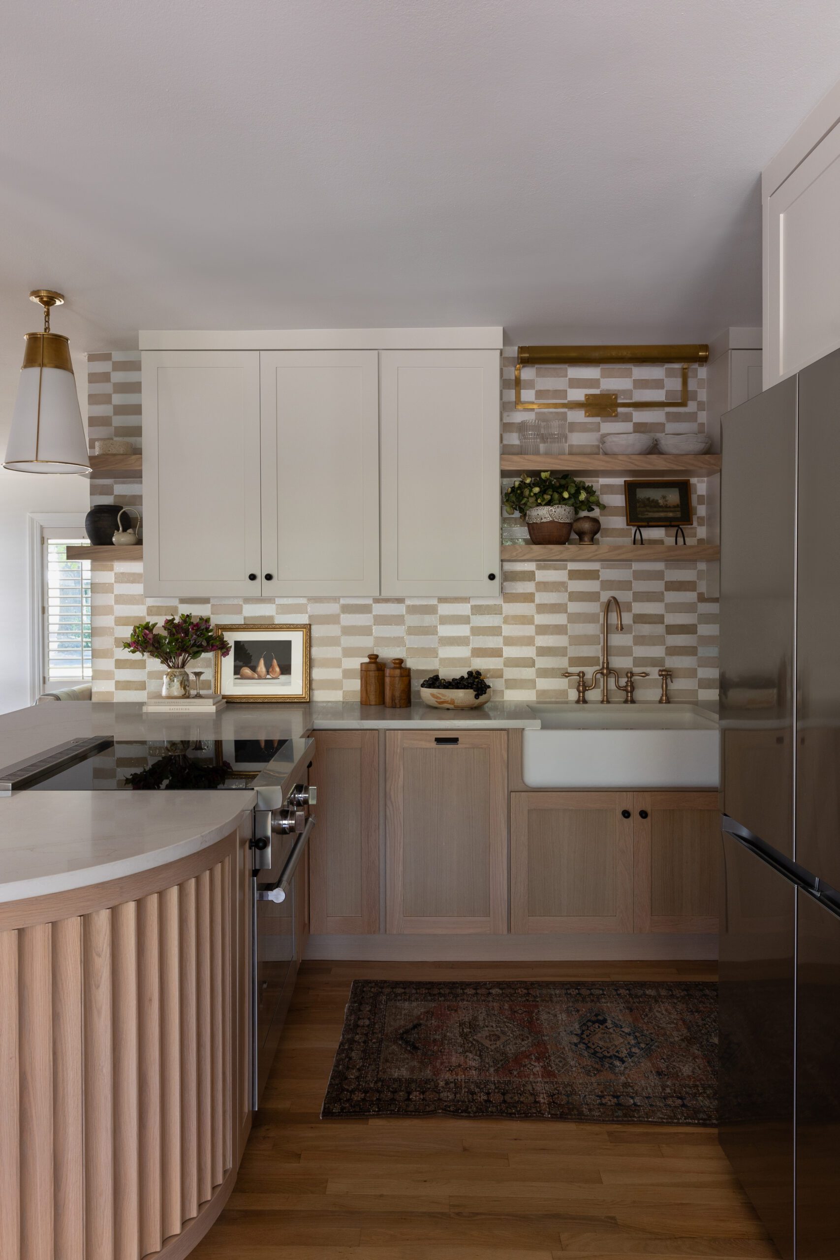
While the kitchen had plenty of square footage to work with, Audrey wanted to optimize the layout by removing a wall and introducing a curved peninsula featuring fluted edge details and concealed storage. Unique details like the checkered Zellige backsplash, floating shelves, and playful lighting add charm and character to the heart of the home.
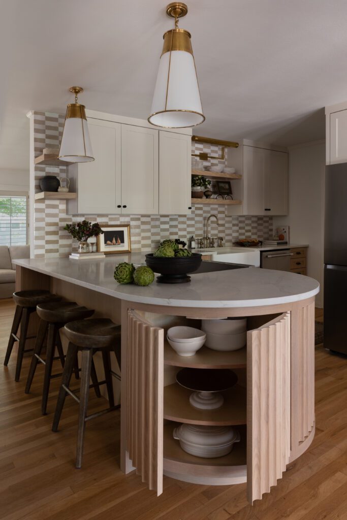
Hidden storage fits smartly inside this custom curved cabinetry detail on the peninsula for added storage.
The Olive Guest Bath
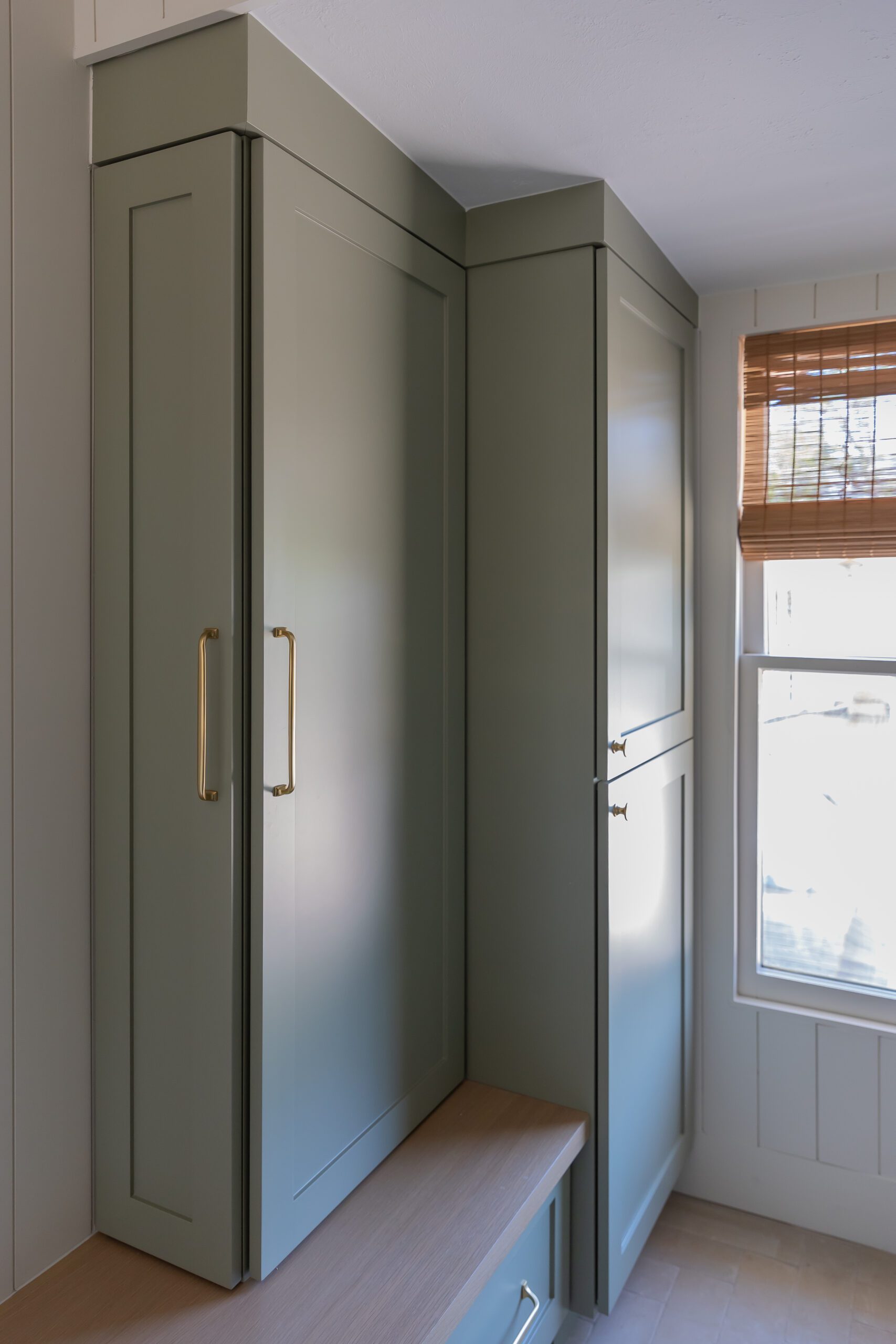
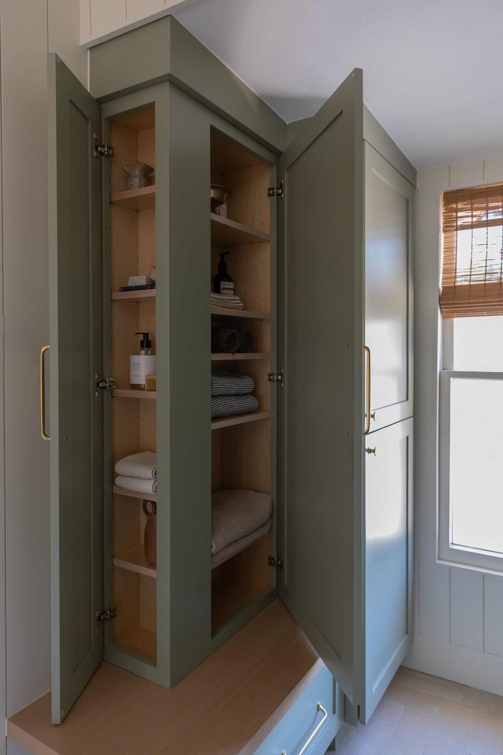
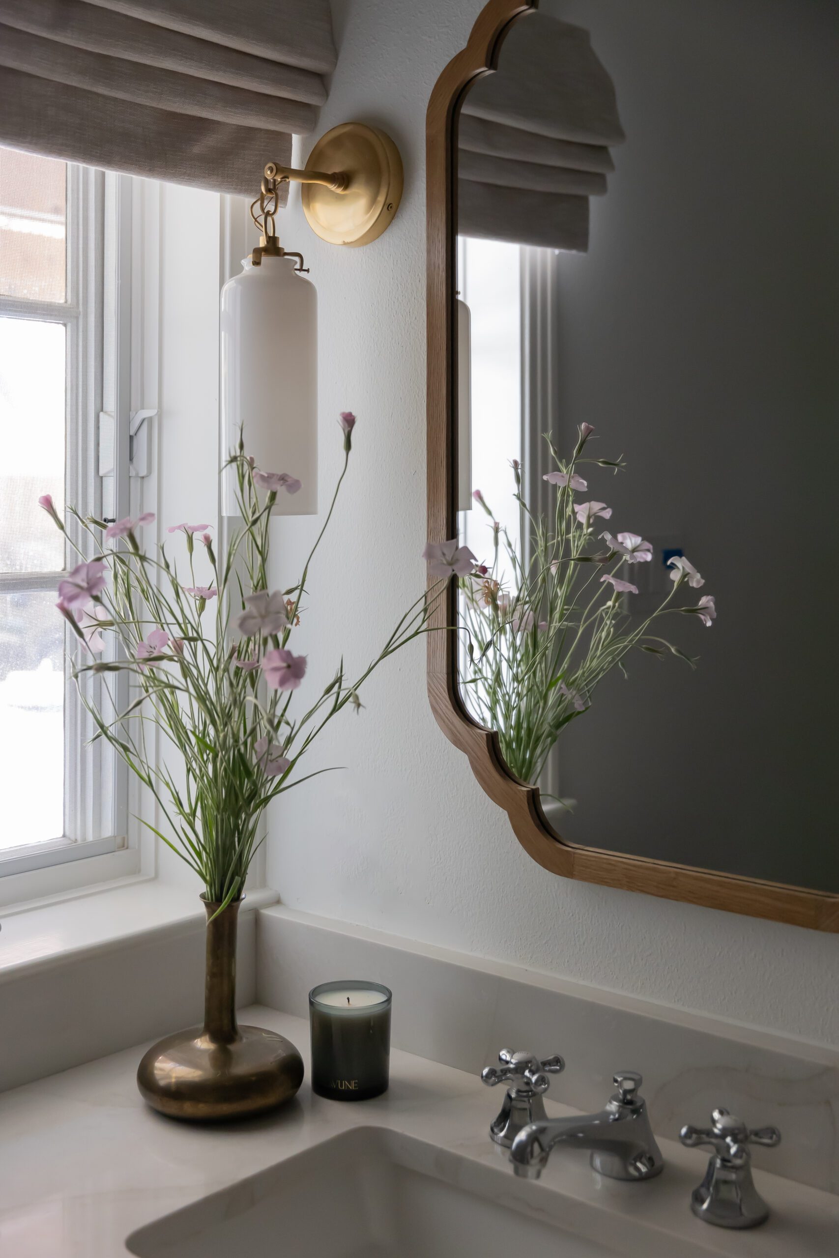
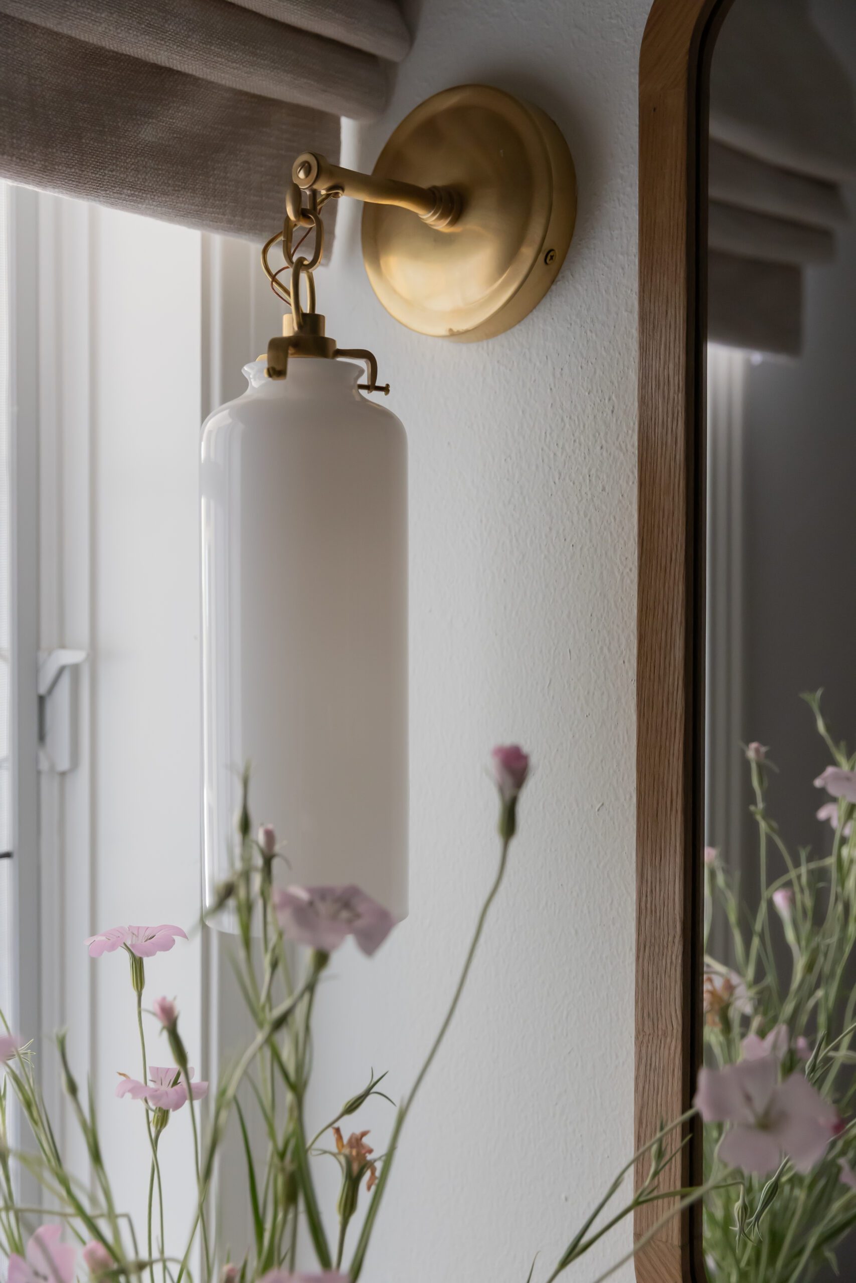
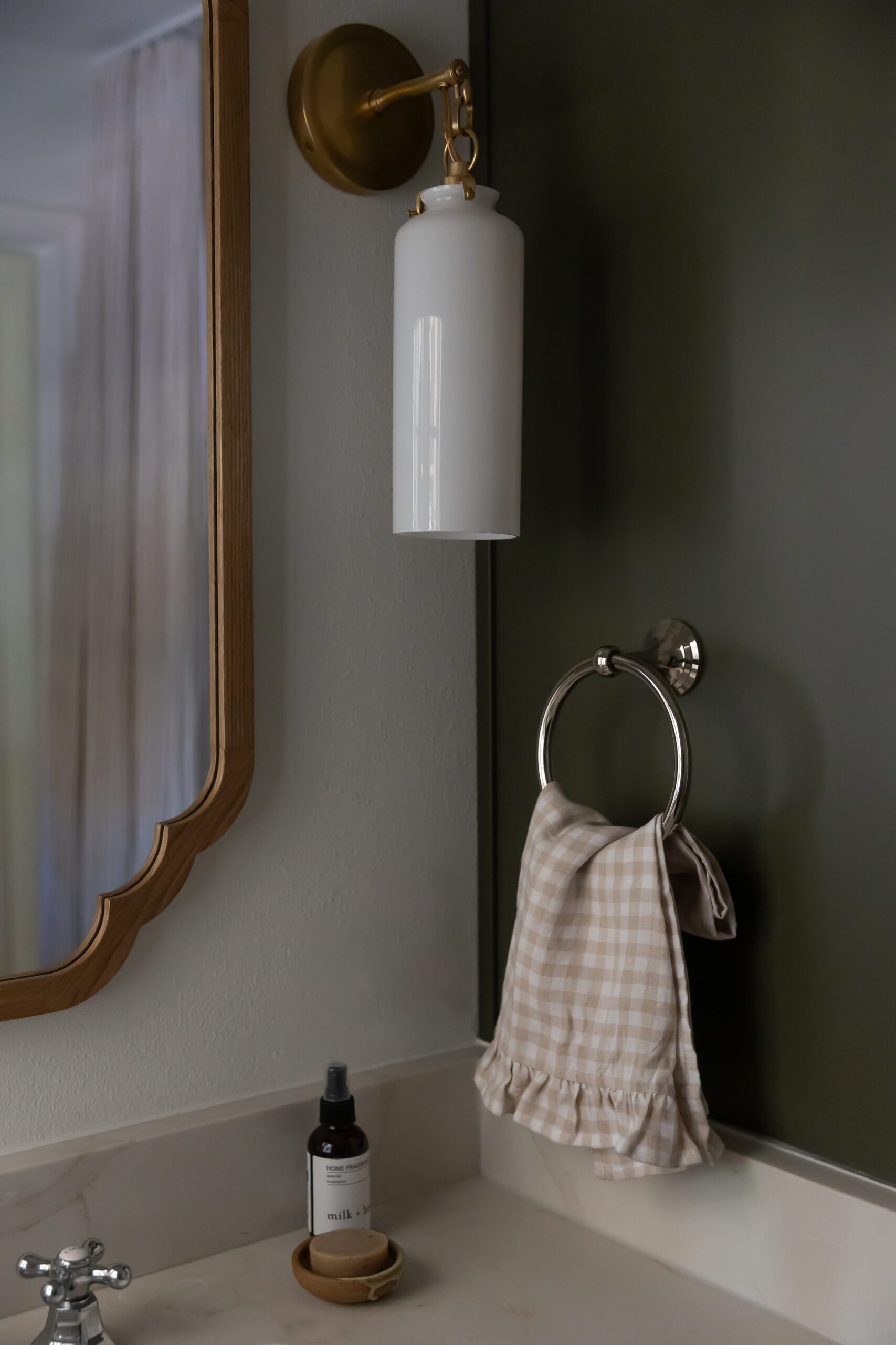
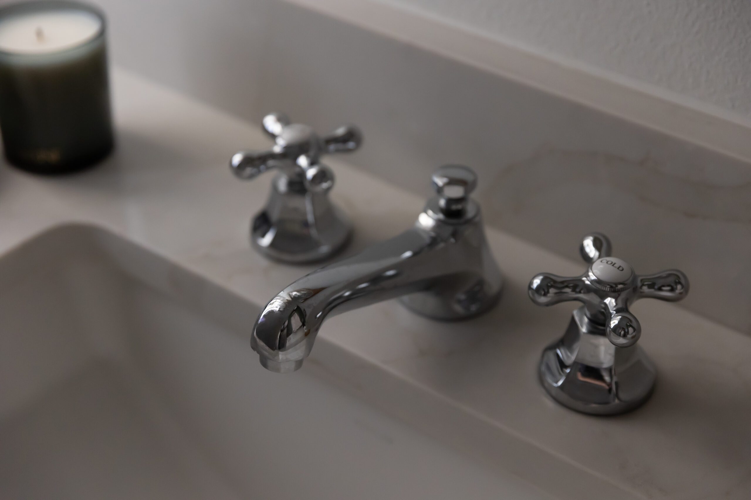
Audrey and her team salvaged the original tile in the guest bathroom while introducing new cabinetry, finished in a rich olive tone complemented by vintage-inspired hardware, seamlessly integrating the home’s aesthetic.
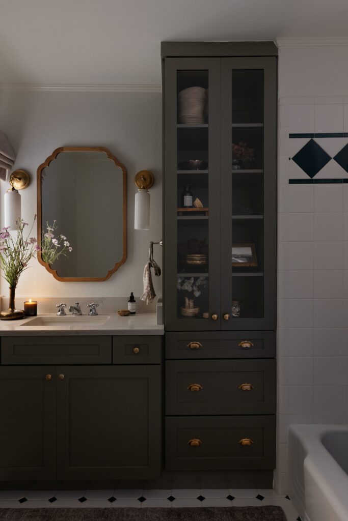
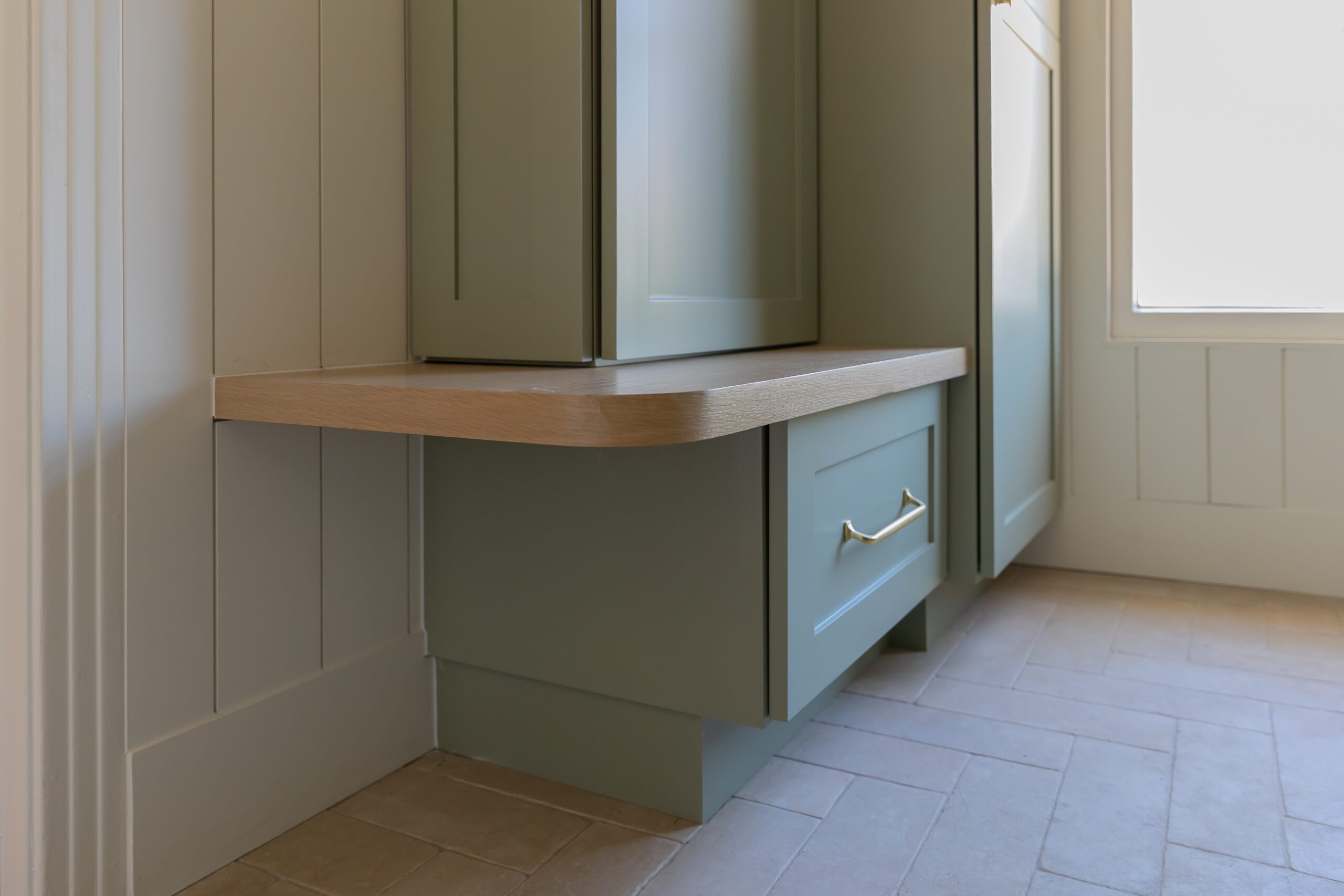
Dark Olive by Benjamin Moore on the cabinetry adds the perfect amount of color and stands out, contrasted by the warmth of the brass hardware and finishes.
A Timeless Mudroom
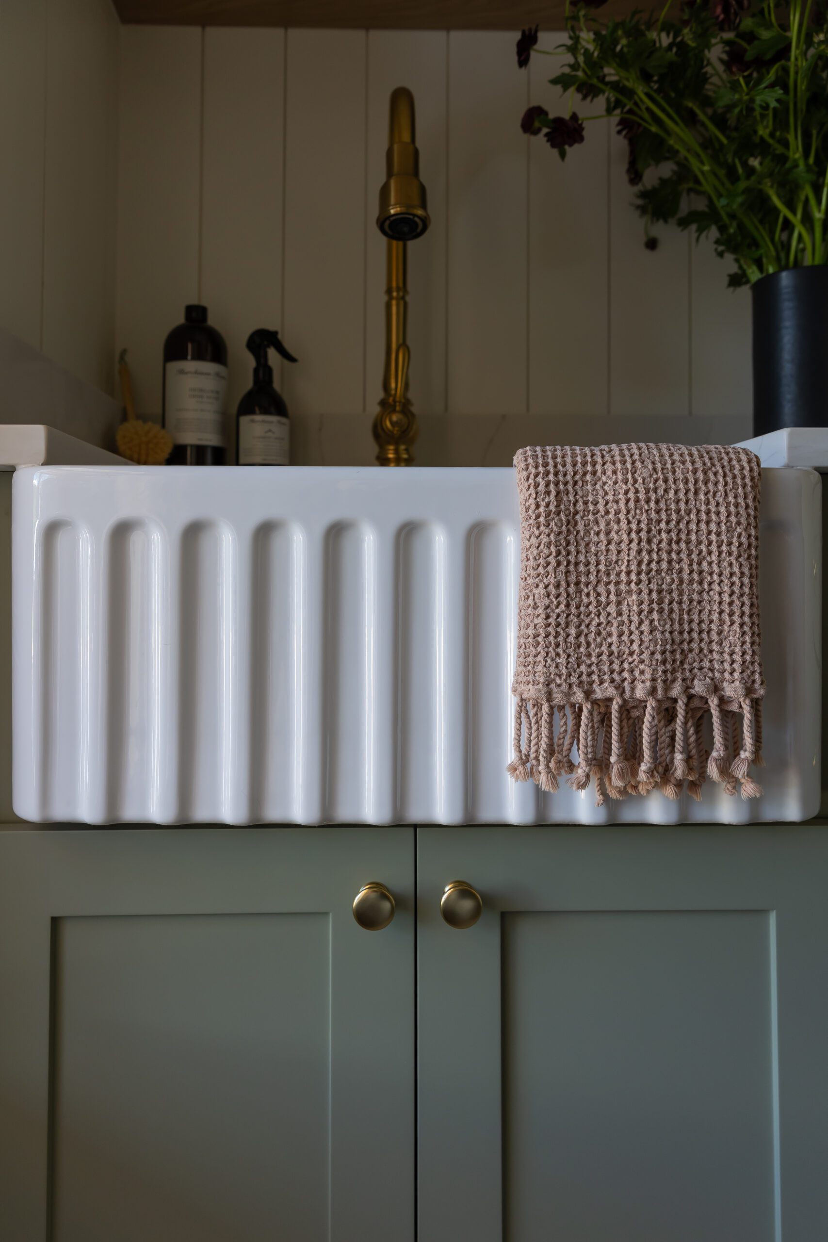
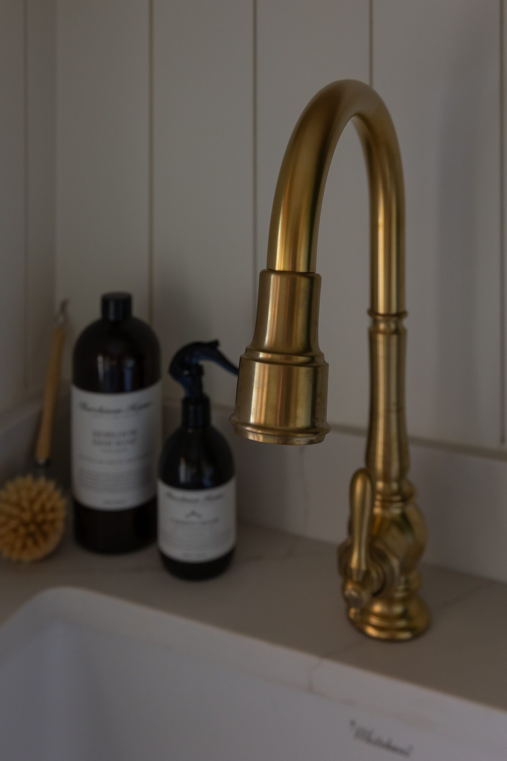
The mudroom underwent a complete transformation with the addition of a small sink, custom cabinetry, and a stacked washer and dryer to maximize utility. Vertical wall paneling draws the eye up and adds a textural element to the space, while a reeded glass door makes the area feel separated and private from the kitchen while still light and airy. We love the timeless feeling of the stone floors that help distinguish this space from the kitchen’s hardwood.
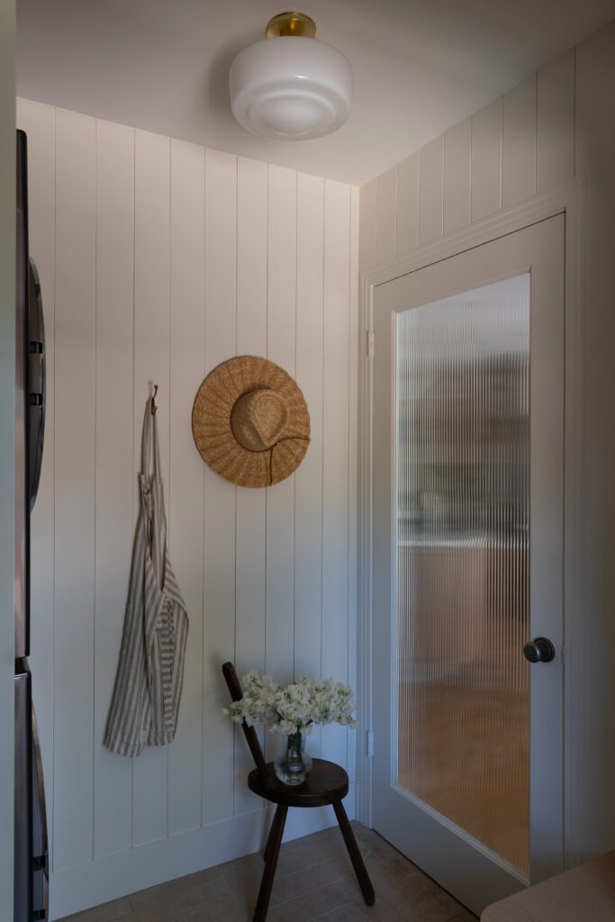
Explore the gallery below to see more from this home!
BY: Jasmyne Muir
« Boy vs. Girl Nursery Design Plans, Plus the Gender Reveal >


