

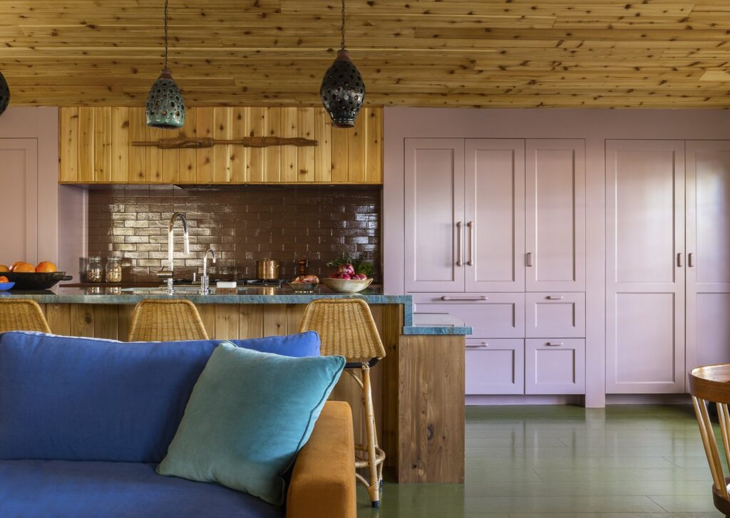
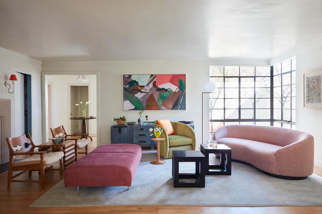
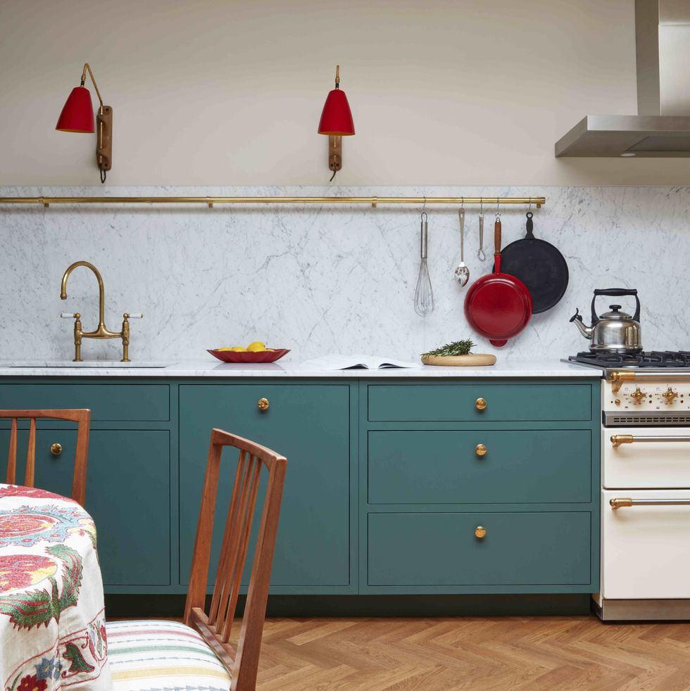
Color theory is one of the most fundamental elements of design. As both an art and a science, creating visually compelling interior color palettes requires experimentation and nuance. Sometimes, it’s two primary colors working together to energize a space. Other times, it’s the careful balance of complementary hues that bring harmony to a room. Designers who make sense of seemingly nonsensical color combinations create spaces that challenge classic design principles and rewrite the playbook.
Discover five interior color palettes that are anything but expected. You might just leave inspired to step outside your comfort zone and play with color in a fresh new way.
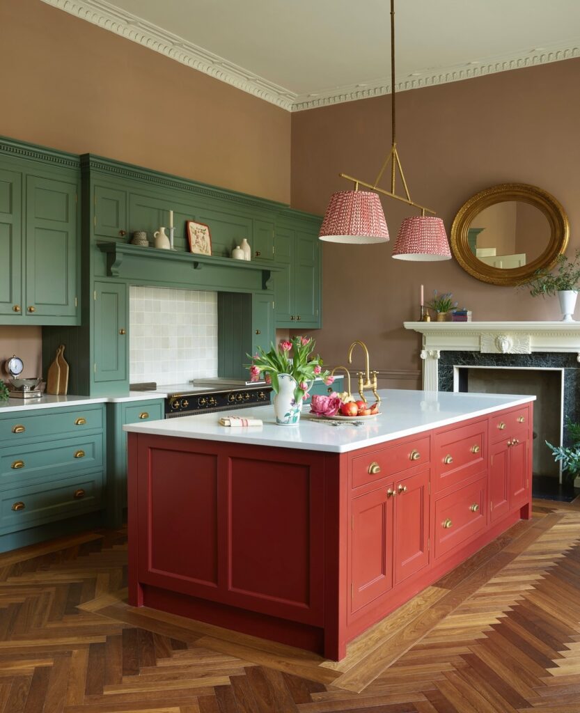
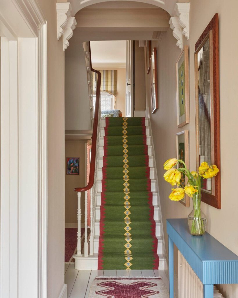
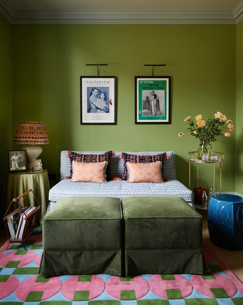
Red + Green
HERE’S WHY IT WORKS
At the risk of ‘giving’ Christmas vibes all year round, most studios steer away from red and green. But then again, designers with expert color command like Annabel Grimshaw and Anne McDonald prove otherwise. By pairing more muted shades of green with warmer brick reds, this kitschy combination can take a modern, tasteful turn. Natural wood tones nicely balance red and green, adding warmth that dials down the vibrance in a subtle way.
Design by Annabel Grimshaw, Photography by Rachael Smith
Design by Kate Guinness Design, Photography by James McDonald
Design by Anne McDonald, Photography by Taylor Hall O’Brien
Design by Reath Design
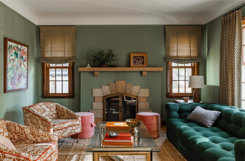
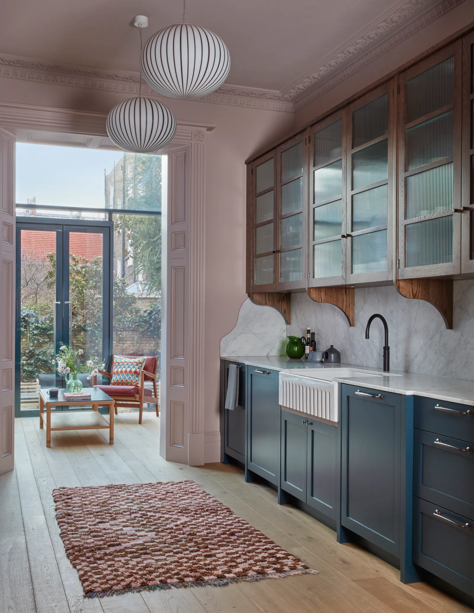
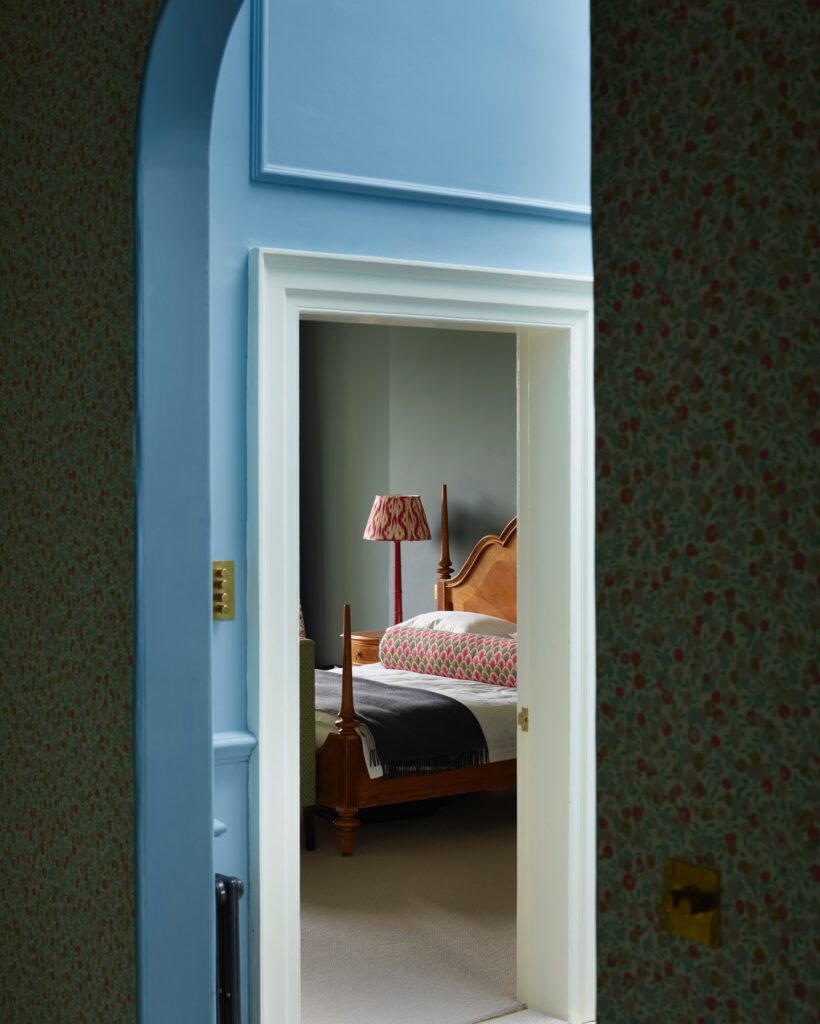
Blue + Mauve + Plum
HERE’S WHY IT WORKS
Purple has been given a rebrand, of sorts, in recent years. The hue’s many iterations, like mauve and dusty plum, have shown up everywhere, even being named a top design trend of 2024. Of course, it’d be easy to pair purple with a range of beige-y neutrals, but many designers are opting to combine it with bold shades of blue. These analogous colors are inherently pleasing to the eye, and work with everything from cornflower blue to a rich cerulean.
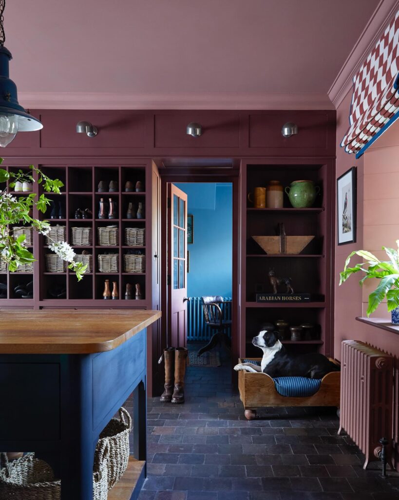
Design by Nicola Harding & Co, Photography by Paul Massey
(Left) Design by Kate Guinness Design, Photography by James McDonald // (Right) Design by Anne McDonald, Photography by Tim Lenz
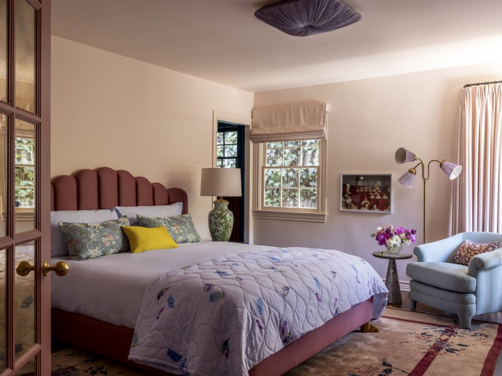
Design by Reath Design
Design by Reath Design
Fuchsia + Lime
HERE’S WHY IT WORKS
Fuchsia and lime might seem like an audacious choice, but designers like Nicola Harding and Avery Cox have continually demonstrated how these vibrant hues can feel unexpectedly fresh. Fuchsia brings a warm, bold intensity, while bright green offers a light and zesty counterpoint. To be clear, this palette isn’t for the faint of heart, but it results in a space brimming with cool girl energy.
Design by Avery Cox Design, Photography by Ngoc Minh Ngo
Design by Nicola Harding & Co, Photography by Paul Massey
Design by Nicola Harding & Co, Photography by Paul Massey
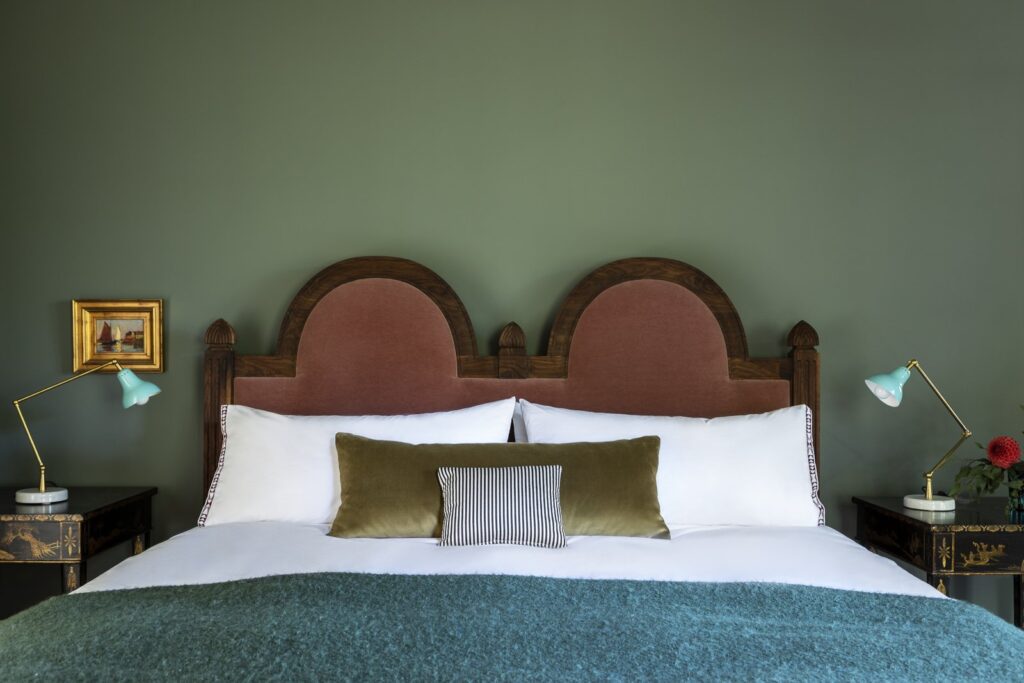
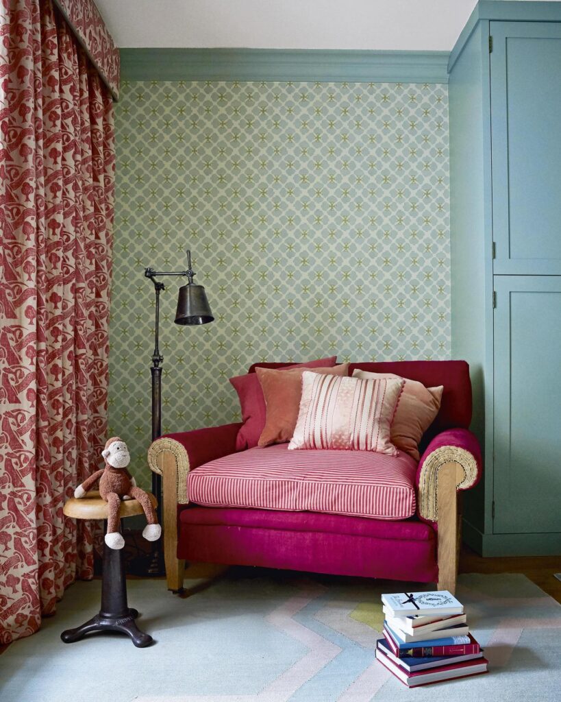
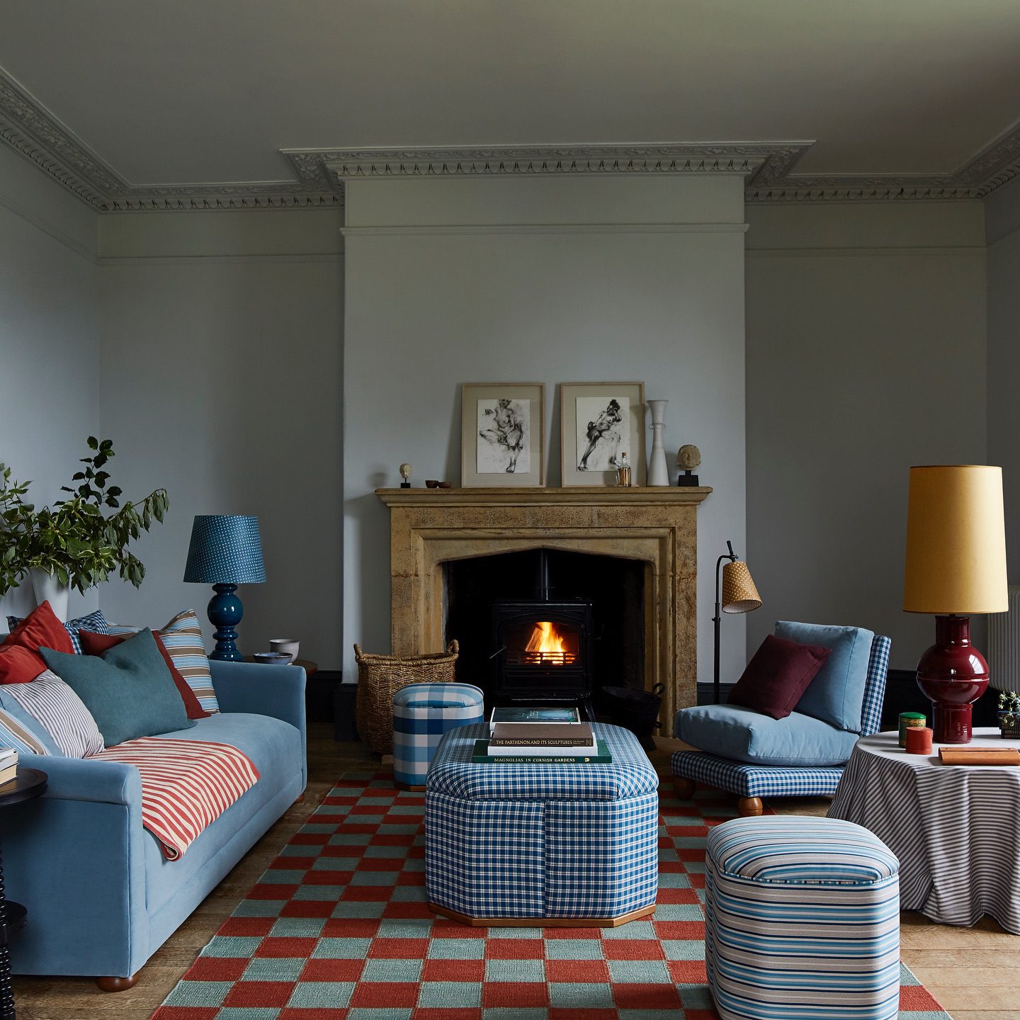
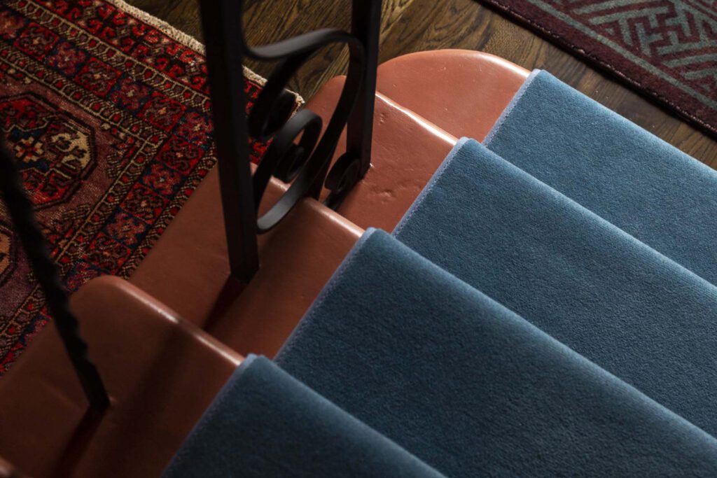
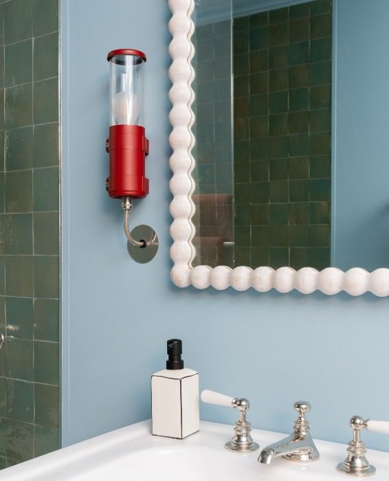
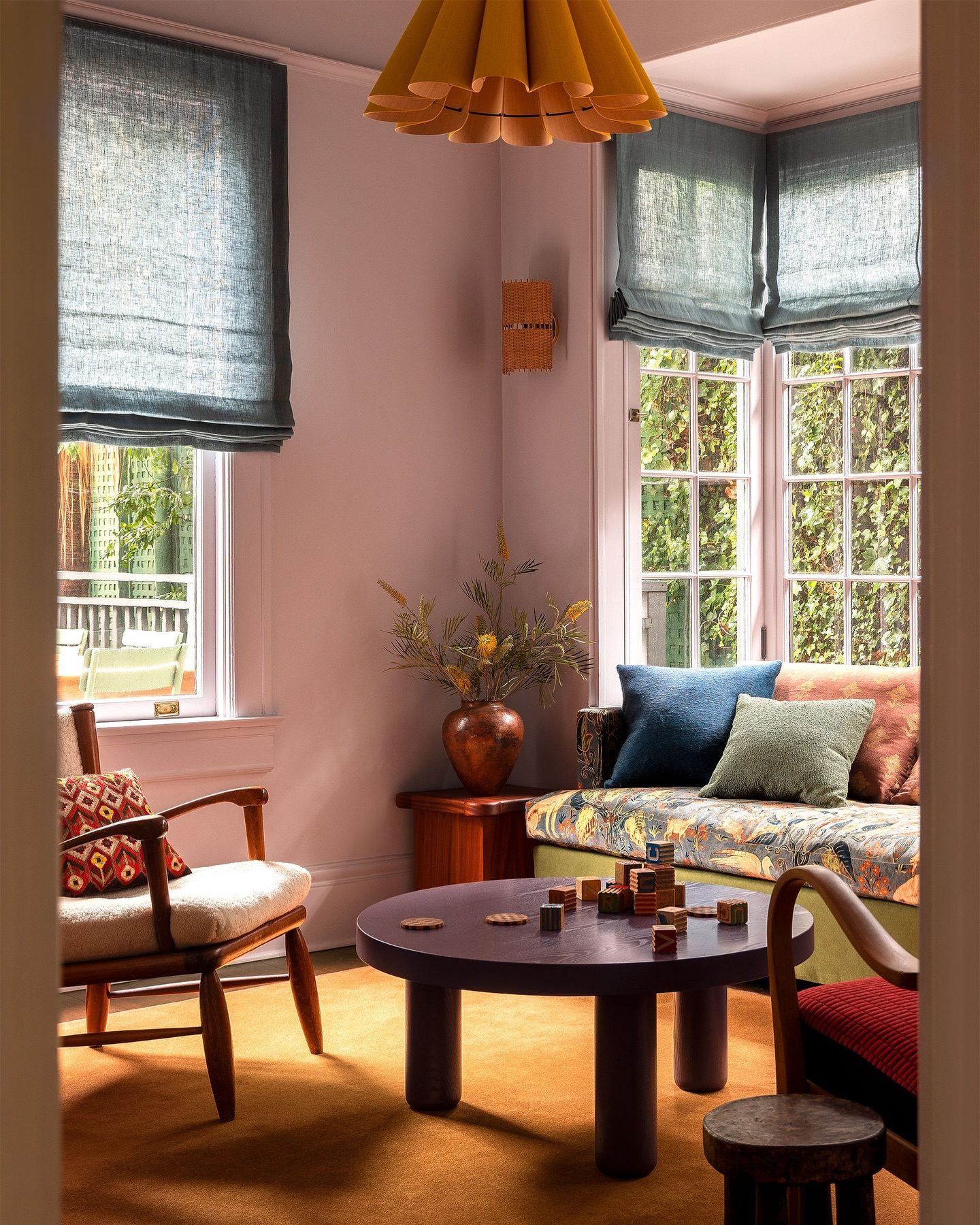
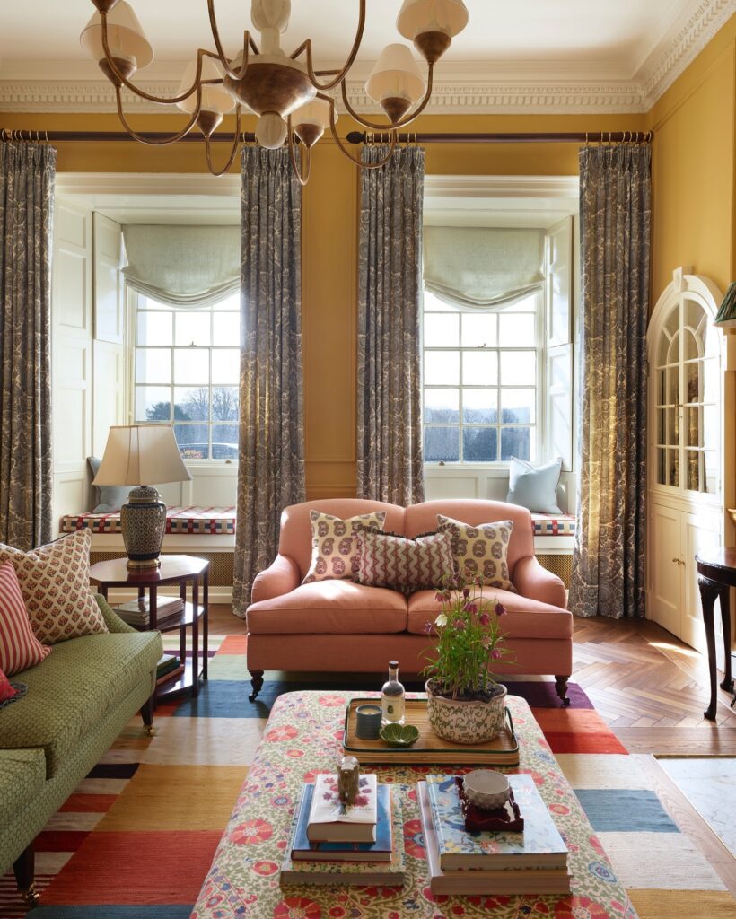
Blue + Red
HERE’S WHY IT WORKS
Blue and red are often associated with a classic, preppy aesthetic, but the work of Kate Guinness, among others, demonstrates how these colors can be reimagined for modern interiors. This color duo feels adventurous yet refined by pairing light blues with deep, moody reds. The key is selecting the right shades: light blues provide the calm, while deep reds inject the punch. Two primary colors within a single space should clash on paper, but when carefully executed, they can create an incredible, eye-catching contrast.
Design by Nicola Harding & Co, Photography by Kristin Perers
(Left) Design by Avery Cox Design // (Middle) Design by Reath Design // (Right) Design by Annabel Grimshaw
Design by Kate Guinness Design, Photography by James McDonald
Design by Kate Guinness Design, Photography by James McDonald
Design by Kate Guinness Design, Photography by James McDonald
Mauve + Gold
HERE’S WHY IT WORKS
Some colors are just better together—mauve and gold being one of them. This pairing is perfect for creating warm environments that feel unexpectedly timeless, as demonstrated by designers like Ashley Lavonne Walker. Her recent craftsman project takes this color palette in such an interesting direction, layering Majestic Mauve by Benjamin Moore with golds, greens, and blues for an interplay of hues with an artful effect.
Design by Ashley Lavonne Walker, Photography by Haris Kenjar
Design by Annabel Grimshaw, Photography by Rachael Smith
Design by Nicola Harding & Co, Photography by Paul Massey
BY: Stephanie Weers