A Modern Edwardian Home Tour for Music Lovers
For this young couple, making a stately San Francisco Edwardian feel like a reflection of themselves was no easy task. They enlisted the expertise of Bay Area interior designer, Heather K. Bernstein, to renovate key areas of their home as their family looked to expand. Heather K. Bernstein expertly renovated their kitchen, living room, and bathrooms while furnishing the home to feel anything but period specific in this modern Edwardian.

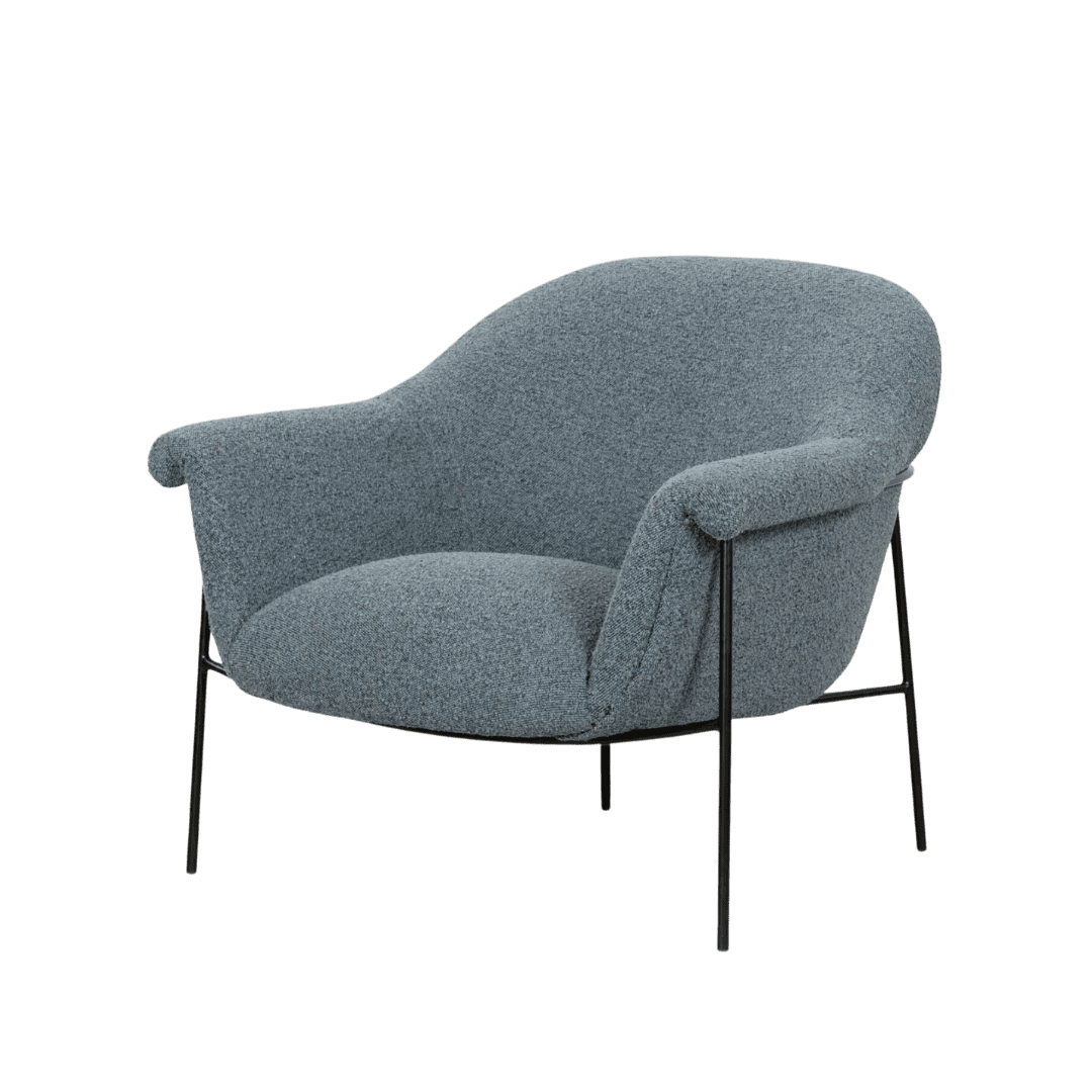
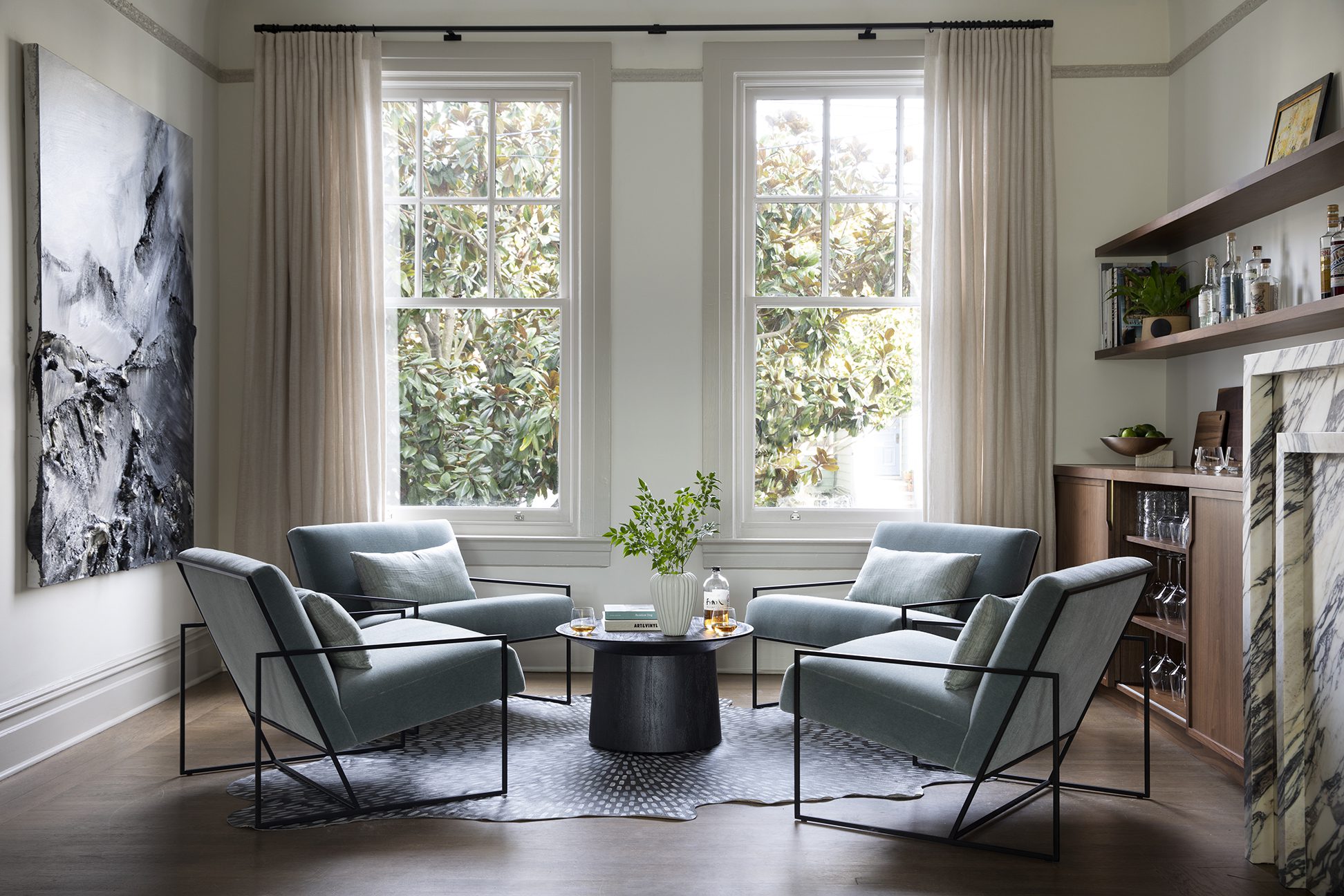
A grouping of 4 lounge chairs in a dusty blue mohair define the formal living area.
Historical Context of a San Francisco Edwardian
Having spent my most formidable years in a San Francisco Victorian, I have a sharp understanding of the challenges one faces with long, narrow rooms and grand details. A few key notes about the design details in a home of the Edwardian era:
- At the turn of the 20th century, simpler, clean lines out fashioned the gold rush’s frilly details.
- While still grand, ornamental details were far less concentrated in Edwardian homes than their Victorian predecessors – making this space the perfectly detailed blank canvas to work from.
- Edwardian homes quickly outnumbered Victorians in San Francisco after the infamous 1906 earthquake and respective fires, because they were less expensive to build – often constructed by hand and pulling inspiration from simpler design influences.

Making it Modern
Heather’s clients trusted her completely, ready to push boundaries in color and materiality. One of the client’s primary requests was a sexier fireplace – a focal point for the sprawling gathering space of the living room. Replacing the existing mismatched, beige tiled fireplace surround and ornate mantle with a boldly veined marble iteration was the level up the space needed. I love the nod to Georgian symmetry and repetition of the bespoke mantle design; a true masterclass in pulling inspiration from historic elements in a contemporary way. HKB modernized the soaring 10 foot ceilings by painting the walls Benjamin Moore White Dove OC-17 and highlighting the original trim that underlines the cove ceilings in Revere Pewter HC-172.
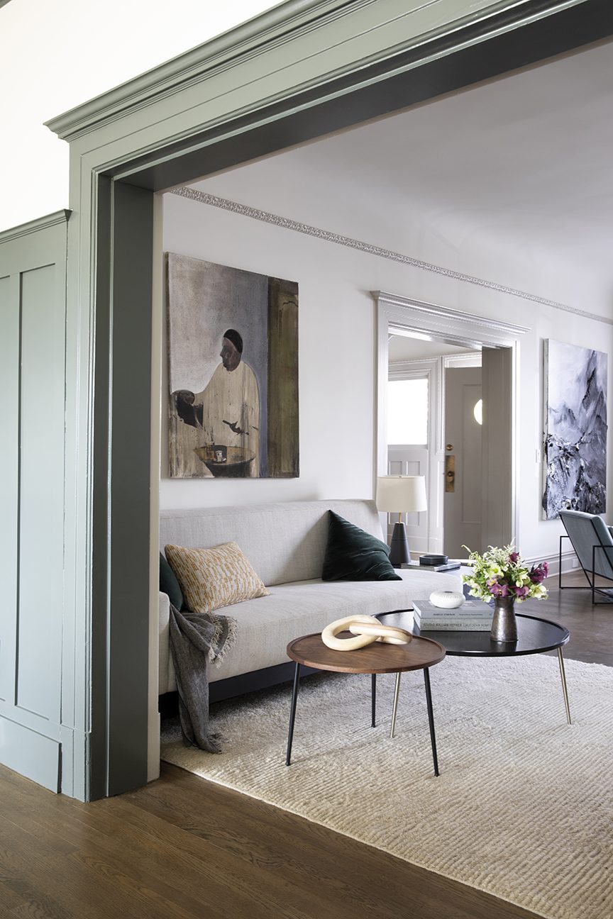
By dividing the long and lean living room into two distinct sitting areas, HKB anchored the sides accordingly, creating one formal seating area and one more relaxed. One side plays bartender, while the other plays DJ. Musically minded, displaying the hip couple’s extensive vintage vinyl collection was top priority for the large living room’s renovation. HKB designed sleek walnut builtins flanking the fireplace which clearly define the purpose of each area.

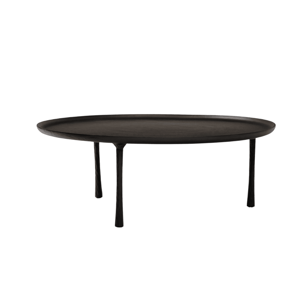
A pair of coffee tables provide floor plan flexibility in the low-key lounge area.

A Carefully Colorful Kitchen
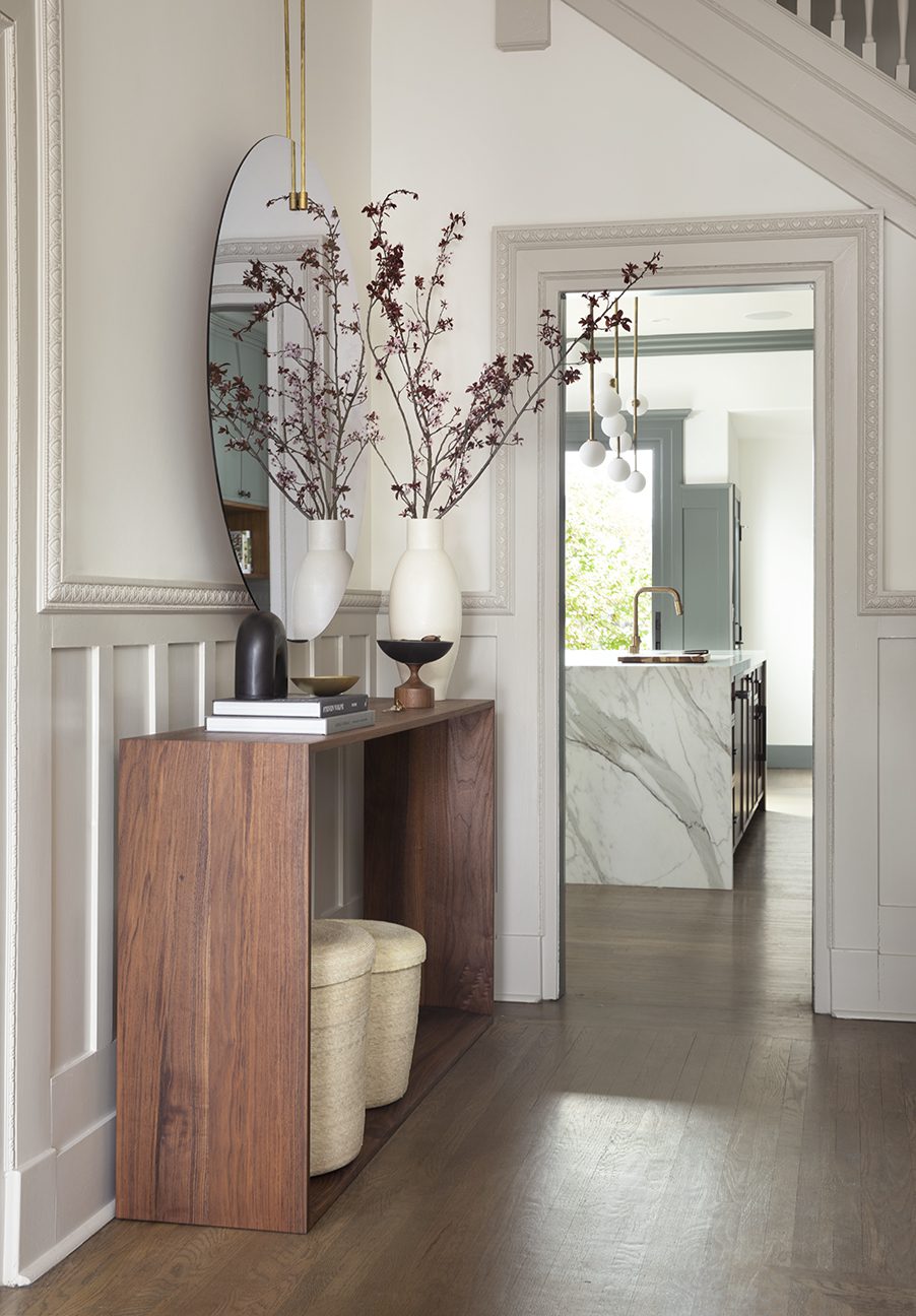
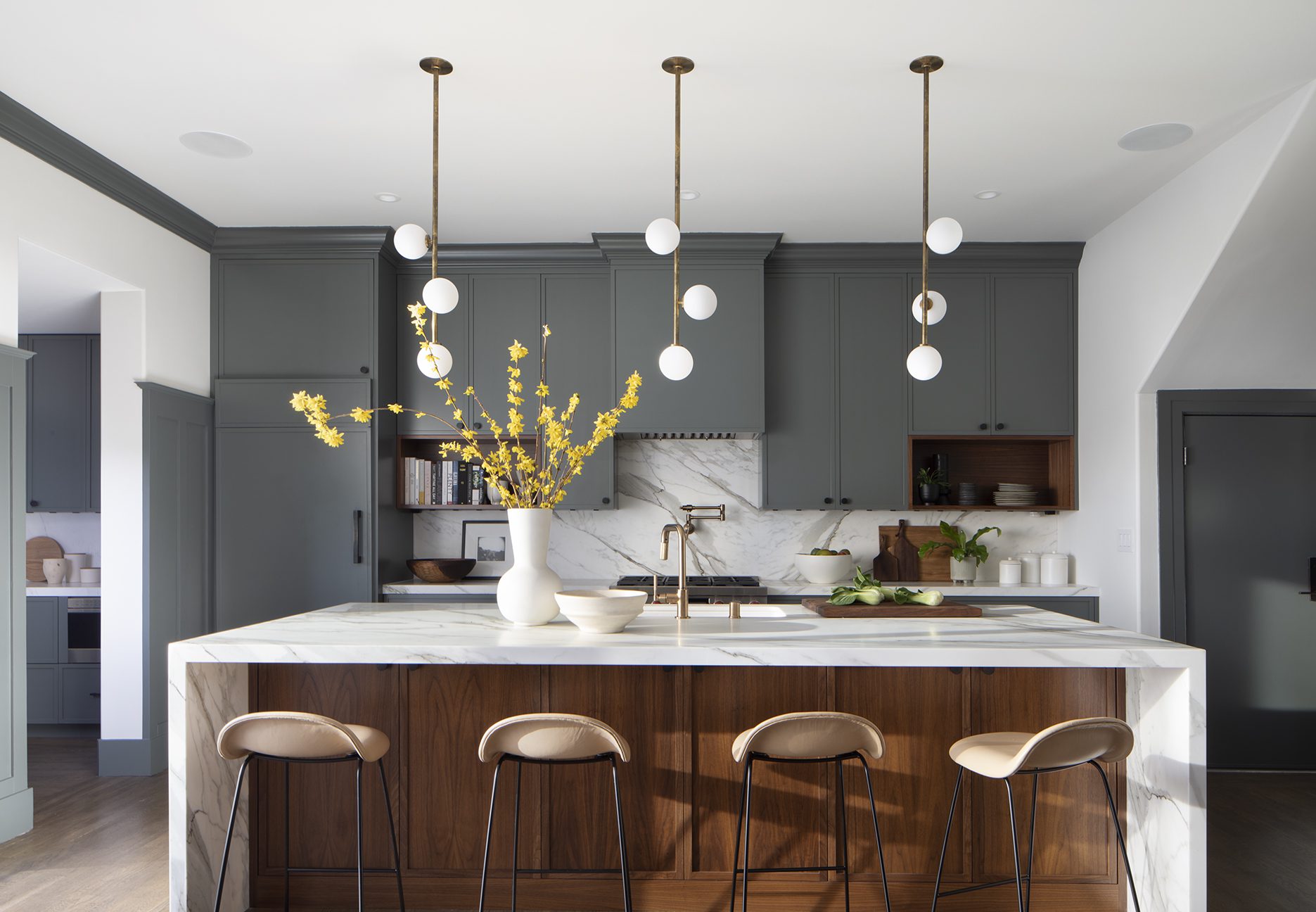
The kitchen is where HKB most leveraged her clients’ trusting sensibilities – continuing the cool color palette accented by warm organic tones. Low profile cabinetry run to the ceiling in Benjamin Moore’s Millstone Gray – 1581 packs a colorful punch while still feeling neutral. A trio of mid-century inspired Allied Maker pendant lights anchor the waterfall island. Did you notice the thoughtful detail and careful installation of those? Each pendant light is secured at a slightly different angle, adding a playful amount of movement to the space, almost as though they were a single fixture dancing.


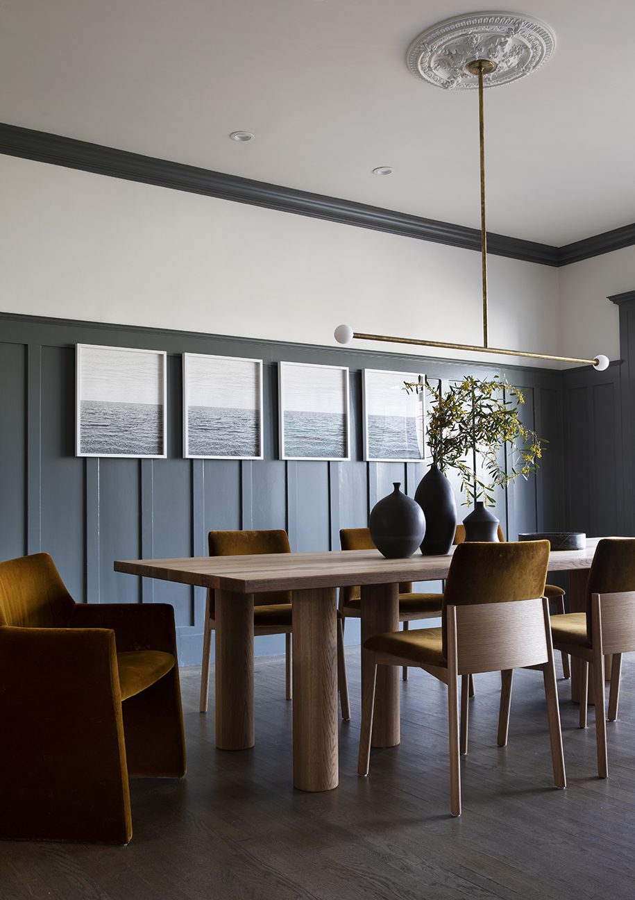
I love the original board and batten millwork detail HKB painted Millstone Gray – 1581 used to frame the formal dining room. It pulls from craftsman characteristics entirely accurate to the home while feeling entirely fresh, flattering and vibey. Perfect for this young family to entertain against.

A custom upholstered headboard allows for space saving nightstands while bringing bold, dynamic color into the space.


Benjamin Moore’s White Dove OC-17 and Rever Pewter HC-172 grace the walls and trim throughout the remainder of the home – keeping things consistent, modern, and refined.

The upstairs custom vanity was painted in Farrow & Ball’s De Nimes – 299
Clean, modern lines, thoughtful introductions of color and layers of walnut keep this San Francisco modern Edwardian young, hip, and joyful. Heather K. Bernstein may have been given total design freedom on this project, but I can say with confidence, after viewing the results, she totally earned it.
Design: Heather K. Bernstein / Photography: Paul Dyer
BY: theinteriordev


