A Mid-Century Modern Renovation That Pays Homage to Its Roots
Something about mid-century design always draws me in. Whether it’s the undeniable artistry of an Eichler or a 70’s ranch in Austin, I appreciate that every element is so decisive. Built in 1956 with exposed rafters and distinct architecture, this mid-century modern renovation pays homage to its roots in the best way. The client, a first-time homeowner, reached out to Cathie Hong to update the interiors to match the charming mid-century details that initially drew her to the Northern California property.
Cathie and her team were given creative freedom to breathe life into the home. With modern earth tones, intentional use of color and expert attention to detail, that’s exactly what they did. Now, it captivates with clean lines, layers, and natural light flooding in through floor-to-ceiling windows in the main living areas.

Photography by Margaret Austin
When Style Meets Function
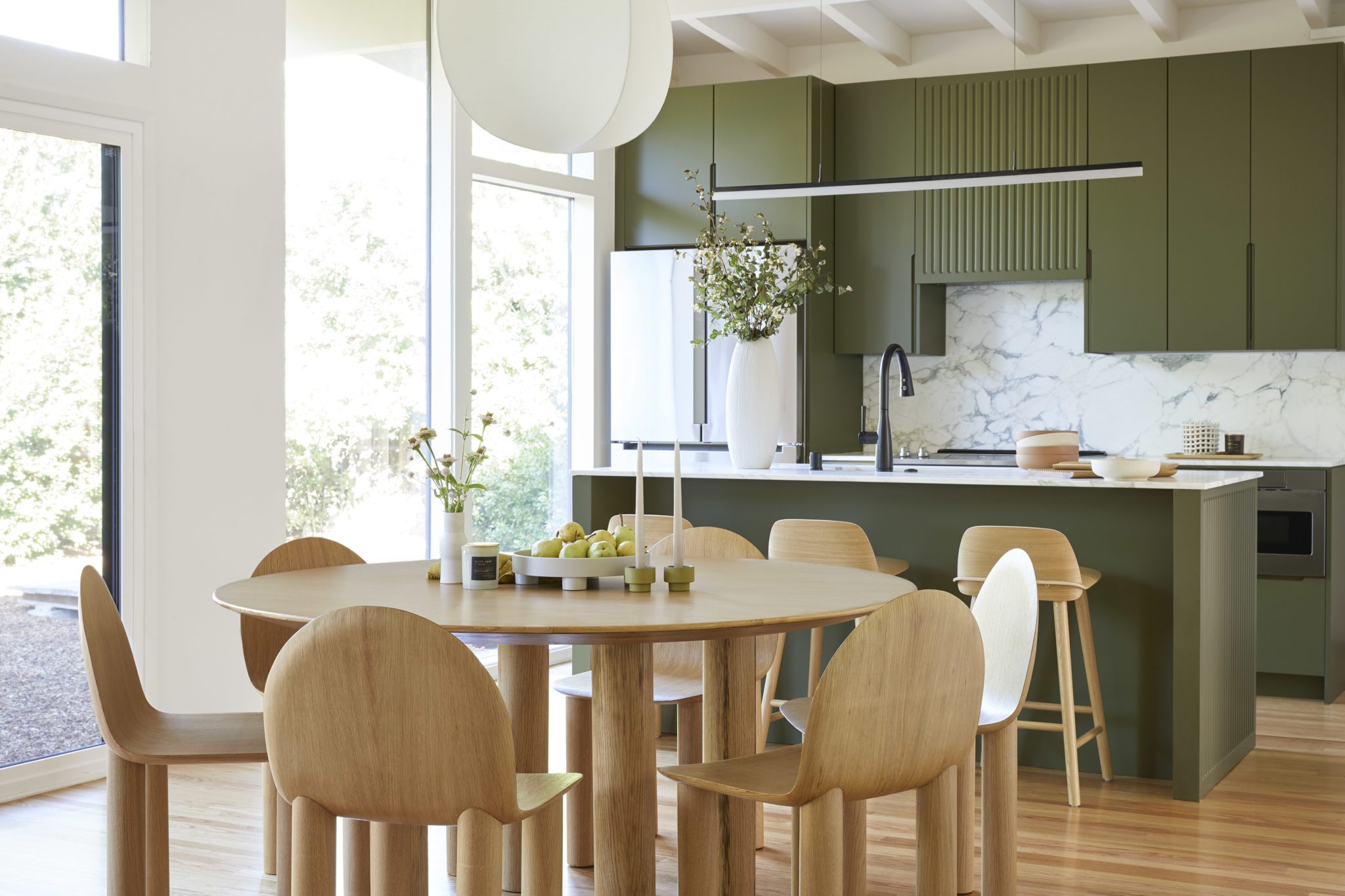
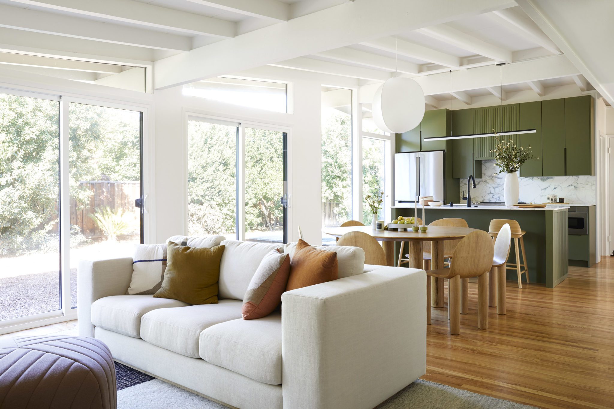
The original kitchen was a little too reminiscent of the 1950s. Located in the middle of an open room– it limited both storage space and functionality. Cathie Hong Interiors relocated the kitchen against a wall and built a small island for additional seating and counter space. Adorned with a Calacatta Vagli honed marble slab and painted a deep avocado green, the kitchen expertly honors the original architecture while still remaining modern and functional.
Staying true to every little detail, they carried the vertical lines from the side of the island to the range hood for a subtle eclectic moment.

A Transitional Dining Space
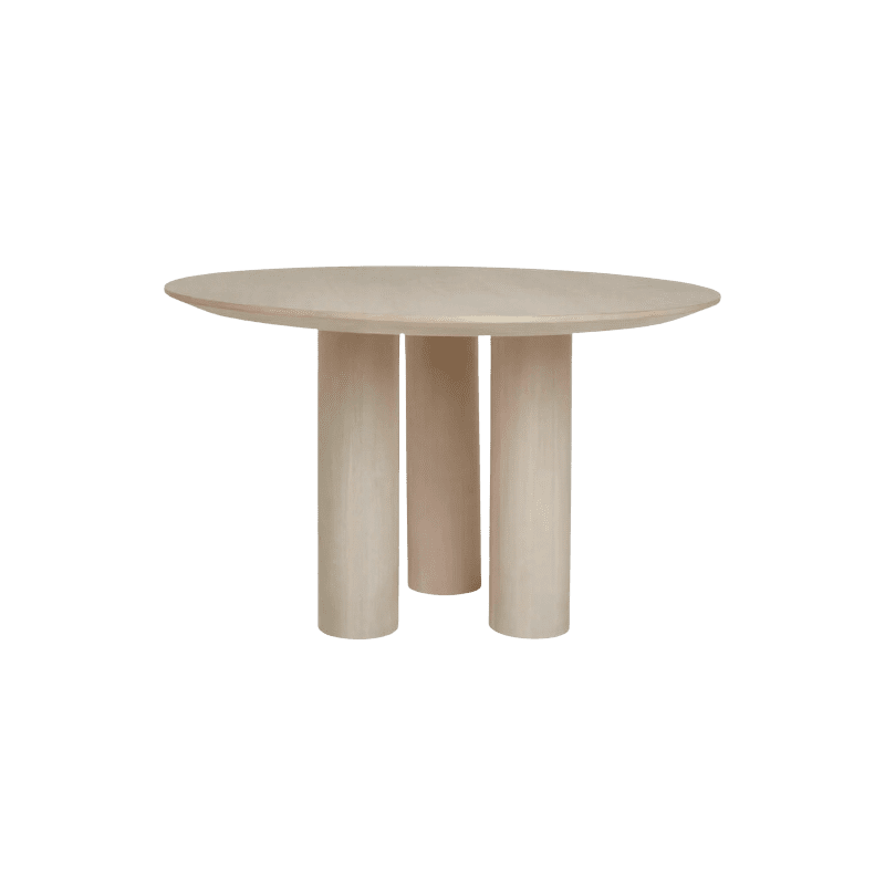
Flanking the kitchen adjacent to the living room is a wooden dining set by Australian designer Sarah Ellison. The modern design mirrors the wood tones from the kitchen stools and juxtaposes the linear grooves in the island and custom range hood. The dining set is perfectly complemented by the pared-down silhouette of the white pendant light suspended from the rafters above.

Highlighting The Original Architecture
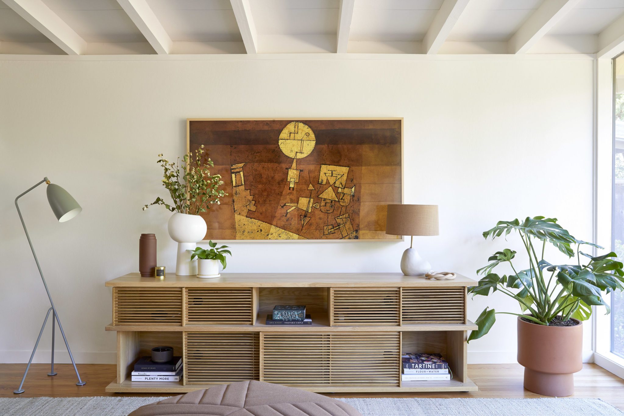
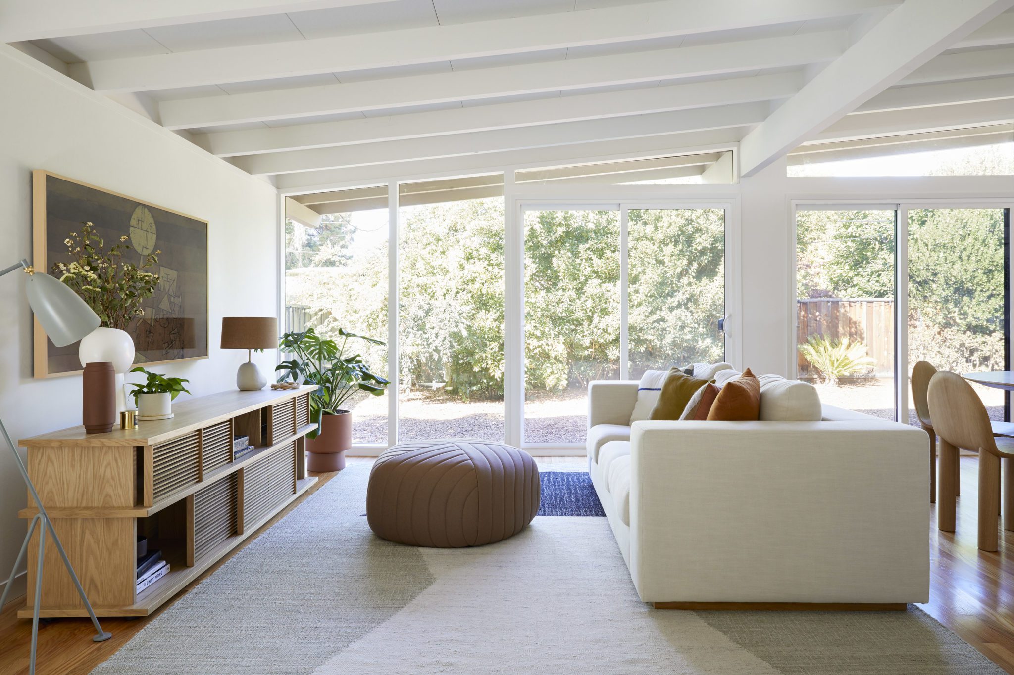
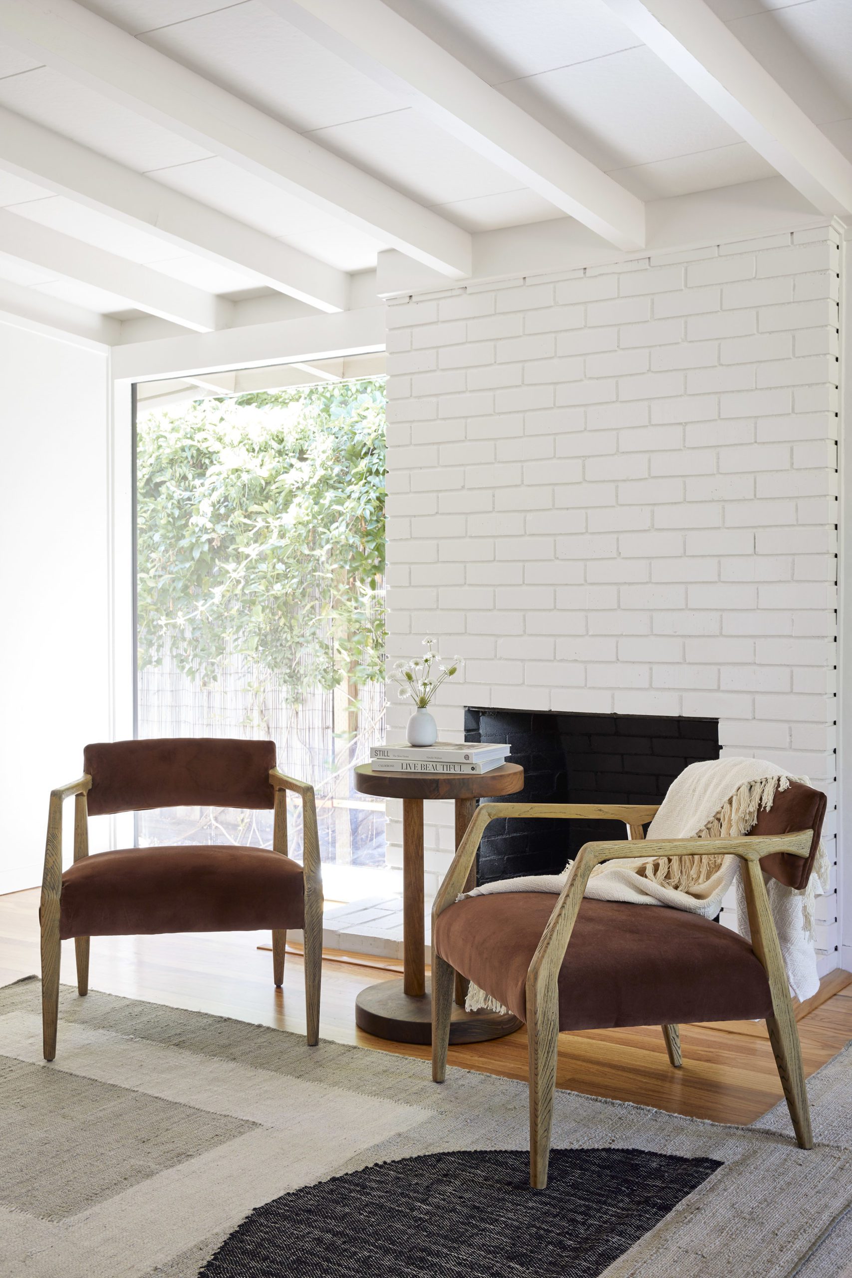
While the kitchen is seriously stunning, the living space is what really stole my heart. The floor to ceiling brick fireplace highlights the original exposed rafters. The horizontal lines of the media console contrast them in the best way. I love the simplicity of Cathie’s furnishings (like the clean, contemporary sofa) allow the architecture to be the star of this space. As a bonus, the new dual pane, tempered windows make the home more energy efficient while allowing the natural light to flood the main areas.

A Proper Ensuite
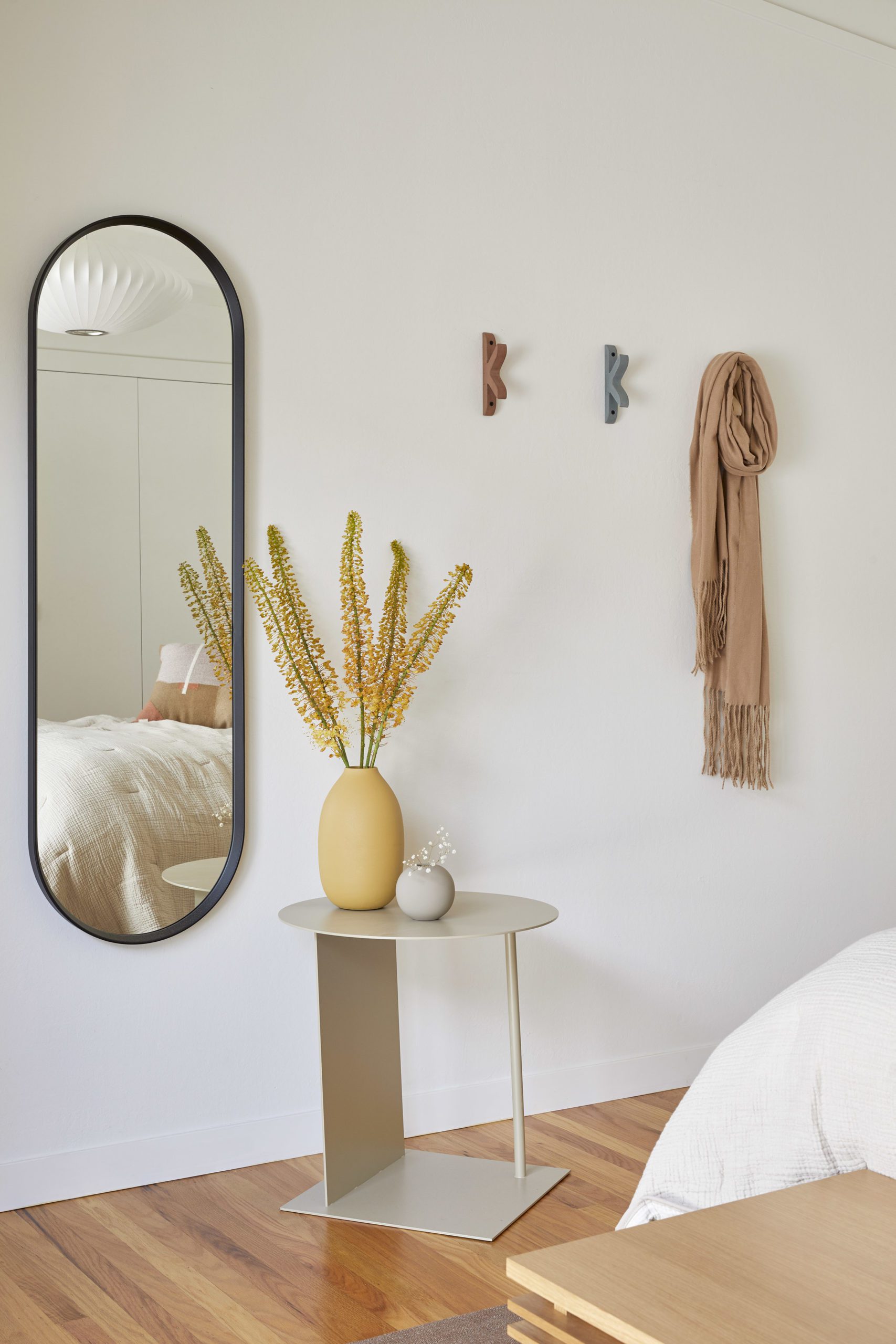
The primary suite transformation is the dreamiest sanctuary. The exposed beams continue into the bedroom and are complemented by clean white walls and intentional layers. Paired with desert-inspired accent tones, the entire space Is serene and collected.
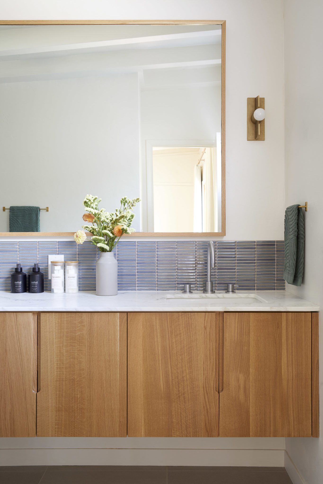
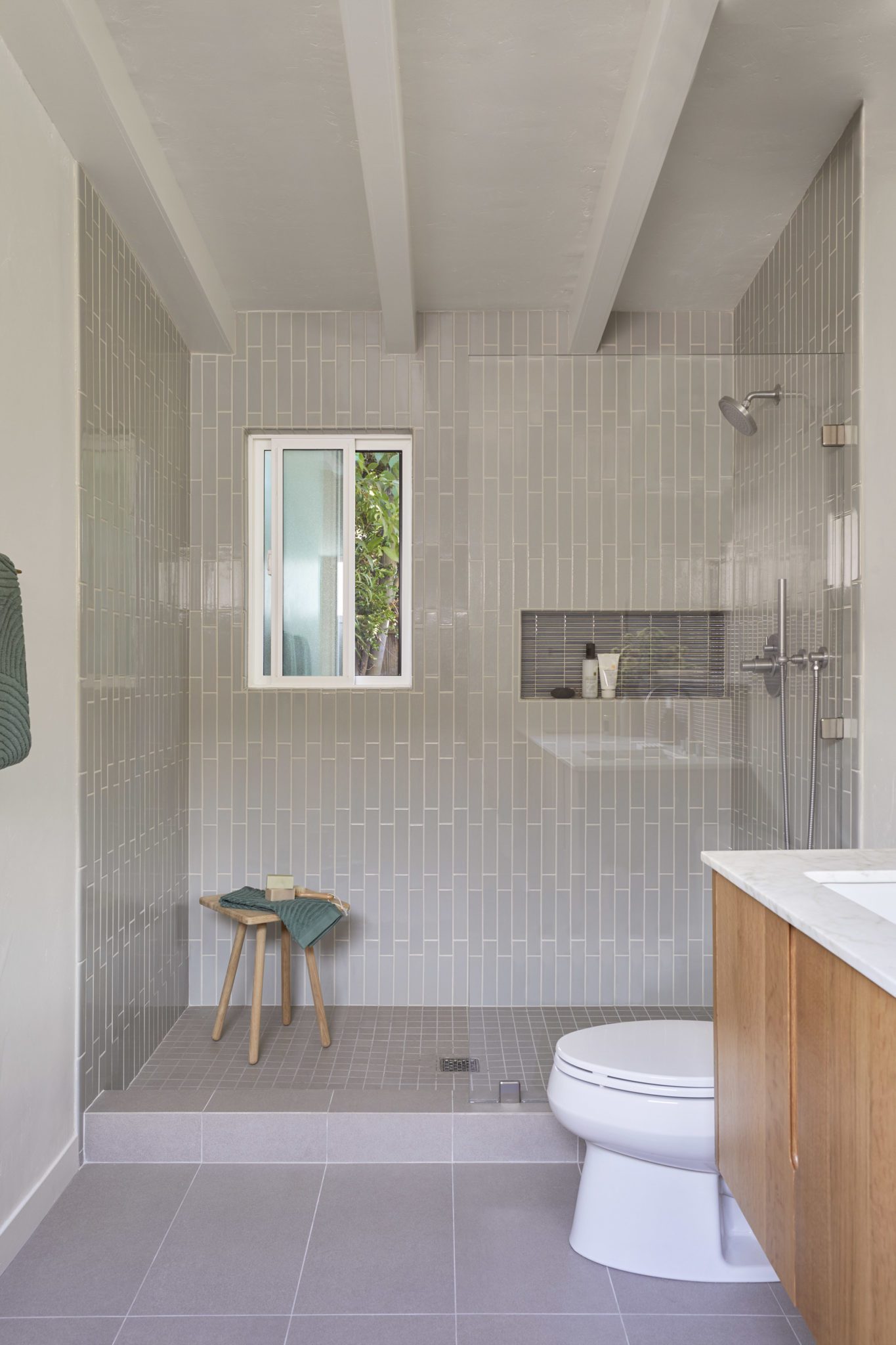
Before Cathie Hong and her team stepped in, the overall layout was less-than-ideal. Originally, the vanity and closet were open to the carpeted bedroom. They enclosed the space and created a proper ensuite with a spacious floating vanity. The new layout allows for an open-concept shower twice the size of the original. The closet was relocated into the bedroom with a new wall and door to accommodate the larger bathroom.


A Guest-Worthy Getaway
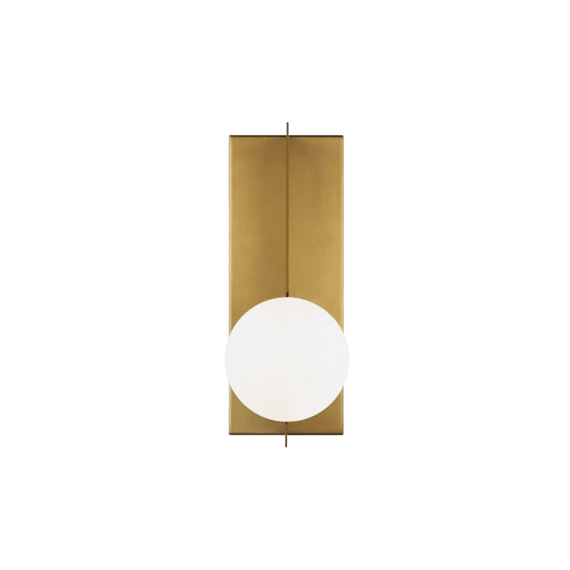
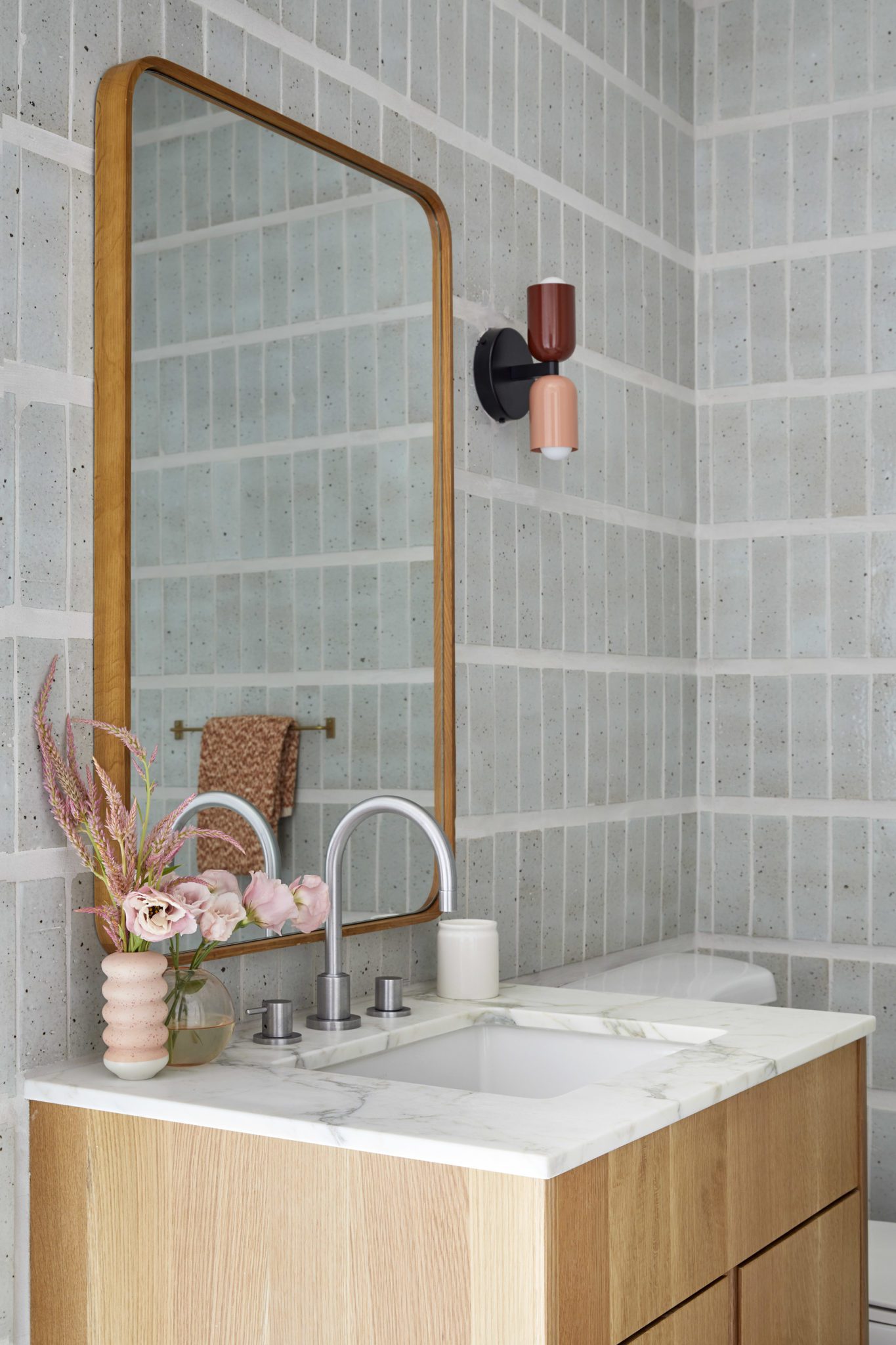
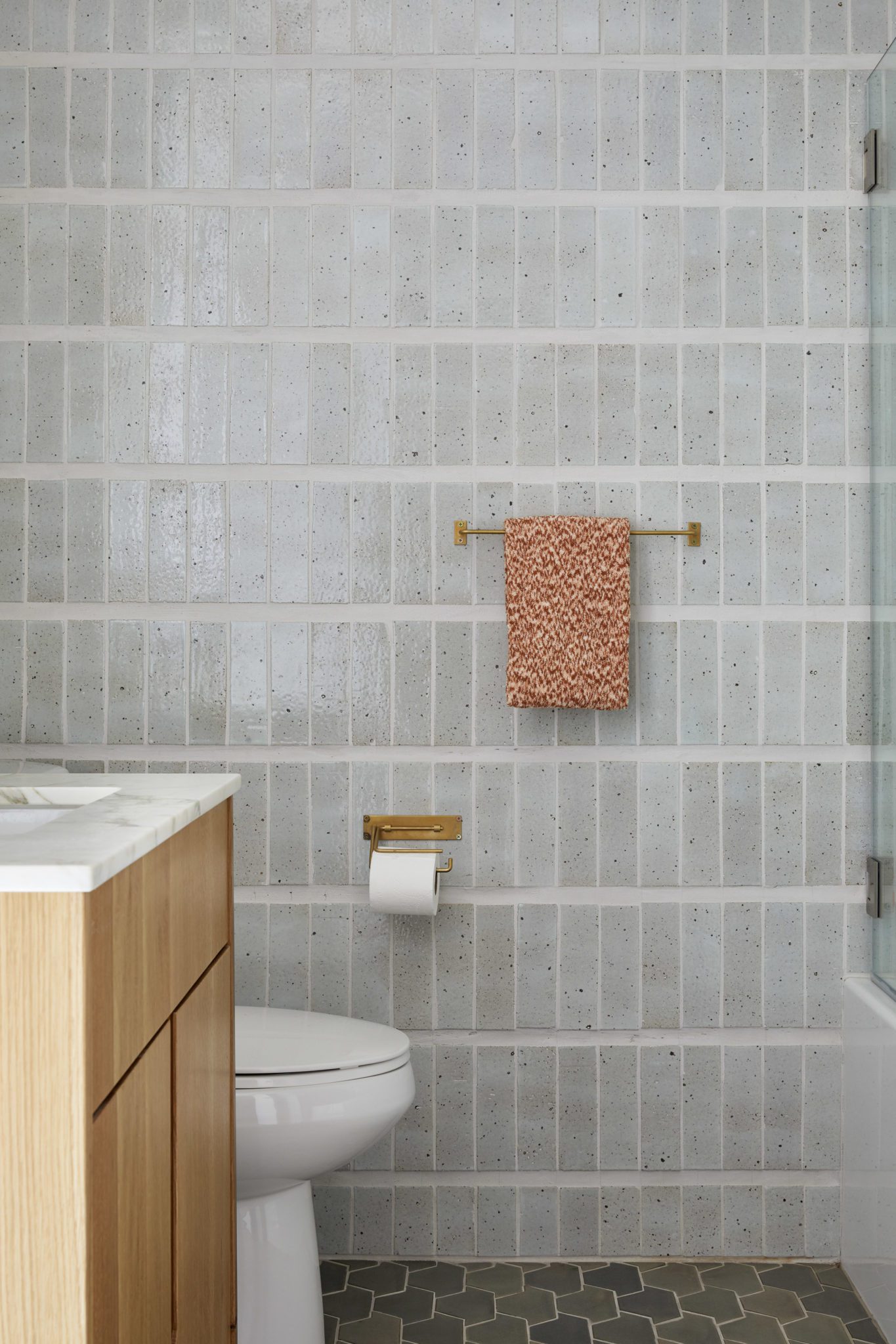
The guest bathroom is warm and welcoming. Handmade brick tile walls effortlessly steal the show, and a petite two-tone wall sconce effortlessly furthers the mid-century design.
With the help of Cathie Hong Interiors, this Mountain View home renovation embraces its mid-century roots modern roots for years to come. This project perfectly combines original architecture in a way that feels fresh for modern living.
BY: theinteriordev


