A Hong Kong Village House Turned Modern Oasis
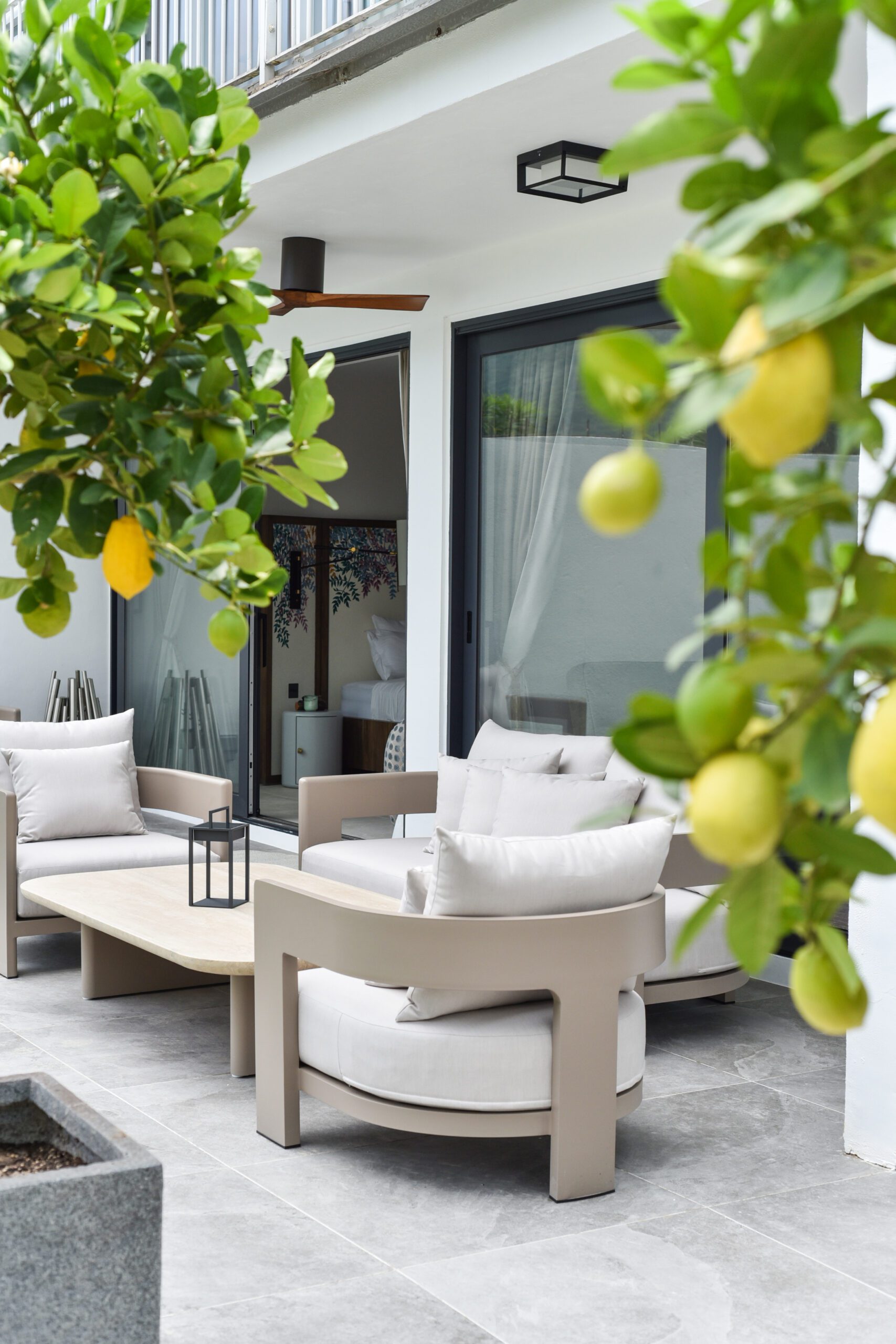
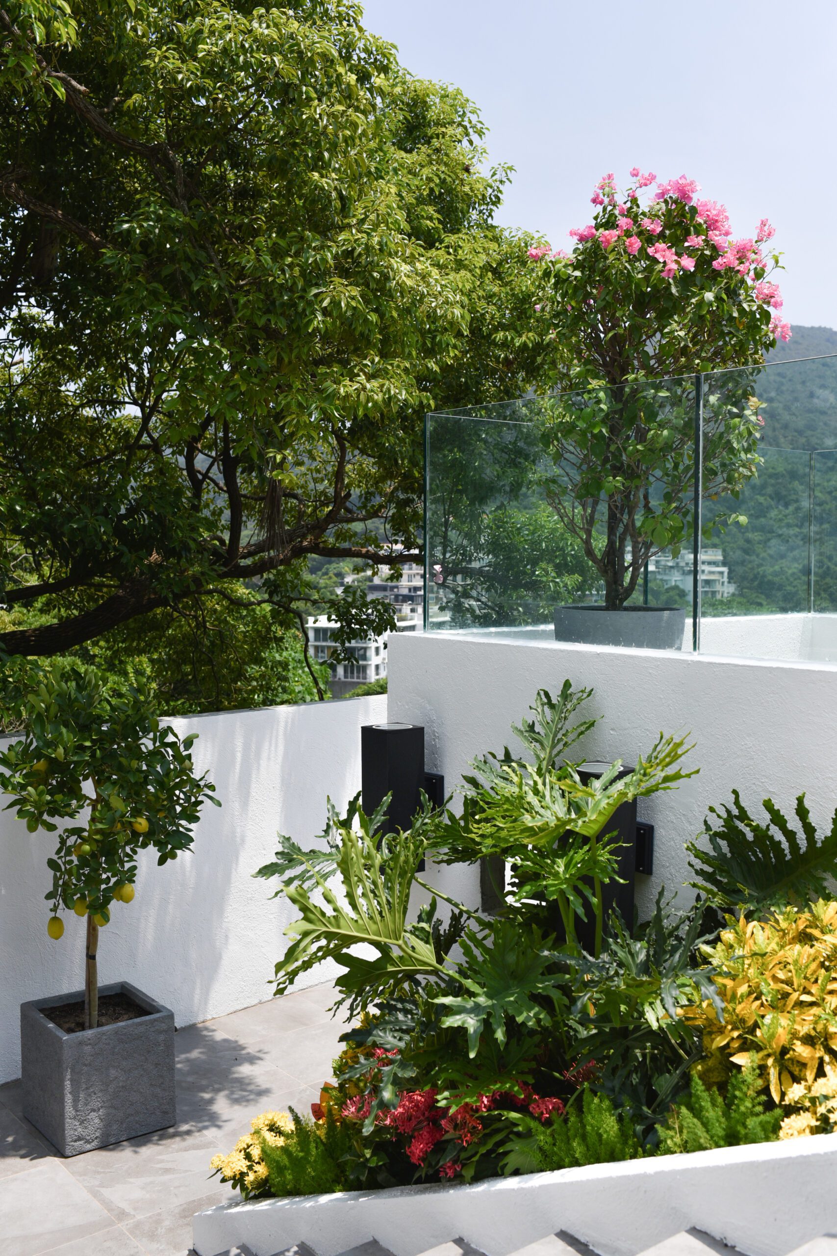
When design team S.Lo’s clients came to them, they had big plans to annex their beautiful property overlooking Ocean Bay in northeast Hong Kong. They had recently purchased the ground floor in the next building over, so the project required knocking down an exterior wall to join the two properties. After a complete gut remodel and interior architecture, they created a beautiful primary suite, family room, and a hidden “bunker” style garden studio office. The result is a peaceful and vibrant city oasis filled with thoughtful details inspired by the beauty of the surrounding architecture and landscape.
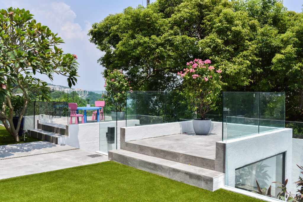
Regardless of the style and square footage, the most personal and memorable designs always nod to their environments — and it’s easy to see the inspiration drawn from the sweeping views throughout this project. Who wouldn’t want to lounge in this garden overlooking the city after a long day?
Design: S.Lo Studio | Photography: Camilla Warburton
The Understated Yet Elevated Interior
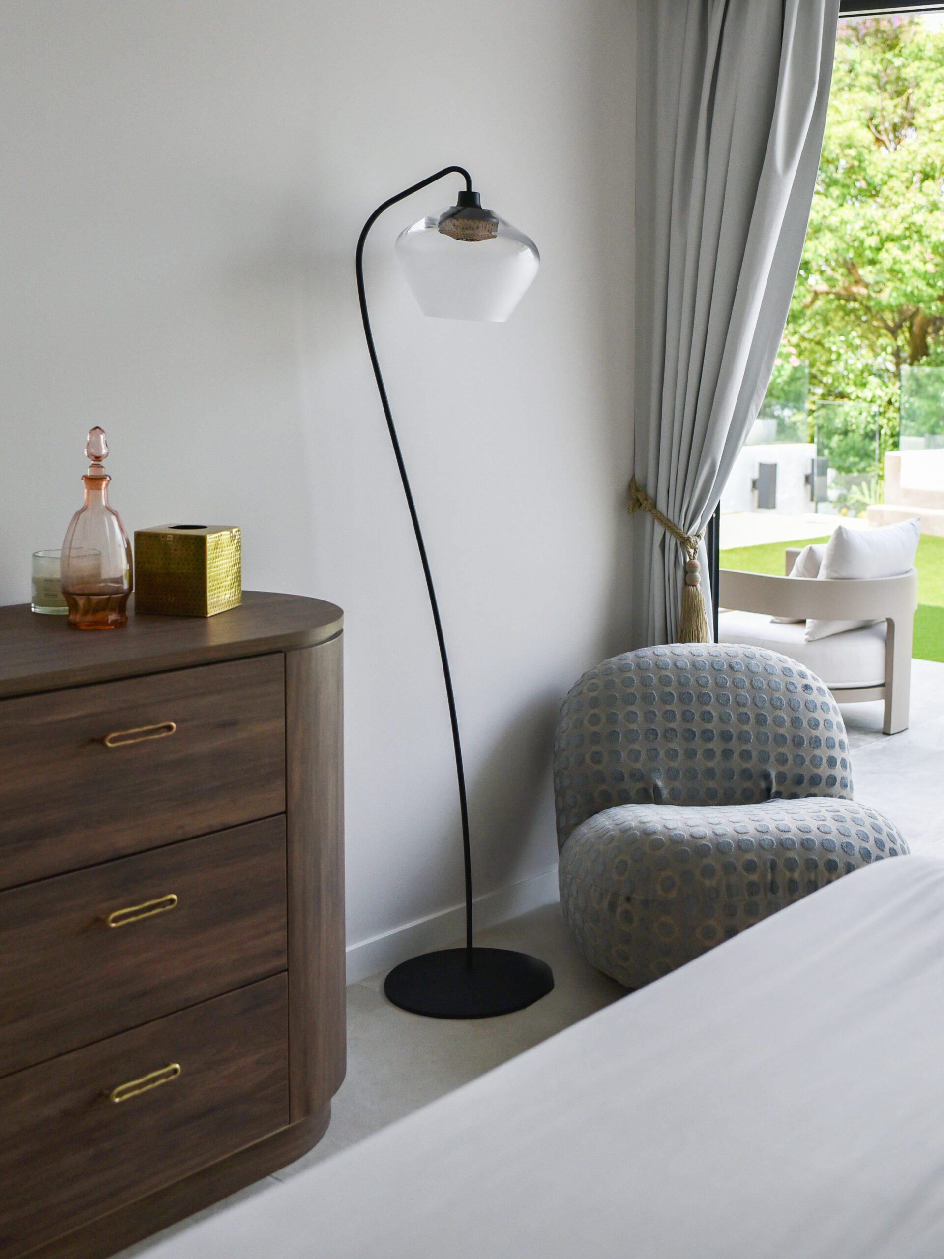
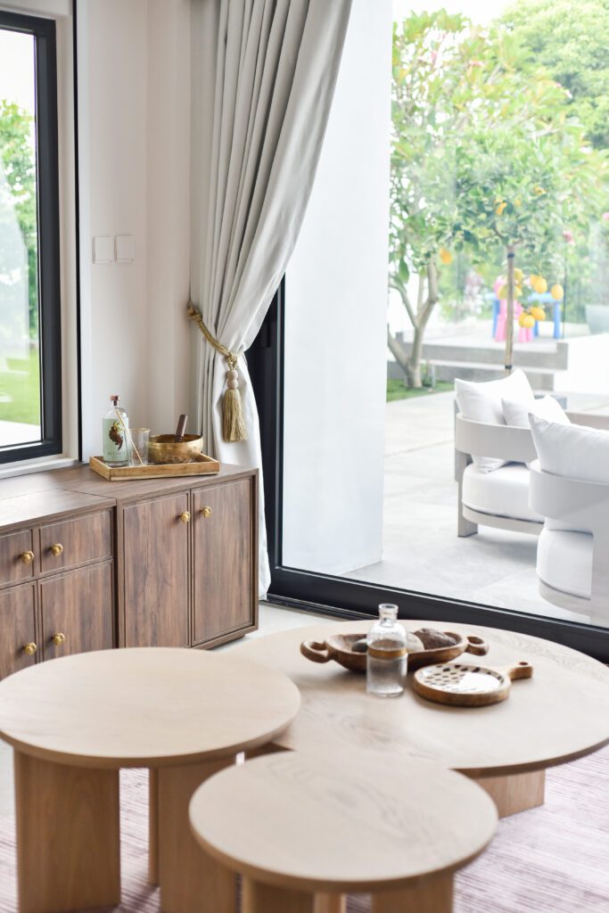
While the landscaping of this project draws you in and sets the scene, the renovation of this interior was no small task. This Hong Kong “Village House” was a standard 3-story concrete box built in the 1980s, and S.Lo added a lot of custom touches to bring warmth and personality to the modern structure. Although the finishes in the interior are subdued in color, the foliage peaking through the windows brings each space to life and encourages you to sit back and enjoy the views.
The Balanced Primary Suite
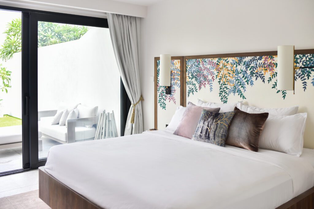
Aside from the unique brief of the renovation, one of the biggest design challenges was designing a primary suite space that was minimal and clean for him (his request) but feminine and intricately detailed for her (her request). S.Lo customized a version of Lalacurio’s “Fern Foliage” collection on the headboard to add a touch of romance to this space, and we love how it perfectly contrasts the clean, modern lines.
The Unexpected Niche Vanity
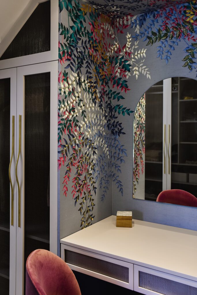
Our favorite moments in any project are the unexpected elements that make you look twice — the ordinary hallway filled with a touch of color or pattern, the spare closet turned office niche. In this case, this vanity is a unique feature created under the stairs leading to a separate upstairs unit. The hand-painted and embroidered wall coverings mirror the design on the headboard from Lalacurio’s “Fern Foliage” collection and make this space feel nothing short of magical.
BY: Jasmyne Muir


