A Home Office Turned Sophisticated Boardroom
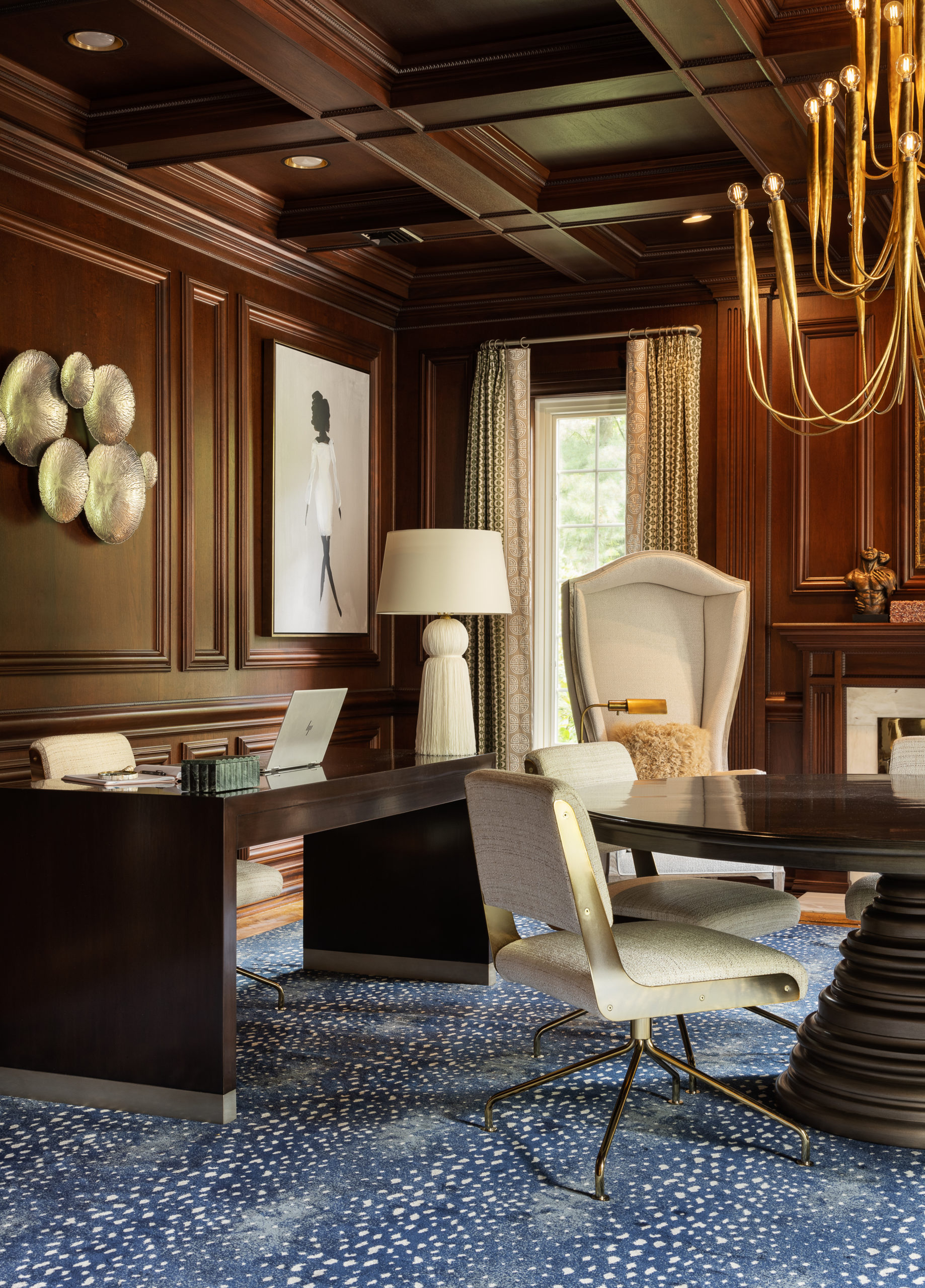
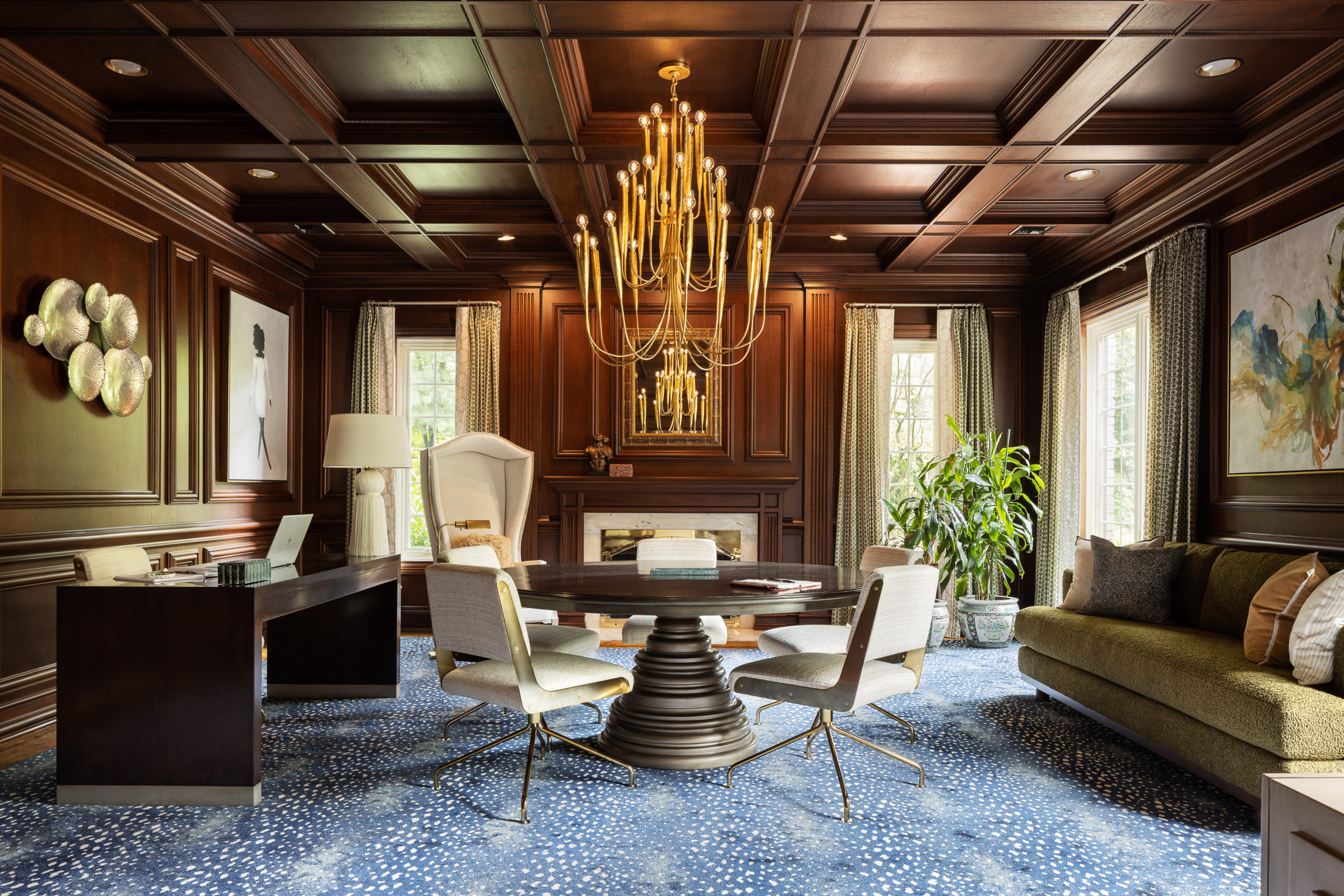
No one ever said working from home was easy, but then again, they probably didn’t have Gail Davis by their side. She reworked her client’s home office to mimic a full-scale boardroom complete with tasteful style and ample seating for up to twelve. Lighting was a particular point of concern within the existing space, but Gail only saw it as an opportunity. She sourced a brass statement chandelier that anchored the office, delivering both form and function in droves. Gail was kind enough to share the inner workings of her design process alongside photographs captured by Mike Van Tassell—let’s have a look.

Design: Gail Davis Designs | Photography: Mike Van Tassell
How Gail Davis Helped Her Client Bring the Boardroom Home
Tell us about this project and the scope of work involved.
The client wanted her home office to be more feminine, intimate, and inviting. We discussed how she runs her meetings, and I wanted to ensure that everyone would have a comfortable seat and be gazing at something beautiful.


“I wanted to ensure that everyone would have a comfortable seat and be gazing at something beautiful.”

What were some of the key pain points for this project, and how did you problem-solve with design?
The main pain point was limited seating. My client didn’t have enough seating for twelve, and the space was dark due to the paneling on the walls. There also wasn’t a center light in the space. I installed a voluminous fixture that would light up the room but also be amazing eye candy.
Shop the Look: Statement Chandeliers
Talk to us about the initial inspiration and the process of honing your vision?
The initial inspiration was to create a home office that felt elegant and inviting. Sometimes a home office can feel like an afterthought, and I wanted to ensure this felt like a sophisticated boardroom.
More to Read: The Benefits of Having a Signature Style

Can you describe what went into designing the key spaces within this project?
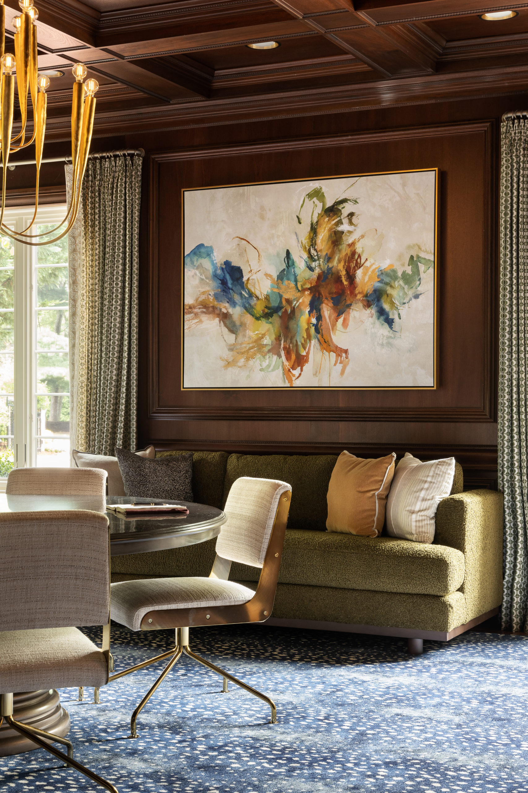
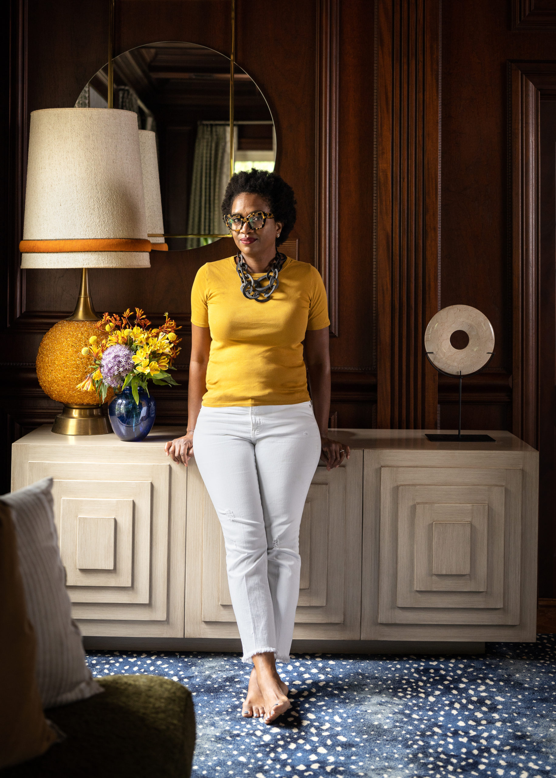
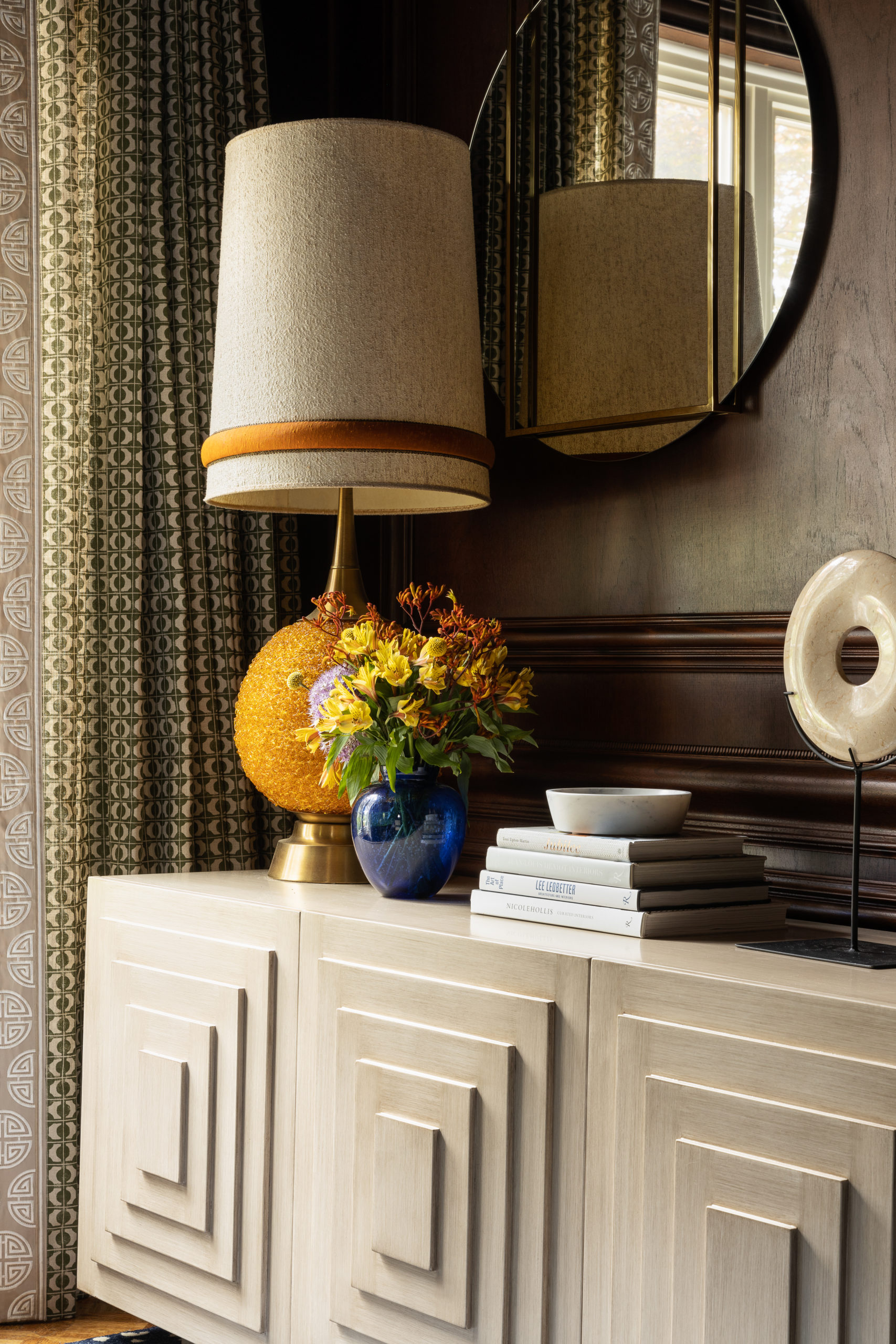
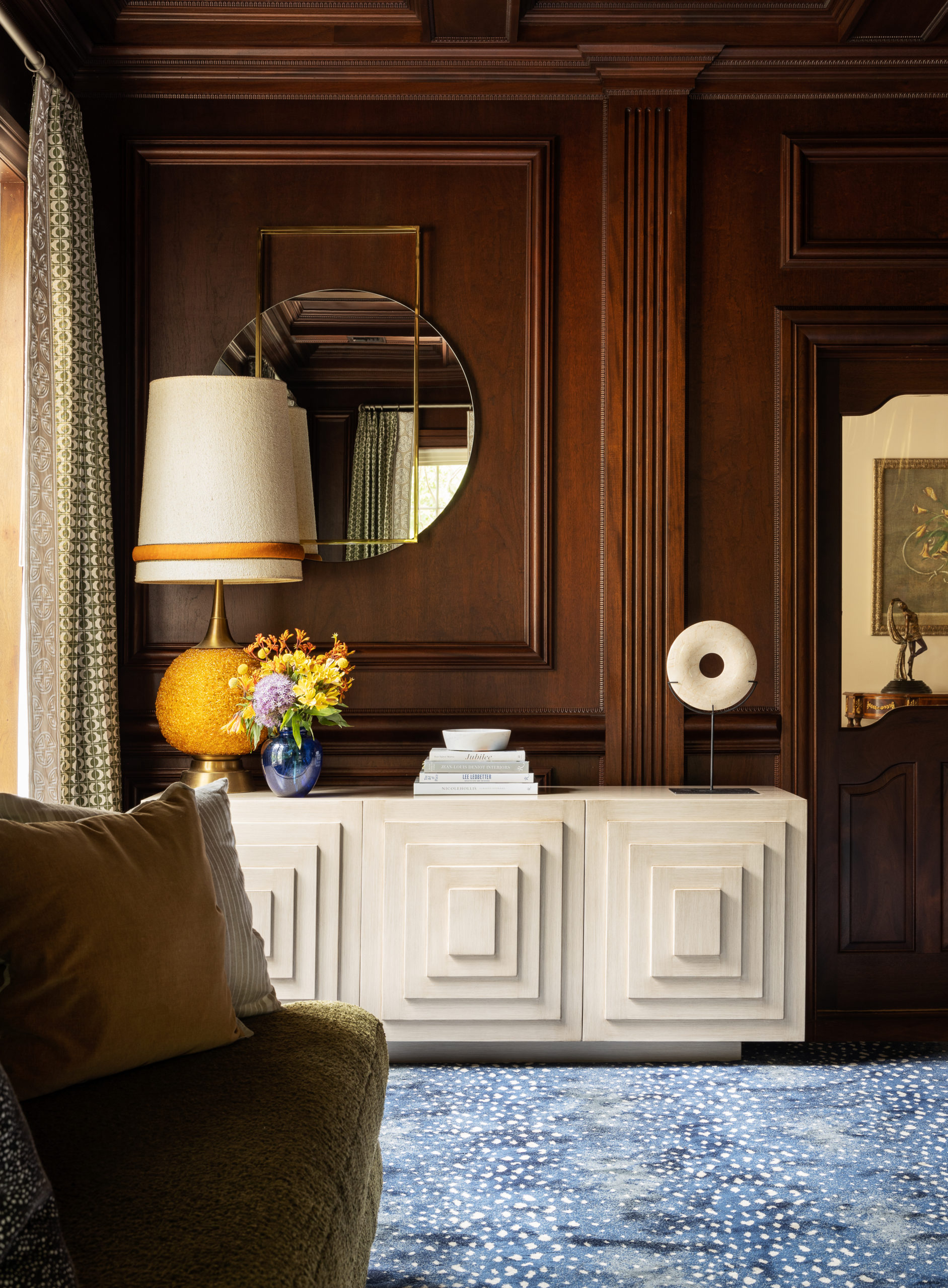
As one of my longtime clients, I was excited to turn this home office into a space that would really work for my client and her staff. It was important that the conference table be round to be more inviting when having meetings. Instead of chairs on wheels, I opted for swivel instead. The concentric console mimics the conference table base, and the drapery also mirrors the console.
More to Read: Work From Home Productivity Hacks

“Sometimes a home office can feel like an afterthought, and I wanted to ensure that this felt like a sophisticated boardroom.”

Any favorite details to share?
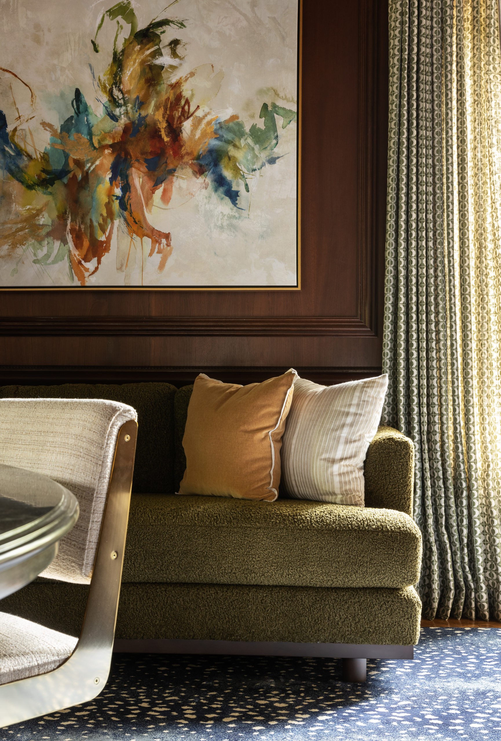
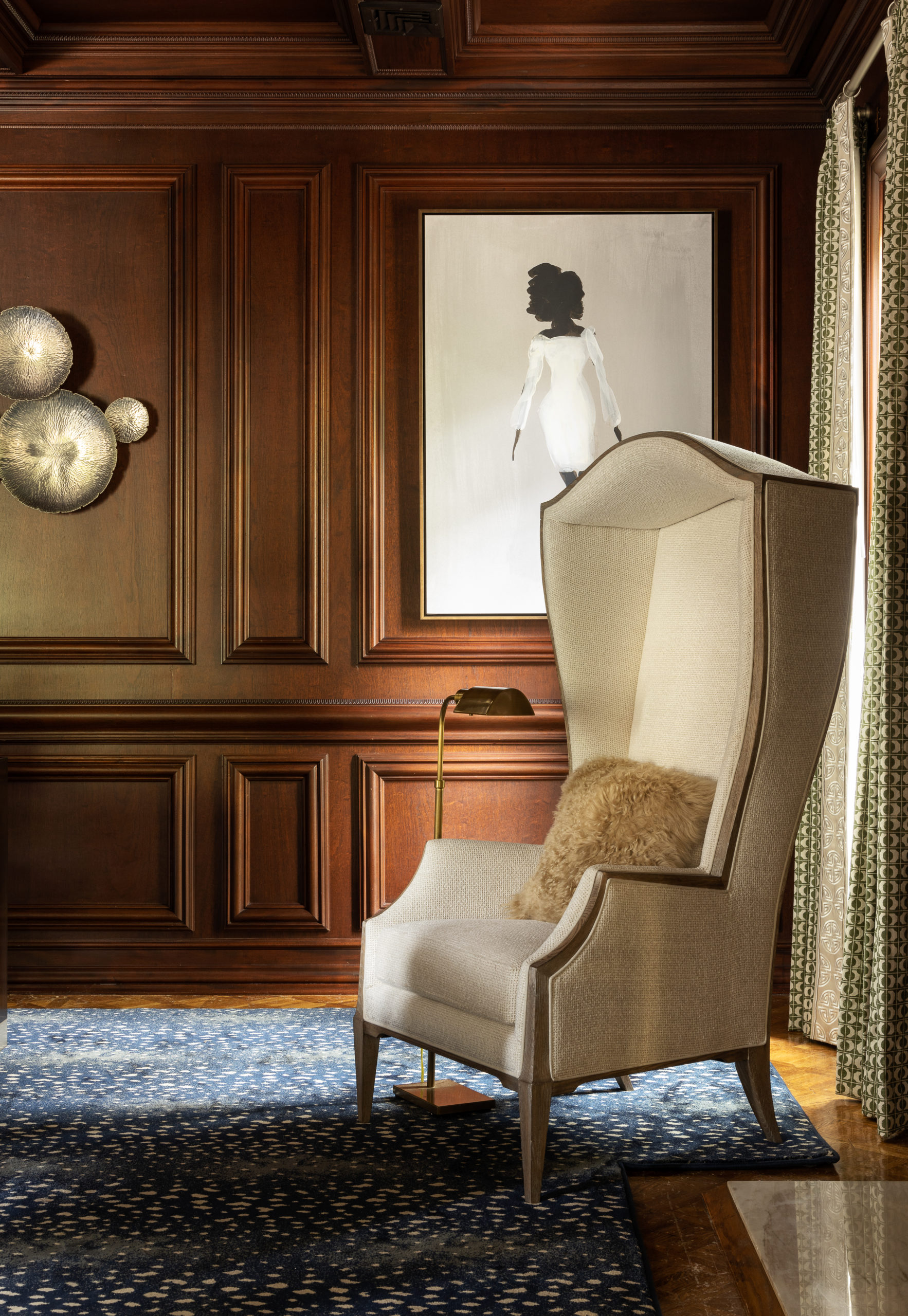
I love the artwork. I was able to use what the client had and elevate it to create a cohesive room. I also love the center light fixture that adds a bit of whimsy.

Tell us what made working on this particular project so special?
What made this project so special is that the client is the one that introduced me to my husband. We’ve now been married for 20 years.
Note: Our mission to support and elevate those within our design community means we’ve recently expanded our blog content to include reveals of your latest work. Have a project you’d like to have considered for publication? Send a note to stephanie@idco.studio. We can’t wait to connect with you!
BY: theinteriordev


