An Earth Tone Lake House Primary Bedroom
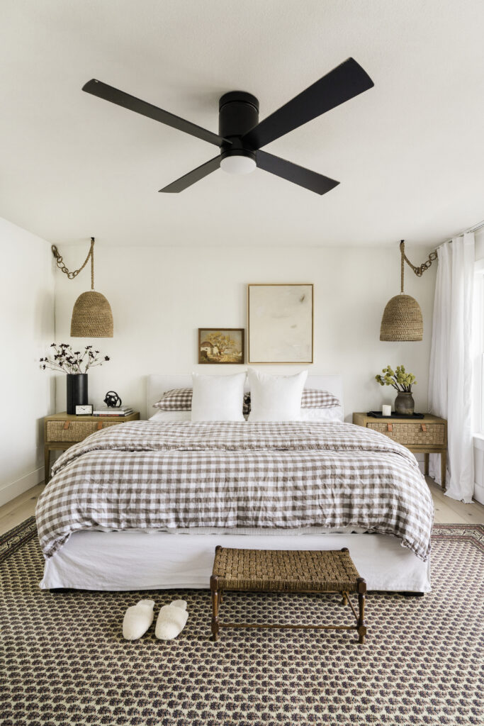
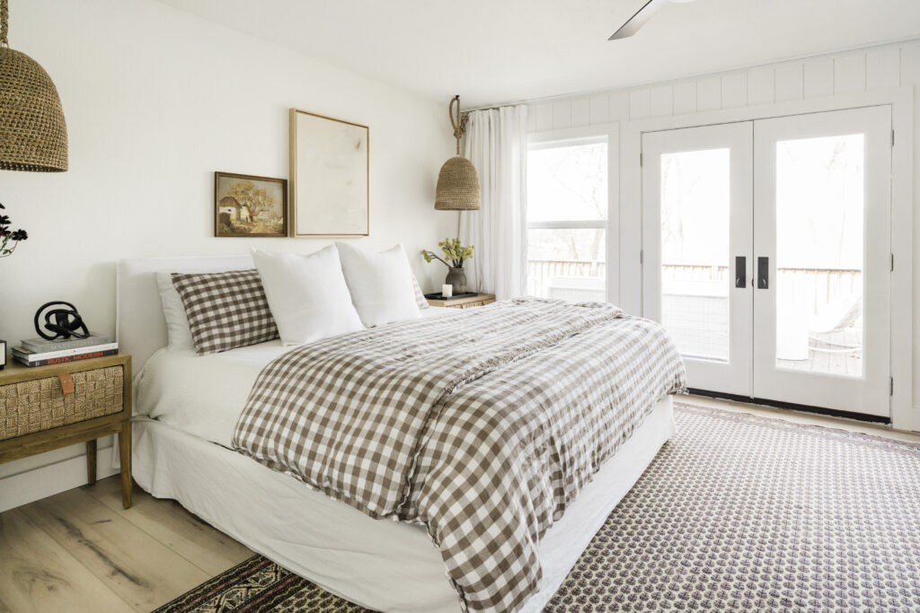
Sometimes all it takes is one piece to inspire an entire space. In the case of our lake house primary bedroom, that one piece was the vintage rug. I fell in love with its deep plum color palette against our brown gingham bedding and decided to let earth tones lead the way. As for design features, I knew nothing could compete with the scene outside our windows and I wanted the room to feel like an indoor/outdoor continuation. This meant bringing in lots of natural, woven elements, leaning into our rustic-modern aesthetic, and adding TWO windows to bring in way more natural light. The entire renovation was quite the undertaking, but I have to admit, there’s nothing like waking up to these lakefront views.
Revisit the lake house reveals: Entryway + Dining Room + Kitchen + Bath
IDCO Lake House
Primary Bedroom Reveal
LAYOUT
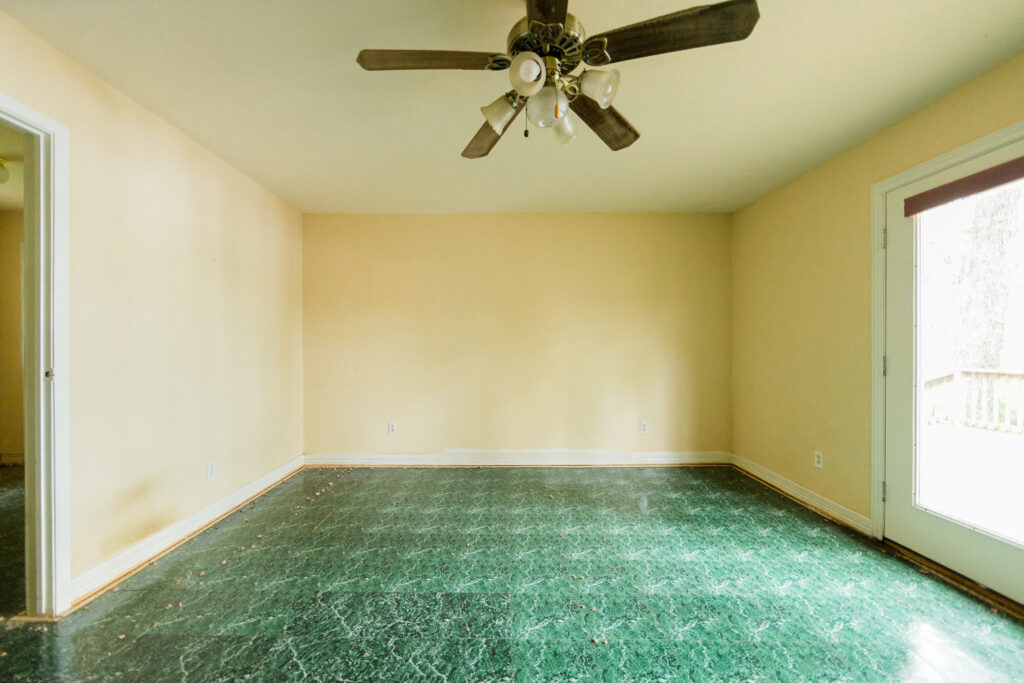
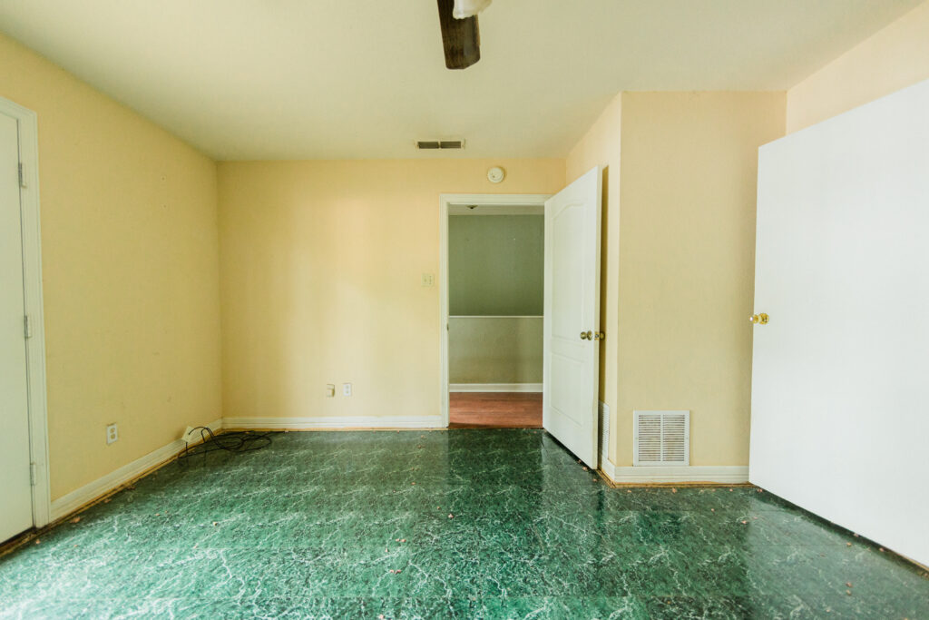
The biggest challenge we faced with the primary bedroom was reworking the existing layout. This room used to be the ONLY way to access roughly 40% of the home’s square footage, including the bathroom, sitting area, large closet, laundry room, AND the garage. Talk about some pretty terrible space planning.
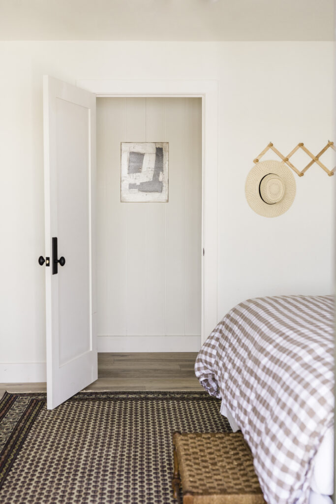
A constant flow of traffic through the bedroom was never going to work, so we closed up the hallway door (I sheetrocked it myself!), opened the bathroom to create the hallway, and we can now access this bedroom from the newly created hallway instead of the entryway. With that floor-plan change, this room was no longer the “en suite” (we have to cross a hall to get to our bathroom), but it kept us facing the lake with gorgeous views.
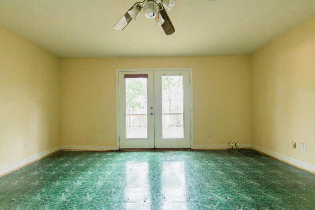
WHERE WE STARTED
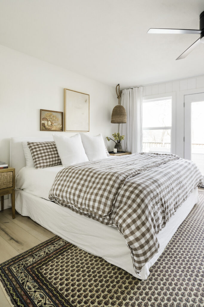
SAME VIEW: AFTER
THE DESIGN PROCESS
WINDOWS
This bedroom is all about the views, so the next big change was adding two new windows (!!!) Initially, the only natural light in this room came from the glass french doors. This meant you couldn’t have fresh air in the bedroom without opening the screenless doors, which is a huge no in a mosquito-heavy area like East Texas. Adding the two windows brightened the space a million times over, but it’s also so nice to sleep with the windows open and enjoy breezes coming off the lake.
CLOSET
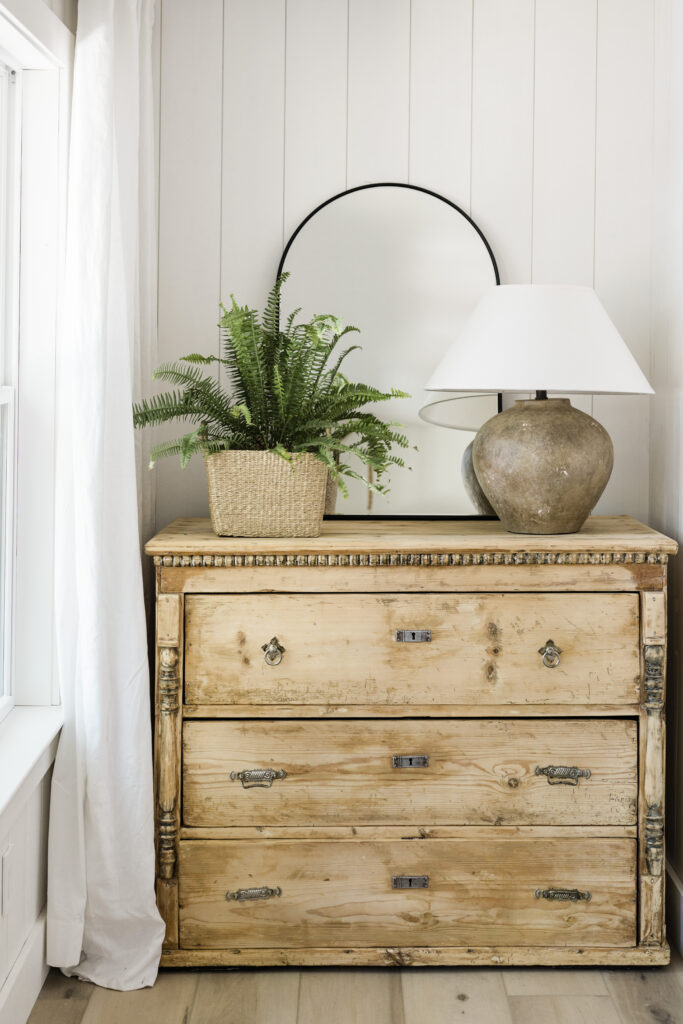
Our primary bedroom was missing a closet once we ran the hallway through the previous “primary suite” so we built one out! The room had a funny bump-out in the corner for the HVAC, so I saw a clear solution: run a closet along that wall at the same depth as the HVAC closet and square off the room.
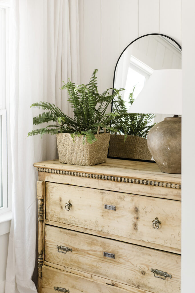
The only problem? The newly-installed windows would cut that wall in half and was a non-starter. My problem-solving mode kicked in, and I found a pretty creative solution. I sourced a vintage dresser, and we did a “built-in” nook for it, which let us keep the window where it was, add some drawer storage, and still fit in a 6×5” closet.
WALL TREATMENTS
To keep the space from feeling flat, we turned to my favorite wall treatment: shiplap! We opted to shiplap because it goes so much faster than sheetrock, and it’s also way easier to do ourselves. Deciding to shiplap was a substantial investment but the time savings AND the architectural interest were 100% worth the splurge. Some weekend down the line, I’d like to shiplap the wall behind our bed to finish off the room, but it’s on the running project list for now.
THE FINISHING TOUCHES
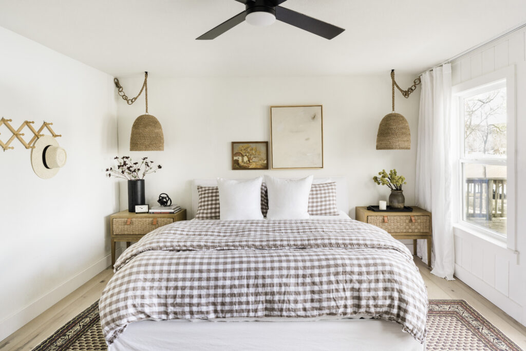
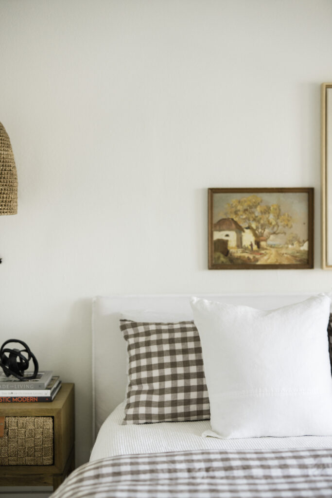
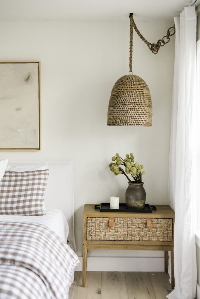
I designed the lake house around the concept of “elevated camp vibes,” which meant a gingham print had to be involved. This duvet cover was everything I was looking for, and it’s become my favorite bedding we’ve ever owned—period. The linen is that perfect texture to keep you cool in the summer and warm in the winter. And buttons at the bottom are covered in the same linen for a seamless look. Color-wise, the mink is almost a soft mauve-meets-taupe that transitions beautifully between seasons.
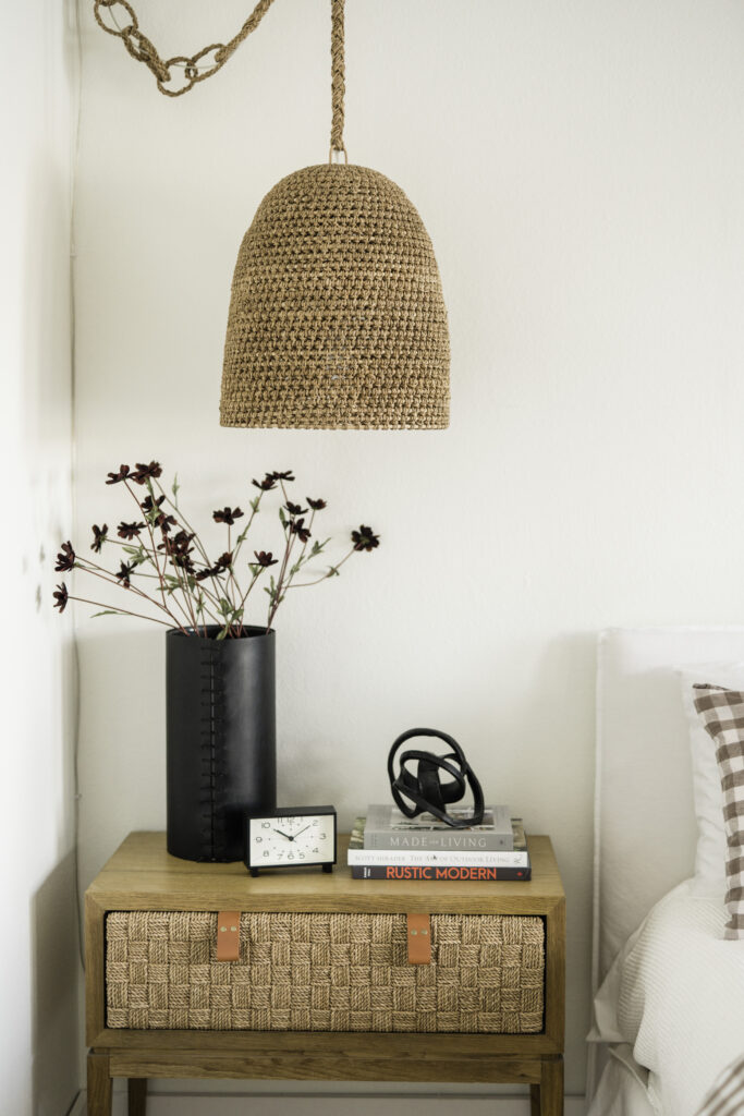
If I HAD to play favorites, this nightstand is probably one of my top three pieces in the entire lake house. It really embodies the effortlessly cool and casual vibe I was aiming for and also feels like a real statement. It’s a spacious nightstand with ample storage, and the leather pulls are super sturdy but have the perfect cognac hue. The wood finish has held up great, even when Quinn forgets to use a coaster.
Note: this nightstand is currently sold out online, but the matching console table is also well worth a look.
“There’s nothing better than waking up to these lakefront views.”
SHOP THE LAKE HOUSE PRIMARY BEDROOM
Gingham Duvet Cover: Serena & Lily
Sheets: Boll & Branch
Rattan Pendant Lights: Palecek
Woven Nightstands: Serena & Lily
Wall Color: Greek Villa SW 7551
Rug: Vintage via Revival (similar)
Abstract Art: Kate Zimmerman Turpin
Landscape Art: Vintage
Tall Dresser: Vintage
Ceiling Fan: Wayfair
Linen Curtains: Amazon
Styling Books: Made for Living + Rustic Modern
Door Hardware: Emtek Quincy in Flat Black Finish
Floors: Palka Signature by Flooret (code IDCO33 for 33% off samples)
For more IDCO Lake House content, have a look at these posts:
- Lake House Reveals: Entryway + Dining Room + Kitchen + Bath
- Paint Colors at the IDCO Lake House
- Why We Chose Flooret LVP
- My Lake House Serena & Lily Reviews
- The Exterior Design Plan
- The Entry Design Plan
- The Kitchen Design Plan
- The Living Room Design Plan
Photography: Madeline Harper for IDCO Studio
BY: theinteriordev

