Tudor Dining Room & Snug
As our journey through the Austin Tudor continues, look inside Anastasia Casey’s personal home renovation. Partly inspired by Alice in Wonderland, equally inspired by seductive British lounges, today we tour The Austin Tudor dining room, snug, and loft areas. This project has been an incredible labor of love and we can’t wait to have you in. Watch the full video tour here.
Design: The Interior Collective | Photography: Lindsay Brown
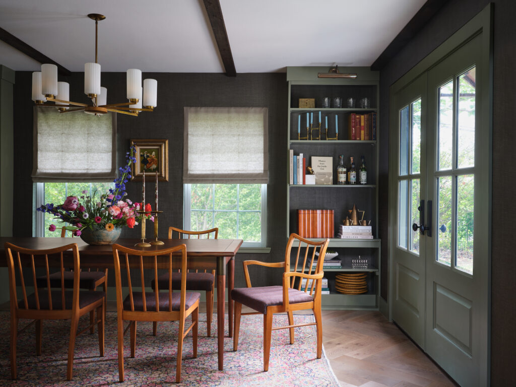
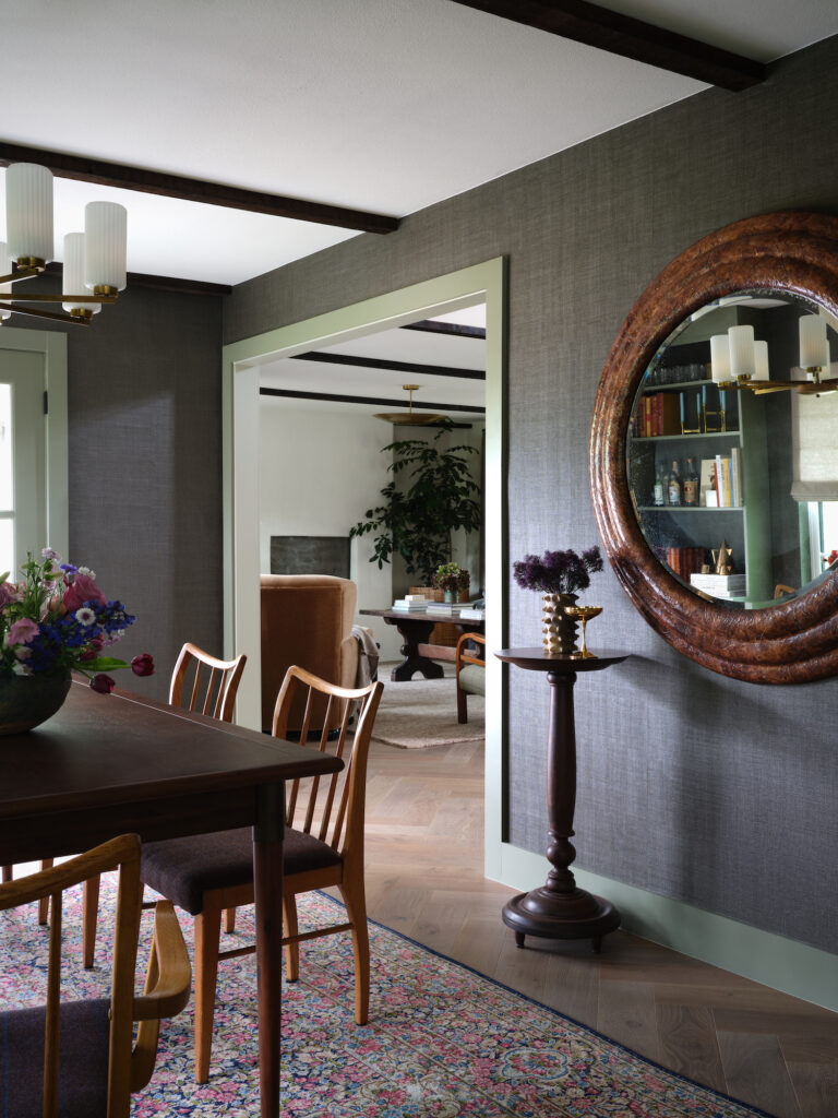
The moody Tudor dining room plays a pivotal role in this home. It’s the walk through to the English kitchen, powder bath and primary suite. It provides access to the spacious backyard. It’s also the first thing you see when you enter the house, sitting adjacent to the moody living room. Because the dining room has defined pass throughs, I knew I wanted to take a bigger risk here in color and depth.
The Changes We Made in the Tudor Dining Room
To begin, we flattened the ceilings and removed the bay window to maximize the square footage and make the ceilings feel as tall as possible. Instead of shying away from ceiling details all together, we continued the rough cut cedar 2x4s we used in the living room and kitchen areas. This draws the eye up without compromising any ceiling height.
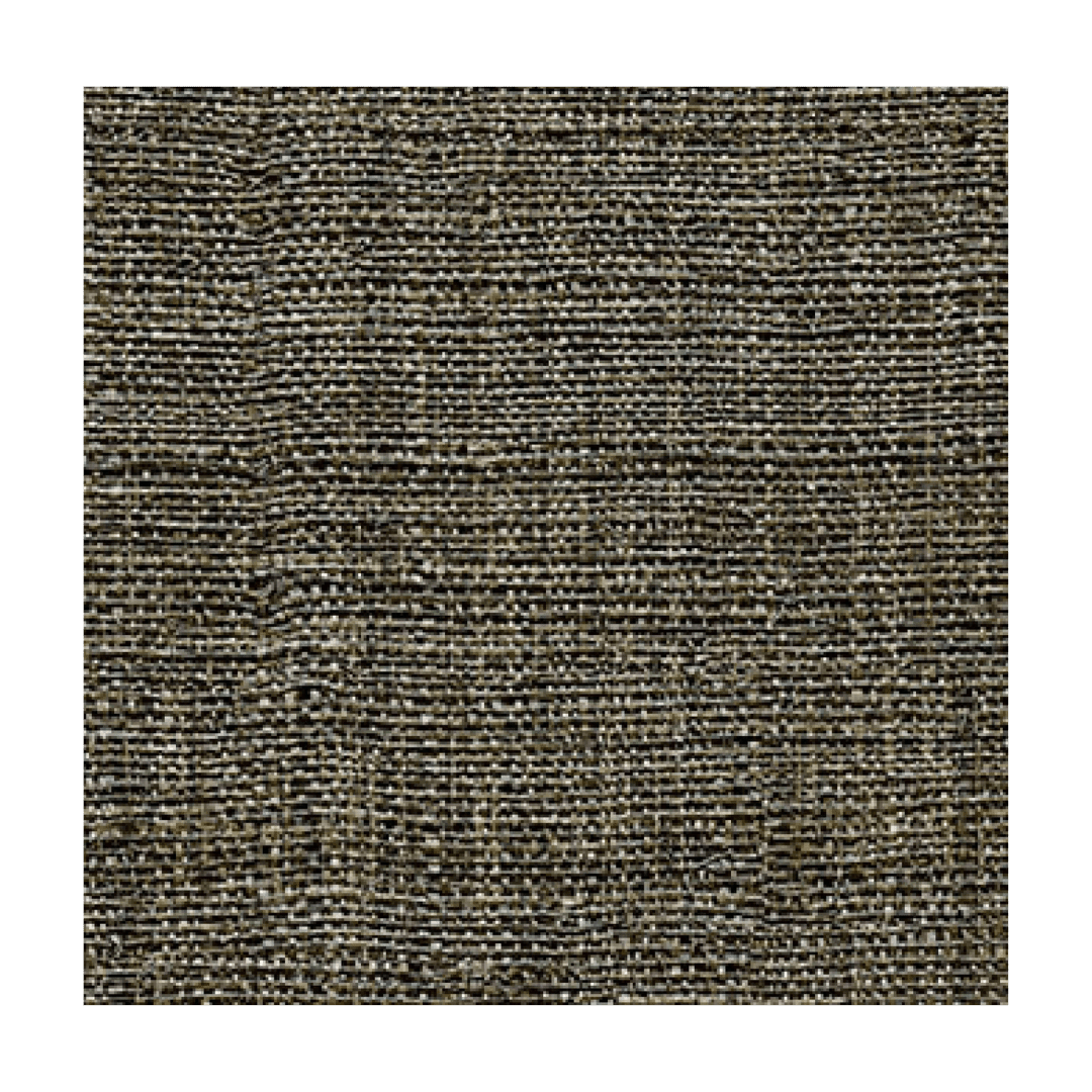
Next, we enveloped the room in this beautiful green woven wallpaper from Elitis France. The wall covering lingers somewhere between a charcoal gray and a deep moss tone, adding depth and movement. This particular wallpaper has a more durable finish than traditional papers, making it really easy to clean.
To pull the green undertones out even further in the Tudor dining room, we painted the trim in here Tate Olive by Benjamin Moore in an eggshell finish. This is an exact match to the kitchen cabinetry by Unique Kitchens & Baths and makes for a pretty transition between the two spaces. For reference, the trim through the rest of the house is Nantucket Gray by Benjamin Moore–a much softer, more muted shade.
The Dining Room Shelves
I was deeply inspired by moody, library-like spaces for this Tudor dining room. We entertain very frequently and I wanted the room to comfortably sit 12 on a regular basis. To achieve this, we opted for narrow bookcases along the back wall instead of a more traditional sideboard or console table. The footprint of these salvaged Facebook Marketplace shelves keep a comfortable walkway through the space.
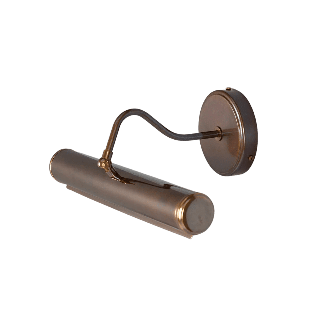
Working with our contractor, we repurposed the old bookcases. We painted them the same contrast trim as the rest of the space, and added a handsome art light to the top trim. I love that you can still see the wallpaper through the back, while giving a semi-custom built in look.
The European Inspired Furnishings in the Tudor Dining Room
As with the majority of pieces in our home, we opted for vintage elements in this space. In order to accommodate 10+ people on a regular basis, I searched far and wide for an extension dining table. Funny, as these seem to be out of fashion these days. They couldn’t be more practical and beautiful. I ended up finding this mid-century inspired extension table from Four Hands. It has beautiful brass detailing, super smooth gliding hardware, and pinch-free storage. The table seats six on a daily basis for us,. With room for eight without the extension, it seats 10-12 with the leaf.
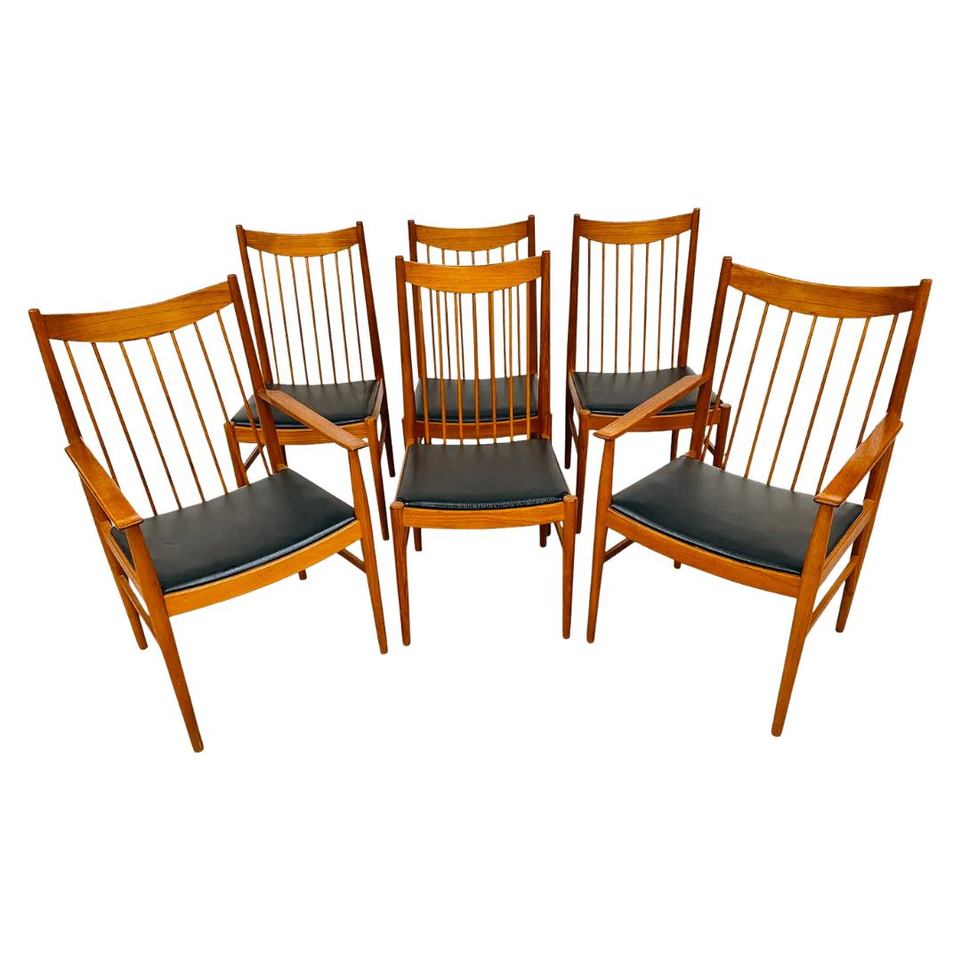
I found a set of beautiful Scandinavian dining chairs on Etsy. While it usually involves deeper hunting than the likes of Chairish or 1stDibs, I often find better prices on Etsy. This set cost about $600 for the six chairs. Plus another $300 for fabric and reupholstery. They really are my favorite part of the Tudor dining room.
The Anchor Pieces from Litt Concept House
To anchor everything below, we sourced this vintage rug from Litt Concept House, along with a few other key pieces in the space. If you didn’t get a chance to watch my visit to their LA landmark, you can catch up here on YouTube. This vintage overdyed rug is a one-of-a-kind piece that is hand knotted over several moths. Made of high-quality hand-spun wool, this 1970’s Persian rug had the perfect coloring for the space. I needed something that complimented the cool tones in the space and added a bit of femininity. The floral pattern and crimson hues were perfect.
The tobacco leaf mirror is also from Litt Concept House–beautifully bouncing light around the dark and moody dining room. It is generous in scale – almost four feet wide, which mimics the two new windows across the table. My favorite part of the mirror placement is the reflection into the kitchen you witness while you sit at the table.
The Purple Snug
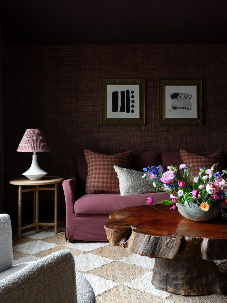
Without doubt, the Snug is our favorite hangout spot. Originally this space was the primary bedroom. But its awkward entrance off the kitchen and even worse access to the bathroom and closets made it an obvious pivot to be common space. By simply moving the access door from the kitchen to just off the entry at the bottom of the stairs, this space works as a lounge type space. And man, do we lounge.
We had two goals for this space:
- Create a work from home space for Quinn
- Let it double as entertaining space when hosting parties
Because it was “Quinn’s space”, he got to pick the color, and Quinn bleeds purple. That’s the TCU alumni for ya. While I wasn’t open to full horned frog purple, I was excited for the challenge of designing a swanky lounge, saturated in color.
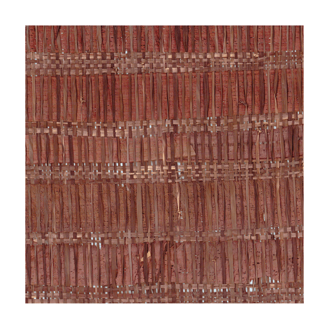
The wallpaper is a beautiful woven grass from Elitis France. This acted as our jumping off point for the rest of the space. The trim, door, ceiling and millwork were all painted Benjamin Moore’s Caponata. It’s the prettiest purple brown with red undertones. Again, we repurposed bookcases we found on Facebook Marketplace, built them in and added a desk between. It makes for a spacious work area that also tucks neatly into the side of the room
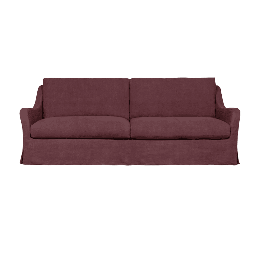
Color drenching is having a major moment, and I fully intended to lean into it again here in The Austin Tudor. This purple linen sofa took about three months to arrive. However, it’s the size of a twin bed and acts as an additional sleep space when needed. And Kennedy’s dog bed, naturally.
The Styling Details
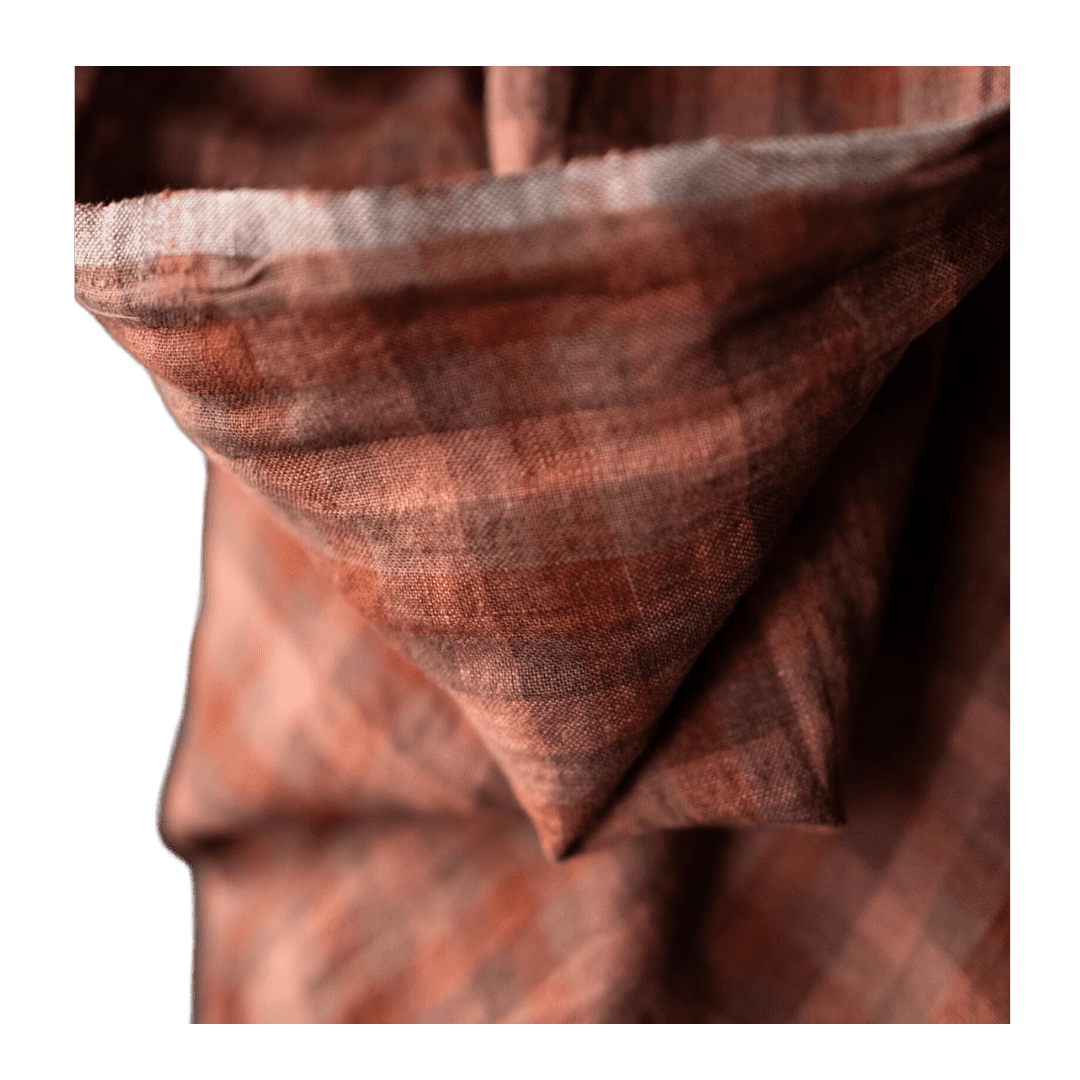
Both here in the Snug and the Tudor dining room, we finished the spaces off with Everhem Roman Shades in Fawn. They’re super easy to operate, soften the harsh edges of the windows, help to keep the Texas heat out and give us a little privacy when needed. Everhem continues to amaze me with their American-made, female founded operations. I’m so grateful for giving our community more options than expensive, mass produced window treatments.
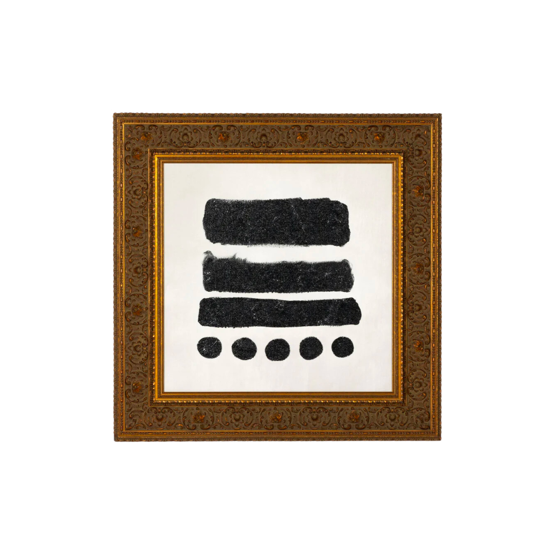
Recently, I got to tour the Four Hands Art Studio and get a better understanding to why reproduction art is not a bad thing, but a great thing. Watch the full tour here. Two abstract pieces hang above the sofa in beautiful gilded frames. A cheeky Bunny Club photograph sits just above Quinn’s desk.
The Swanky Sky Loft at the Austin Tudor
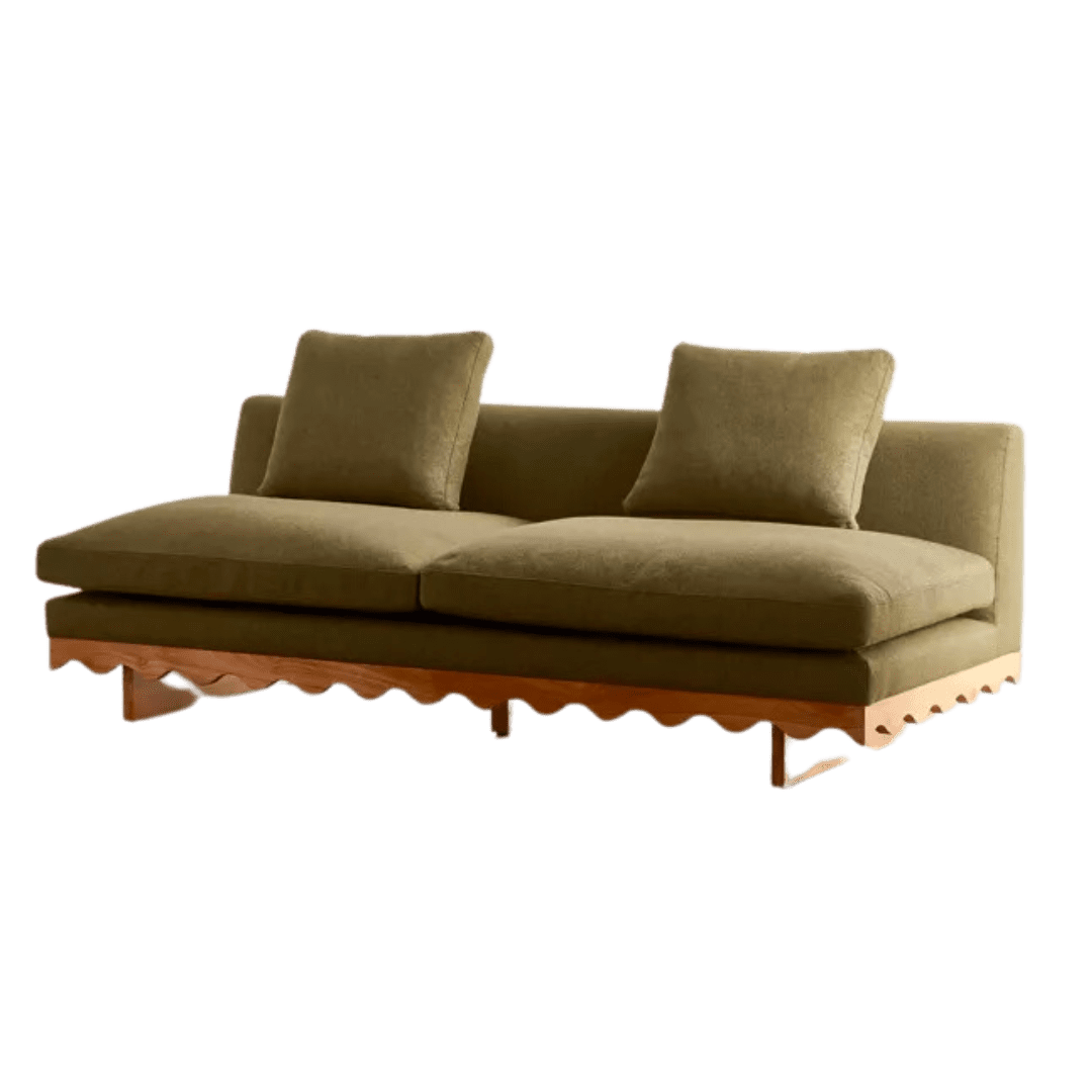
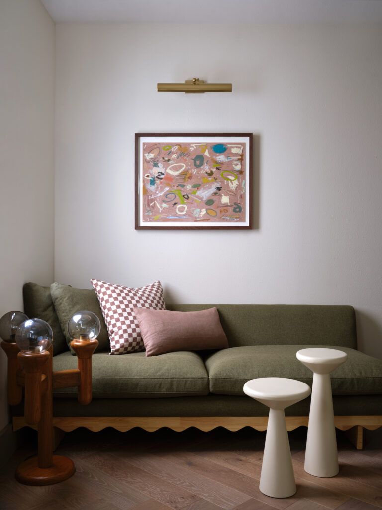
Just up the stairs overlooking all the public spaces in the Tudor sits the sweetest loft area. I think the previous owners may have used this for an office space. With no acoustic privacy, I wanted to make it more of a hangout space (for Kennedy) and guests when entertaining. Using two, very affordable, scalloped sofas, we achieved a built-in daybed look in the loft. While they aren’t comfy enough to be a full-time sofa, they are perfect for sneaking afternoon naps or reading on rainy mornings.
Framed under original works from artist Caleb Mahoney, I love the slightly circus vibes all the interesting pieces play in this space.
In reflection, words can’t describe how proud I am of these spaces. Not only did I push myself as a designer, I executed the full renovation in under six months, learning so much along the way. Most importantly, we sourced second hand, repurposed everything from the built-ins to the old dining room counters, and loads of furniture. I think this project shows how great design is about joy, risks, and creative solutions. Spaces that envelope you in inspiration and offer you refuge aren’t a exclusively a luxury. They can be created anywhere, at any budget. But typically, make sure you start your search on Facebook Marketplace.
BY: Anastasia Casey


