A 1950s Silver Lake Home Gets a Chic Refresh
This 1950s Silver Lake home designed by Nishia Shubert of Stay Interiors is a masterclass in making the most of your design resources and always remembering that a little bit of change can go a long way. Hired by her clients to re-imagine their small bathroom space and refresh the kitchen, Nishia transformed the spaces with a focus on sustainability by reusing as many elements as she could, borrowing materials from other areas of the home and even past projects.
These chic and considered spaces are equal parts beautiful and functional. Nishia’s talent for creating elevated spaces that meet her client’s needs is apparent in every vignette.
Design: Stay Interiors | Photography: Charlotte Lea Photography
A Light-filled Modern Kitchen
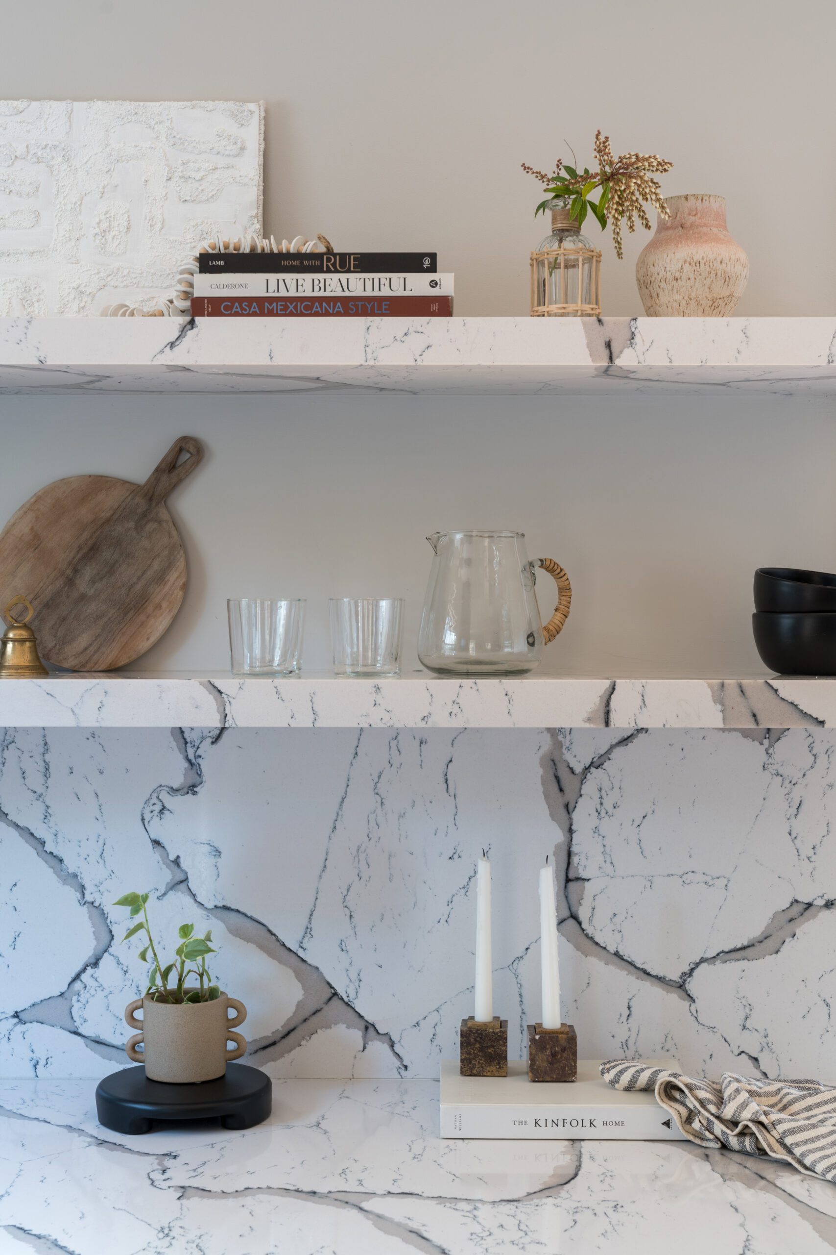
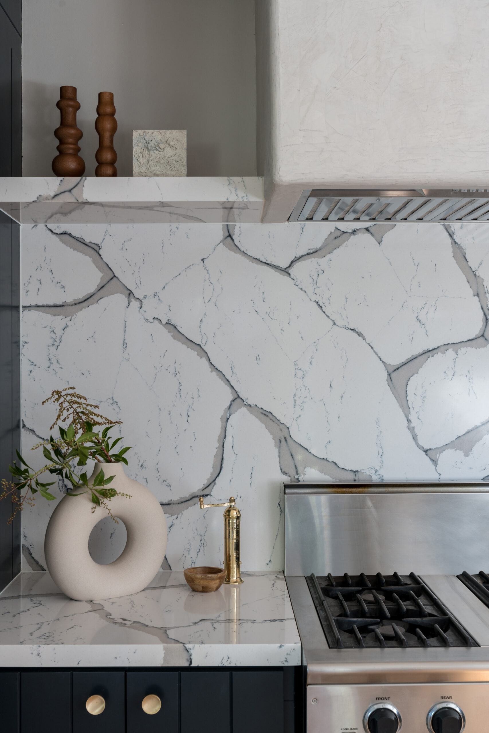
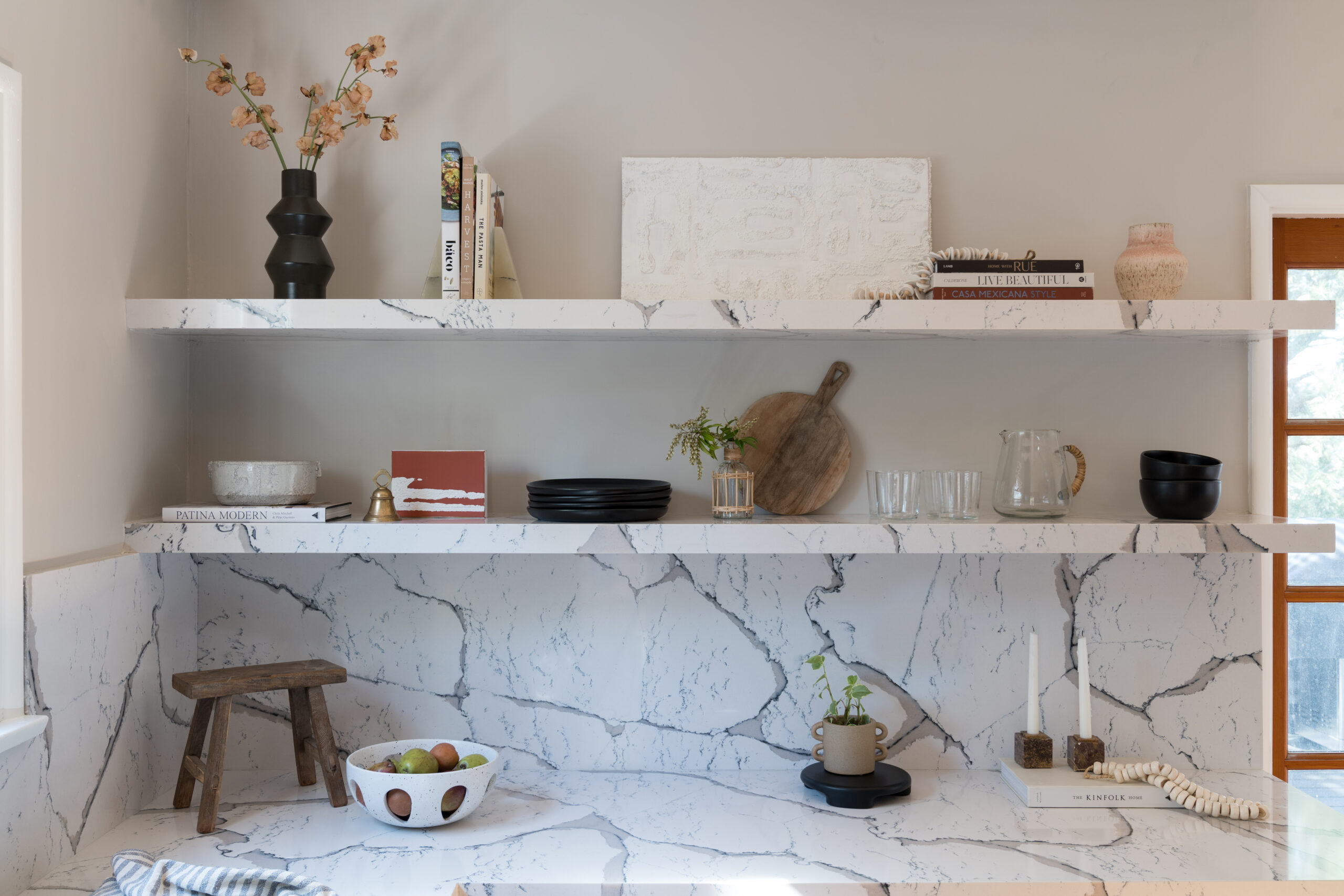
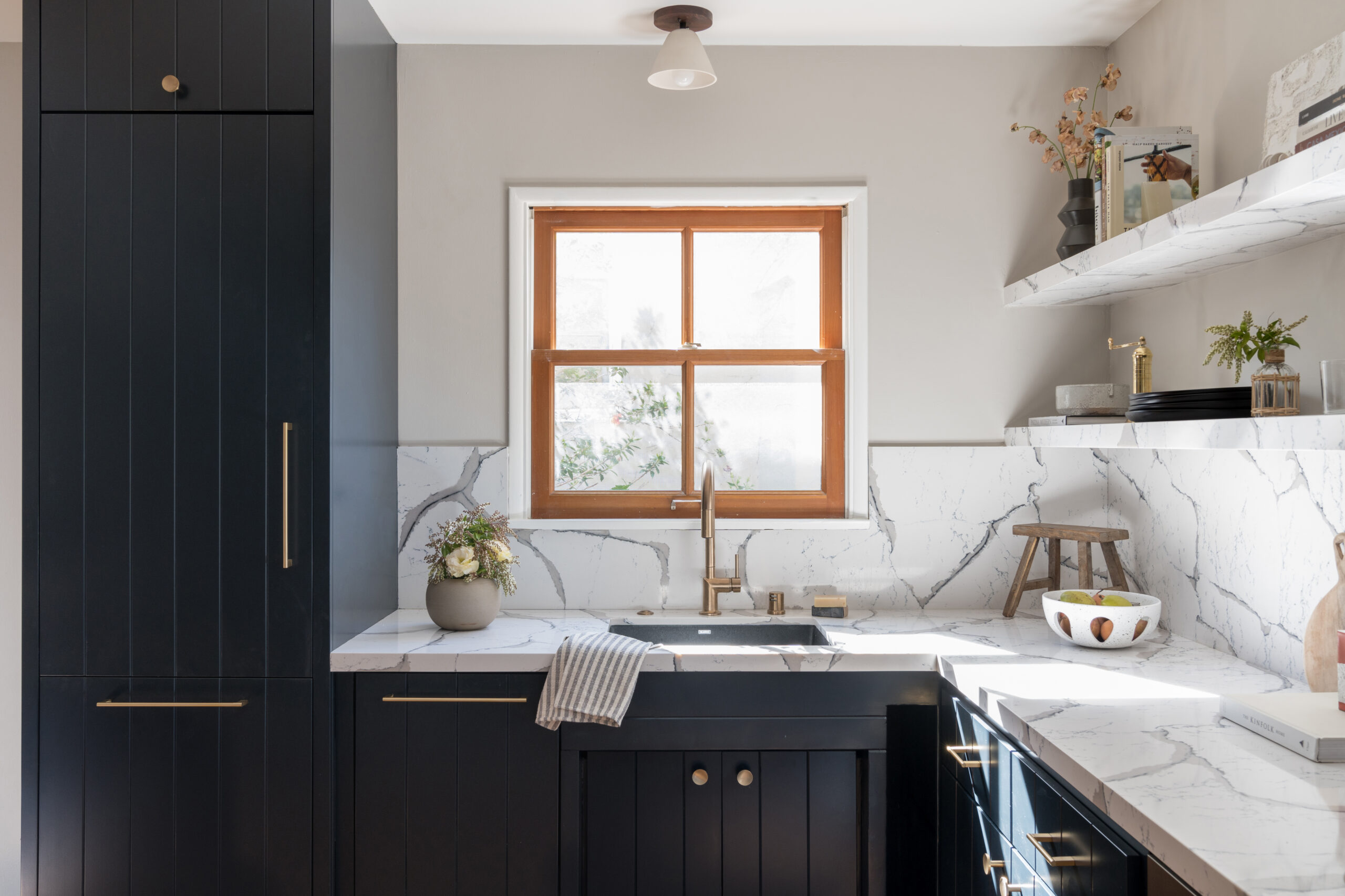
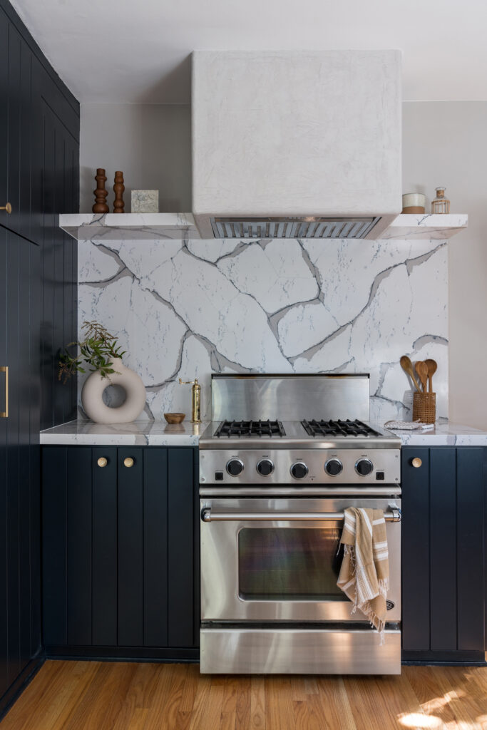
Although the initial project brief was a kitchen refresh and not a total rehaul, Nishia and her team transformed the look and feel of this space with a few minor updates that made a world of difference in form and function. Focusing on sustainability, they kept the kitchen layout as-is, repurposing the existing cabinets, and applied a fresh coat of paint in Dunn Edwards “Salem Black” – a dramatic yet inviting blue-black. Paired with heavily veined quartz for the counters and backsplash, the cabinetry feels as good as new.
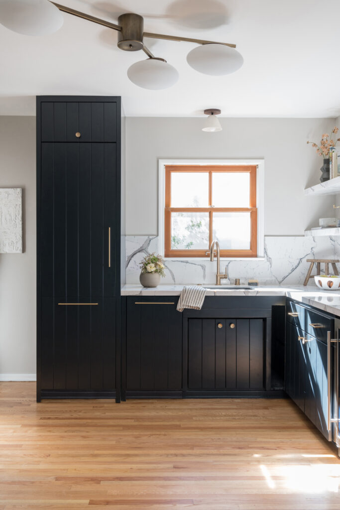
While they were able to reuse the range, they had to replace the refrigerator and dishwasher as they broke at the start of the project. In the process, they opted for panel-ready appliances and clad them in matching millwork to the existing cabinets for a beautiful custom look.
A Sleek & Warm Bathroom
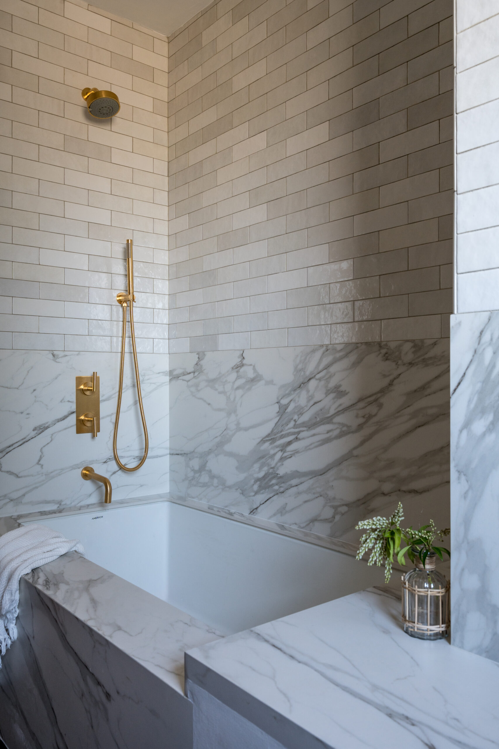
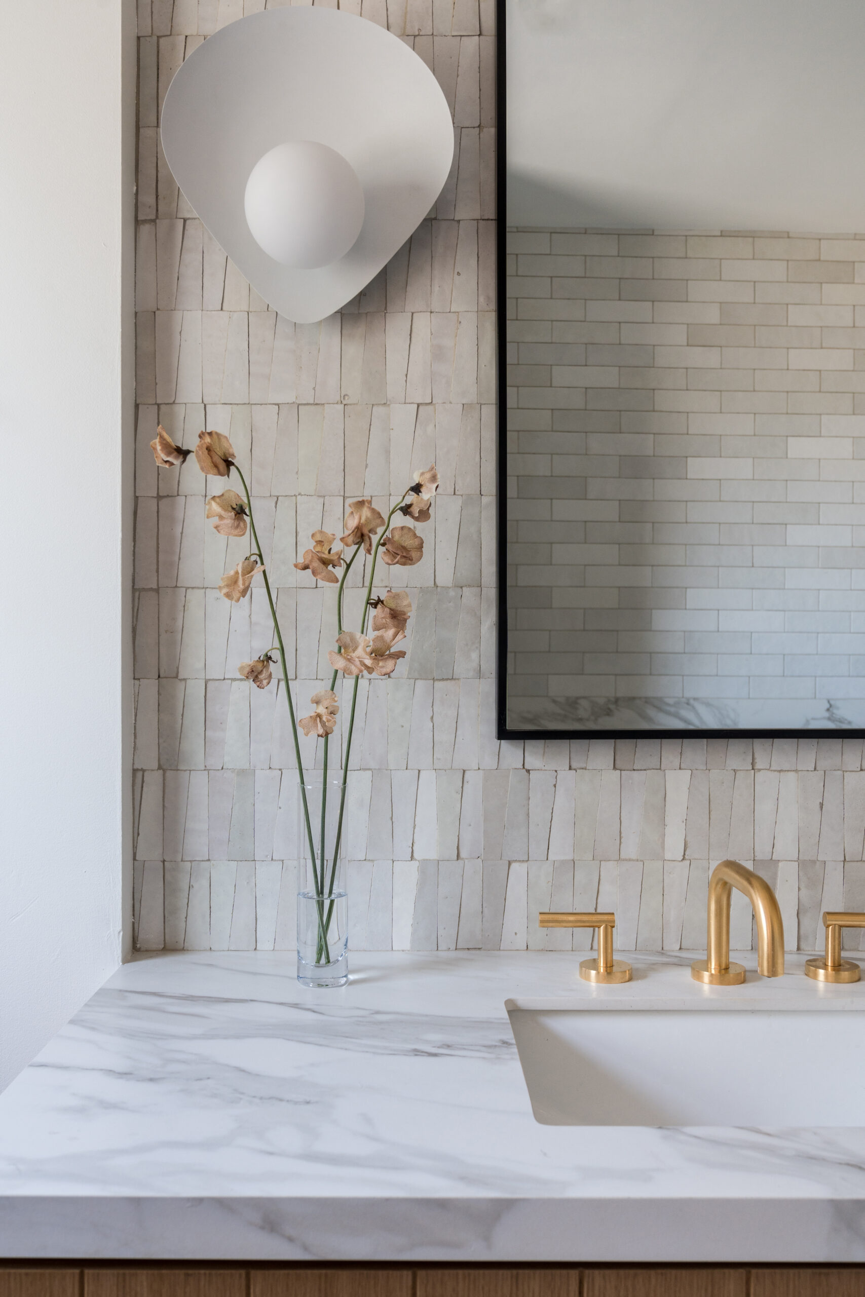
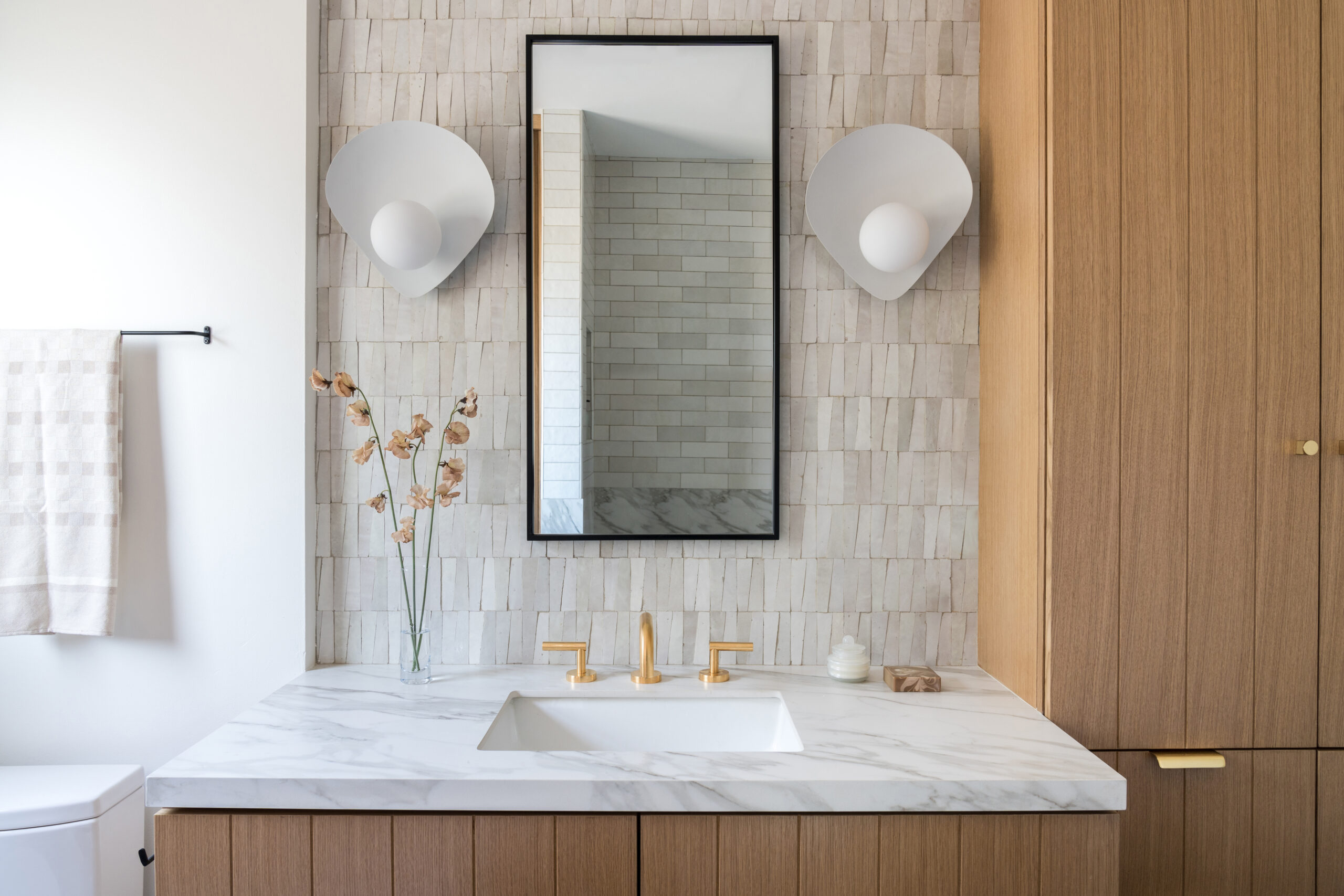
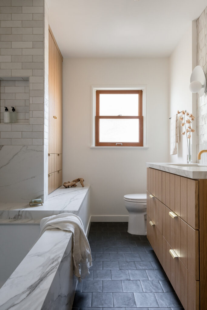
The primary goal for the bathroom space was to make the small 65-square-foot area more functional for the family. To maximize every inch, Nishia designed custom white oak cabinets to provide plenty of storage while bringing natural texture. Since the clients focus on zero-waste in their everyday lives, Nishia opted to use some of the shower and floor tile used in the bathroom from her former clients who had extras.
A Material Balance
Mixing materials is one major part of a custom design process that often gets overlooked, and we love how Nishia balanced the warm and cool tones throughout the project to bring contrast and interest. In the bathroom, oak cabinetry and gold hardware warmed the black slate tiles and grey veined marble, creating the perfect balance.
In the kitchen, the reverse effect is in play with warm wood floors that contrast the cool blue-black cabinetry and marble backsplash. We can only imagine how lovely it is to move throughout the two spaces that flow and speak to each other without feeling too one-note.
Scroll below to see more from this project and shop the look!
BY: Jasmyne Muir


