An 80s Tudor Turned Charm-Filled Family Home
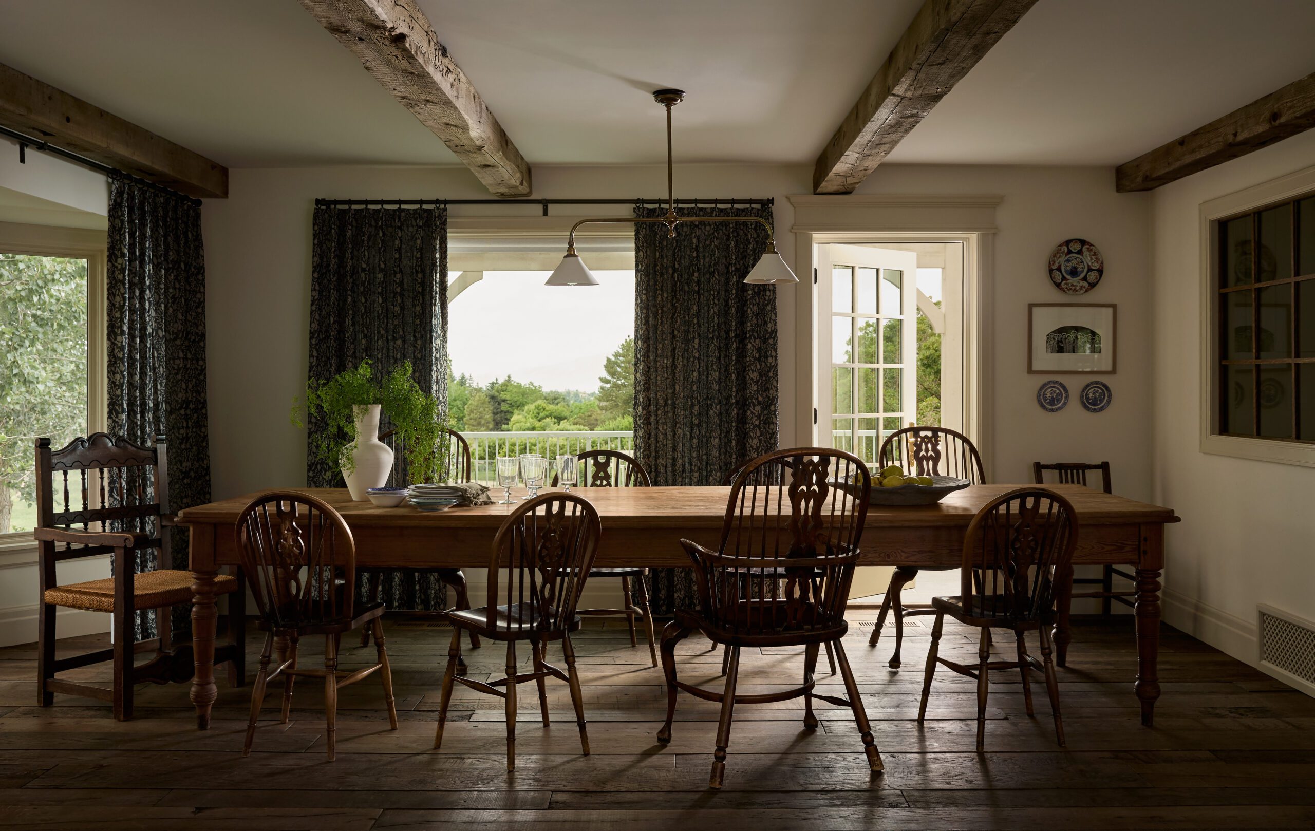
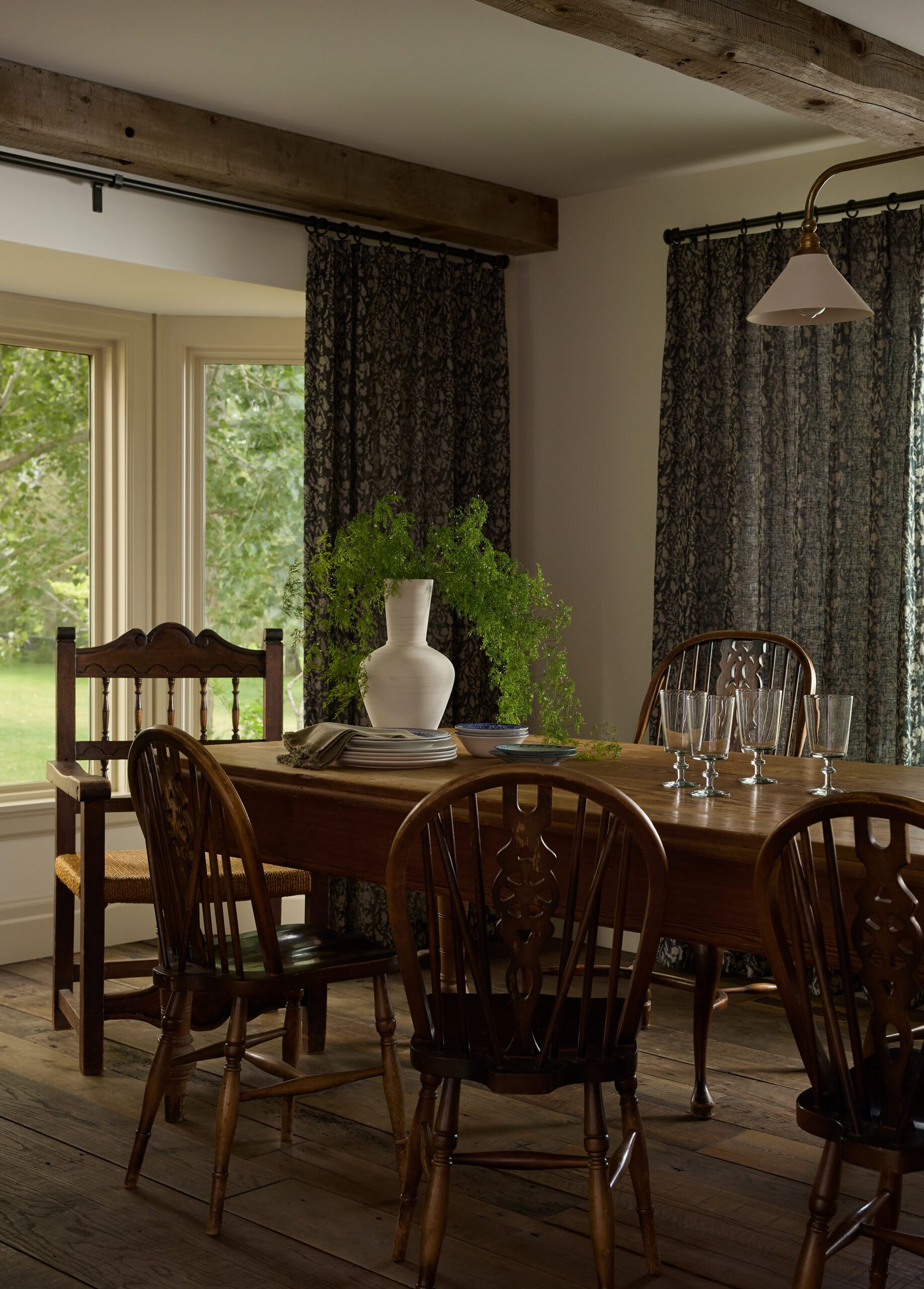
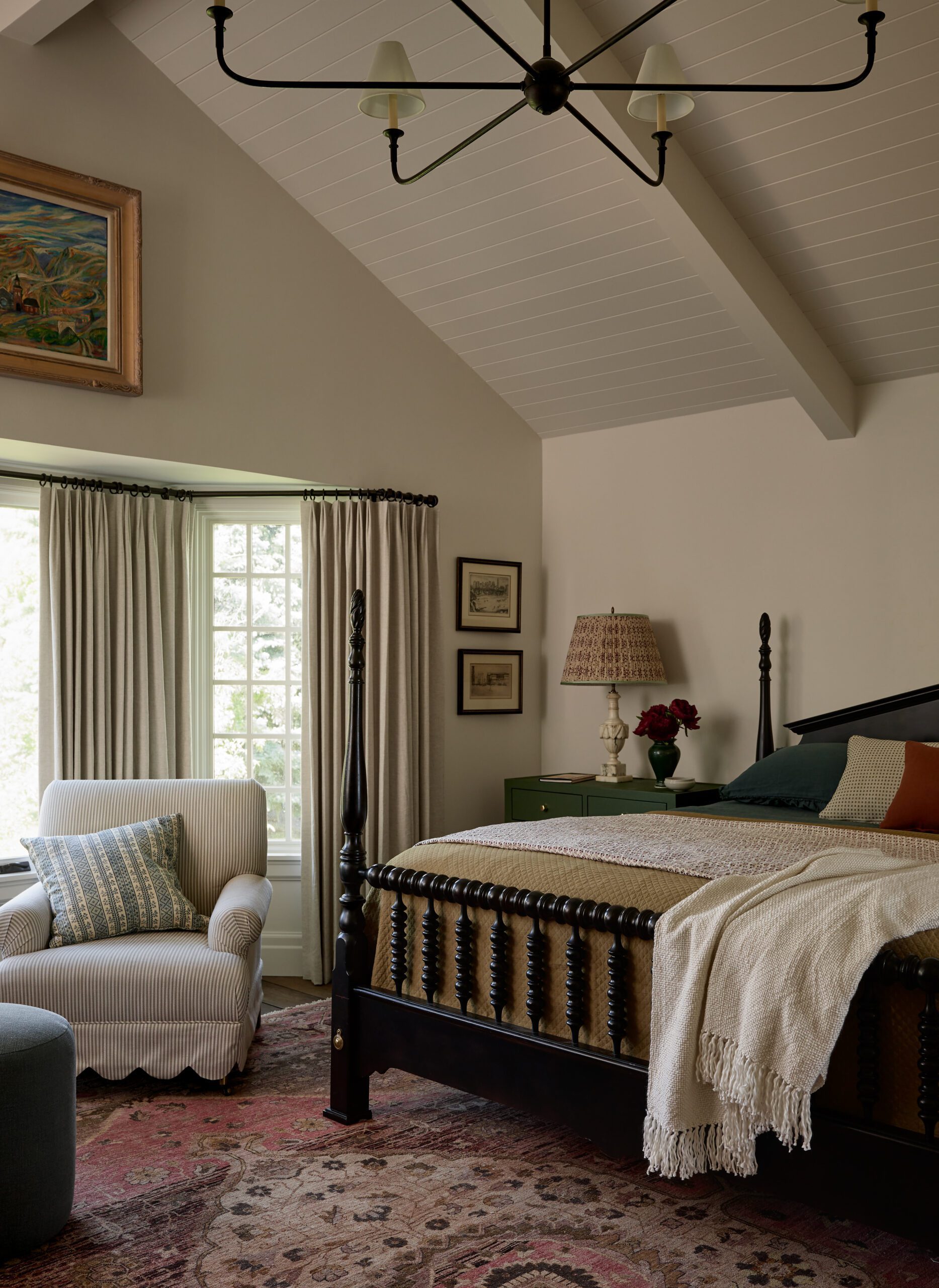
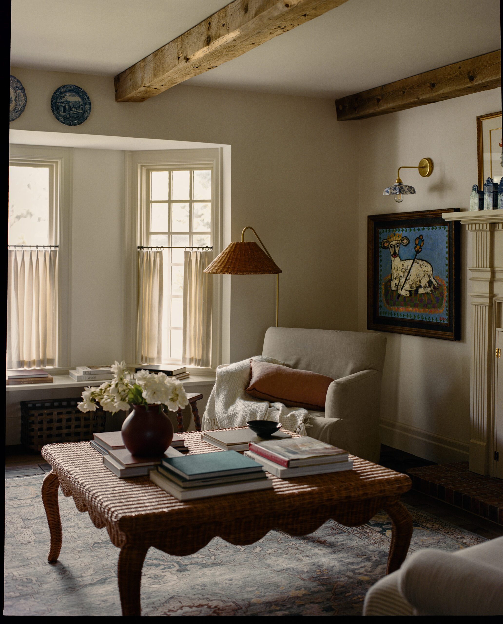
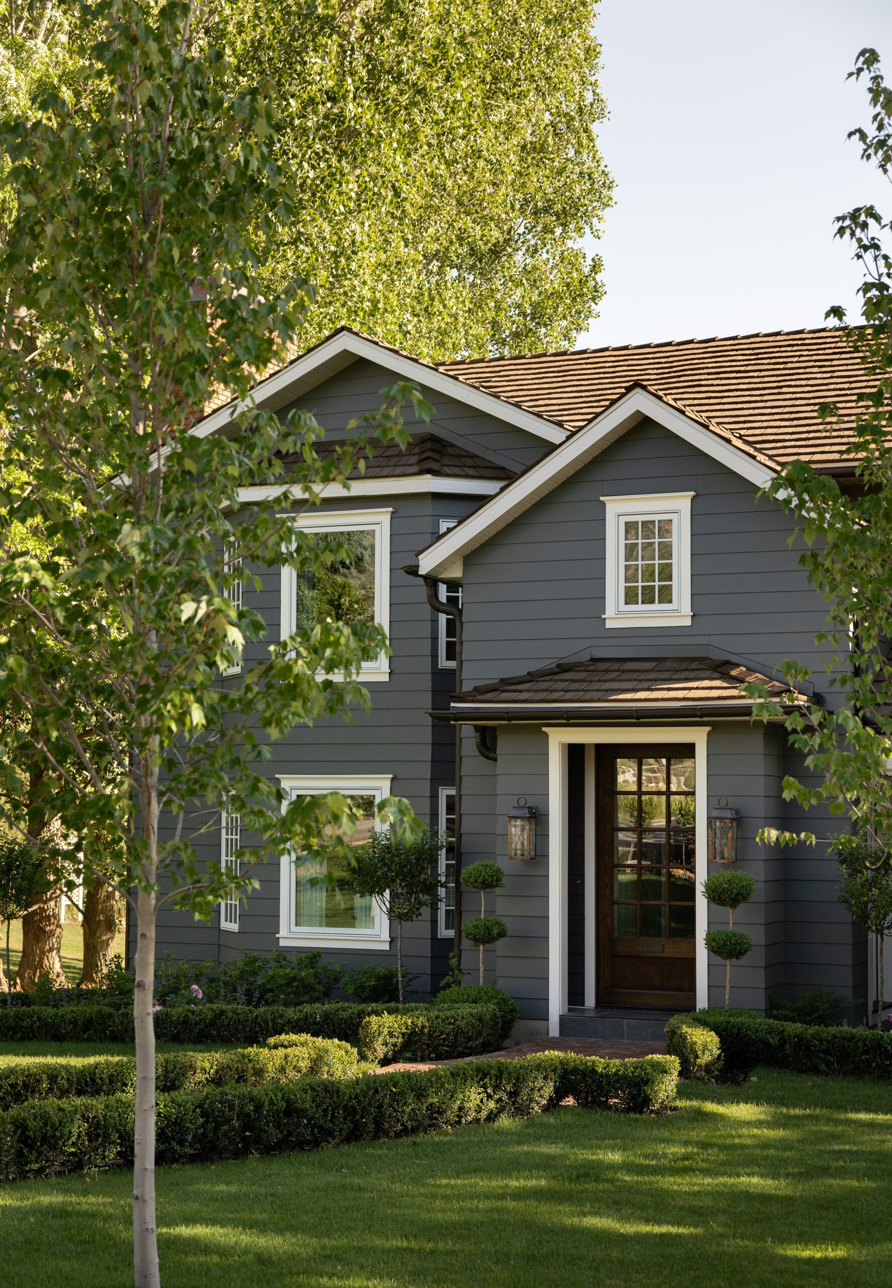
When you take an 80s Tudor-style exterior, a client with a penchant for Cape Cod and Arts and Crafts styles, and a strong design direction from firm Freestone & Smith, you get a storied and distinctive space filled with personality, charm, and impactful details. Today’s home tour was a full remodel to add dimension and function to the client’s home and bring cohesiveness to the interiors.
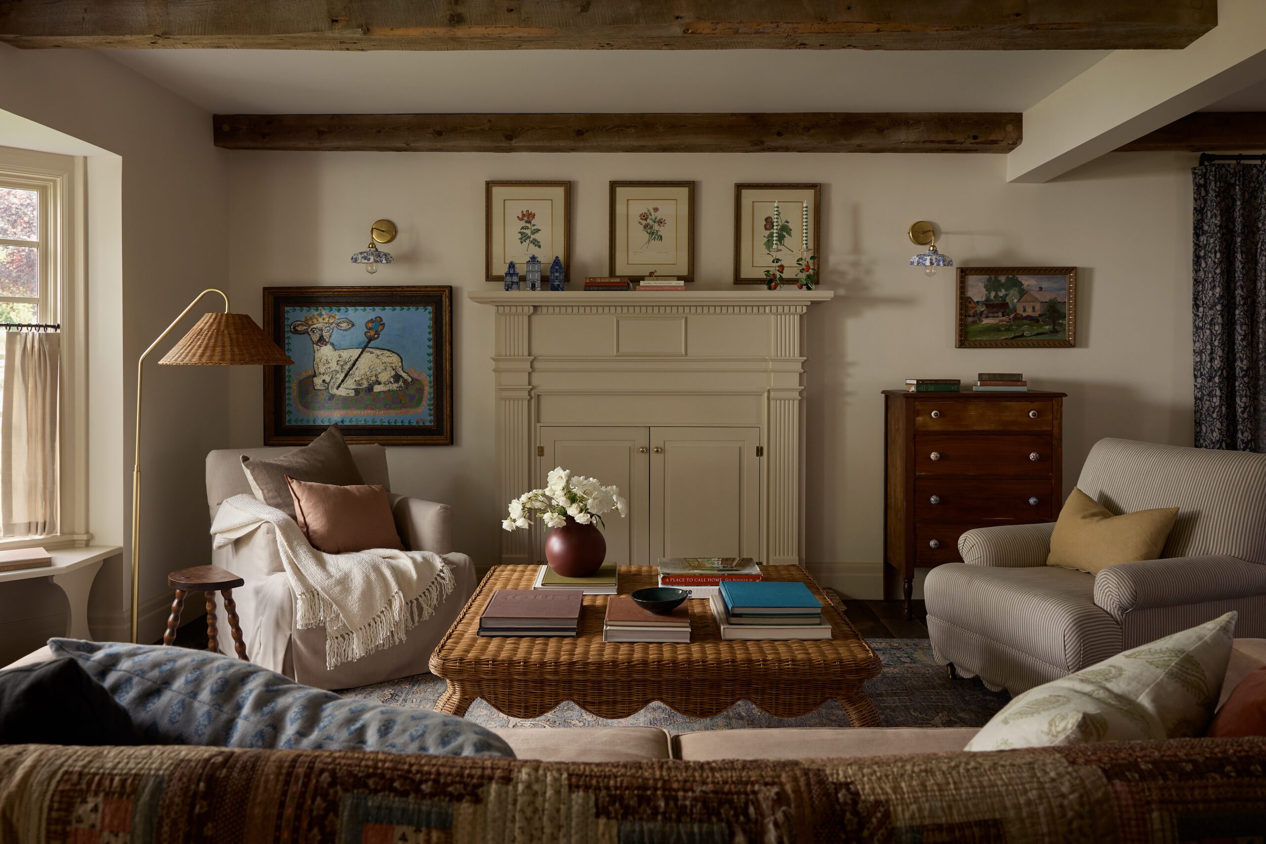
The Freestone & Smith team began with developing the architectural plans, moving through all the hard finishes, and ending with the soft finishes. The result is a home that feels uniquely tailored to the clients. By incorporating distinctive details, vibrant colors, and patterns, the team created a space that feels intentionally older than it is and filled with character.
Design: Freestone & Smith | Photography: Malissa Mabey | Stylist: Jen Paul
An Expanded Entryway
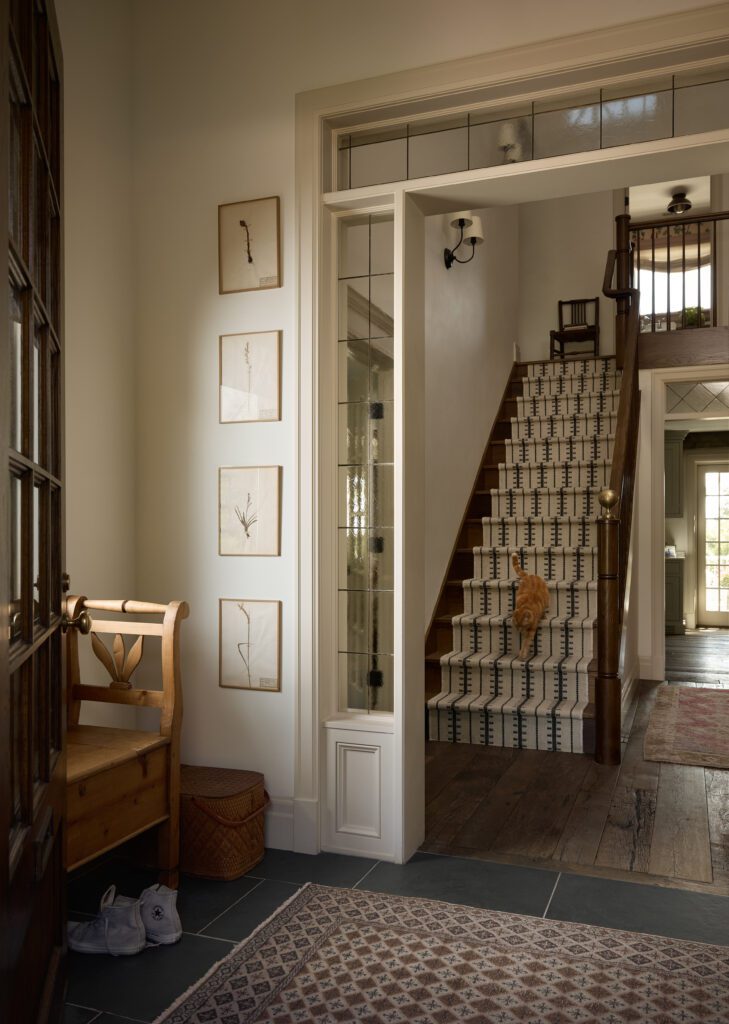
While the original entryway had some great elements, the layout felt a bit cramped, with the stairs starting immediately upon entrance. The team wanted to create a more open feel without losing the French doors on either side. To achieve this, they added an entry corner to intentionally define the space and welcome guests. The new layout enhances the area’s impact and functionality while preserving the charm of the leaded glass doors. The completely rebuilt staircase and a mix of flooring materials bring the entry to life, making the best kind of first impression.
Impactful Finish Work
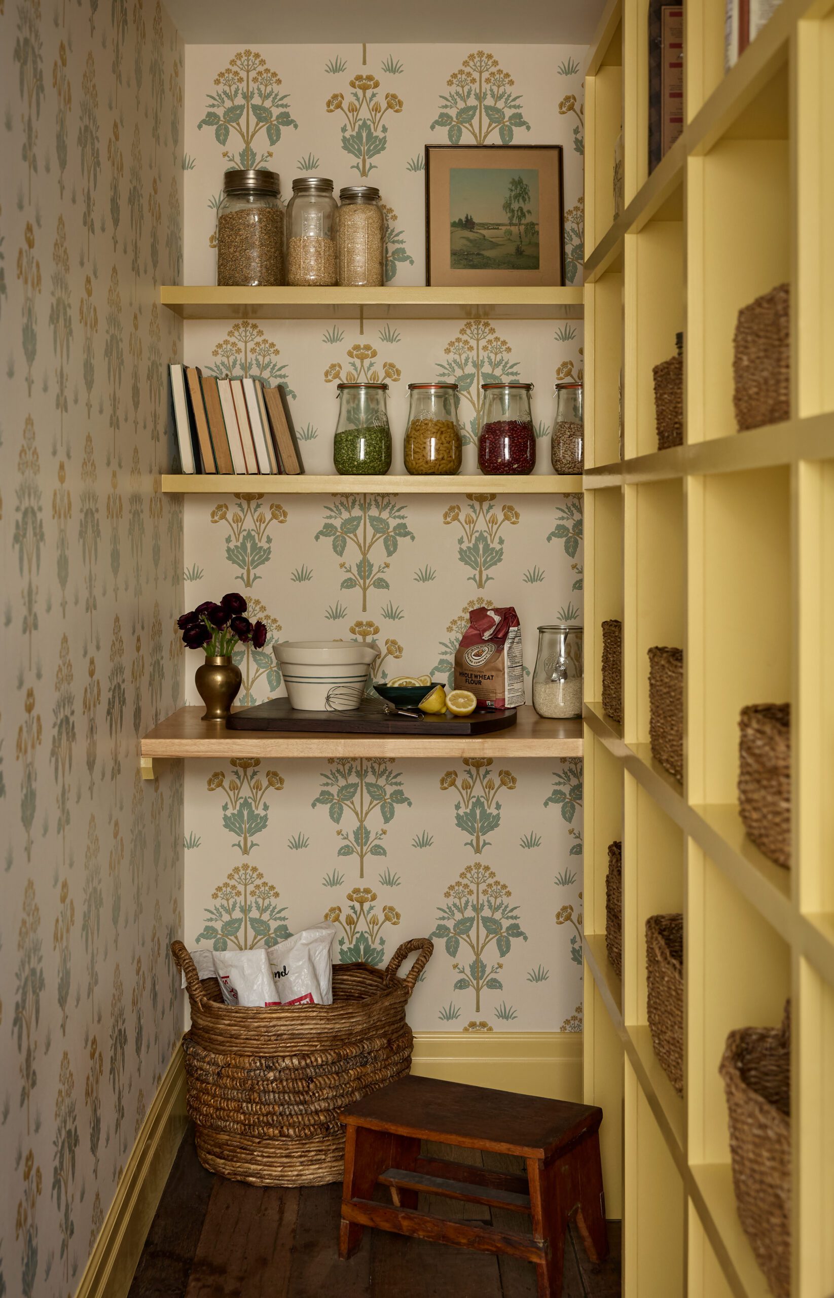
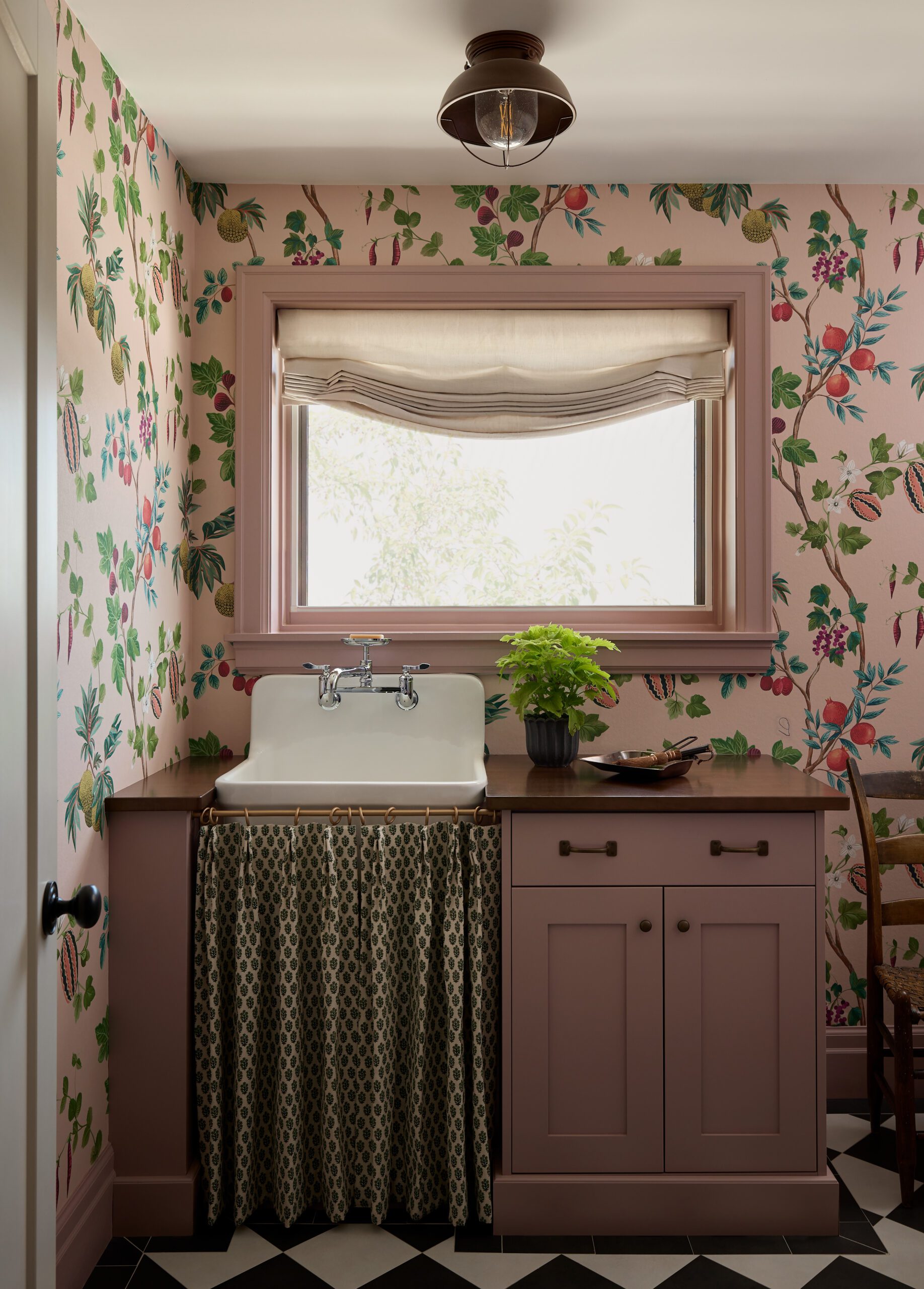
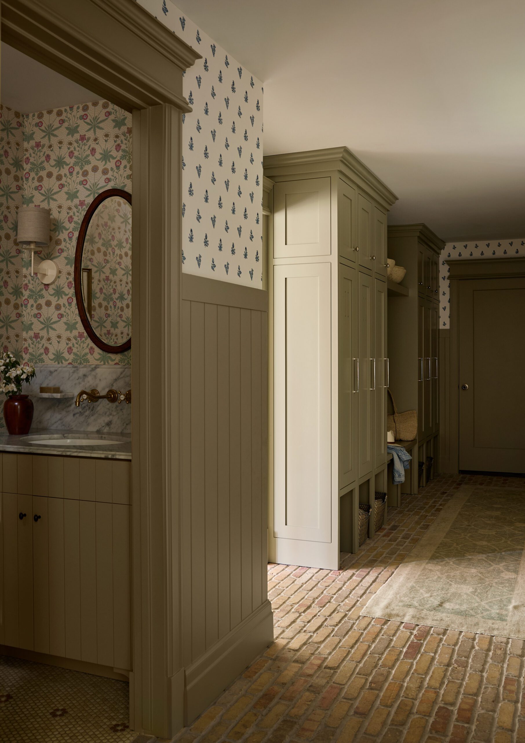
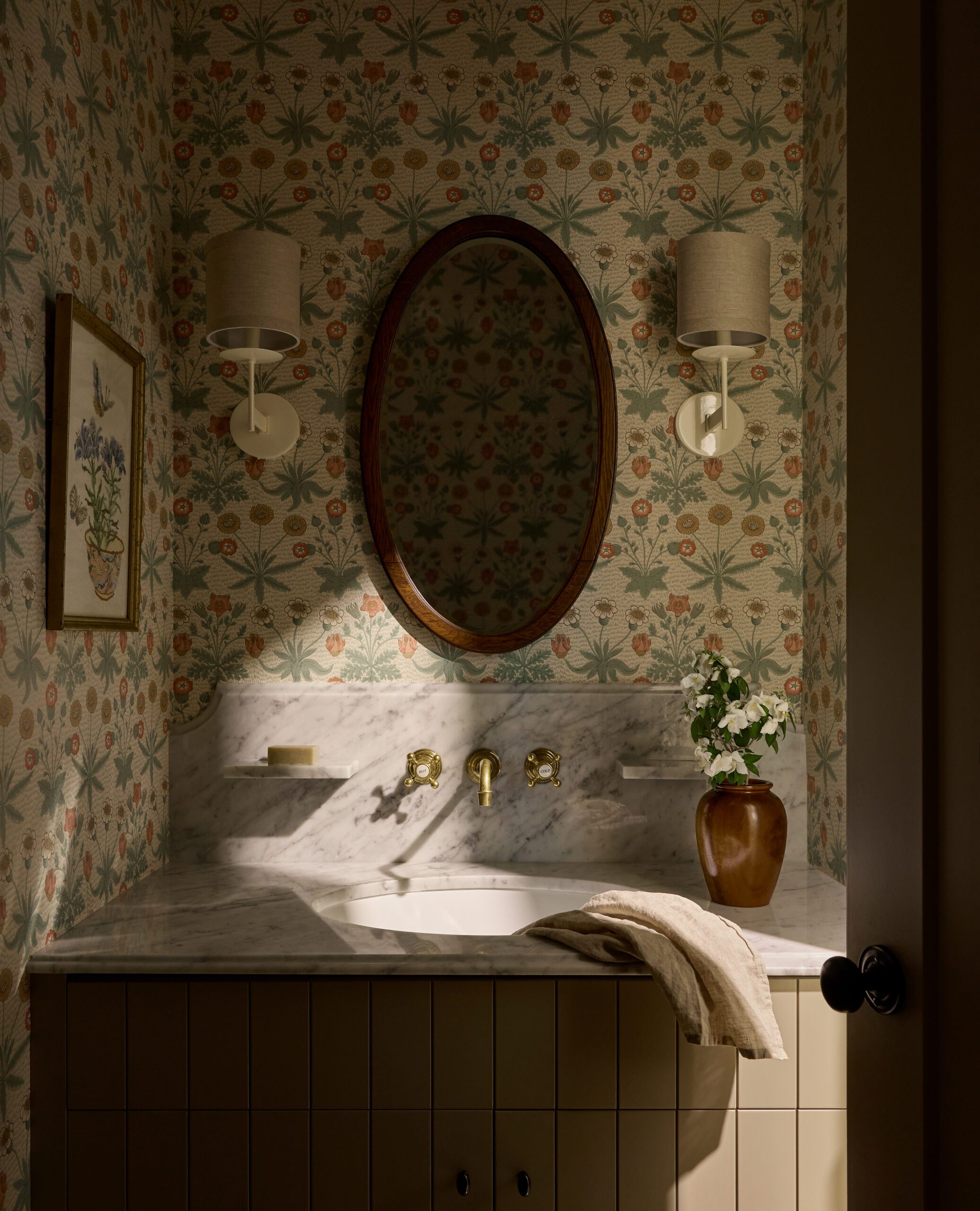
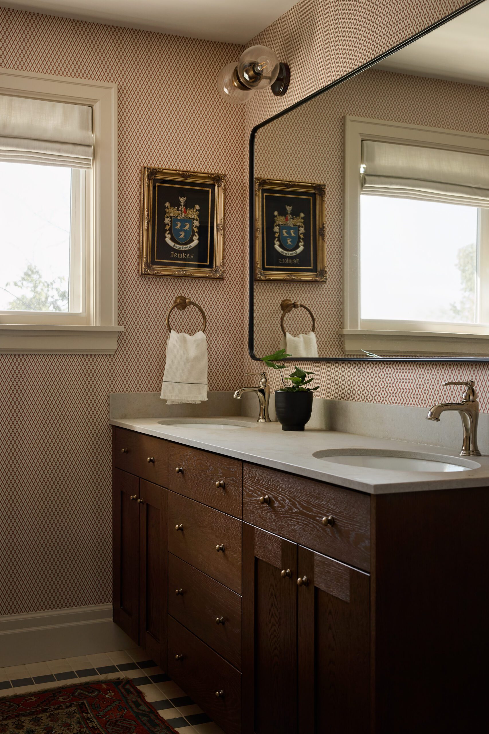
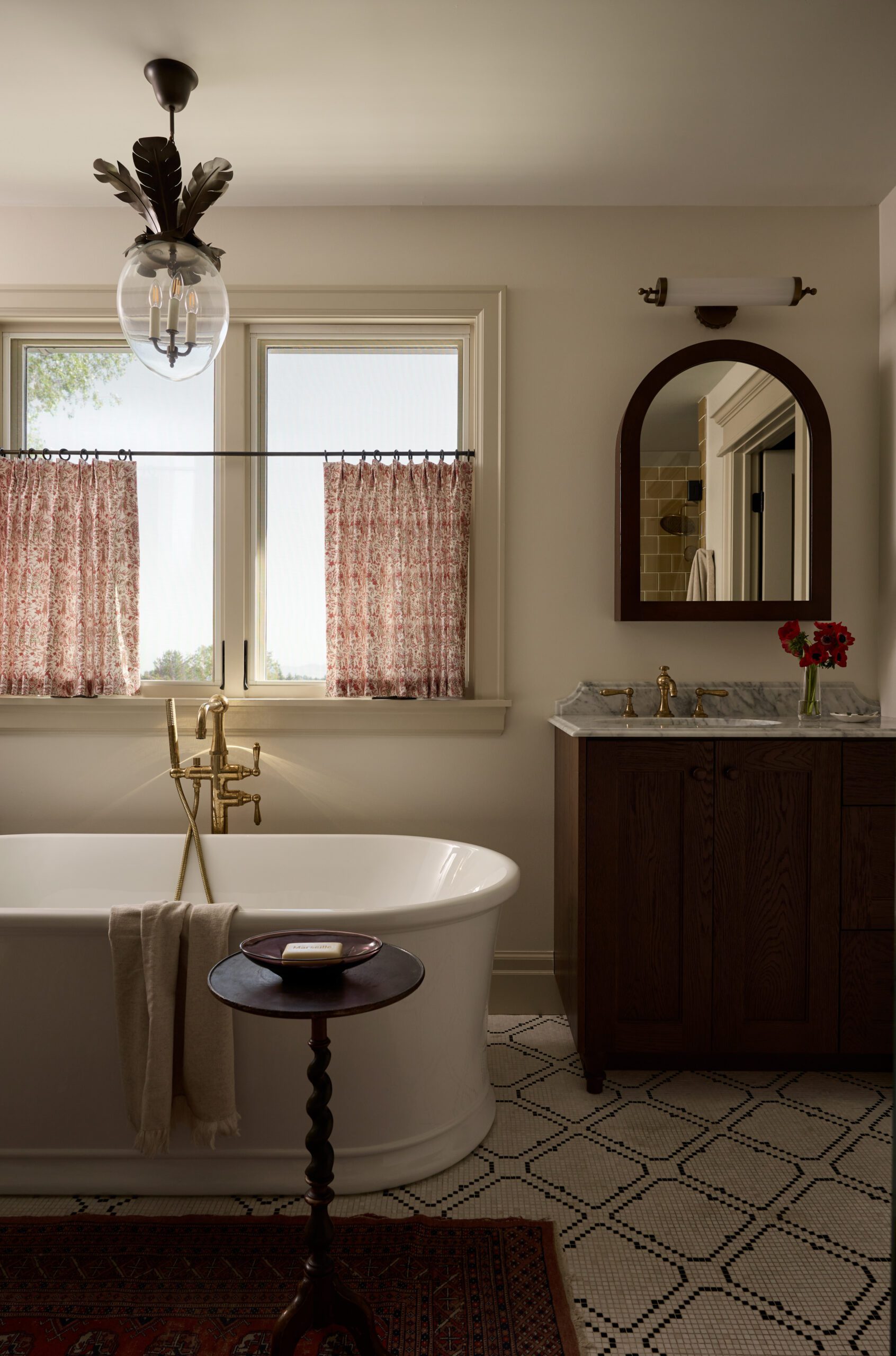
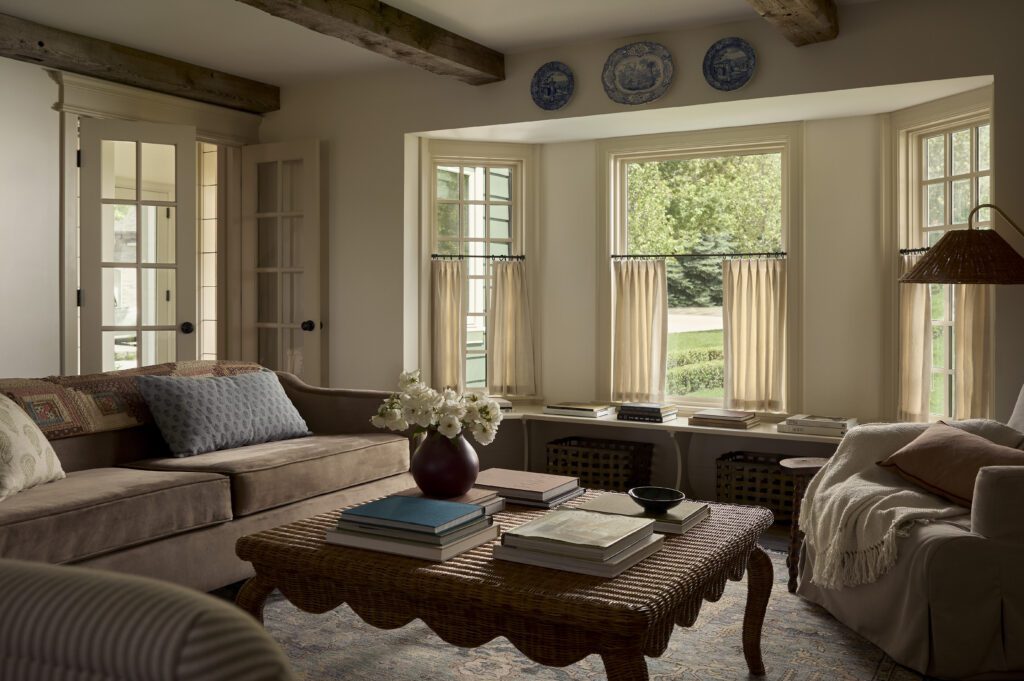
Carefully selected details helped create impact and bring a feeling of history into this home — from the trim work to the various wallpaper patterns incorporated throughout. This client wasn’t afraid to go bold with color and pattern, and the risks paid off in the charm-filled spaces. When it came to the finish work of the home, one of the first decisions the Freestone & Smith team made was to add headers to each of the doors. While it’s a small detail that blends with the remainder of the design, it makes a significant impact and adds a lot of interest to the transition spaces.
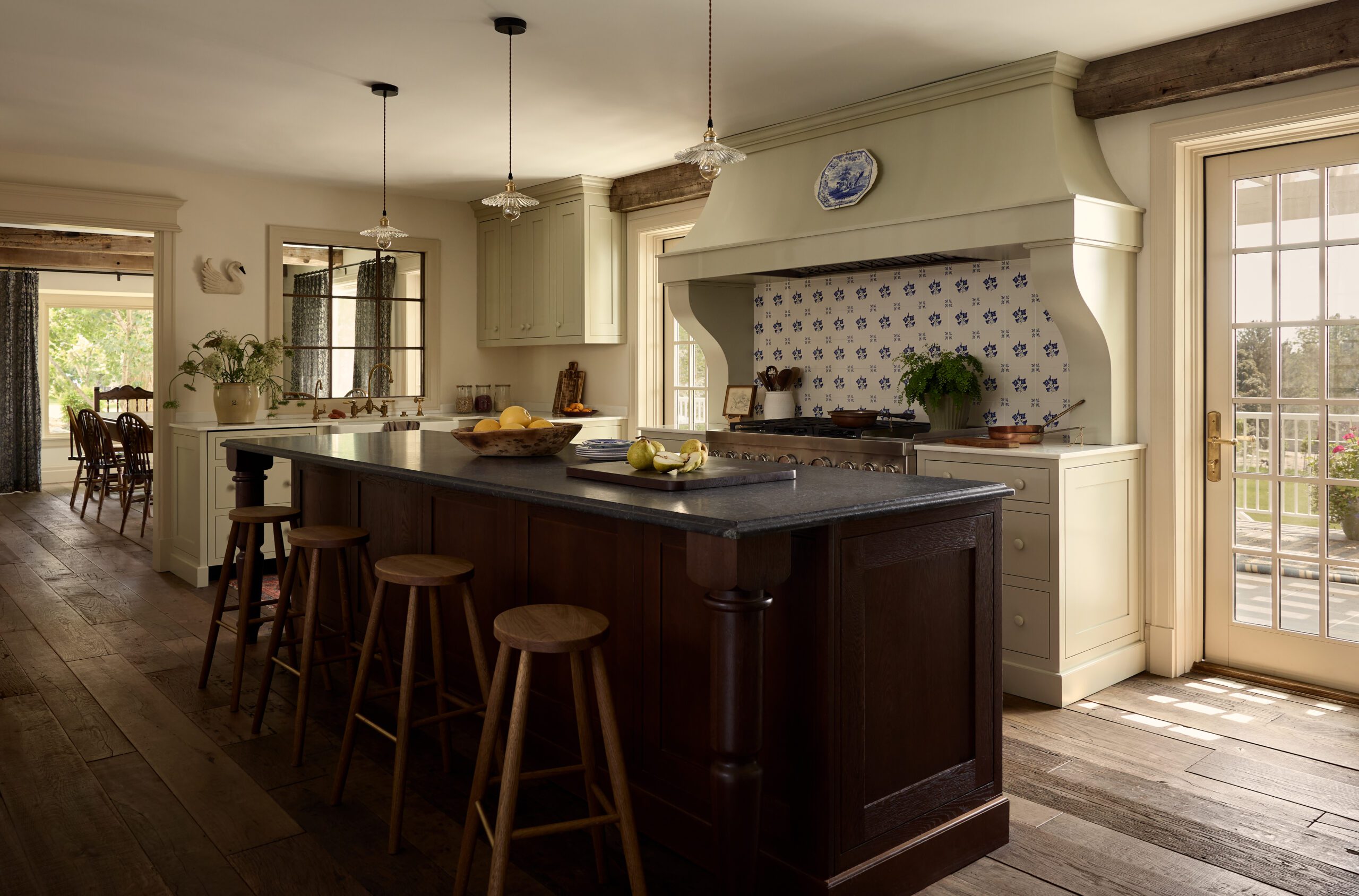
A Storied Kitchen
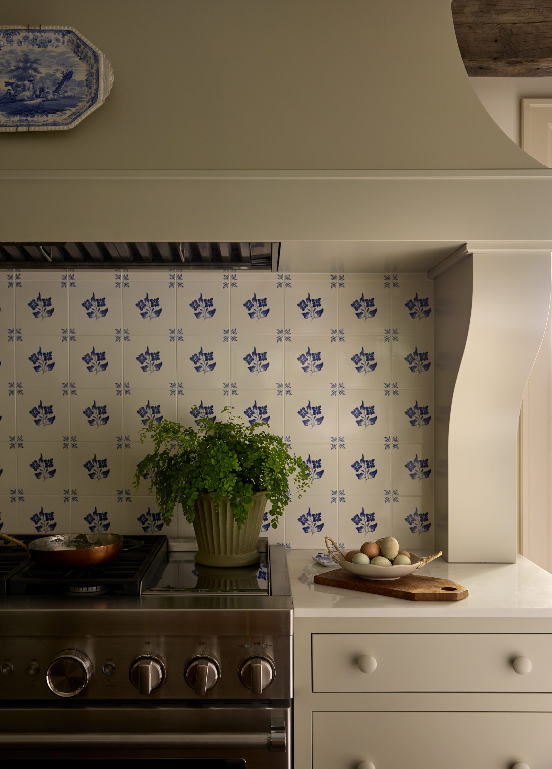
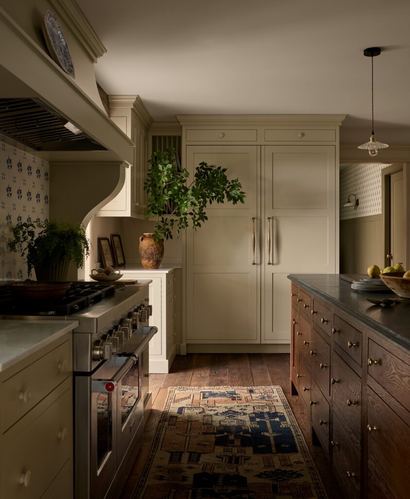
Reclaimed wood floors the client sourced directly from France set the tone for the kitchen, while blue Delft Tiles on the backsplash reflect their love for blue and white dishware reminiscent of the East Coast and tie in the tones from their collection displayed throughout the home. Unlacquered brass hardware creates an aged finish look, and sage-colored cabinetry brings just a hint of color to complete the space.
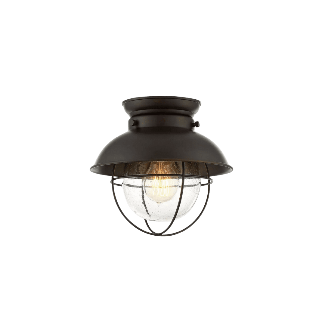
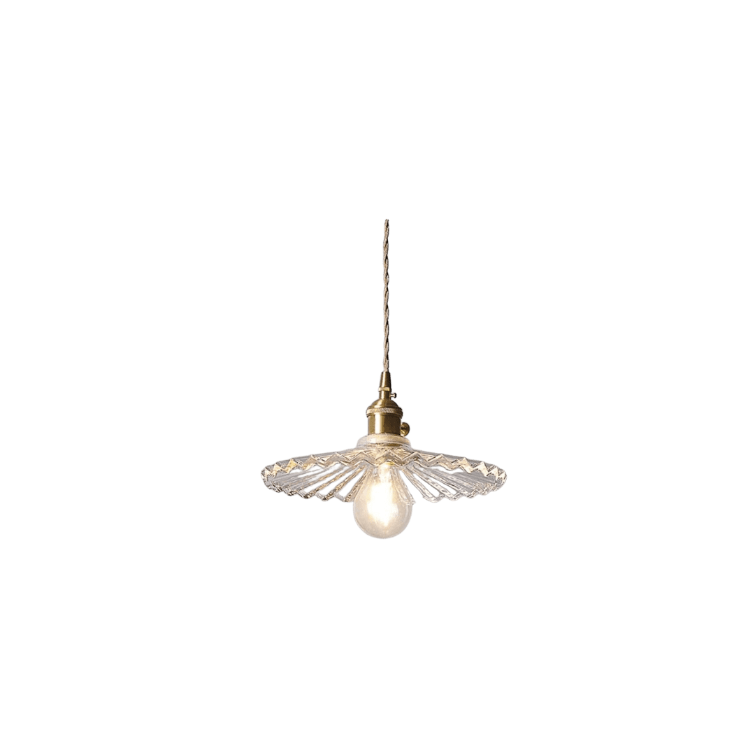
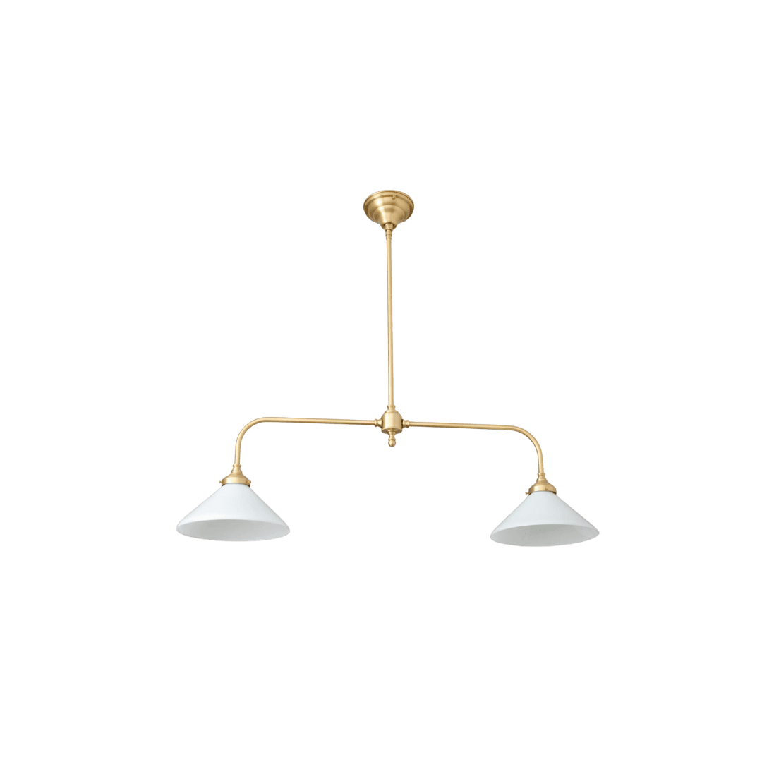
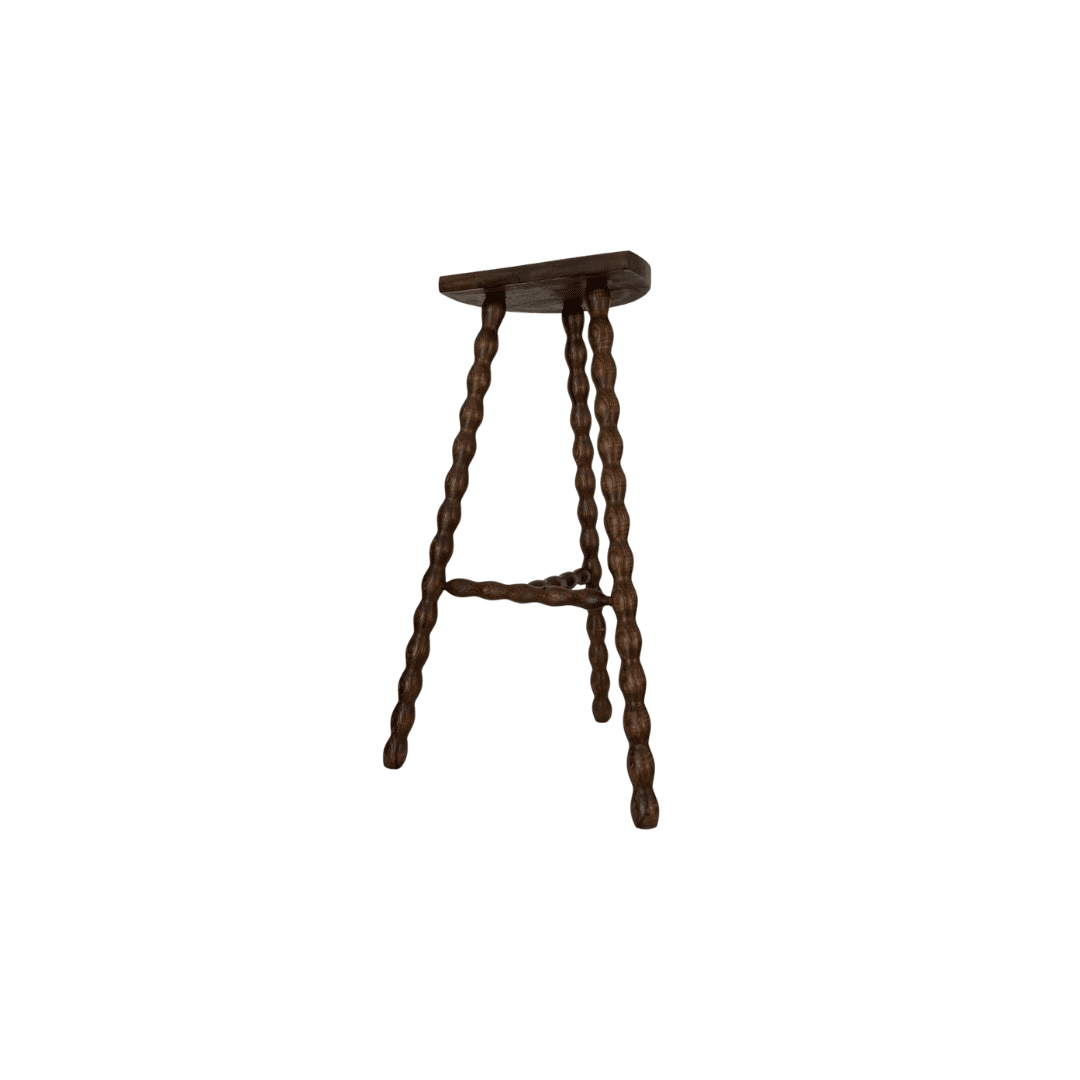
Scroll through the gallery below for more from this tour, and shop the look below!
BY: Jasmyne Muir


