An Organic Modern Sea Ranch Home Transformation
When the Tama Bell Design team did the first walk-through of their client’s project — a 1990s Sea Ranch house in need of a refresh, they started by assessing the home’s layout. The floor plan of this space (and most Sea Ranch homes) places the bedrooms on the entry-level and the living room, kitchen, and primary suite on the second floor to allow for better site lines. In this project, that meant spectacular ocean views in all the right places — setting the scene for equally calming and fresh interiors.
Sea Ranch holds a special place in my heart, as it’s close to my grandmother’s home and was an easy day trip we’d often take from Marin County. If you aren’t familiar with its history, Sea Ranch is a unique development created in the 1960s that pushes the boundaries for communal, environmental living. Architect Lary Halprin wanted to prioritize buildings that became part of the landscape, encouraging harmony between its inhabitants and nature. If you’re ever in the area, it’s definitely worth visiting some of the public beaches. While scrolling through this home tour, it’s easy to see the connection between the beautiful surroundings of Sea Ranch and this home’s interior; you can only imagine how serene it feels in real life.
Design: Tama Bell Design | Photography: Stephanie Russo
A Sea-View Living Room
While the floor plan of the upstairs living space didn’t change drastically, the Tama Bell team refreshed all of the 1990s details to give it some new life. An added three-sided fireplace plastered with Portola Paints Roman clay and floating shelves added an offset design element, and cozy, laid-back furnishings set the scene for the rest of the home.

Organic Modern Kitchen Dreams
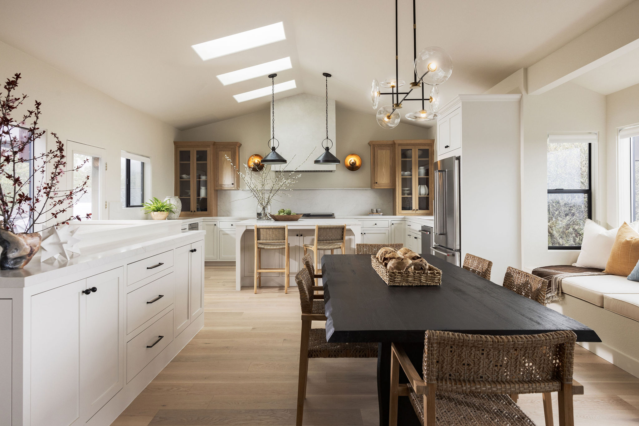
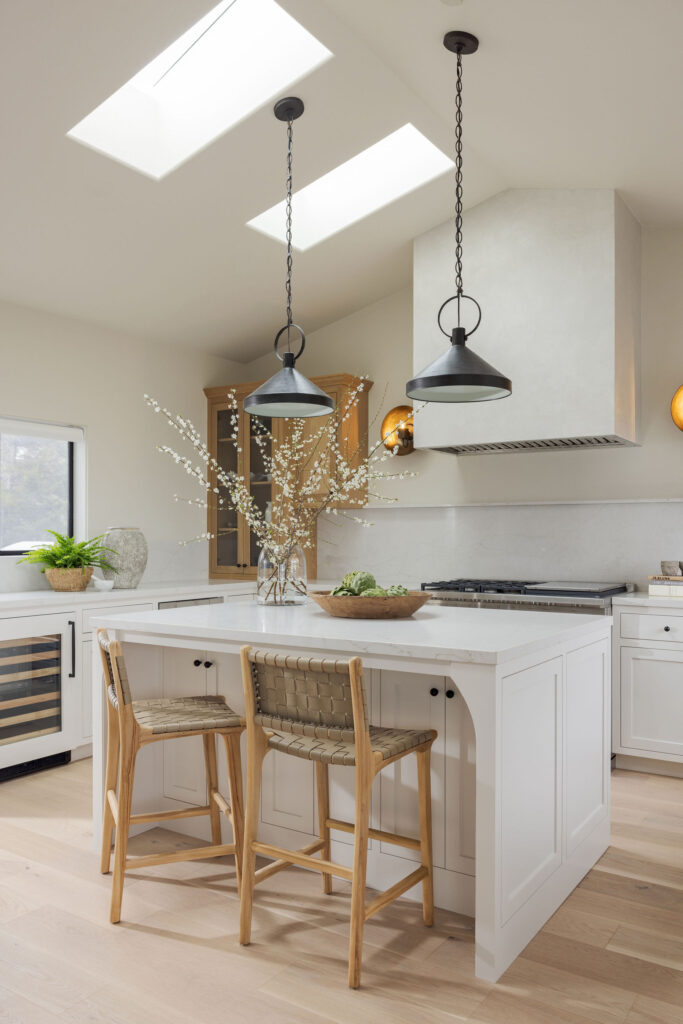
Opposite the living room, a transformed kitchen and dining space strike the ideal organic modern balance, filled with materials that speak to Sea Ranch and its surroundings. This kitchen design is the perfect case for mismatched uppers and lowers — just look at how much warmth and character that wood addition brings to the otherwise white & airy space. Who else is jealous of that adorable wine fridge in the corner?
An Open & Airy Downstairs Guest Space
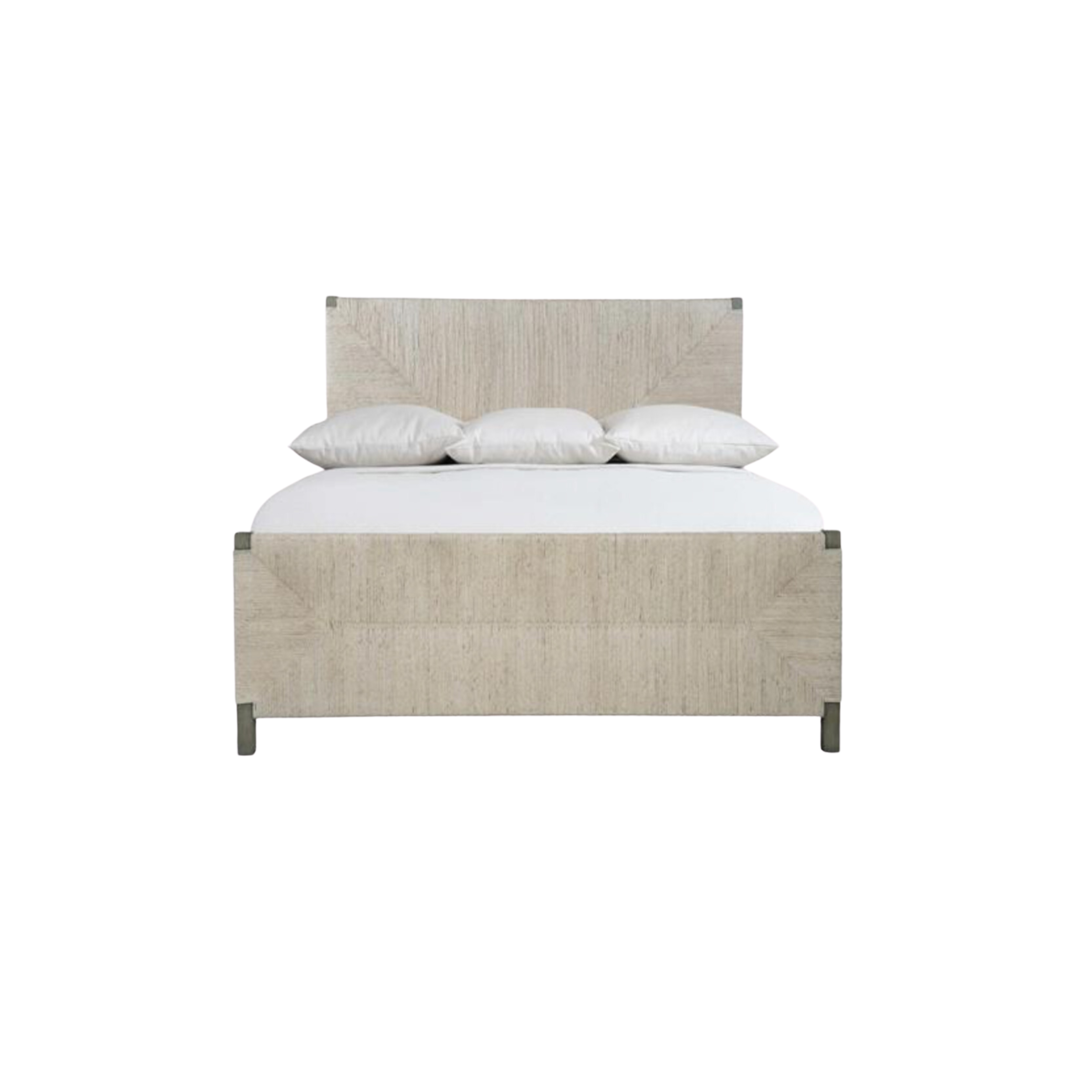
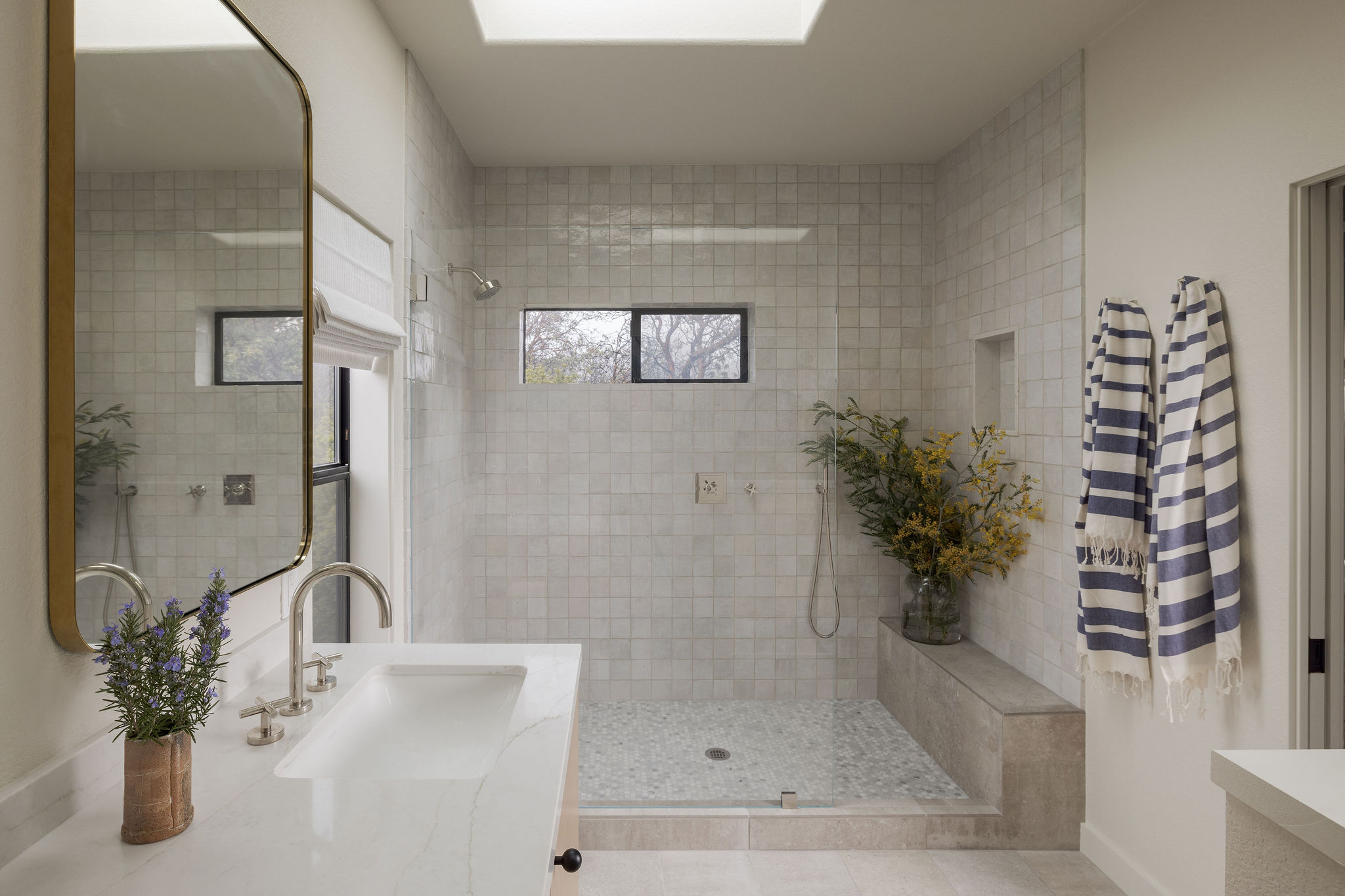
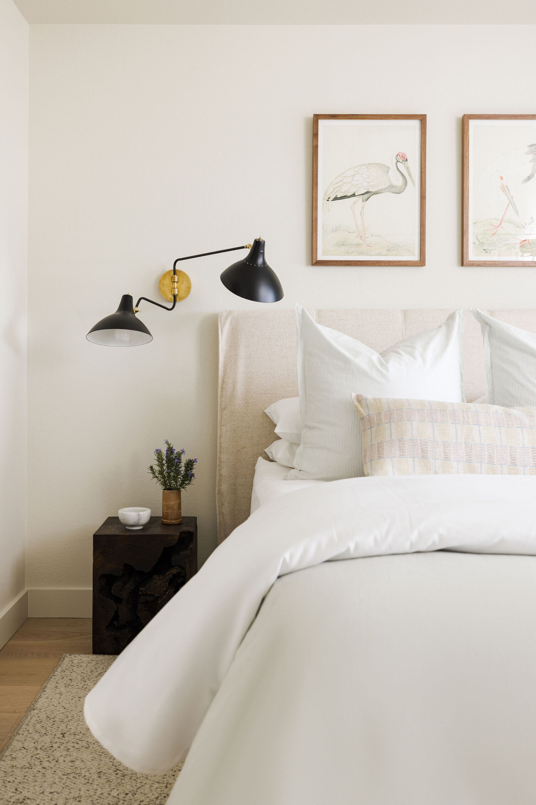
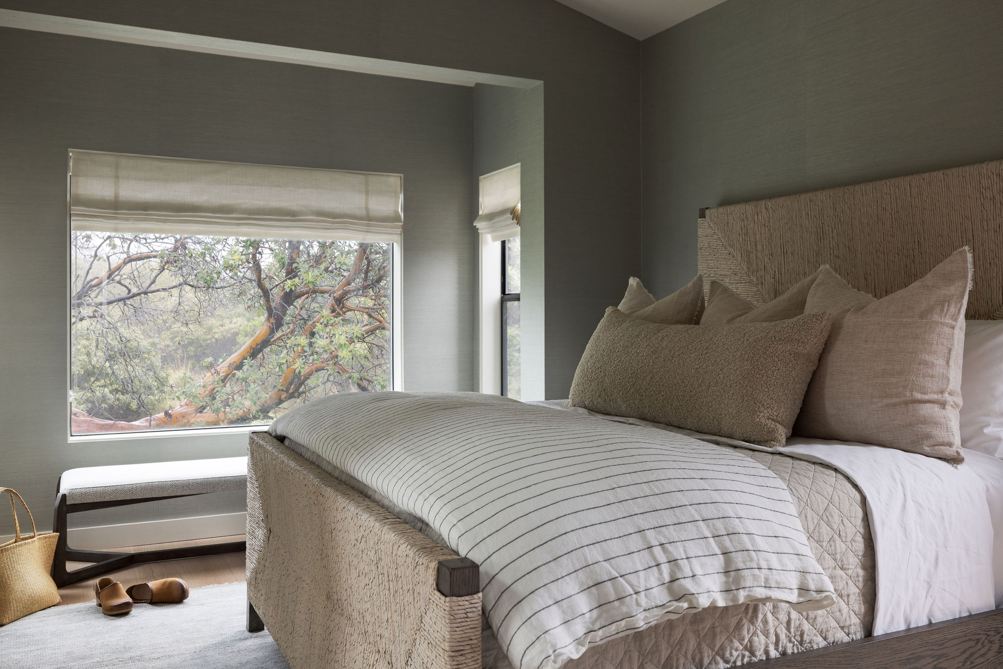
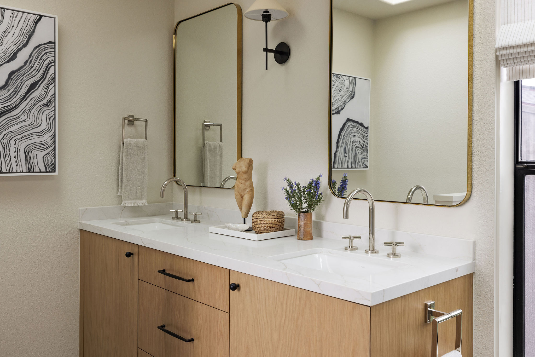
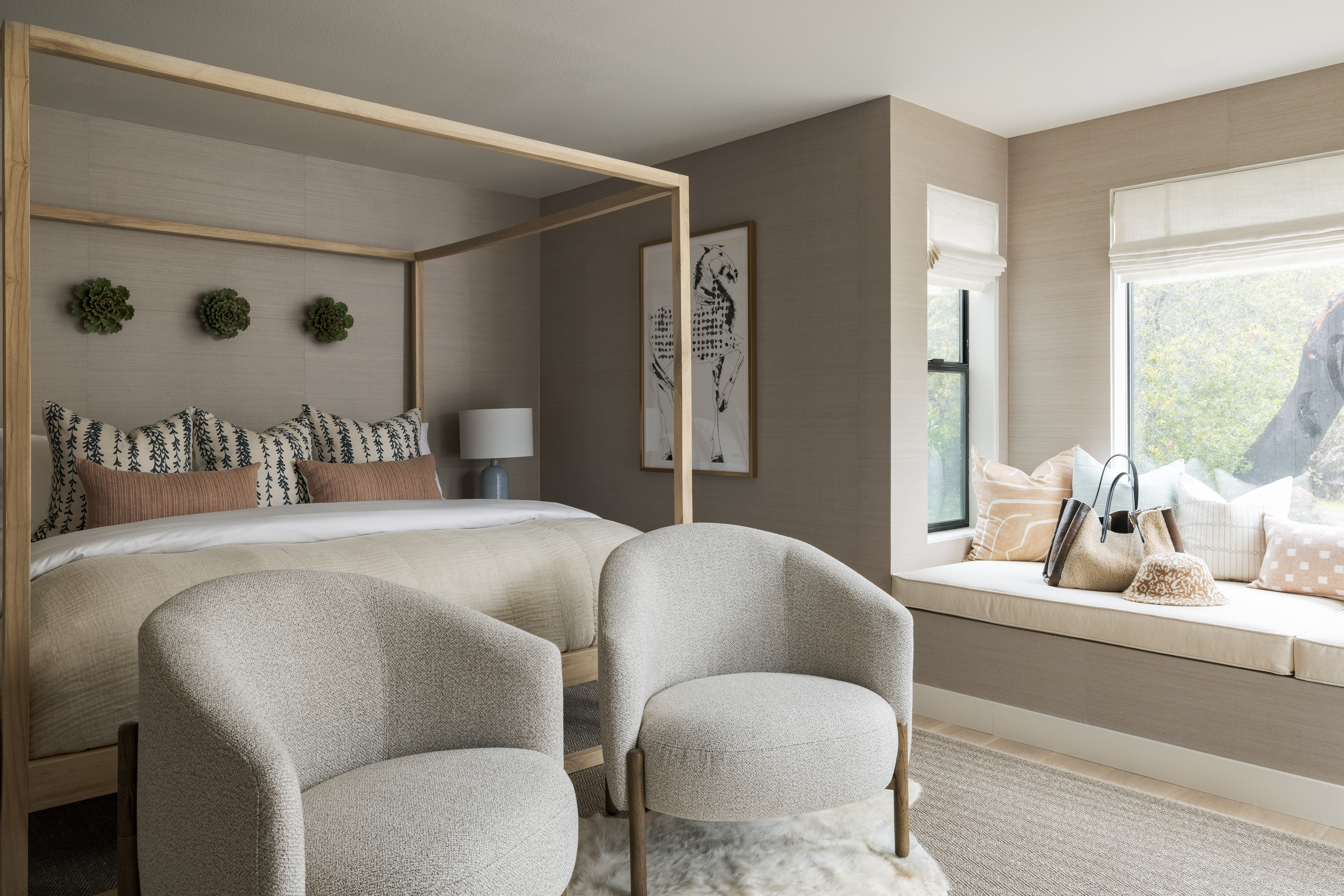
Due to the original floor plan, the downstairs guest space proved to be the biggest challenge in this project. In the original footprint, the only bathroom was in the primary suite, meaning you had to walk through the bedroom to get to it. Luckily, they were able to steal the walk-in closet downstairs to create an efficient powder bath with storage to make everything a bit more comfortable. A refreshed bedroom space and a few updated finishes in the hallway complete this dreamy guest oasis.
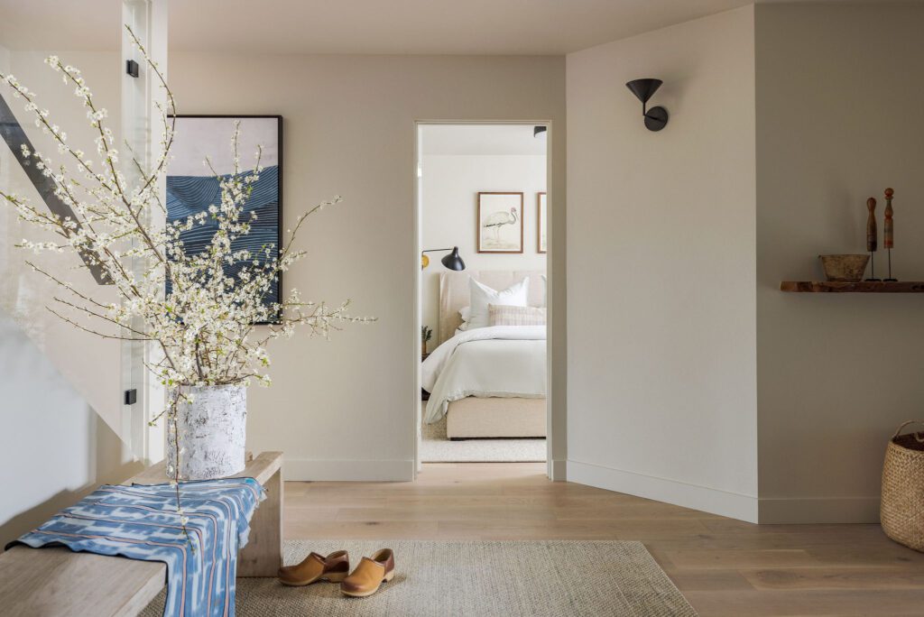
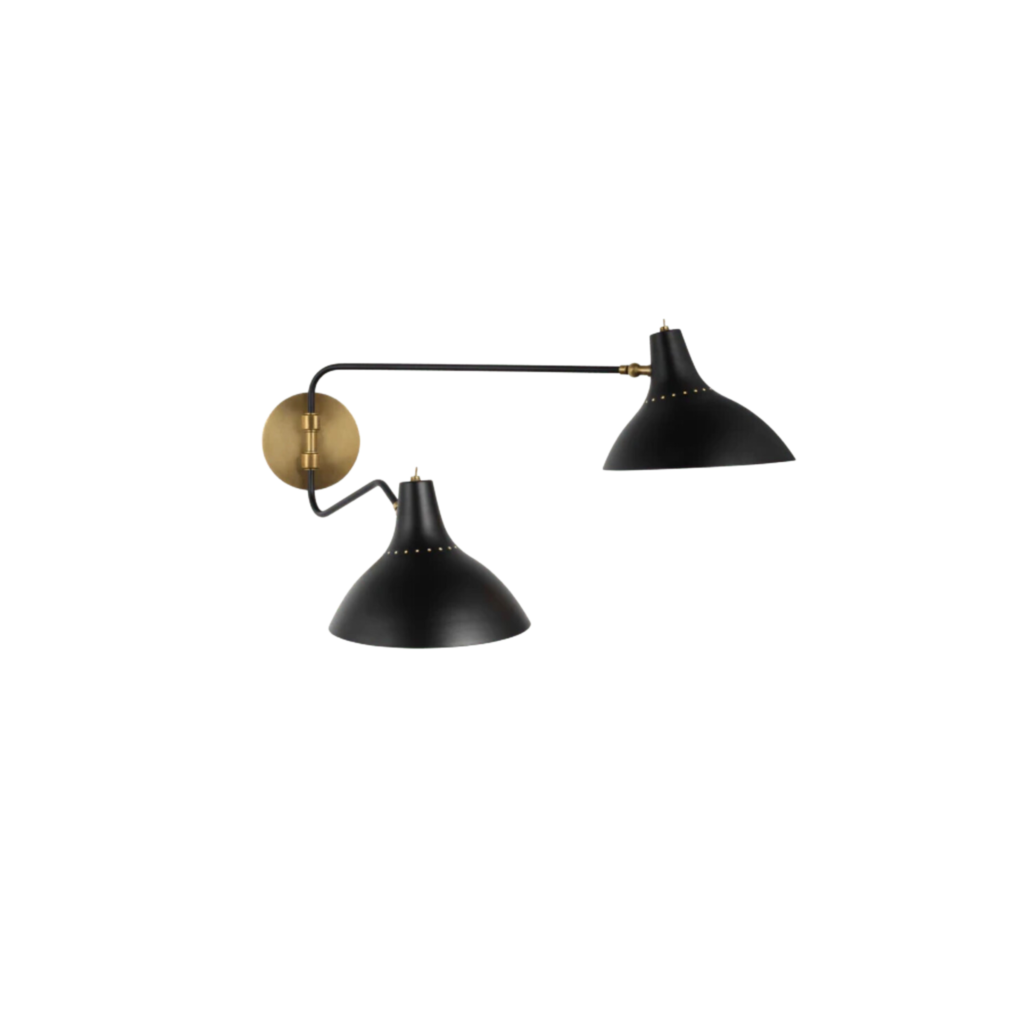
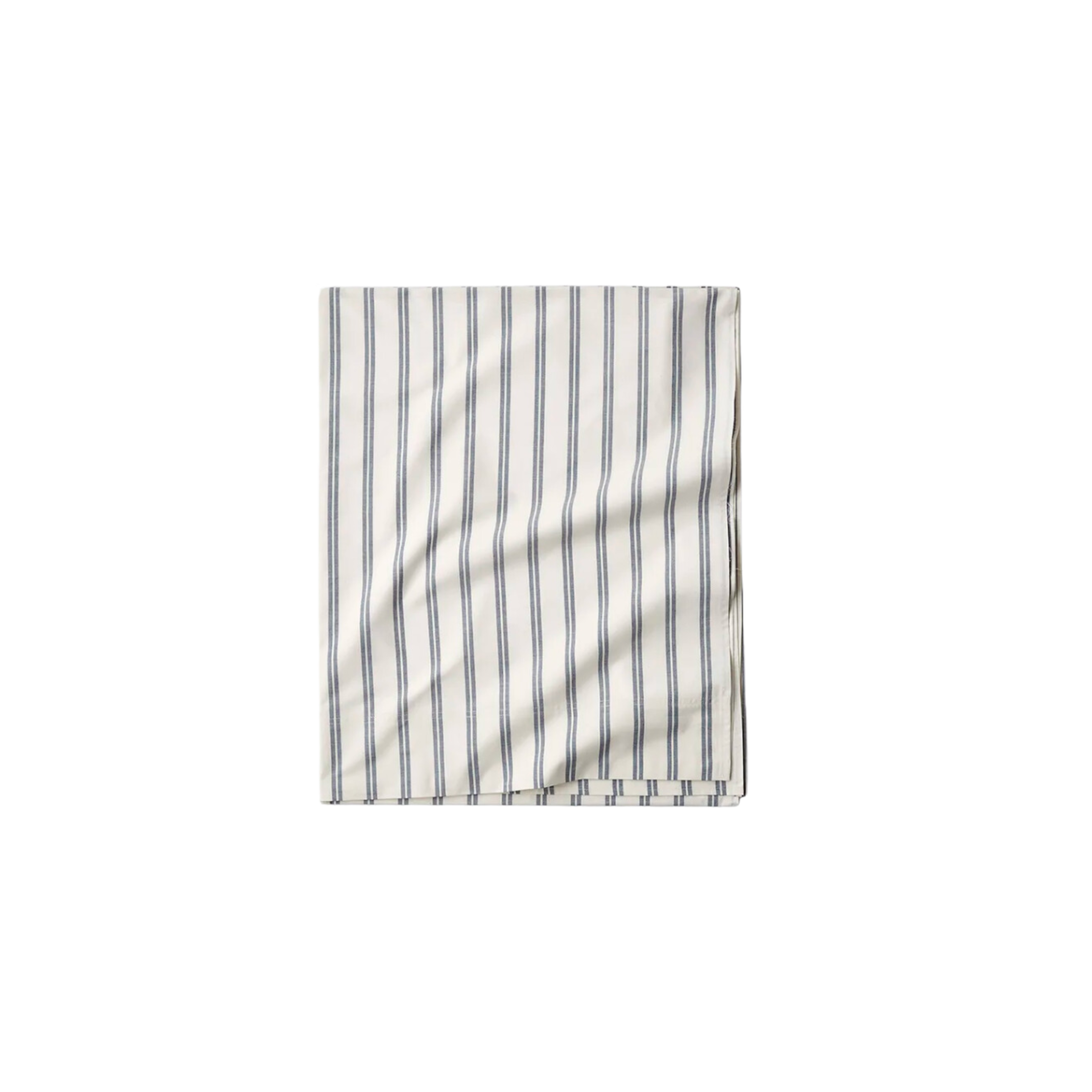
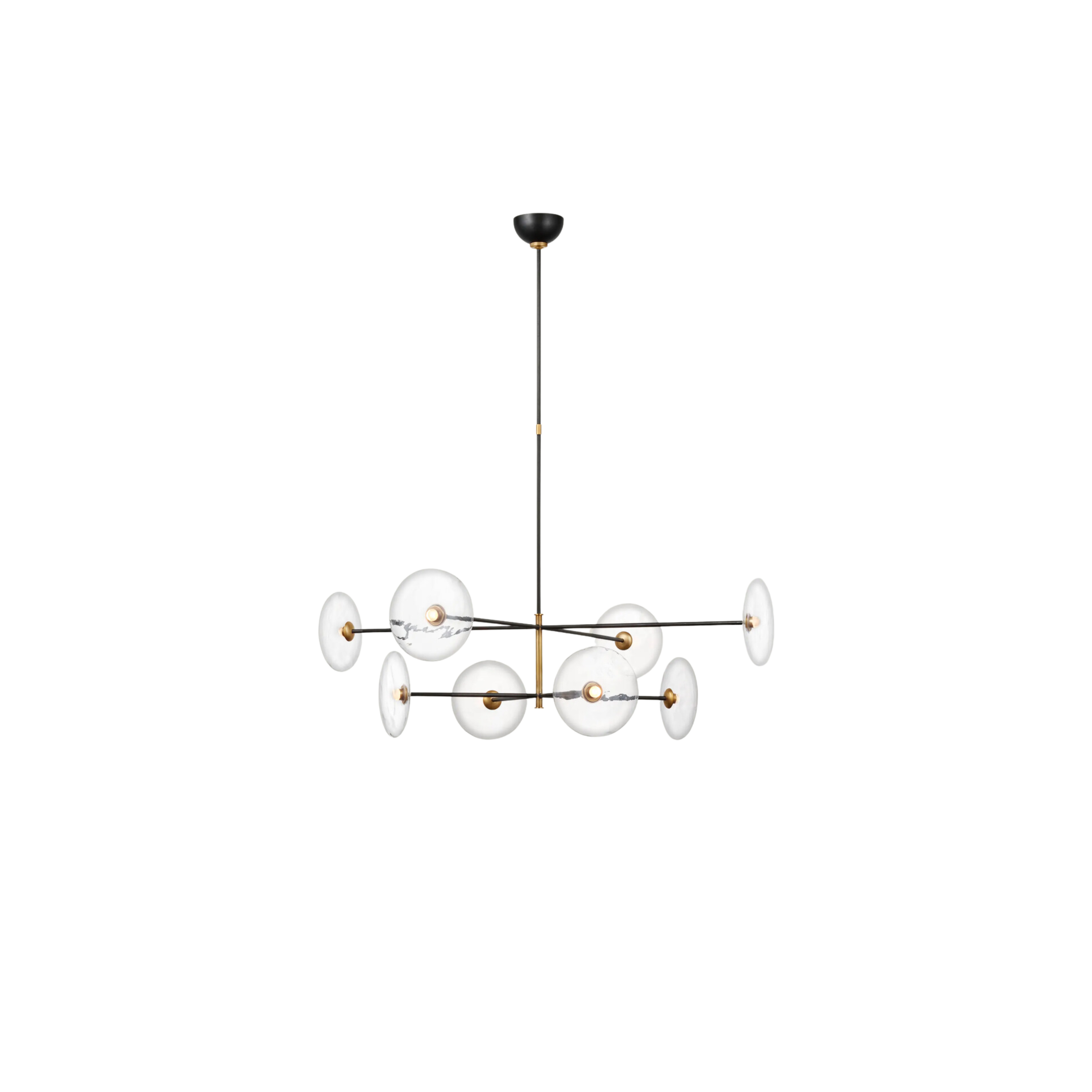
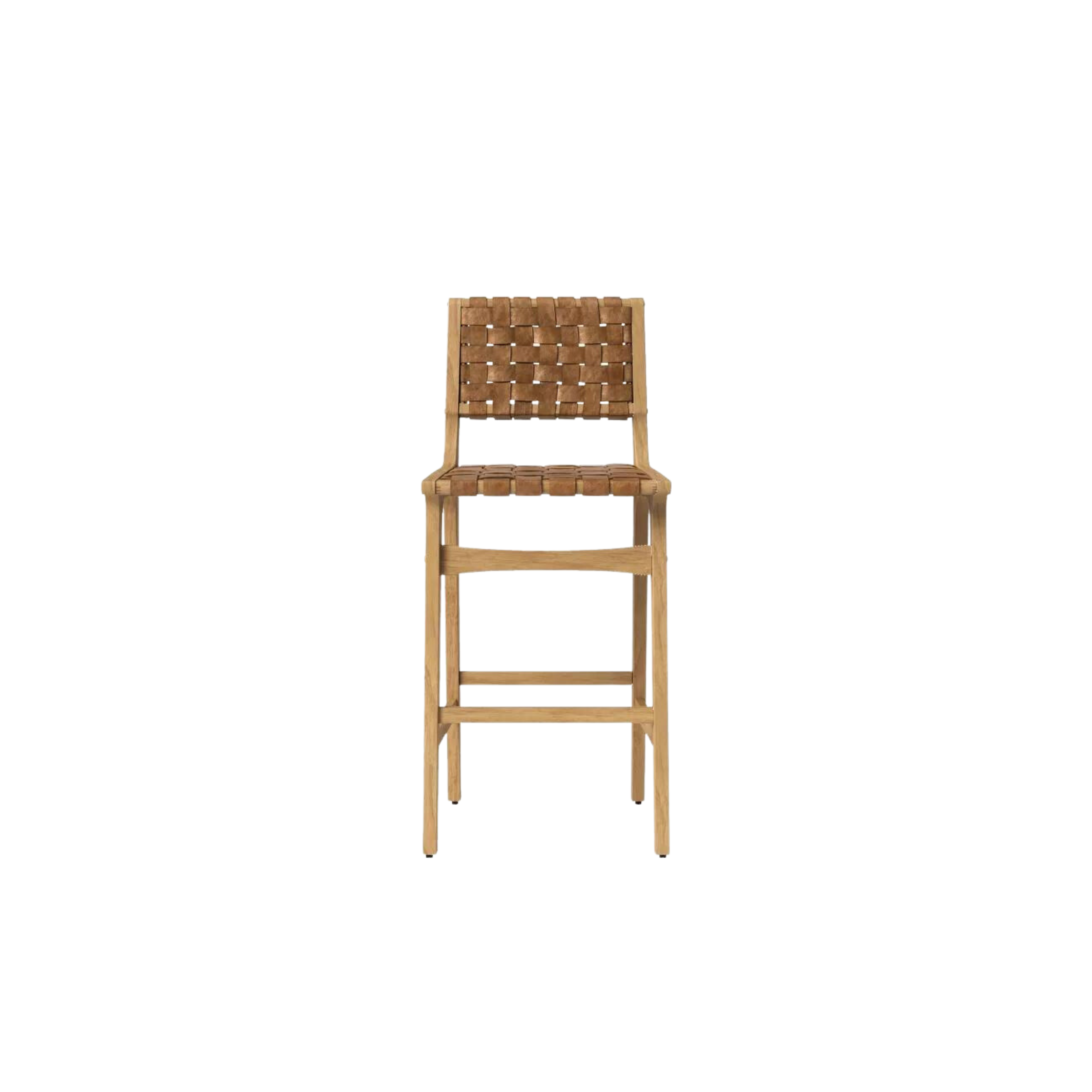
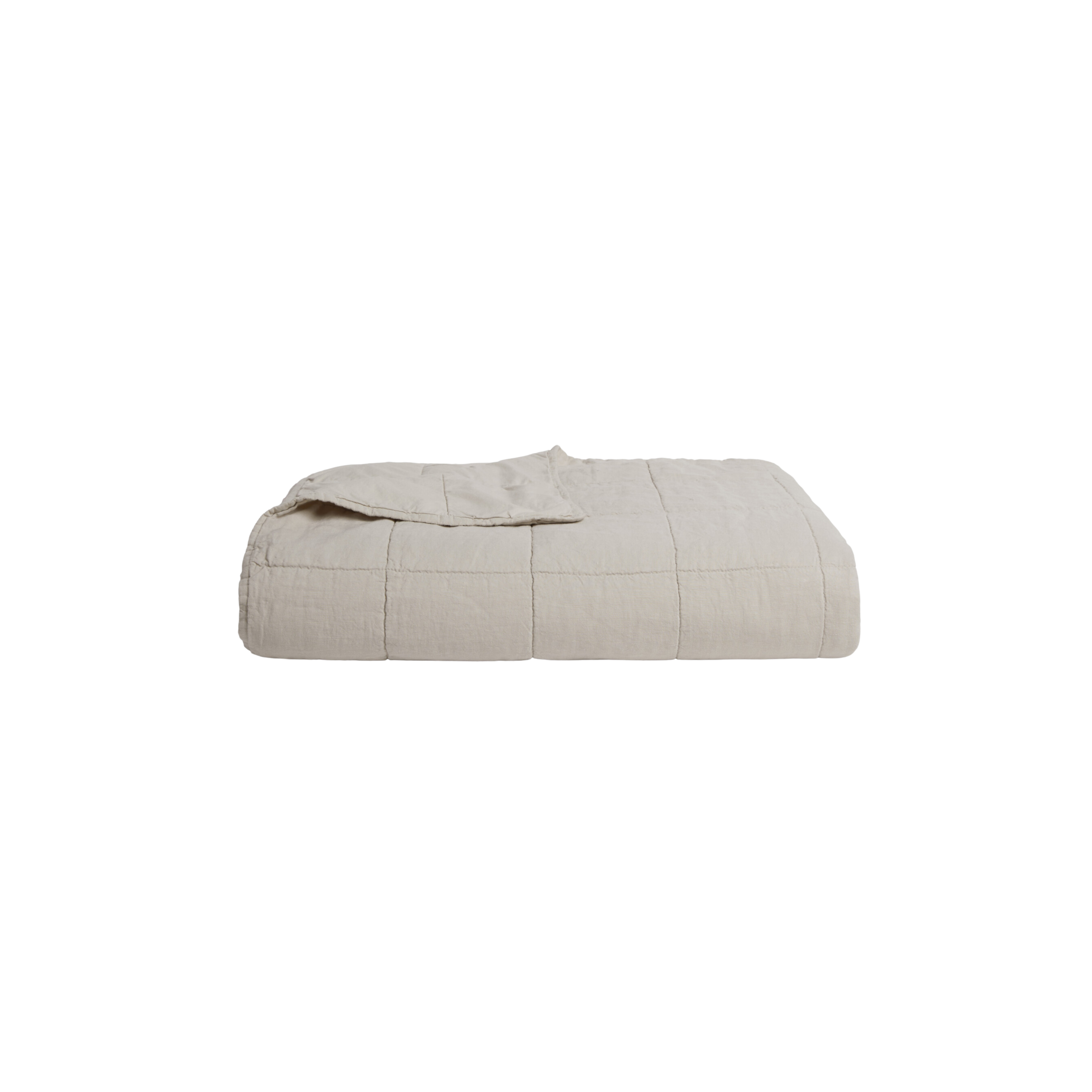
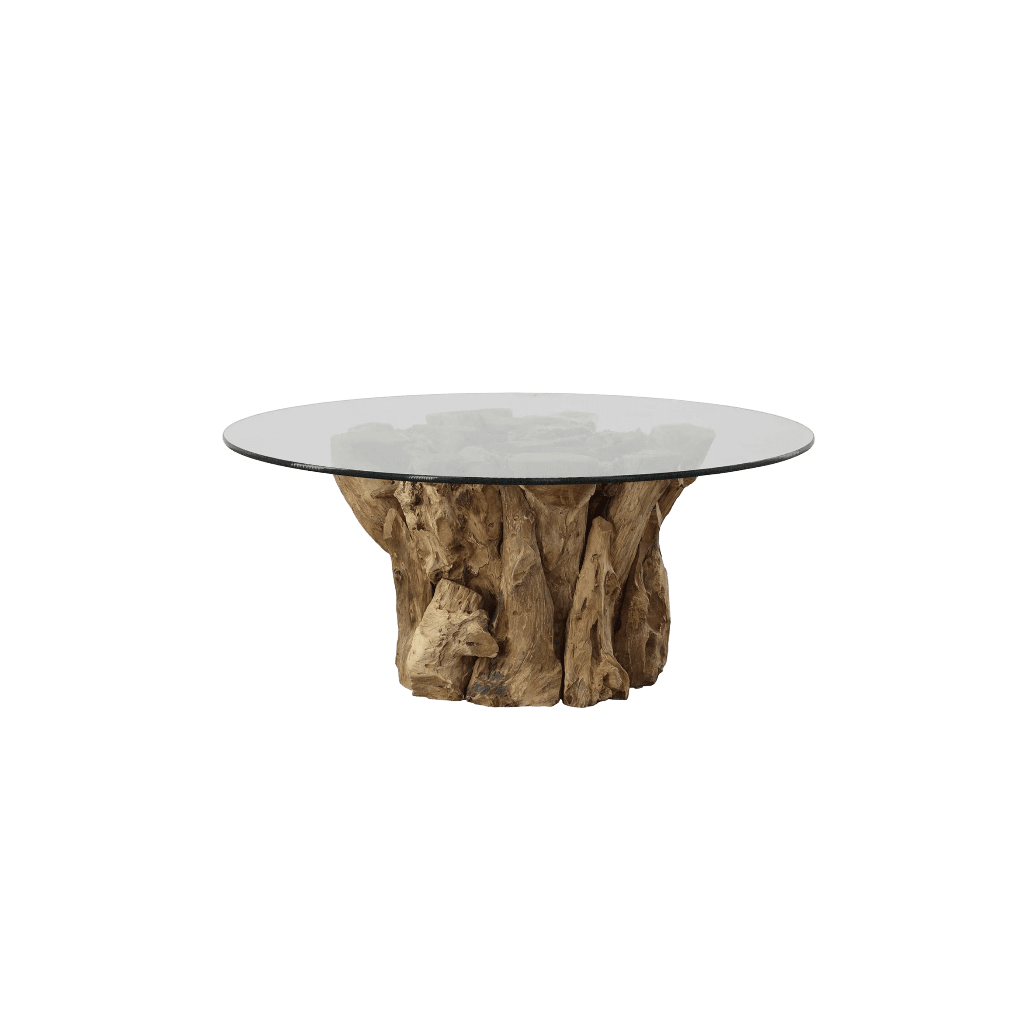
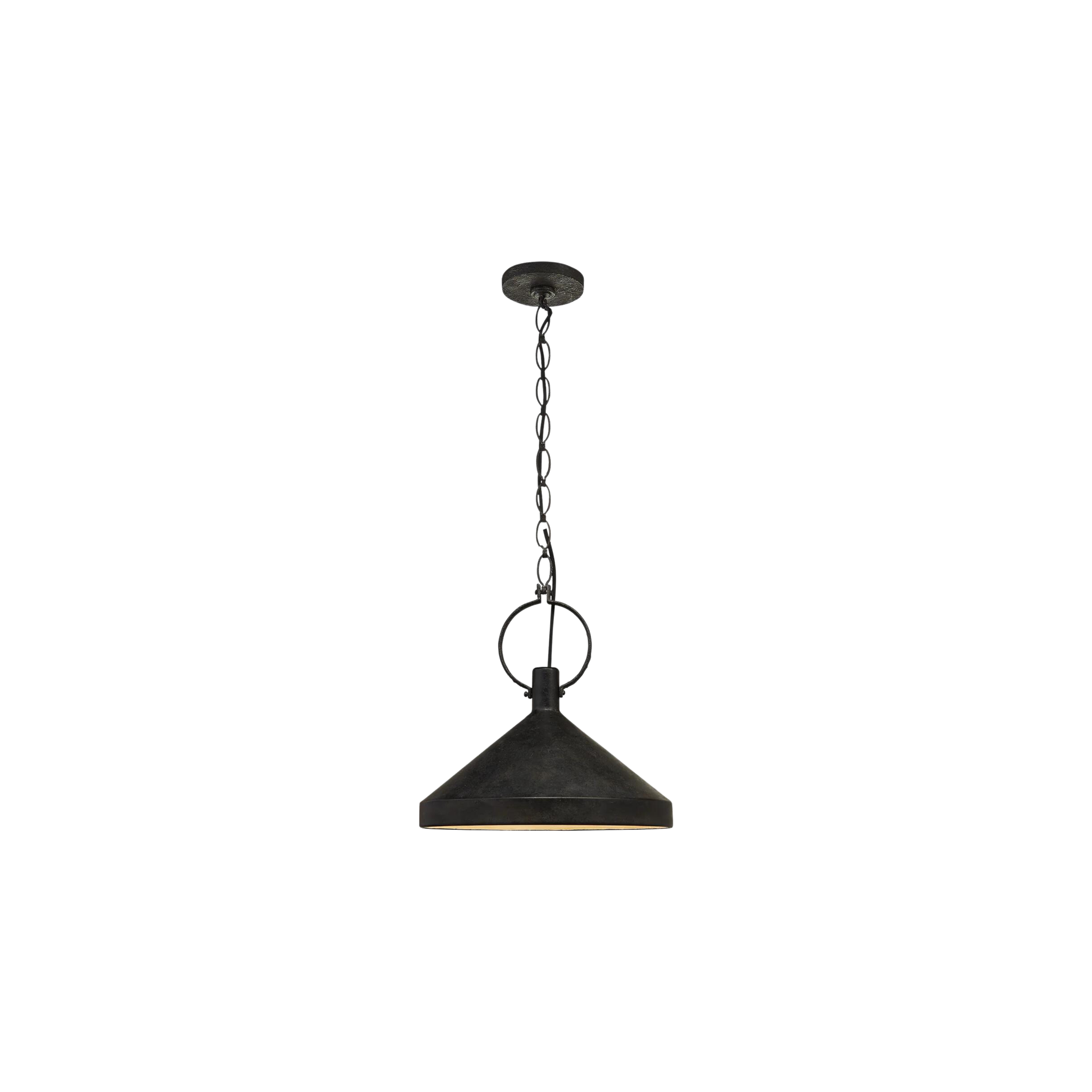
Scroll through the gallery for more from this space and shop the look below.
BY: Jasmyne Muir


