The Best Not-White Neutral Paint Colors
As the major paint brands are offering their takes on the Color of the Year, one shade is noticeably missing: White. After several years as the shining star of paint colors, and a frequent topic of conversation on this blog (here are my favorite white paint colors in 2021), there is a definite shift happening away from all-white interiors and toward more color. And as I’m planning the paint scheme for the Austin Tudor, I’m taking advantage of the more-closed-off floor plan to make way for more not-white neutral paint colors. That’s not to say it will look like a crayon box, but I’m definitely sampling some dark and moody shades and some subtle neutrals to play on the cozy, European-inspired vibe we have going in our new (to us) home.
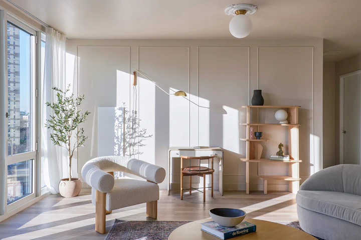
Design by The Brownstone Boys
Beige and Dark White Neutrals
I know, I know, dark white doesn’t sound like a “not-white neutral,” but it’s hard to be the nuanced versatility of a dark white or the perfect beige. And if you aren’t quite ready to dive into dark, moody shades, this is a good stepping stone. This shades are great when paired with brighter whites either on paneling or cabinetry for a subtle tone-on-tone look.
Try These Shades:
Swiss Coffee by Benjamin Moore
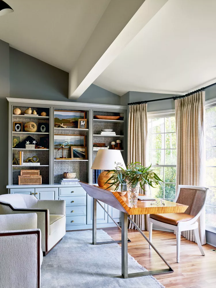
Styling by Kendra Surface | Photo by Chris Edwards

Design by Keith Wing
Gray-Green Neutrals
For slightly more color, chose a chameleon color that changes throughout the day. These shades are one of the toughest to get just right, so our picks are good places to start but should always be sampled on multiple walls in different lighting situations. However, when these gray-green tones work, they offer an versatility and an earthy sophistication. I especially love these colors when they are used on both the trim and the walls in a room, or used as a contrast trim color.
Try These Shades:
Edgecomb Gray by Benjamin Moore
Repose Gray by Sherwin Williams
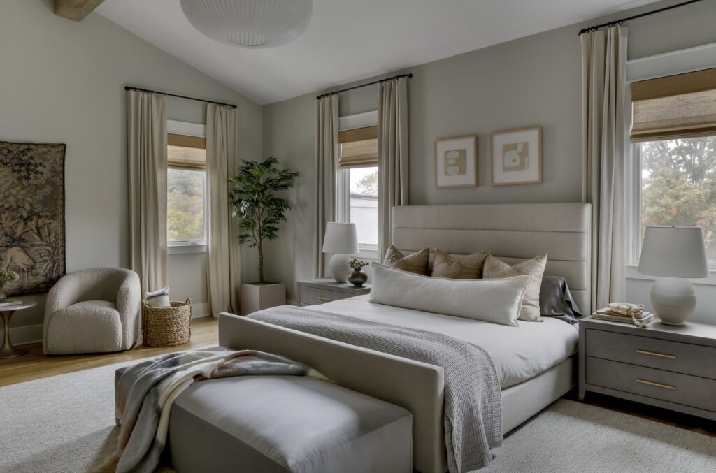
Design by Lilly Taylor Interiors | Photo by Paige Rumore
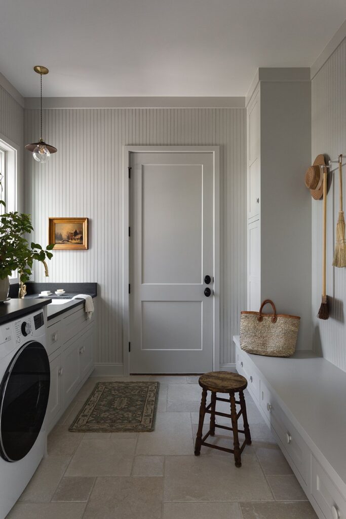
Design by Light & Dwell | Photo by Amy Bartlam
Pale Gray Neutrals
Gray may be officially on its way out (I’ve already laid out my case for the return of brown interiors), but the truth is, sometimes it just works. It’s especially pretty when paired with natural stones, as they often feature different shades of gray. To keep it current, stick to shades with warm undertones and steer clear of cool grays that lean blue. And be sure your room has plenty of other colors and textures in it.
Try These Shades:
Agreeable Gray by Sherwin Williams
Repose Gray by Sherwin Williams
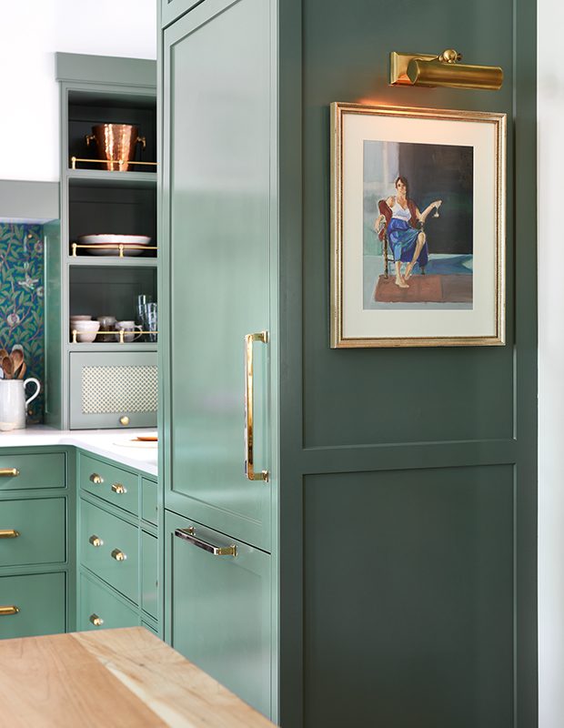
Design by Emily Wunder | Photo by Valerie Wilcox
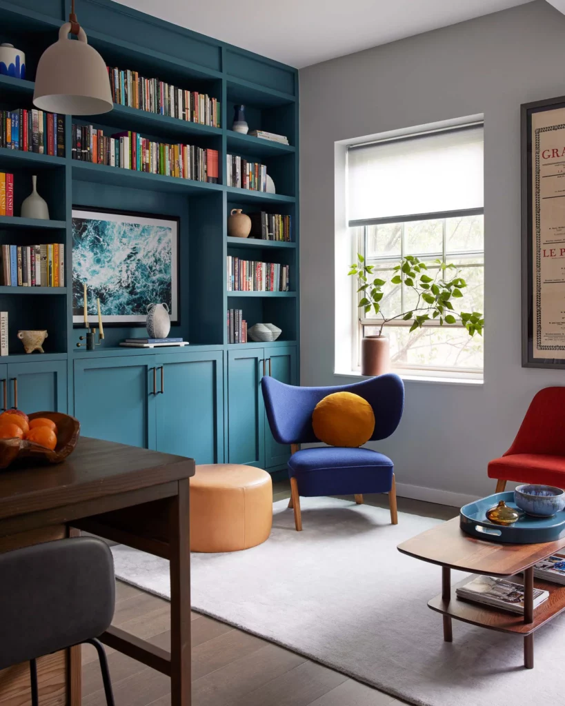
Design by Nina Blair | Photo by David A. Land
Dark Neutrals
Can dark colors be neutral? I say a resounding yes. Earthy colors like blues, greens, and browns are especially versatile, and are well-suited to a variety of styles. For the best results, choose shades that have brown or green undertones, and if it is too dark, you can have it mixed with a lower percentage of the color added in, offering a more subtle version of the same shade.
Try These Shades:
Morning Coffee by Benjamin Moore
BY: theinteriordev

