An Early 20th-Century Home Gets a Modern Makeover
There’s just something about a home rooted in history and updated with integrity to its original design and architecture that we’ll never get enough of. While it might look effortless, achieving that character-filled yet fresh and modern balance is easier said than done, and today’s home tour is a masterclass in how to do it right by the design duo behind Becky Shea Design.
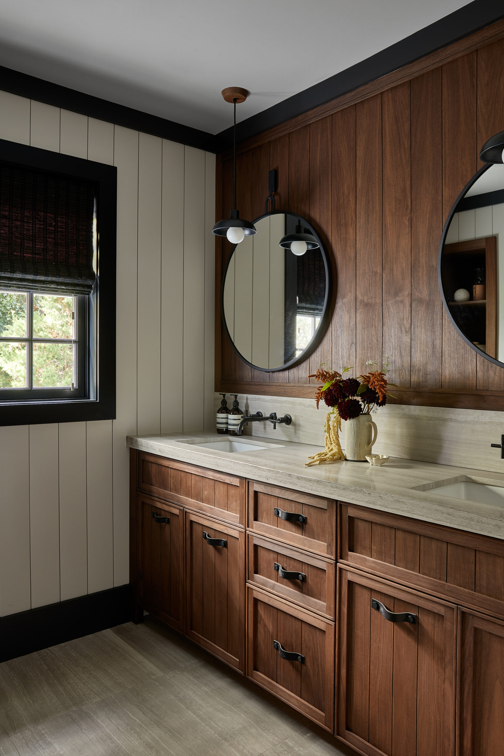
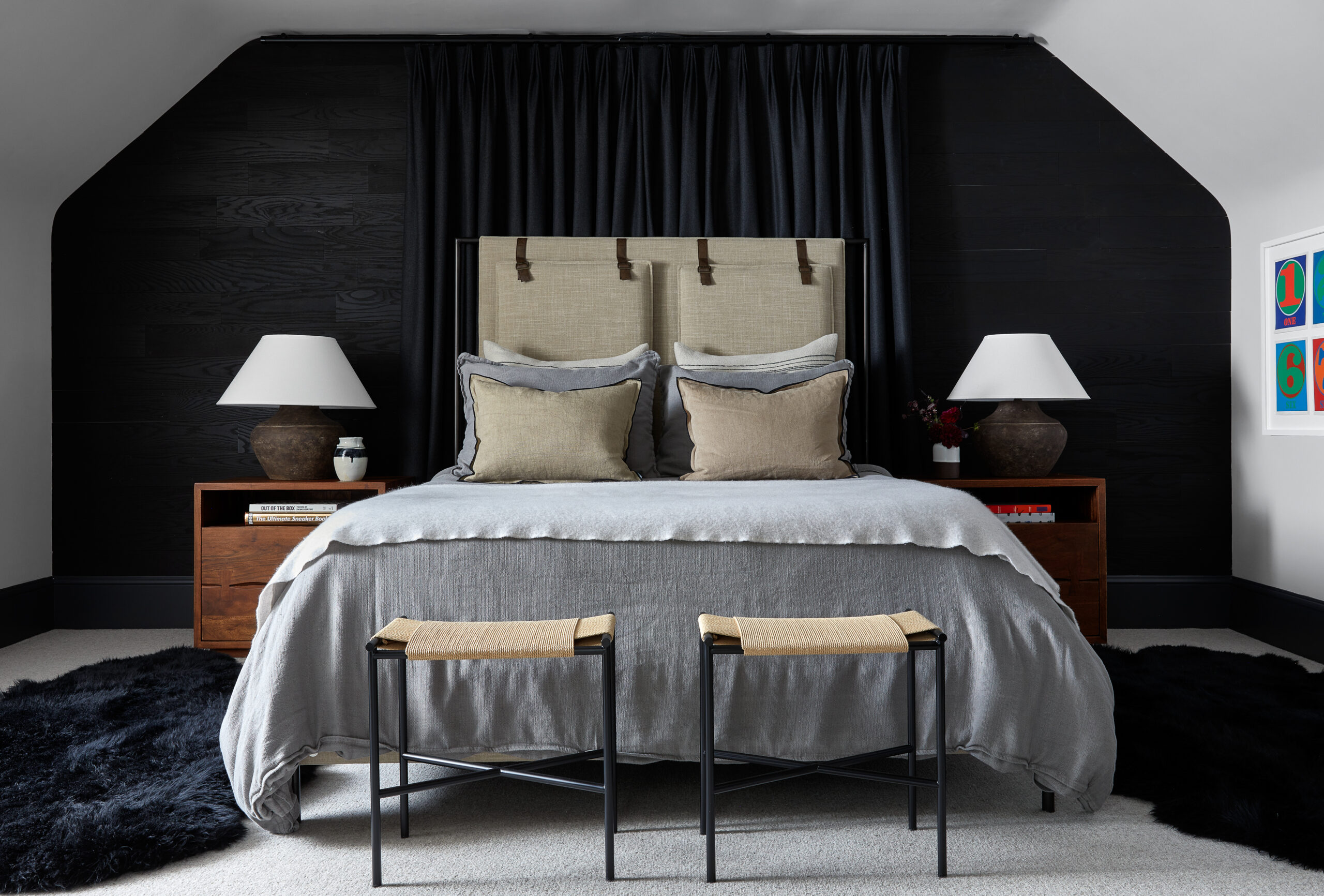
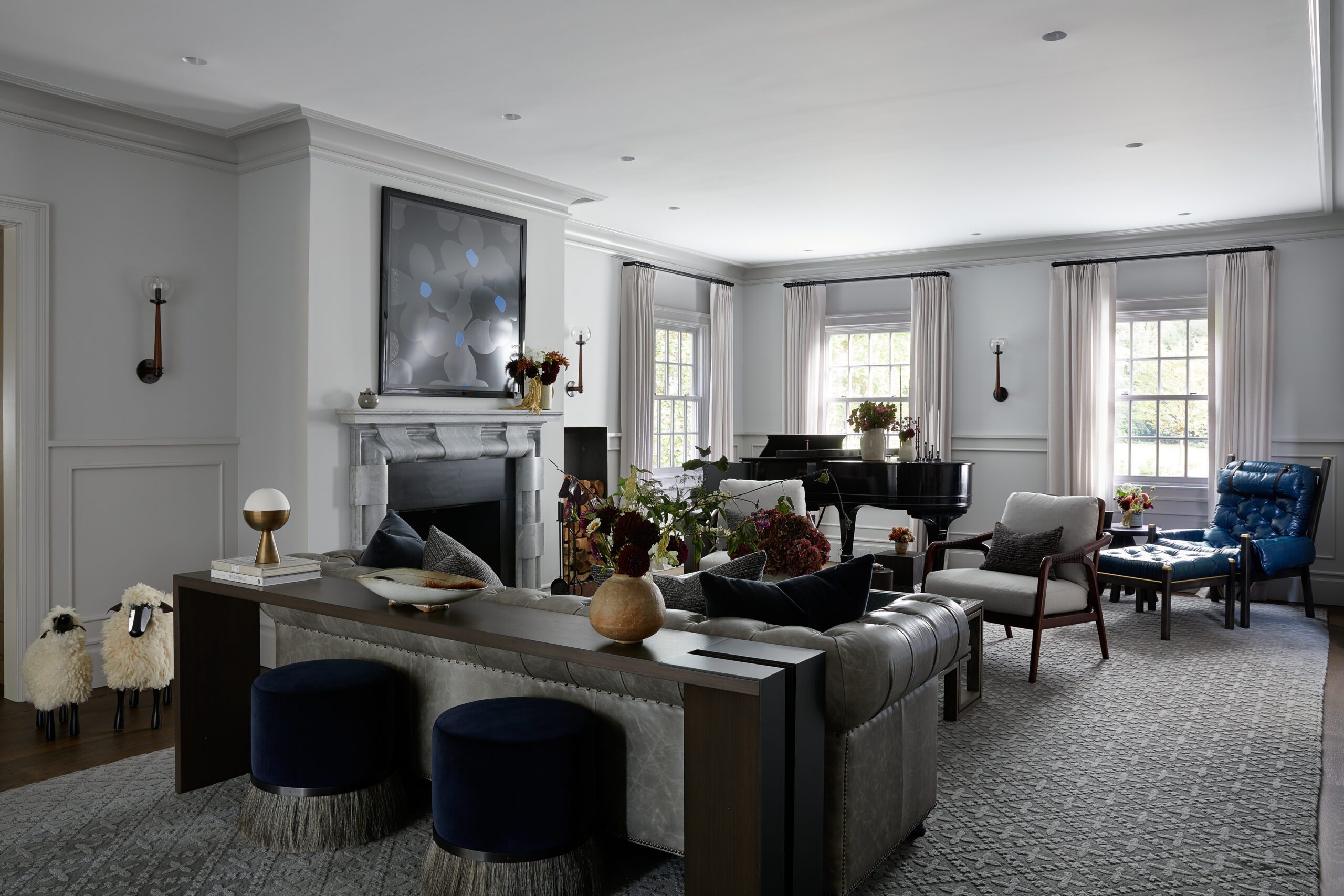
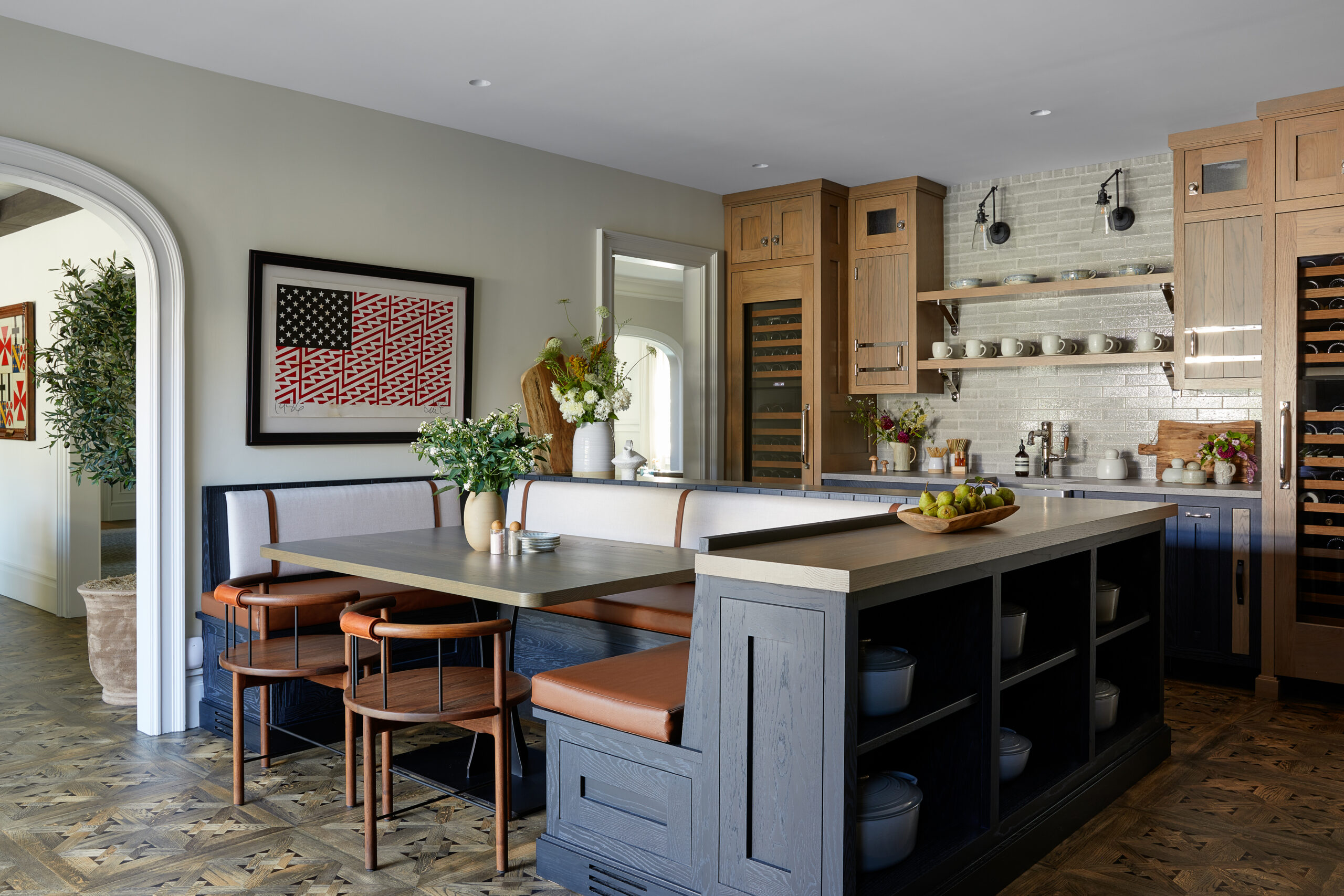
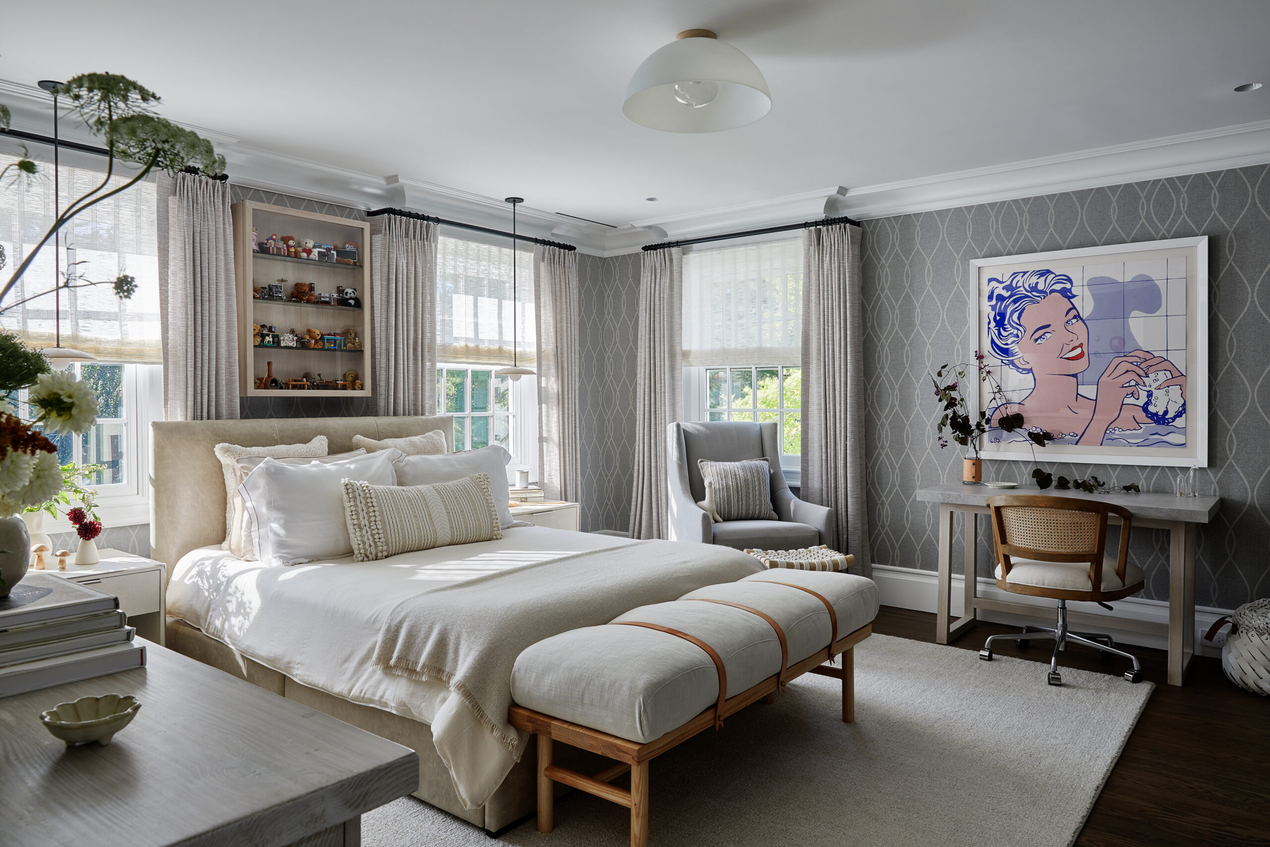
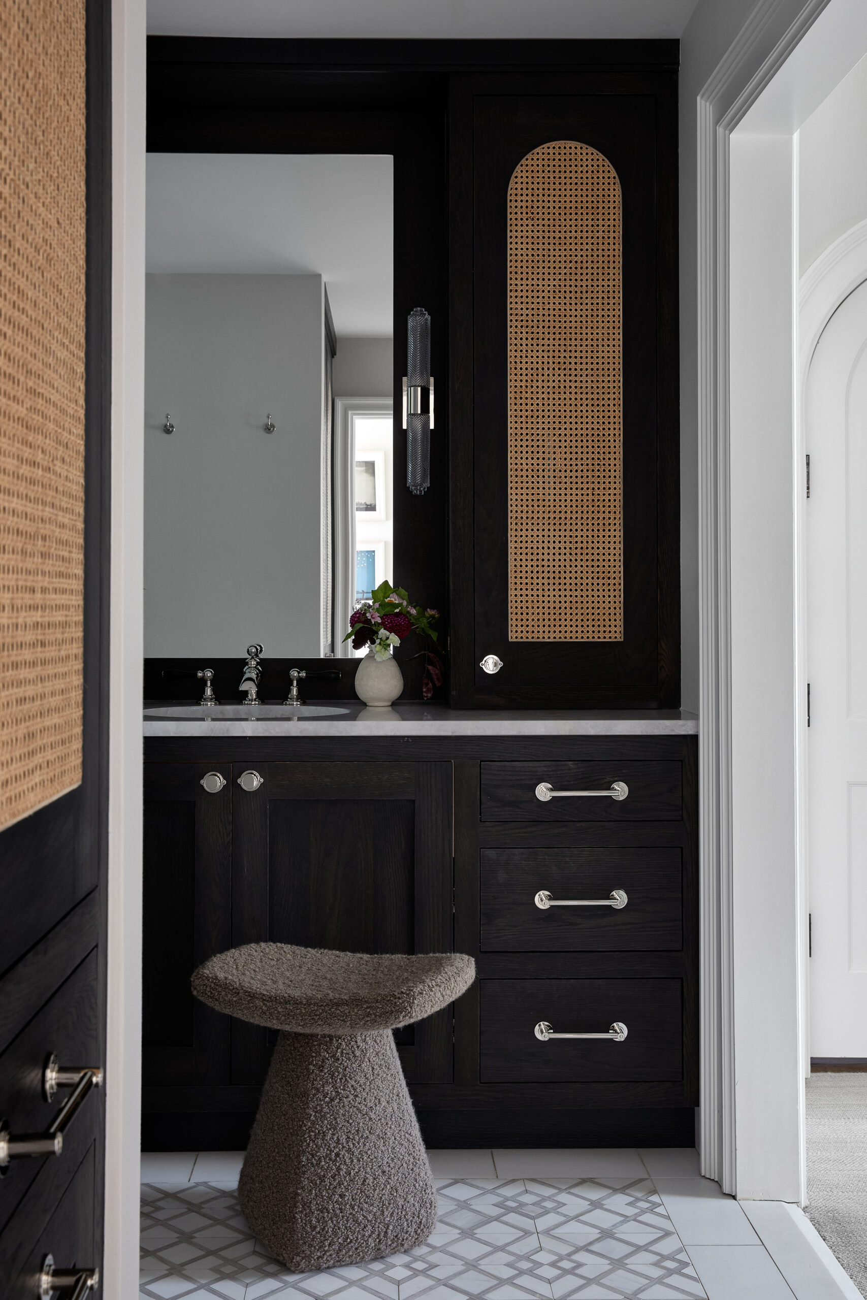
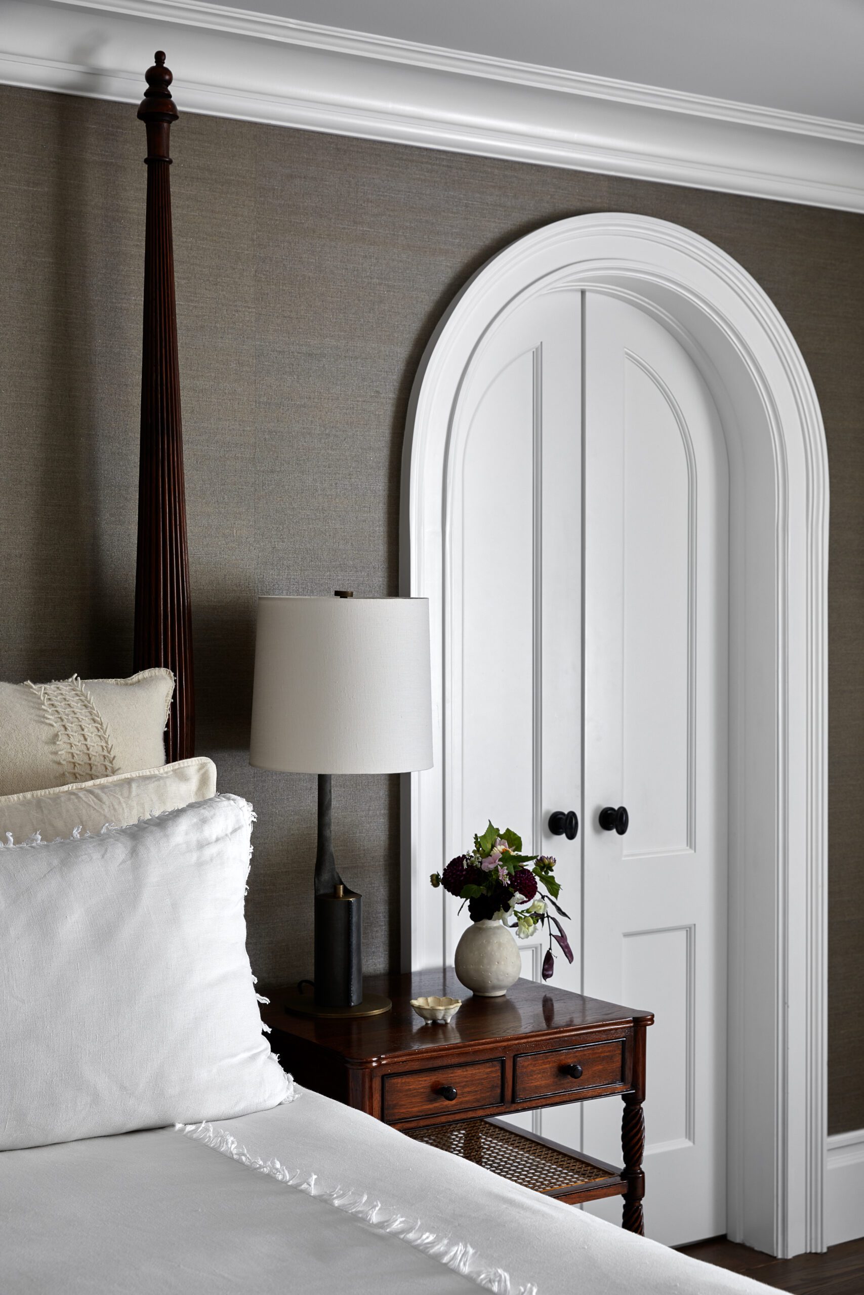
After renovating and revamping the property built in 1928, Becky and her team added thoughtful details to every square foot (all 10k+ of them), transforming the estate entirely. The result is filled with custom millwork, handmade vanities and flooring, and family heirlooms passed down from generations that make this house a home.
Design: Becky Shea Design | Photography: Sean Litchfield
Making a Grand Entrance
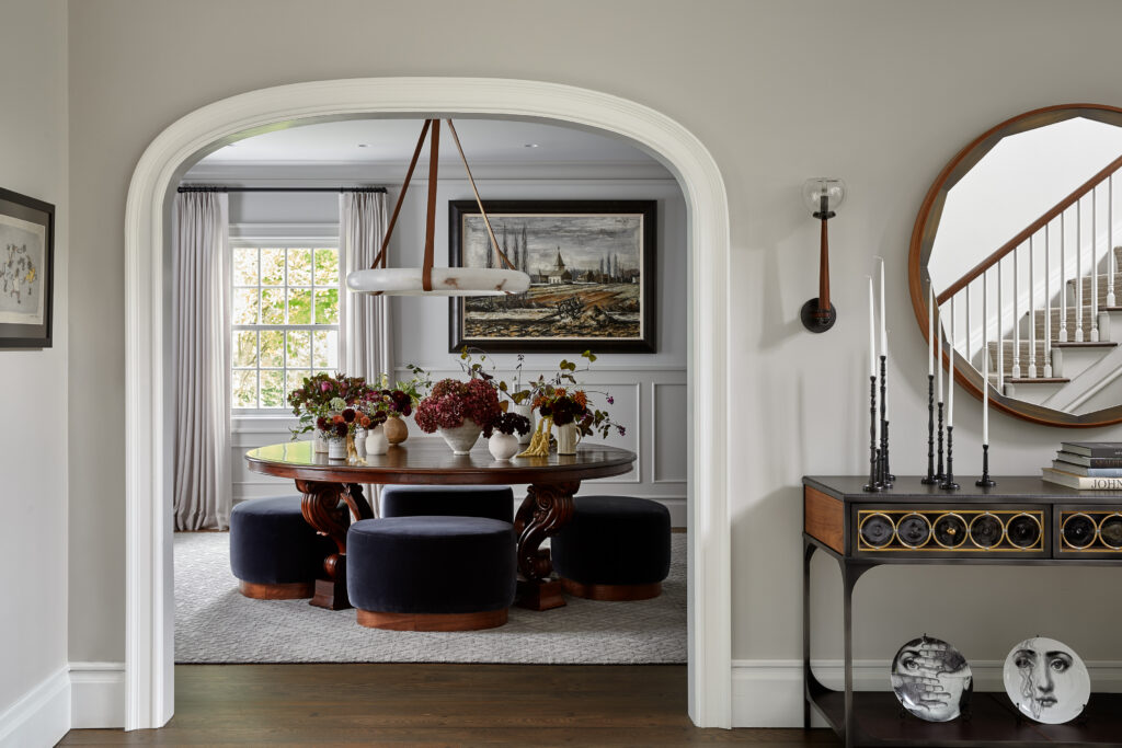
It’s hard to imagine a better way to set the tone for this space than positioning a wine room right off the grand arched entrance. Original flooring, a custom light fixture made of alabaster and leather, and a table belonging to the client’s father ground the space, making it feel equal parts sophisticated and inviting. Who wouldn’t want to entertain friends and exchange gossip over a glass of Pinot Noir in a room like this?
A Case for a Moody Pool House
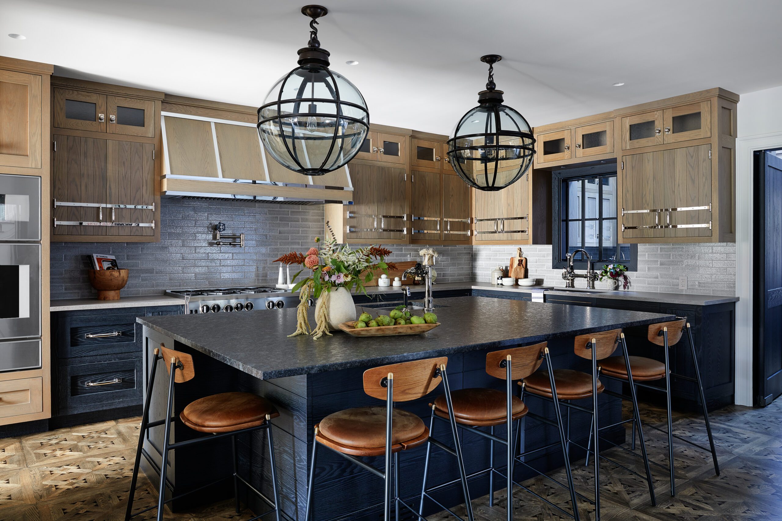
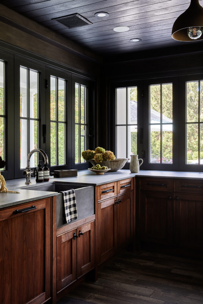
As with many complete renovations, the interiors weren’t the only part of this estate that got a significant makeover. The exterior renovations of the property included a pool house (with a spin studio, gym, and spa inside), a new hardscape, a pergola, a pool, and our favorite — the outdoor kitchen.
While a light and bright kitchen may have felt like an obvious choice for this view-centric space, the contrast of the kitchen’s dark windows and wooden cabinetry provides the perfect twist that draws you into the surrounding property.
A Funky Football Room
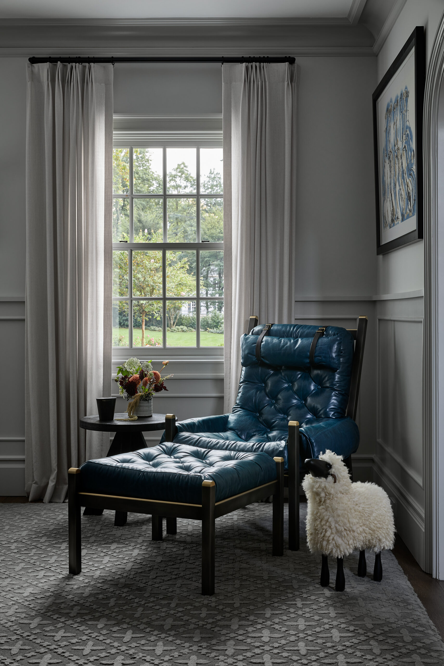
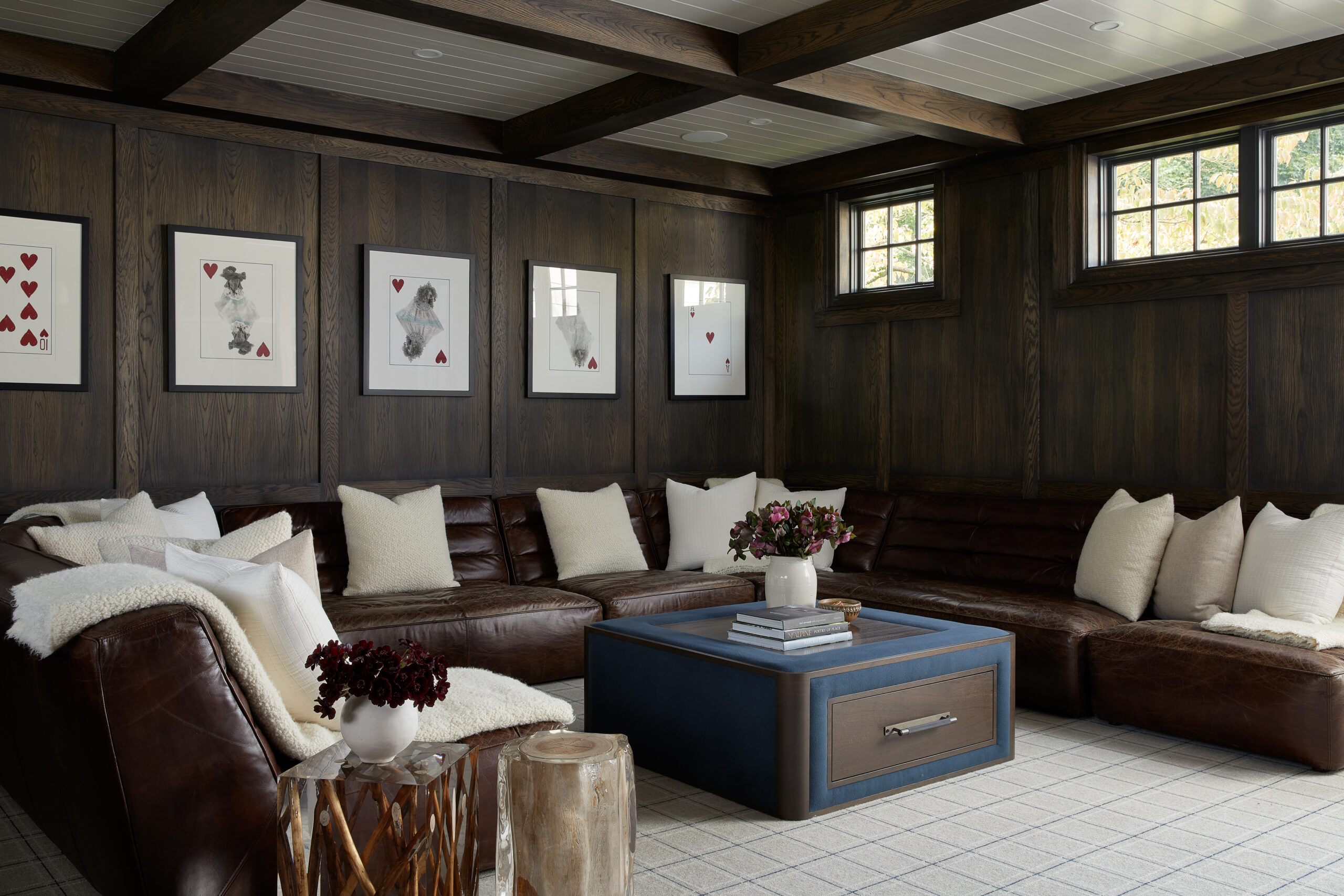
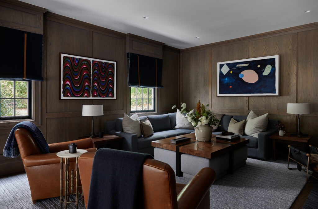
Live-sawn oak paneling makes this “football room” the perfect lounge area for any big game. Re-upholstered club chairs belonging to the client’s dad inspired the furnishings and decor, and custom safari rolls with leather straps frame the windows.
While Becky describes this project as a hodge-podge in terms of style, it’s easy to see her expertise in creating a mood from room to room that feels connected but distinct. The home’s cohesive material palette helps balance the mix of styles effortlessly and has us taking notes on blending influences.
Collectors Grade Speakeasy
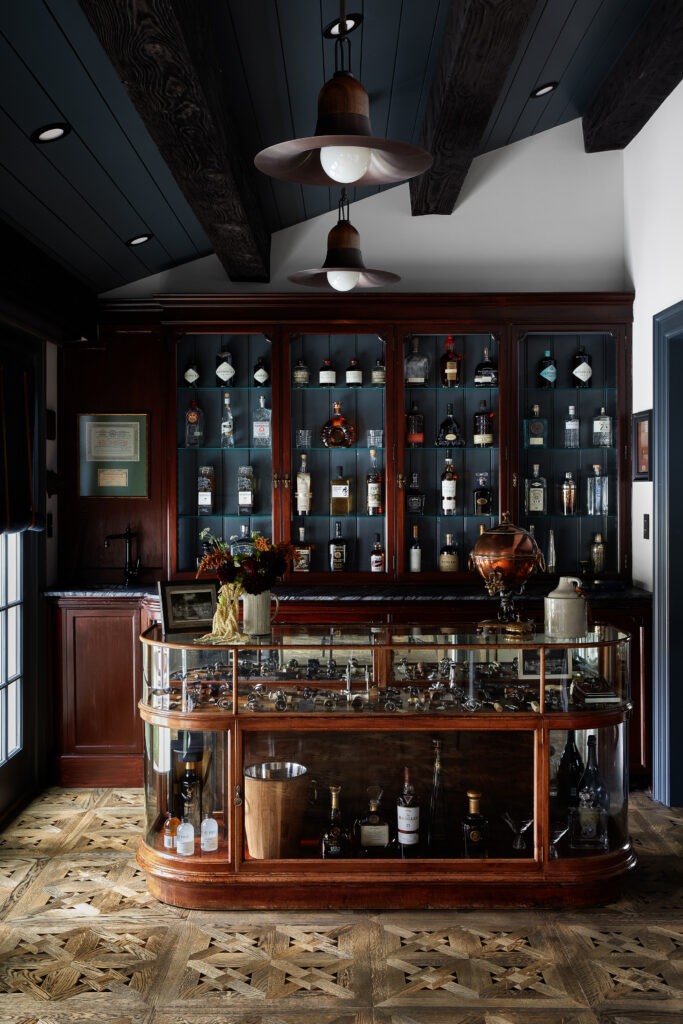
When your client has an original island from his uncle’s prohibition liquor store, the only correct choice is to design an iconic in-home speakeasy. Becky and her team refurbished the original millwork behind the glass shelves to display a few favorite bottles and included all the personal details that take this space up a notch. If you look closely, you’ll notice a corkscrew collection with pieces dating back to the 1600s and a photo of the original bar and home to the wooden island relic. There’s no doubt that any drink would taste better when made here.
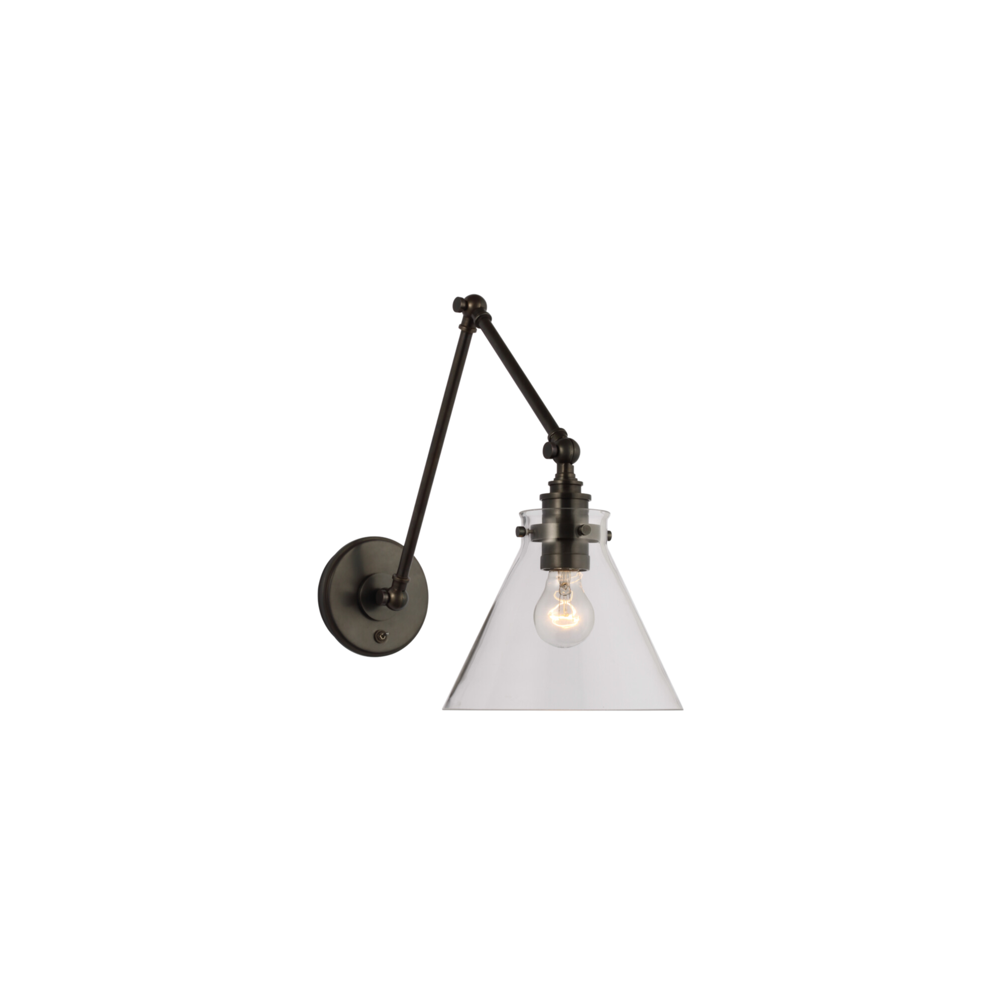
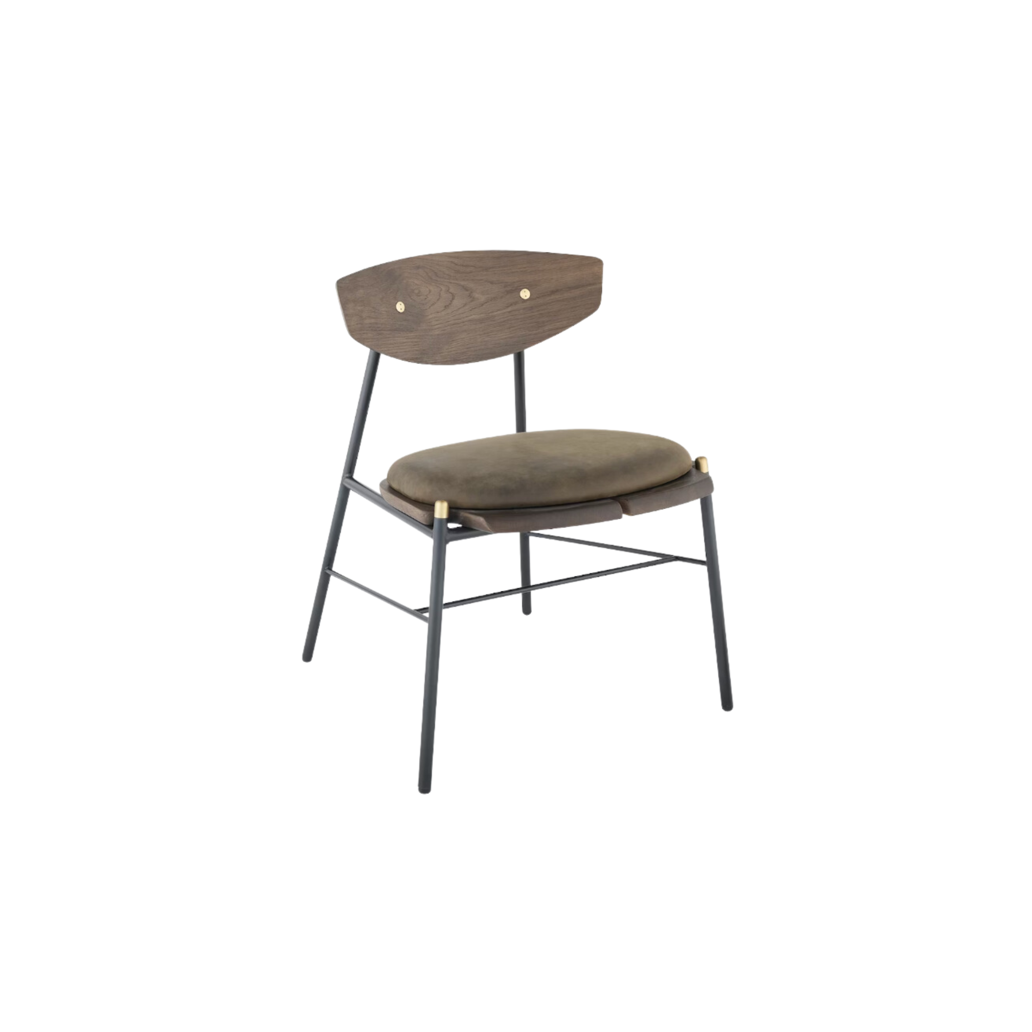
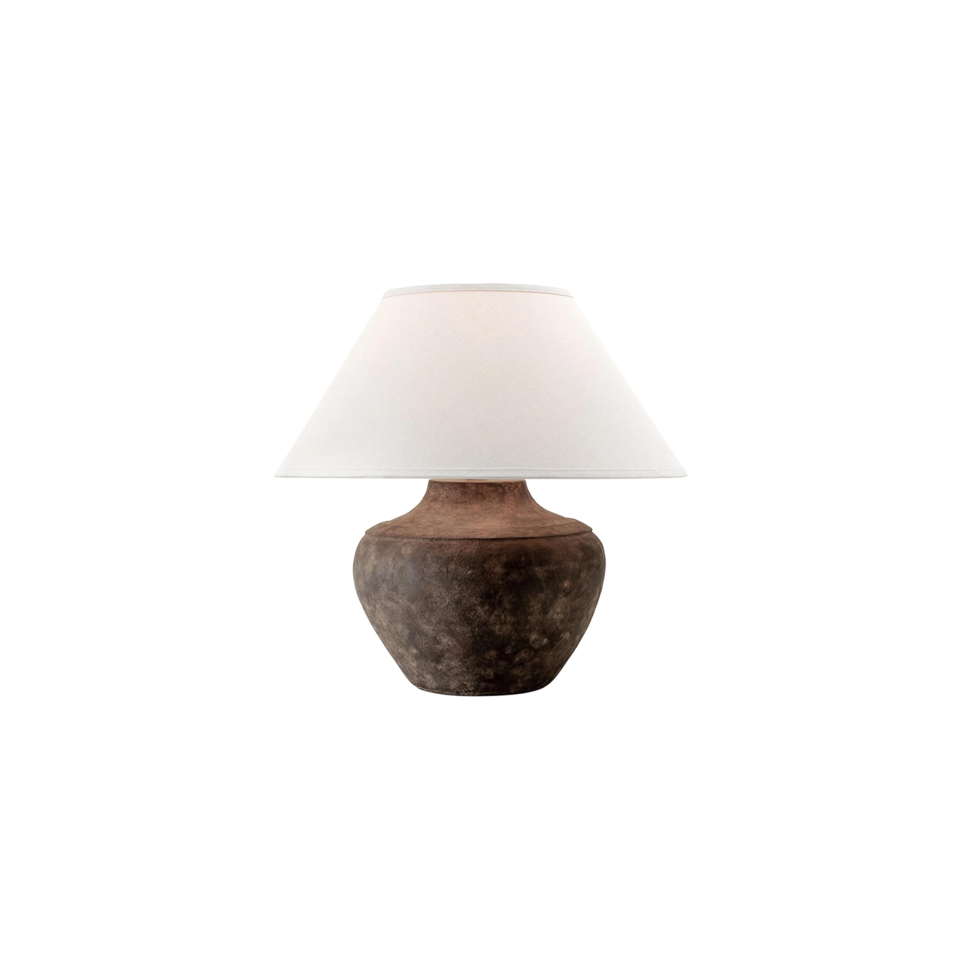
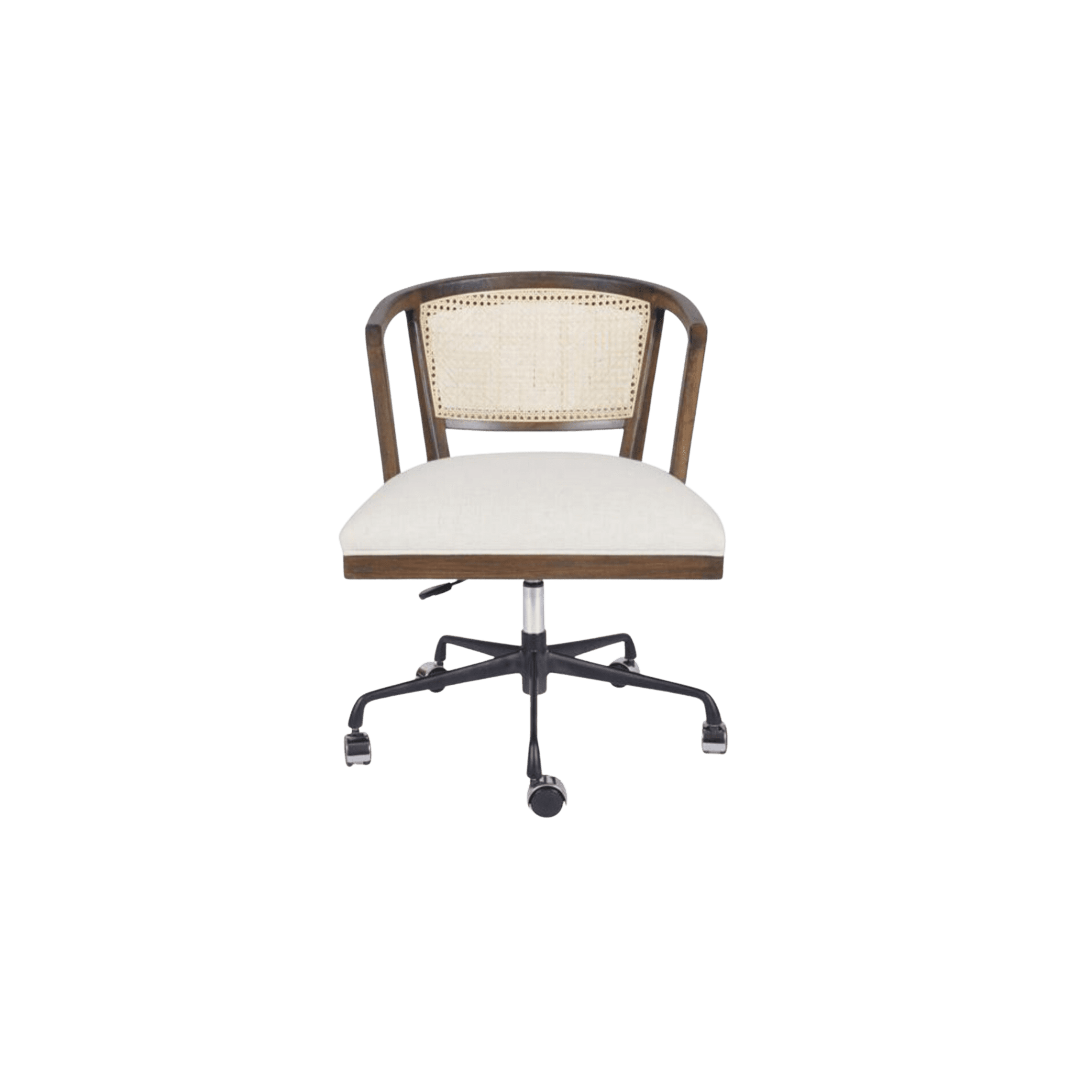
Scroll through the gallery below to explore this project, and shop the look from the design below.
BY: Jasmyne Muir


