Shop


Think Pink: The Psychology, History, and Paint Colors Designers Love
Once seen as too sweet, too trendy, or just too much, pink is having a real design renaissance. It’s richer than its reputation, and more versatile than most people think. From its surprising backstory to the psychology behind the shade, here’s why pink keeps showing up in the best interiors (and why we’re still not over it).
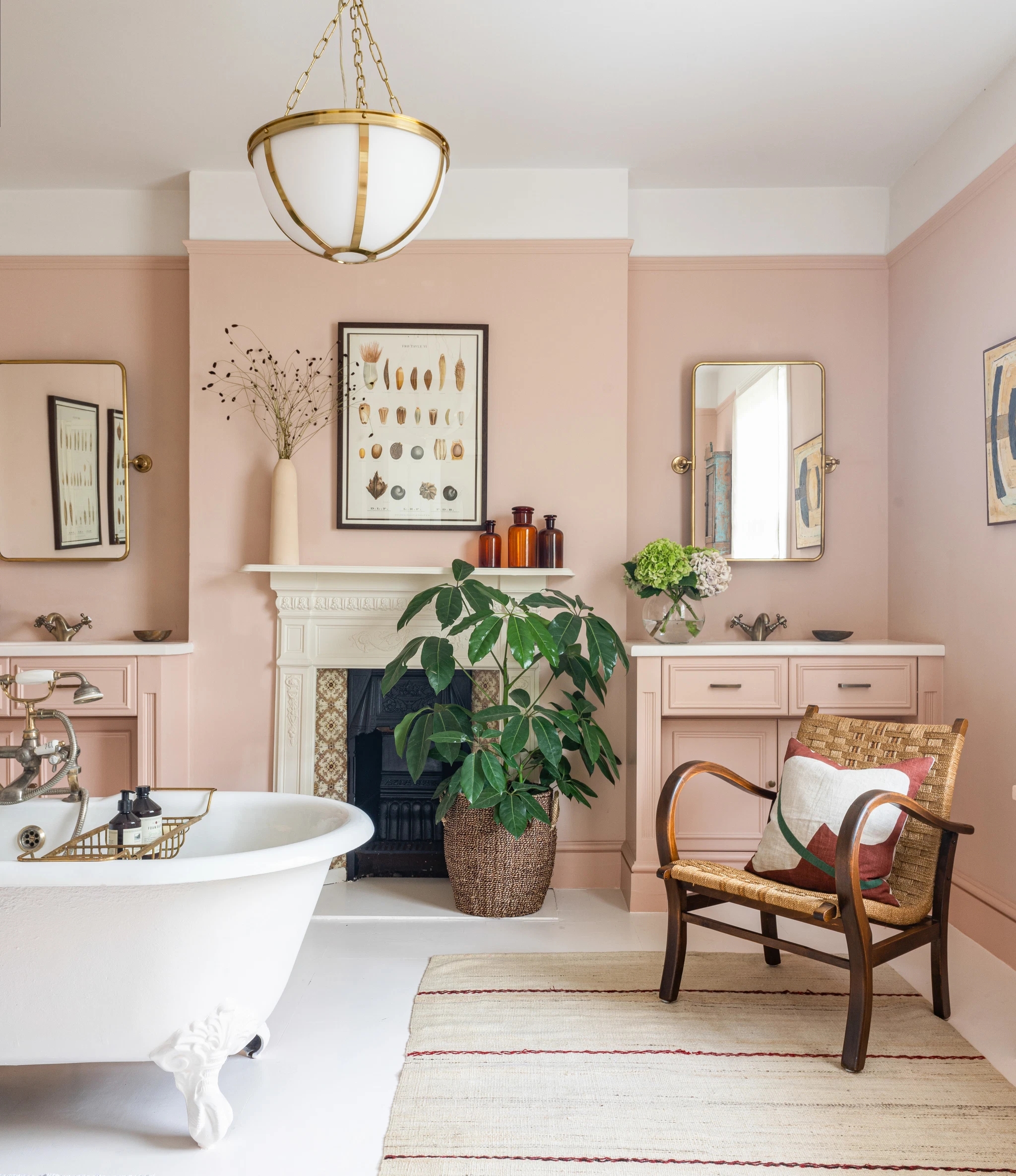
Design by Reath Design, Photography by Laure Joliet
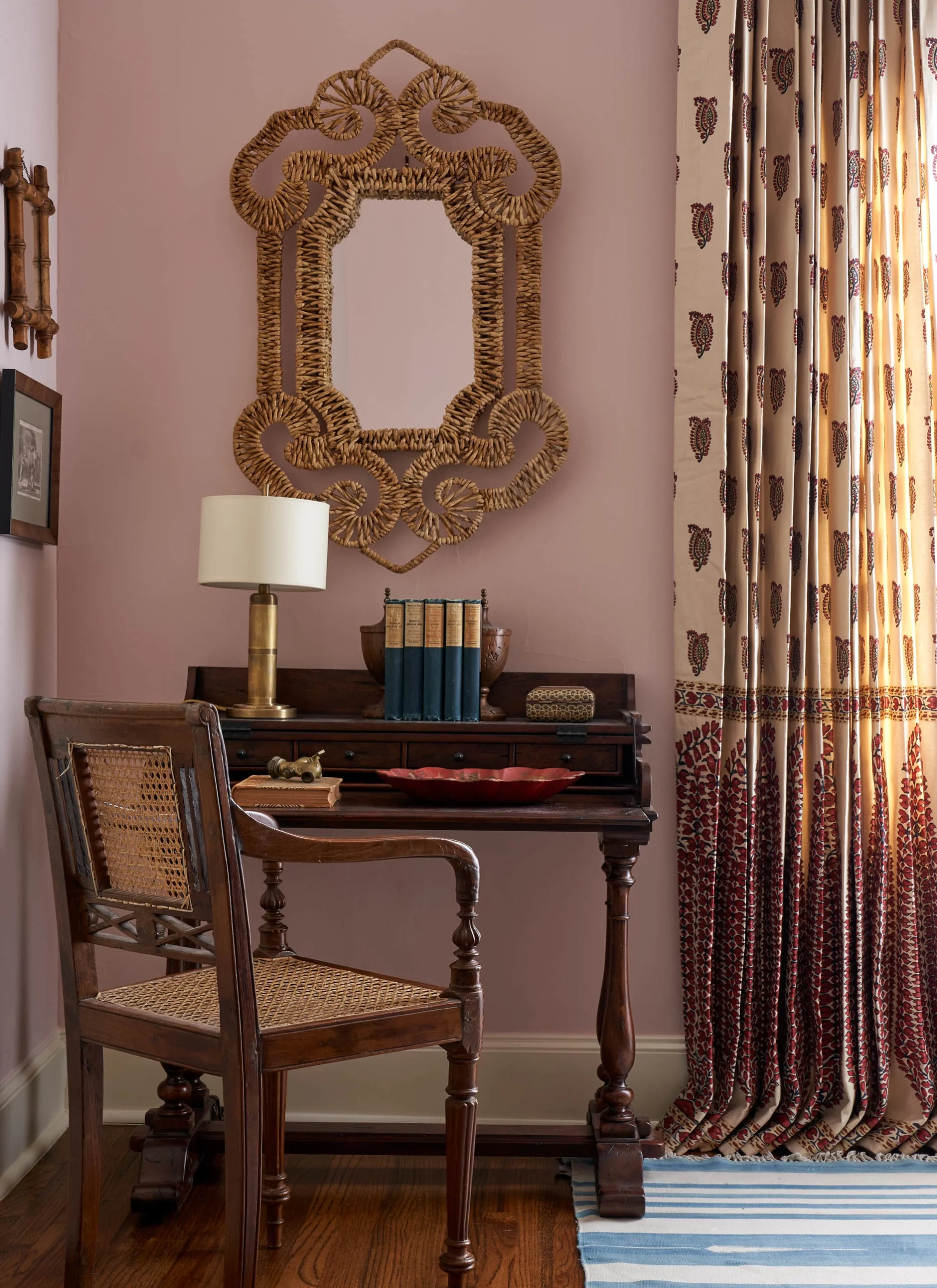
Pink has always carried a lot of cultural baggage. It’s been boxed into binaries—feminine or not, trendy or tired, serious or frivolous. But the truth? Pink is a shapeshifter. Unlike mauve, which leans more towards violet and earthy tones, pink is emotional in a louder, more immediate way.
And sometimes, pink doesn’t just change how a space feels—it changes how people feel too. In the late ’70s, a specific bubblegum-like shade was used in prison holding cells as part of a psychological experiment. The goal? To reduce aggression through color alone. The color became known as Baker-Miller pink, and while the science behind it was shaky at best, the story stuck. It became part of color psychology lore—later nicknamed “drunk-tank pink” and occasionally referred to as the “Pink Room Effect”—the idea that pink has the power to influence behavior. Now, designers are using pink not for shock value, but to gently shift the mood of a space.
Design by Shannon Eddings, Photography by Molly Culver
The Power and Psychology of Pink
Long before it was seen as delicate or girlish, pink was a sign of strength. In 18th-century Europe, it was a go-to for men’s fashion: vibrant, expensive, and associated with status. It wasn’t until the mid-20th century that pink got coded as feminine, thanks to postwar marketing and a heavy dose of consumer culture.
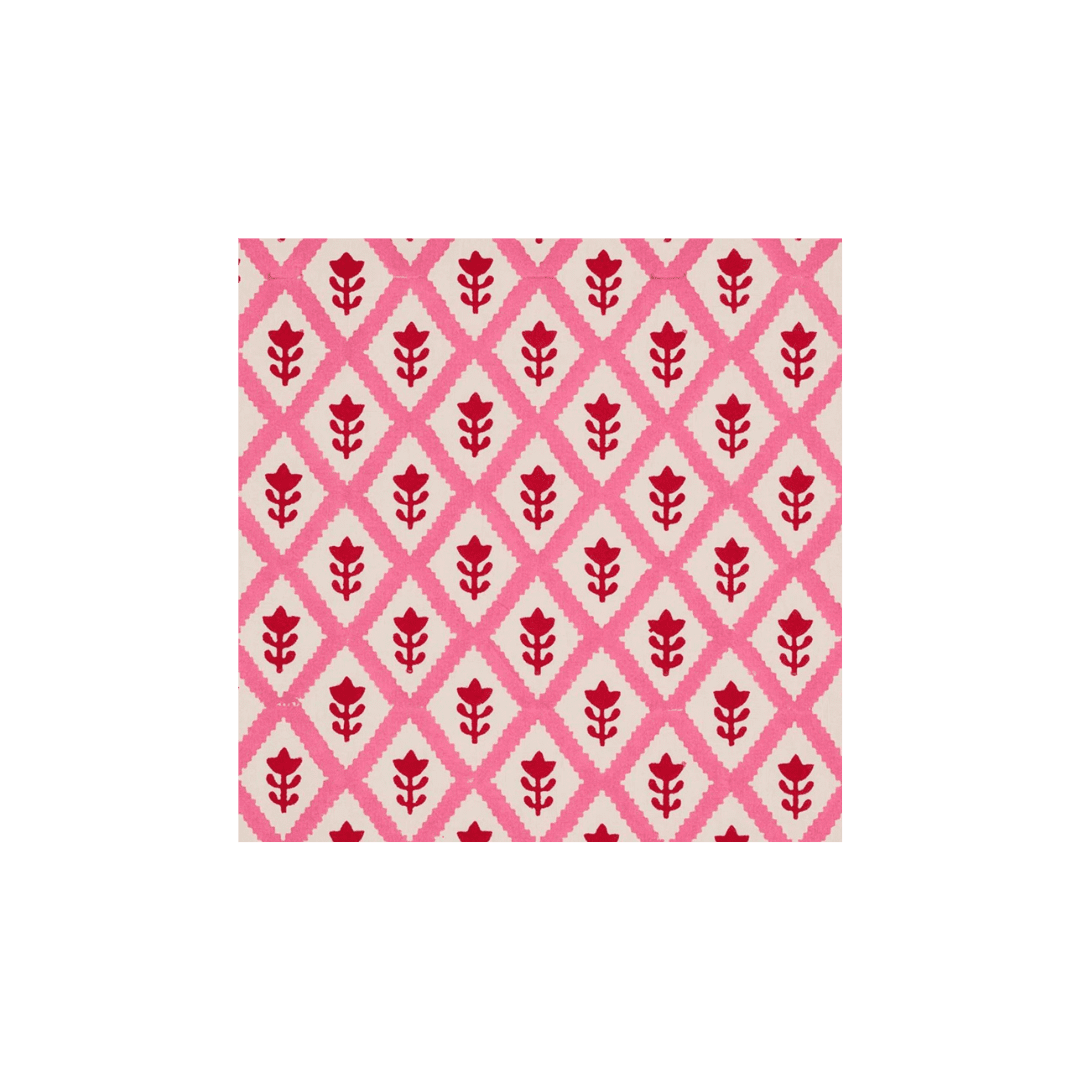
From there, pink went through its cycles: salmon in the ’80s, dusty rose in the ’90s, millennial pink in the 2010s, and the full technicolor punch of Barbiecore more recently. But underneath all of that, the psychology has remained: pink is a feeling. Depending on the shade, it can slow the heart rate, evoke childhood memories, add a layer of calm, or intensify a space.
It’s that range that makes it so compelling in interiors. A pale pink can act like a neutral. A bold fuchsia can spark energy. Somewhere in between, you get warmth, romance, edge, even rebellion. It’s a color that contains multitudes. And in the right space, it makes magic.
Design by Anna Haines, Photography by Rachael Smith

Photography by Ashok Sinha
How Designers Are Using Pink Now
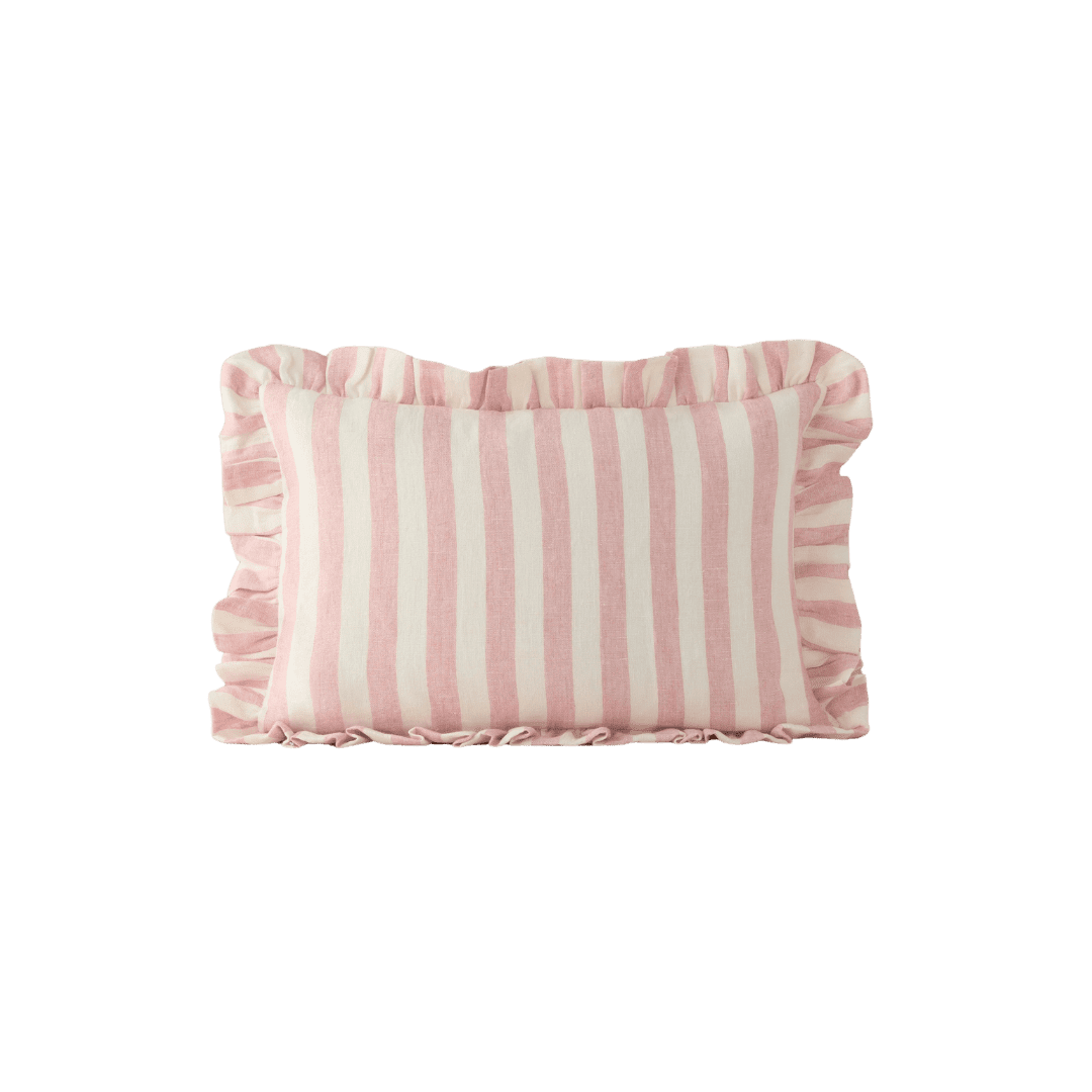
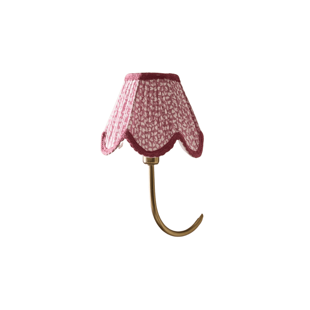
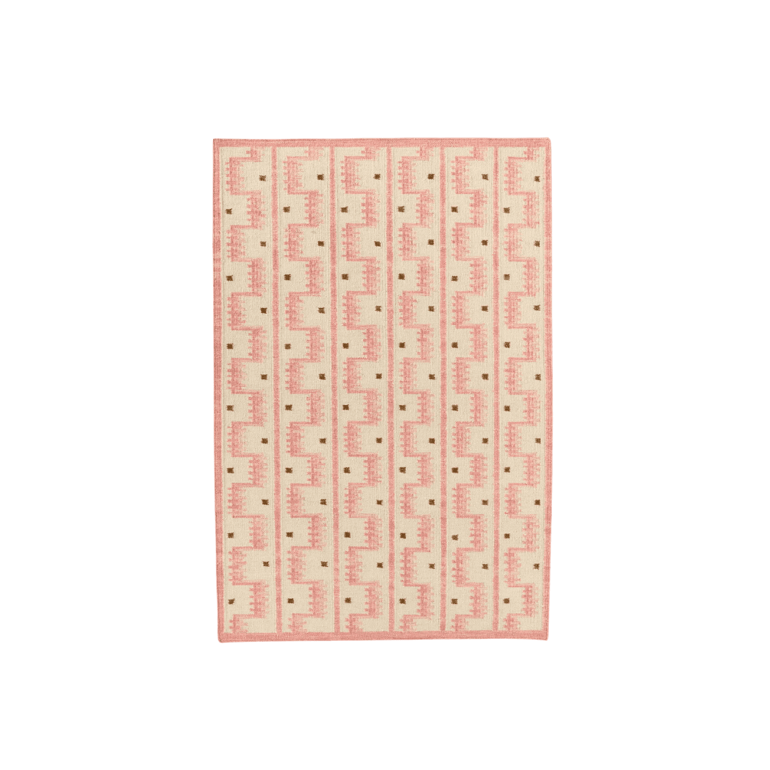
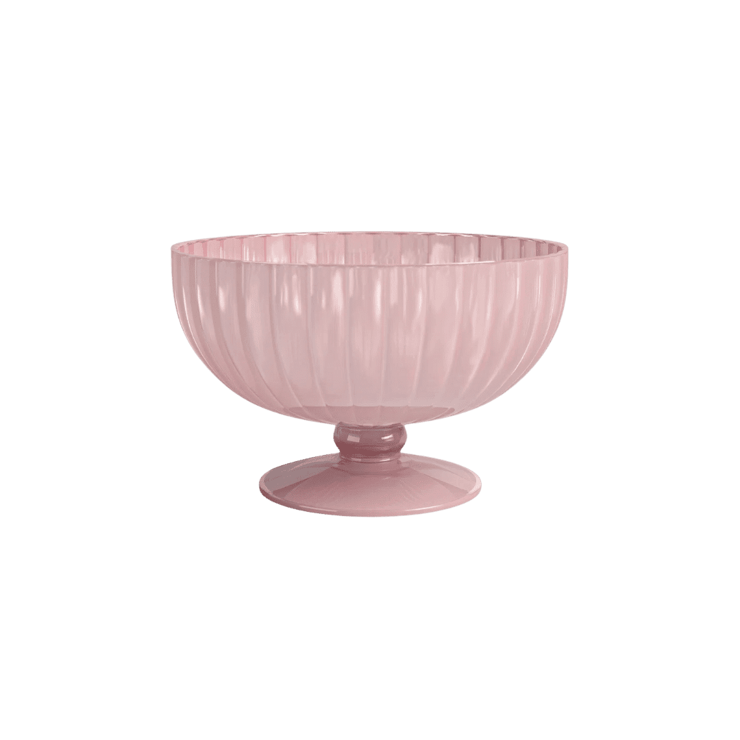
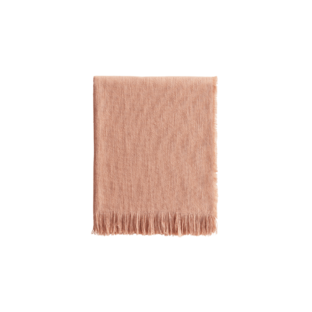
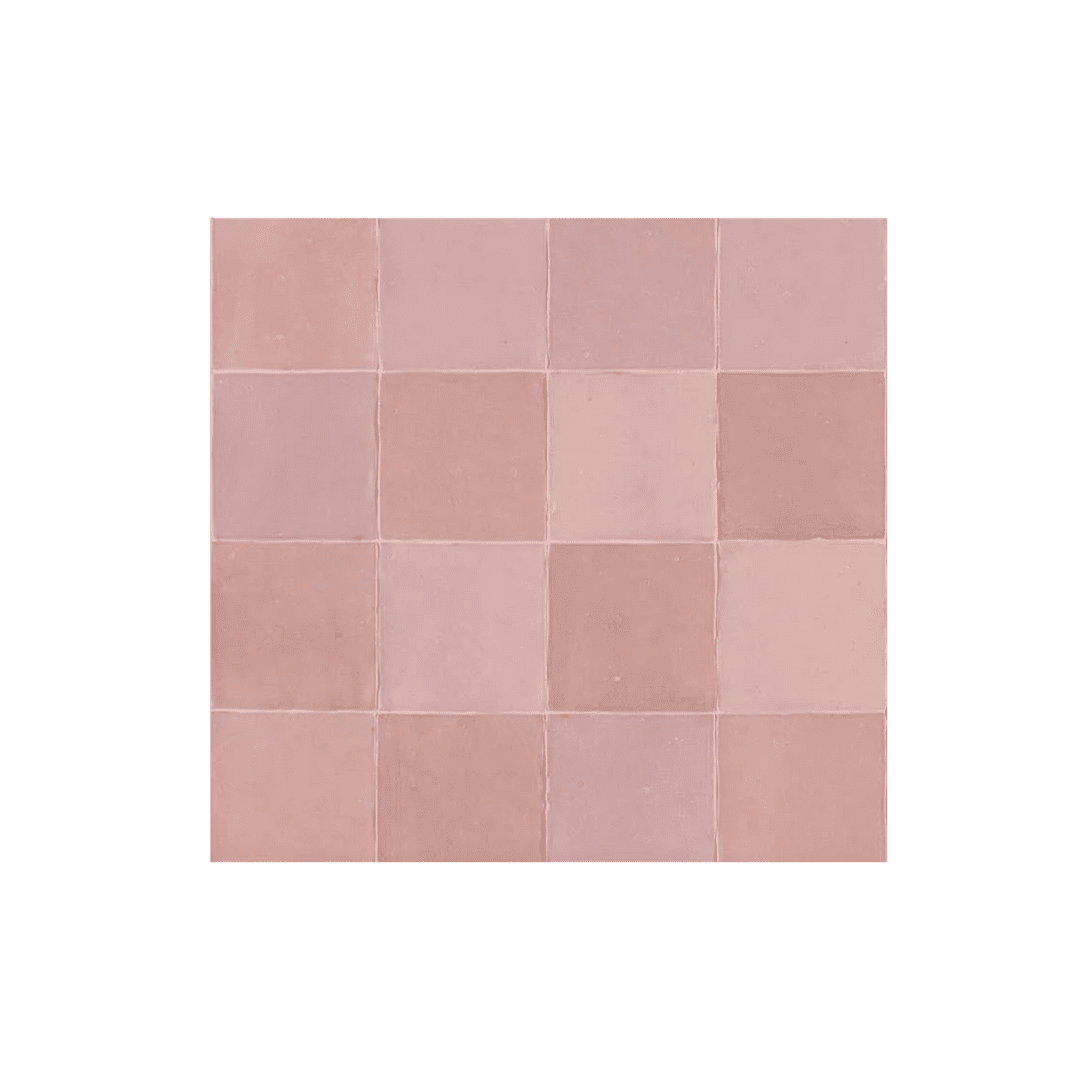
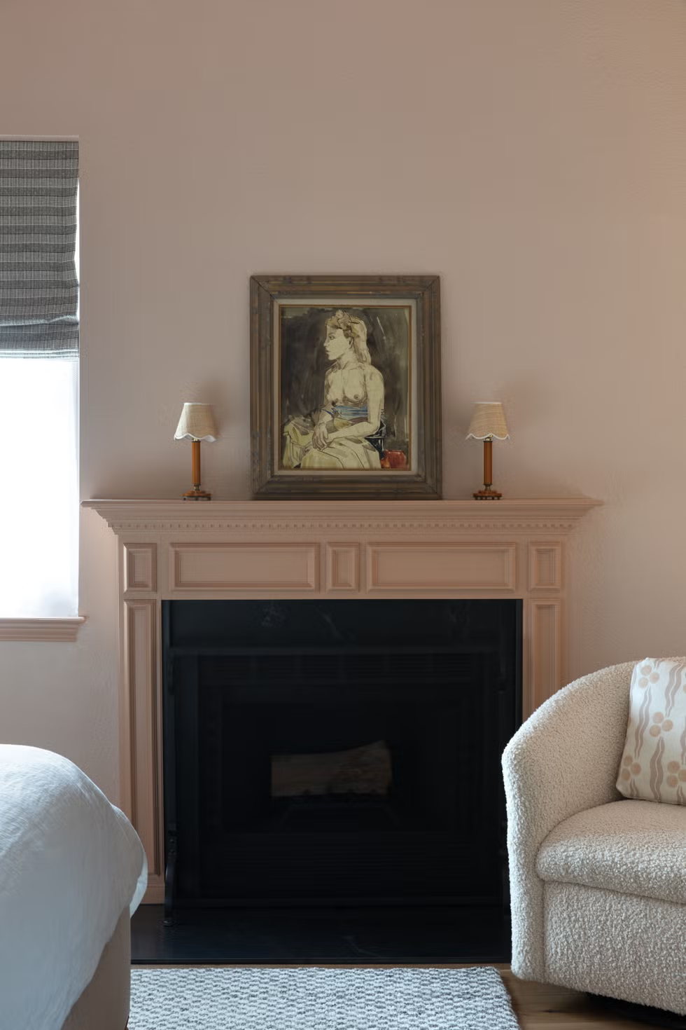
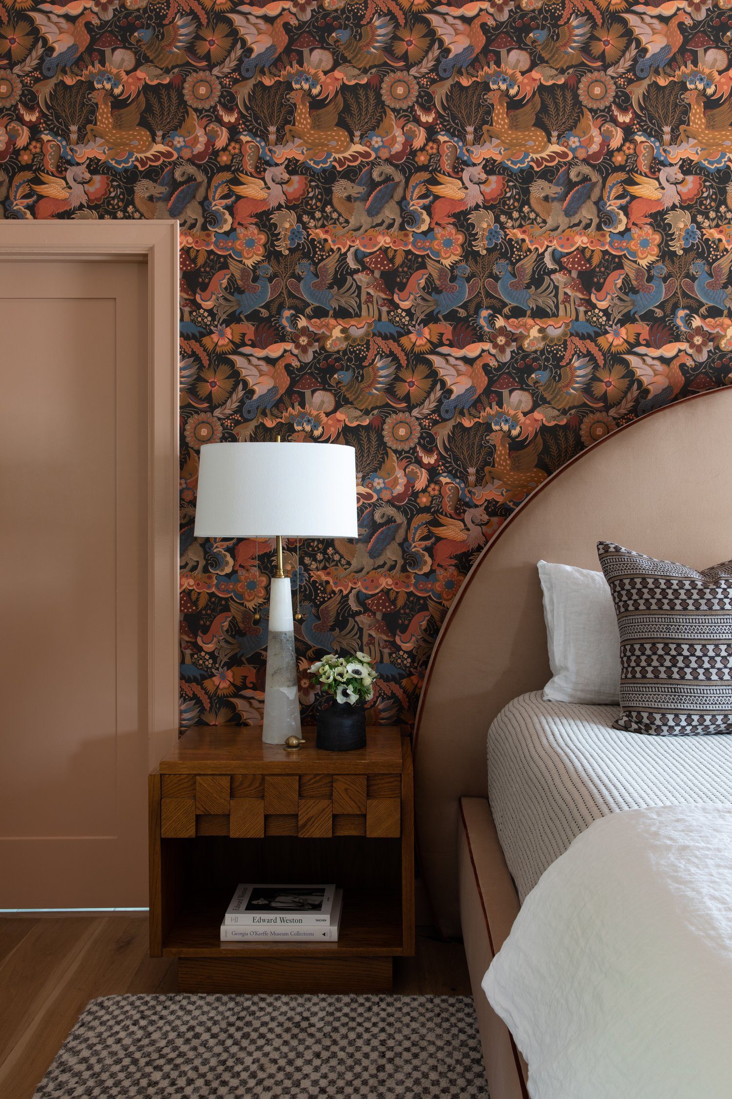
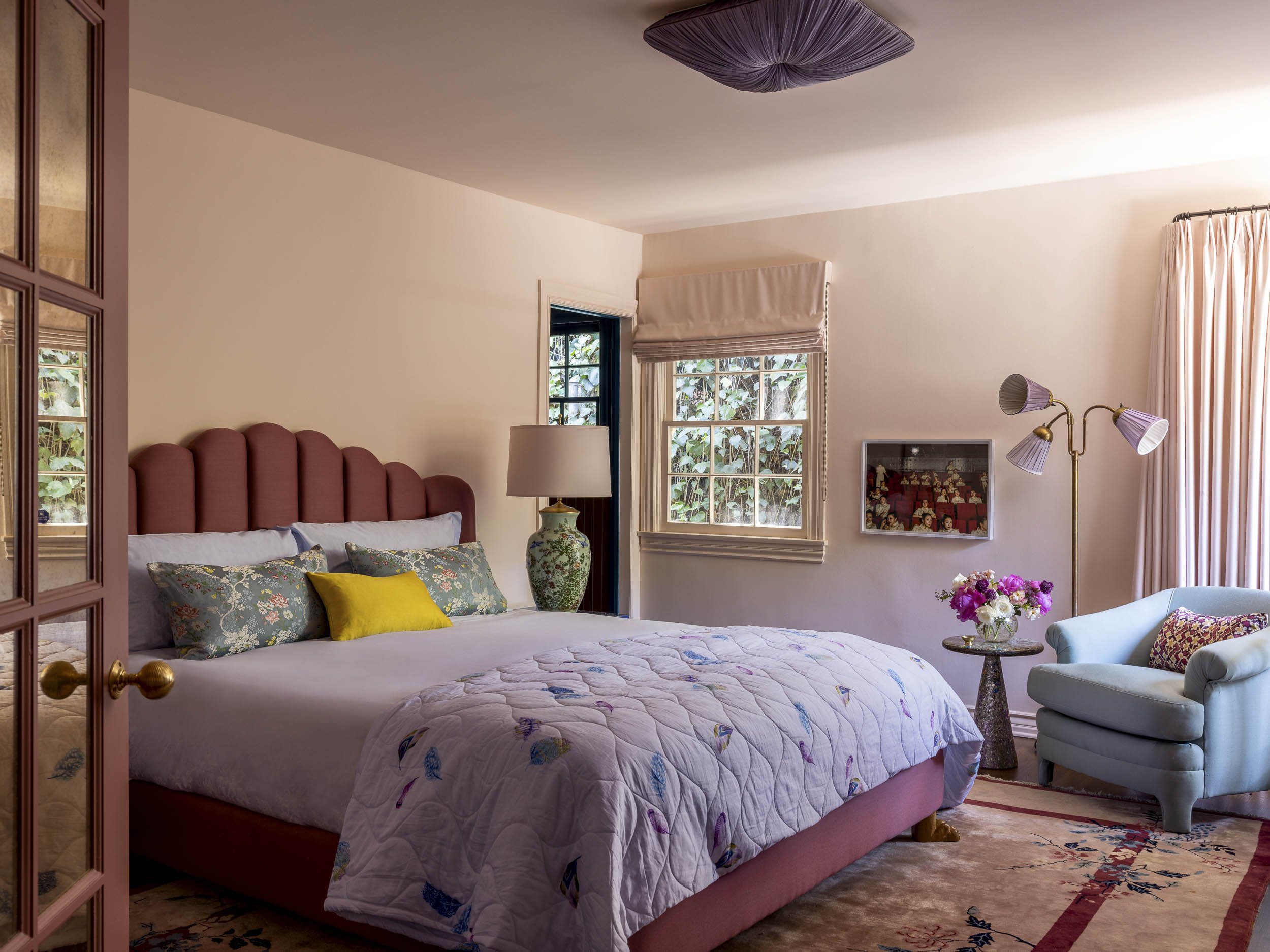
Today, pink is being used with more intention and more edge. In kitchens, designers are leaning into clay-toned pinks that evoke a sunbaked and grounded feel. In bedrooms, it shows up as soft upholstery, limewashed walls, or even tone-on-tone trim. We’ve seen it on ceilings, bathroom tile, and in color-drenched moments that feel rich and cocooning rather than too sweet or safe.
Texture is doing a lot of the heavy lifting. Matte finishes, natural fibers, and imperfect surfaces keep pink from feeling too polished. And the color pairings are more innovative, too—think muted burgundy, tobacco brown, or soft green. The point isn’t to follow rules about where or when pink “belongs.” It’s about figuring out which pink belongs in your space.
Design by Meredith Ellis, Photography by Nathan Schroeder

Design by Reath Design, Photography by Laure Joliet
Pink Paints We Keep Coming Back To
Whether you want a soft whisper or a stronger statement, there’s a pink for that. These are the shades that designers turn to again and again, for good reason.
An earthy pink with warm undertones and a subtle vintage depth. It leans more muted than rosy, making it ideal for cozy dining rooms, enveloping bedrooms, or anywhere you want pink to feel grounded.
A soft, chalky pink with a whisper of gray that keeps it from feeling sugary. It works beautifully in north-facing rooms, where its warmth balances cooler light. Think primary bedrooms, reading snugs, or powder rooms with a little charm.
A clean, barely-there pink with subtle peachy undertones. Fresh without feeling cold, it reads almost like a blush-tinted off-white. A safe entry point for pink on walls, especially in sunlit living spaces or soft, modern bedrooms.
Rosy Outlook by Sherwin-Williams
A clear, mid-tone pink with cheerful energy and just enough saturation to hold its own. It’s friendly without being loud—ideal for a kid’s room, laundry room, or anywhere you want a dose of optimism without going full fuchsia.
36 Hours in Marrakesh by Backdrop
A terracotta-forward pink with earthy, clay-like depth. It brings warmth and richness to walls without veering orange. Perfect for dining rooms, entryways, or any space that benefits from a sunbaked, desert-adjacent palette.
A true pink that leans neither too warm nor too cool, and vibrant but not loud. It’s polished enough for grown-up spaces but still feels fresh and playful. Try it in a bathroom or layered against crisp white trim for contrast.

Design by Meredith Ellis, Photography by Read McKendree

Photos Courtesy of (Left) Farrow & Ball, (Right) Lick
Design by Reath Design, Photography by Laure Joliet

Design by Rebecca Amir, Photography by Kirsten Francis

Photo Courtesy of Perry Seymour-Marsh
BY: Daniela Araya
Shop