Archway to Heaven: Primary Bathroom Reveal
It’s finally reveal day for our primary bathroom remodel! After sitting on these photos for a month, I’m so happy to be able to share them here on the blog. Domino got the first look and we chatted all about the technical aspects of the renovation. Today, I want to give you the full tour of the space, including a look inside the arch shower room, the two vanities, our pretty lighting and even into our water closet.
Every time I step inside our bathroom I feel overcome with joy. They say that the spaces around you have the power to transform your mood, and I don’t think I realized just how true that was until we remodeled our primary bathroom. You can view my initial design plans here. I was deciding between three different concepts and I’m so pleased with how I took a little bit of each and crafted the final design.
The project came together quickly and smoothly, mostly in part to an incredible contractor and careful planning. We’ve worked with Austin’s Home Renovation on our kitchen remodel, our guest bathroom, our entryway, staircase, and my parents entire home. They are the kindest, most honest, easiest to work with contractors and I feel so lucky to get to continue projects with them.
The huge game changer in this project though, was working with Alexander James – an incredible tile resource to designers and design lovers alike. Their customer service was incredible, helping me calculate how much tile I needed, remembering to ask about little things like how I’m finishing the tile around the edges, quick shipping and super clear communication. They ship direct from the manufacturer, cutting out the middle man and their massive catalog of products include designer favorites. You can shop their tile collection here and use code IDCO15 for 15% off your entire order.
I’m sharing links to everything we used in this bathroom below, the full photo tour and scroll down for the before.
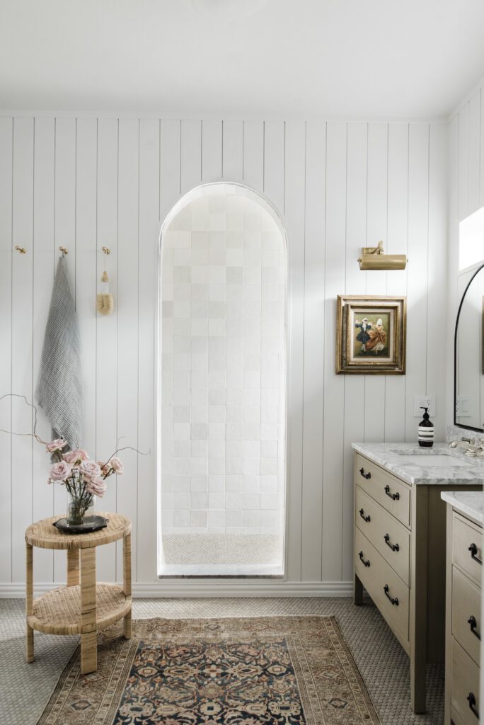
That Archway Through
This archway was absolutely the launching point for the entire bathroom plan. I knew I didn’t have room to make a shower and a bathtub work without re-plumbing the entire bathroom. One night I literally had a dream about ripping out the bathtub, closing off the shower area with a wall, and just having a single archway leading into the double shower. You can watch my Story Highlights here to see my plan as it unfolded in real time.
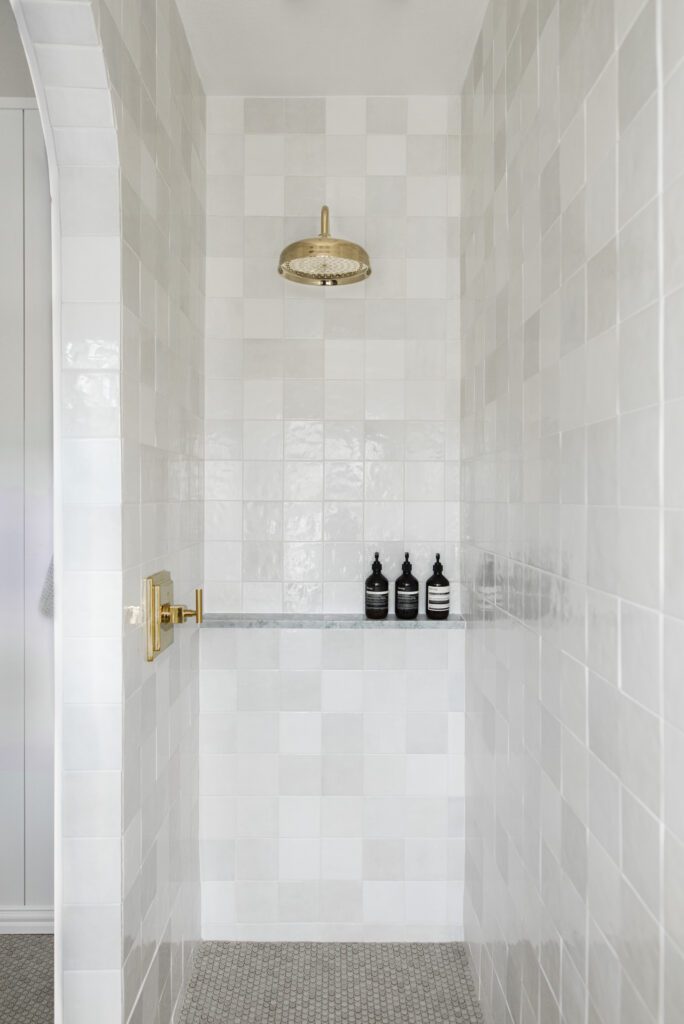
The Tile
The tile really steals the show in here. We ran this Alexander James Pumice Penny Tile throughout the entire space, for a seamless floor that helped make the now smaller space, feel much larger. I wanted a very organic, tone on tone look, so we used Oyster Gray grout. This Penny Tile runs from the shower room floor, into the main area, into the toilet room and even into the linen closet. Because of their small size (they really are the size of a penny), the tile isn’t slick at all. It feels much safer walking around in bare feet, in and out the shower. It’s also a total foot message when you’re steaming up the shower room washing your hair.


The walls of the shower are this beautiful 5 inch square Handcraft White Tile from Alexander James. I used bright white grout with 1/8 inch spacers. I love the organic look of these tiles stacked perfectly in rows, with subtle color variations. Do note – the White has lots of variety to it and is not perfectly matching. You’ll want to open the boxes up and make sure you’re laying your tiles in a random pattern so the colors are evenly varied. One note on the arch – we had to cut the 4 inch square tiles in half at the top of the curve. Without doing that, the archway would be more hexagonal and not as nicely shaped.
The Hardware
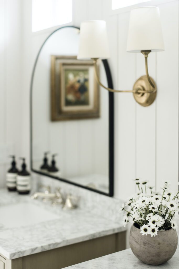
Per usual, I ignored all rules and mixed three kinds of metals for my hardware. I also used plumbing fixtures from different vendors. If you’re looking for a perfect bathroom, this isn’t the way to go. I really wanted this space to feel old world, collected, and charming. By mixing the finishes and tones, I think it helped pull the “builder basic” out of this space. Just like not wanting to match your furniture, I feel fixtures in the bathroom is kind of the same thing.
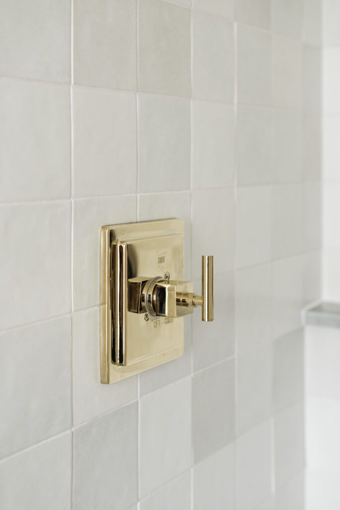
The Walls
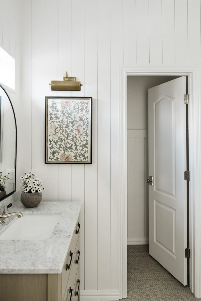
While the shower room is tiled floor to ceiling, the main area of the bathroom was shiplaps floor to ceiling. We painted the shiplap Snowbound by Sherwin Williams in an eggshell finish and it’s the prettiest soft white. In the water closet, I wanted it to be a bit different, so I only ran the shiplap up 5 feet and repeated the same shaker style trim that we did in the bedroom and guest bathroom. It’s currently also painted Snowbound, but I’ve been toying with the idea of painting it something unexpected, like a dusty heather.

The Rug
A great vintage rug was key to pulling off this look in the bathroom. I knew going to Passerine Home (formerly District Rug Shoppe) would get me not only the perfect rug aesthetically, but also the highest quality. I showed Georgia pictures of the tile we were using and measured my space. Instantly, she sent detailed photos of this one and I purchased it immediately. Its low pile makes moisture a non-issue and I just make sure to wipe up any significant splashes that land on it. Even our robot vacuum can easily move from the tile to the rug and clean it without ever getting stuck. Final note: Vintage Rug > Bath Mat
The Risks
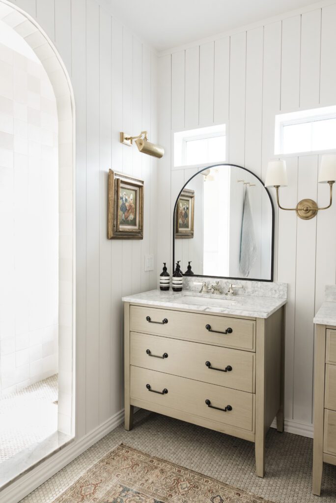
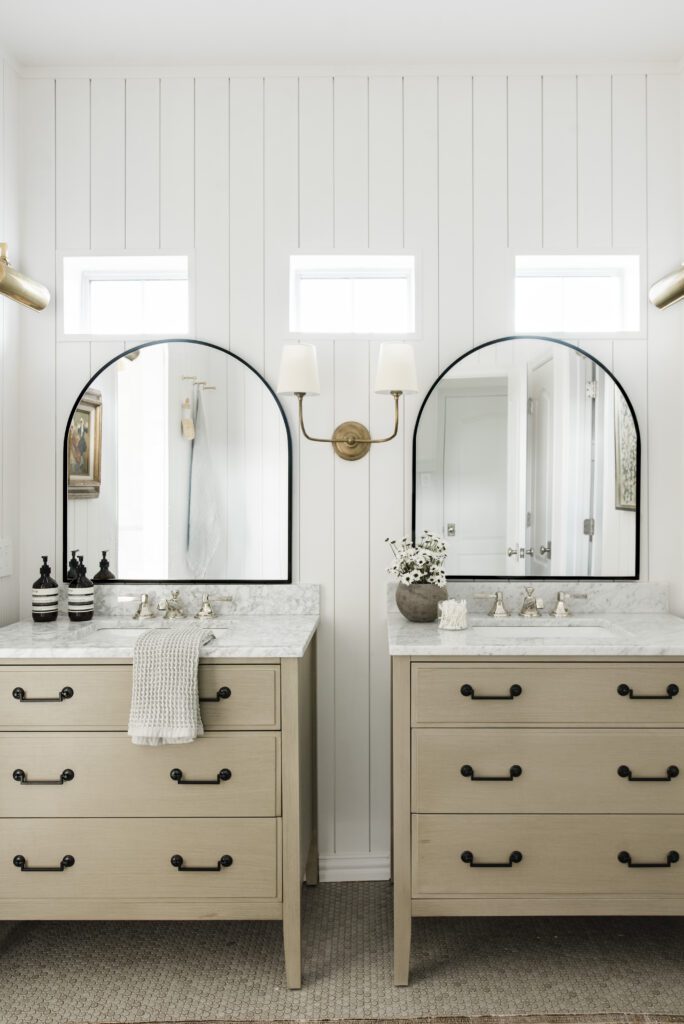
Once I decided on the archway, the rest of the plan just fell into shape. I knew we would be replacing the old vanity, and I wanted something that felt custom, without the custom price point (don’t we all?). I found these pretty vanities in the perfect mushroom color. They had white marble tops and pretty black hardware. I loved the fact that they were all drawers, because I find drawers in a bathroom extensively more useful than cabinets.
After measuring, and re-measuring, I know they’d fit perfectly in the new, smaller, main area of the bathroom. This was definitely a design risk – I couldn’t find ANY photos on Pinterest that showed two individual vanities next to each other. They were always one long vanity, or had something else between them like a the tub or a linen closet. Despite the risk, I’m so happy with the results. It feels cozy and cottagy and charming.
The second big risk was making those miniature windows work. There were three along the top of the single wide mirror before, and removing windows was neither in the budget, or HOA approved. I decided to kinda just go with it. We trimmed them out just like we did to the windows in the kitchen, which made a big difference immediately. Searching high and low, I finally found arched mirrors that were short enough to fit under the windows. It was close, but they worked!
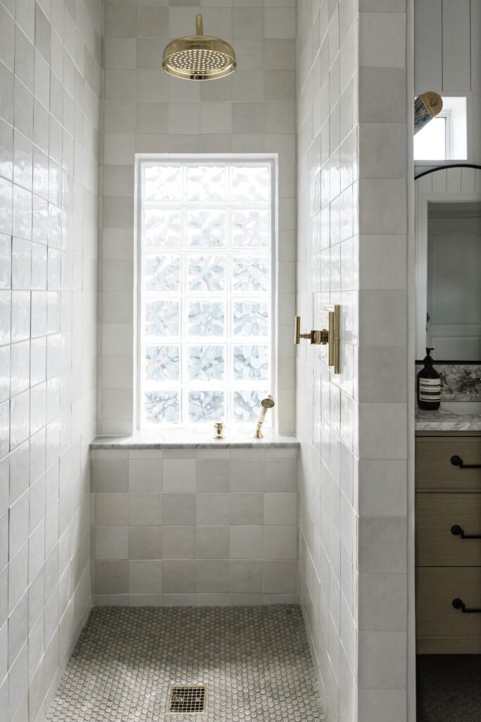
Lastly – and probably most significantly, I had to deal with the glass ice block window. To reiterate, replacing a window was neither allowed, nor in the budget. I wanted to keep natural light in both areas of the bathroom, so I decided to work with the glass block, not against it. We purchased a marble shelf from Floor & Decor to create a new windowsill ledge, and ran the tile from floor to ceiling. Then I mimicked that look on the opposite wall and did a single shelf instead of the expected niche. I love it so much. Showering there with the morning light pouring in literally feels like a resort. Every. Single. Day.
Full List of Sources
*use code IDCO15 for 15% off your entire order
Vanities (including top, hardware + sink)
Mirrors (similar)
Rug (similar)
Floor Grout in Oyster Gray
Wall Grout in Bright White
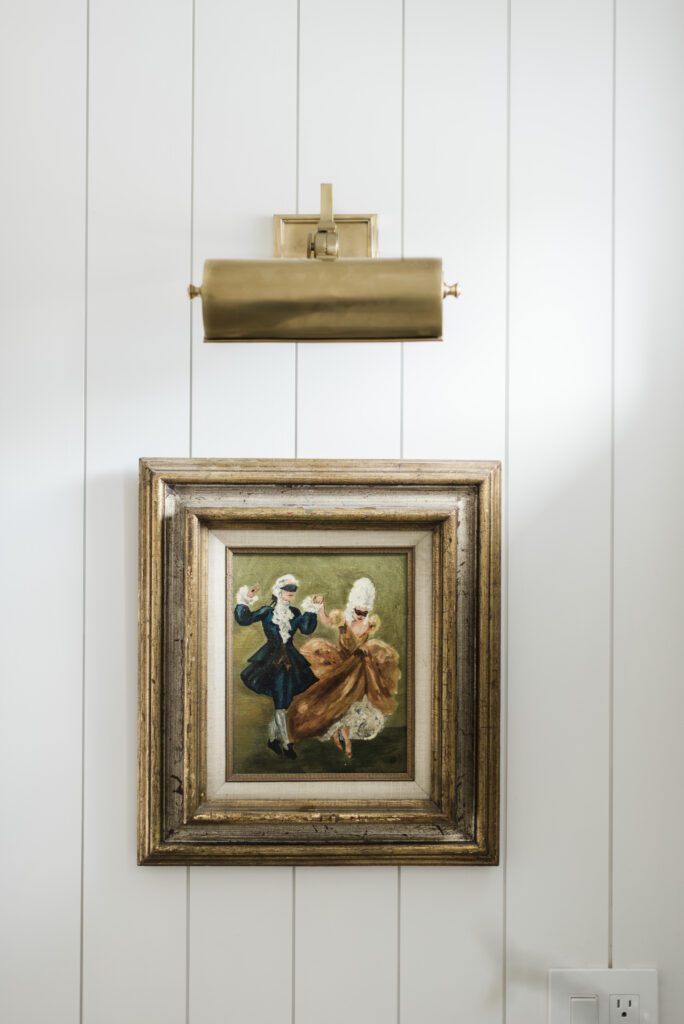
Antique Masquerade Oil Painting
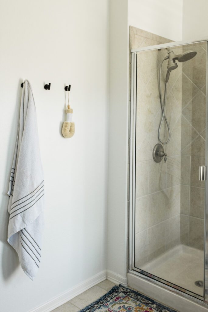
Before Photos


BY: theinteriordev

