Inside A Cozy Modern Family Hosting Hub
When Jennifer Ramsey’s clients reached out to her firm to help them transform their family home into a modern, relaxing hosting hub, they had one primary request — to remove anything reminiscent of the home’s early 2000s design. They entrusted Jennifer and her team to take an over-the-top architectural space and open it up to give them several gathering areas and two dreamy kitchens to center their loved ones around.
After taking it down to studs and reworking the expansive space for maximum functionality, Jennifer created a stylish and comfortable home that checks all the clients’ boxes and brings moments of inspiration to every vignette.
Design: Jennifer Ramsey Interiors | Photography: Nicole Dianne Photography
A Function First Kitchen
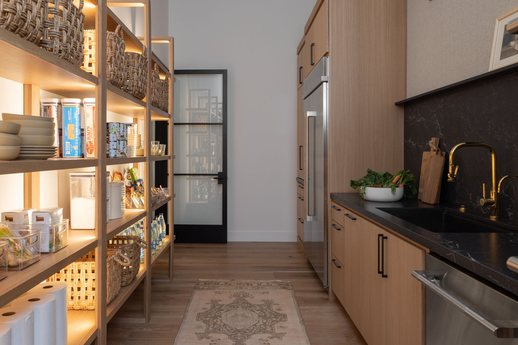
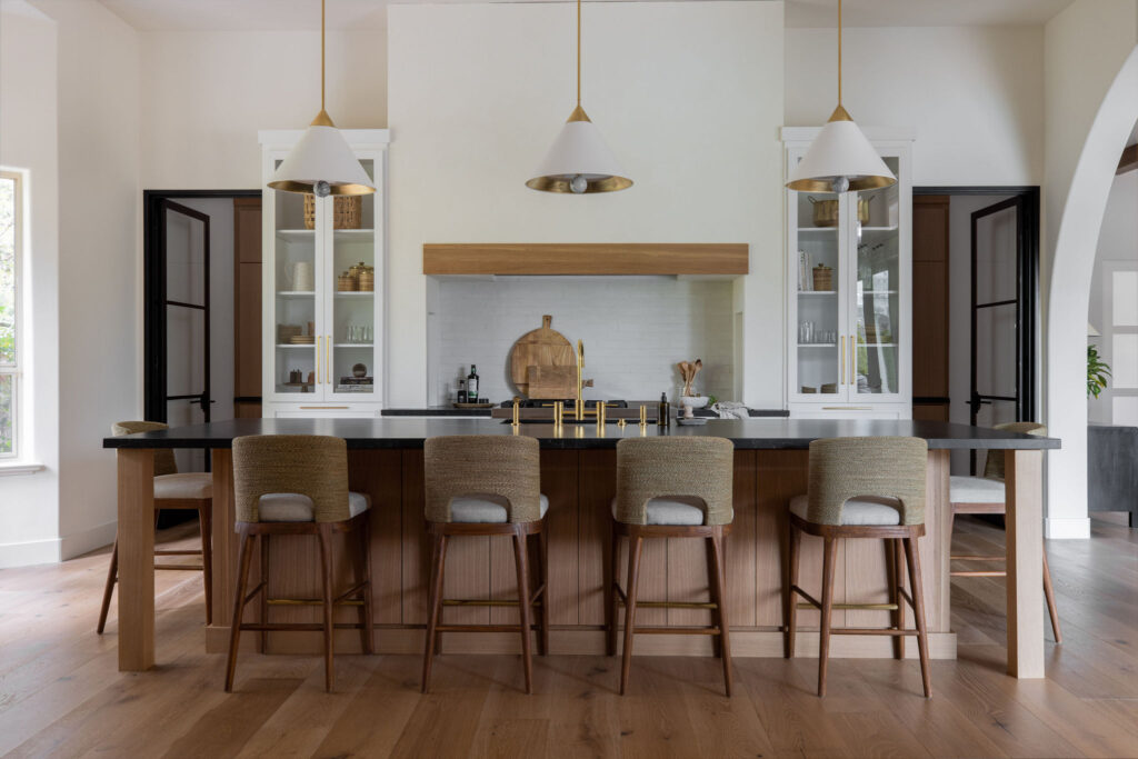
While we all love a big kitchen, Jennifer mentions that the expansive kitchen in the original home was almost too big, and she and her team wanted to ensure the space was as functional as possible for the homeowners. In incorporating a mess kitchen/pantry and bringing the central kitchen closer to the living room, they optimized the area to get the most out of every square inch.
Woven wallpaper, dark stained cabinets, and a moody, dramatic backsplash in the pantry contrast the light and bright kitchen while still coordinating with the primary space. Custom iron doors separate the two rooms and balance the massive plaster hood
The Relaxed & Detailed Living Room
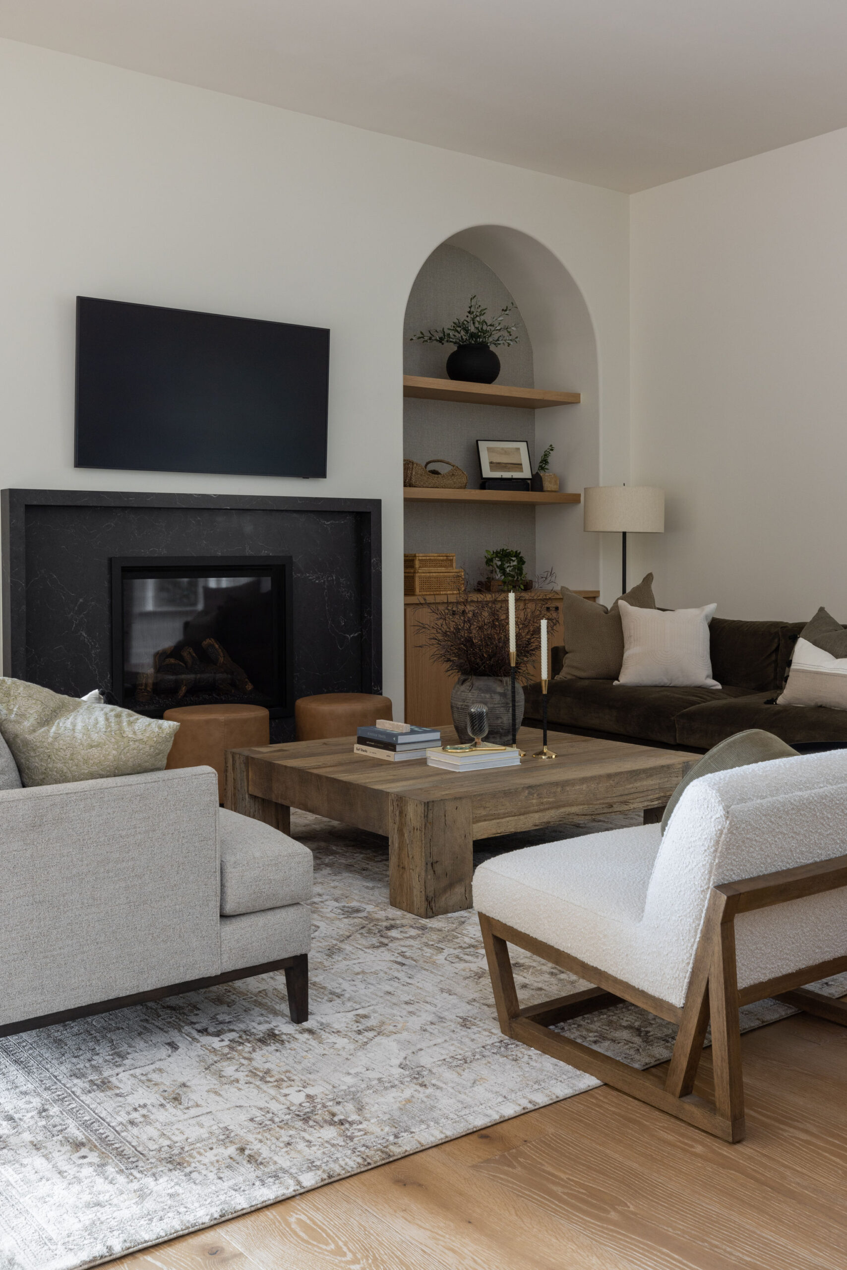
The living room is the first space you experience when entering the home, surrounded by large, arched doorways that merge each area. To create a cozy feeling in the core of the home, Jennifer lowered the 12-foot ceilings while adding beautiful custom faux wood beams and 36″ woven pendants that sit perfectly centered on a stunning hand-plastered fireplace. Built-in cabinets display the family’s pieces collected from travels and a few classic board games for bonding time.
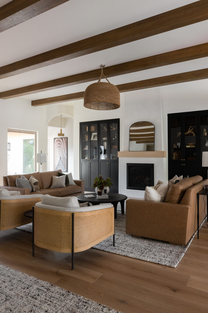
When furnishing the project, Jennifer wanted to emulate the decisions made during construction. These smart but subtle details create cohesivity within the space, from the furniture arch shapes to accent wood elements matched to the beams and hardwood floors.
A Moody Office
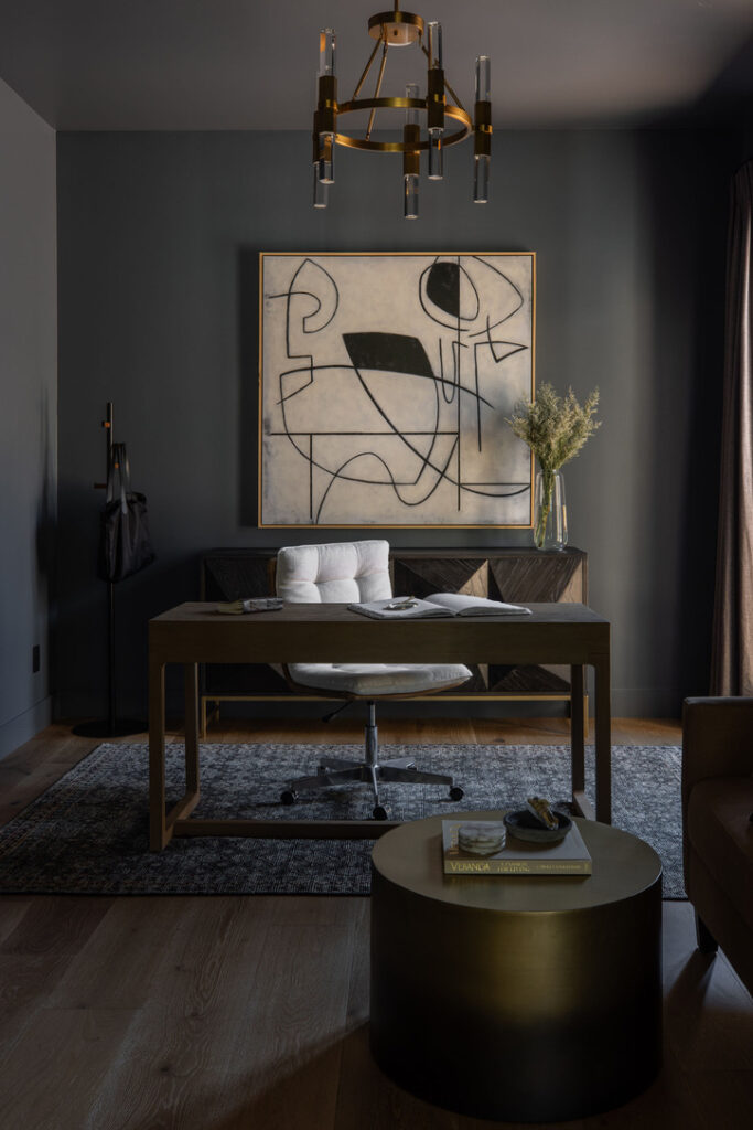
In the office, Jennifer went a beat in the opposite direction and designed a dark and moody space off of the main entry and living room. Alongside the remaining warm and bright interiors, infusing a little drama into this area was the perfect bold move to set the tone. A chic bronze lighting moment draws your eye up and adds just the right balance of warmth to contrast the room. Jennifer chose Benjamin Moore’s Wall Street to paint the walls and ceiling and even tied in the same color with Fireclay tile on the shower for the en suite bathroom.
BY: Jasmyne Muir


