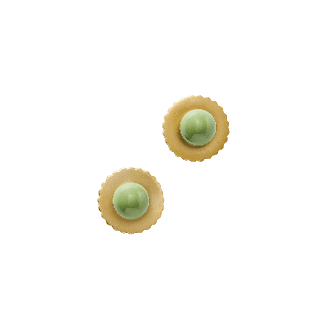
Shop


Pistachio Is the Color of the Moment—Here’s How to Use It
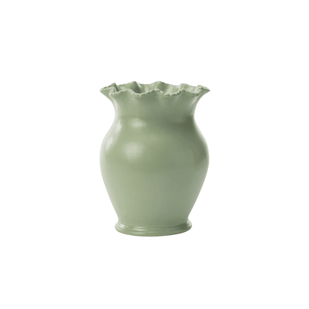
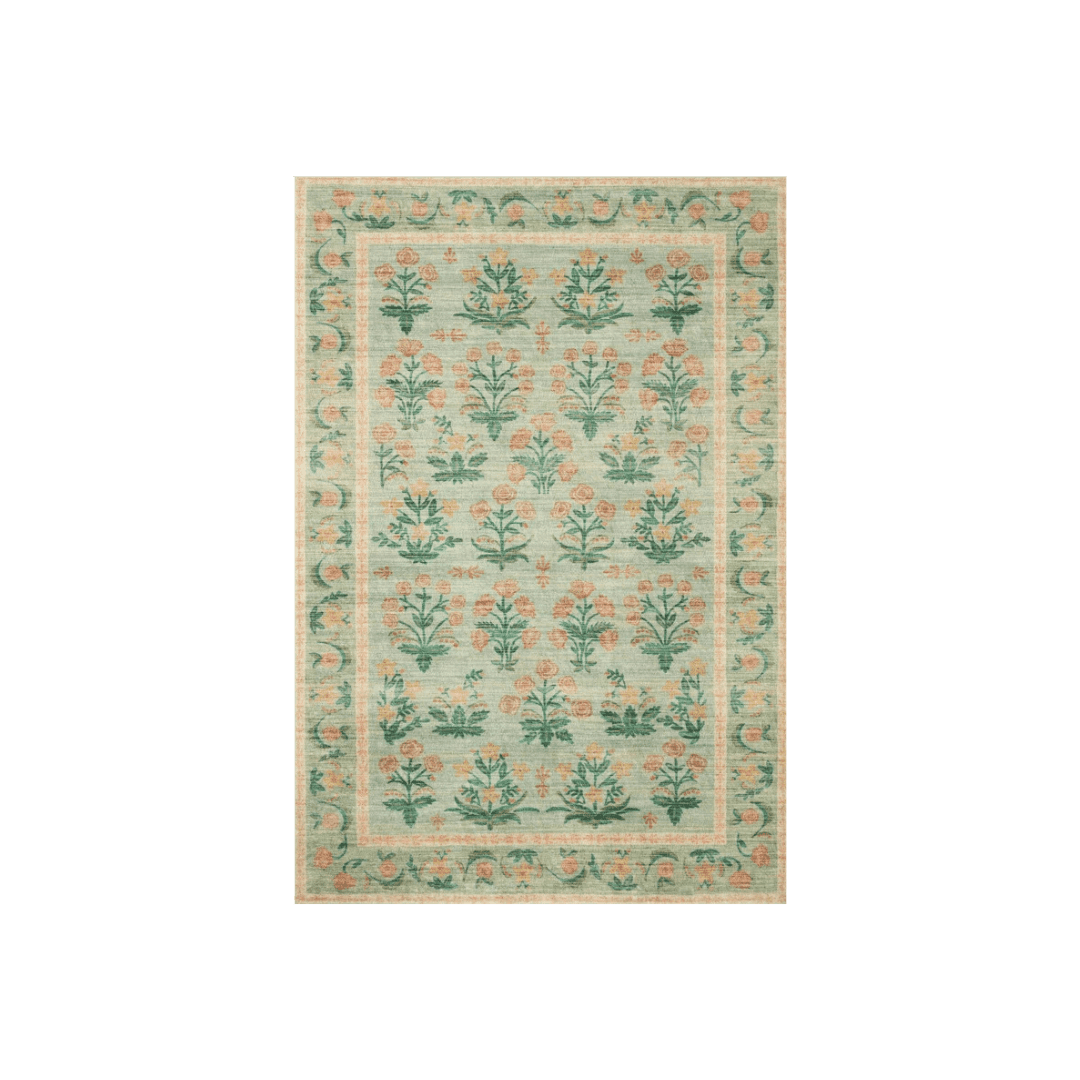
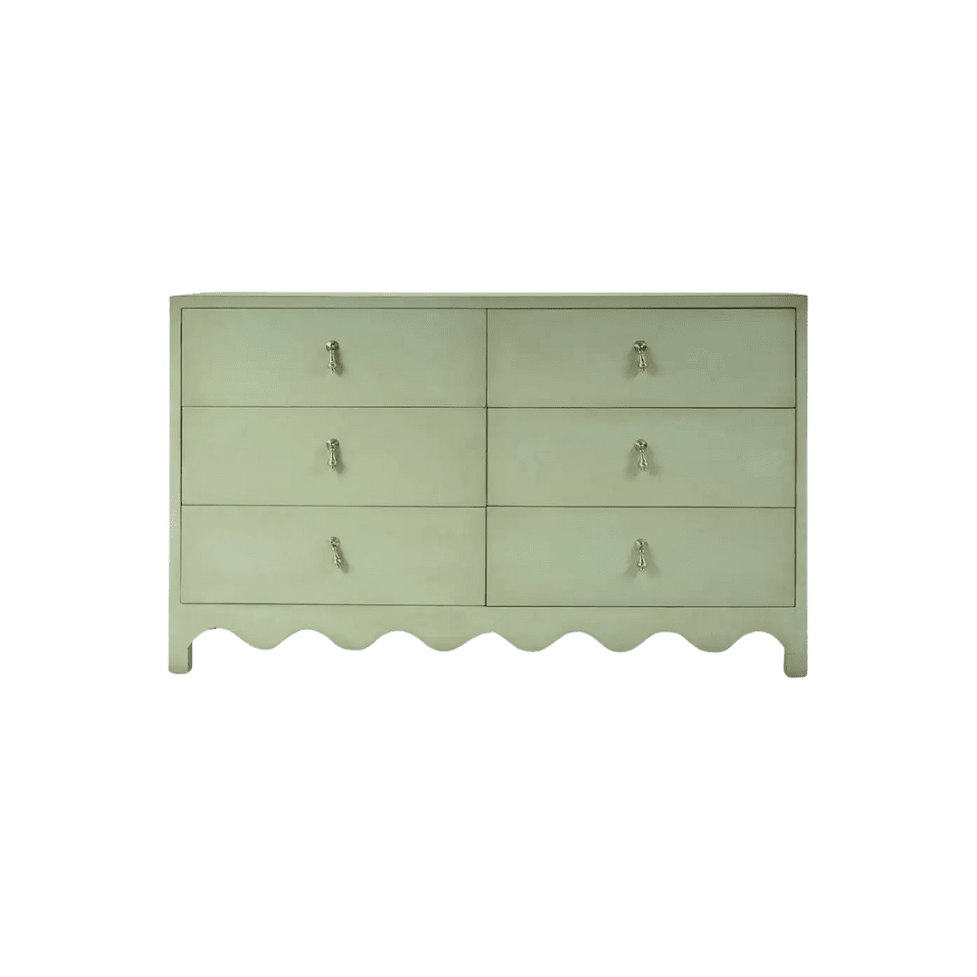
Pistachio is a soft, creamy green with subtle retro charm that’s quickly becoming a go-to for designers looking to bring a bit of character to a space. Unlike bolder shades like emerald or forest, pistachio has a quiet ease that makes it especially versatile. Here’s how to make it work at home—along with a few favorite shades to get you started.
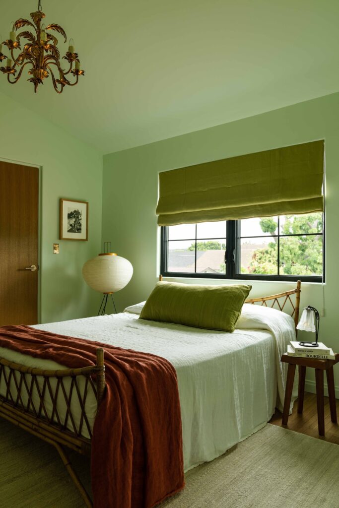
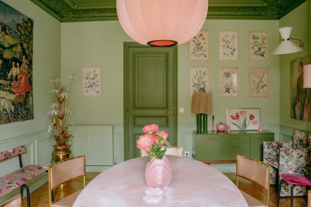
Design by Nickey Kehoe, Photography by Haris Kenjar
The foodification of color trends is nothing new. Over the past few years, we’ve seen tomato red, butter yellow, and mocha mousse each have their moment in the spotlight. Now, a new shade is gaining momentum in the home: pistachio.
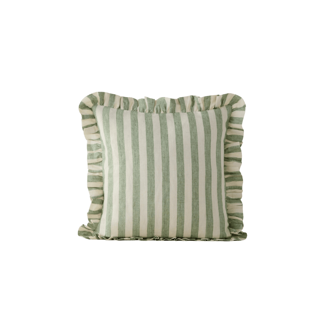
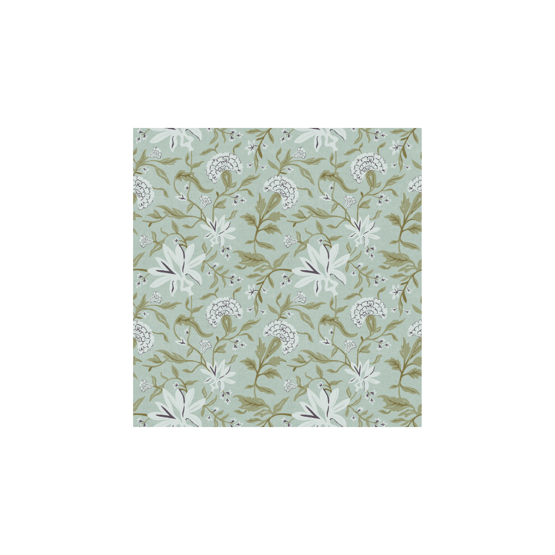
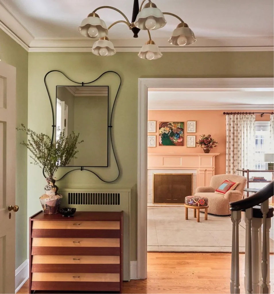
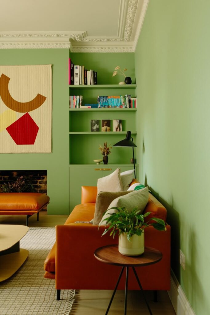
Pistachio green lands somewhere between mint and sage. Cooler than olive, warmer than celadon. It’s easygoing and adaptable, which makes it especially appealing in a moment where color-drenched spaces are replacing all-white design. Whether you go all in or use it as an accent, pistachio feels like a fresh yet familiar way to bring color into your home.
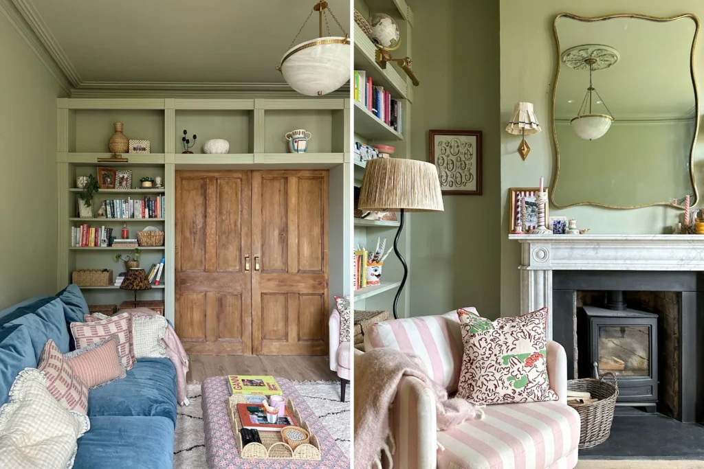
(Top) Design by Prospect Refuge, Photography by Wing Ho; (Bottom Left) Design by Draper Studio, Photography by Richard Oxford; (Bottom Right) Design by David Lucido, Photography by Ori Harpaz
A Softer Approach to Green
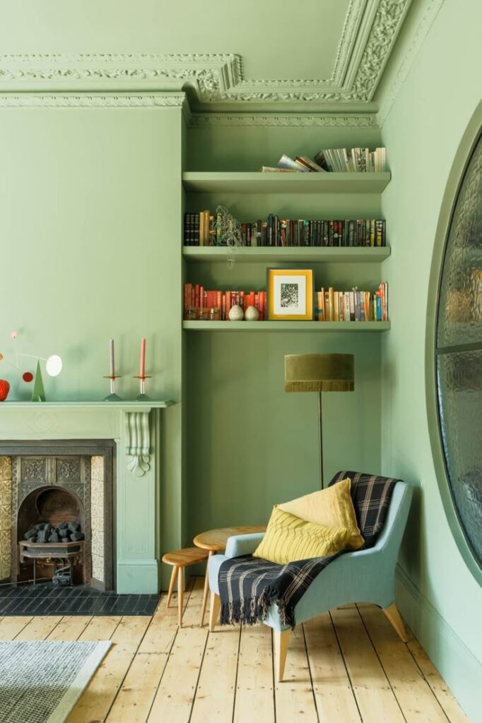
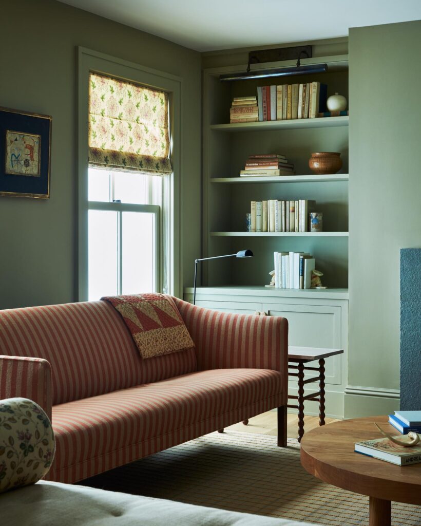
While moodier greens like emerald and forest have dominated in past years, pistachio offers a gentler alternative—and because of that, it’s easier to layer and pair with different textures like warm woods, natural stone, and unlacquered finishes. The great thing about pistachio is that it doesn’t compete for attention in a room. It’s a color that actually supports the design of a space and can even act as a neutral, depending on how soft you go.
(Top) Design + Photography by Claire Kennedy; (Bottom Left) Design by Hutley & Humm, Photography by Rachael Smith; (Bottom Right) Design by Fran Keenan x Photo David Tsay
How to Use Pistachio at Home
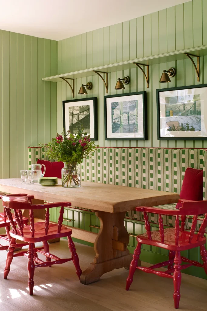
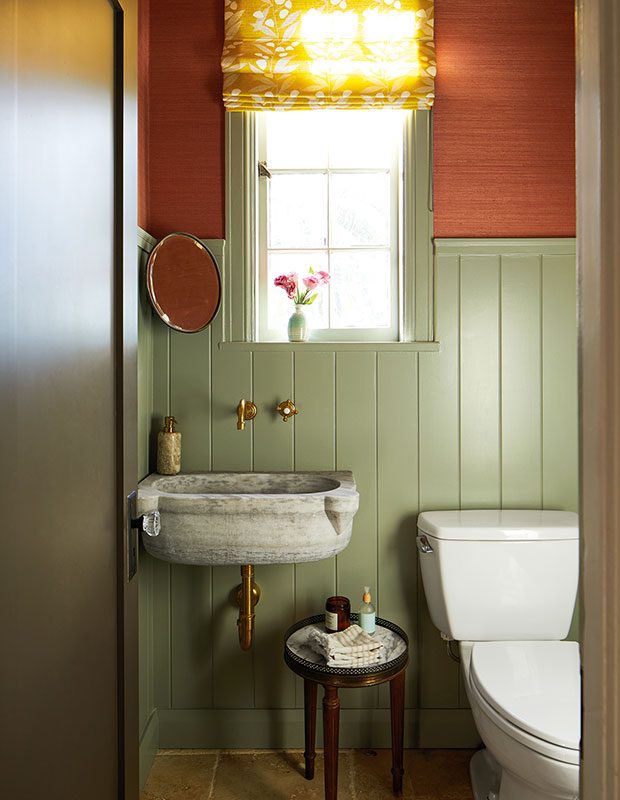
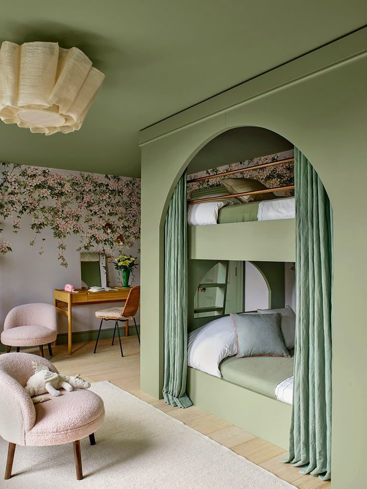
Pistachio is more versatile than you might think. While it brings a touch of nostalgia, especially in kitchens, you don’t have to lean fully retro to make it work. In a kitchen, it pairs well with brushed silver hardware or warm-toned woods. In bedrooms and baths, pistachio plays nicely with terracotta, soft pink, or even a warm red for contrast. Yellow is another natural partner here because the two are analogous on the color wheel, which means they naturally complement one another. It also shines in small, unexpected places: a cozy snug, a painted bookshelf, or even the ceiling. These moments add personality without requiring a full color commitment.
(Top) Design by Tiphaine Verdier, Photography by Jeanne Perrotte; (Bottom Left) Design by Olivia Williams, Photography by Henry Bourne; (Bottom Right) Photography by Shootfactory
The Best Pistachio Paint Colors
Here are some of the best pistachio paint colors to consider for your next paint project.
Feather Green by Benjamin Moore
A soothing powdery green with a feather-soft touch of gray and endlessly versatile for airy interiors.
A lively pistachio-meets-mint shade that brings charm and character to rooms of all kinds.
A sweet light green with positive and irresistible energy. Great for a nursery or bedroom.
Breakfast Room Green by Farrow & Ball
A bright and cheerful green that’s perfect for spaces with lots of natural light.
Vert de Terre by Farrow & Ball
A calming and fresh green that feels serene, ideal for creating a relaxing palette.
Pea Green by Little Greene Paint
A peaceful green with a gentle richness—warm, welcoming, and still quietly bold.
Design by Hadley Wiggins, Photography by Tim Lenz
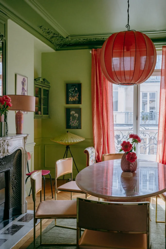
Design by Tiphaine Verdier, Photography by Jeanne Perrotte
BY: Daniela Araya
« Victorian No More: Inside a Stunning Riverside Transformation >
Shop