A CT Home Filled With Creative Solutions
It’s always a treat seeing the care and attention to detail designers put into their personal homes, and today’s home tour by designer Lisa Schwert of Innate Studio is no exception. Initially built in the 1990s, Lisa’s Wilton, CT home had plenty of opportunity for experimentation and creative expression for her and her young family. Complete with innovative design solutions, the prettiest of custom details, and natural materials that bring the outdoors in, this project is sure to inspire. Scroll through to dive deeper into Lisa’s home and read about her process of bringing the space to life.
Design: Innate Studio | Photography: Read McKendree
Serene surroundings
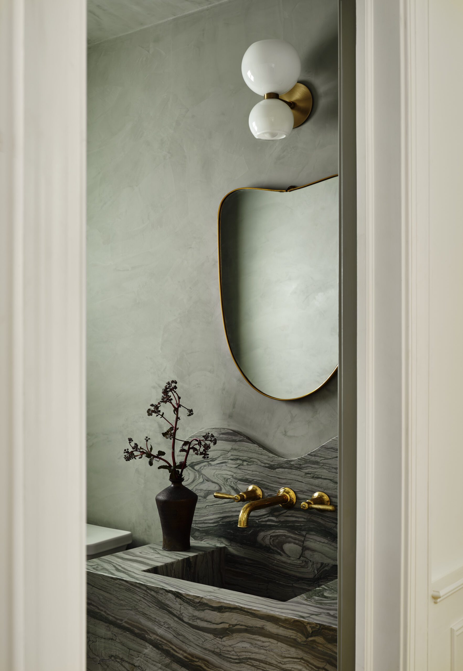
The almost 13-acre lot is significantly setback from the road, giving it an incredibly private feel to welcome the designer’s family. With large windows in every room, the connection to the outdoors extends into the interiors and puts the seasonal changes throughout the year on full display. By incorporating natural wall treatments like lime wash, Roman clay, and nature-inspired wallcoverings throughout the home, Lisa connected the design to the home’s surroundings and carried the outdoors in.
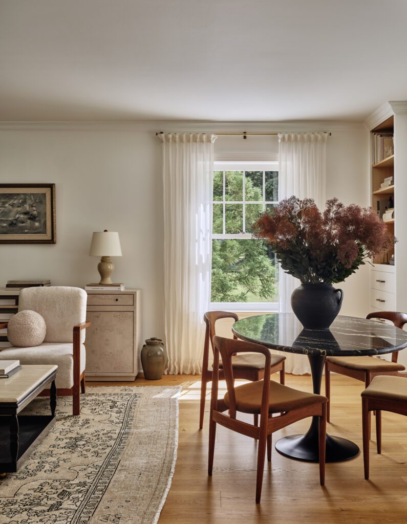
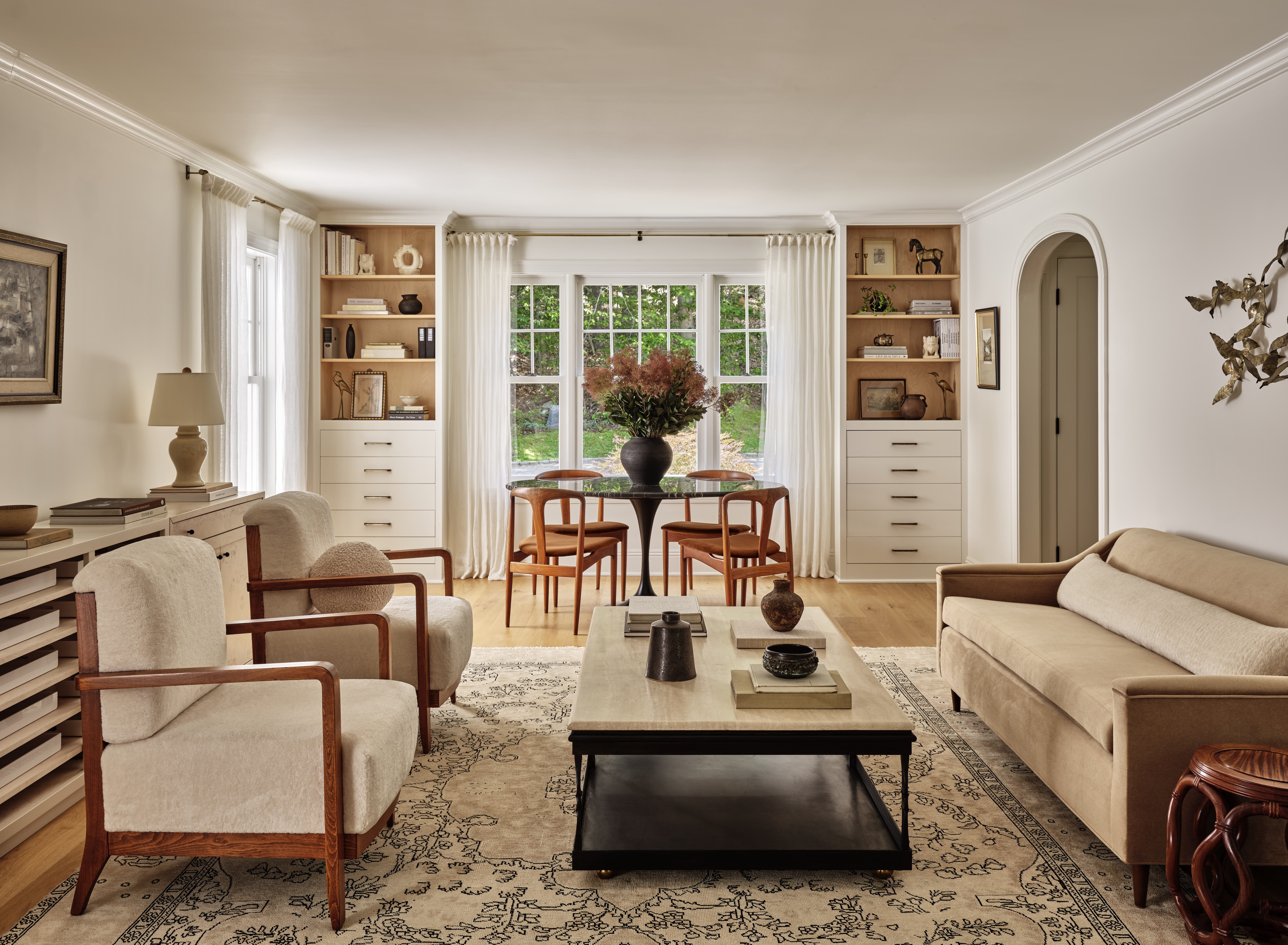
We love how the textures and materials in the living room work together to create a chic and welcoming feeling. Lisa smartly incorporated a small dining nook in the space, allowing for more seating and function to make the most of the square footage in this room.
A custom-crafted kitchen
Positioned in the center of the house, the kitchen has a 16-foot-high ceiling that follows the roof’s pitch, along with unusually shaped, massive windows. A light fixture from Allied Maker beautifully complements the unique ceiling design and is a central point of interest seen throughout the home’s main level. The updated design incorporated the semi-circular shape of the existing arch-top window into the light’s dome, the faucet’s arc, and the cabinet pulls, resulting in a cohesive and unified aesthetic.
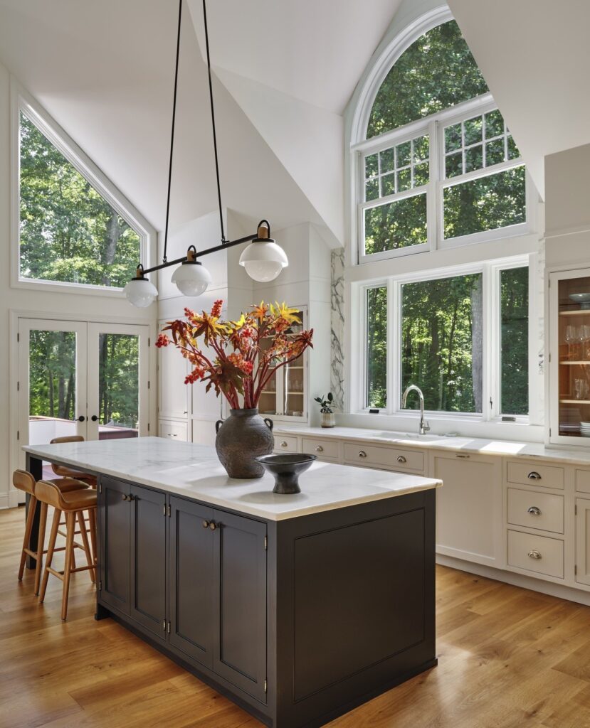
Kitchen island color: Ball’s Off Black by Farrow and Ball
A kitchen island with seating for five people at one end and positioned outside of the work triangle maximizes functionality for Lisa’s young family.
Intentional material selections
While the original Dutch-made cabinetry was outdated, it was well-built and in good condition. In the end, Lisa reused approximately 90% of the cabinet boxes, which she reconfigured to create a highly functional layout. Additionally, two custom larder cabinets now serve as a pantry and coffee bar with a sink. To give the cabinets a timeless shaker look, they replaced all the doors and drawer fronts and gave them a fresh coat of paint.
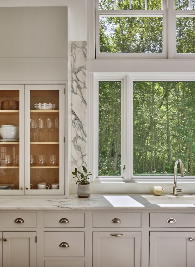
Arabescato Turquoise marble creates a bold statement on the backsplash, hood, and walls, and a complementary marble on the countertops, Olympian Danby marble, brings more durability and subdues appearance. While mixing two marbles in a kitchen may not be common, both types of marble, in this case, have a beautiful creamy background and a honed finish, resulting in a cohesive and complementary look.
Select statement walls
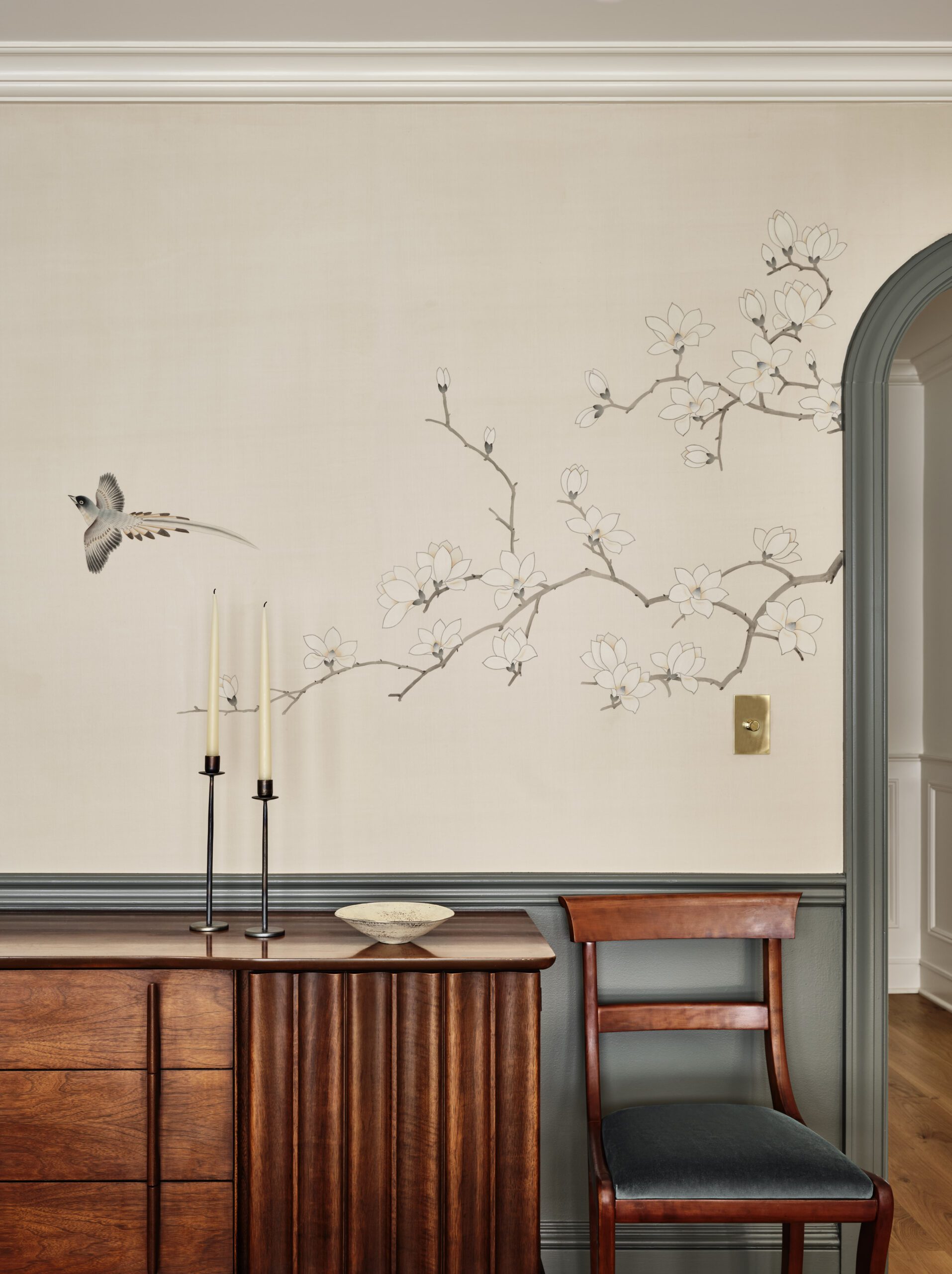
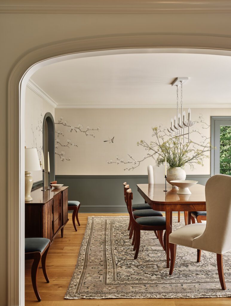
Lisa took the advice she gives her clients to heart and selected a statement wallpaper that she loves to add personality to select spaces. In the dining room, she incorporated a hand-painted silk mural that depicts songbirds and flowering branches to bring the view inside and complement the room’s uninterrupted view of the woods through floor-to-ceiling windows. Working closely with the artist, they achieved the perfect composition for the mural, aiming for a balance between organic minimalism and whimsy.
Scroll through the gallery below to see more from this home.
BY: Jasmyne Muir


