A Light-Filled Textural California Home
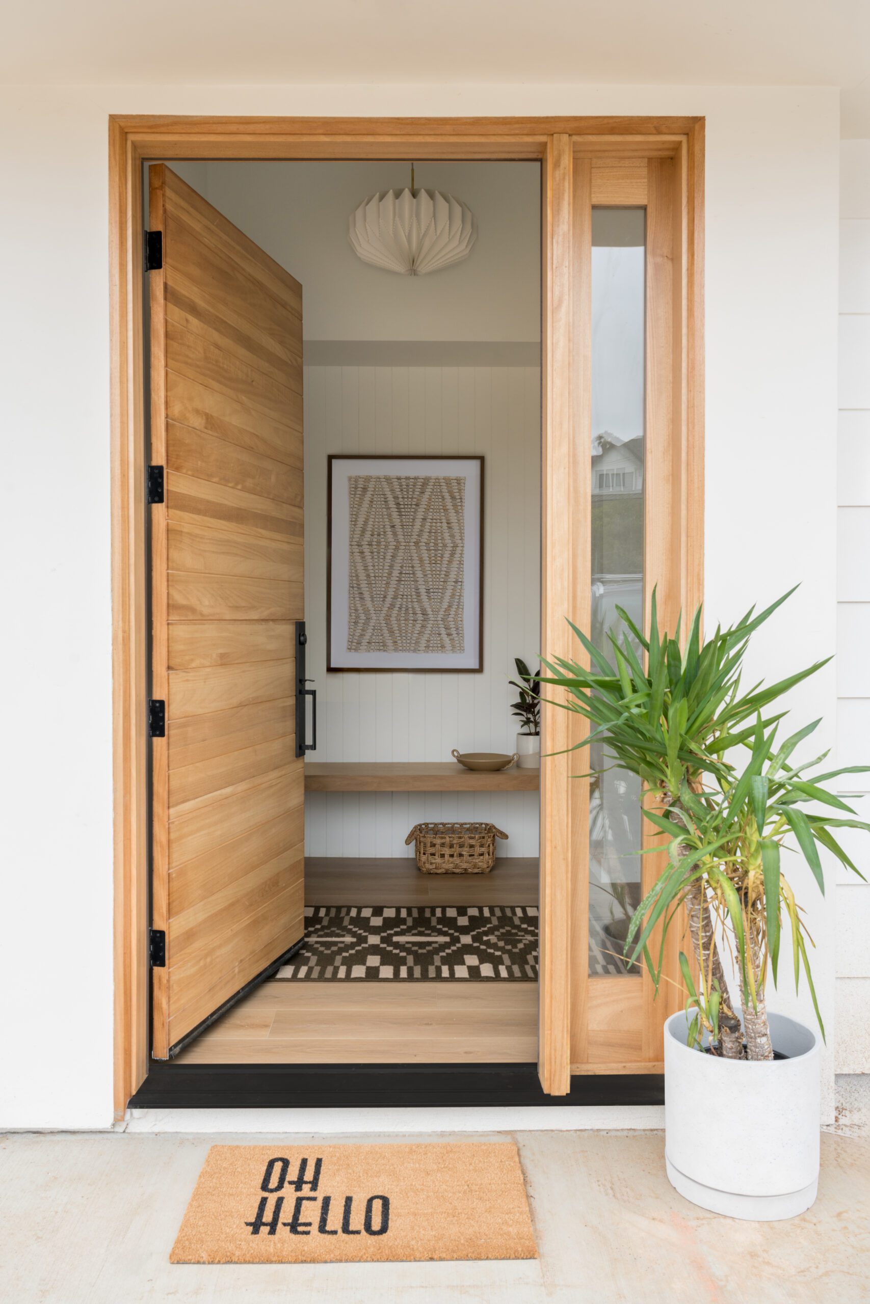
Nestled in the avocado-grove-lined city of Fallbrook, California, today’s home tour by Leigh Jendrusina of Salthouse Collective is a masterclass in adding texture and personality to a contemporary new build. After the architecture and layout were completed, Leigh and her team rounded out the hard finishes and furnished the space with added layers to create a liveable, cozy home for their clients.
Complete with plenty of natural light, beautiful finish work, and picture windows facing the home’s orange-grove-lined surroundings, this home for a family of six is the epitome of California cool. Scroll on to learn more about the design process, see the details, and shop the look.
Design: SALTHOUSE Collective | Photography: Charlotte Lea Photography
Leaning into natural light
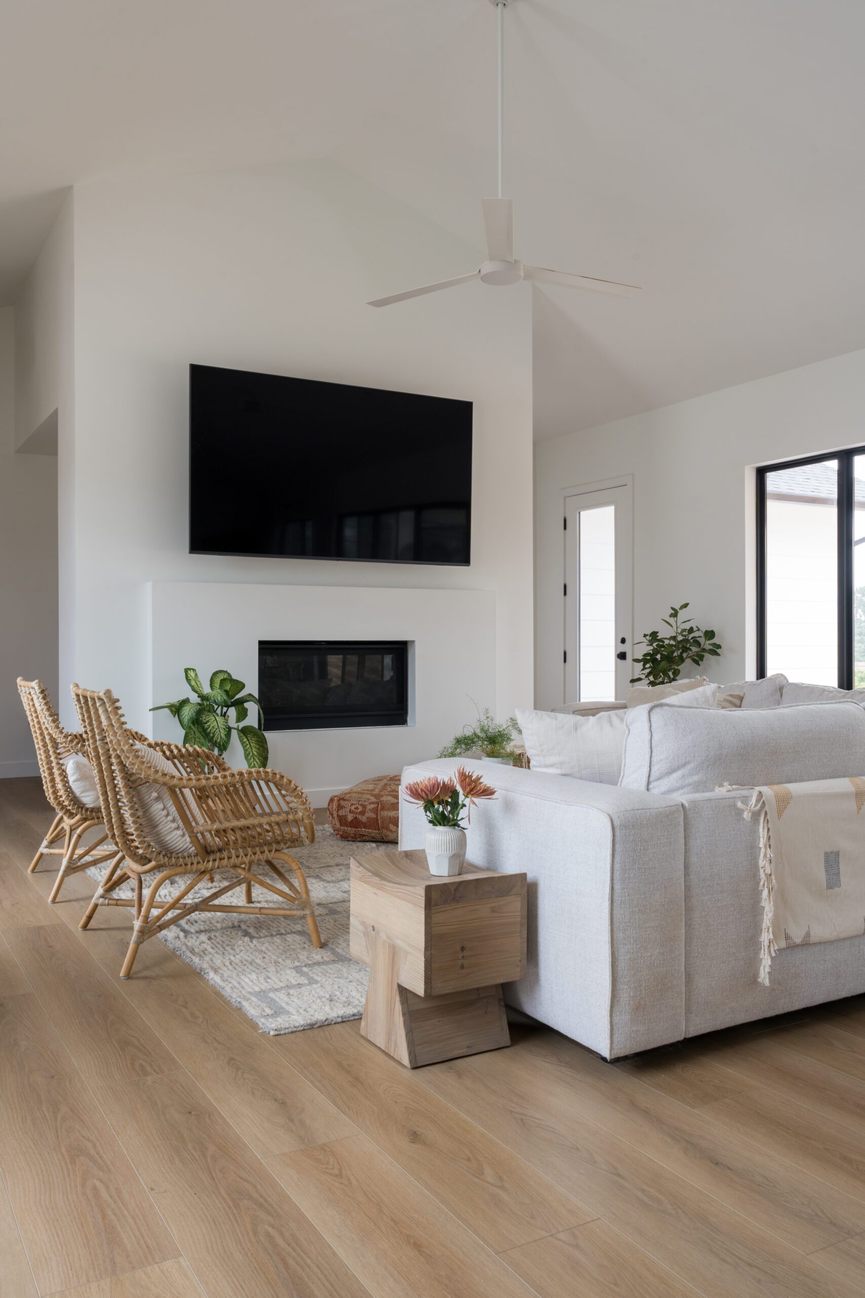
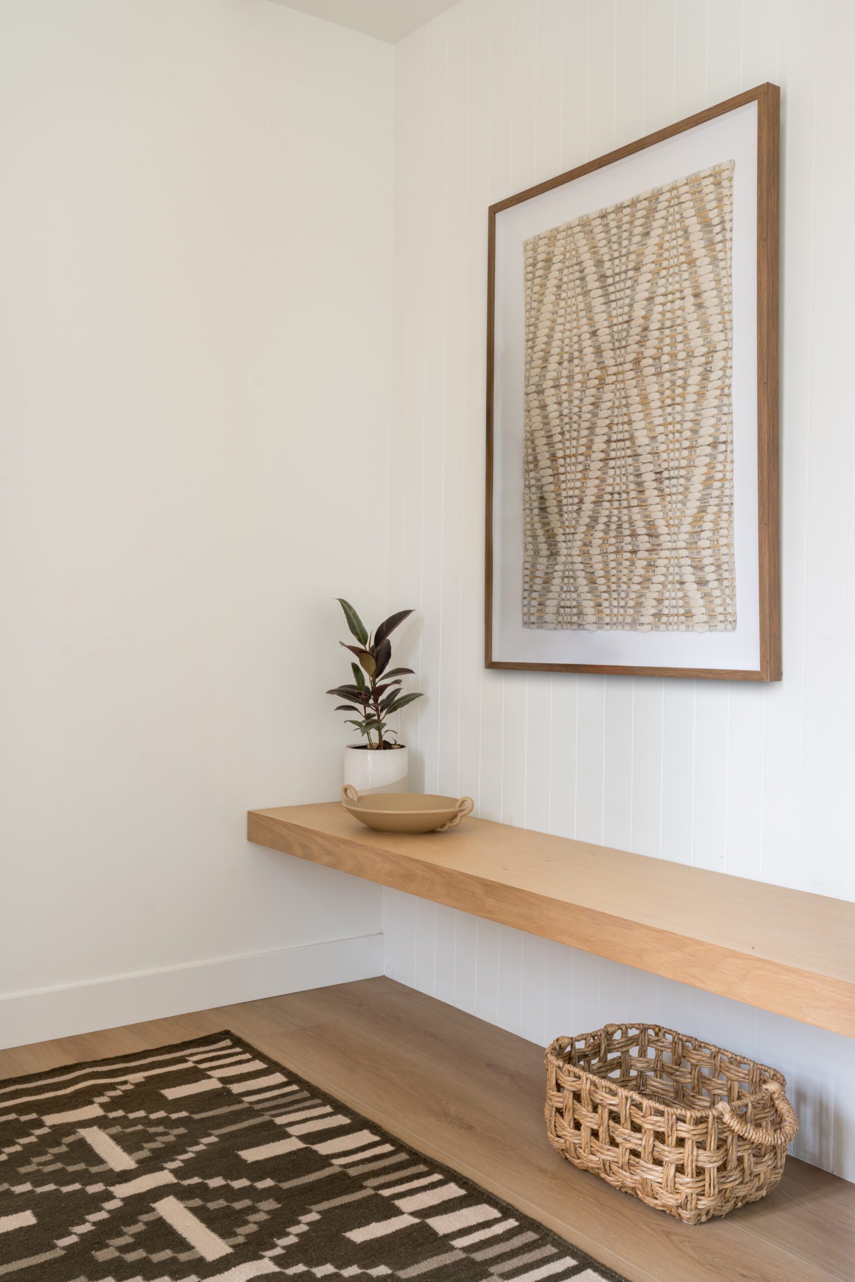
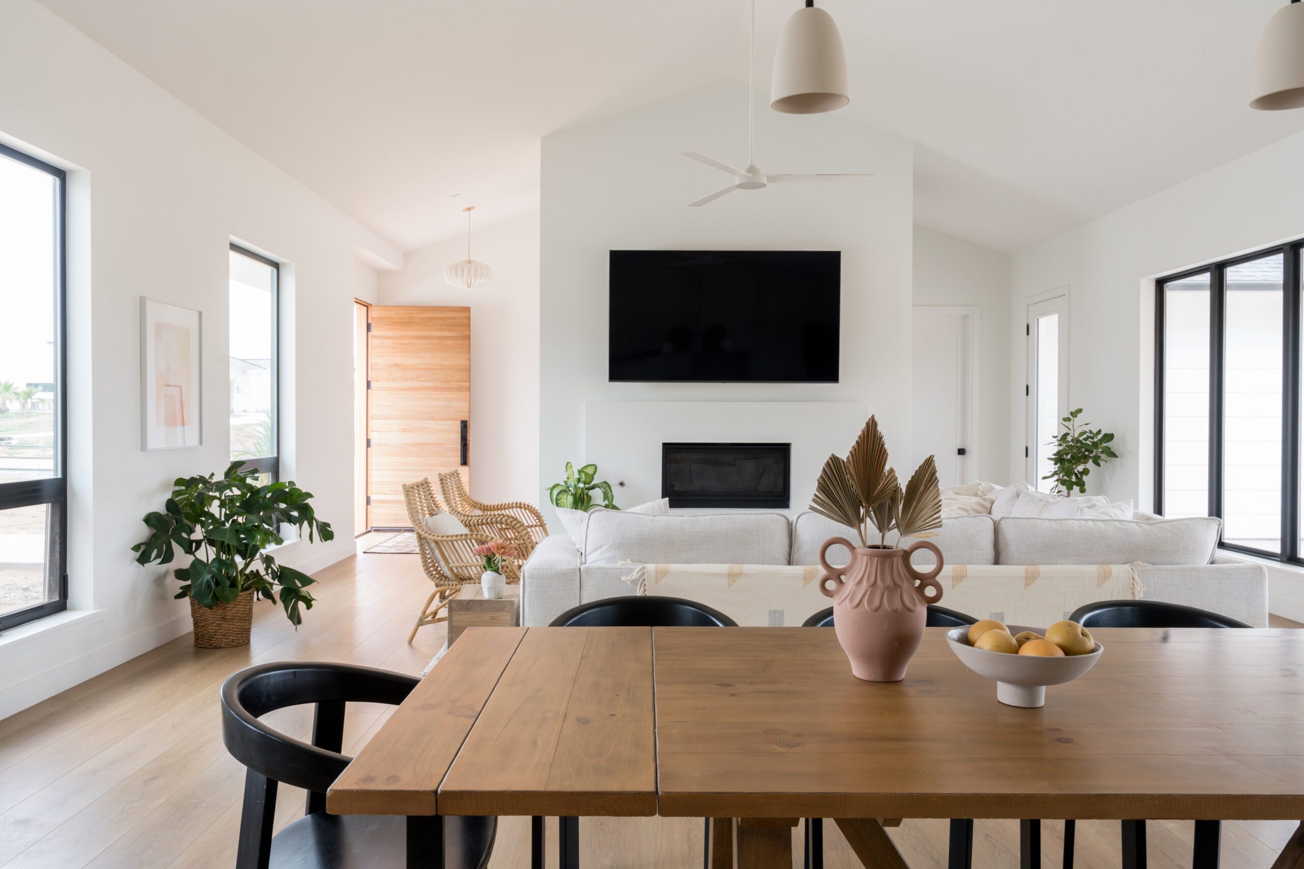
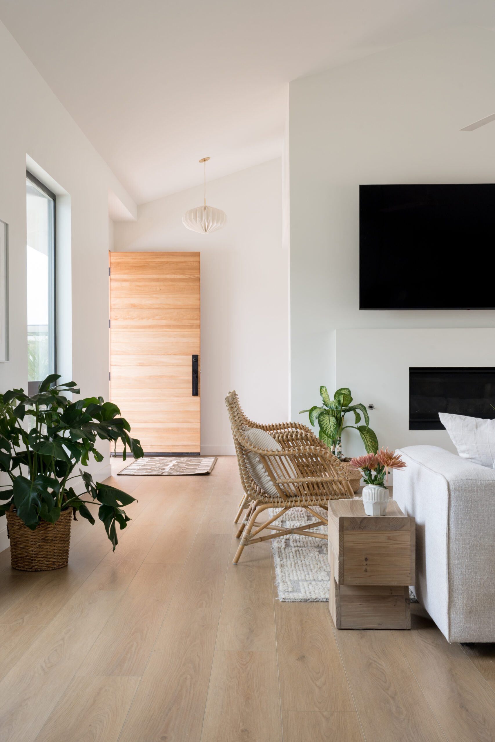
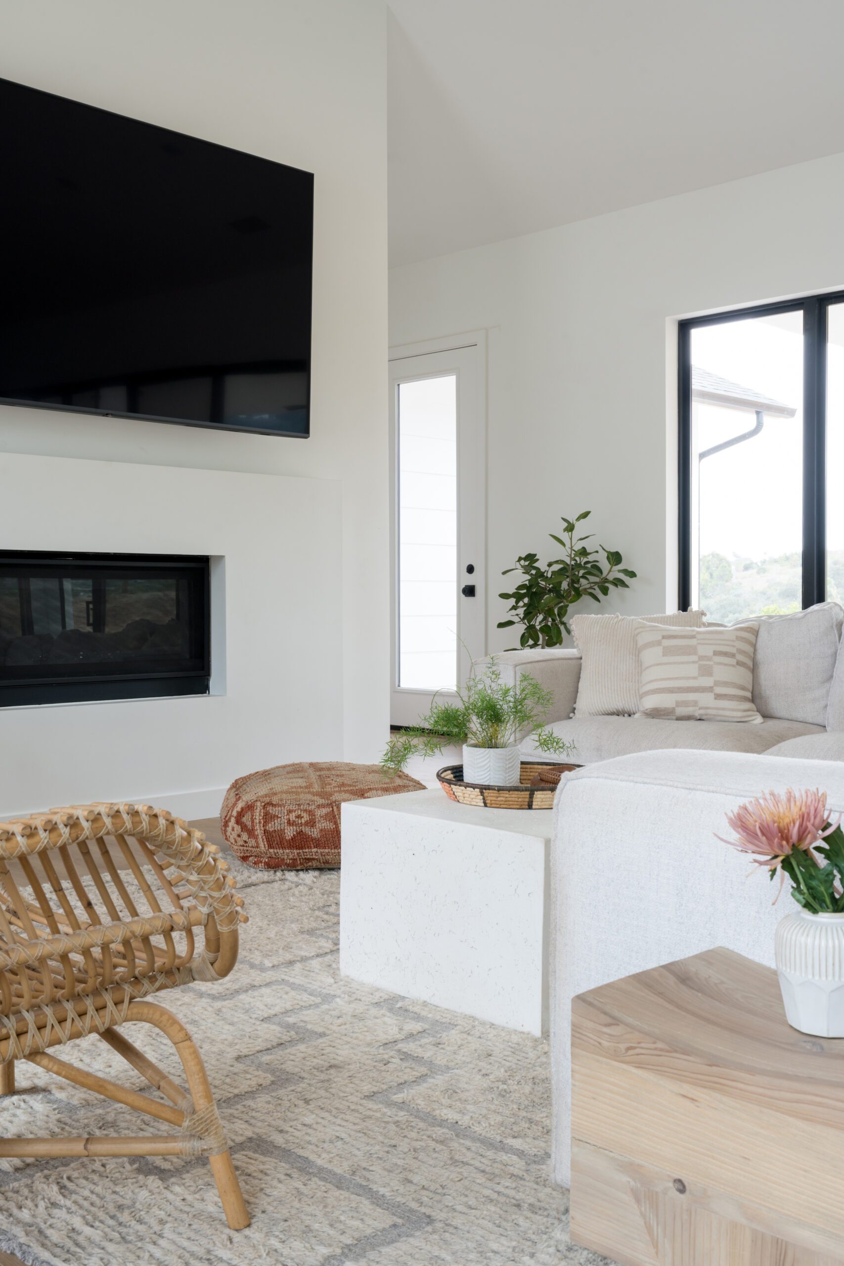
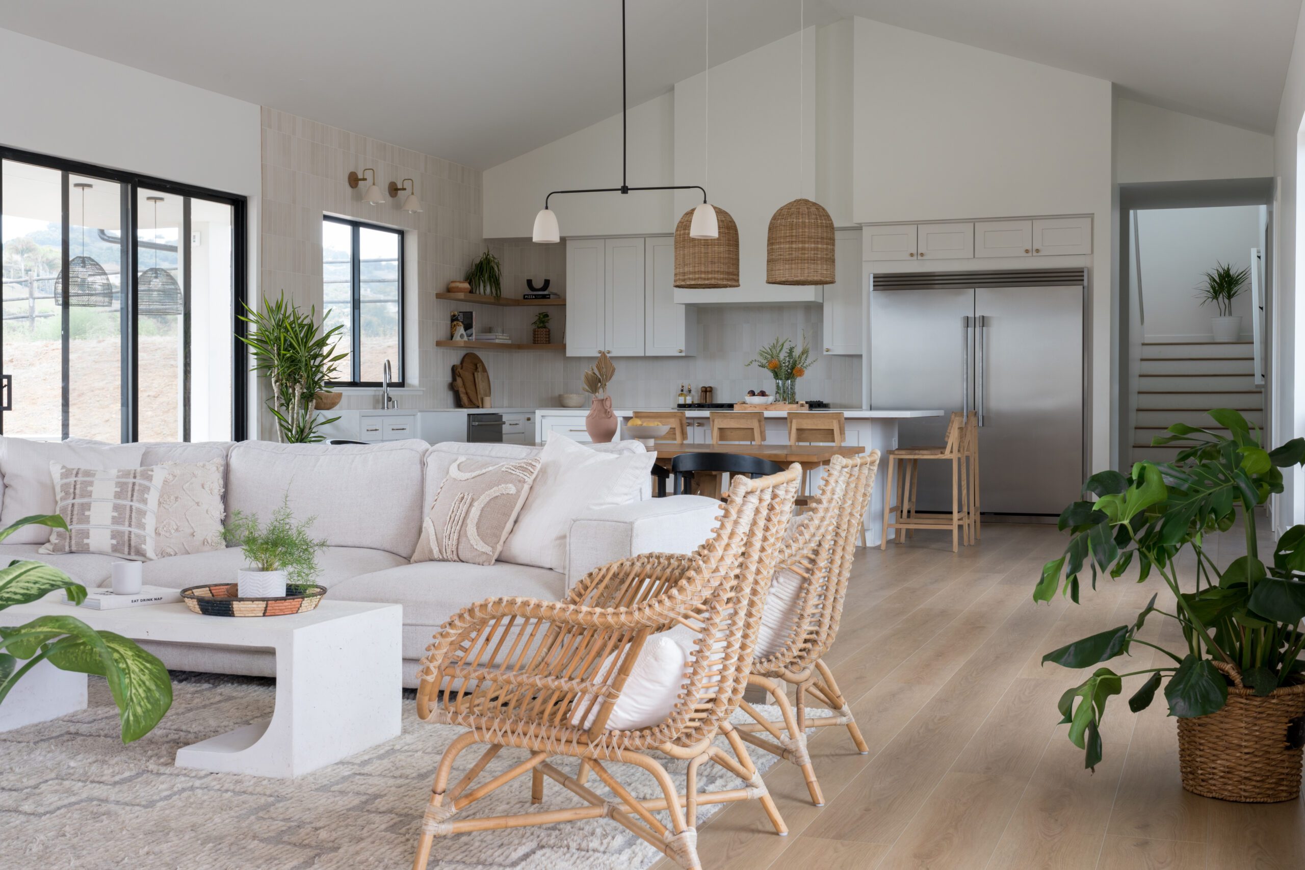
Although the interior doesn’t offer much wall space for artwork, the various windows throughout the living space allow natural light to flow through the interior and make the most of the California sunshine. The clients wanted to keep the home’s fresh and natural feeling, and while they didn’t want to go bold on color, Leigh and her team incorporated plenty of textural layers to add dimension to every room.
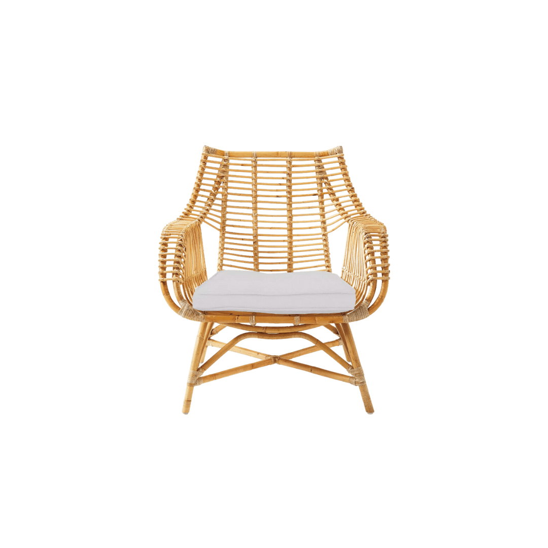
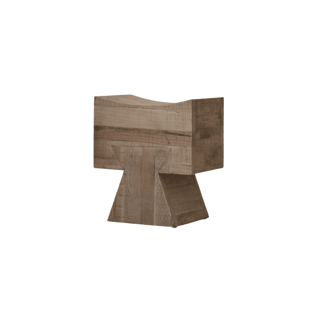
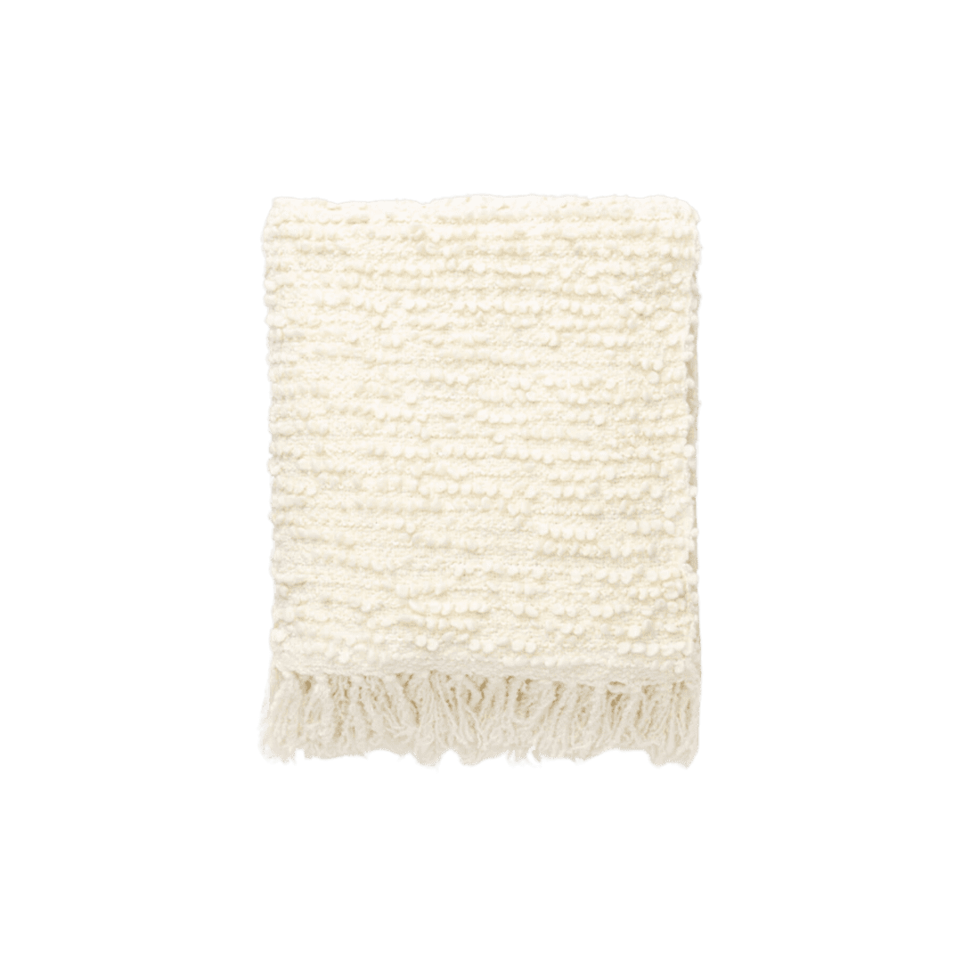
Linens, woven materials, and vintage elements helped warm up the space while keeping the palette relatively calm and neutral, echoing the home’s architecture and surroundings.

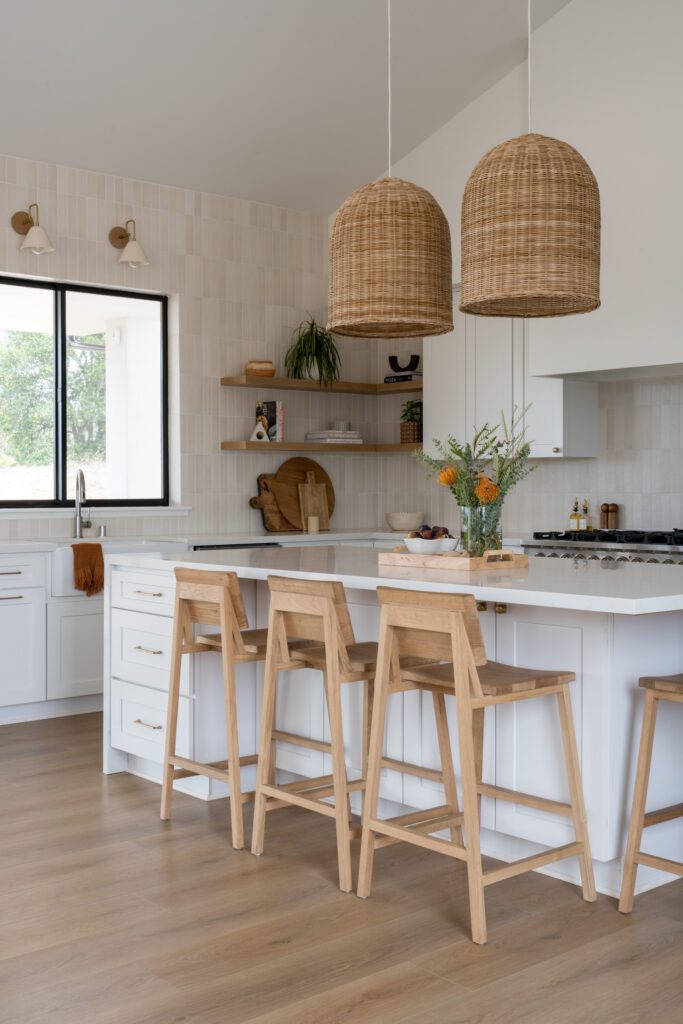
A kitchen for six
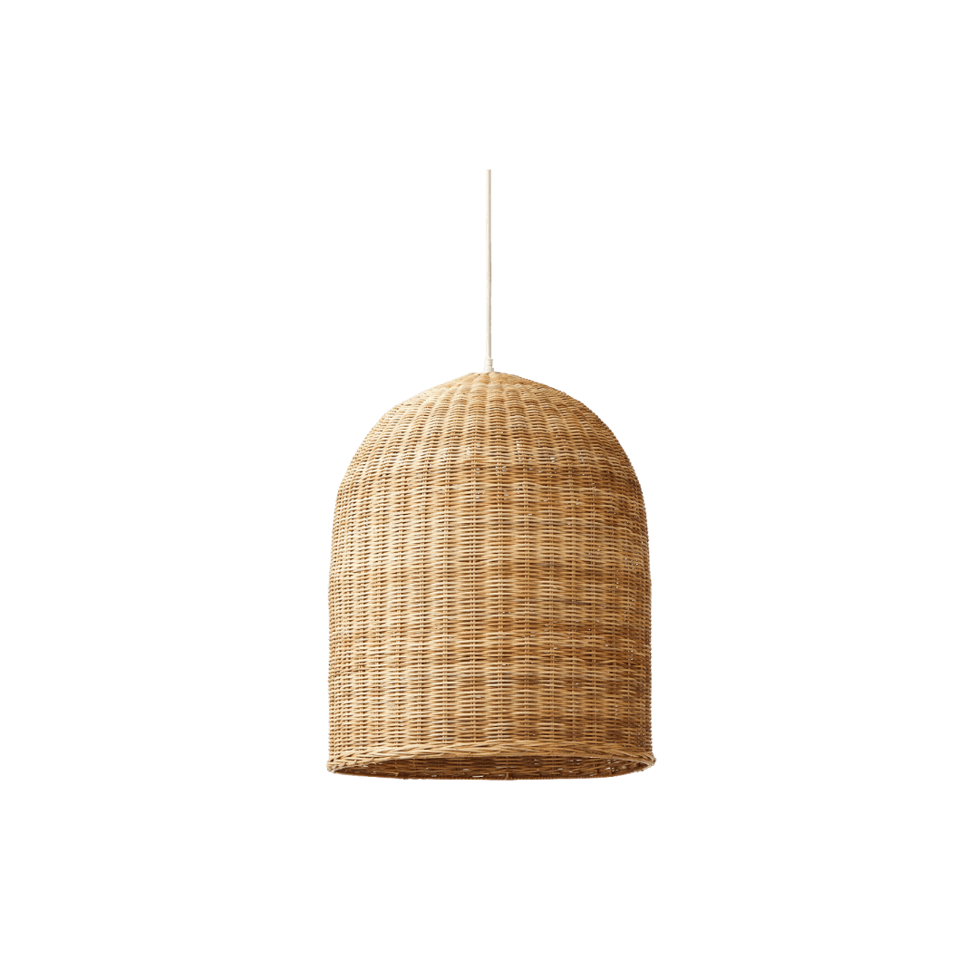
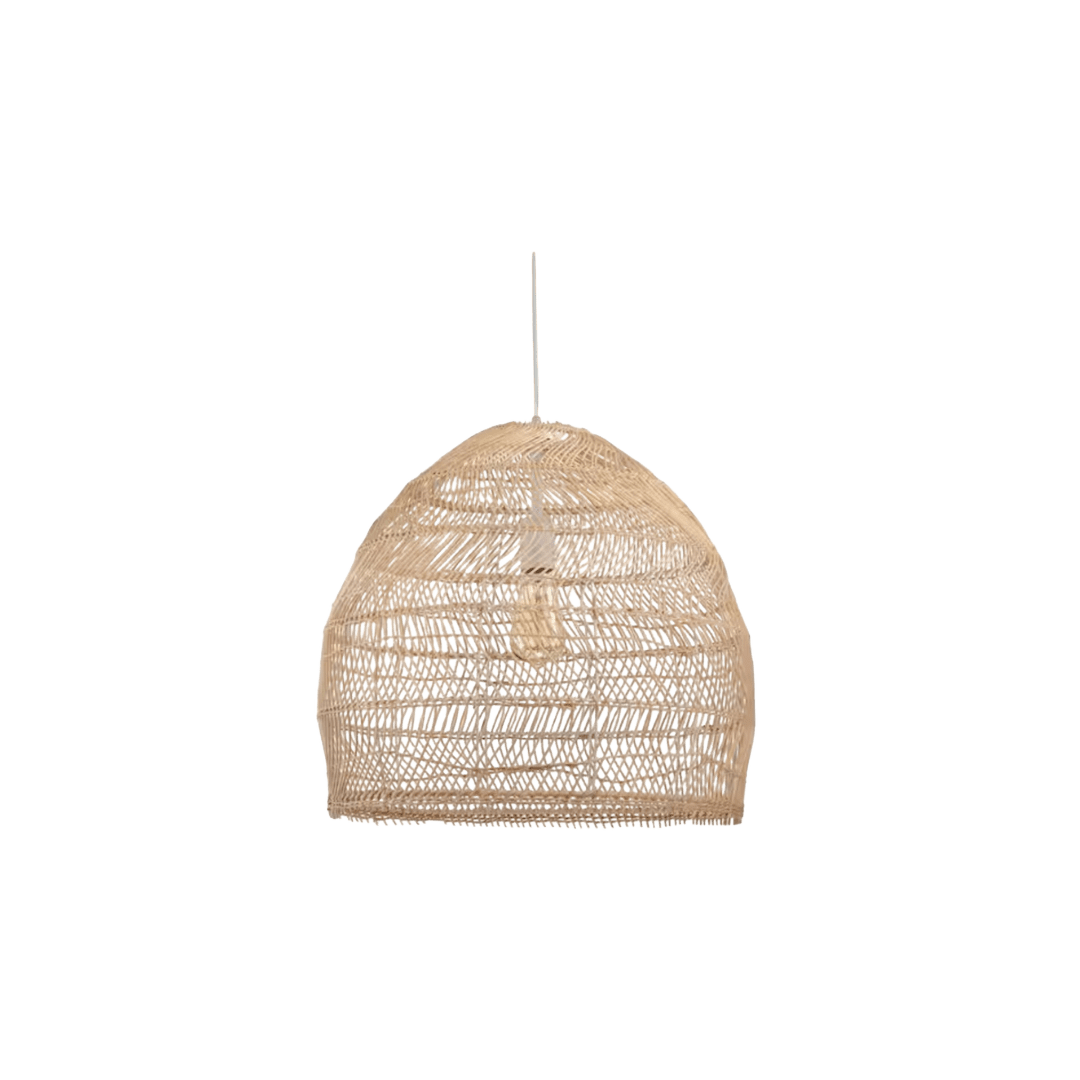
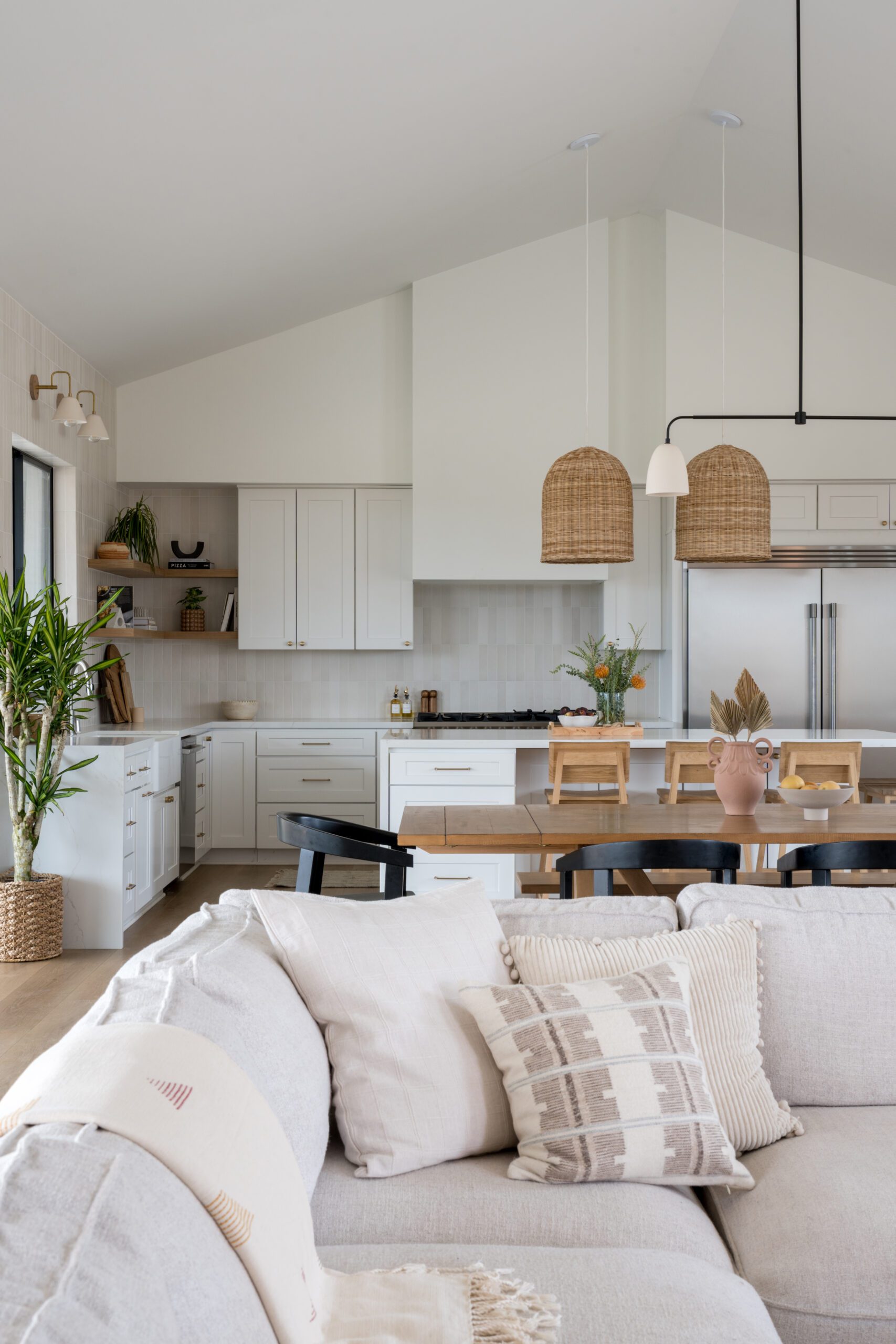
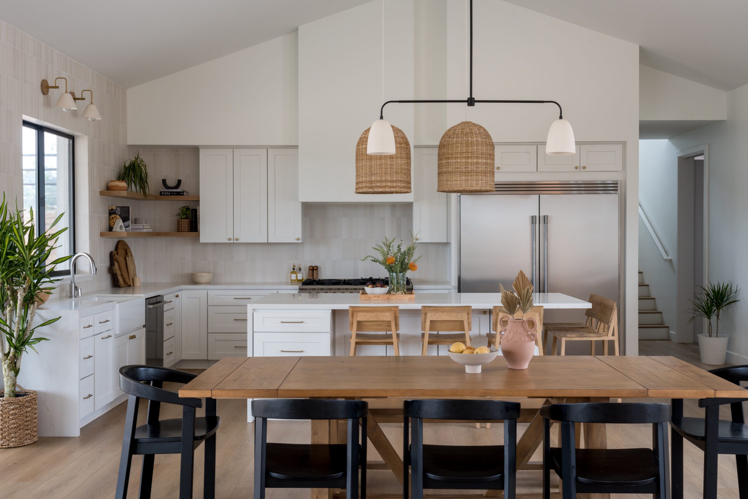
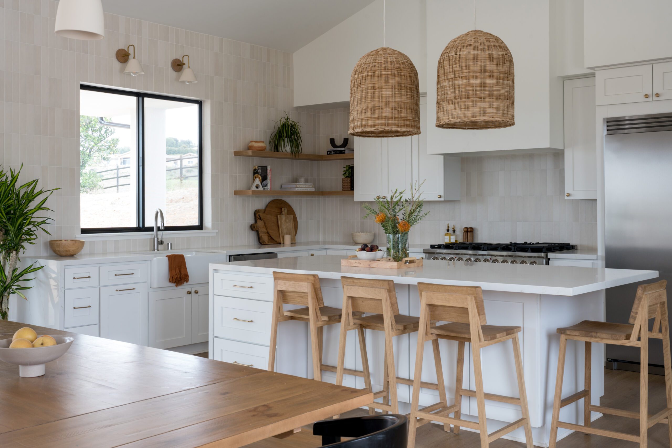
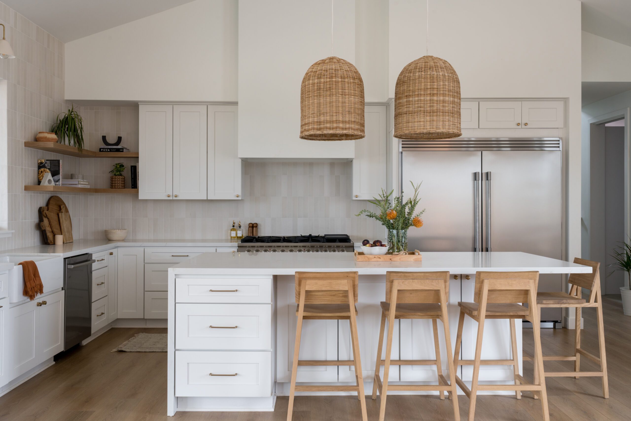
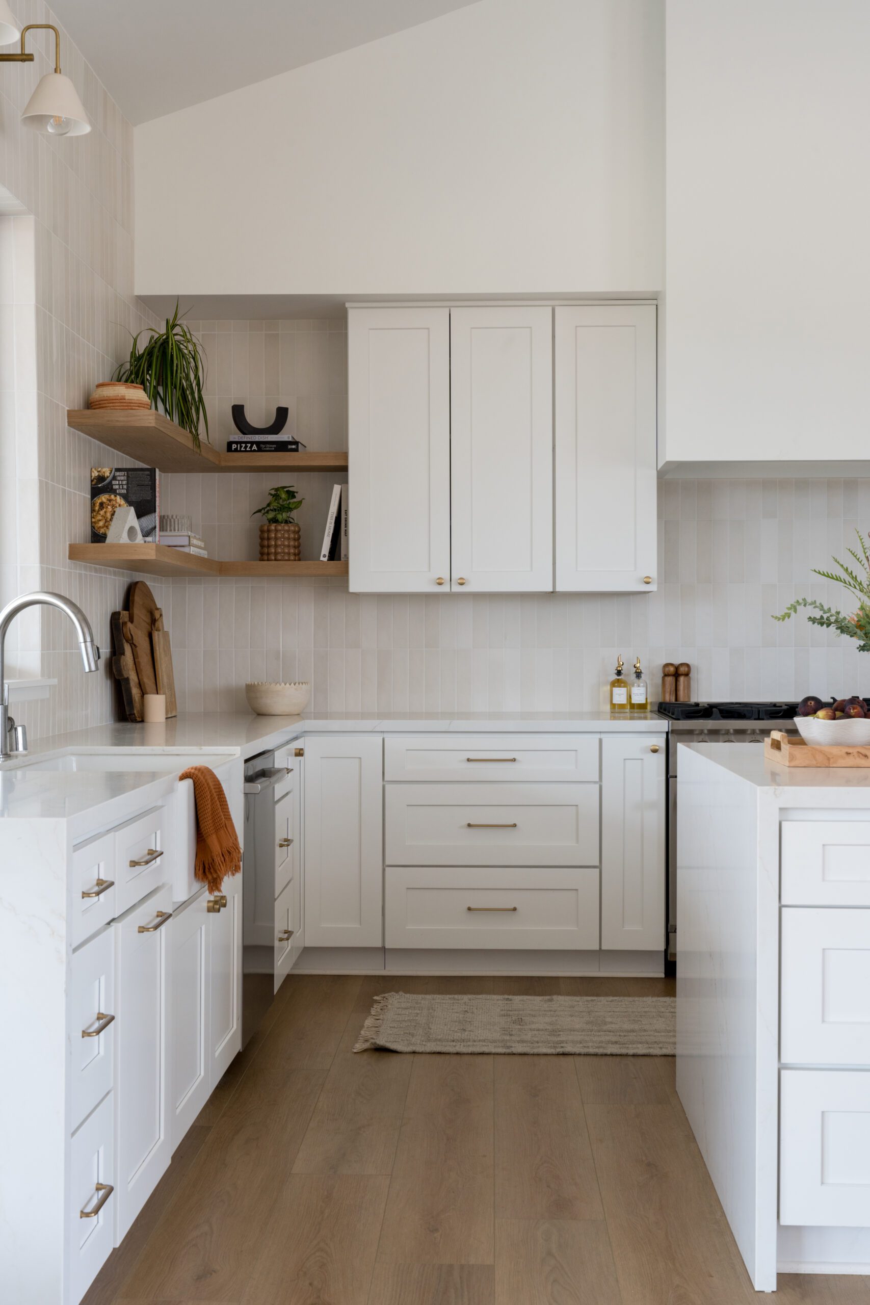
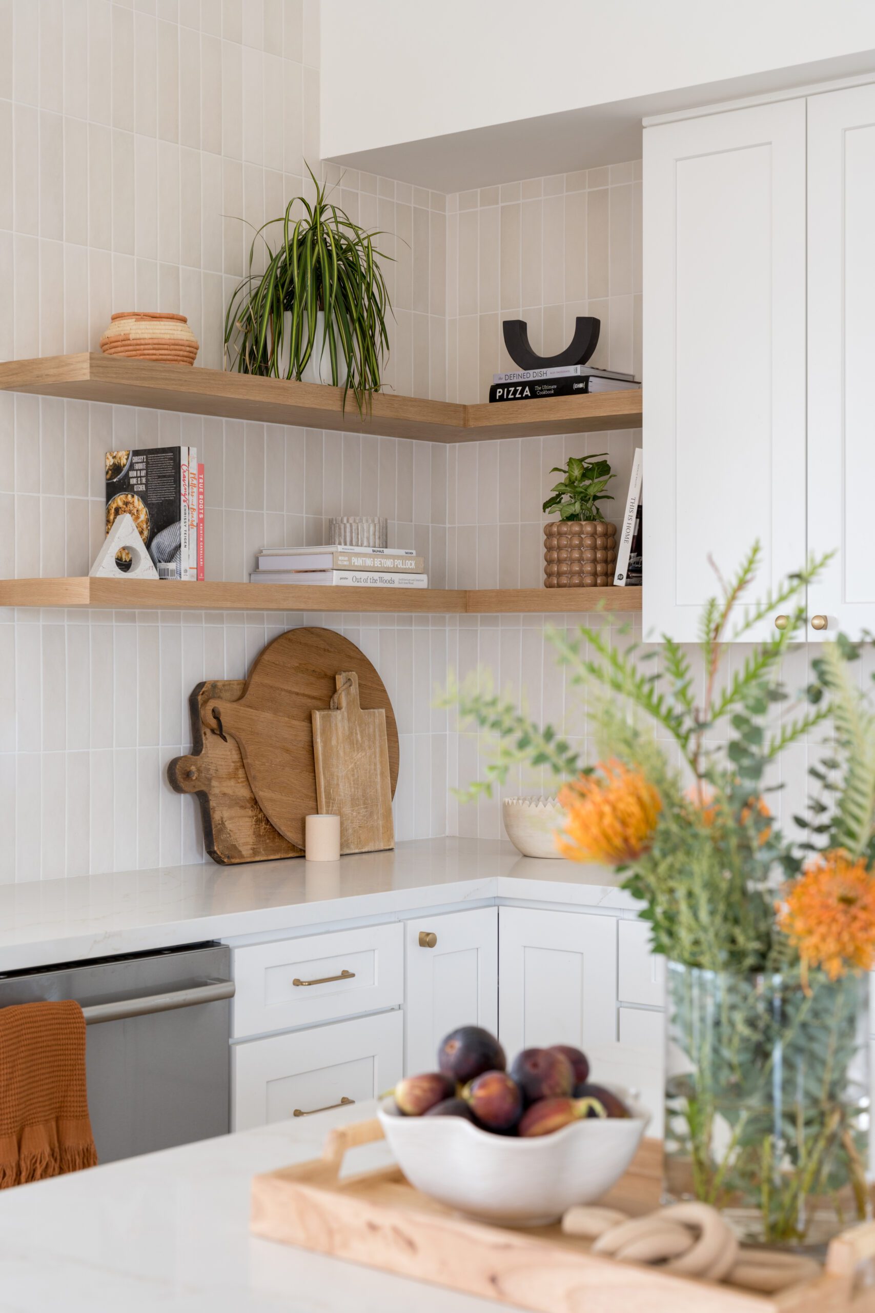
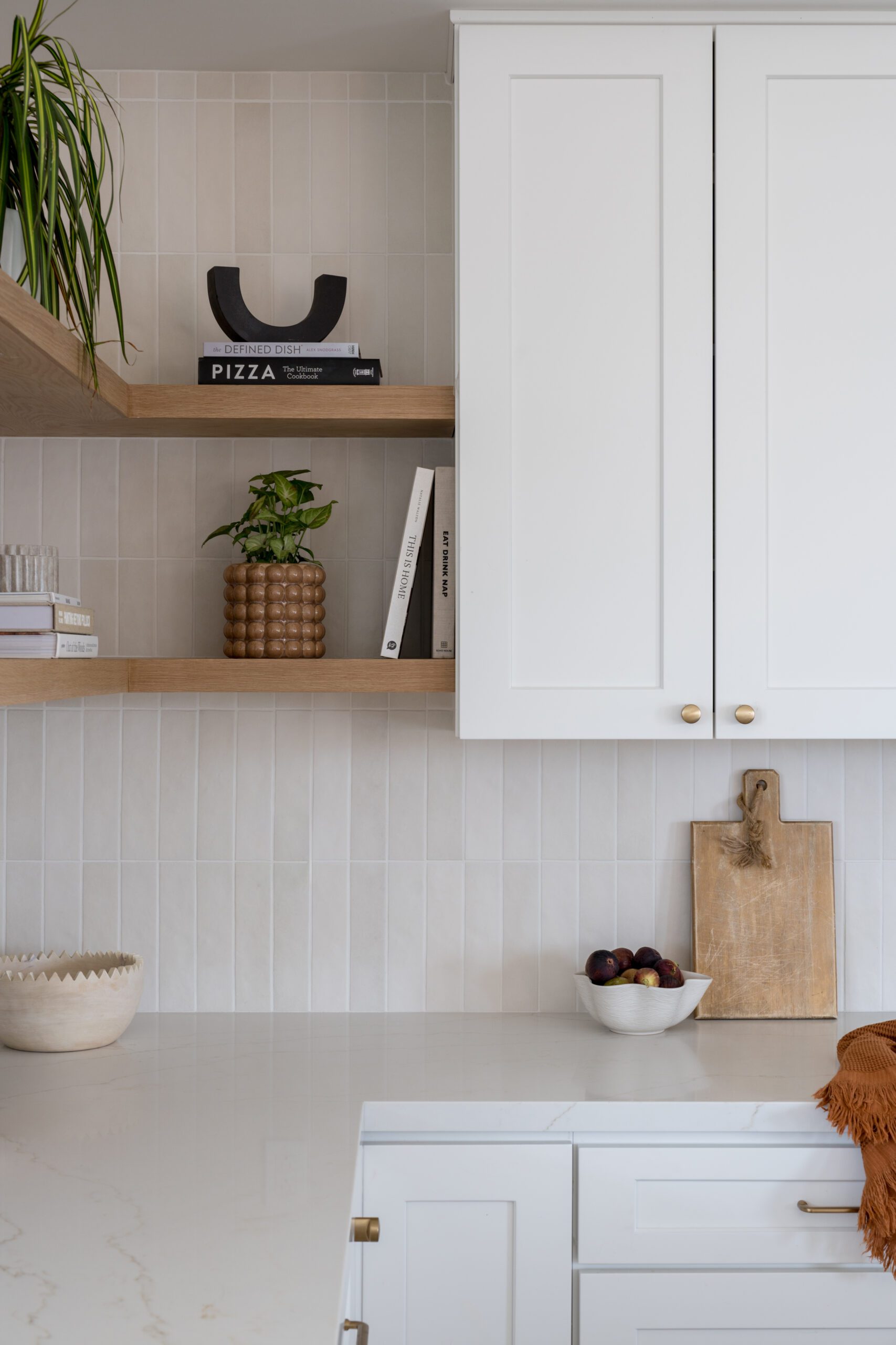
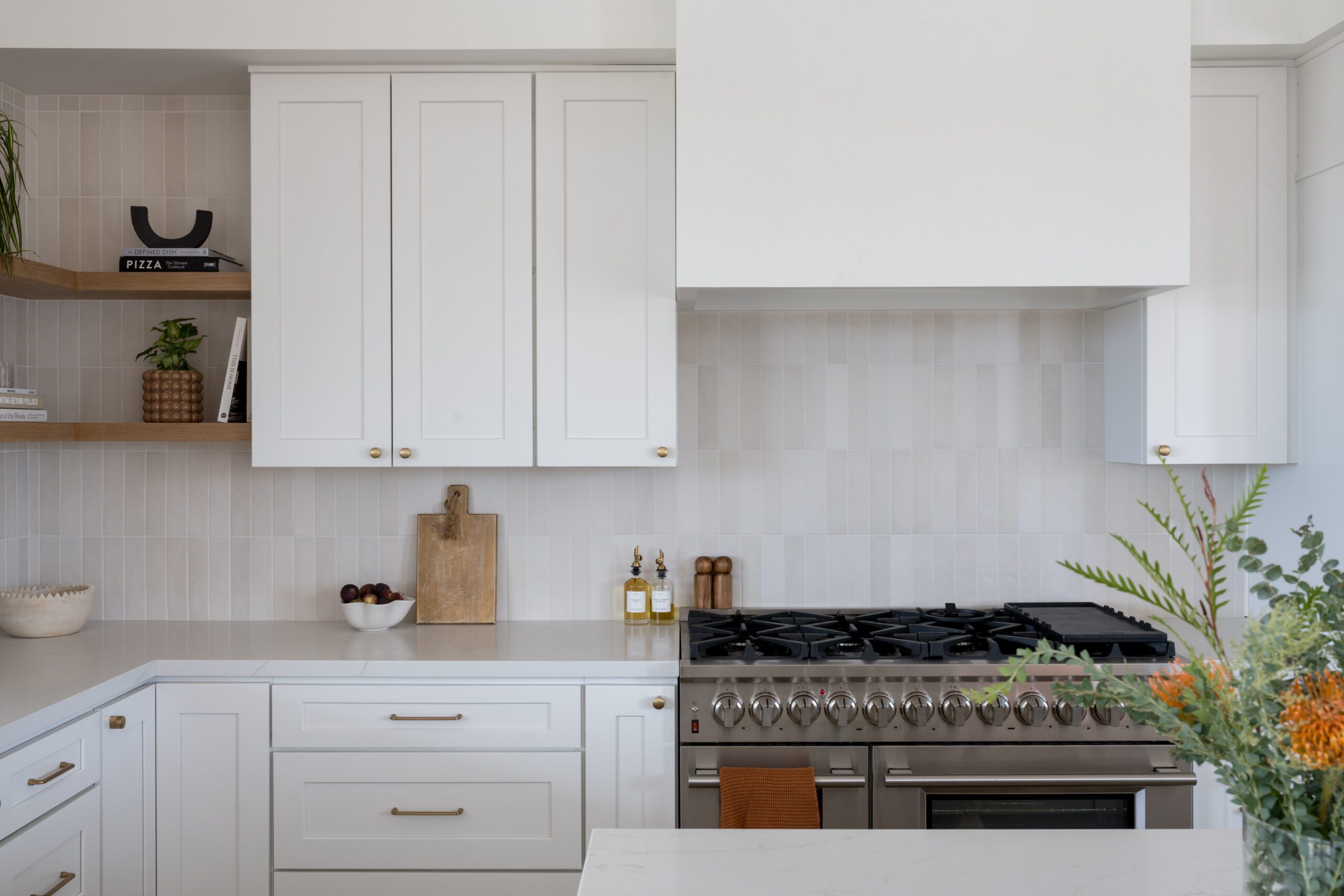
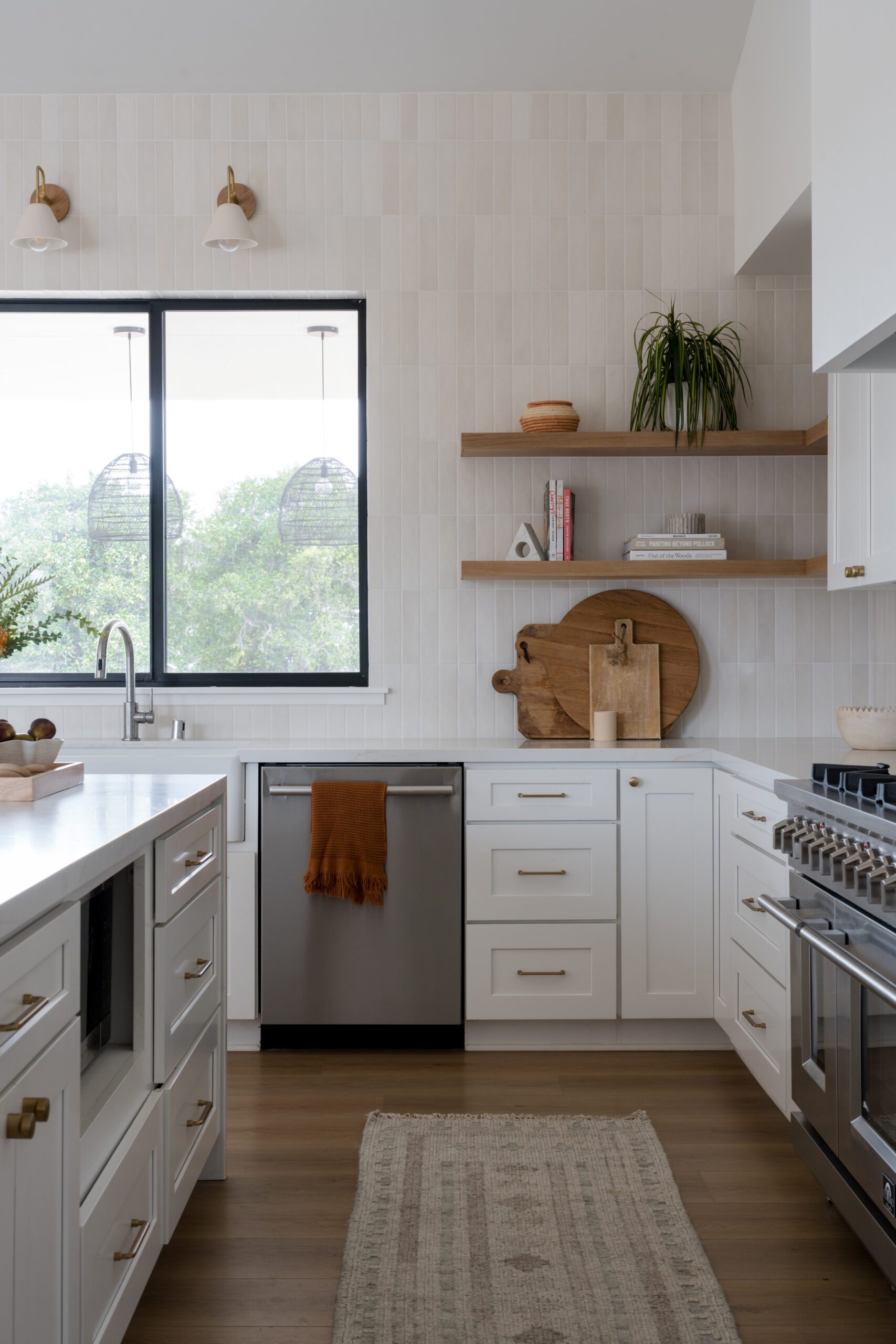
For a family of six, the kitchen is the ultimate gathering space, and it was important that this area functioned well and provided durability for their lifestyle. Working in a neutral palette, Leigh added texture through the dimensional tile, wood, and woven accents to bring warmth to the space. Oversized Serena and Lily pendants set the tone and pull in the wood and brass tones throughout the open-concept space.
A peaceful palette in the primary
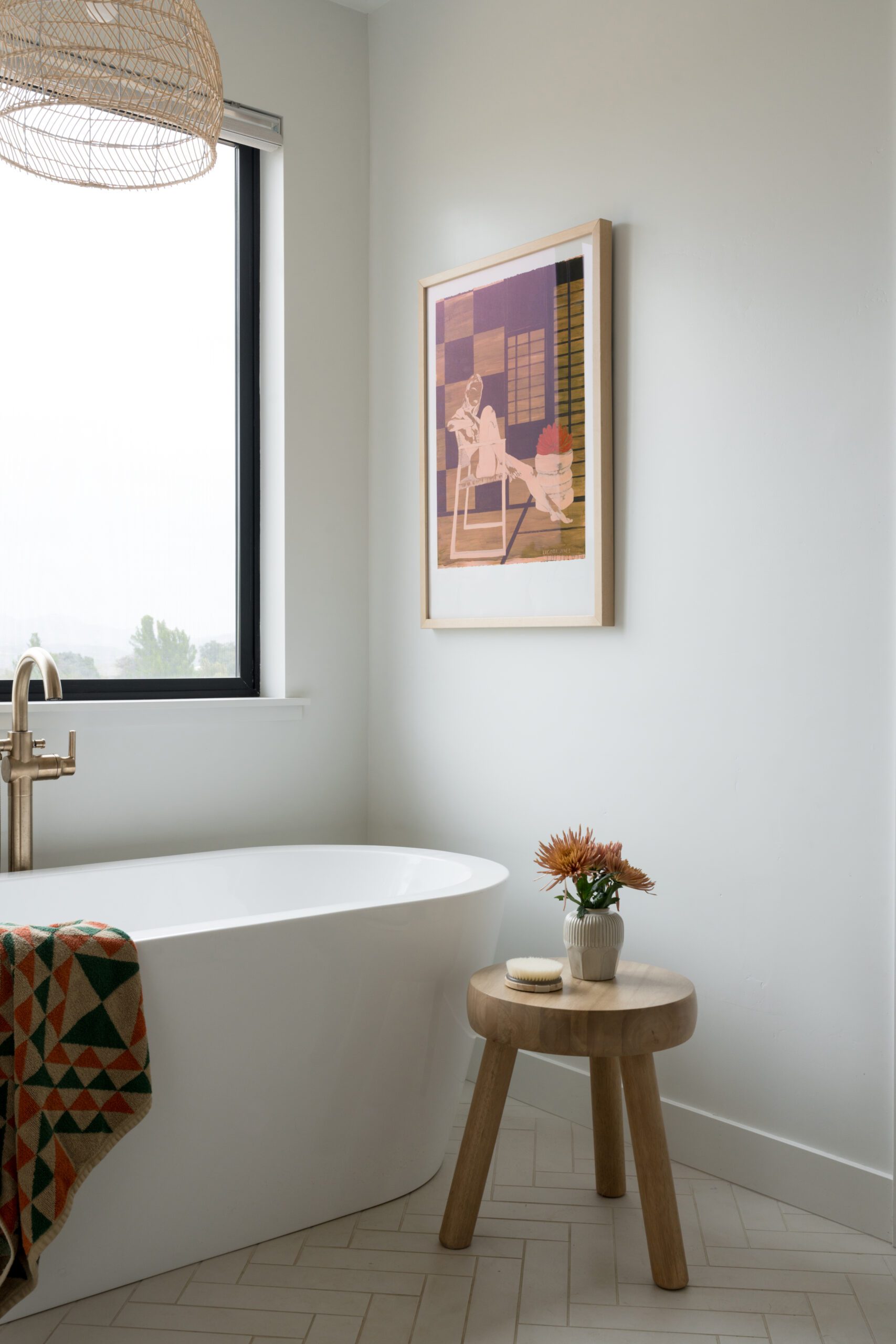
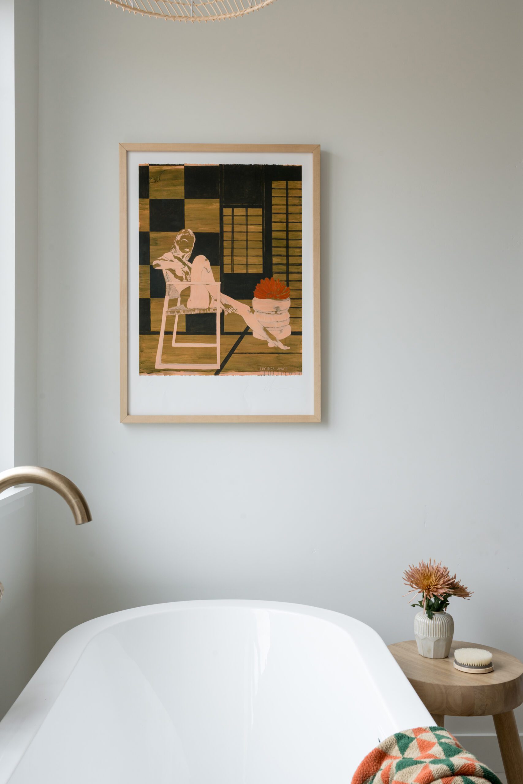
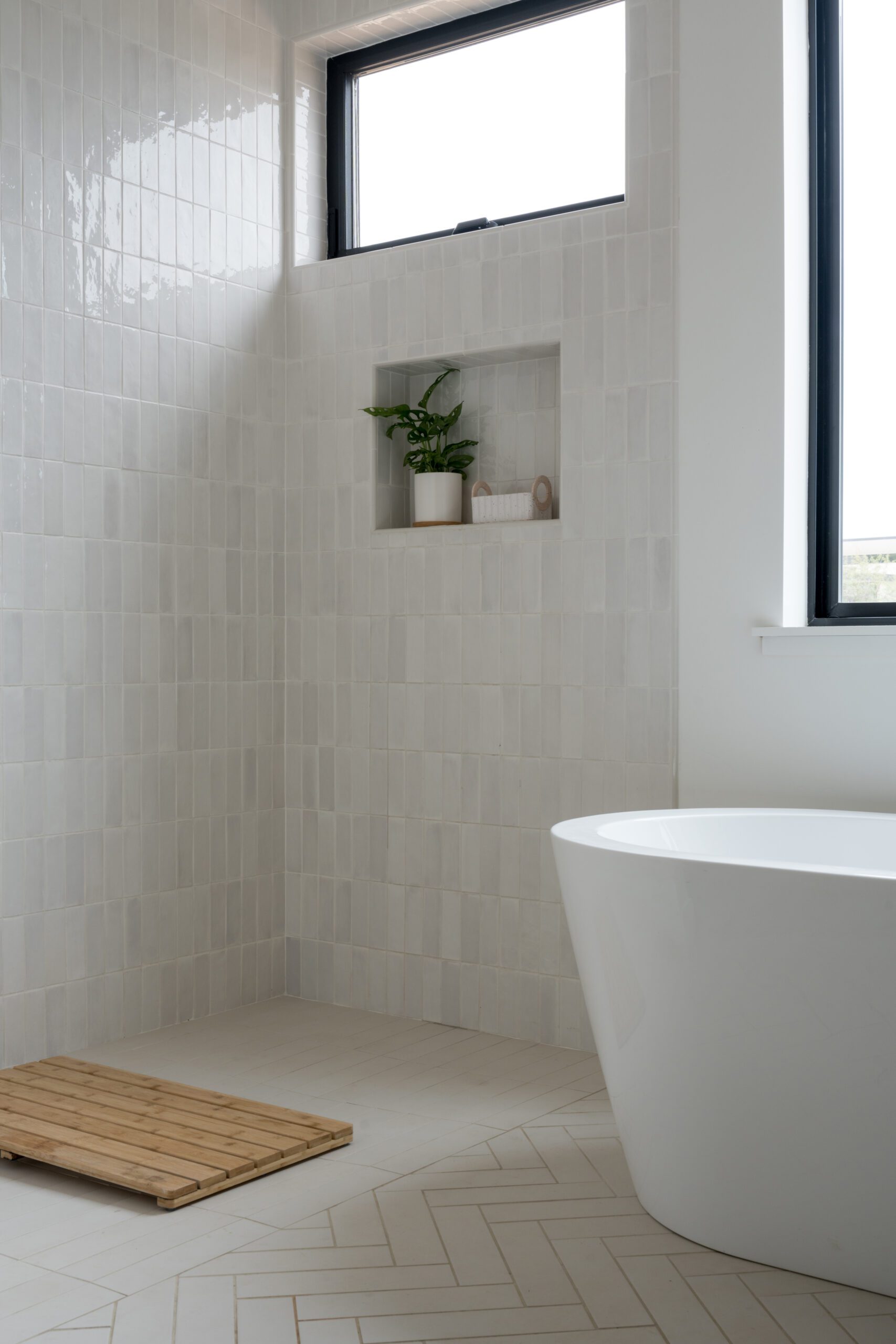
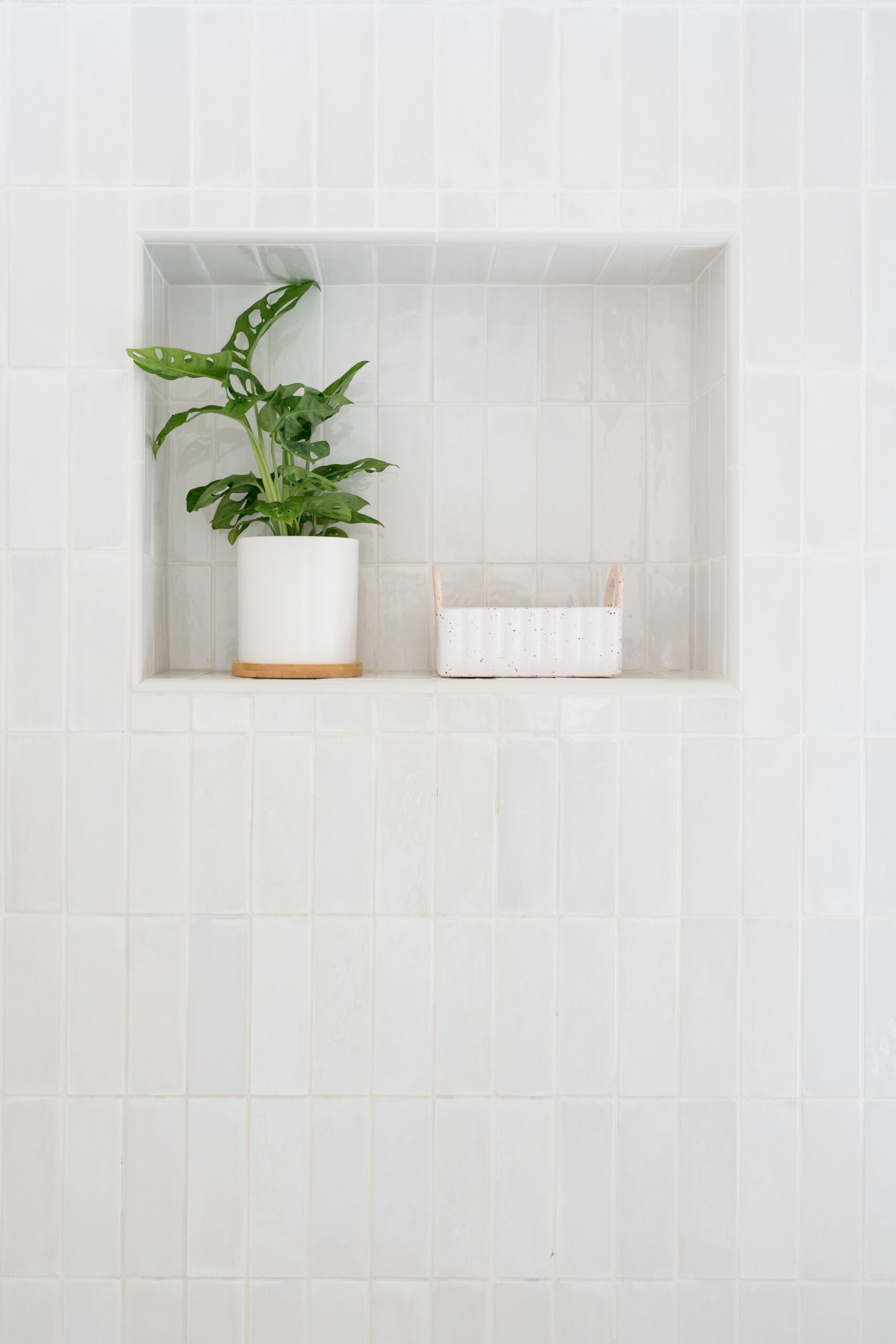
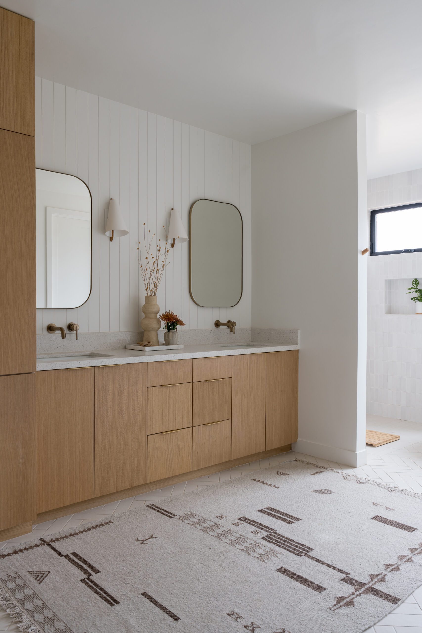
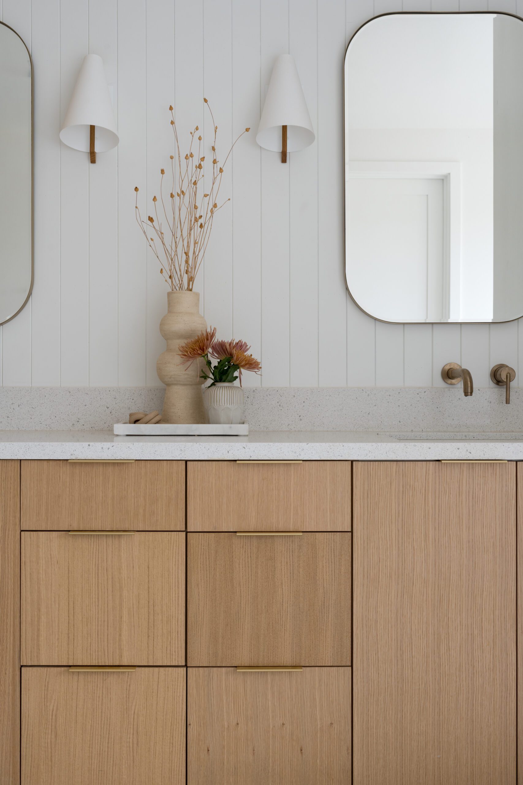
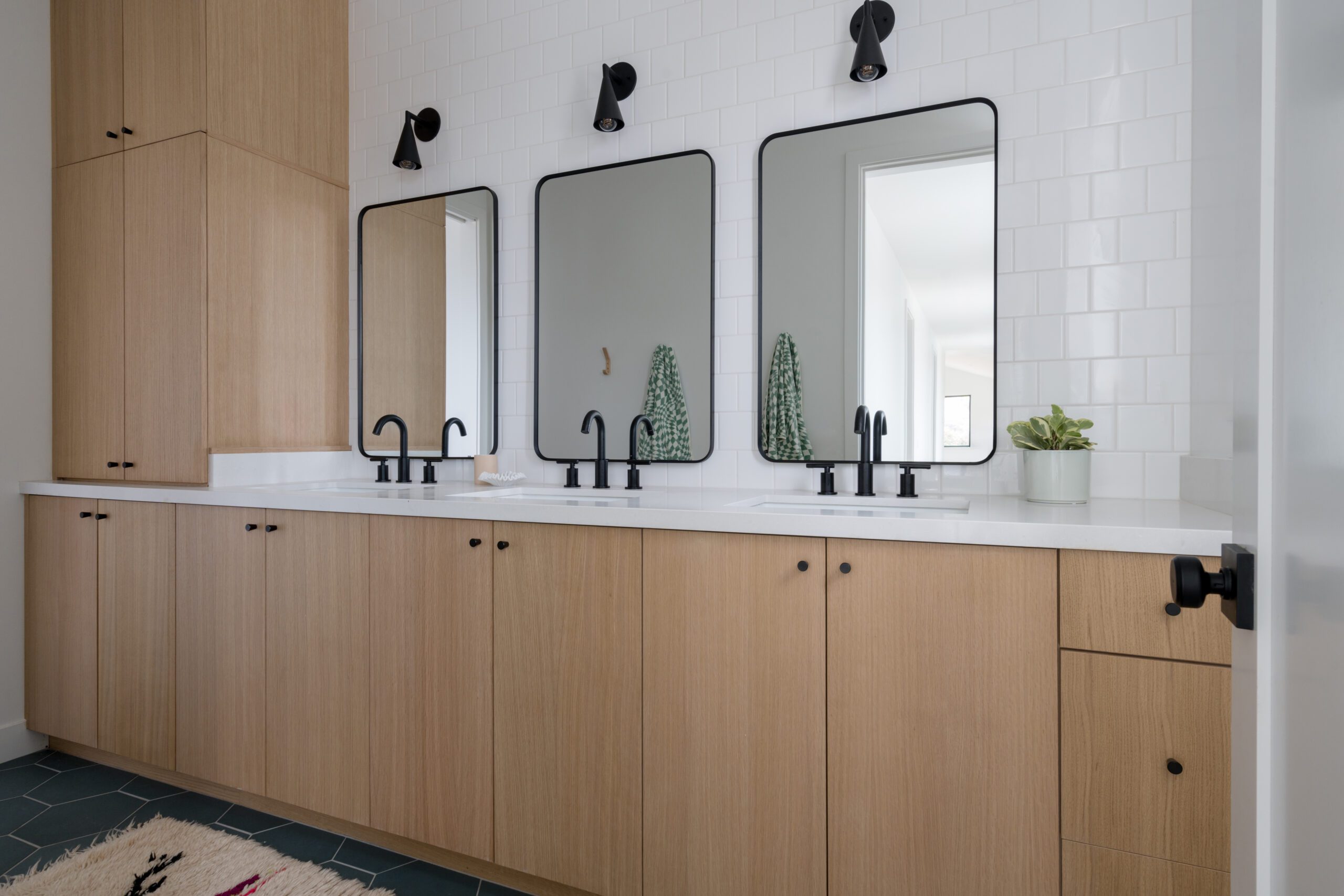
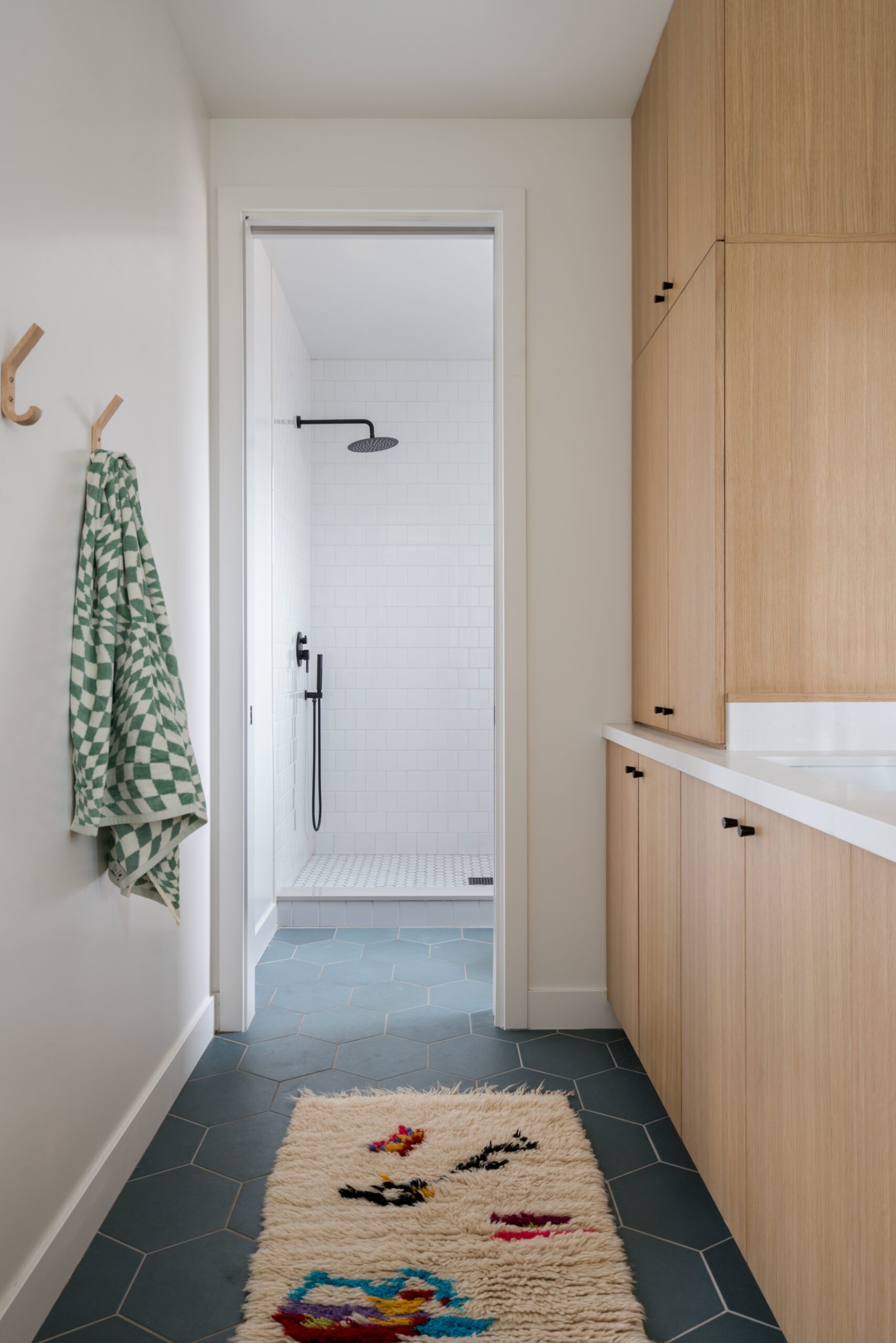
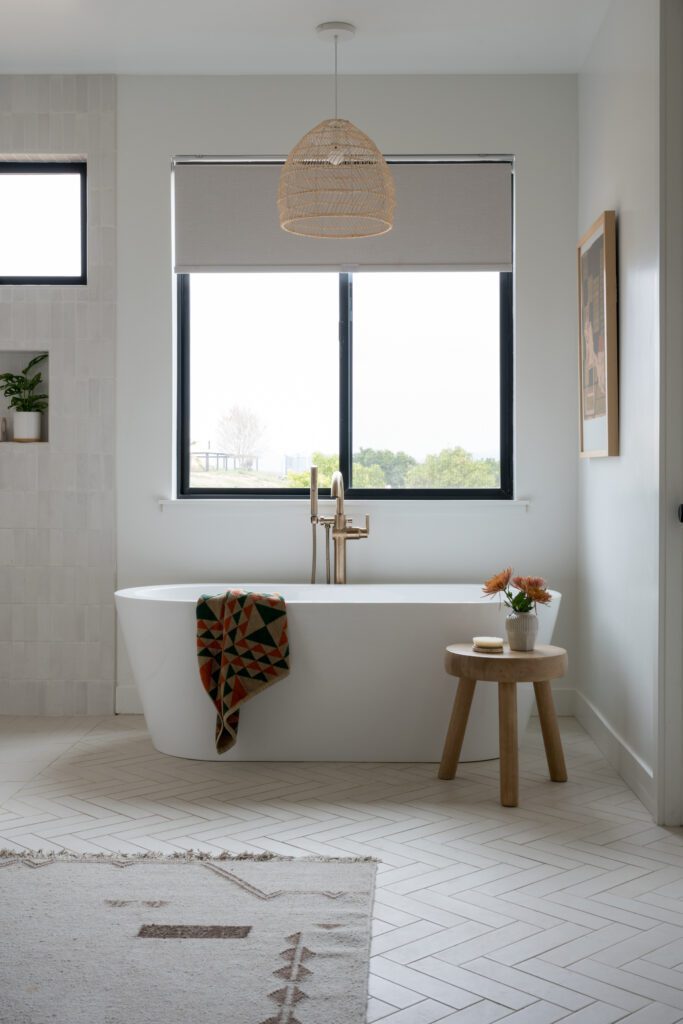
In the primary bathroom, a few key elements keep this space relaxing and serene, per the client’s wishes, while adding dimension to keep it from feeling too one-note. Instead of using a large format tile, Leigh created a herringbone pattern across the expansive bathroom with 2×10 Bedrosians tiles to make it feel almost like a brick. A large rug breaks up the space even more to add warmth and texture; white oak cabinetry brings storage and slight color variation.
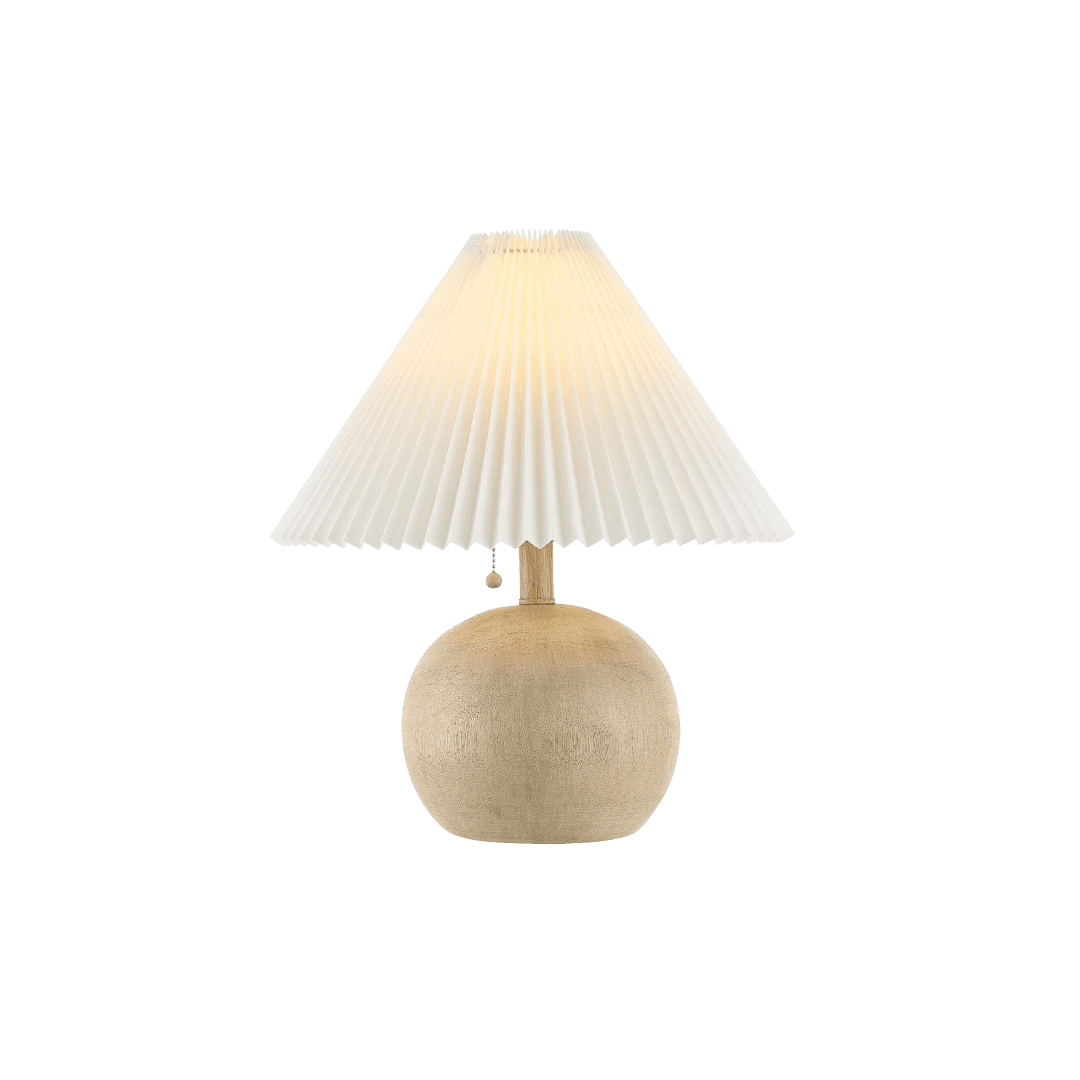
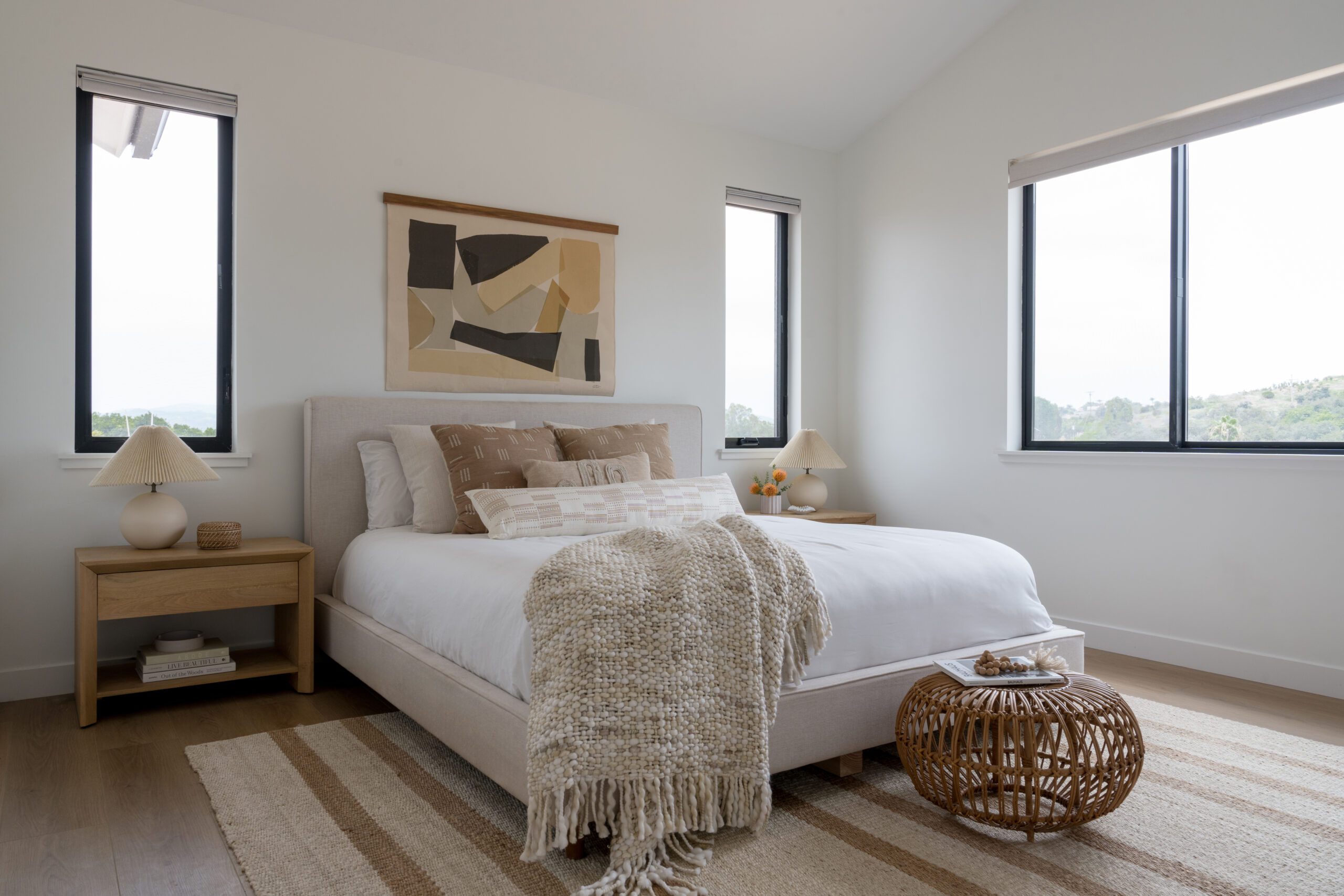
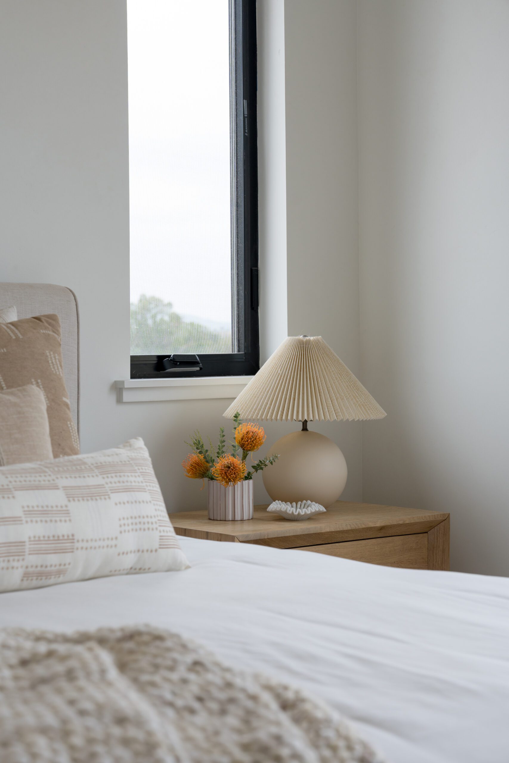
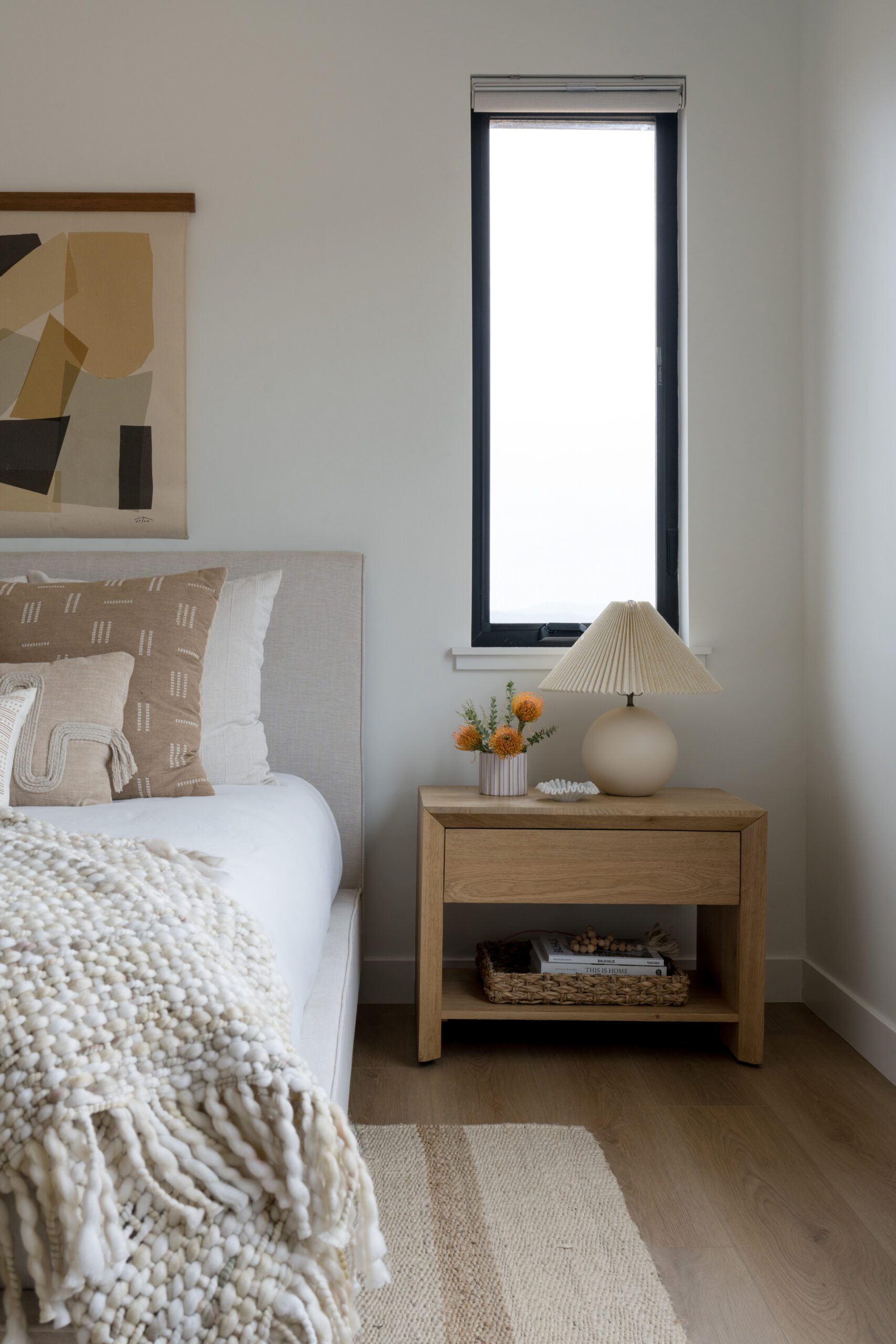
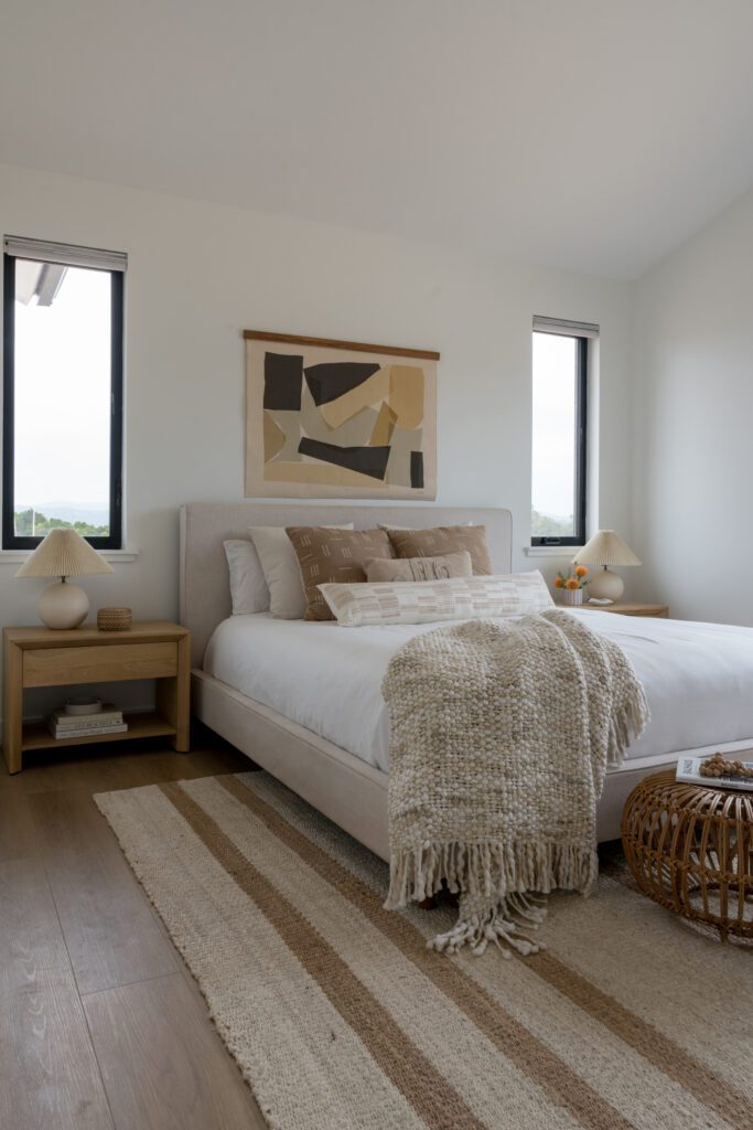
The muted palette carries through to the primary bedroom, where Leigh incorporated subtle patterns and heavy textures through the bedding and the striped jute rug. An Upton home art canvas hangs over the bed and adds the perfect dose of color, while pleated nightstand lighting on both nightstands brings in a playful element.
BY: Jasmyne Muir


