A Revived 1930s Cottage Home
Designers Addie and Caycee Coffield of family studio Living Proper are no strangers to creating timeless, warm homes for their clients, and today’s project feature is the perfect example of merging classic foundations with fresh accents.
Originally a five-bed two bath with a semi-unfinished basement, this Boise, Idaho home needed some restructuring and refreshing to better suit the homeowner’s needs. Addie and Caycee started a complete renovation, eliminating one bedroom to create an ensuite, expanding the kitchen layout, and infusing charm into forgotten details.
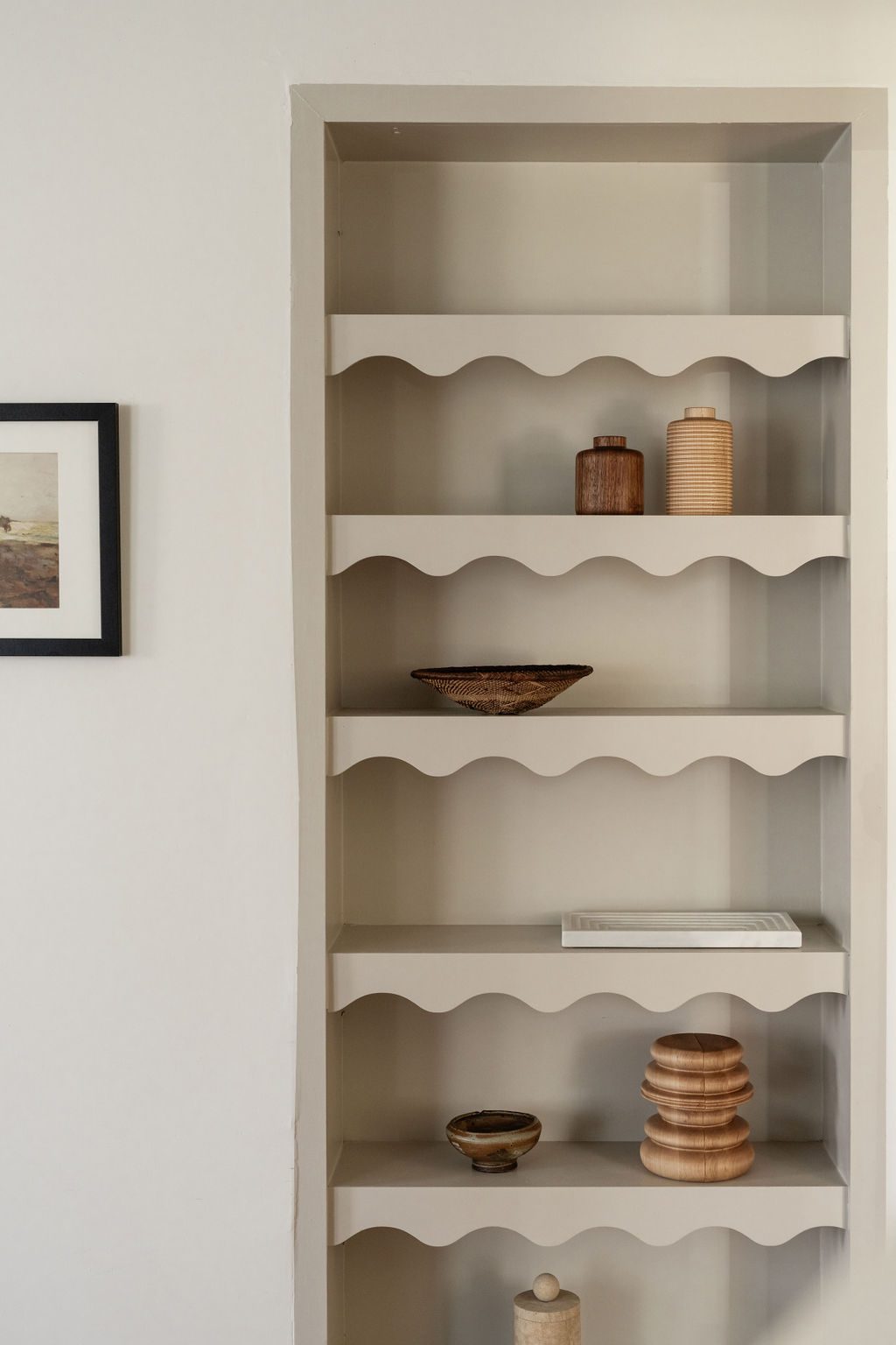
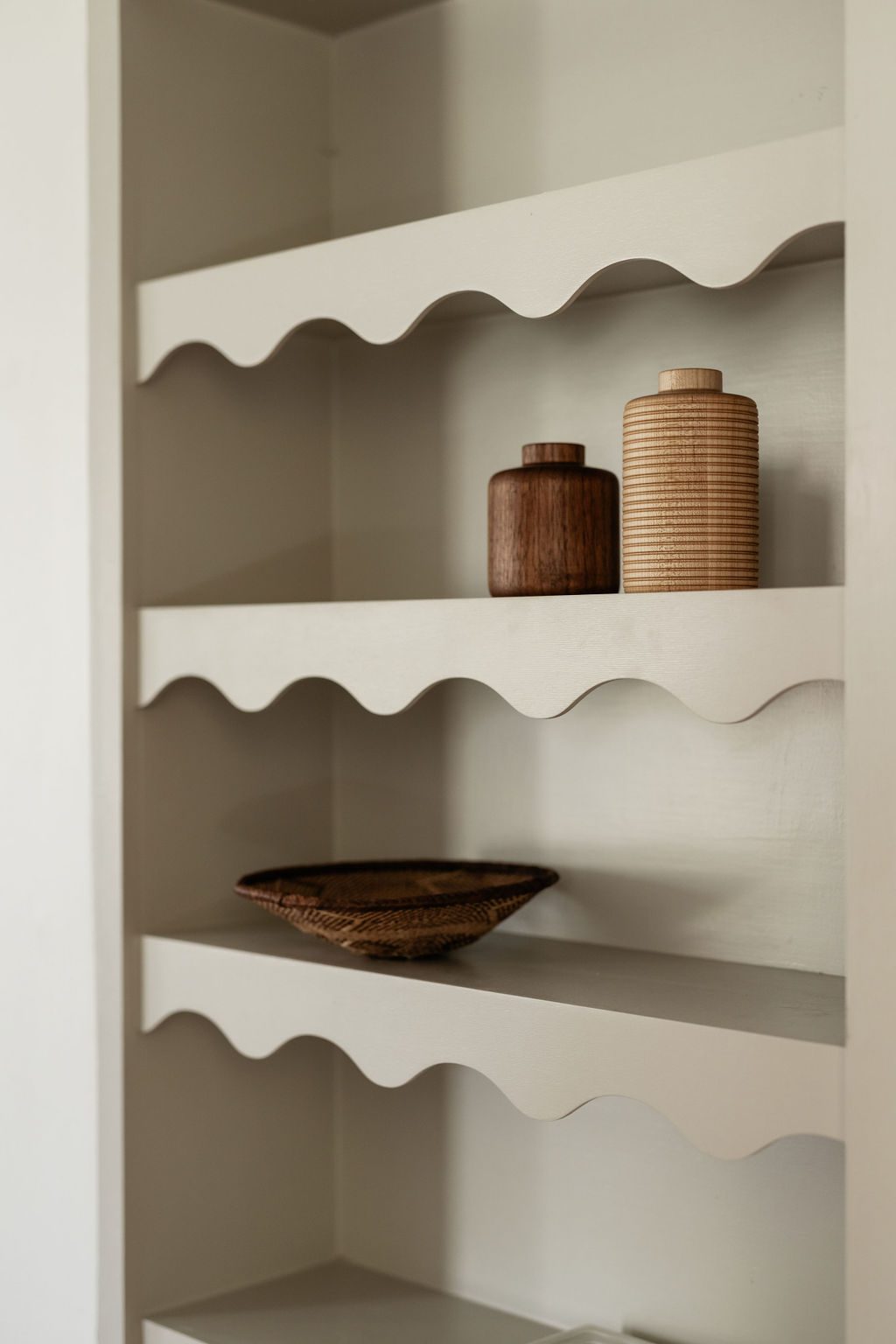
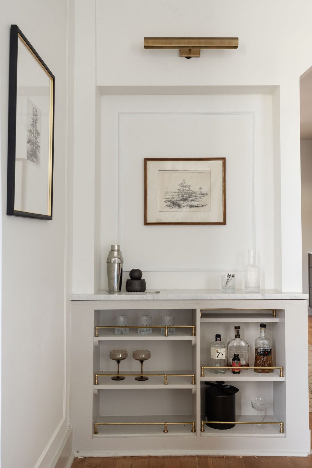
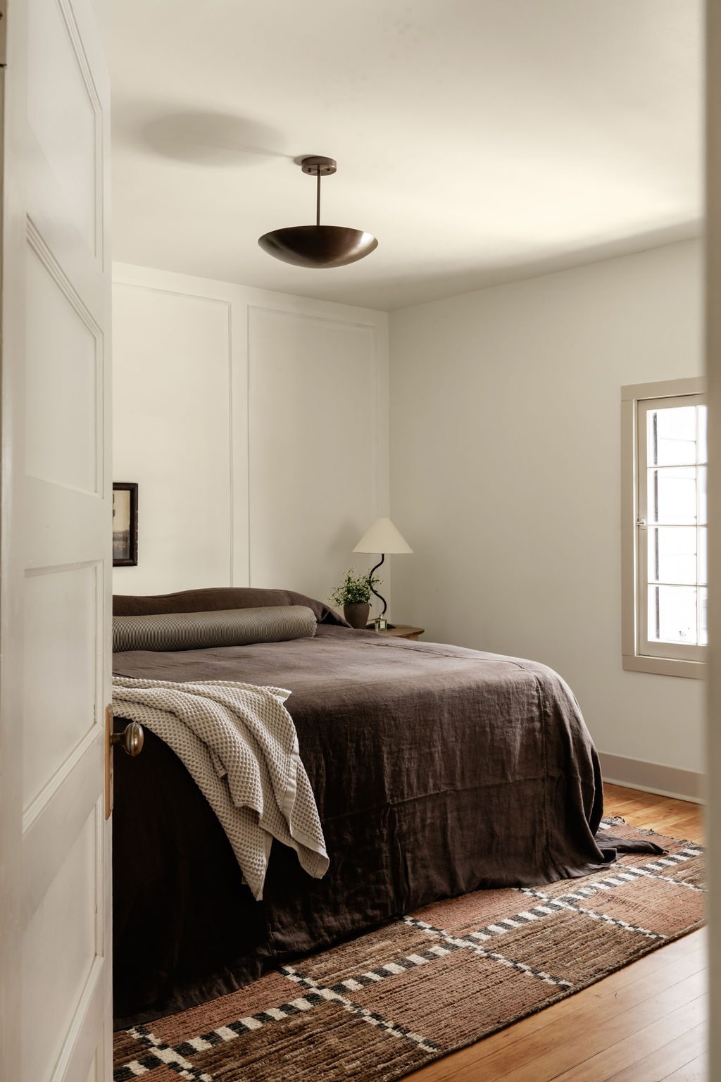
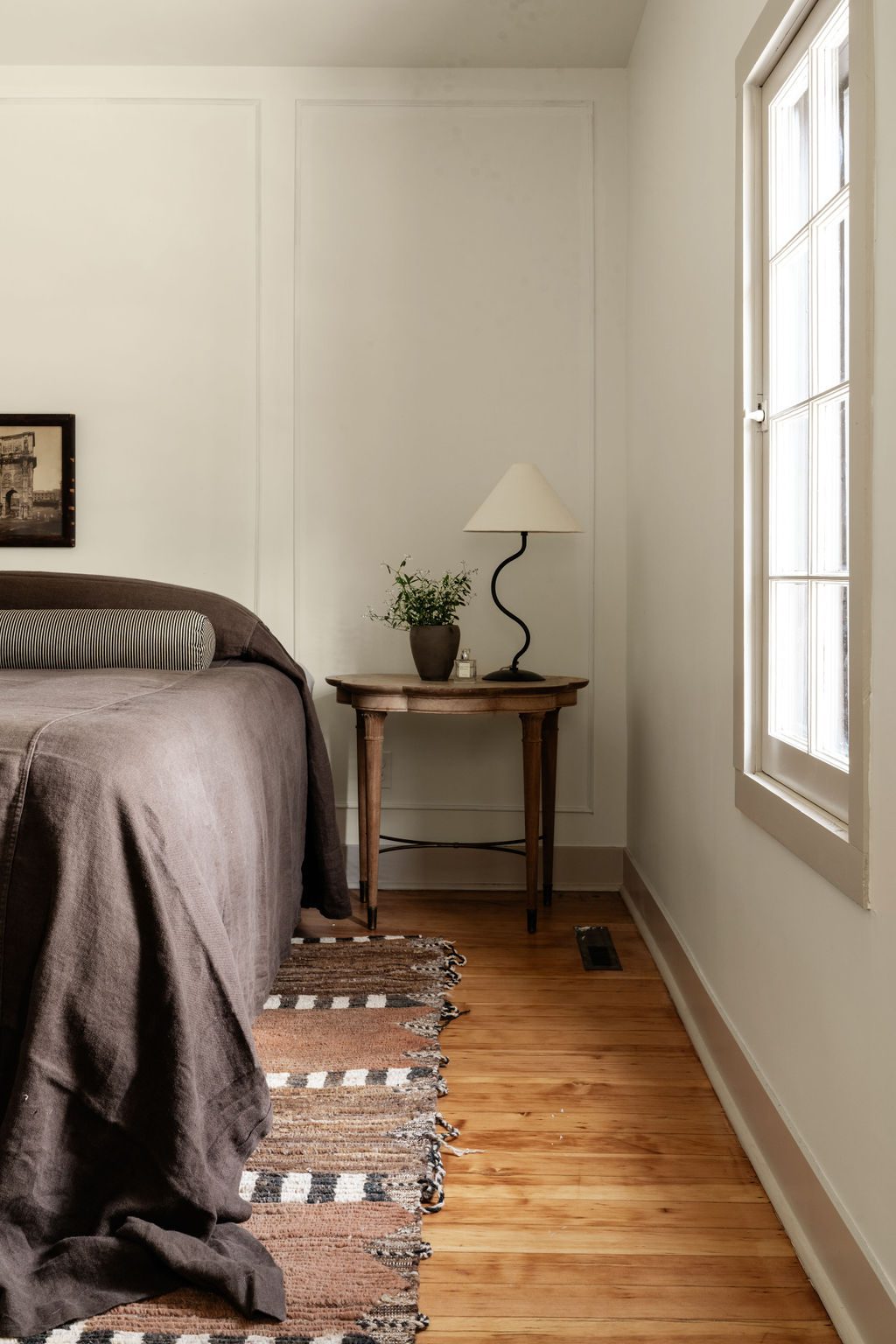
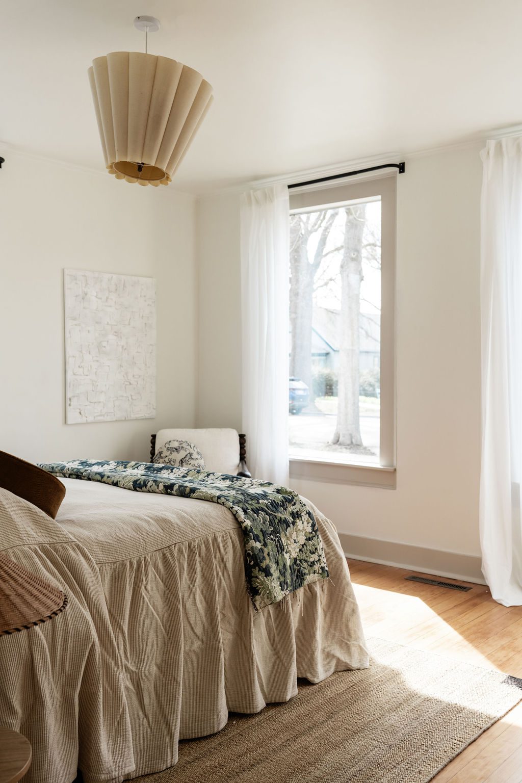
While creating a more functional space for the family was paramount, one of the primary focuses of the project was restoring elements of the home that added character, such as built-ins, original windows, and hardwood floors. The team created an elevated space inspired by travel and art by bringing in updated finishes through lighting, tile, hardware, and counter surfaces.
Design: Living Proper Interiors | Photography: Madeline Harper
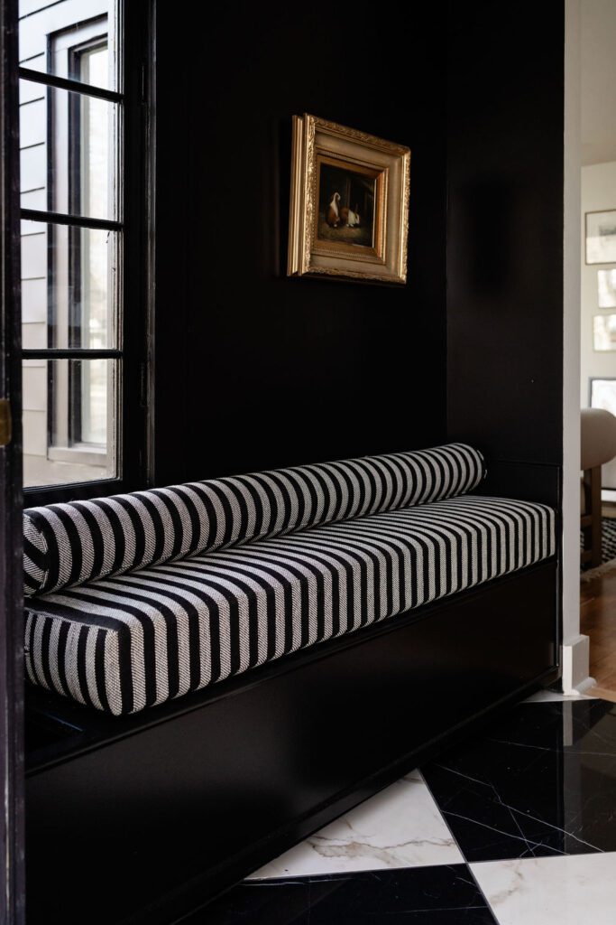
A chic drama-filled entryway
What was once a simple exterior front porch became a charming entryway with a custom bench and mail slot. The team was able to repurpose the original window and add some drama with checkered tiled floors, a black paint wash, and beautiful lighting.
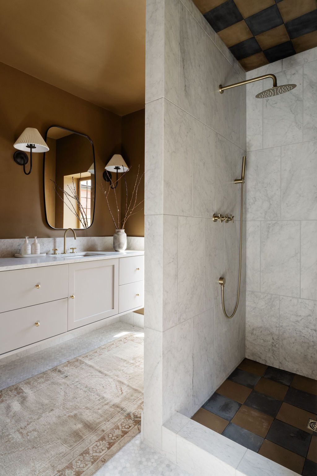
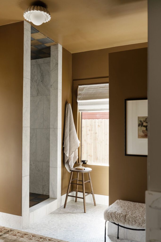
A fresh & classic primary bath
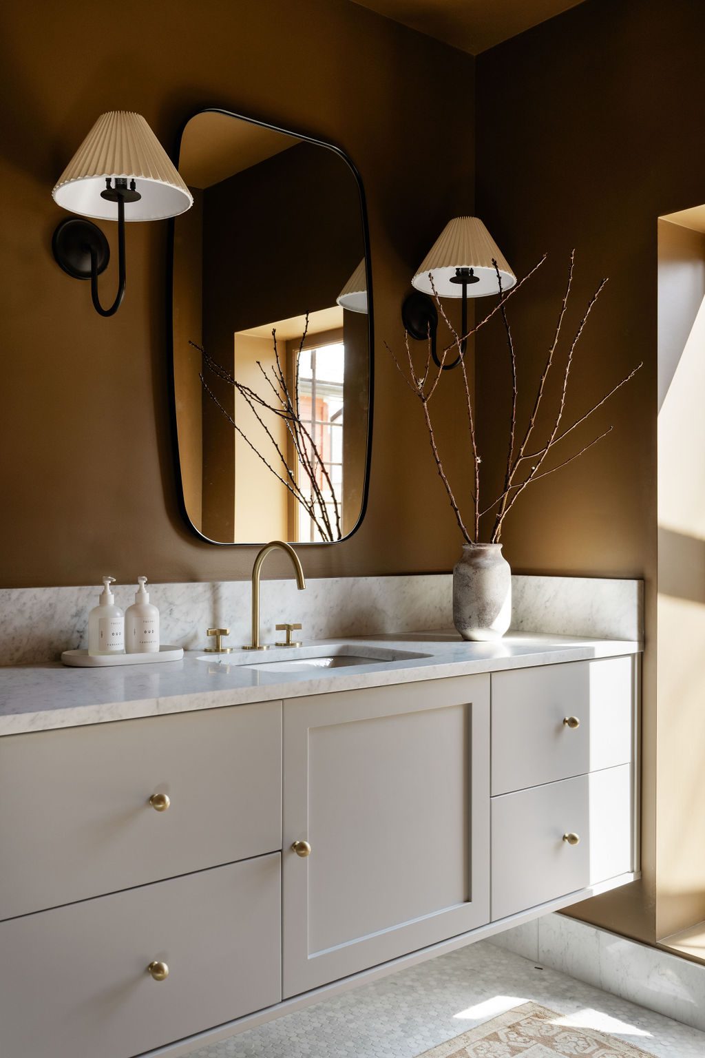
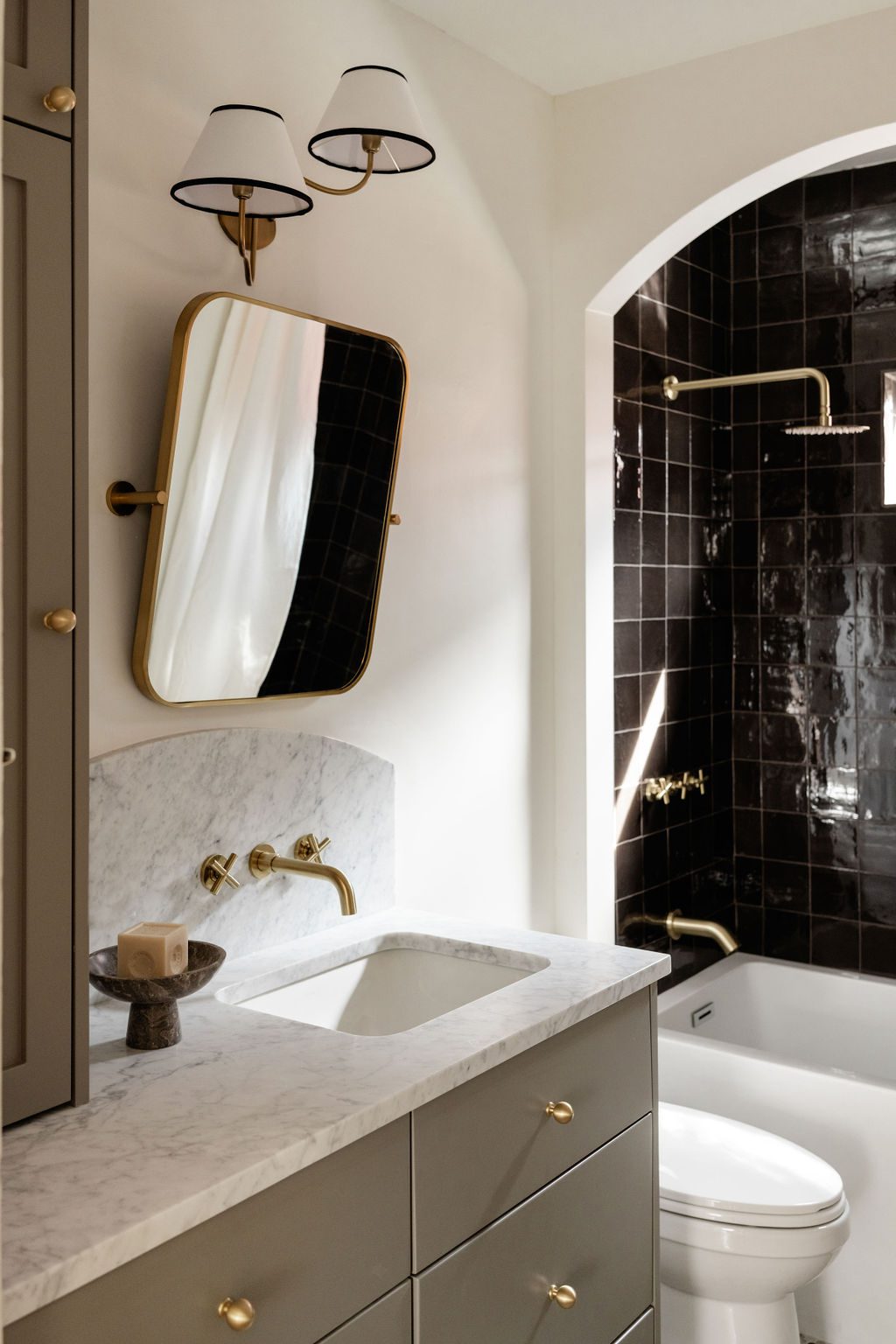
One of the homeowner’s primary wishes was the addition of an en suite bathroom in the primary bedroom. By eliminating a small bedroom, the team incorporated a gorgeous bath filled with natural light, contrasted by a playful custom wall color. The checkered tiles in the shower and Carrara marble help establish layers and create an organic pattern. A custom-built vanity brings in functional storage and accents the floor-to-ceiling window.
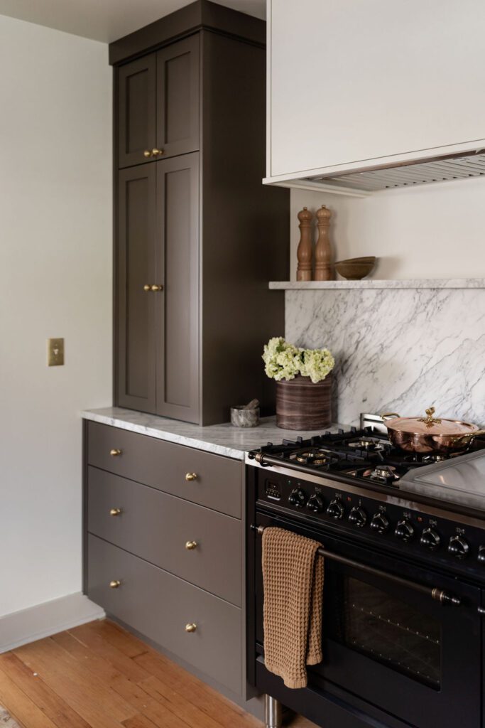
A warm & elevated kitchen
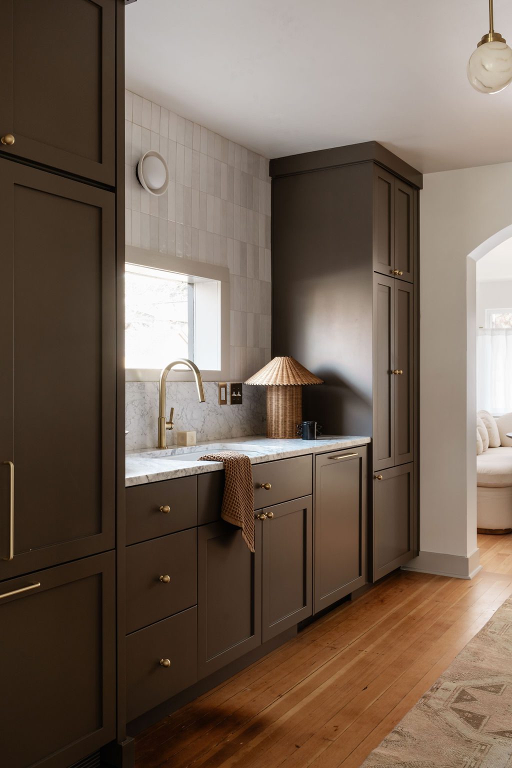
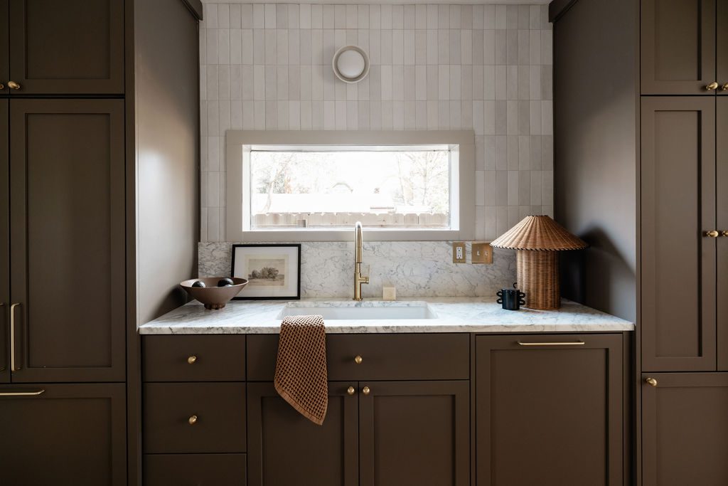
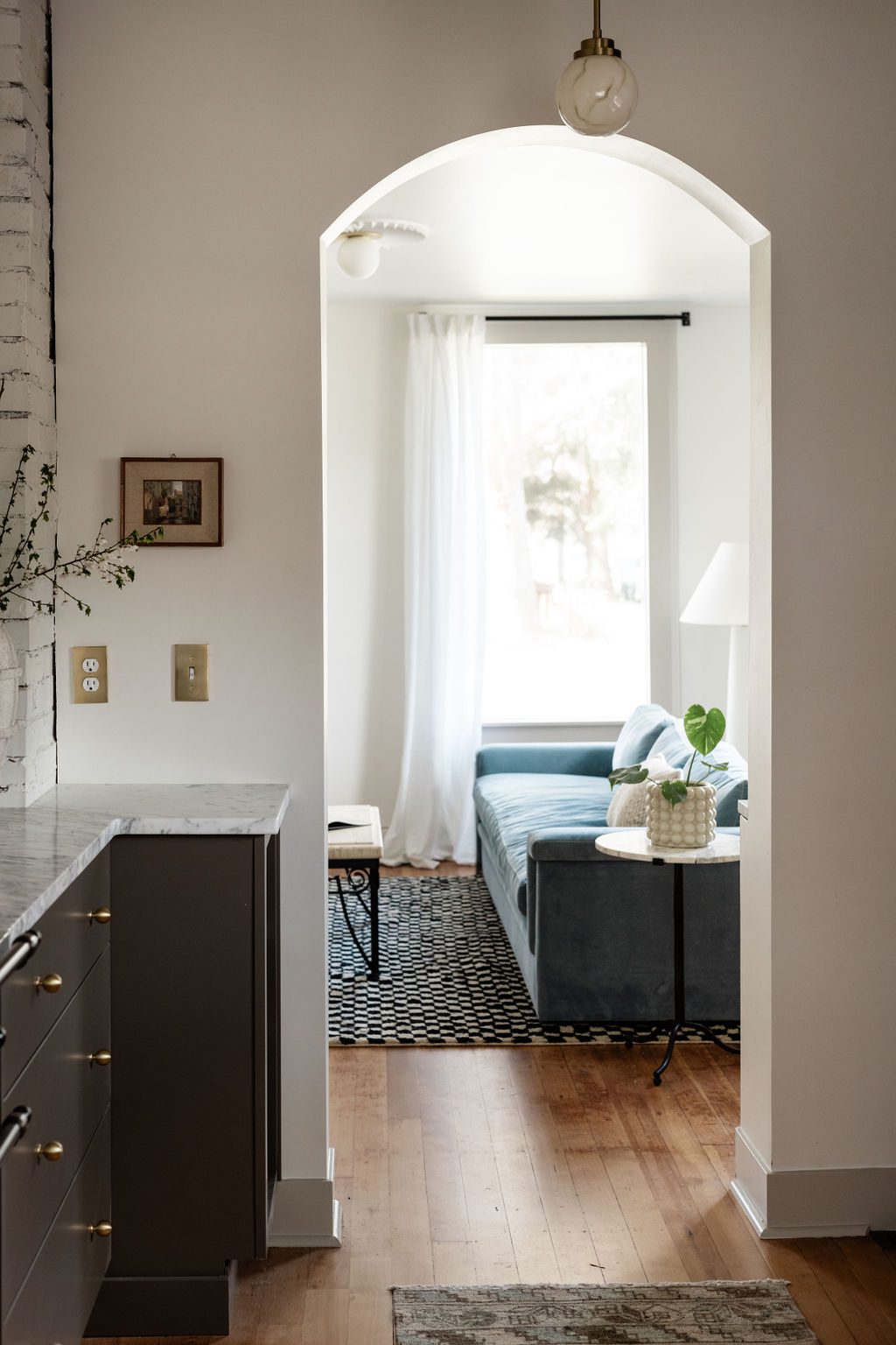
While the entirety of the kitchen’s layout didn’t need to be reconfigured, the floorplan did allow for the expansion of the cabinetry width four feet into the dining area. Dark paint, built-in appliances, and marble countertops elevated the design and added warmth. A 48” Ilve range accented by marble shelving creates a solid focal point accented by carefully selected statement-making lighting.
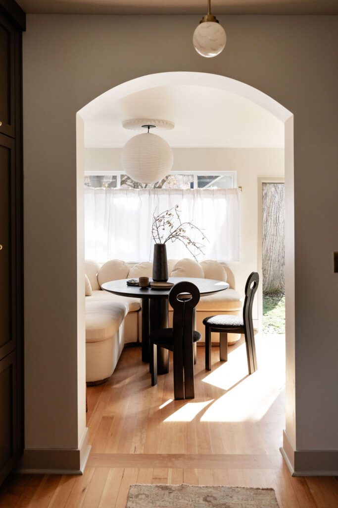
An inviting dining nook
Set off by a Sixpenny banquette, the dining nook brings a cozy and inviting feeling to the kitchen, allowing for extra seating and entertaining space and maximizing the functionality of the small footprint. Simple white cafe curtains add some privacy while keeping the natural light flowing throughout the room.
A moody & playful basement
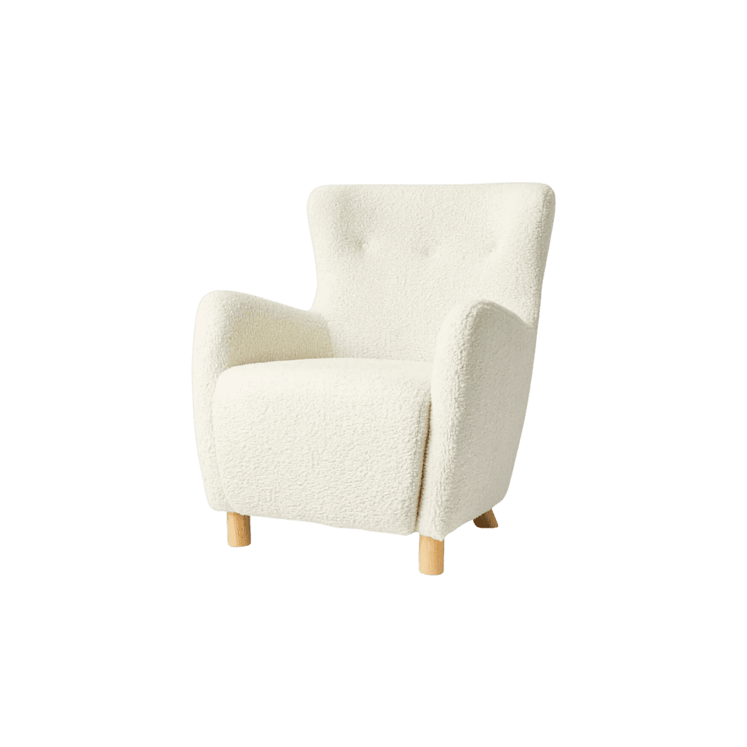
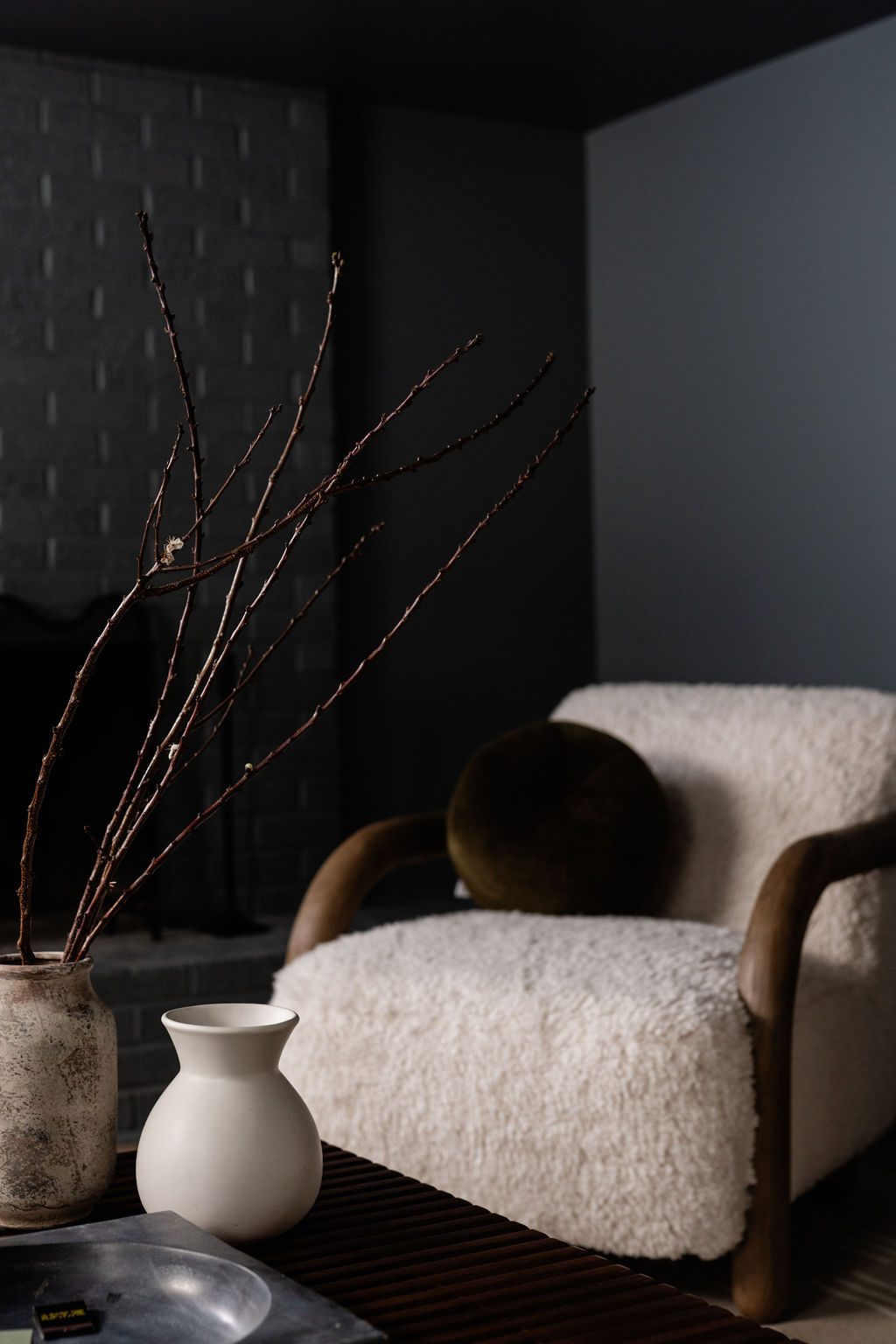
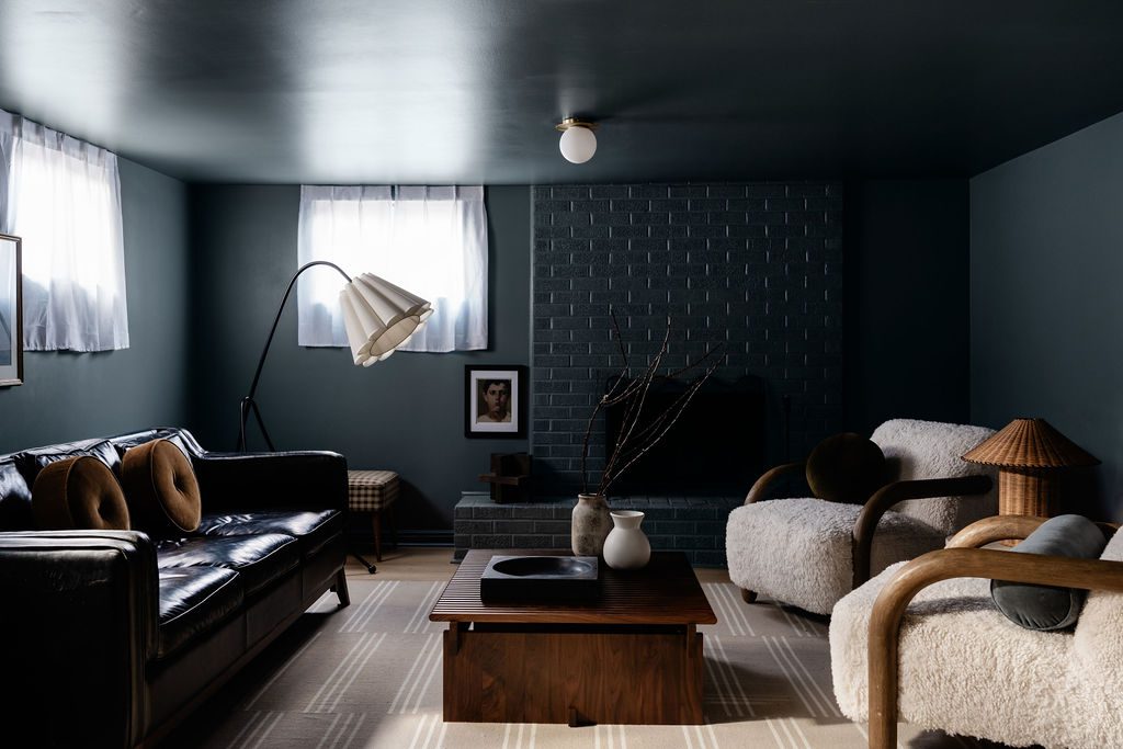
In the basement, the team opted to lean into the limited light available and create a moody yet playful lounge space complete with leather, warm wood, and boucle textures. An oversized pleated lamp in the corner creates some asymmetry and contrasts the deep blue hue.
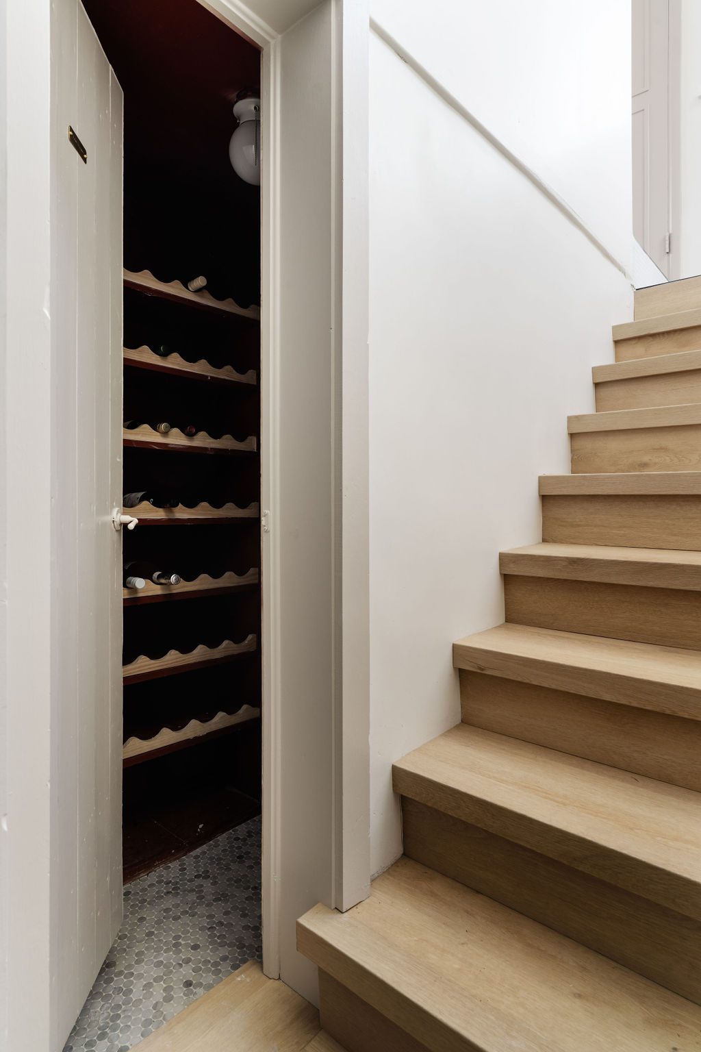
Rather than omit the home’s unused storage area, Addie and Caycee transformed the space into a classic French wine cellar painted to match the basement’s deep color story.
Scroll through the gallery below to see more from this home tour and shop the look.
BY: Jasmyne Muir


