An English-Inspired Salt Lake City Remodel
While creating an addition to a home may seem like a simple solution, designing extensions that connect cohesively to the existing space and flow together is easier said than done. Today’s project feature by Salt Lake City designer Madeline Loomis is a perfect example of how to do it well. In addition to adding a large extension to the back of the original house, Madeline helped her client reposition and design the kitchen, mudroom, and powder room.
Nestled in the heart of Salt Lake City’s historic Yalecrest neighborhood, this remodel is filled with charm and timeless details. Madeline worked with her clients to help them bring their English-cottage-inspired dreams to life, expertly mixing playful but sophisticated patterns and colors in the process.
Design: Mad Luxe Design | Photography: Christina Zolotaia
A timeless custom kitchen
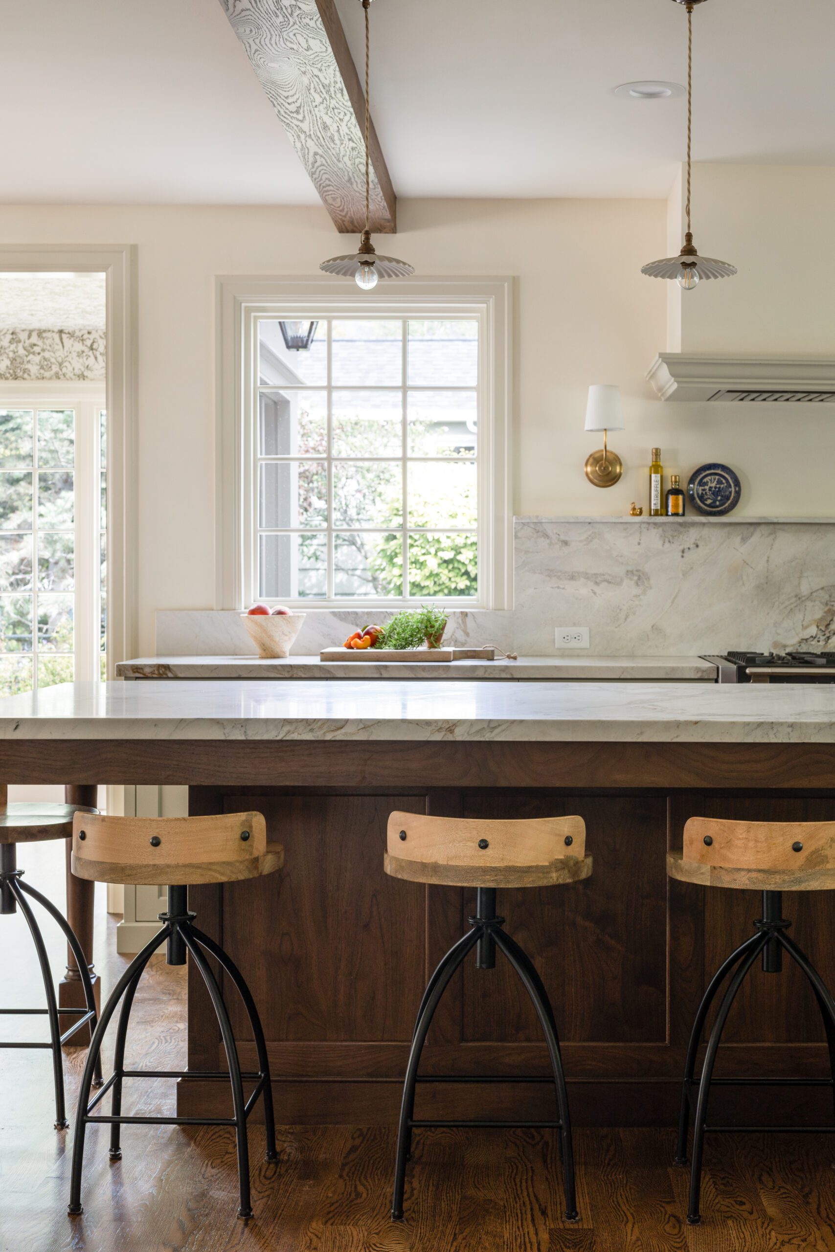
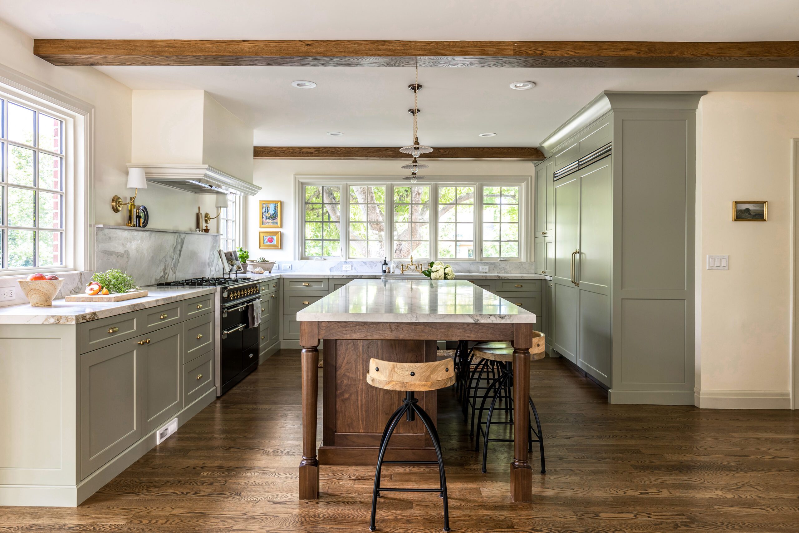
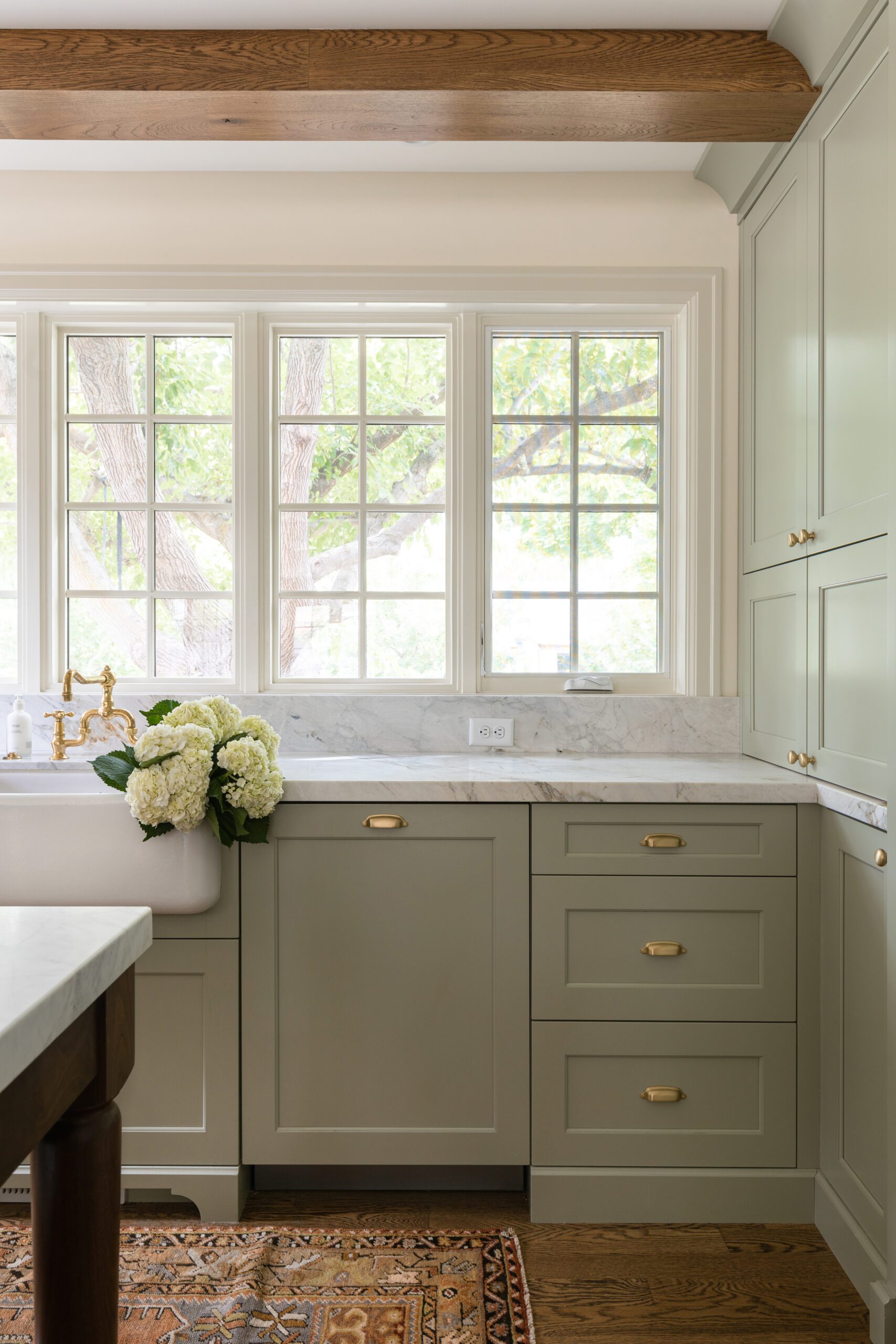
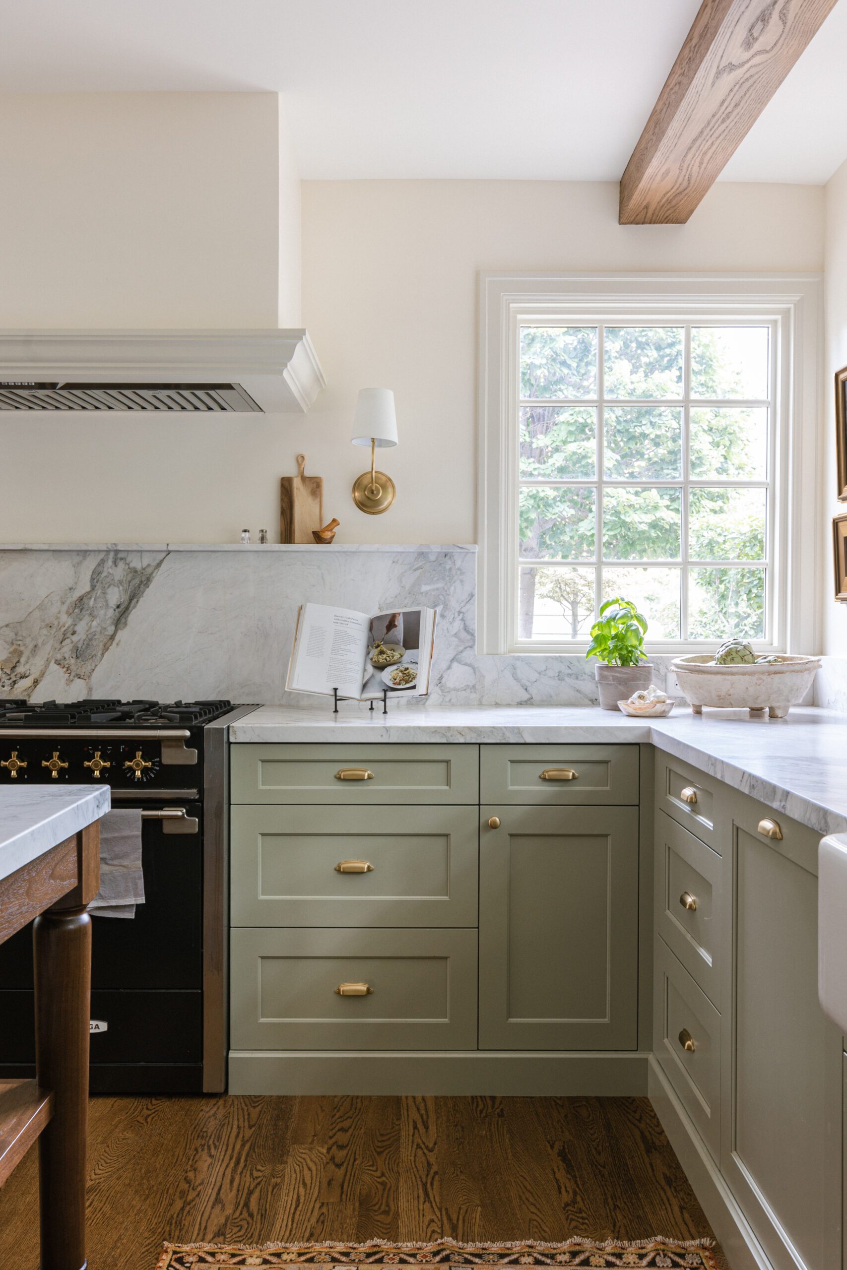
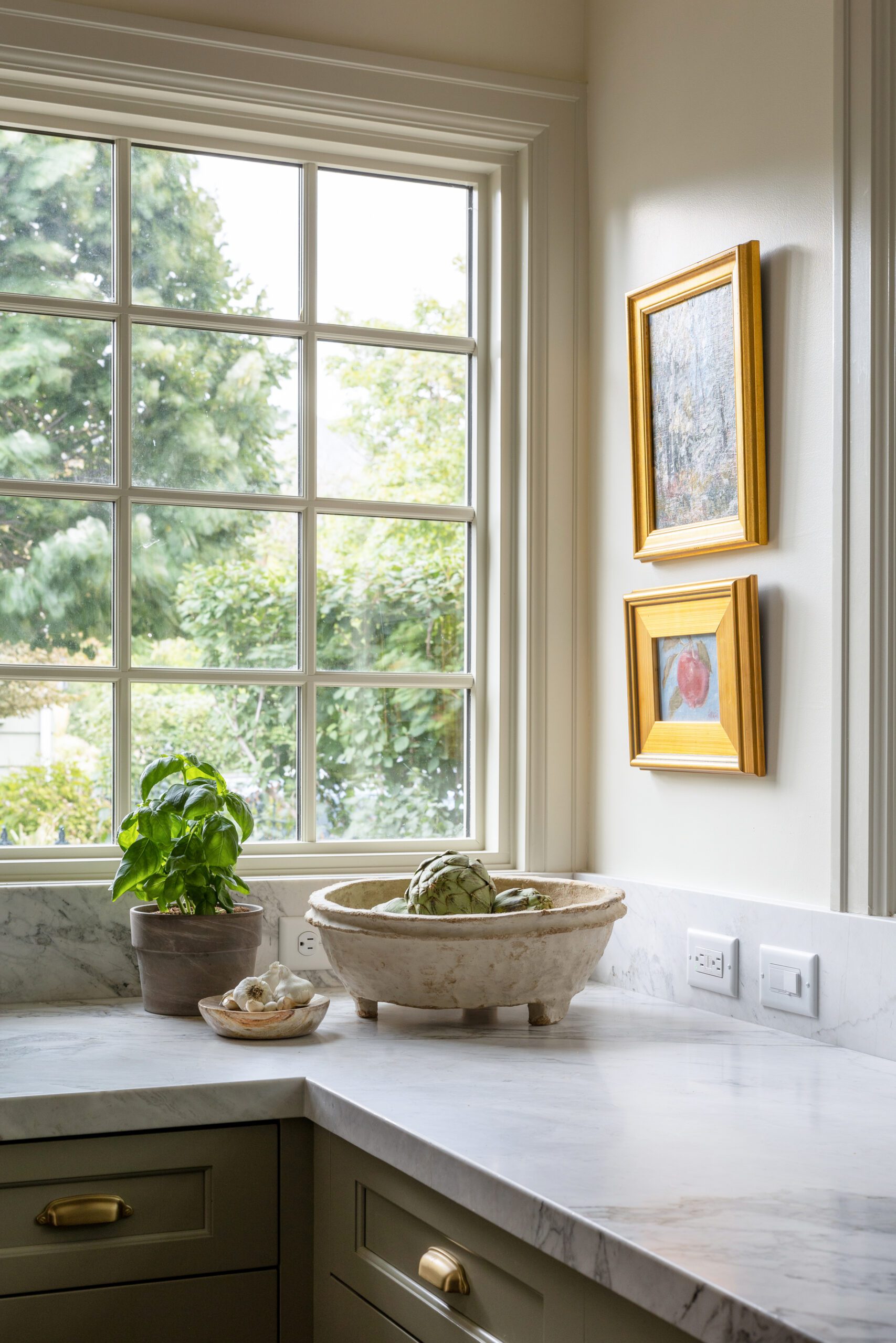
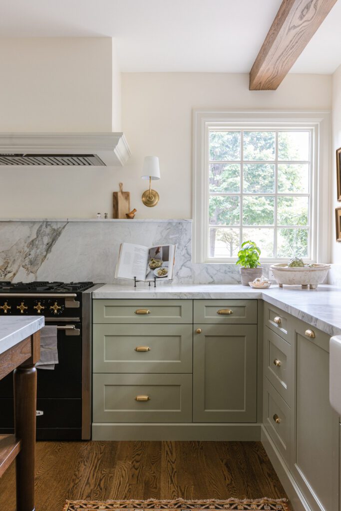
A custom kitchen island, which Madeline designed to look like an older piece of furniture, centers the heart of the home, adding warmth to the grey cabinetry. A beautifully veined marble countertop completes the look and creates a timeless feeling on the primary floor.
A charm-filled pantry
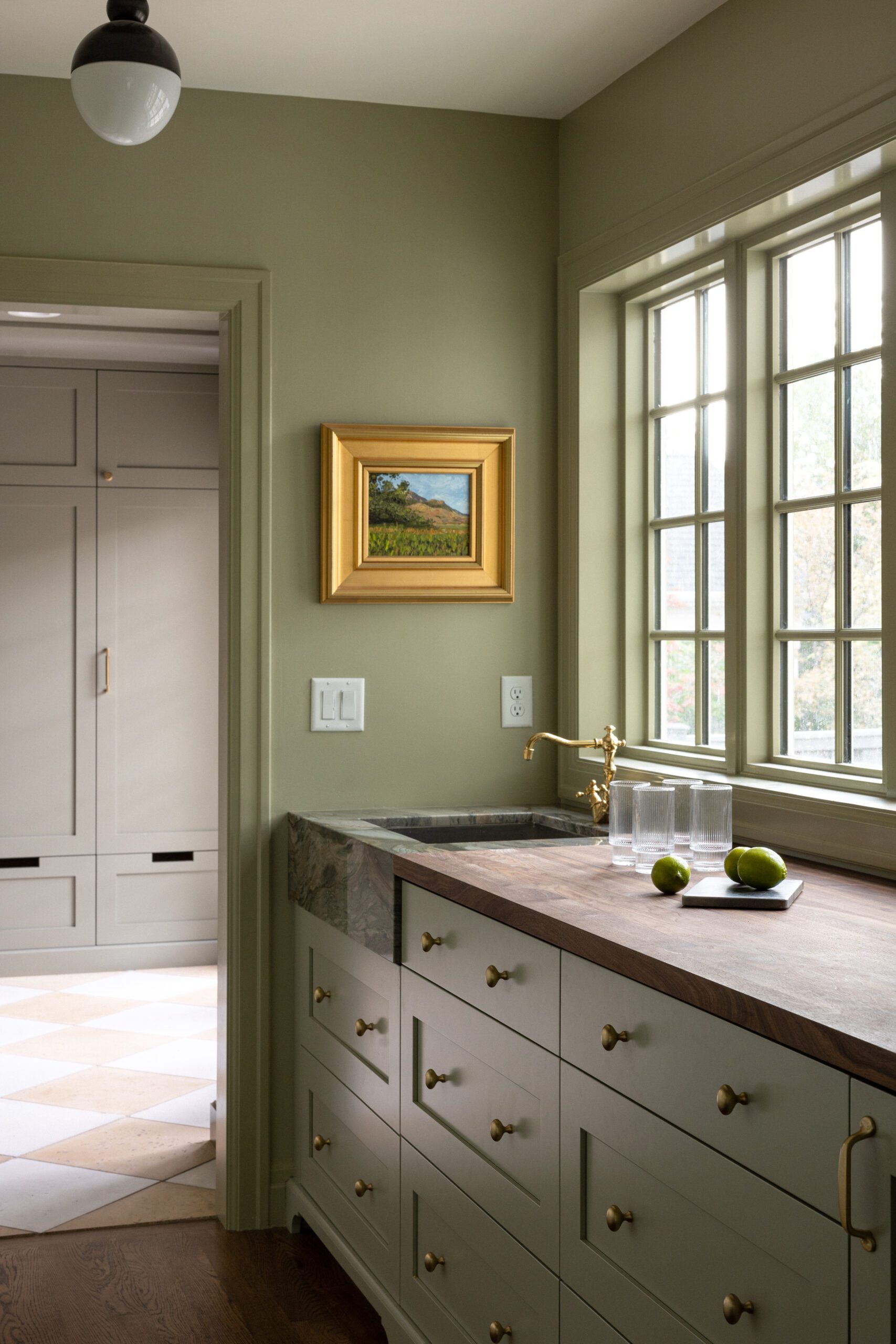
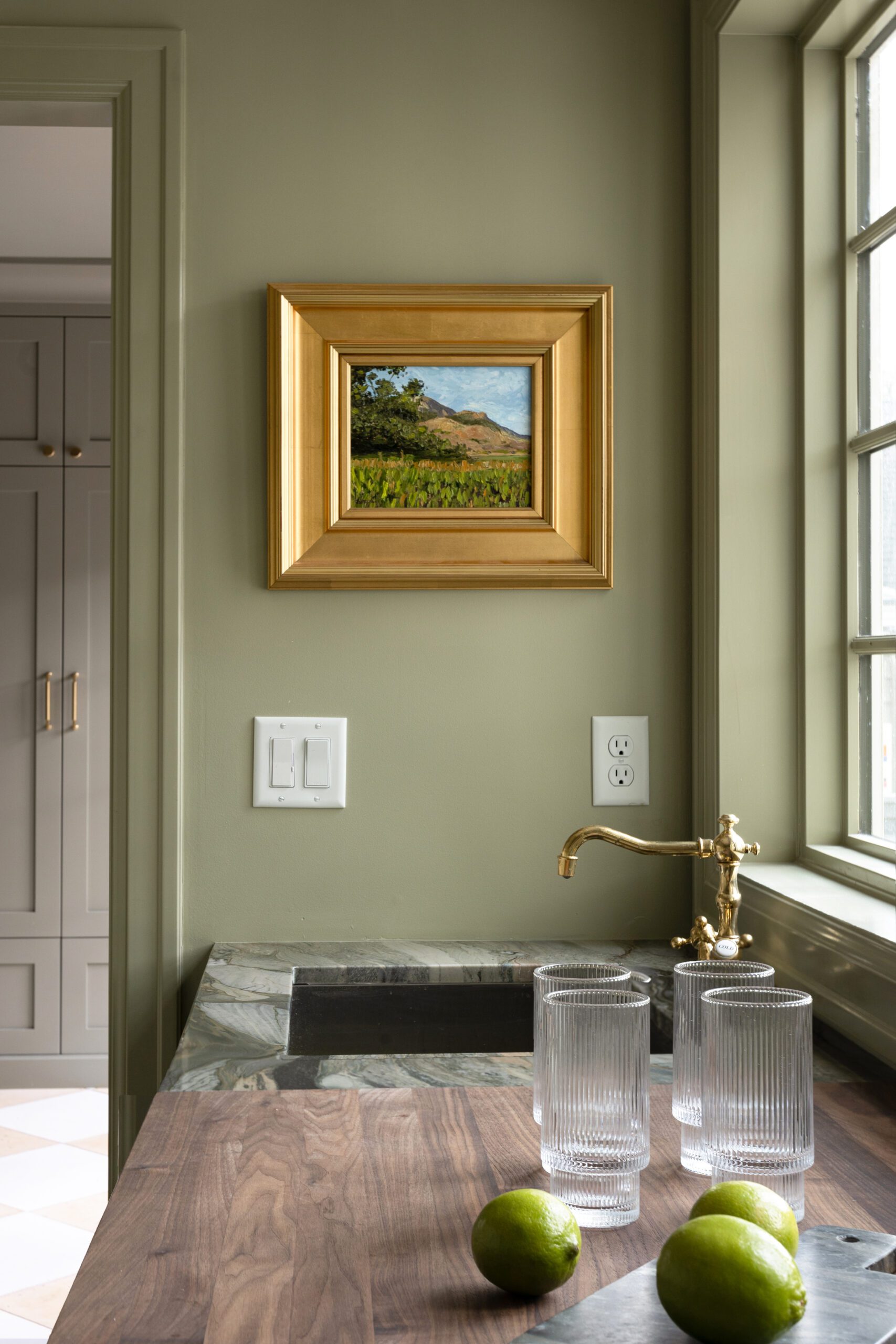
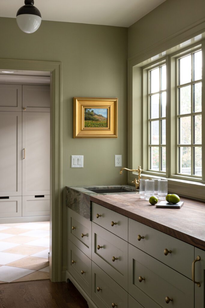
A walk-in-pantry expands the footprint and function of the kitchen, pulling the color palette through to the walls and cabinetry. French grey painted countertops contrast the green walls, while a dark walnut countertop turns into a beautiful, unique natural stone sink surround.
Form & function in the mudroom
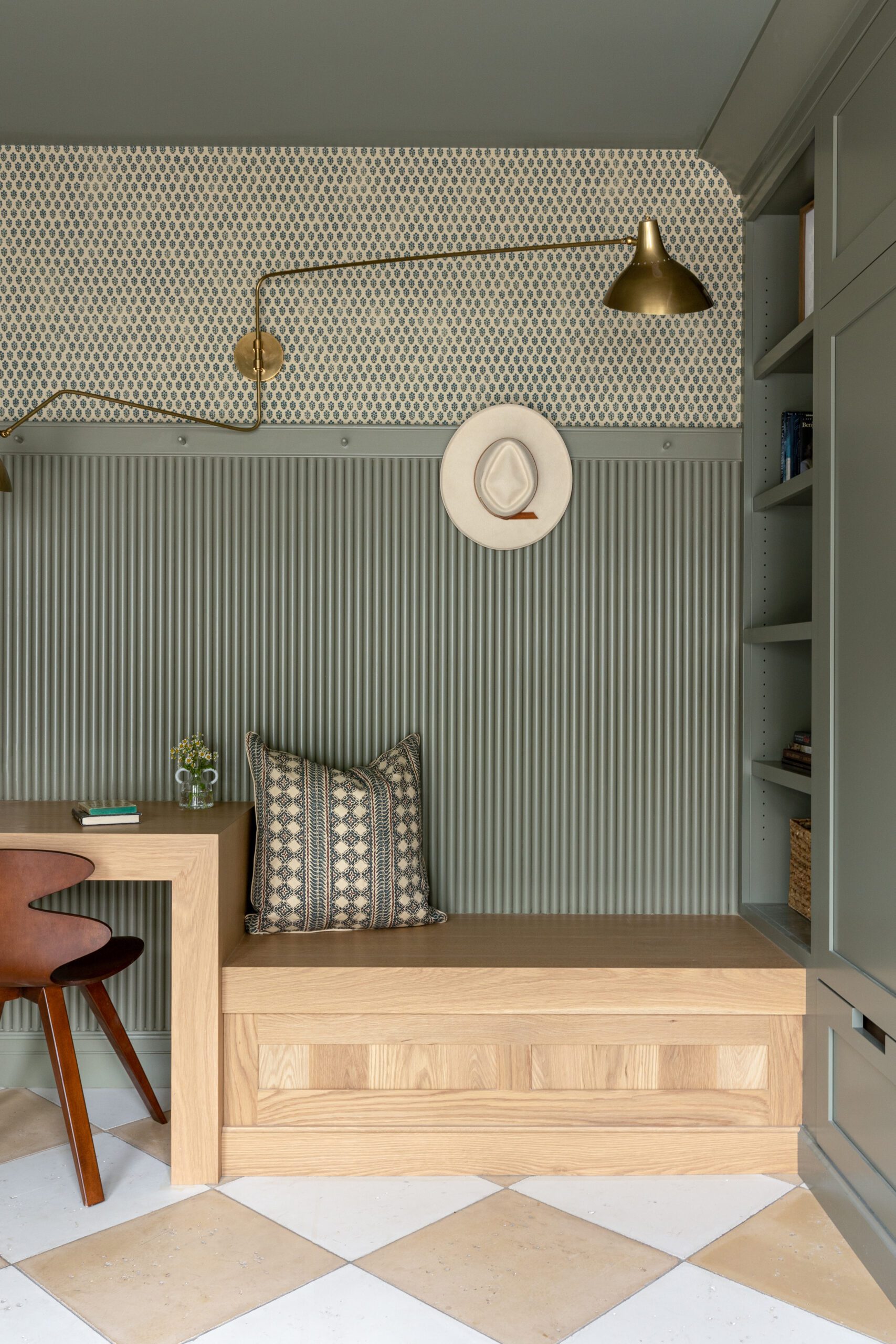
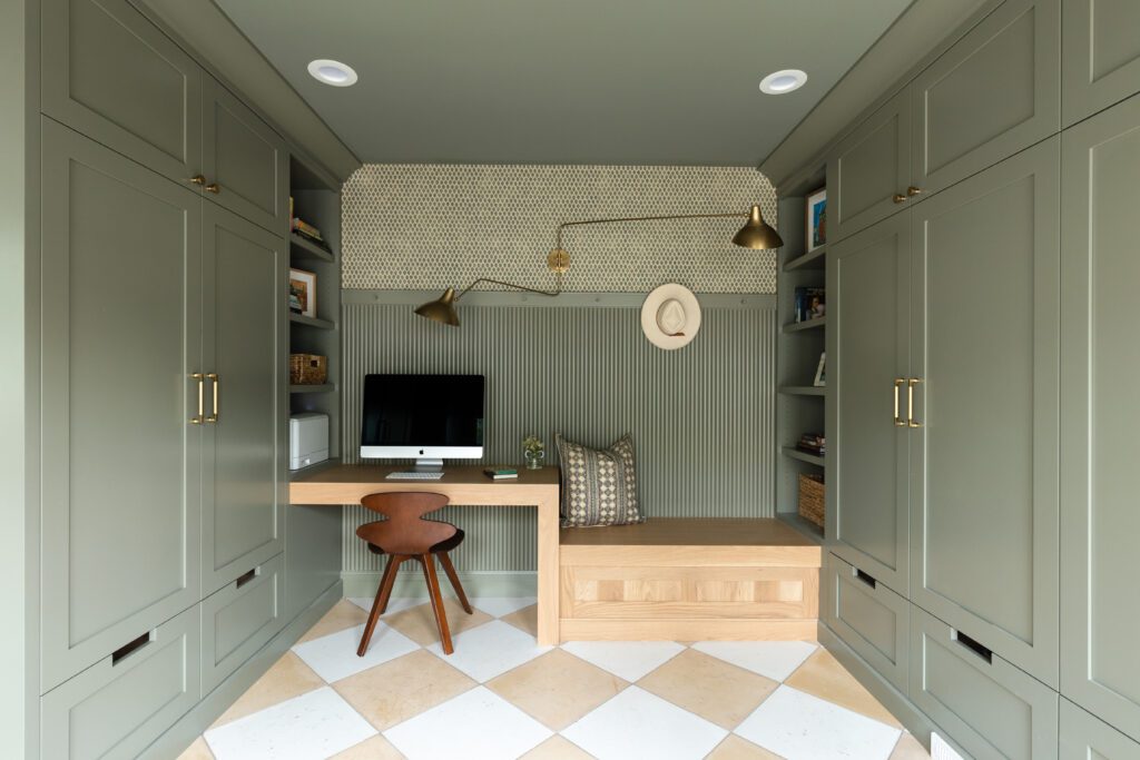
Facing the galley pantry, you get a picturesque view of a compatible, darker green on the mudroom lockers. 18×18 yellow and white concrete checkered pavers ground the room for a modern take on the timeless motif. A built-in wood desk creates a smart use of space, bringing even more function to the square footage, not to mention extra seating for putting shoes on before heading out the door. Jasper Devonshire wallpaper installed above the peg rail adds another dose of interest and ties in with the pattern seen throughout the home.
Pattern play in the powder
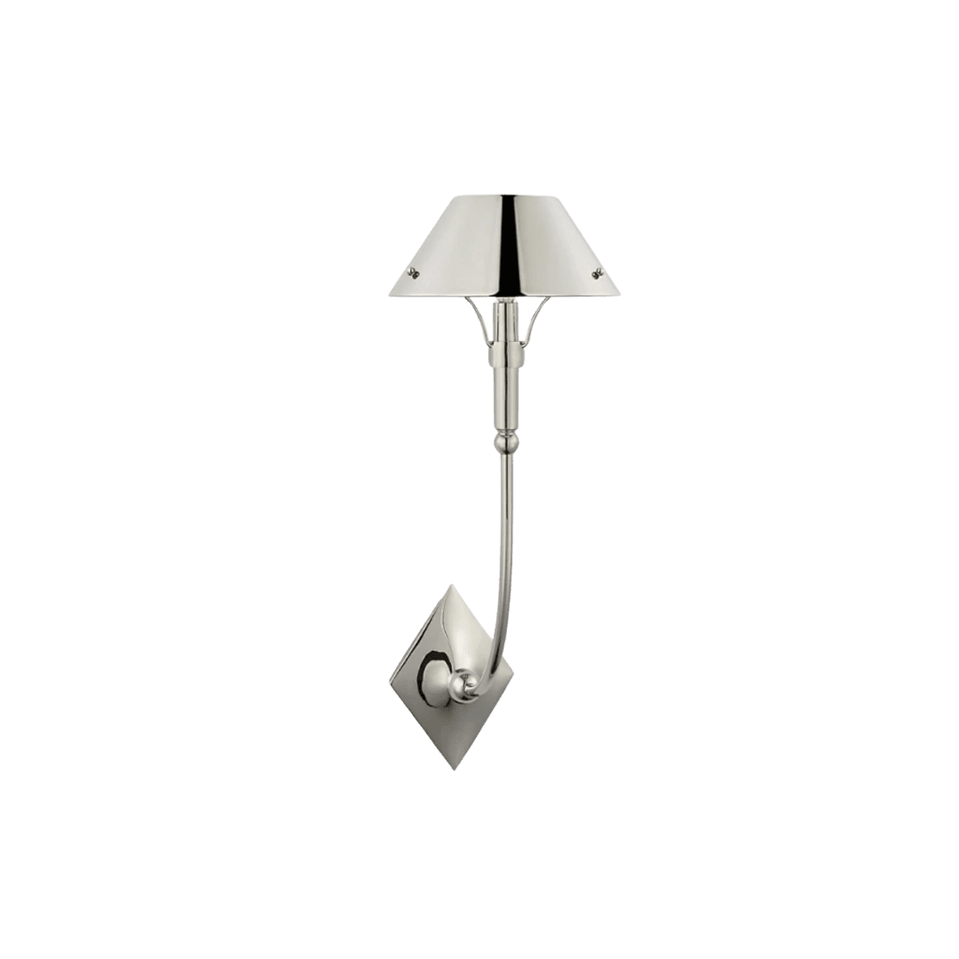
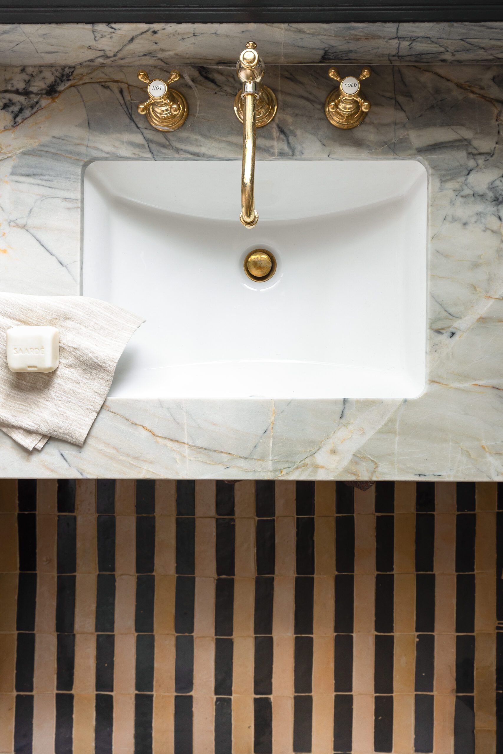
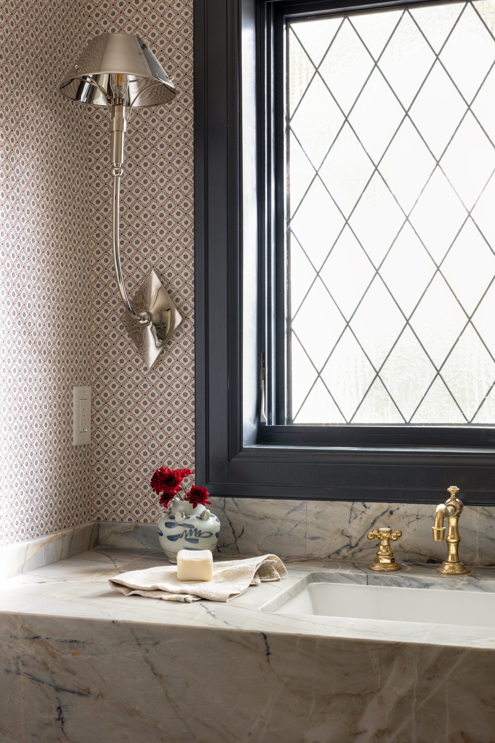
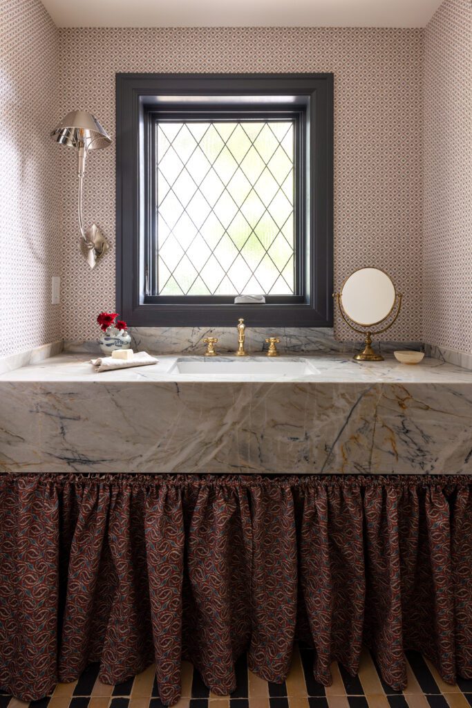
In the powder room, Madeline played with mixing pattern on pattern, incorporating a subtly printed geometric wallpaper, a playful striped tile layout, and a cottage sink skirt. A bold veined marble countertop adds to the look without overwhelming it, centering the space. This room is also an example of how mixing metals when done well, can create interest. Brass plumbing fixtures contrast the nickel sconce and bring something unexpected to this traditional design.
Scroll on to see more from this home and shop the look below!
BY: Jasmyne Muir
« Custom Details Add Personality To This Ocean-front Spec Home >


