Timeless New Build Home with Classic Moments
I’ve actually had the pleasure of driving by this Bay Area new build home. Quinn’s family lives right down the road in Atherton. While Papa was giving us his usual driving tour last time we were in town, this beauty took my breath away. The tricky part of a new build project is that it almost always can be dated to the decade it was built. What makes this classic family home, designed by Lauren Nelson Design, so spectacular, is that it will truly never age.

Sitting gracefully on the edges of Silicon Valley, this handsome home was designed to be the family’s forever home. The Colonial exterior architecture couldn’t be placed to anywhere specific, adding to the timeless feel. Bountiful white hydrangeas and flowering trees dot against the city’s towering Redwoods.
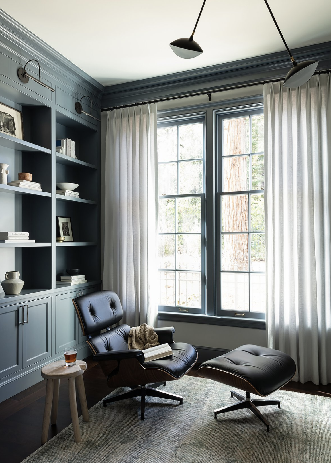
Designed from the ground up, Lauren Nelson Design worked around the classic architecture to infuse elements of modern, clean design – pulling pieces from virtually every decade of design. I recently read an article with Jeremiah Brent who said, every room should have pieces from four or more decades. I think this project really exemplifies the importance of that.

All in Contrast
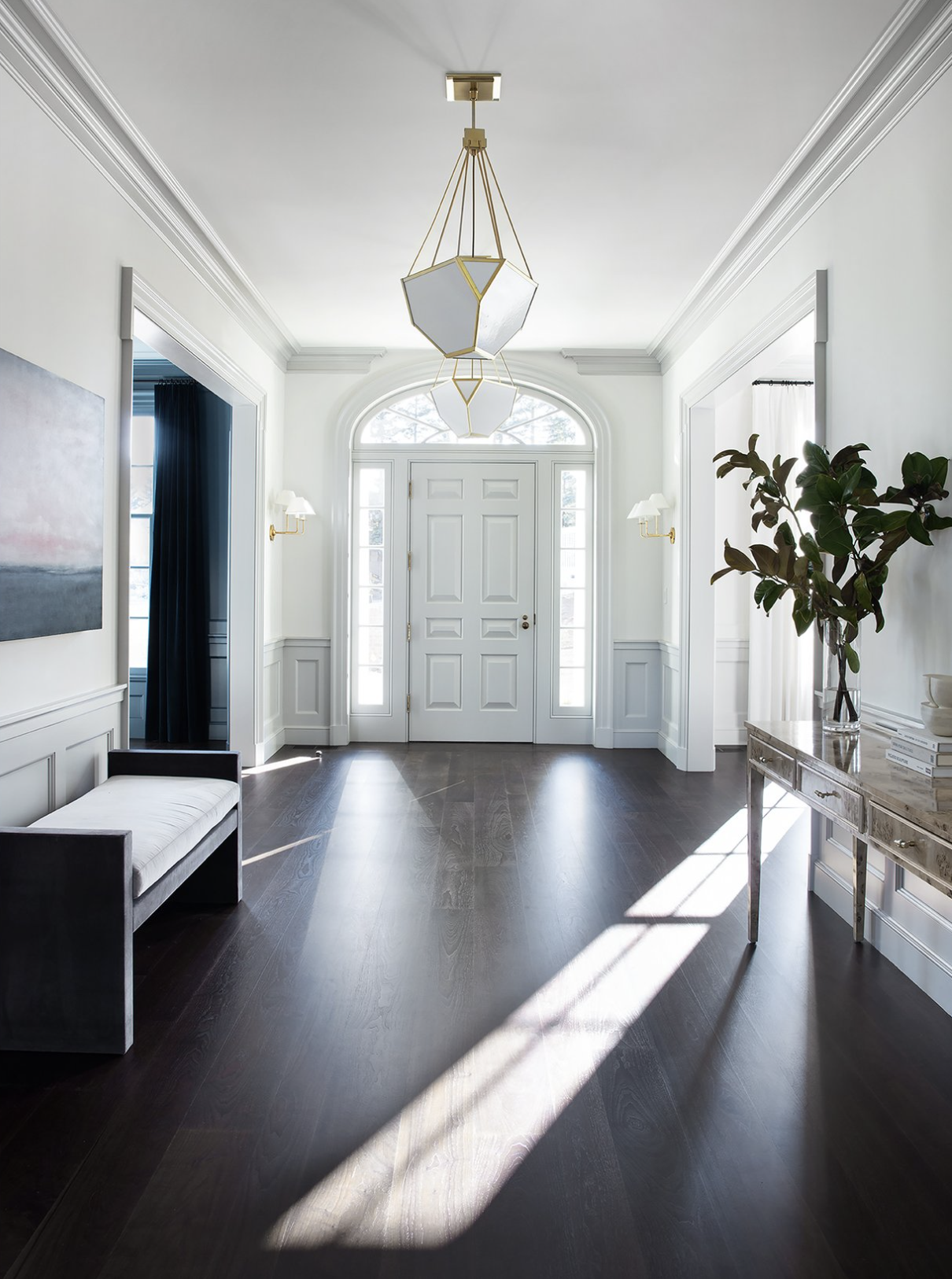
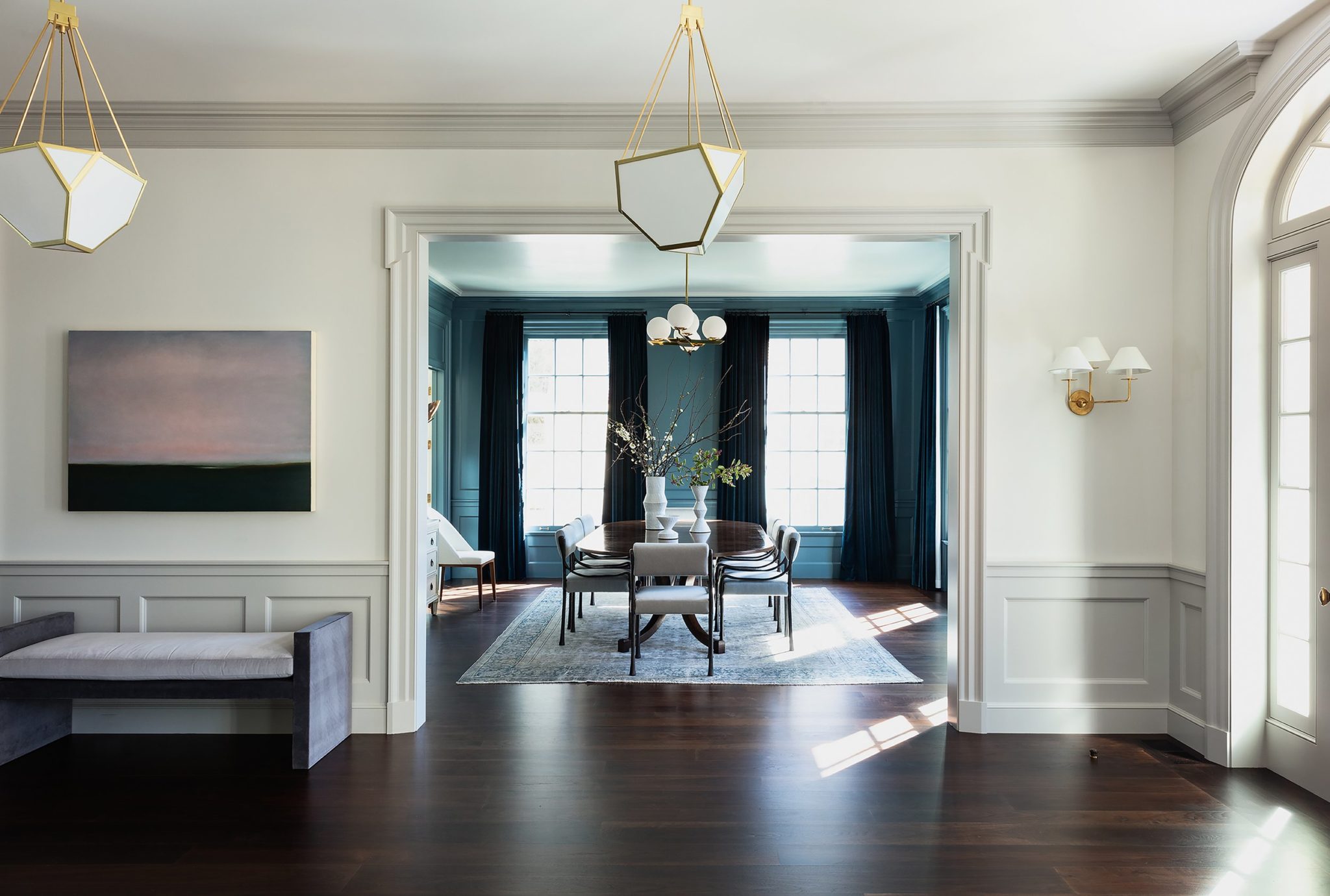
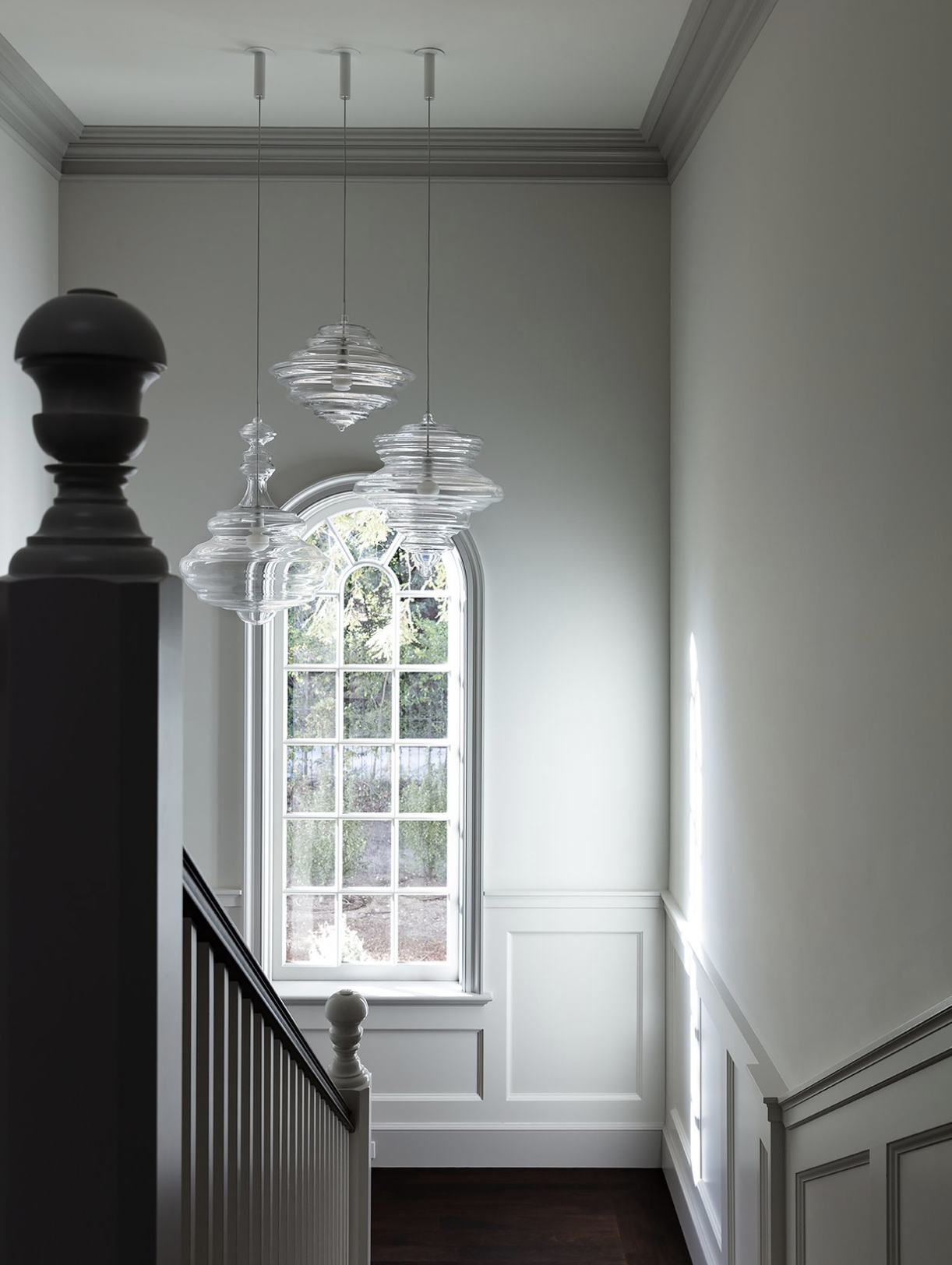
Upon entering the grand foyer, there is a juxtaposition between the soft powdery blue millwork and the reflective materiality used throughout. Rich, dark, hardwood floors add a level of creaminess to the space while providing a masculine contrast. Scale clearly played a significant role in the design decisions for Lauren Nelson, who opted for oversized pendants and triple shade sconces.
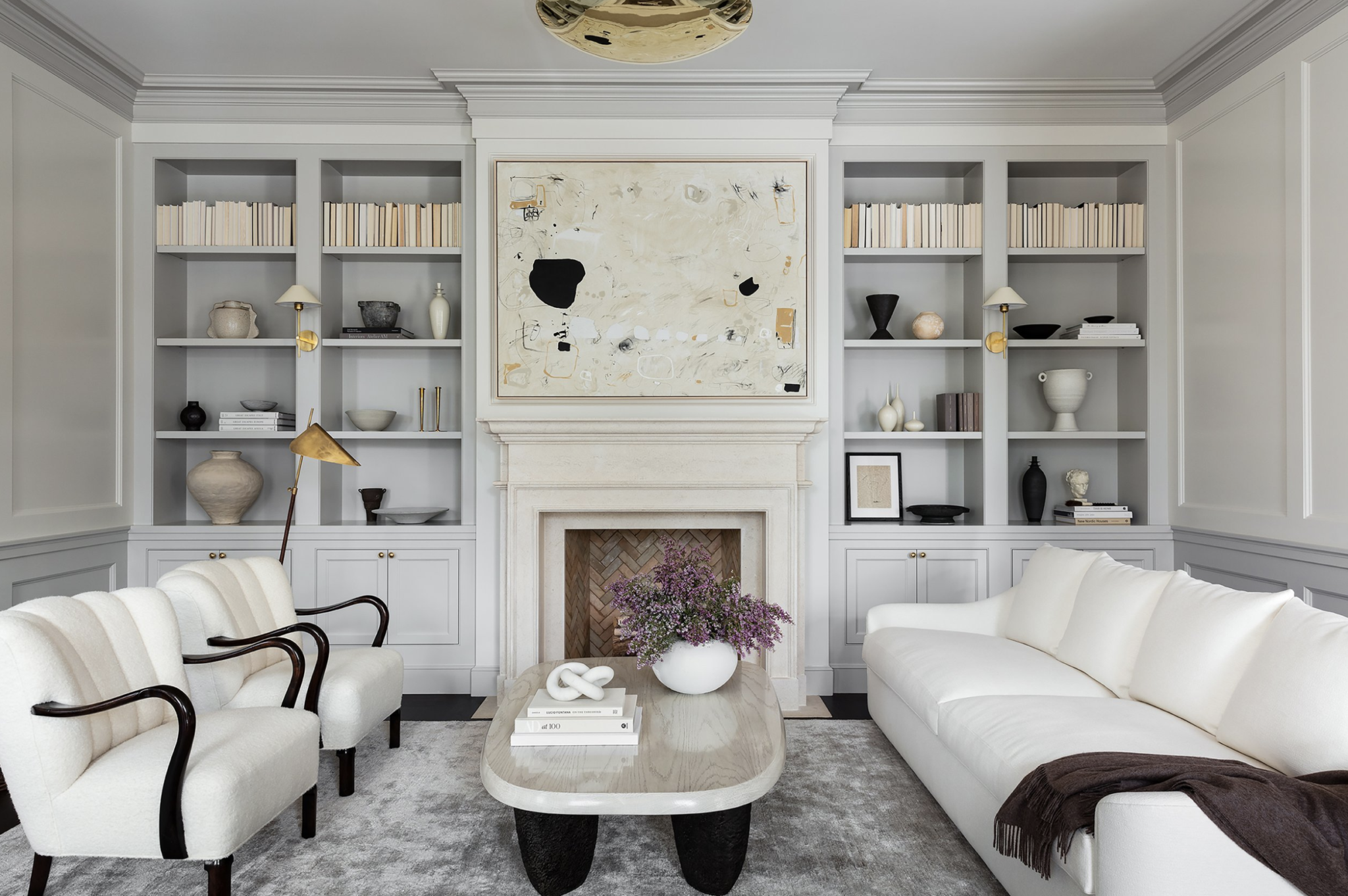
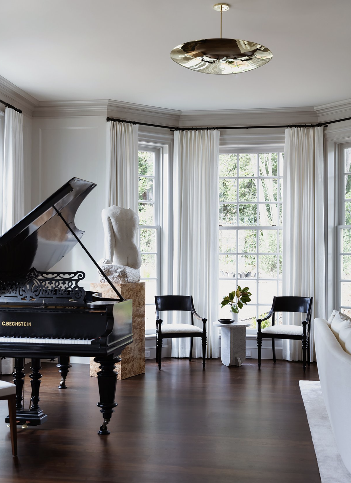
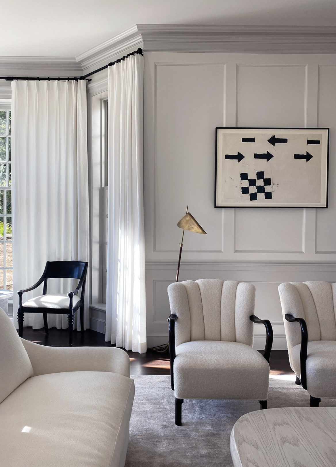
The formal living room is both grand in scale and grand in detail. The space is warmed up for the young family with plush upholstery and cushy rugs. I love how the mixture of curved, feminine shapes and masculine materials make it feel handsome. The sofa is by Dimitri. Notice all of furniture legs are sitting comfortably on the rug? It’s a design element Jake Arnold is known for, and Nelson’s technique adds to the luxe feel.
The walls are painted in Intense White and the contrast trim in Classic Grey by Benjamin Moore. One of the easiest way to add character or history to a space is by painting the millwork a darker color. There doesn’t need to be high contrast, but the subtle layers add so much depth.


The Color + Finishes of this New Build Home
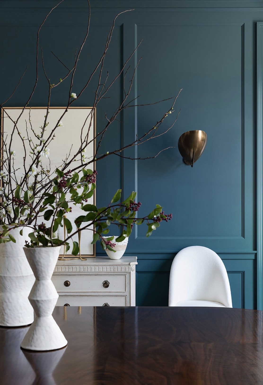
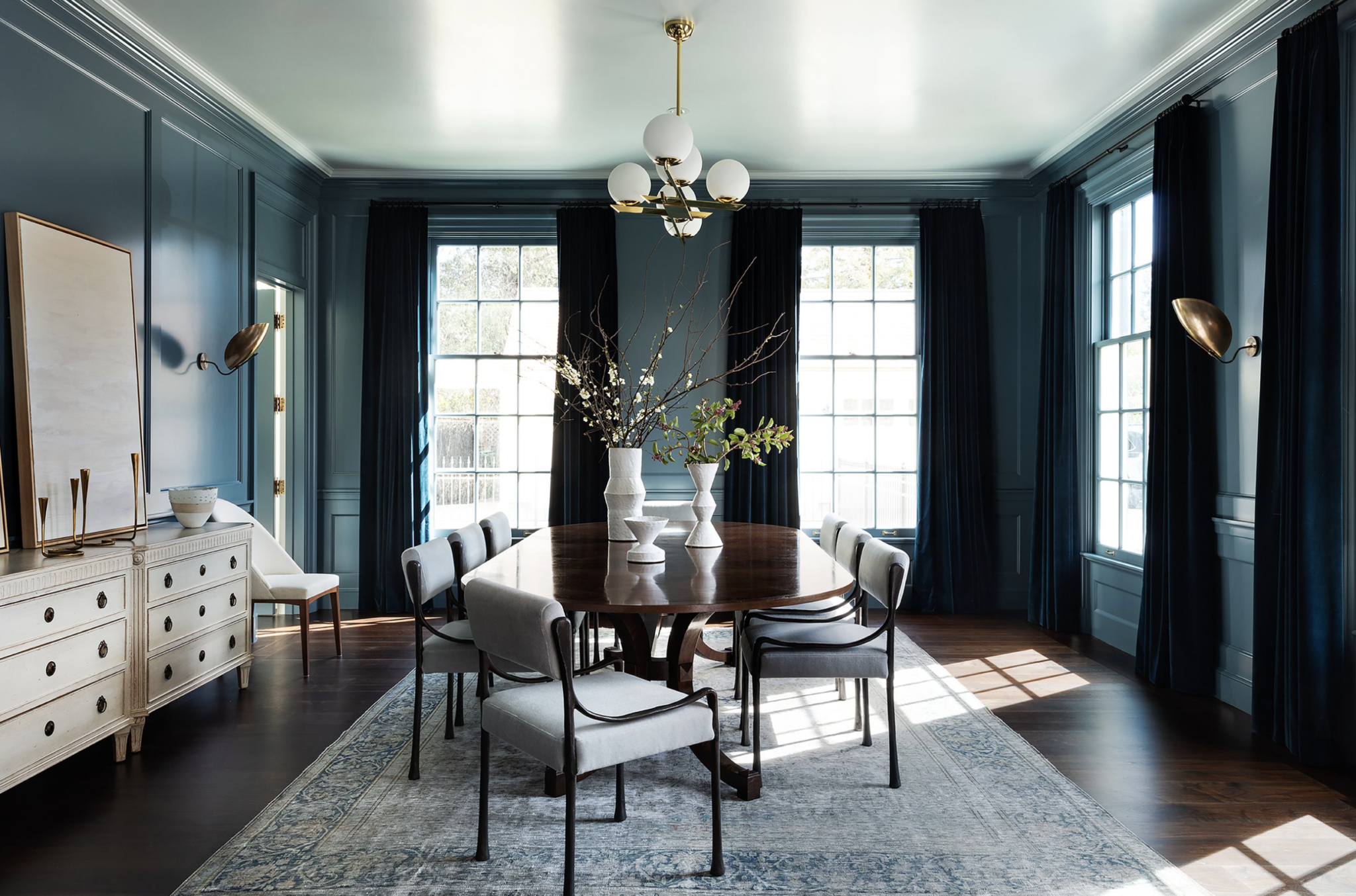
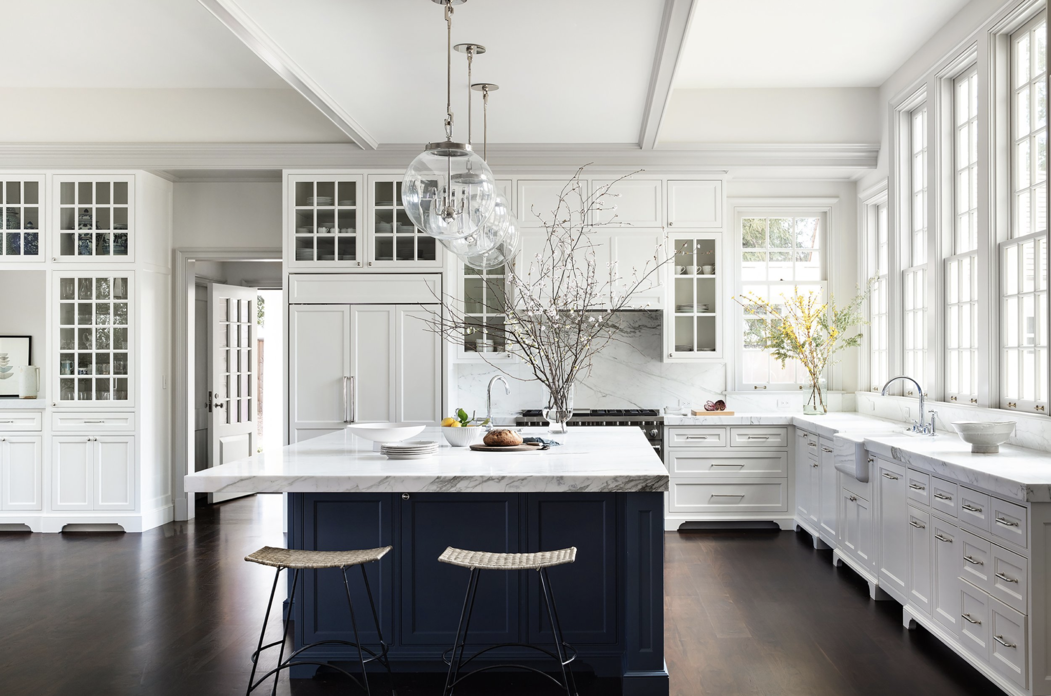
The kitchen and dining room are a play in contrast – masterfully balancing dark, moody moments with light flooding in. The dining room is painted Benjamin Moore’s Nocturnal Gray and the ceiling is clad in Boothbay Grey. The classic blues are carried into the kitchen island, painted in Newburyport Blue. I’ve always loved the patina of those brass sconces and was excited to see them used in a more traditional way. This is another perfect example of how this new build project remains timeless, without fitting into any design box.


Mixed Metals
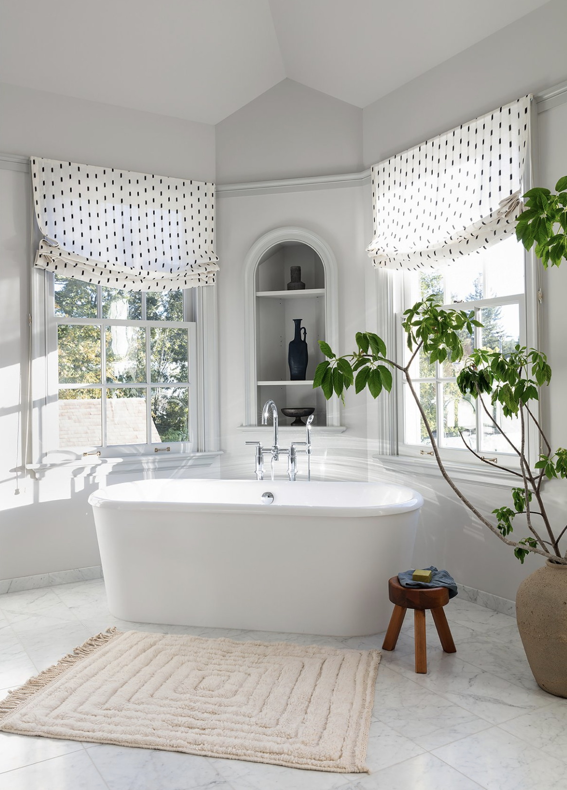
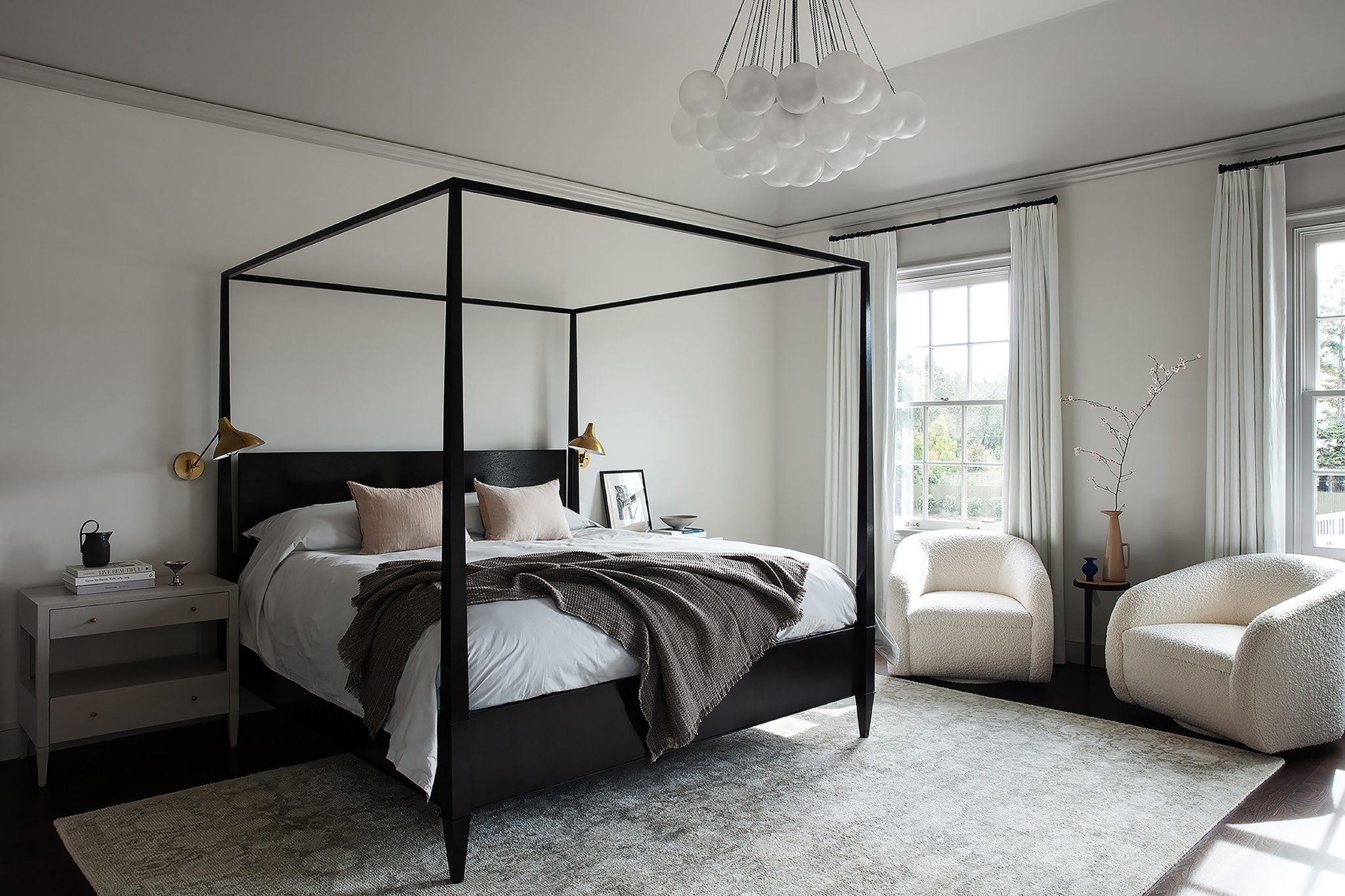
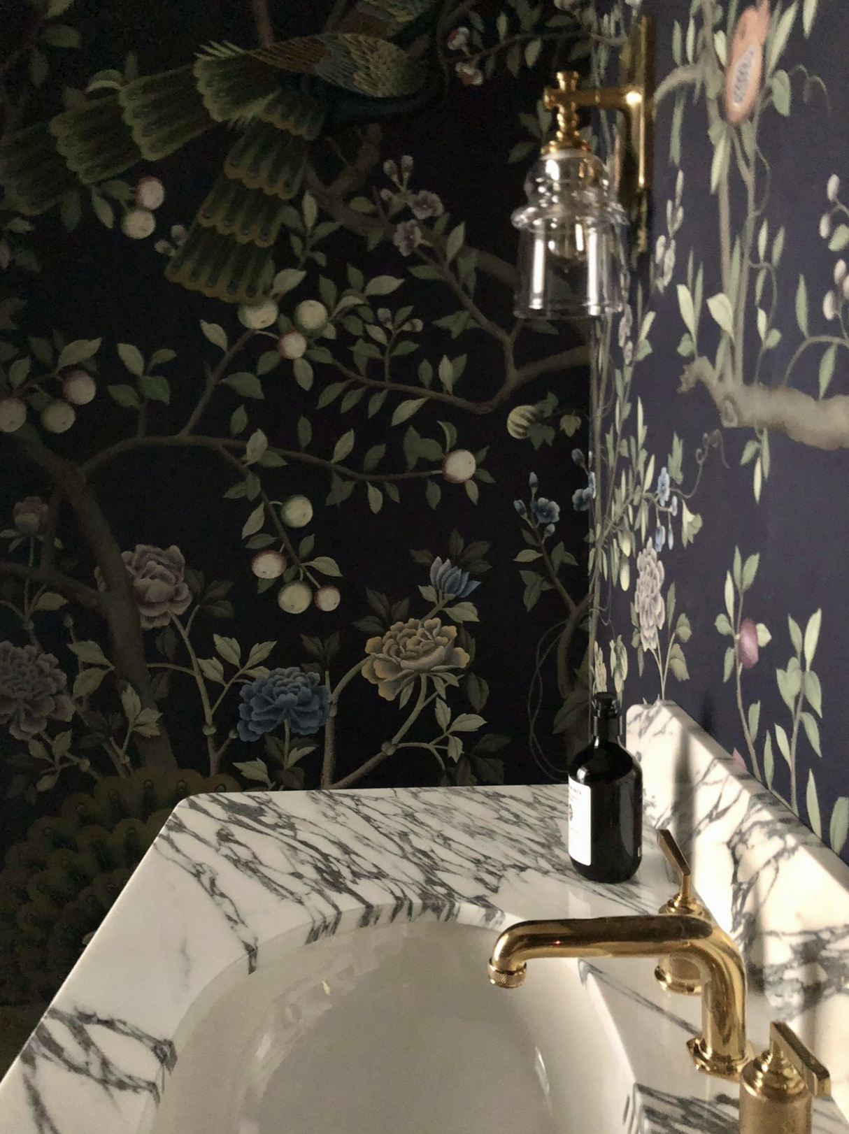
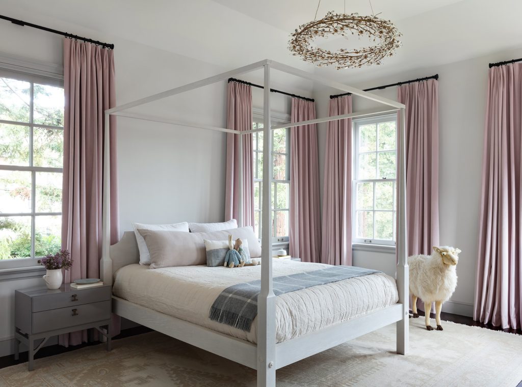
The metallic finishes in this home are perhaps my favorite detail. While so many designers subscribe to sticking to just a few metals, this new construction project has no limits. From blackened brass to polished nickel, polished brass and frosted glass, the lighting and plumbing fixtures are true show stoppers. This classic Cloud Chandelier by Apparatus is a favorite and I especially love it when paired with these sconces.

The bedroom chandelier is by Apparatus and the swivel chairs are by DISC


I’m so glad this beautiful new build home will forever be down the road from Quinn’s grandparents home, so I can look over it fondly from afar. Lauren Nelson Design created a timeless abode for a young family to grow into that will stand the test of time.
Design: Lauren Nelson Design | Photography: Laura Resen Photography
BY: theinteriordev


