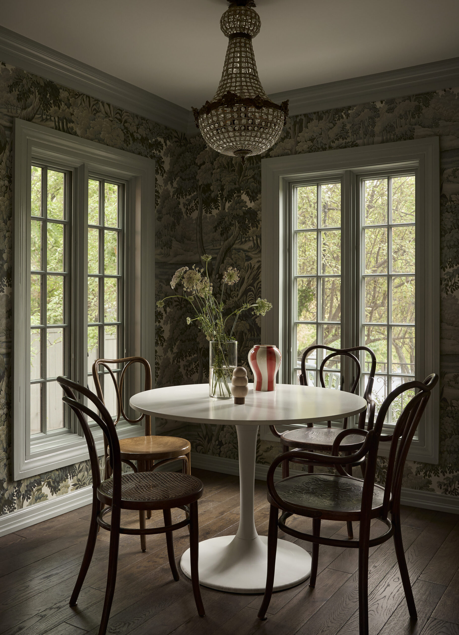
An Eclectic Tudor Home Filled With Modern Charm
It’s always a treat to see how designers create their own personal homes, and today’s home tour by Salt Lake City-based designer Susannah Holmberg, the principal designer of Susannah Holmberg Studios, is certainly no exception. This thoughtfully layered, historic Tudor-style family home is overflowing with personality and considered details that will have you taking notes as you scroll through each room.
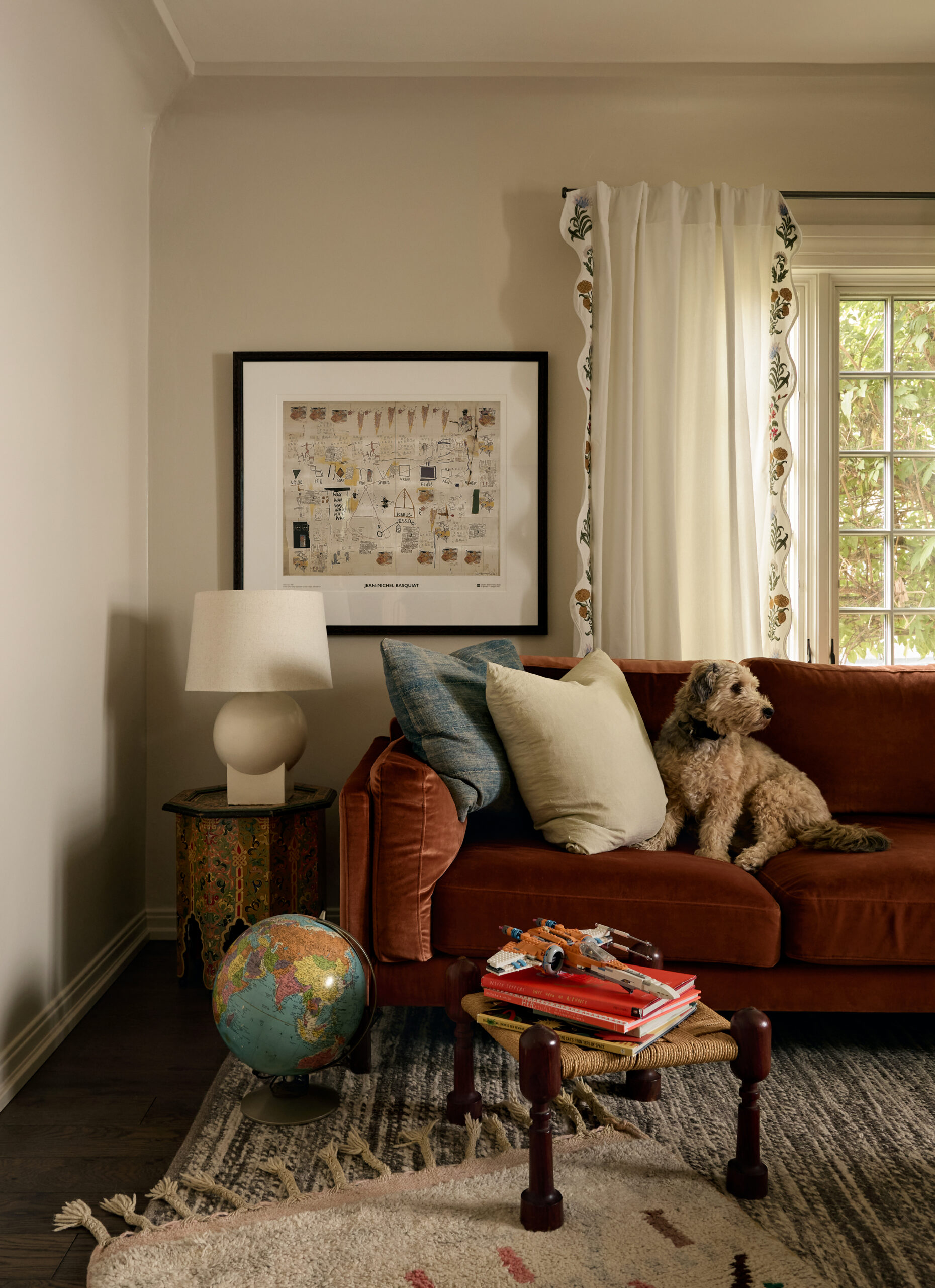
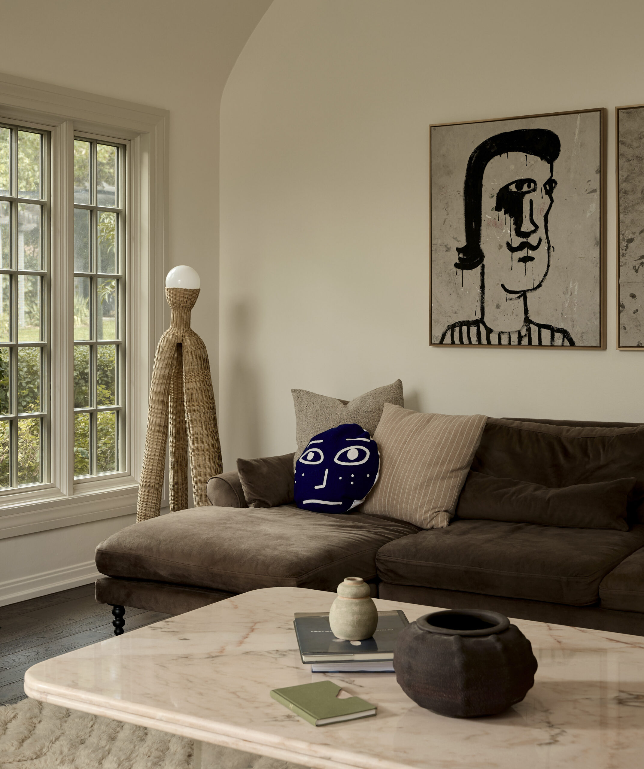
Complete with art deco accents, touches of muralistic wallpaper, graphic art, a modern kitchen, and a few surprise characters (including a dog and a chicken) — this house is undoubtedly inviting, colorful, and full of life. Like many of our favorite projects, this space has evolved over time and grown with its inhabitants to become a vibrant and personal family home.
This project is thoughtfully designed, artful, rich with color, and, of course, modernized. Yet, somehow, it still honors the 100 years of history the home lived before Susannah and her family made it their own.
Design: Susannah Holmberg | Photography: Malissa Mabey
Old World Charm
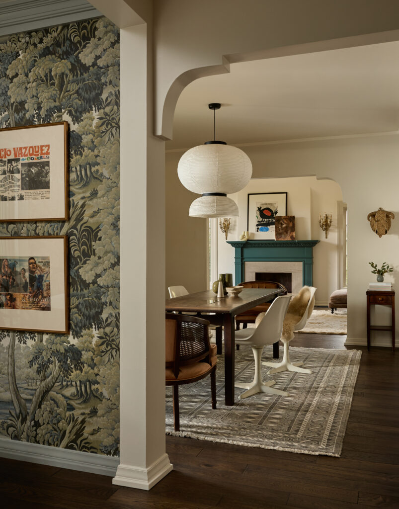
While the goal was to renovate and modernize the old house, Susannah’s top priority was preserving the architecture’s old-world charm. To achieve a thoughtful renovation, she opened the walls to make the home flow to fit a more modern lifestyle. Susannah opted to keep all of the original arch detailing and even worked with her contractor to recreate a few additional arches to add dimension to the main living spaces.
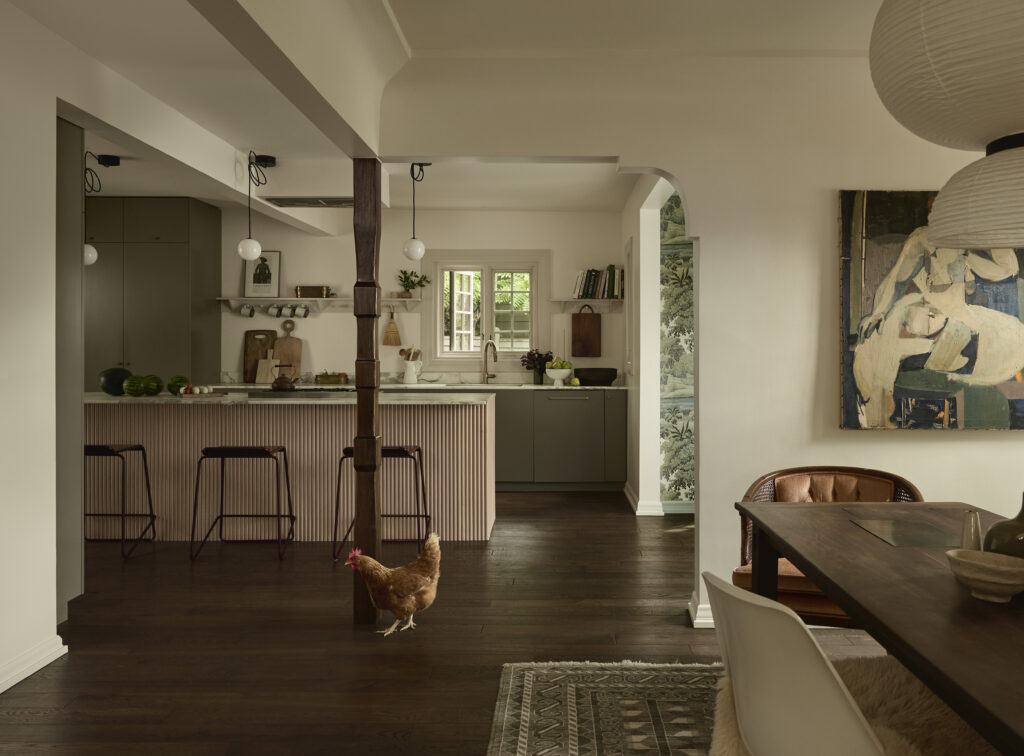
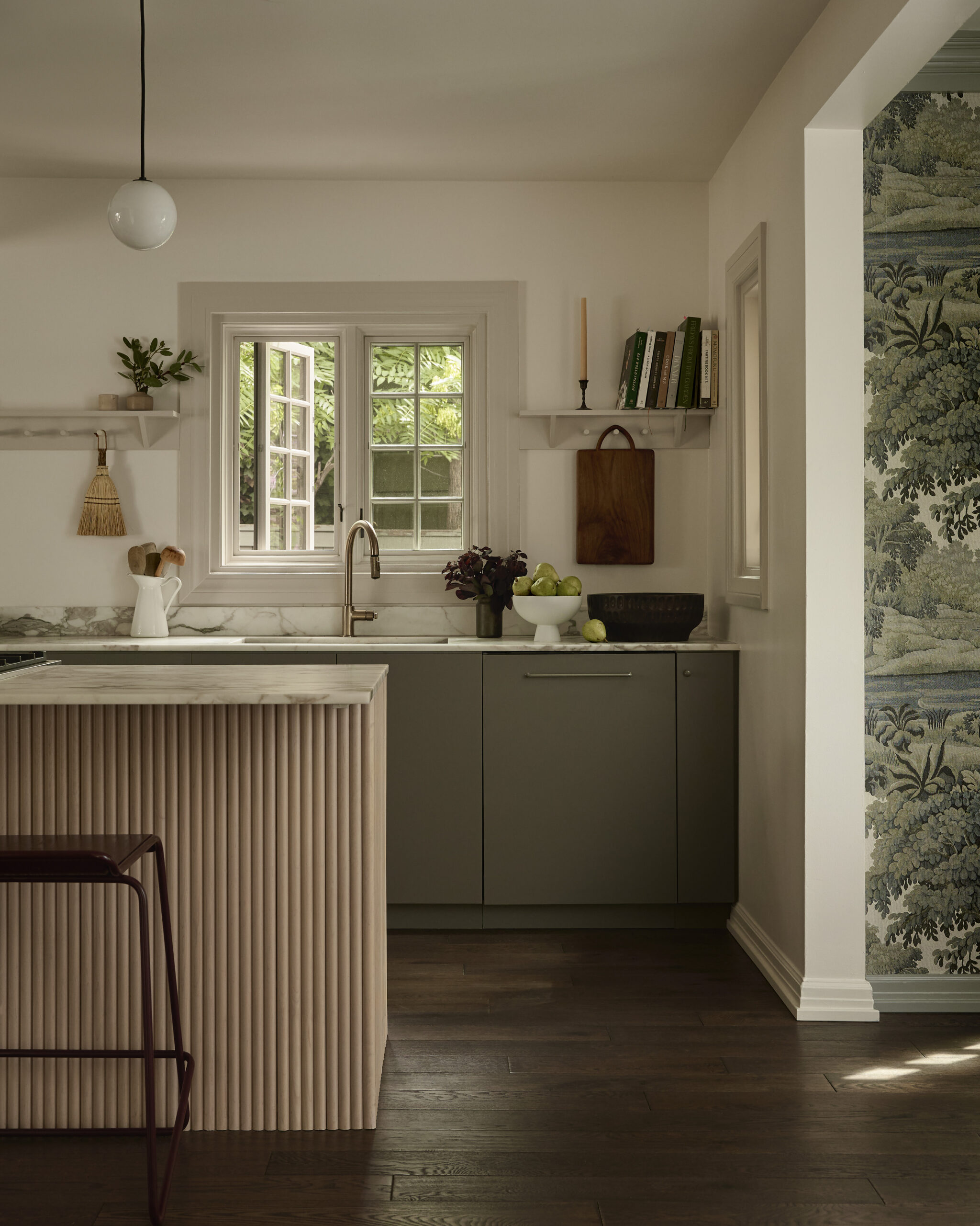
While you may not notice the structural post that divides the living and kitchen space at first glance, its story is a lesson in making even the most functional design decisions feel intentional. Susannah designed the post with her cabinet maker, who hand-carved it to make it look like it had been there forever, taking it from an eye-sore to a beautiful and thoughtful detail.
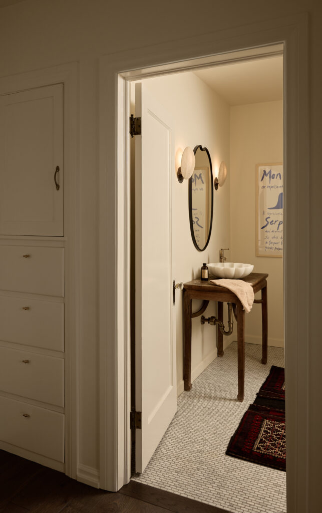
In the powder bathroom, Susannah incorporated a vintage Chinese side table she found on Charish that matched the age of the house in the place of a vanity.
A Preservation Process
After much contemplation, Susannah and her team decided to replace the old windows. While they were sad to see them go, they knew it was the right decision for the function of the space. To ensure they still honored the age of the home visually, they used their architectural line to re-create original mullion patterns. Susannah and her team worked directly with Pella to mimic the original window mullion pattern and the original profile of the mullion itself, making them feel in place with the remainder of the home.
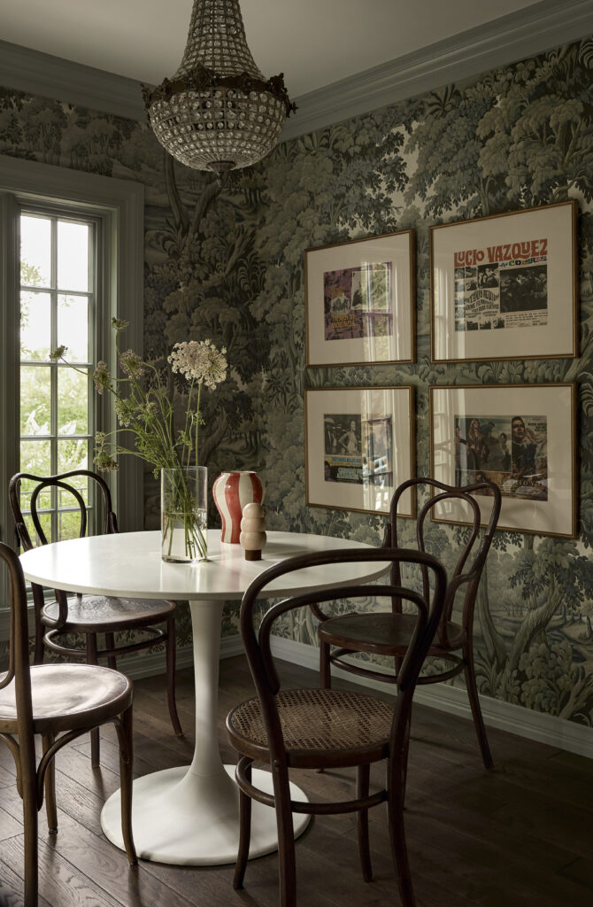
Can’t get enough of this project? Keep scrolling for more photos of the space, and shop the look below.
BY: Jasmyne Muir


