How a 90s Family Home Got a European-Inspired Refresh
When the homeowners of today’s featured project decided it was time to hit refresh on their dated 90s interior and connected with designers Jeff and Johnna of firm J. Studios, they had big plans to transform their home into an updated, cozy gathering place. Inspired by perfectly imperfect European finishes, a warm and timeless color palette, and unexpected details, Jeff and Johnna got to work to re-imagine this home from top to bottom.
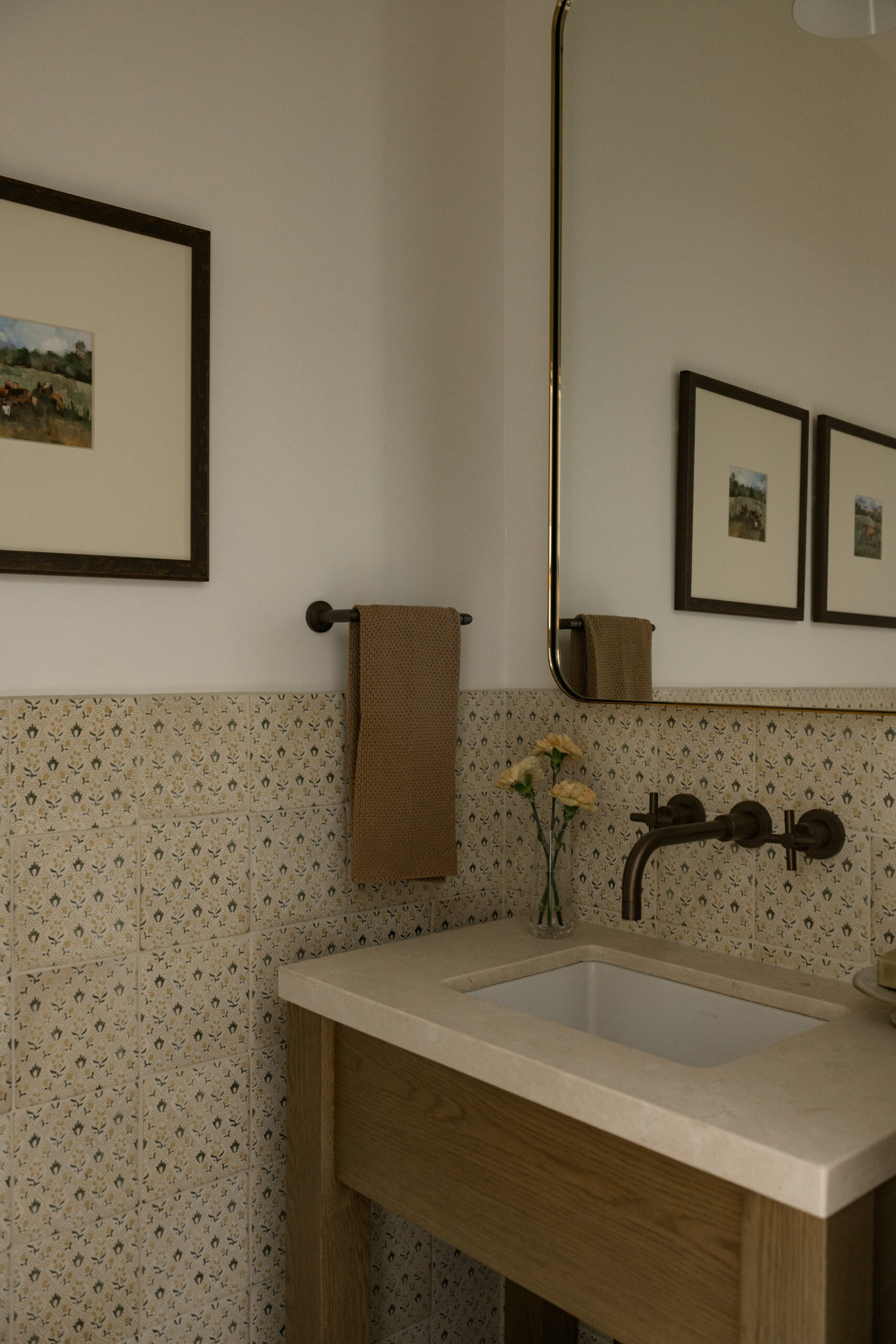
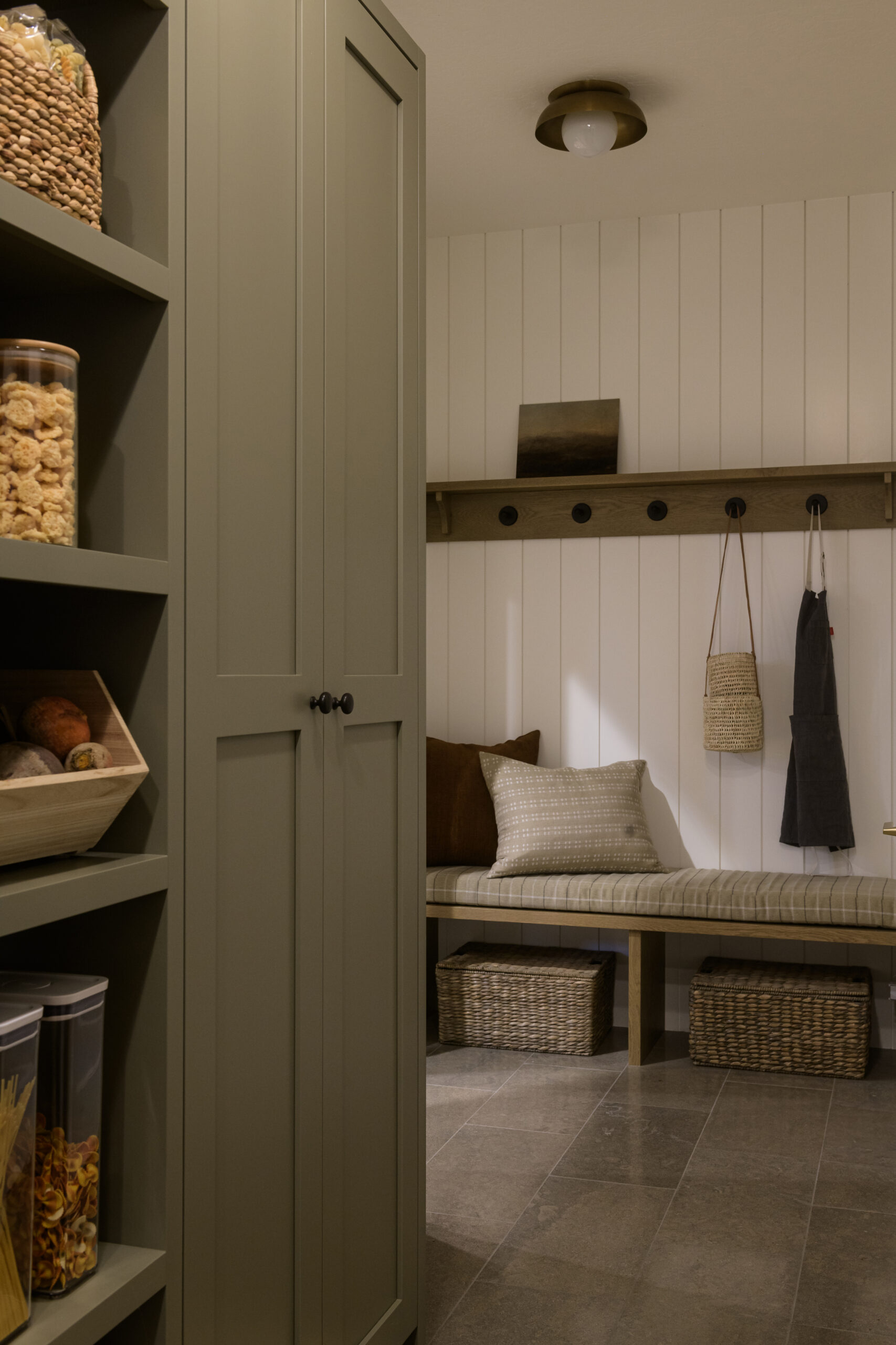
This project is filled with inspiring moments in even the smallest rooms (make sure you don’t miss the charming powder bath), smart uses of minimal but rich tones, and pretty yet functional solutions around every corner. Scroll on to tour the home and shop the look below.
Design: J Studios Interiors | Photography: Rebekah Westover | Styling: Jen Paul
A Living Room for Gathering
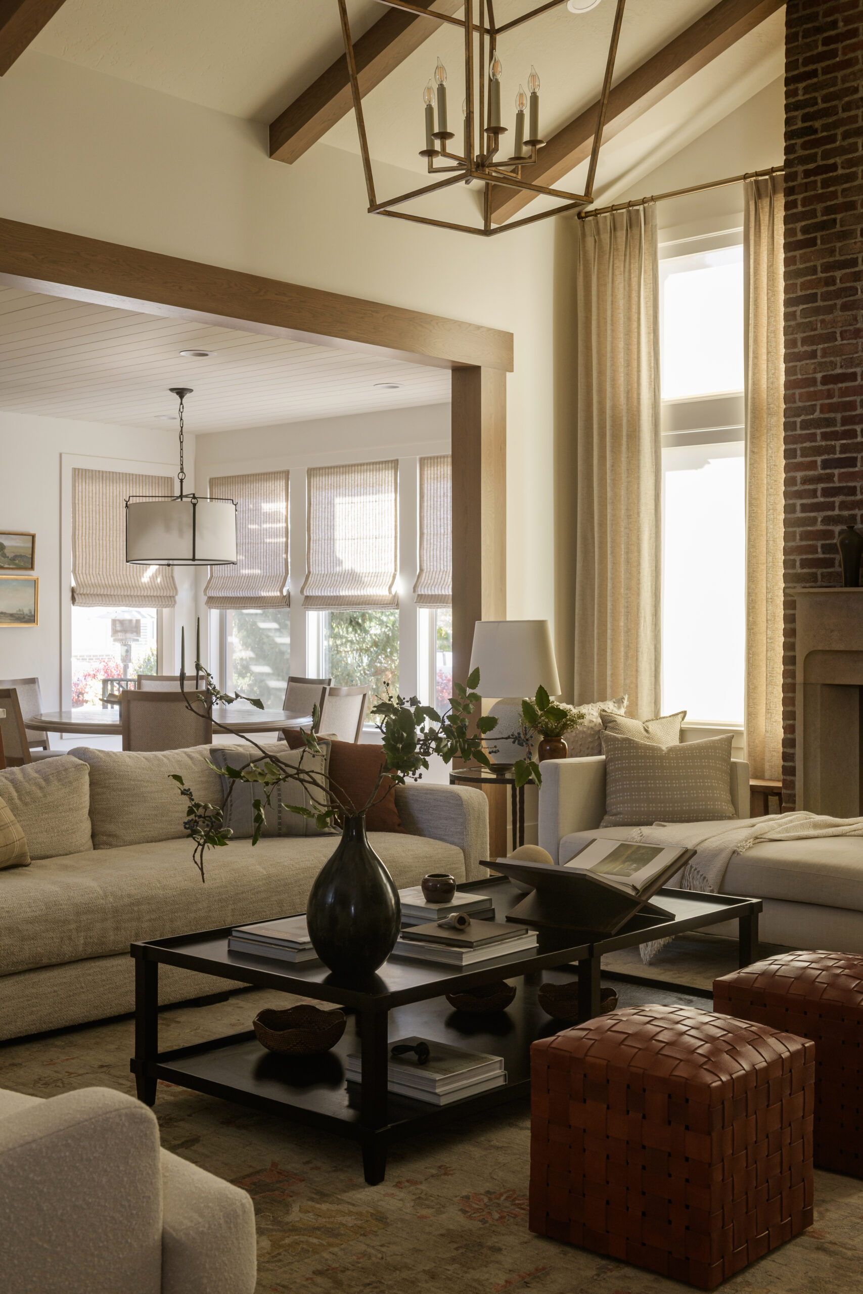
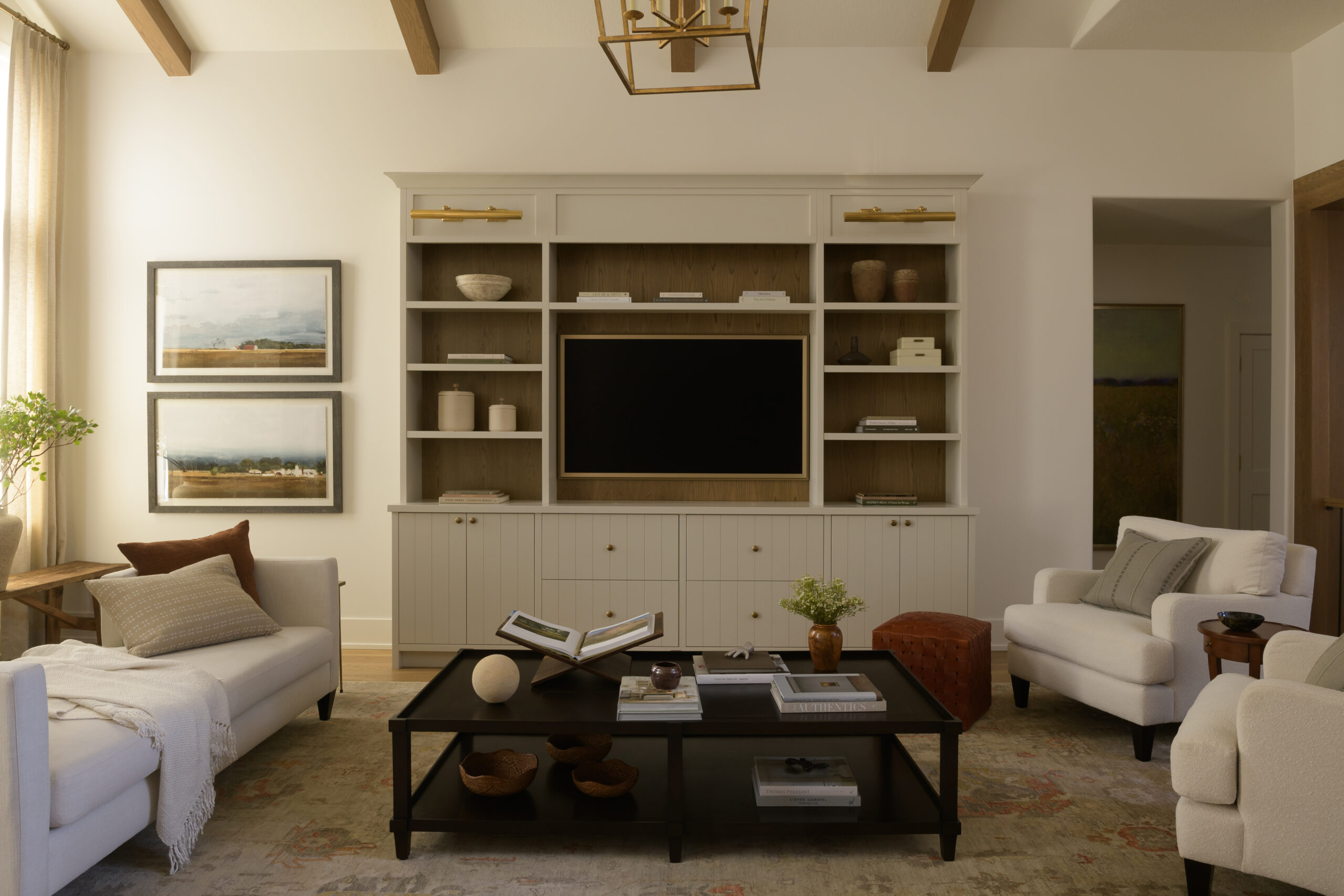
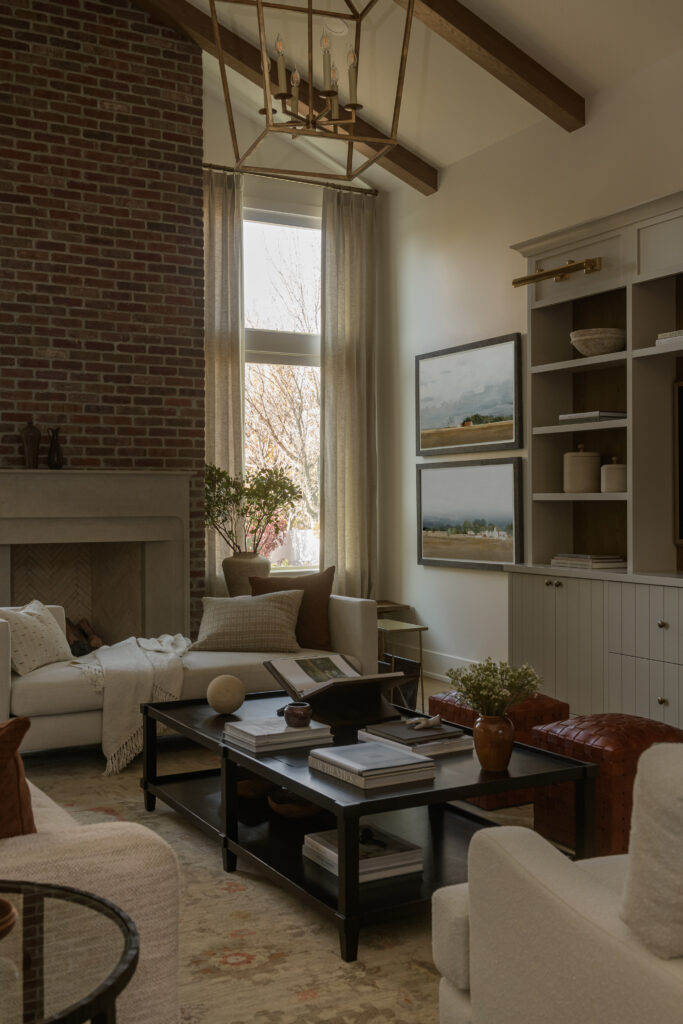
When beginning the process for the project, Jeff and Johnna knew they wanted to create a jaw-dropping focal point for the living room to draw the eye up and create symmetry in the space. To take this room from its 90s roots, they started by making plans to re-center the fireplace with a beautiful plaster mantel and add a brick surround all the way up to the ceiling. Wood beams elevated the tall ceilings further, making the room feel larger and more grand.
The European-Inspired Kitchen
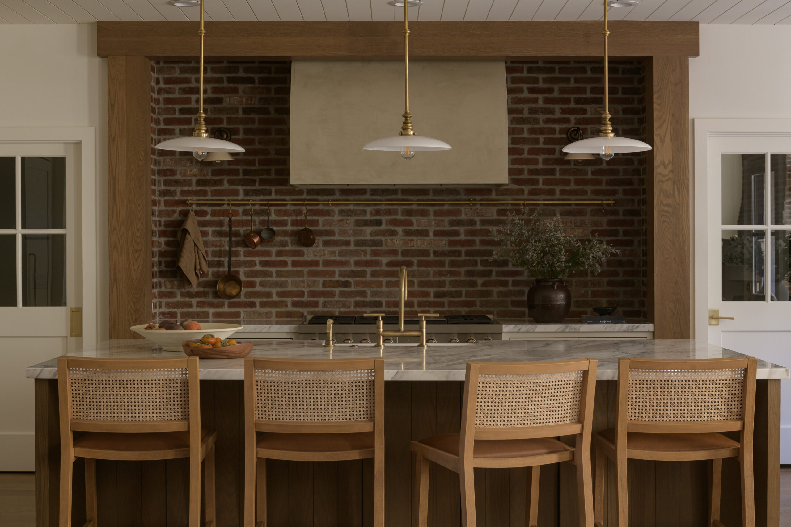
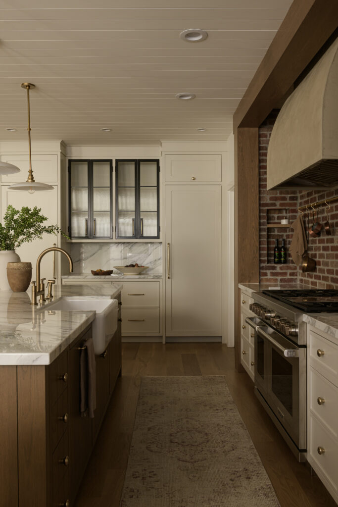
In the kitchen, warm textural details, a brick backsplash, custom cabinetry, and European-inspired finishes make this utilitarian space inviting and functional. The plaster hood centers the space, carrying the materials from the living room. Dimensional designs are all about textural contrast, and we love how the brick and unlacquered brass work together in this kitchen to bring in the character.
A Chic & Warm Office
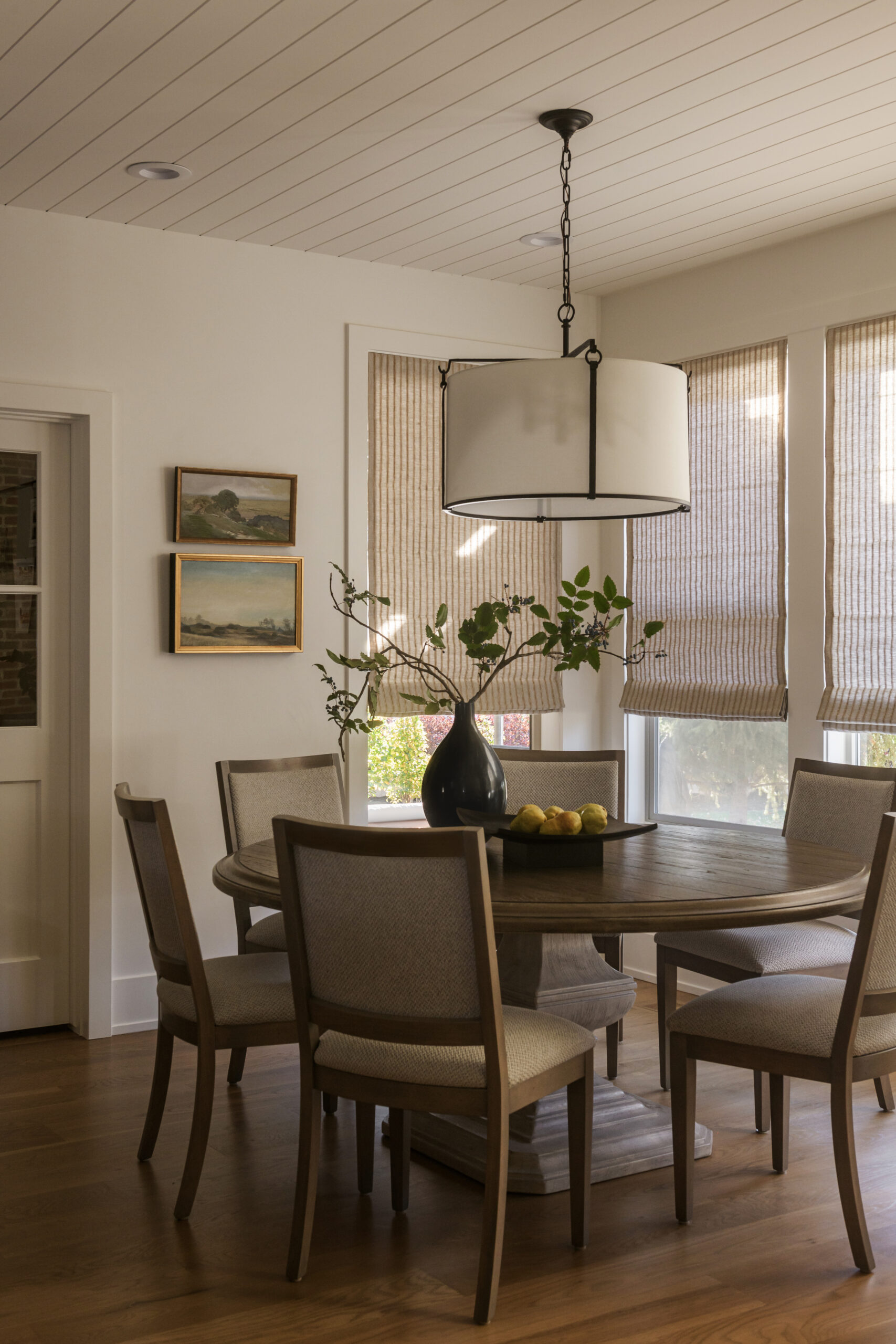
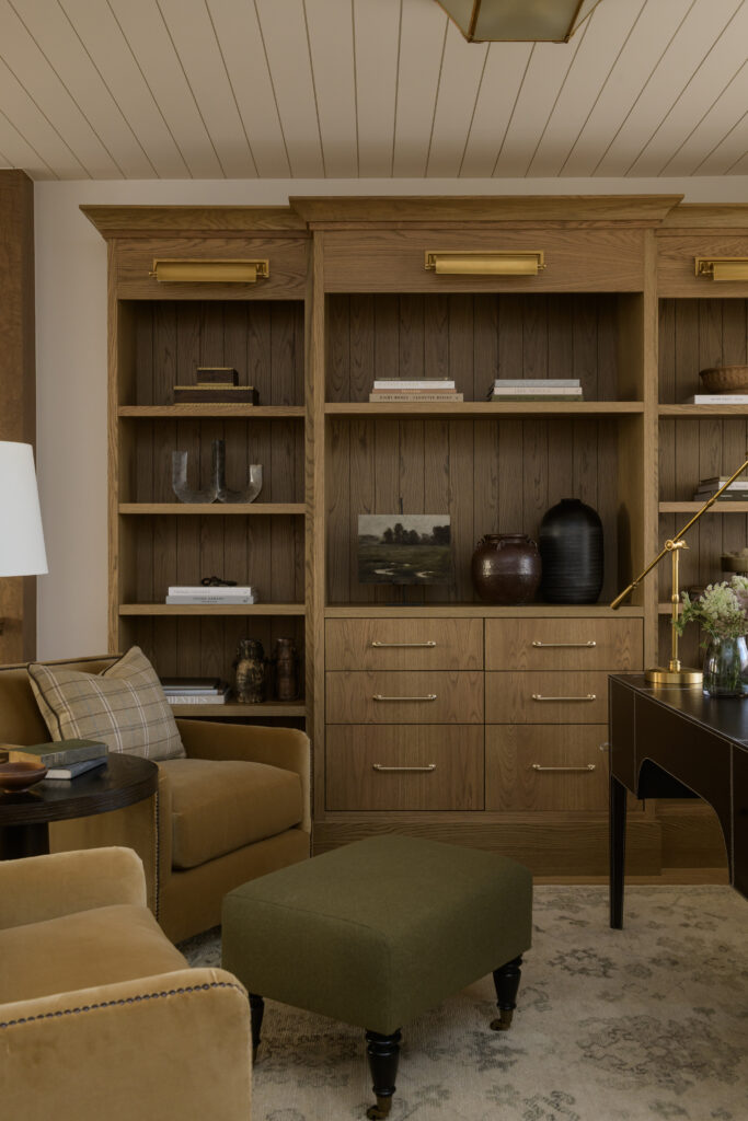
Seeing as the home’s office space came right off of the entryway to greet its visitors, Jeff and Johnna wanted to make sure it made a good first impression. While the layout of the space was working for the clients, the new design warmed it up and refreshed it to flow with the rest of the home. After eliminating the dated ceiling, they added a painted shiplap to coordinate with the new kitchen ceiling. The wood built-ins brought in some added functional storage and provided the perfect focal point that welcomes you into the space (not to mention a great Zoom background).
A Smart & Sweet Primary Bath
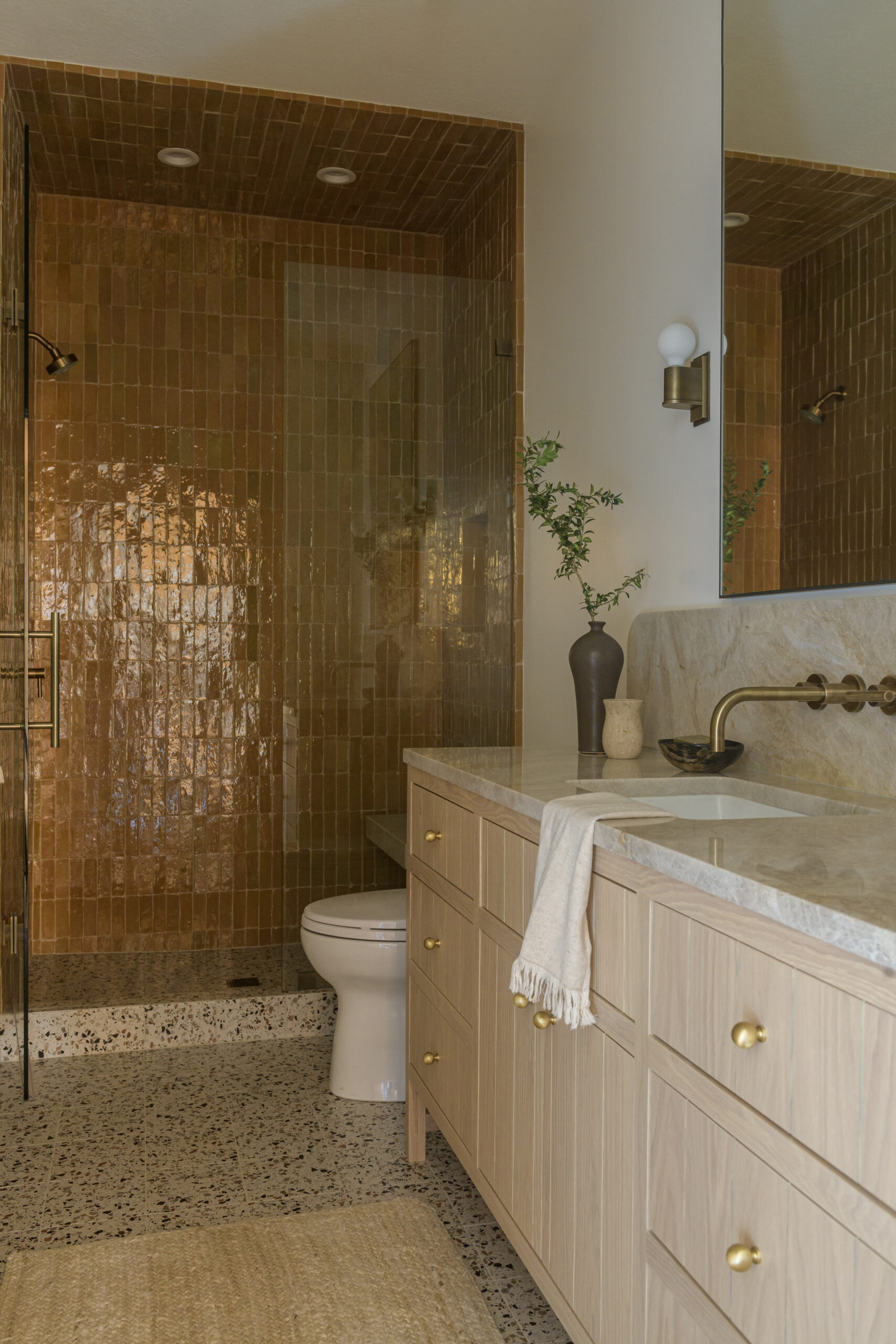
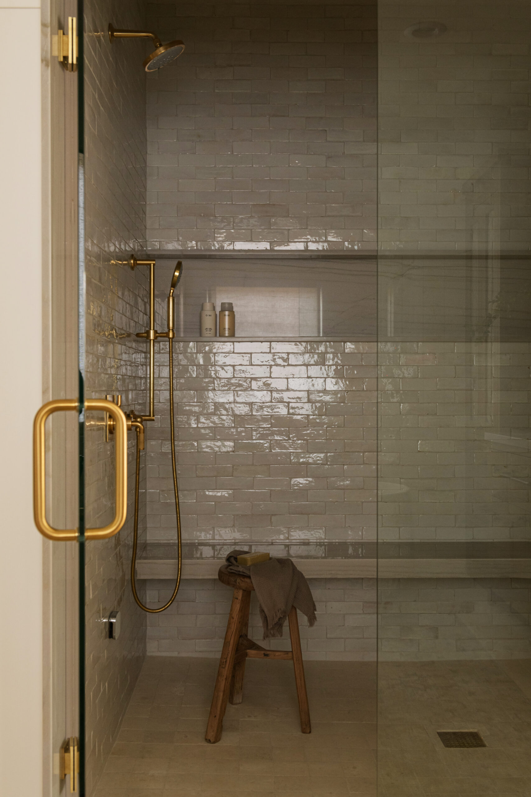
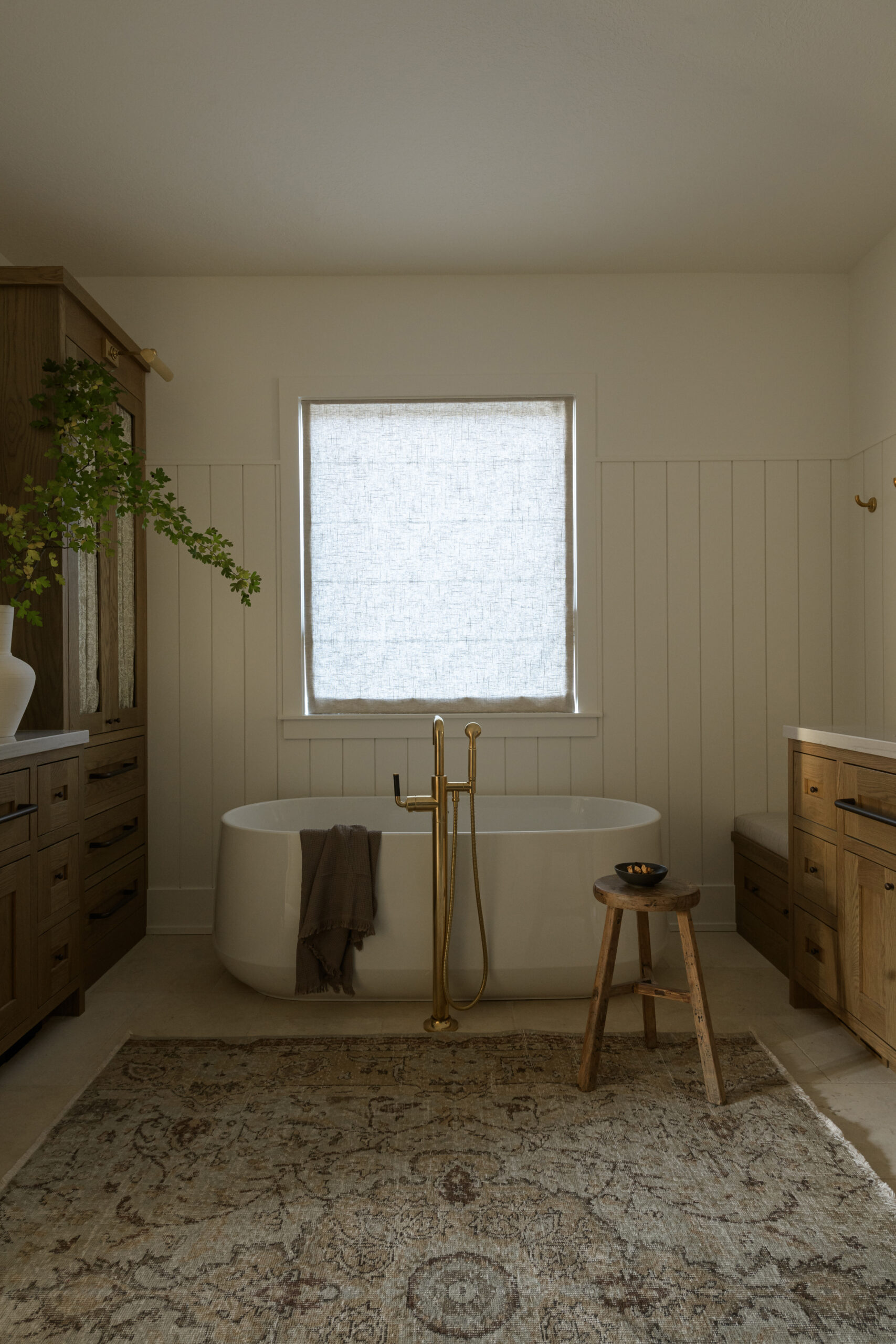
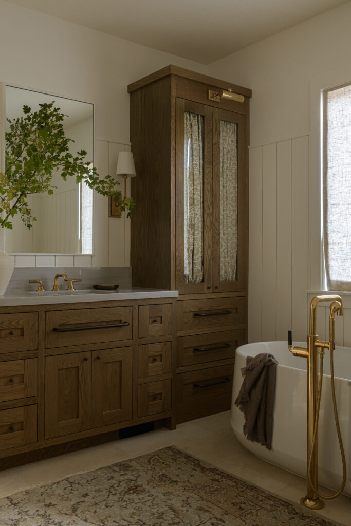
Inspired by blending old and new materials, Jeff and Johnna gave the primary bathroom a major makeover with a top-to-bottom refresh complete with a re-imagined layout, all-new materials, and the prettiest details that pull it all together. How sweet is that patterned curtain in the cabinetry? Talk about a great way to balance the charm of a glass-front detail with the functionality of hidden storage.
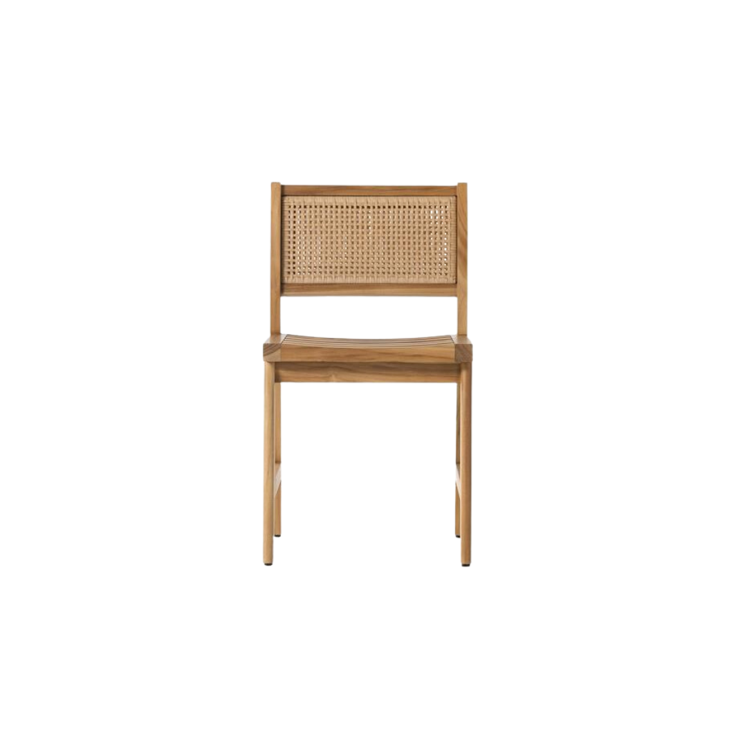
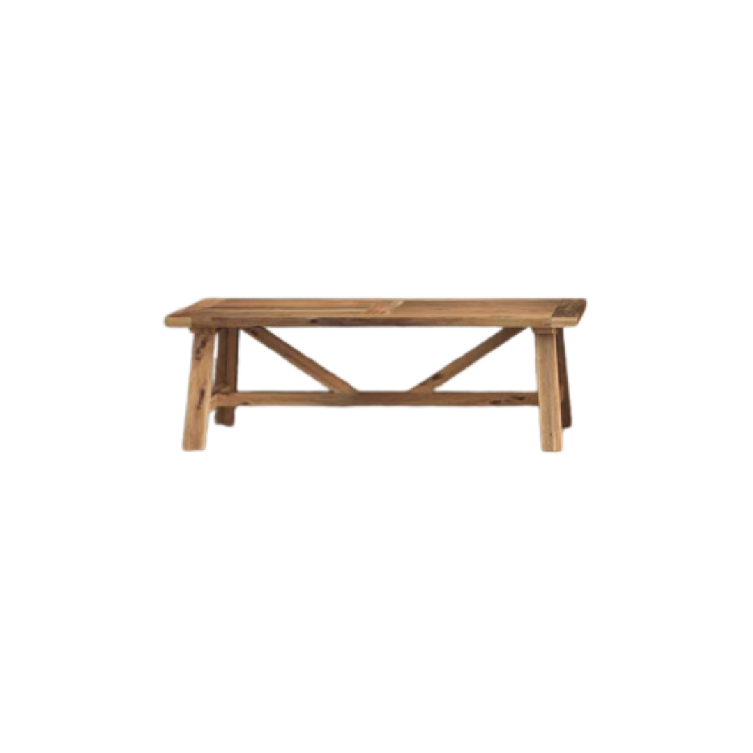
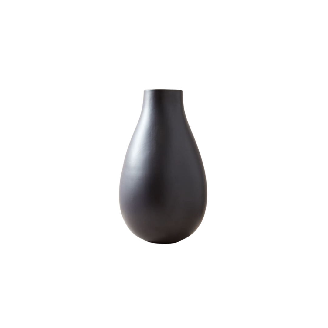
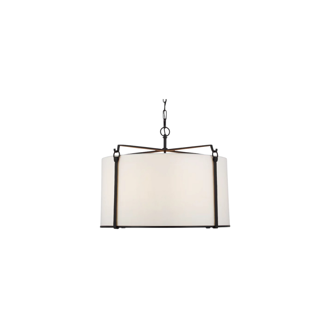
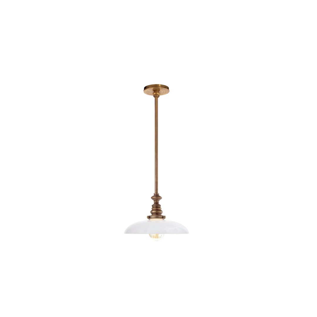
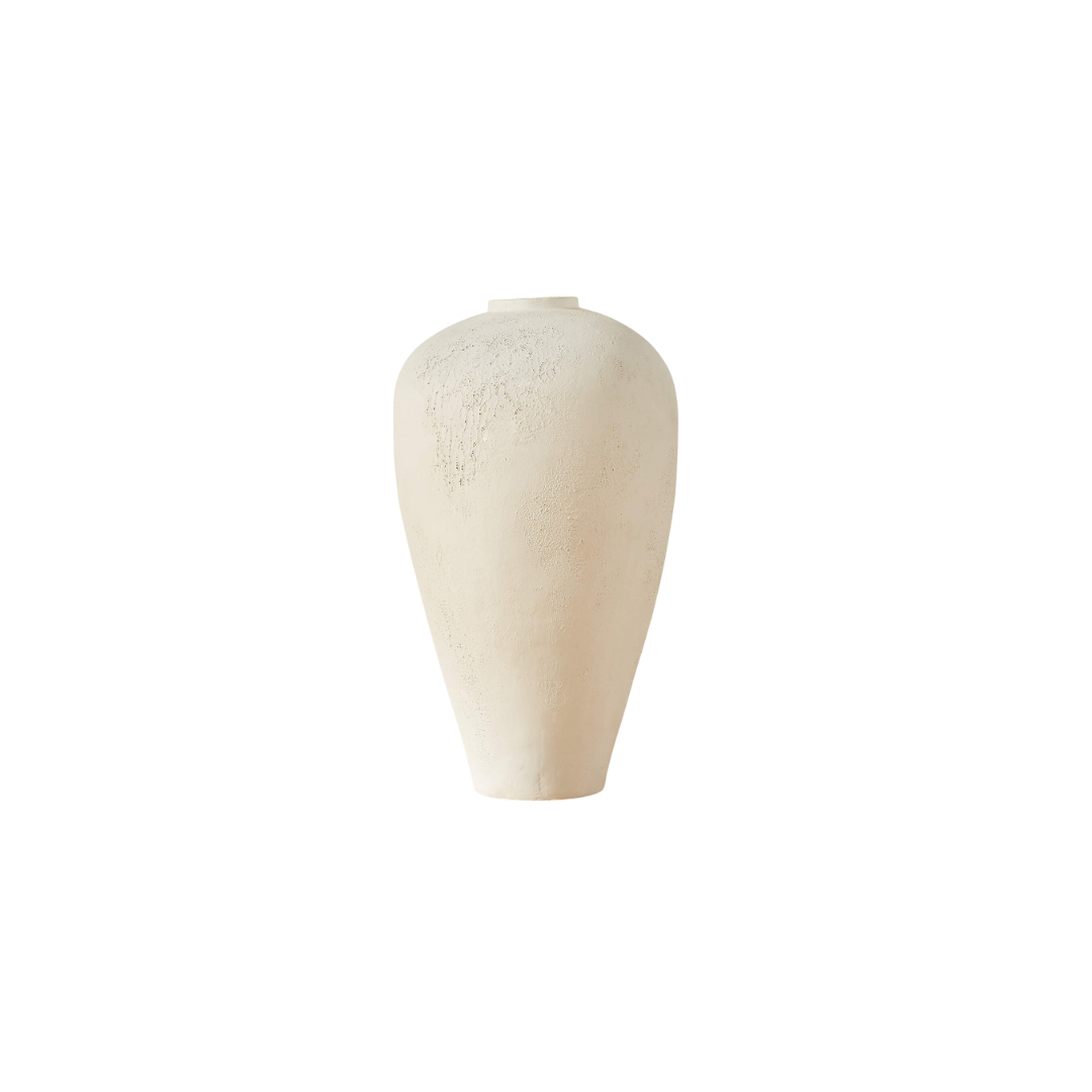
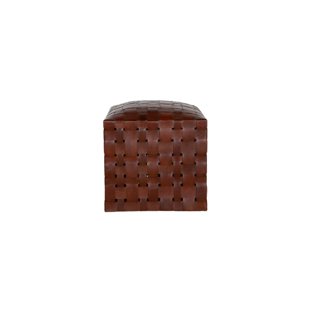
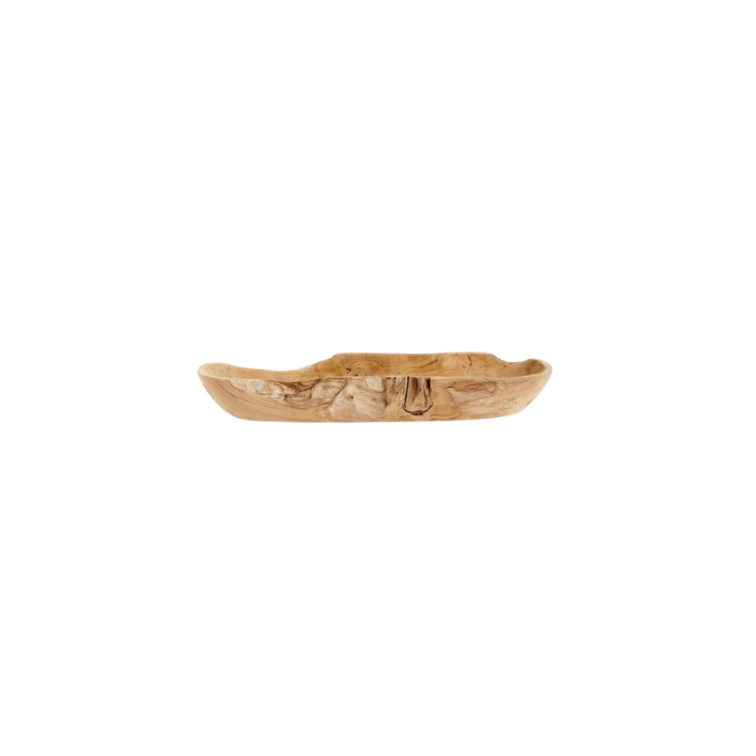
Scroll through the gallery for more from this home and shop the pieces below.
BY: Jasmyne Muir


