This Home’s History Inspired a Thoughtful Remodel
We always appreciate when designers approach renovating an old home with careful attention to detail while paying homage to the space’s original character. Drawing inspiration from the heritage of this 1932 Dutch Colonial home, designer Lindsey Frank and her firm Duet Design Studio masterfully blended charm with modern functionality to complete this timeless renovation.
By seamlessly integrating modern amenities with time-honored touches, Lindsie refreshed this home to enhance practicality and beauty. The project involved a complete kitchen overhaul, the relocation of a powder bath, and a thoughtful redesign of the mudroom. Custom design elements—like an antique-inspired kitchen island and unlacquered brass hardware—add distinct personality, while classic materials such as subway tiles and herringbone slate flooring reinforce the home’s historical roots. The result is a beautiful, inviting home perfectly tailored to the family’s lifestyle. Scroll on to read more about how Lindsie refreshed this home for her clients.
Design: Duet Design Studio | Photography: Gordon Gregory Photo
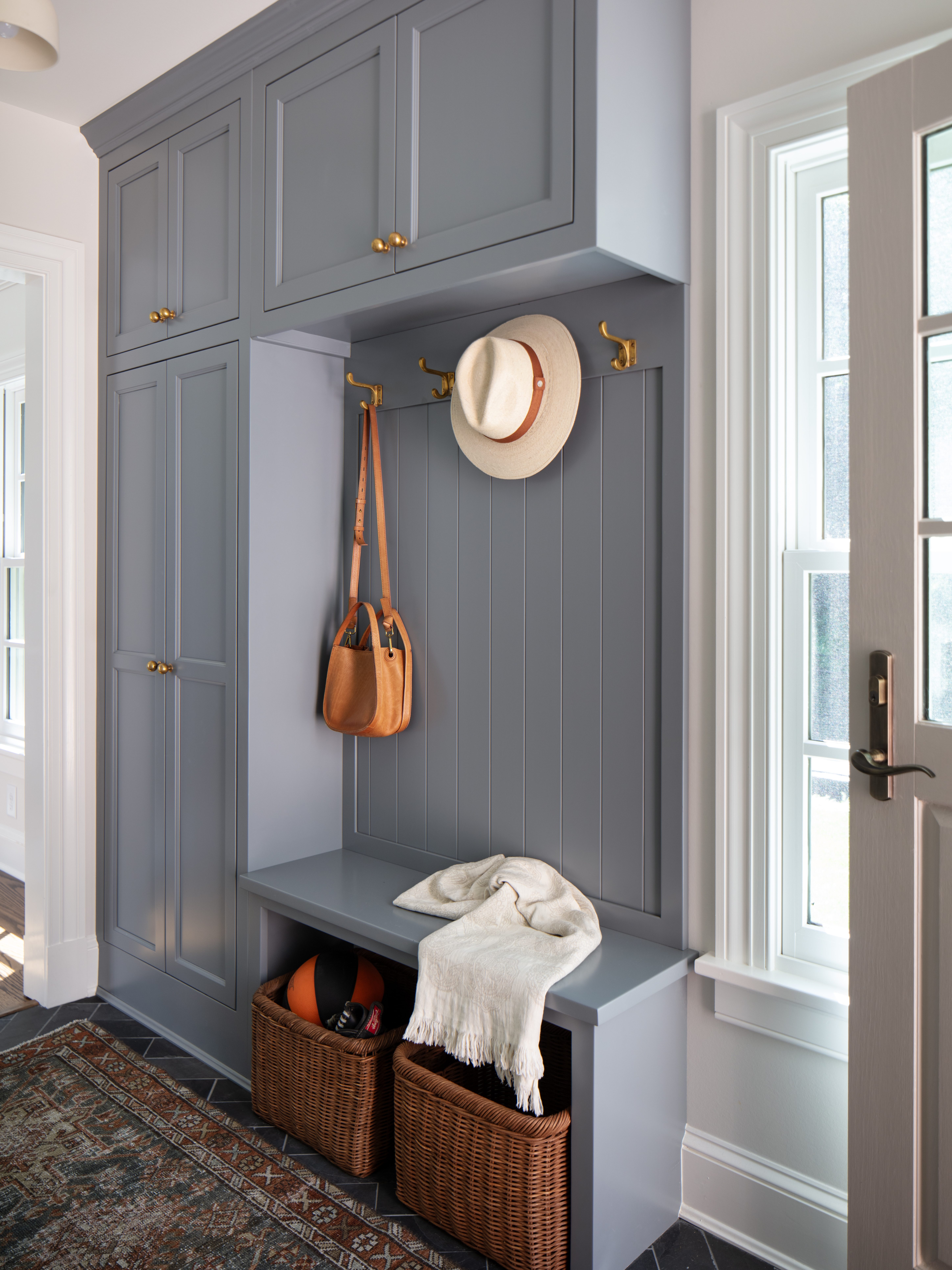
A re-structured mudroom
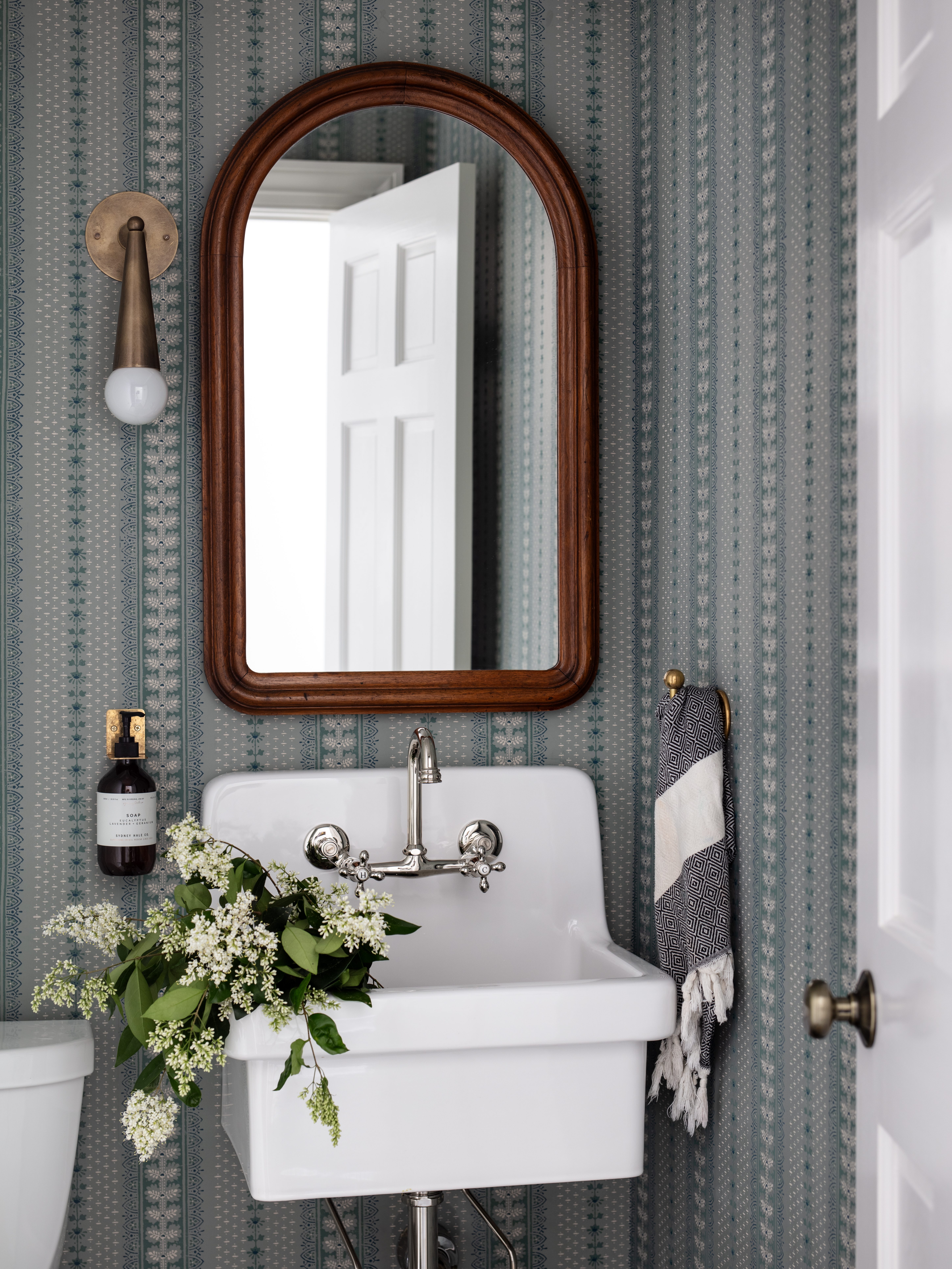
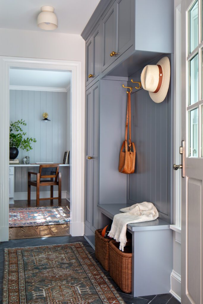
Lindsey and her team decided to relocate the powder bath from the hallway to the new mudroom space early on. This change helped optimize the layout while maintaining the original footprint. The new structure opened the kitchen and enhanced storage capacity, providing a more efficient flow. The side exterior door was repositioned to the mudroom, establishing a straightforward rear entry and landing zone, making the outdoor and indoor transition seamless and functional.
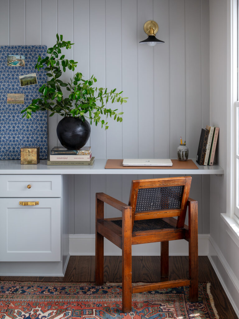
A pretty & practical office nook
While the mudroom office nook was originally a playroom and exercise area, Lindise helped her clients reimagine the space to meet the demands of modern family life. The new office nook helps the family get more use out of the space while setting the tone for the remainder of the home. Slate flooring in a double herringbone layout brings durability and classic beauty, ready to withstand the demands of everyday life.
Carefully selected kitchen details
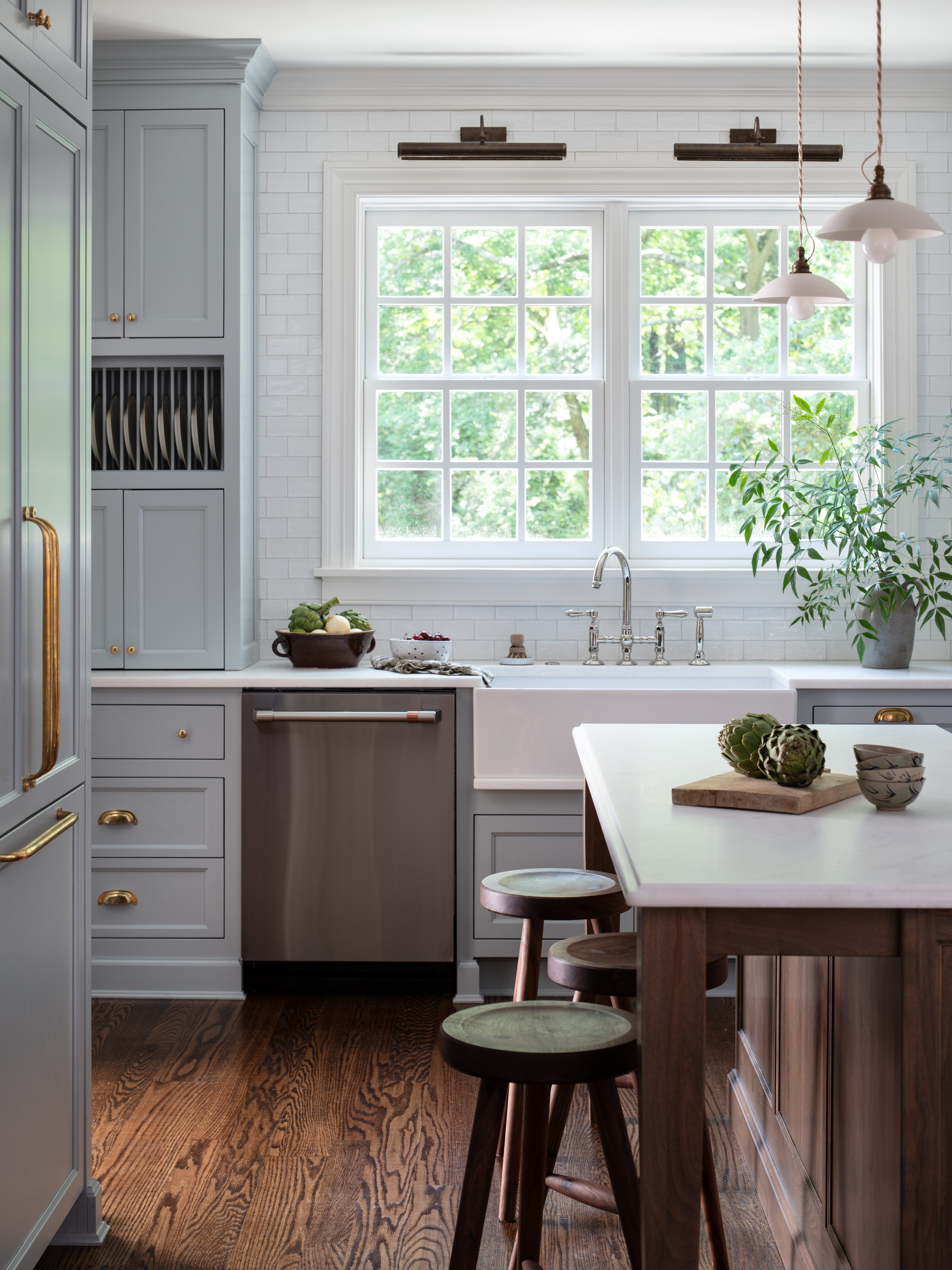
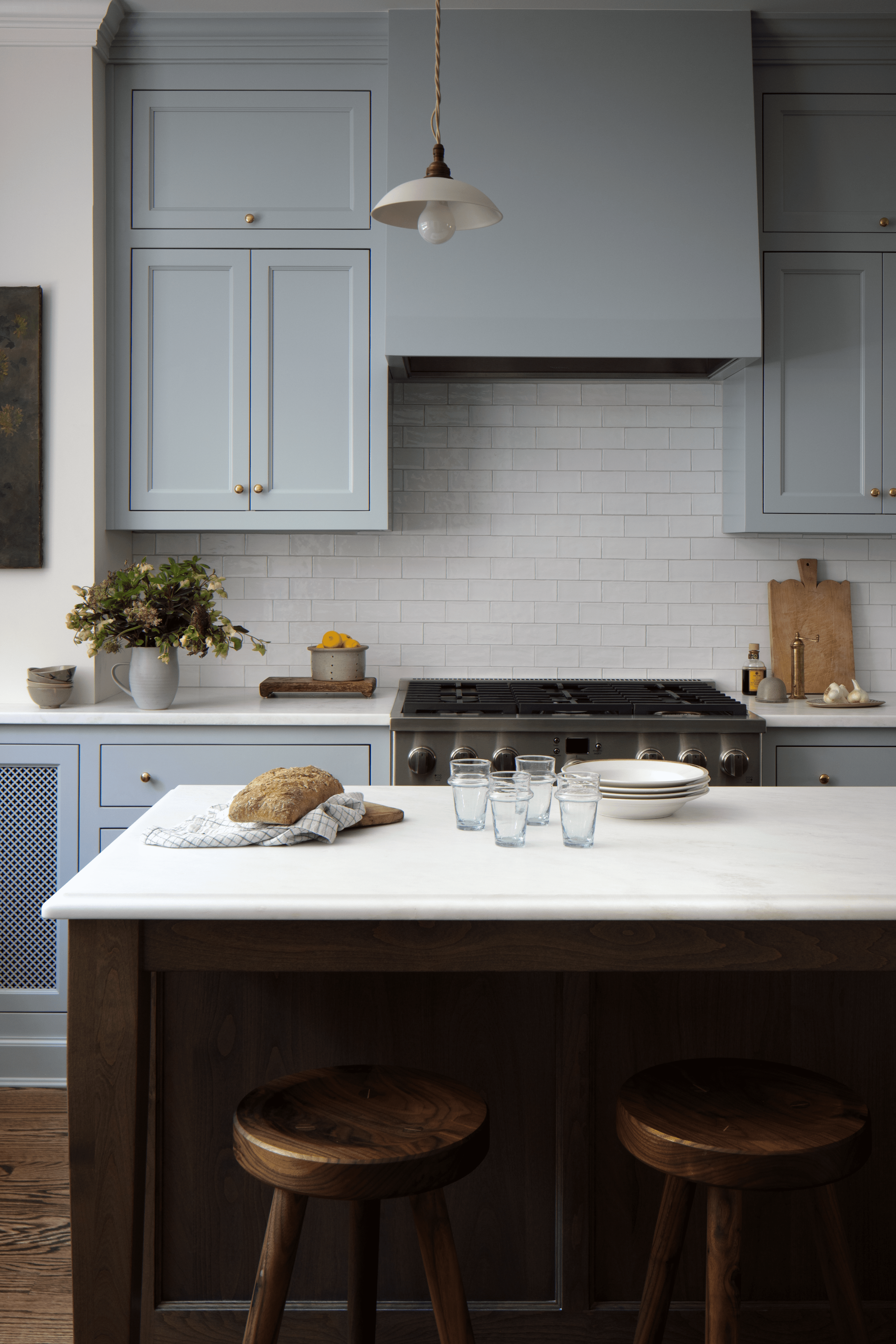
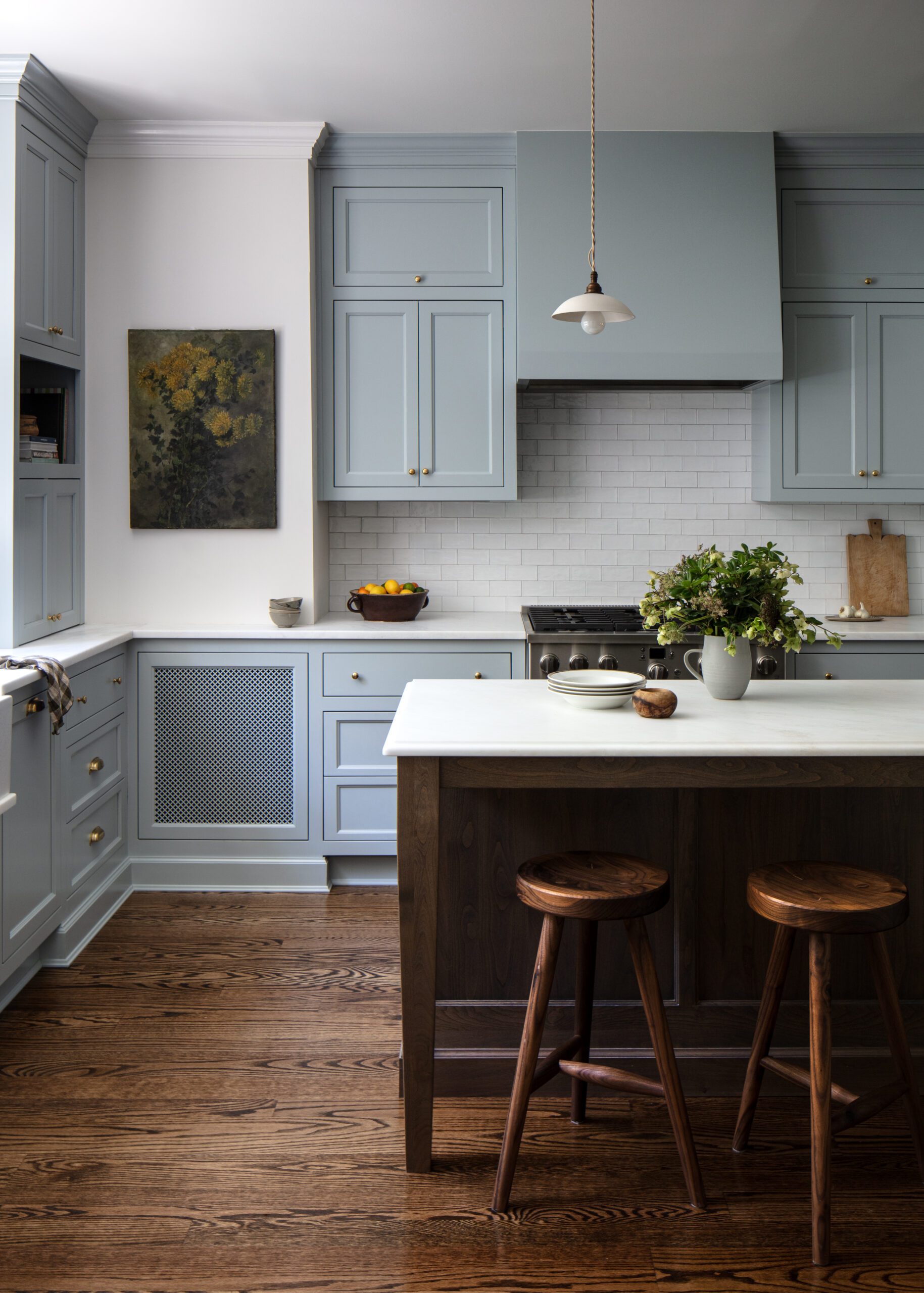
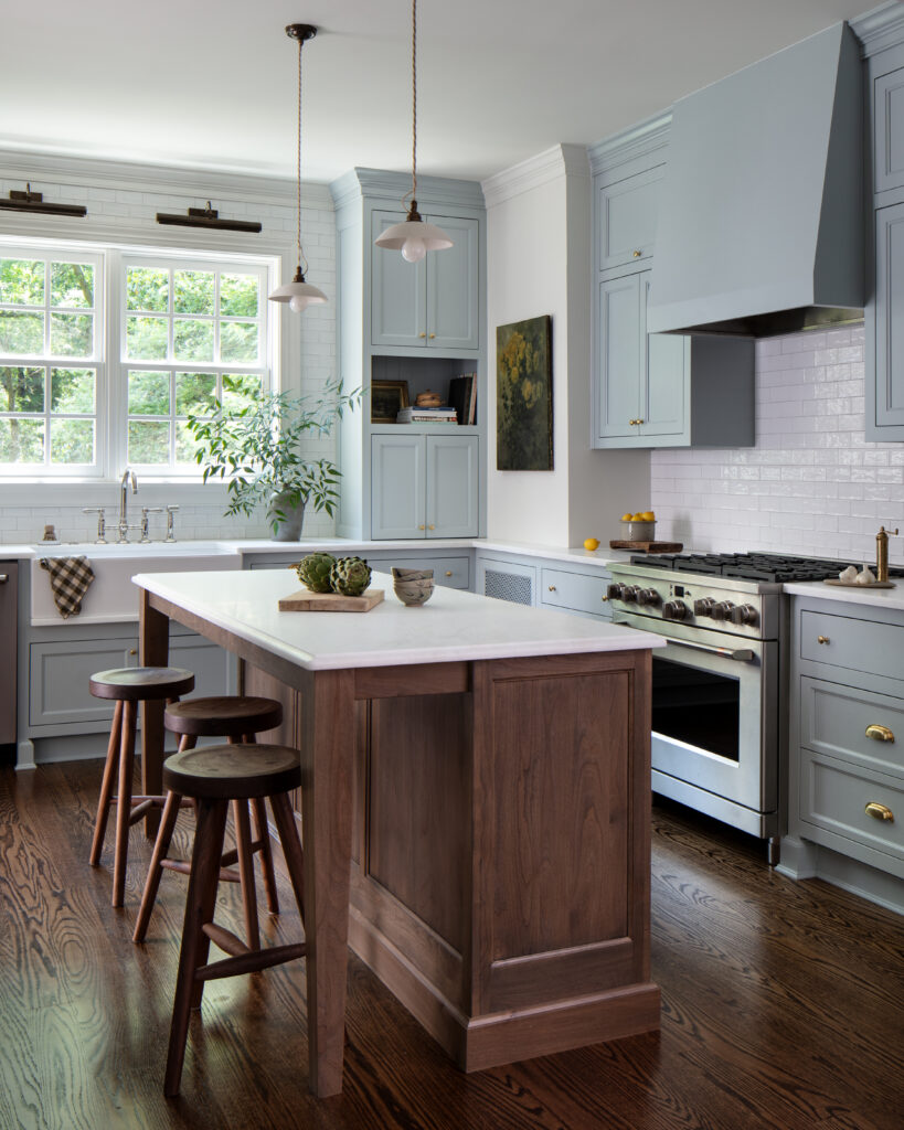
Lindsey and her team made careful selections to reflect the history and tradition in the kitchen and heart of the home. The design process began with gutting the kitchen to the studs, shedding its outdated 1970s laminate tile to embrace a more classic aesthetic. Devol porcelain pendants, brass bin pulls, and a timeless bridge faucet resonate with the home’s heritage and add charm and personality to the space.
A charming en suite addition
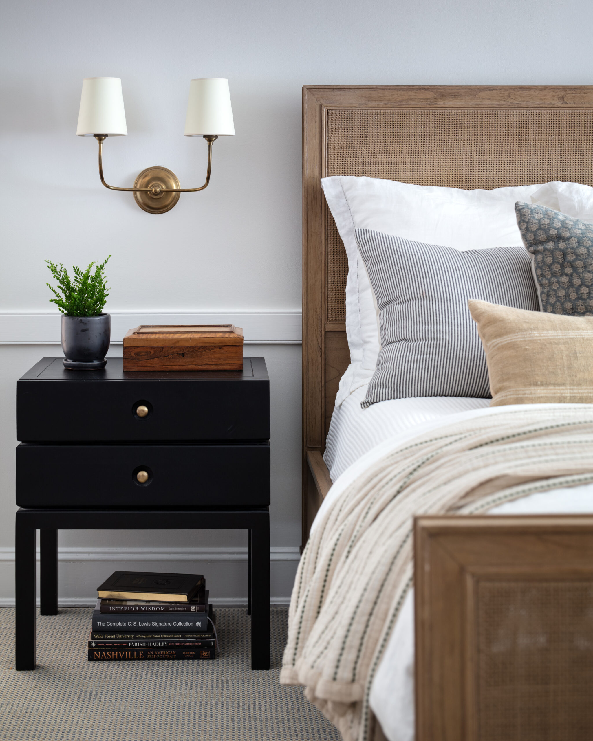
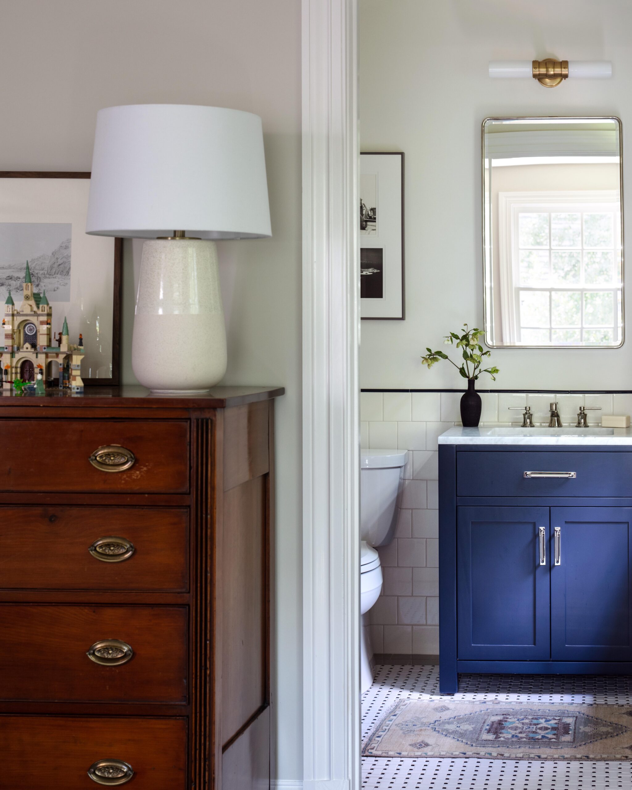
The upstairs bedroom ensuite addition was thoughtfully designed to give the client’s son a dedicated personal space away from his two sisters. This new retreat seamlessly integrates with the home’s historical character while offering modern conveniences. The ensuite bathroom features traditional subway tiles and trim details that evoke a sense of permanence as if they have always belonged to the home.
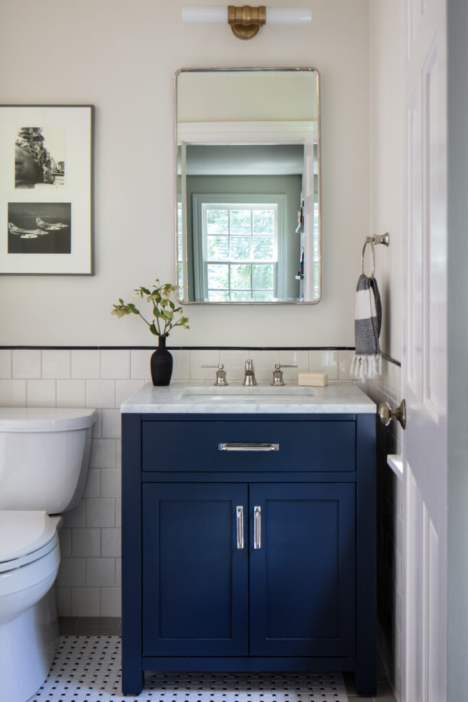
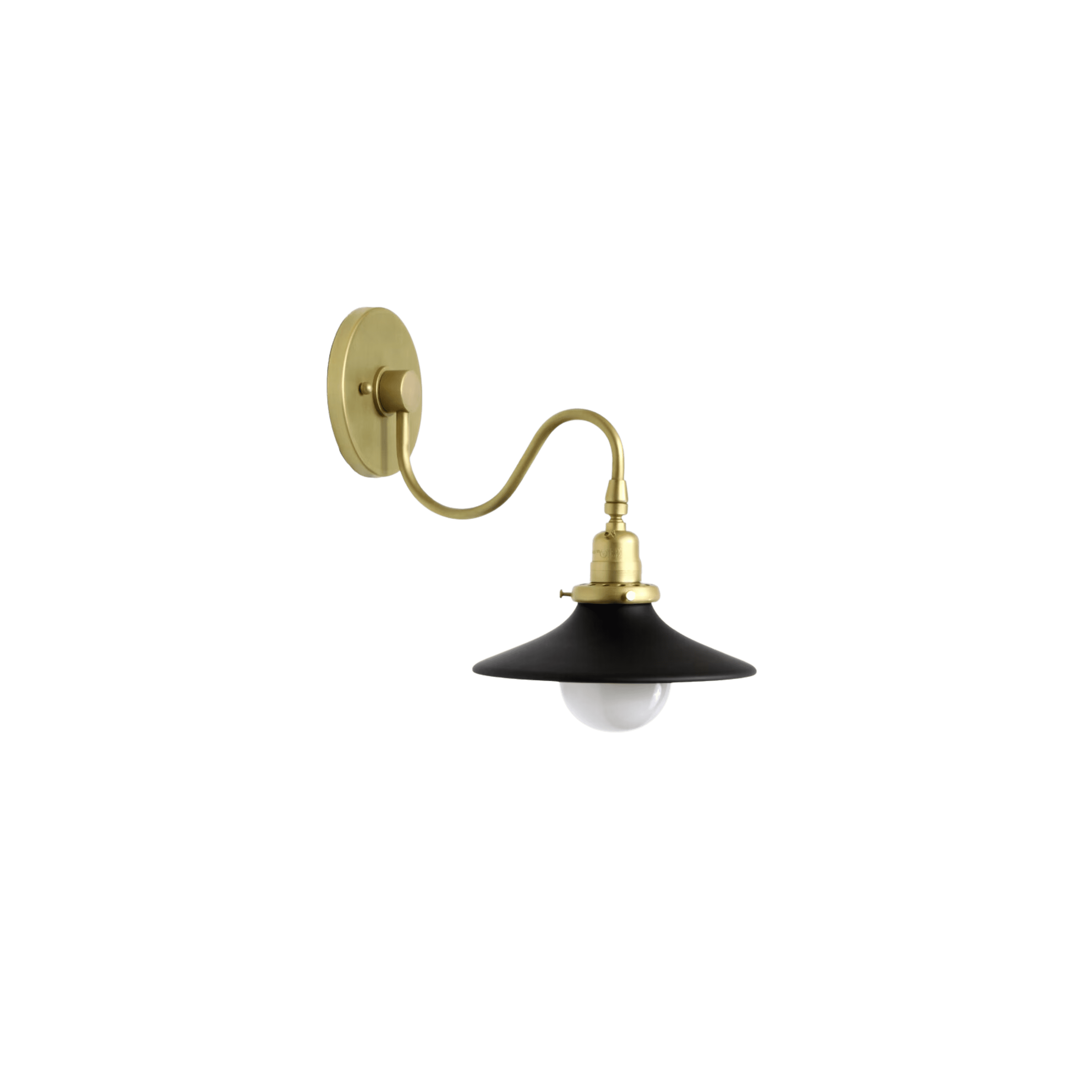
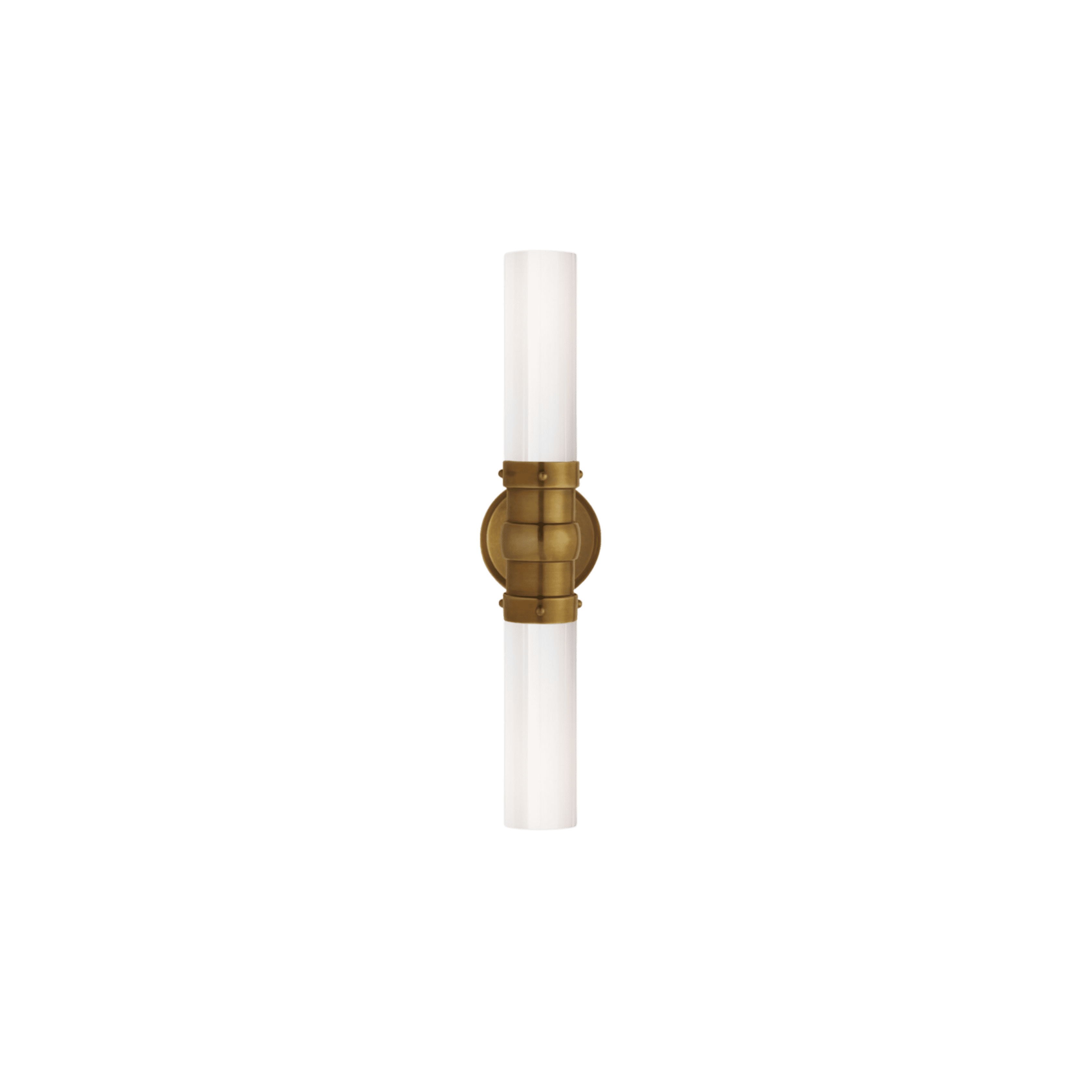
Lindsey chose vintage-inspired sconces and hexagonal and square geometric tile patterns to enhance the bathroom and reflect the home’s 1932 origins.
Scroll through the gallery and shop the look below for more from this lovely space!
BY: Jasmyne Muir


