Shop











The Incredible Transformation of a 1990s New York Home
When a young family traded New York City for a sprawling home in Armonk, they turned to Steph Schlegelmilch of Studio Seva to make the once all-white interiors feel warmer, richer, and distinctly their own. In just one month, layers of mohair, vintage finds, earthy color, and custom details transformed the 1990s home into a sophisticated retreat designed for both gathering and getting away.
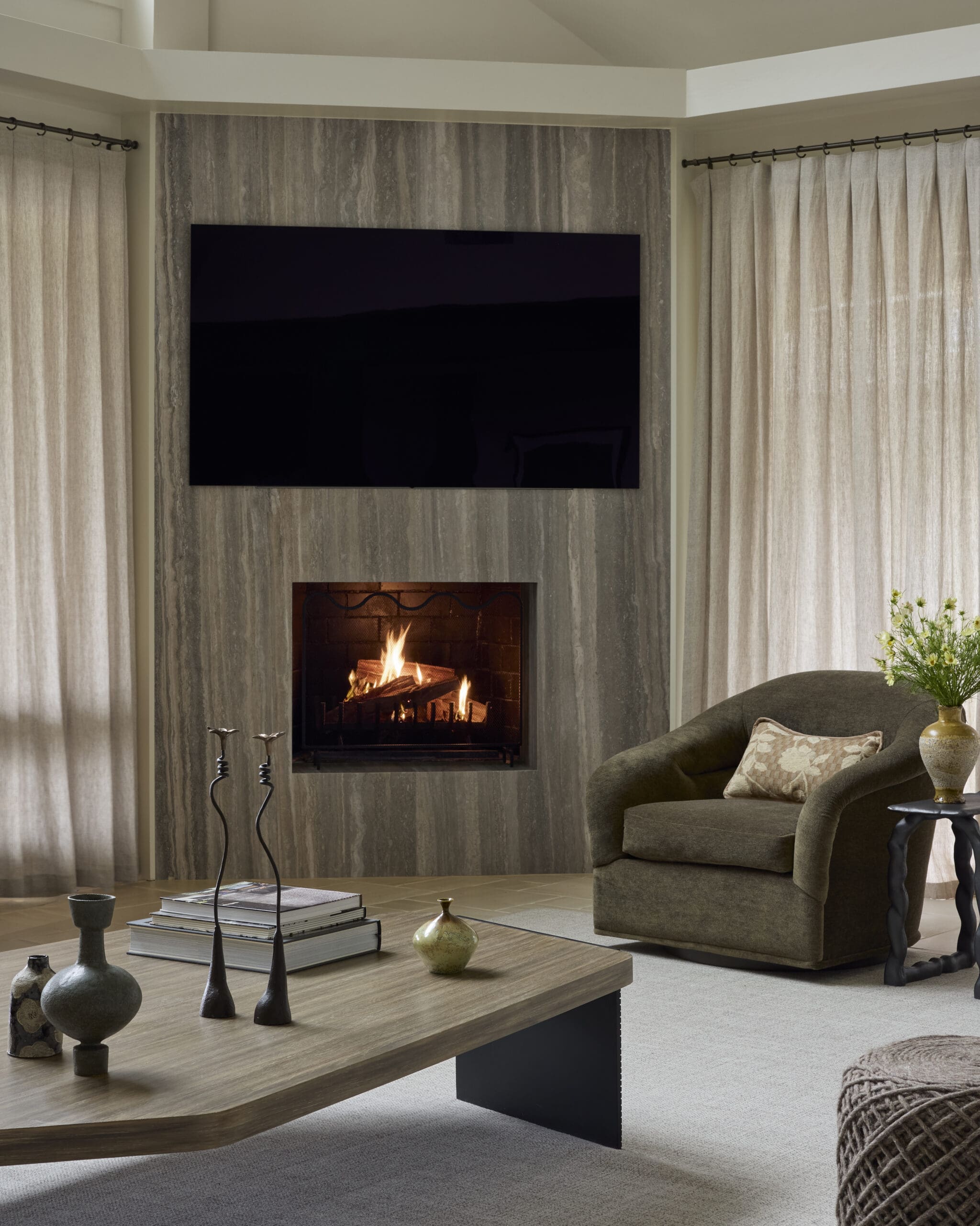
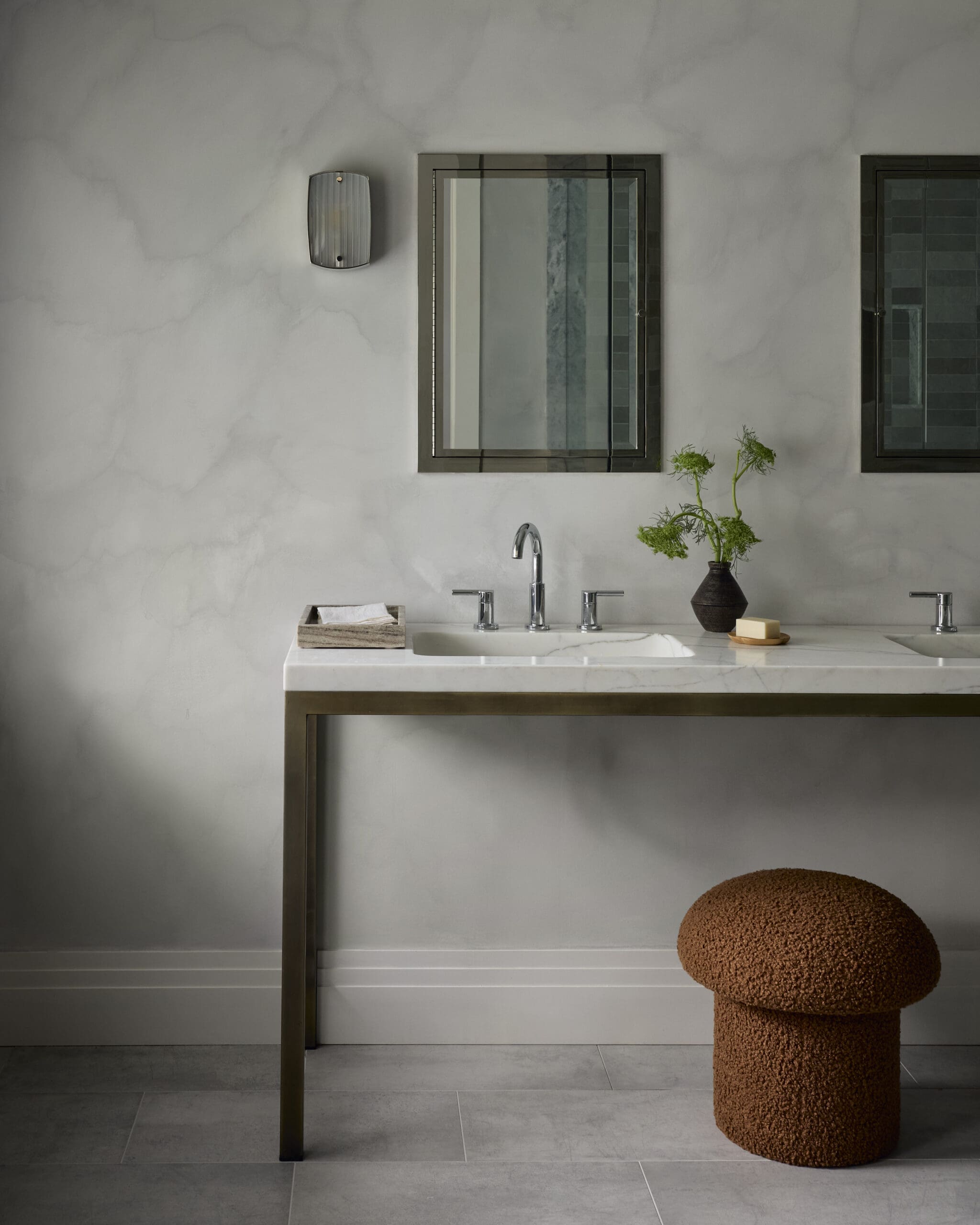
For a couple leaving New York City with their two children, the appeal of this Armonk property was easy to understand. Set on two-and-a-half private acres high above a golf course, the 7,800-square-foot home offered the breathing room they were after without putting the city entirely out of reach. Architecturally, there was already plenty to work with—cathedral ceilings, exposed wood beams, limestone floors, and an unusual mix of open gathering spaces and tucked-away rooms—but a previous renovation had left much of the interior white and disconnected from the homeowners’ style. They brought in Steph Schlegelmilch of Studio Seva to give it a warmer, more sophisticated point of view, trusting her team with everything from custom millwork and fireplace surrounds to furnishings and, crucially, a whole lot of paint. There was just one small catch: once they finally got the keys, Studio Seva had roughly a month to pull it all together.
Design: Studio Seva | Photography: Gieves Anderson | Styling: Martin Bourne
From Blank Slate to Warm Welcome
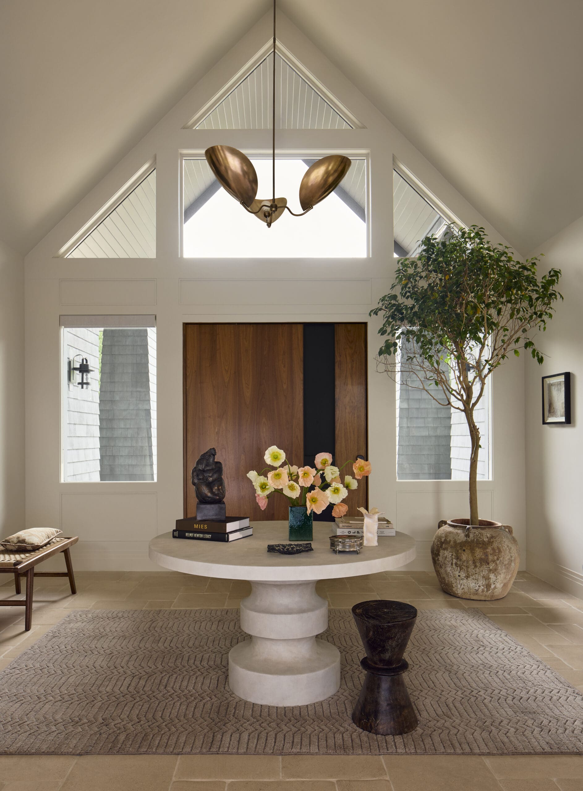
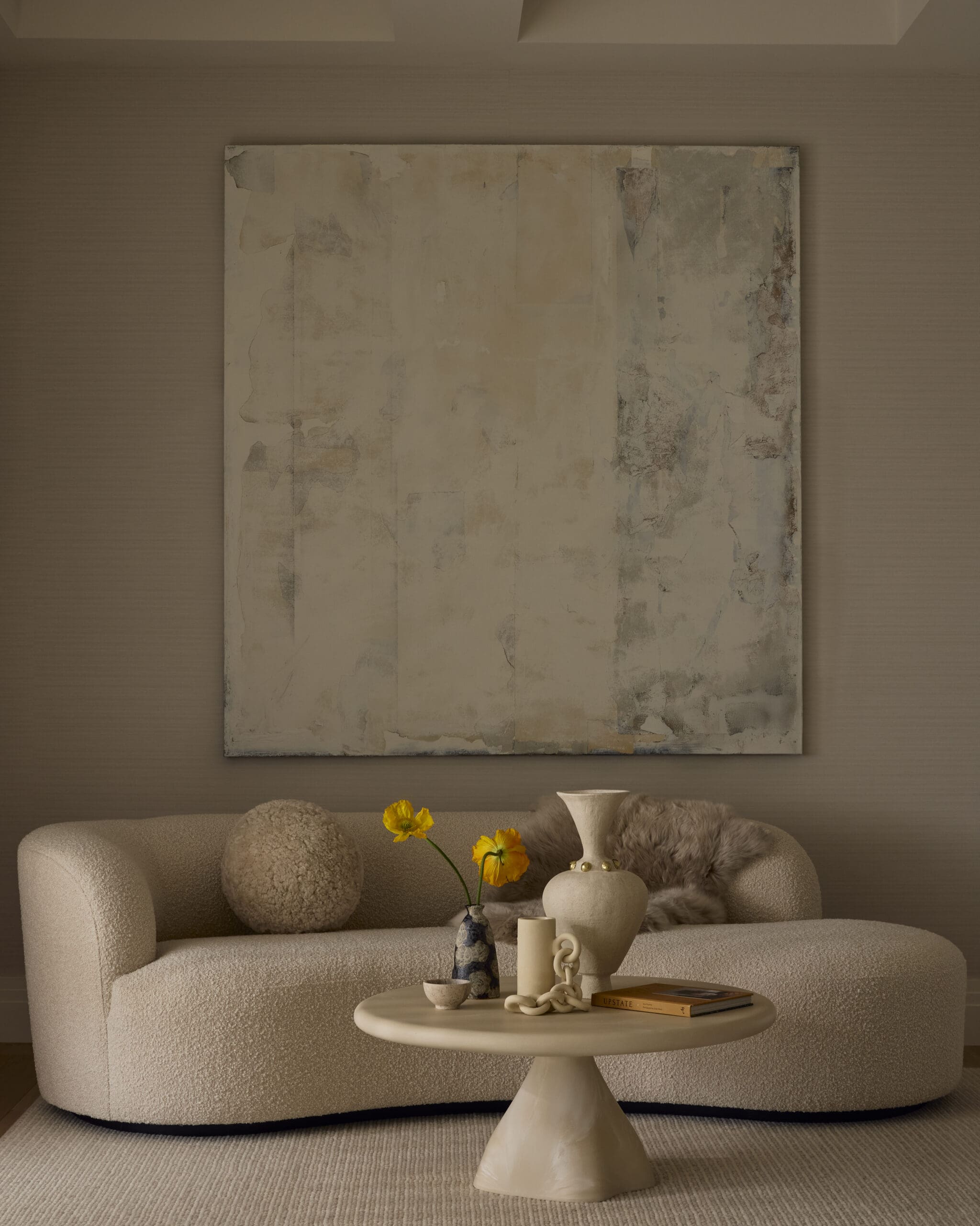
The home’s scale is apparent from the entry, where cathedral ceilings and tall windows open up to views of the property. After inheriting an almost entirely white interior, Steph’s first move was to bring in warmth without losing that sense of openness. The foyer sets the tone with a wool rug from Armadillo that feels substantial enough for the soaring space. “I loved the statement it gave but appreciated how the tone blended in with the rest of the elements to really ground the space,” she says. From there, warmer neutrals, natural wood, and vintage pieces begin to give the 1995 home a sense of history it didn’t have before.
Neutrals, With Something to Say
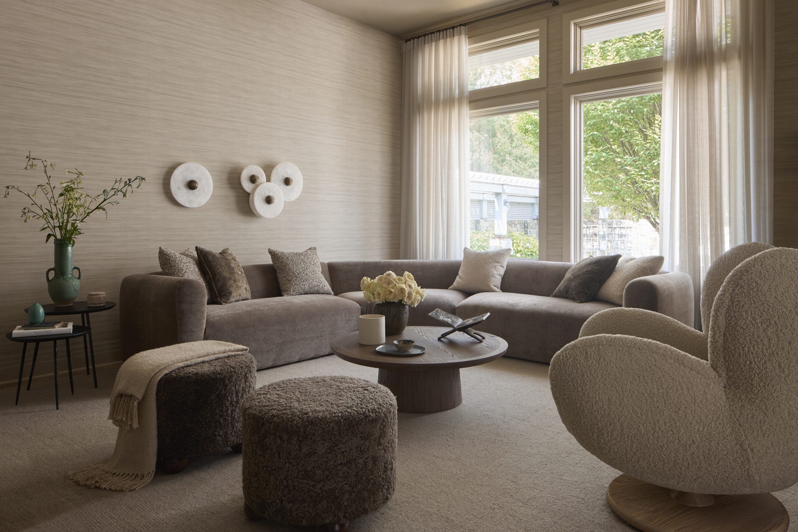
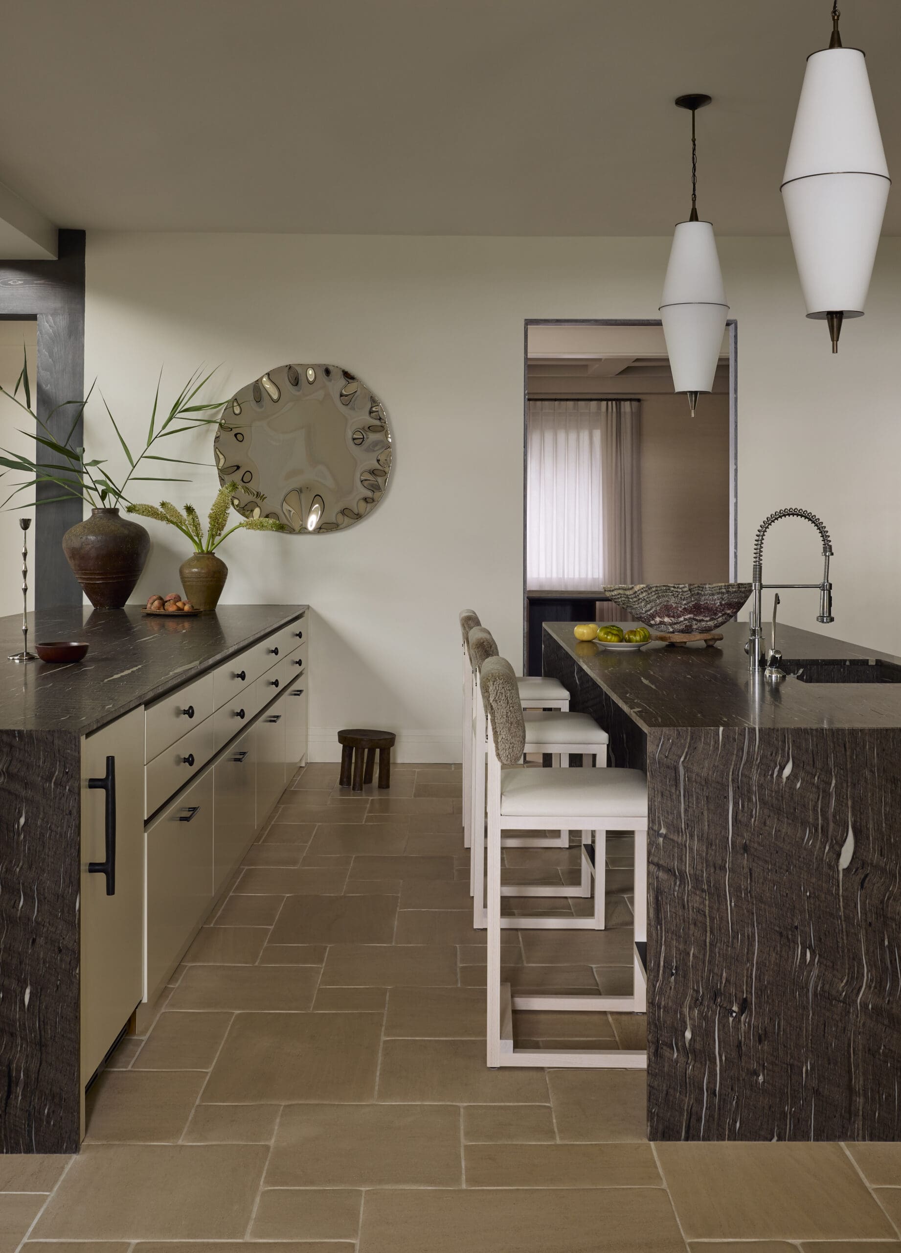
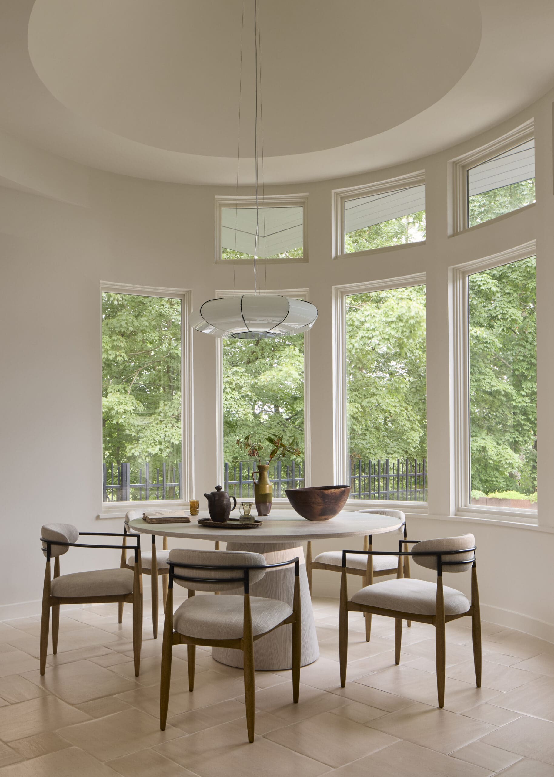
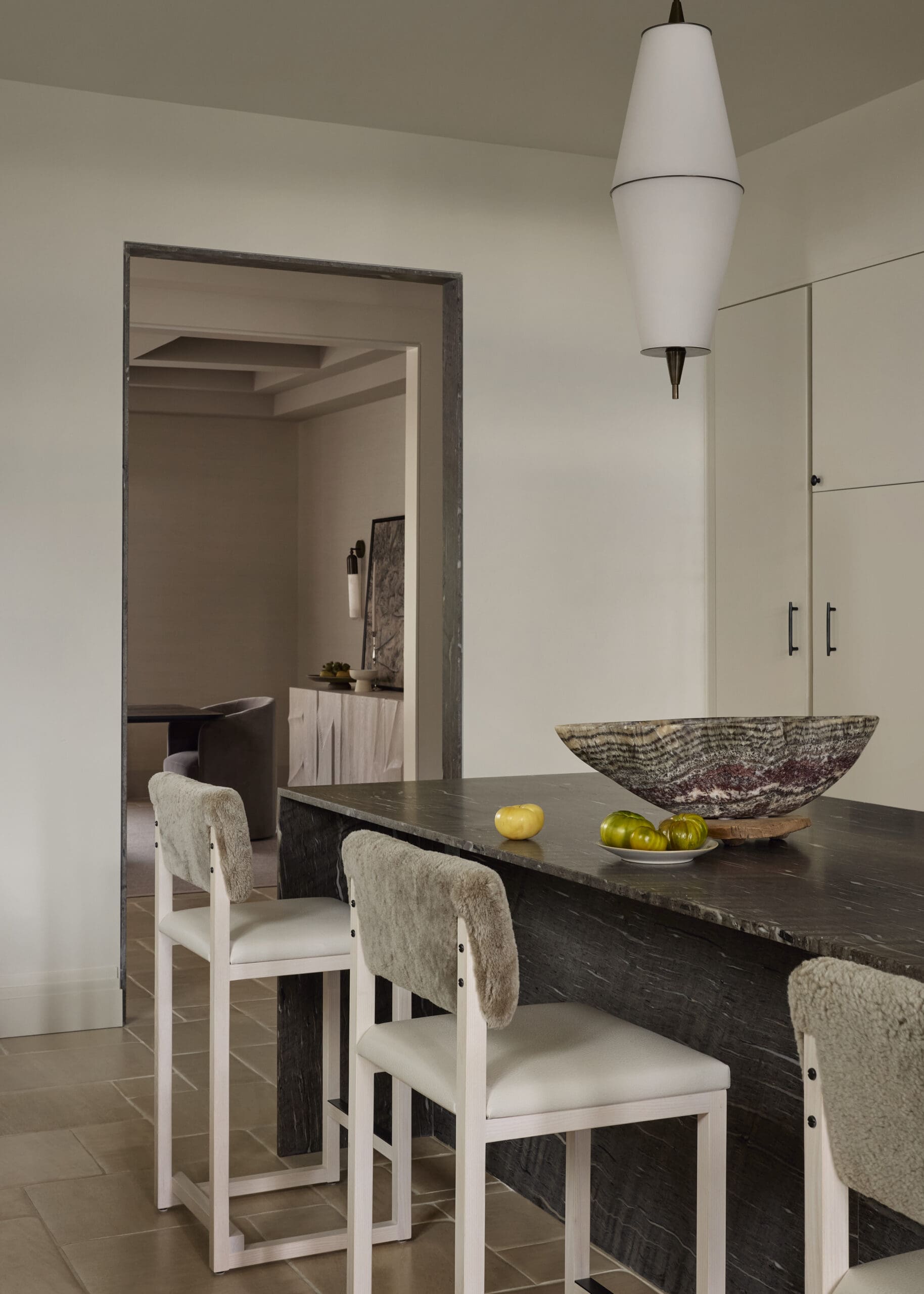
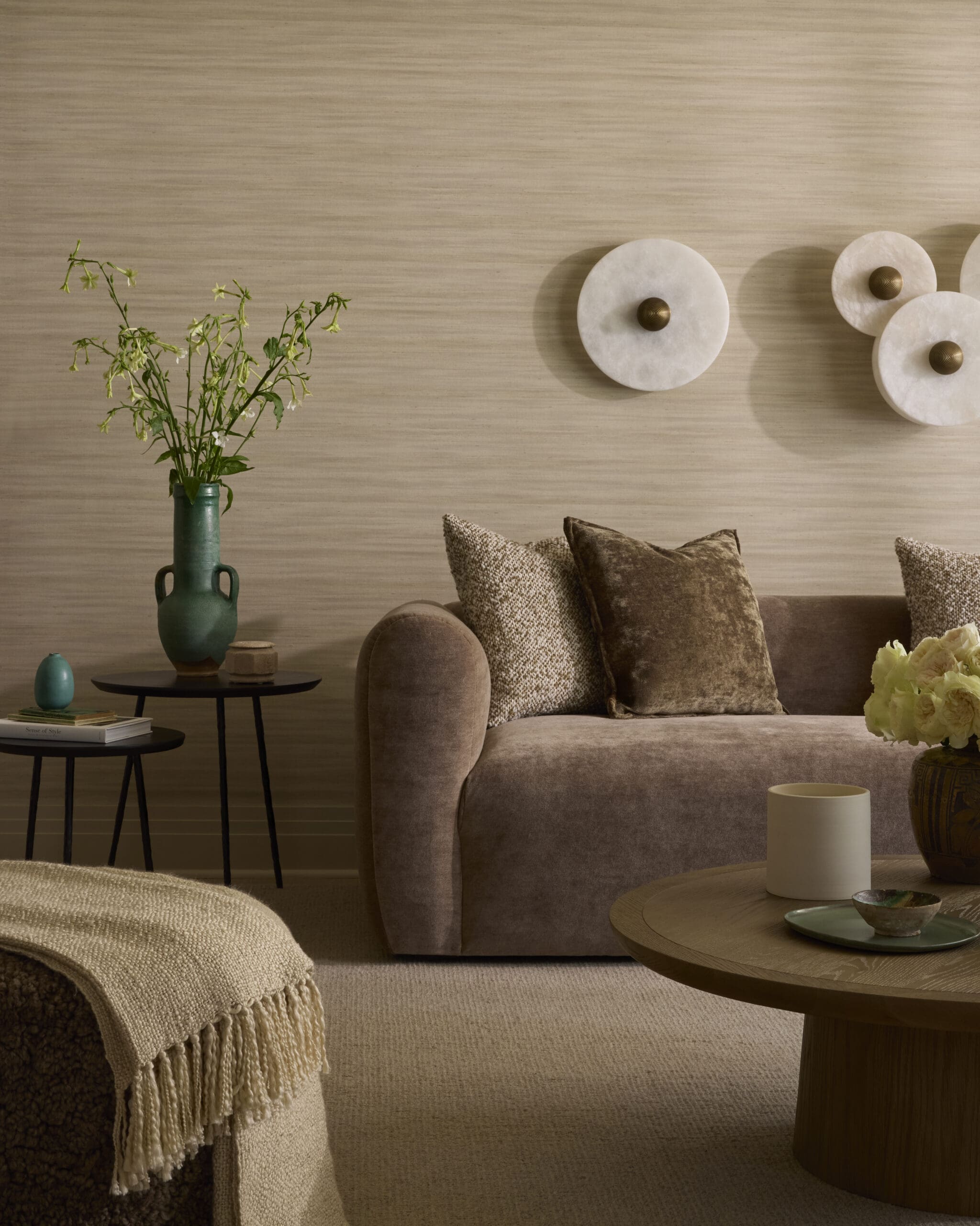
For the home’s main gathering spaces, Steph leaned into richer neutrals rather than introducing lots of color. Mohair and olive tones bring depth to the living room, while Benjamin Moore’s Muskoka Trail carries through the family room and kitchen, working with the limestone floors that first drew the homeowners to the house. Furnishings were chosen with family life in mind, too: the upholstered kitchen stools, for example, pair a wipeable seat with a comfortable back. “The ability to select our own fabrics allowed us to achieve the look we were after,” Steph says.
The Details Do the Heavy Lifting
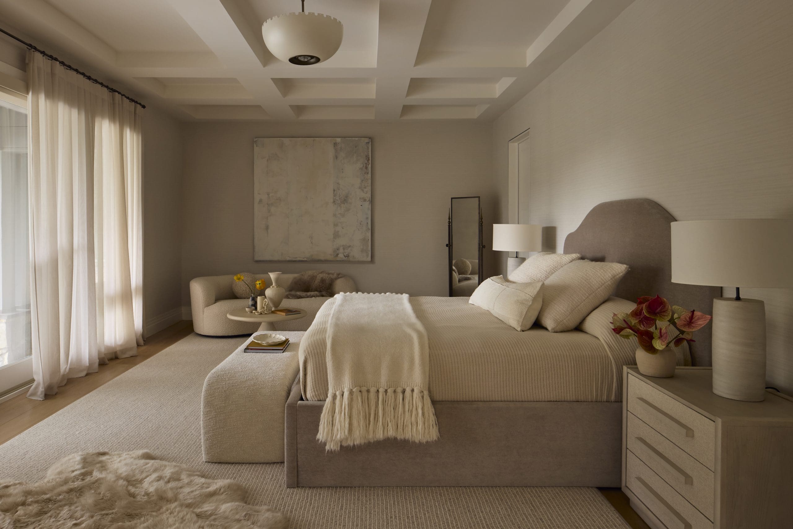
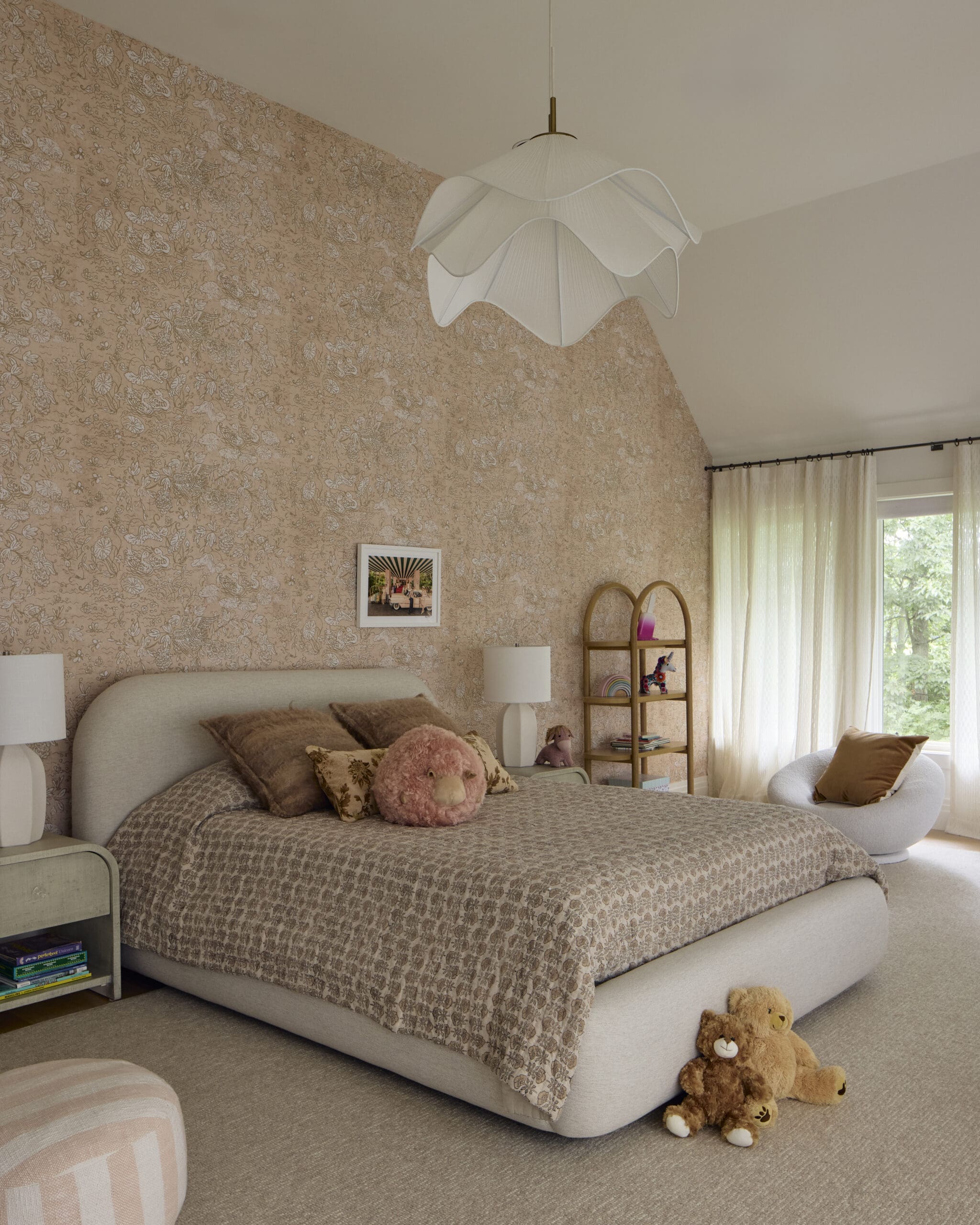
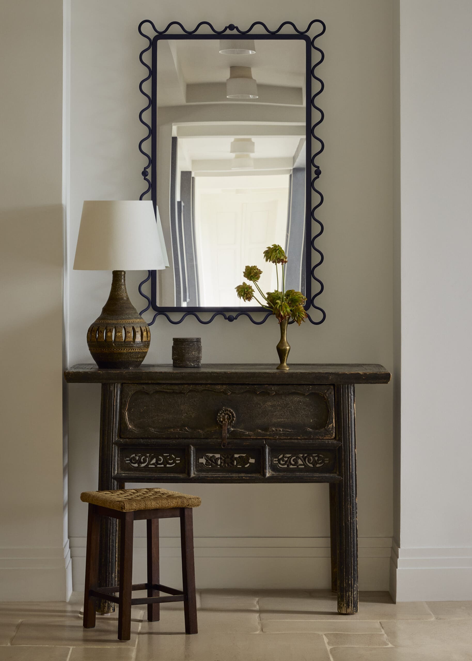
With just a month to complete the renovation, character came through in the details. In the primary bedroom, an Urban Electric ceiling light was chosen for its unusual cut-edge detail—an heirloom-quality piece that Steph says could “blend in with the design but also stand out.” The daughter’s room takes a more playful turn with a small-scale Élitis floral wallpaper designed to grow with her. Throughout the house, vintage finds bring in age and patina, including a wood console in the hallway, where a wavy black metal mirror adds a sharper contrast.
A Moodier Moment at Home
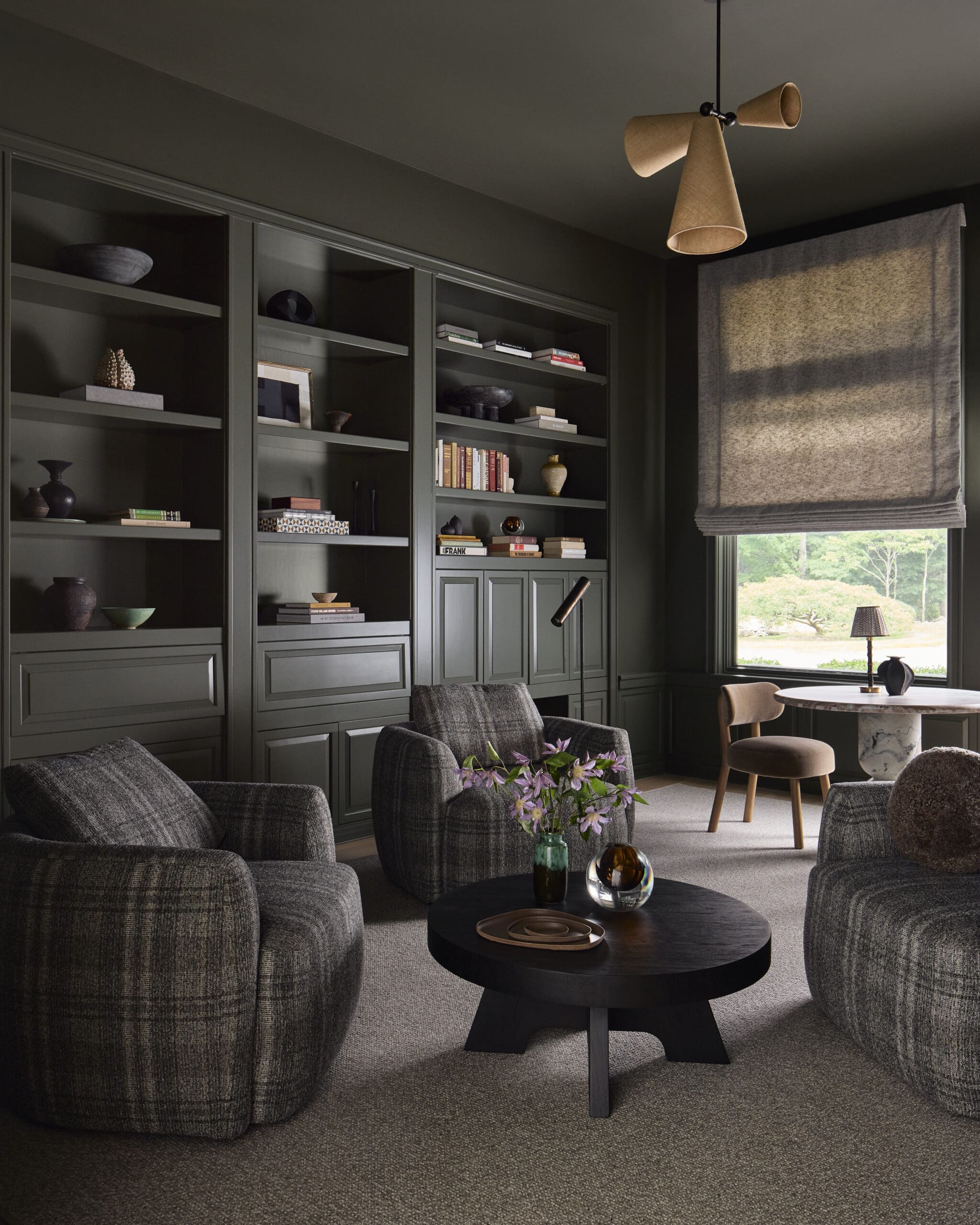
Not every room was meant for gathering. The homeowners also wanted smaller spaces to retreat to, and the library became the moodiest of them all. Studio Seva leaned into its separation from the rest of the house, covering the room in Portola Paints’ Nostalgia and creating the cozy, speakeasy-like atmosphere the couple had envisioned. It’s a dramatic departure from the lighter rooms beyond it, and exactly the kind of shift Steph wanted when she set out to give each space its own story.
Scroll on to see more from this home and shop the look below.
BY: Daniela Araya
>
Shop