A 1963 California Ranch Style Renovation
As the epicenter of our homes, the kitchen is not only where we tend to spend the majority of our time, but it’s also the space that sets the tone for the look and feel of the project as a designer. For Lilly Walton and her clients, the kitchen remodel kicked off phase one of their project, which would later expand into the laundry room, powder room, and primary suite.
When they began working together, they had a clear vision for how they wanted the spaces to look and feel: timeless, functional, and reflecting a healthy balance of materials and organic elements. After removing the kitchen wall to open it up into the living room, Lilly created a larger space to make the most of the kitchen, giving them a clean slate to design from scratch.
Design: Lilly Walton Design | Photography: Mellon Studio
Contrasting Textures
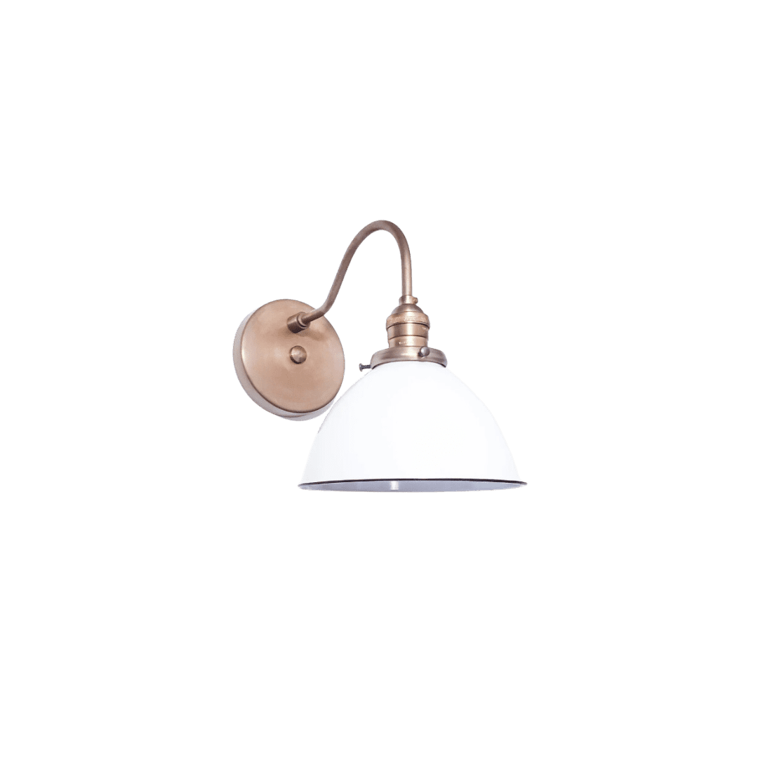
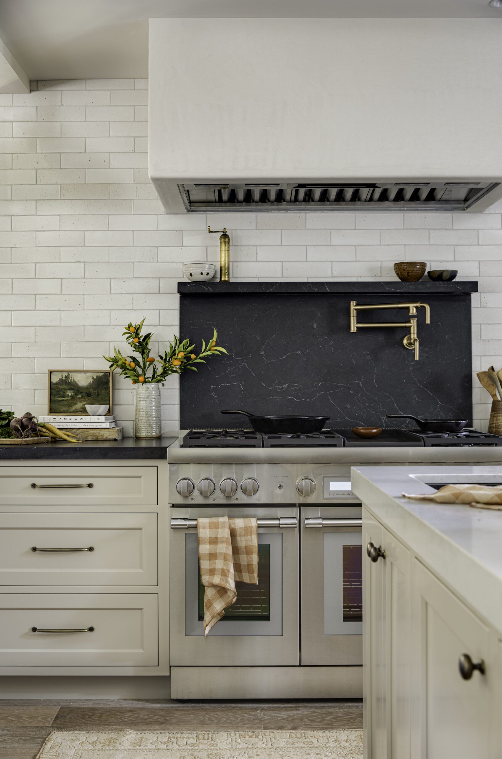
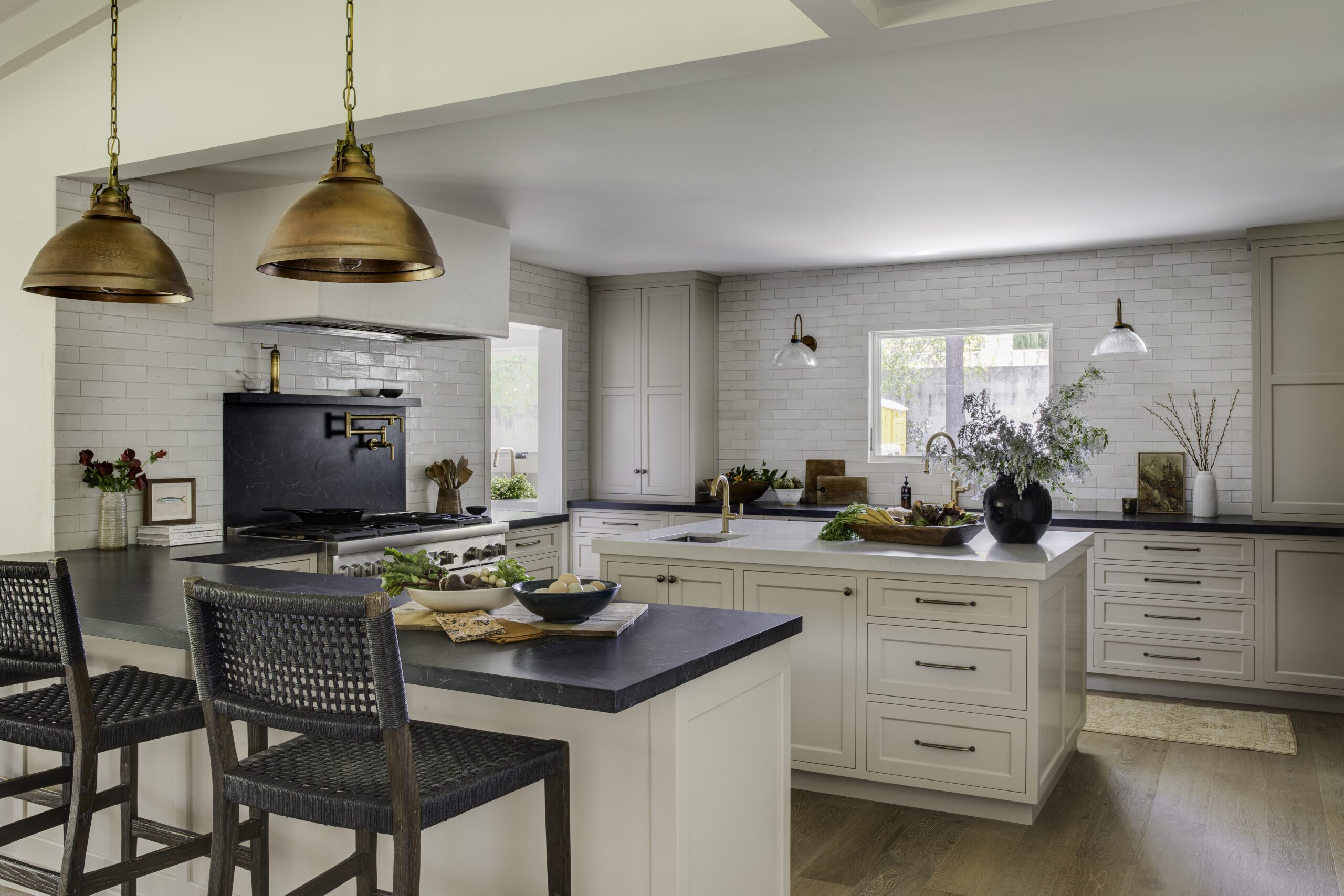
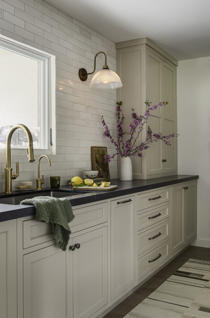
A handcrafted Glazed Brick tile and cabinetry painted in Stone Hearth by Benjamin Moore bring a light and open feeling to the space while black countertops add depth and dimension to the look. Double brass faucets coordinate with the hardware and charming sconces.
Statement Lighting
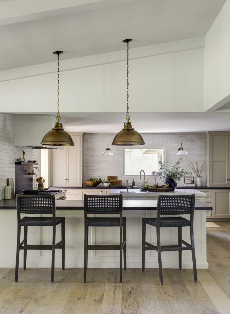
One fool-proof way to separate spaces in open-concept floor plans is through bold lighting selections. In this kitchen, the brass statement pendants help define the kitchen space, centering the island and drawing the eye up to one of the home’s tall ceilings.
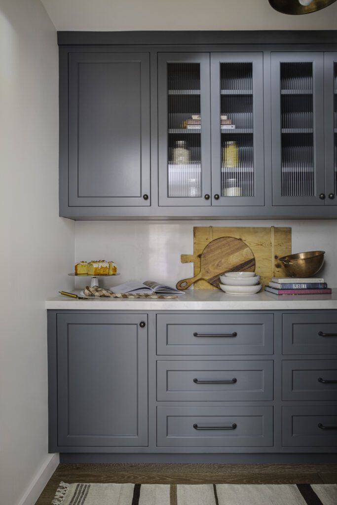
A Lead Grey Pantry
Lilly went bold in the pantry with dark lead grey cabinetry courtesy of Farrow and Ball’s Down Pipe. Reeded glass cabinetry combines the function of closed cabinetry with some of the aesthetic benefits of open shelving to display the family’s favorite kitchen and entertaining items.
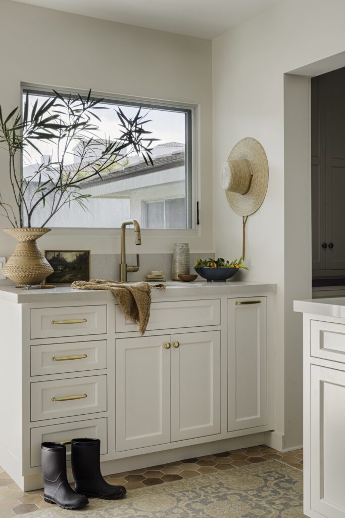
The Charming Mudroom
Brass hardware, creamy-colored cabinetry, and terracotta tile make for a timeless mudroom designed to store out-the-door essentials that blend seamlessly into the kitchen.
Scroll through the gallery below to see more from this home and shop the look below!
BY: Jasmyne Muir


