A Charming Massachusetts Colonial Refresh
The custom renovation of this Natick Massachusetts Colonial built in 1994 began with visions of whimsical pantry wallpaper, a playful checkered kitchen backsplash, and reconfigured rooms to bring more form and function to the client’s daily lives. Designer Emily Starr Alfano of mStarr Design began working on the home in 2020 and completed it over a three-year process of twists and turns to arrive at the final turn-key moment.
Although this project began in 2020, the construction setbacks extended the design process by a few years, giving the clients time to interact with the space and adjust the design to their needs. While the initial scope changed throughout the project, they had a strong vision for the space that carried through each room and detail.
After bringing the majority of the house down to the studs, removing some walls, and creating a new mudroom and expanded pantry, Emily and her team filled the space with timeless finishes, transitional furniture pieces, and thoughtful details to curate this storied home.
Design: mStarr Design | Photography: Erin Kestenbaum
A Charming Living Room
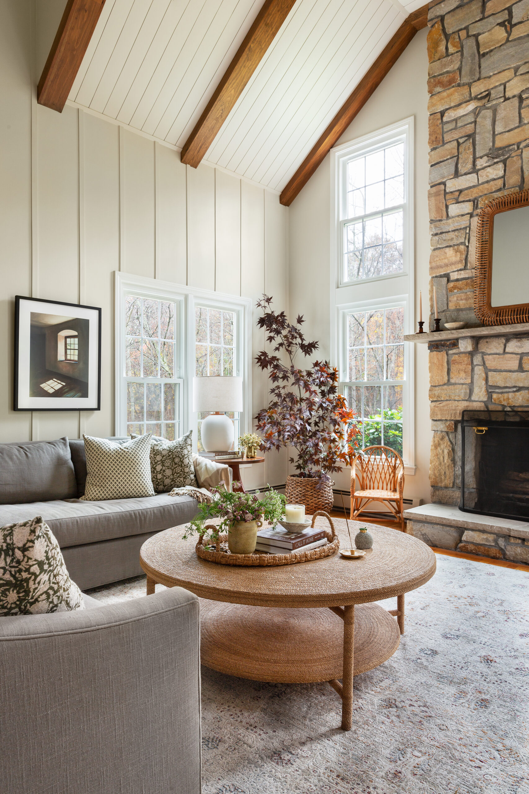
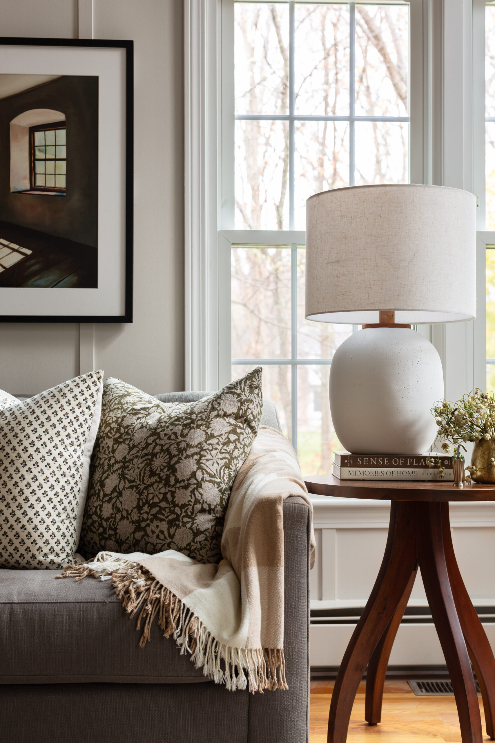
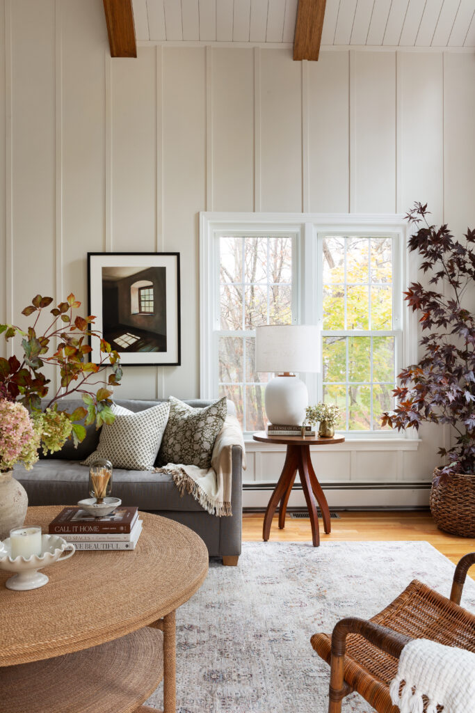
Unlike the rest of the home, the living room didn’t require Emily and her team to make any structural changes to reconfigure the space. Adding millwork to the walls gave the room the reset and charm it needed, allowing the remainder of the re-design to focus on the furniture and decor.
A Dimensional Kitchen
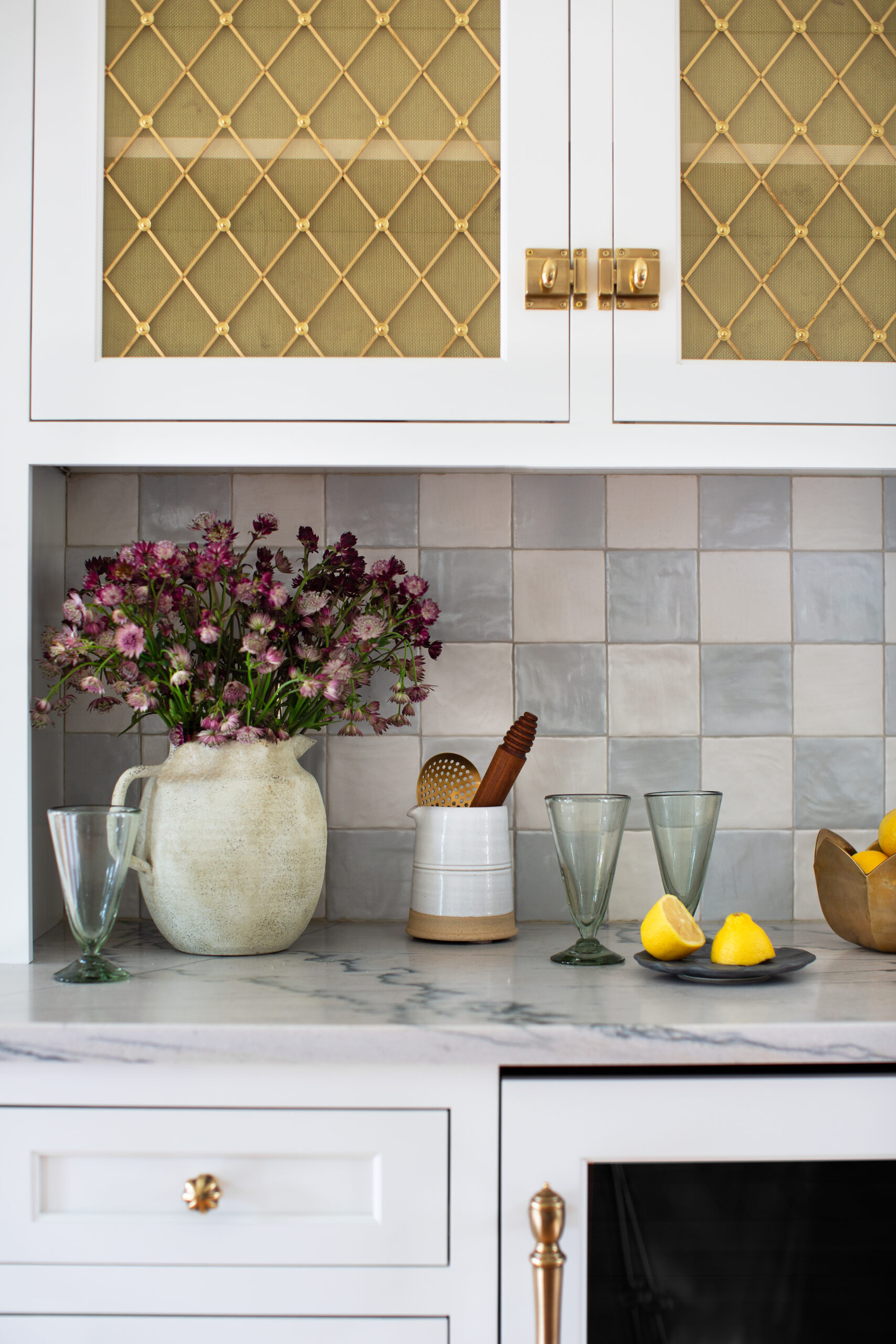
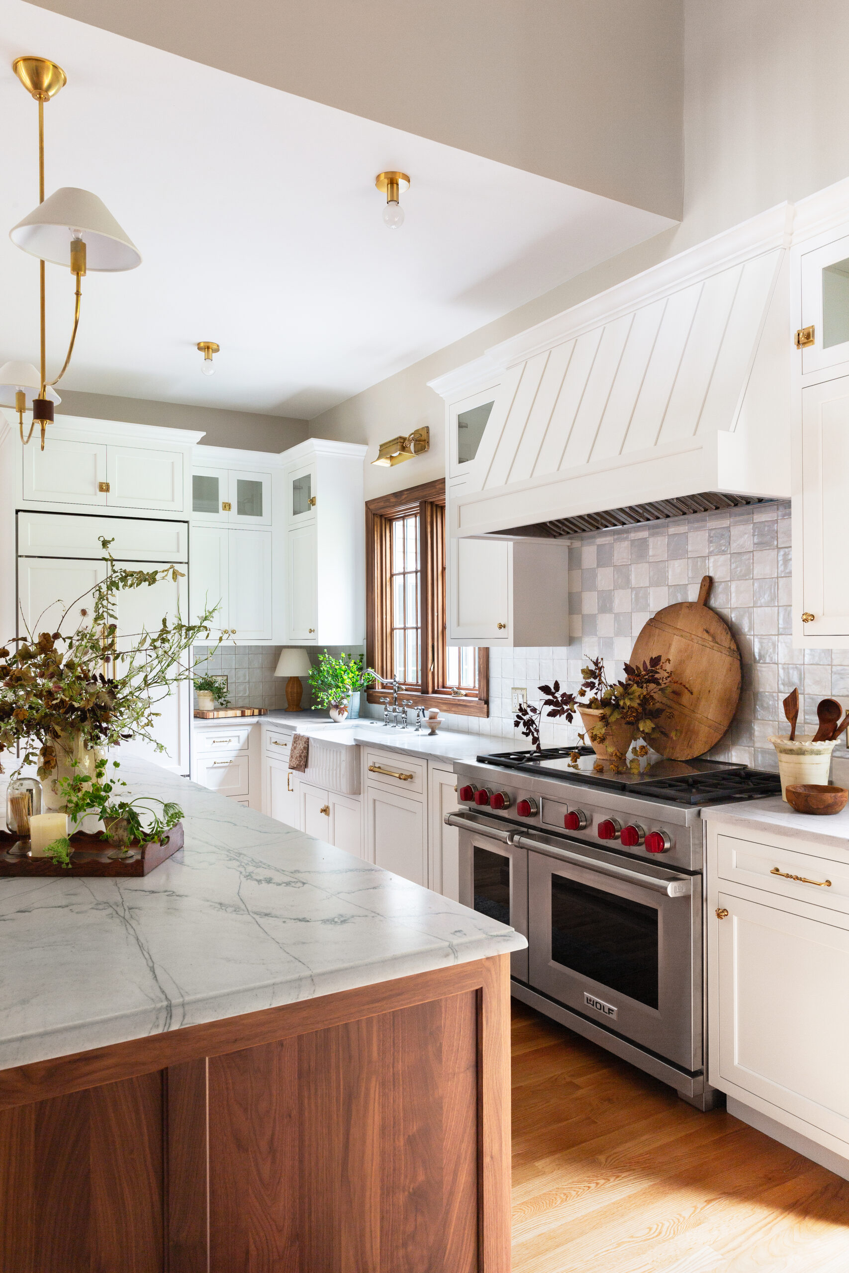
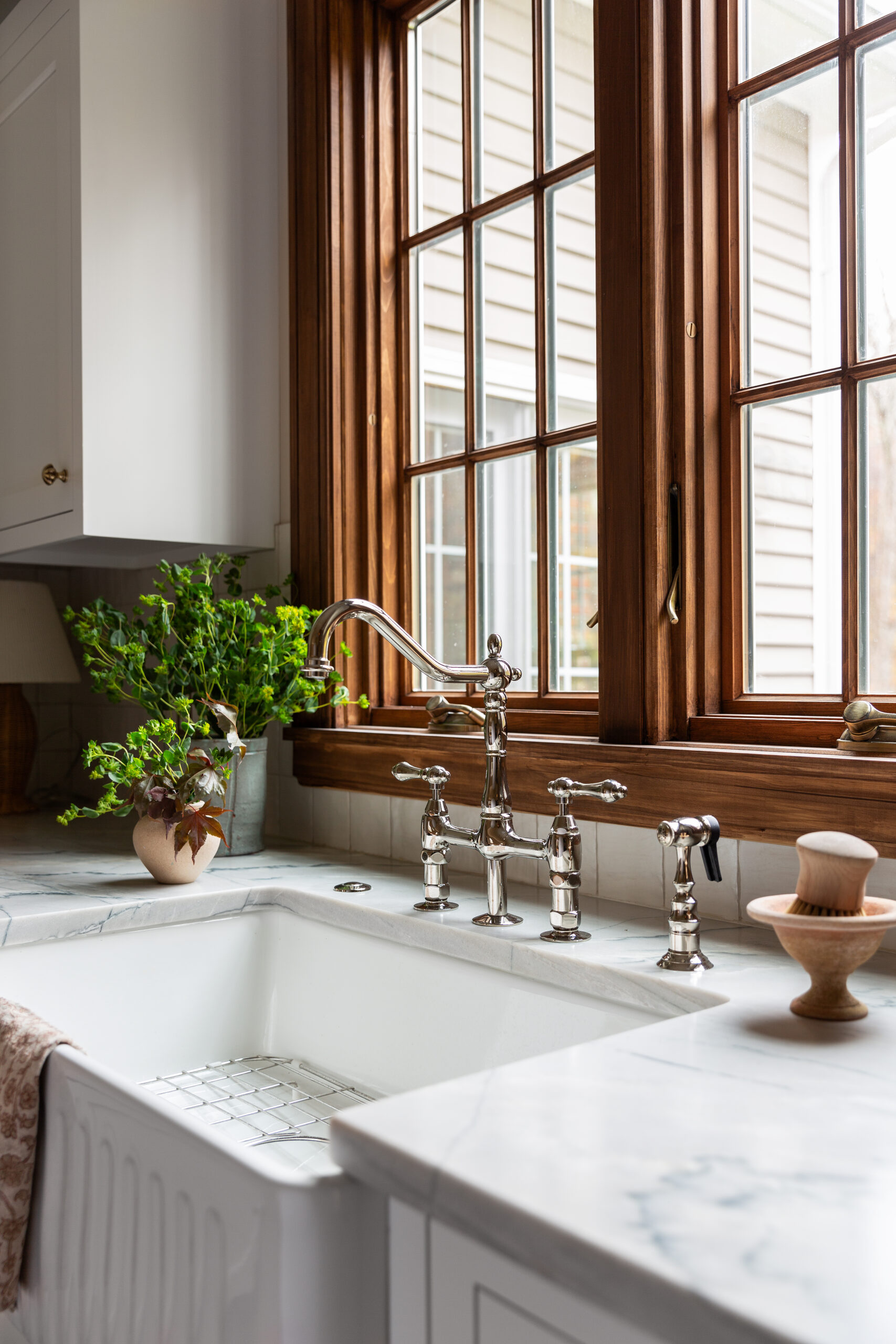
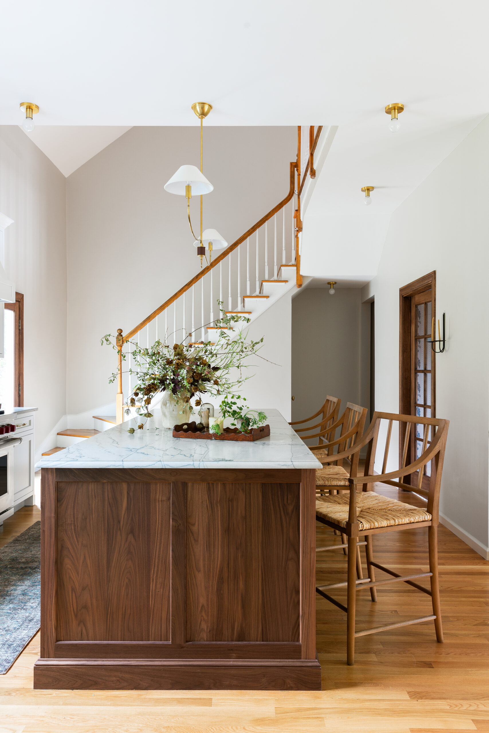
Emily chose a dimensional material palette to add depth and interest to the home’s white kitchen. Embracing the original windows and incorporating a darker wood tone on the island brought warmth to the refresh, setting it apart from the well-circulated California Casual white kitchen. The contrasting countertop materials, playful tiles, and gold hardware perfectly balance old and new.
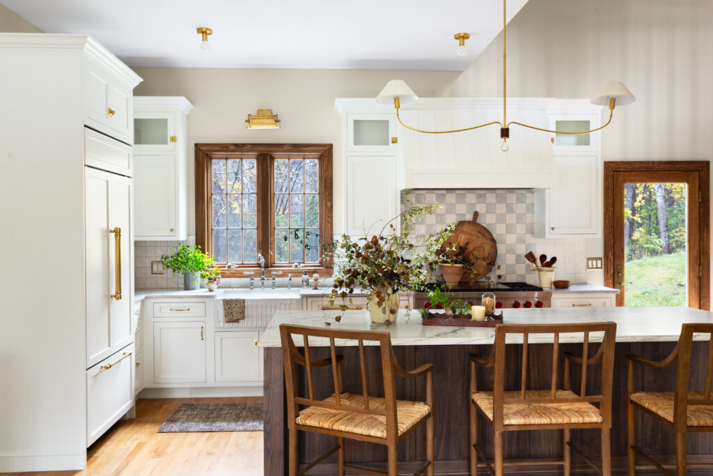
To create the checkerboard backsplash without breaking the bank, Emily found affordable ceramic tiles with lots of natural variation on Wayfair. She had the installer skip spacers and instead install the tiles next to each other. “Even though checks are having a moment, they’re a classic and timeless pattern that can stand the test of time,” Emily mentioned of her choice.
Pattern in the Pantry
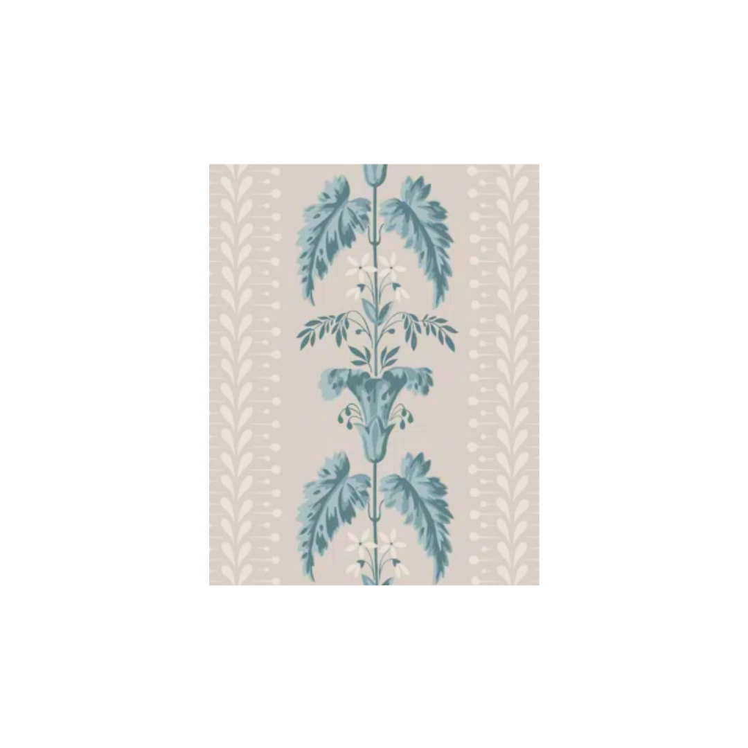
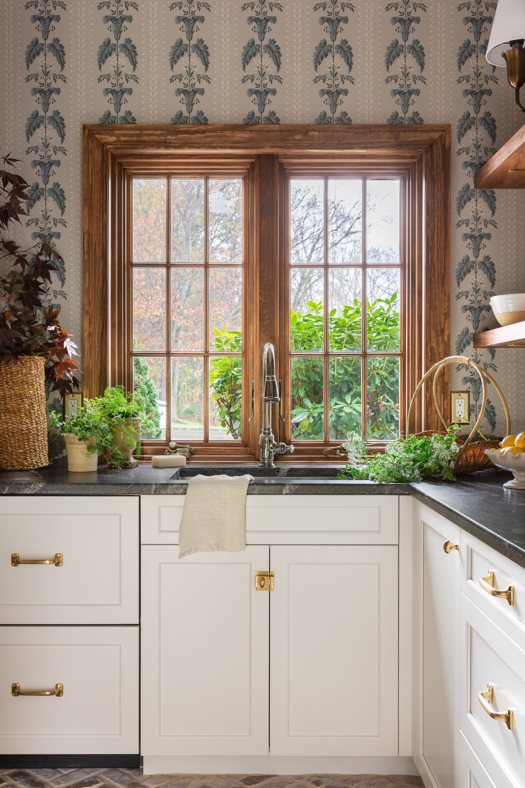
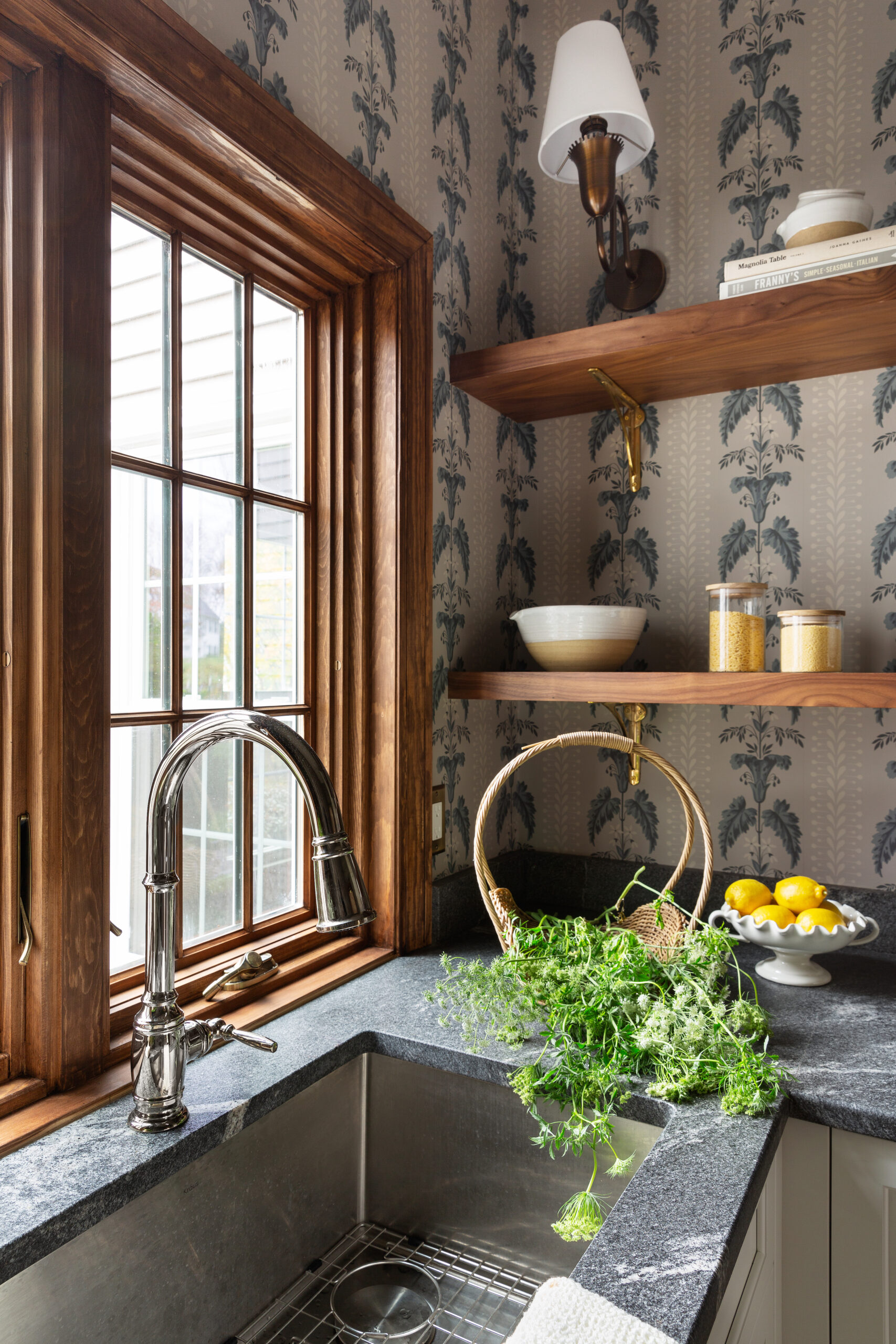
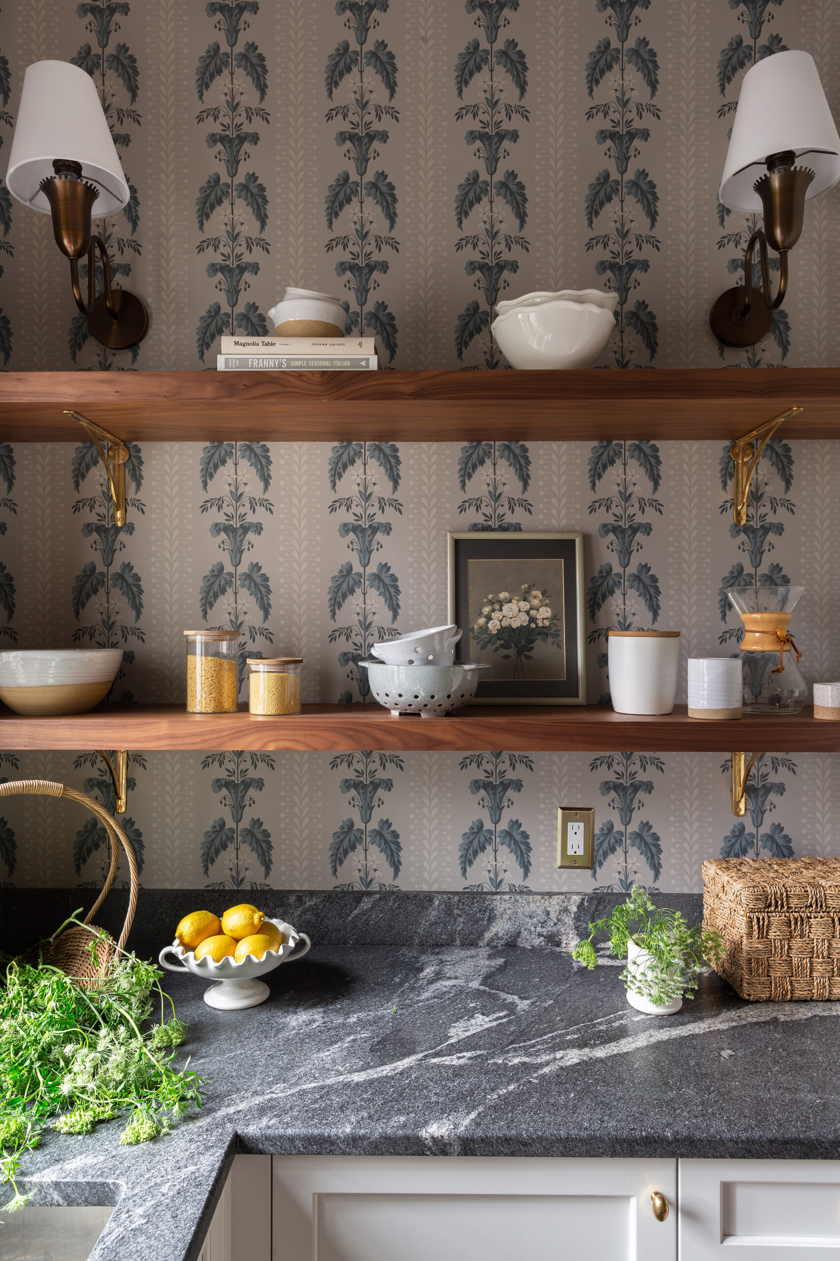
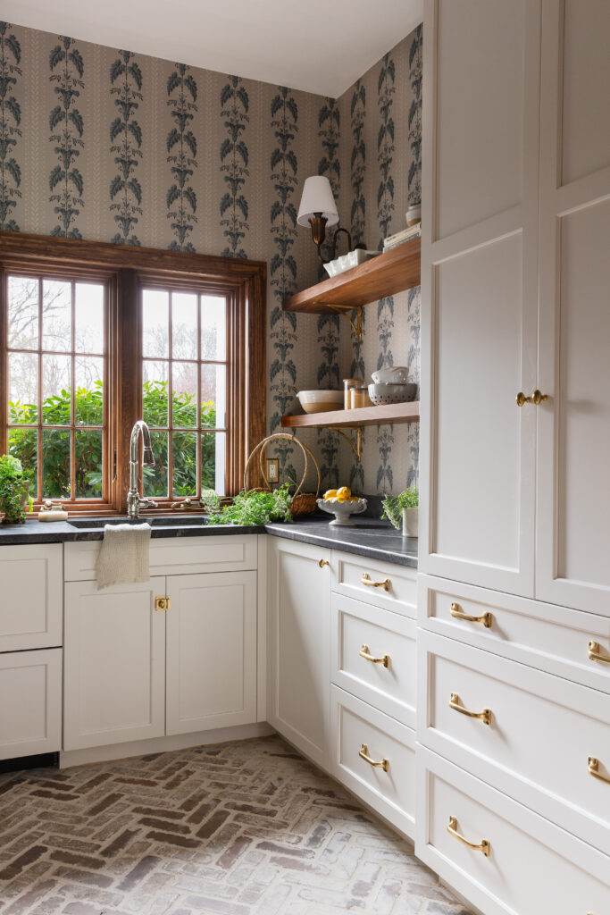
From the start of the project, Emily knew she wanted to incorporate the Sandberg Sophie Wallpaper that sets off the pantry and is visible from the kitchen through a glass-paned door. Herringbone brick flooring nods to the home’s Colonial roots and adds even more dimension to this space.
A Soft Blue Mudroom
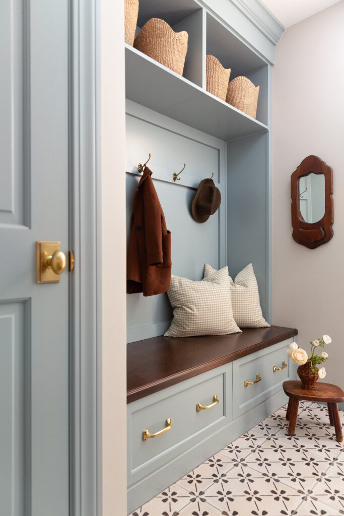
We’ve seen more and more powder blue in fashion lately, and it’s a tried-and-true tone for interiors in spaces where you want to make an impact but keep it subtle. In this mudroom, the icy blue coat is fresh and timeless when paired with brass hardware, charming black and white tiles, and vintage styling accents. Baskets lining the shelves bring added storage, and a few patterned pillows complete the look.
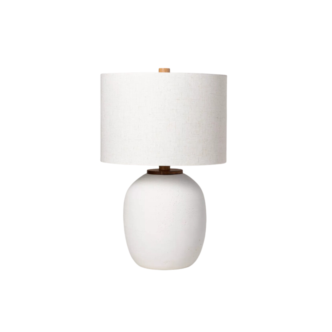
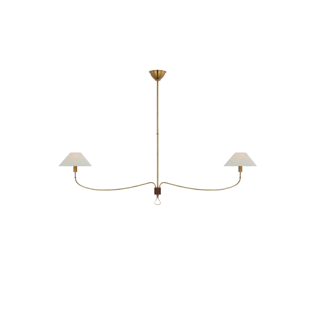
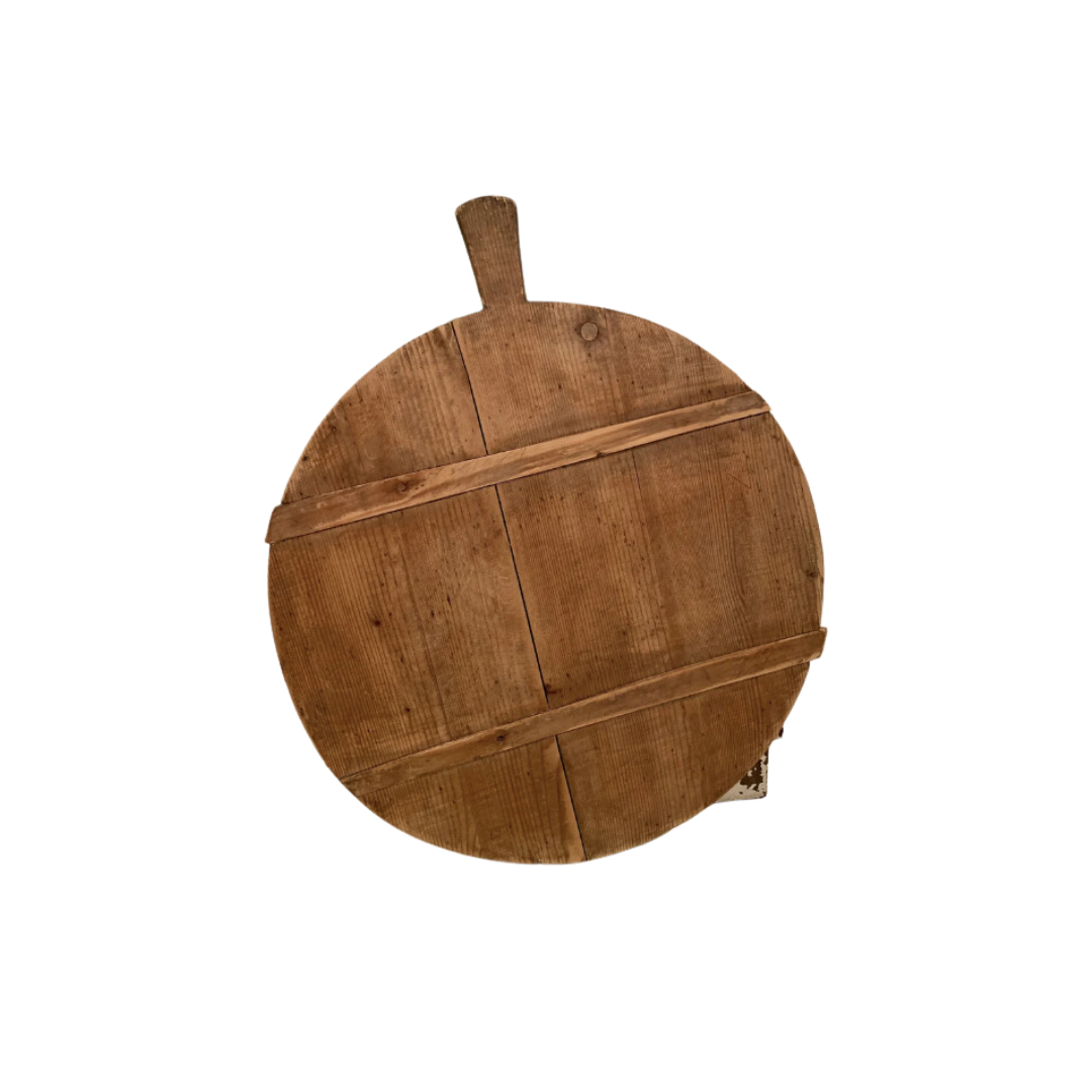
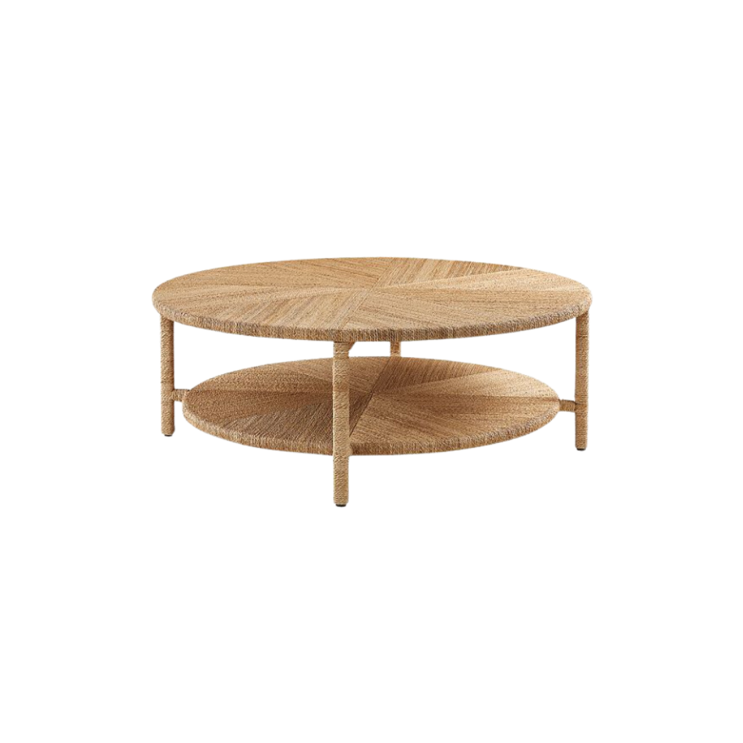
Scroll on to see more details from this home and shop the look below!
BY: Jasmyne Muir


