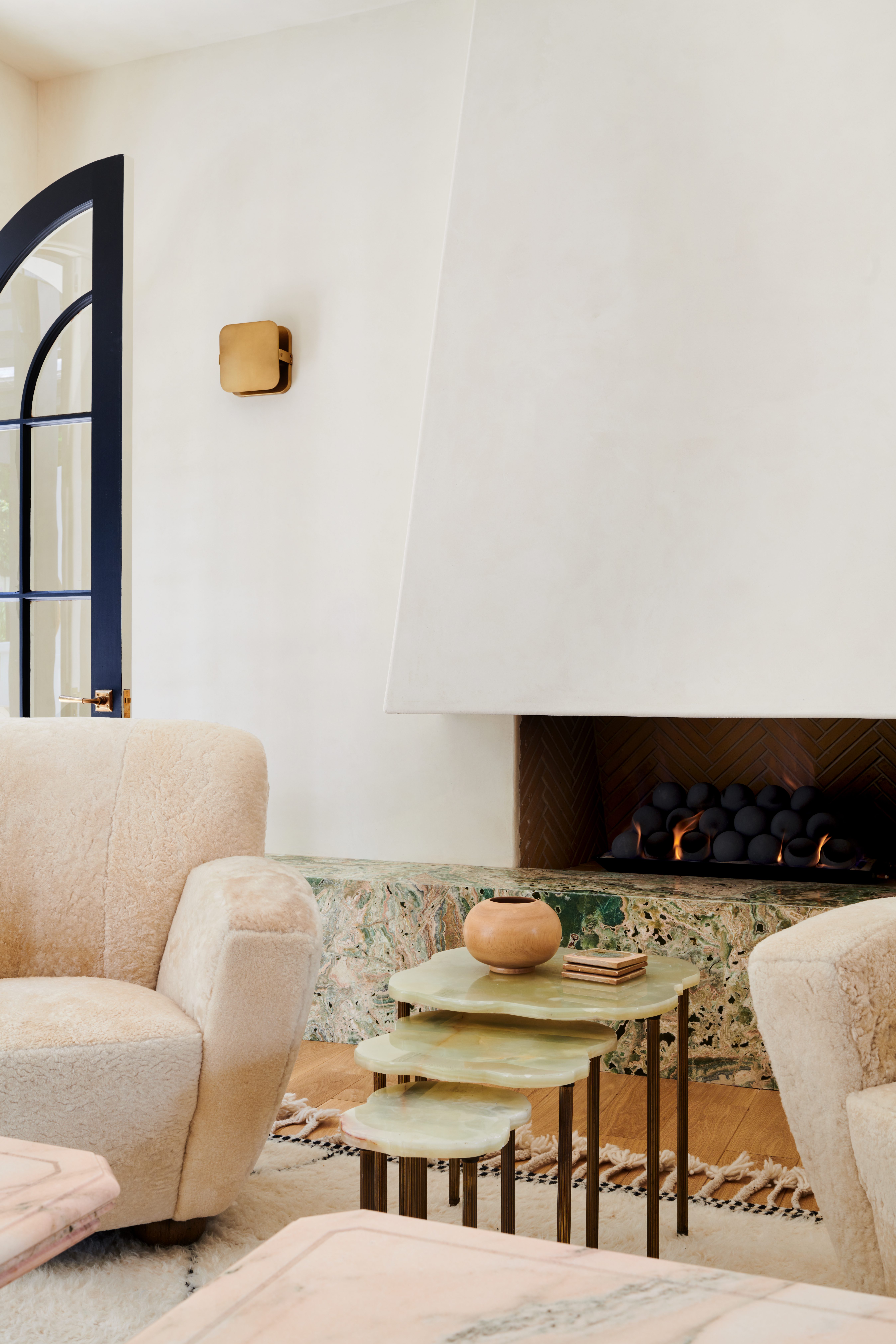
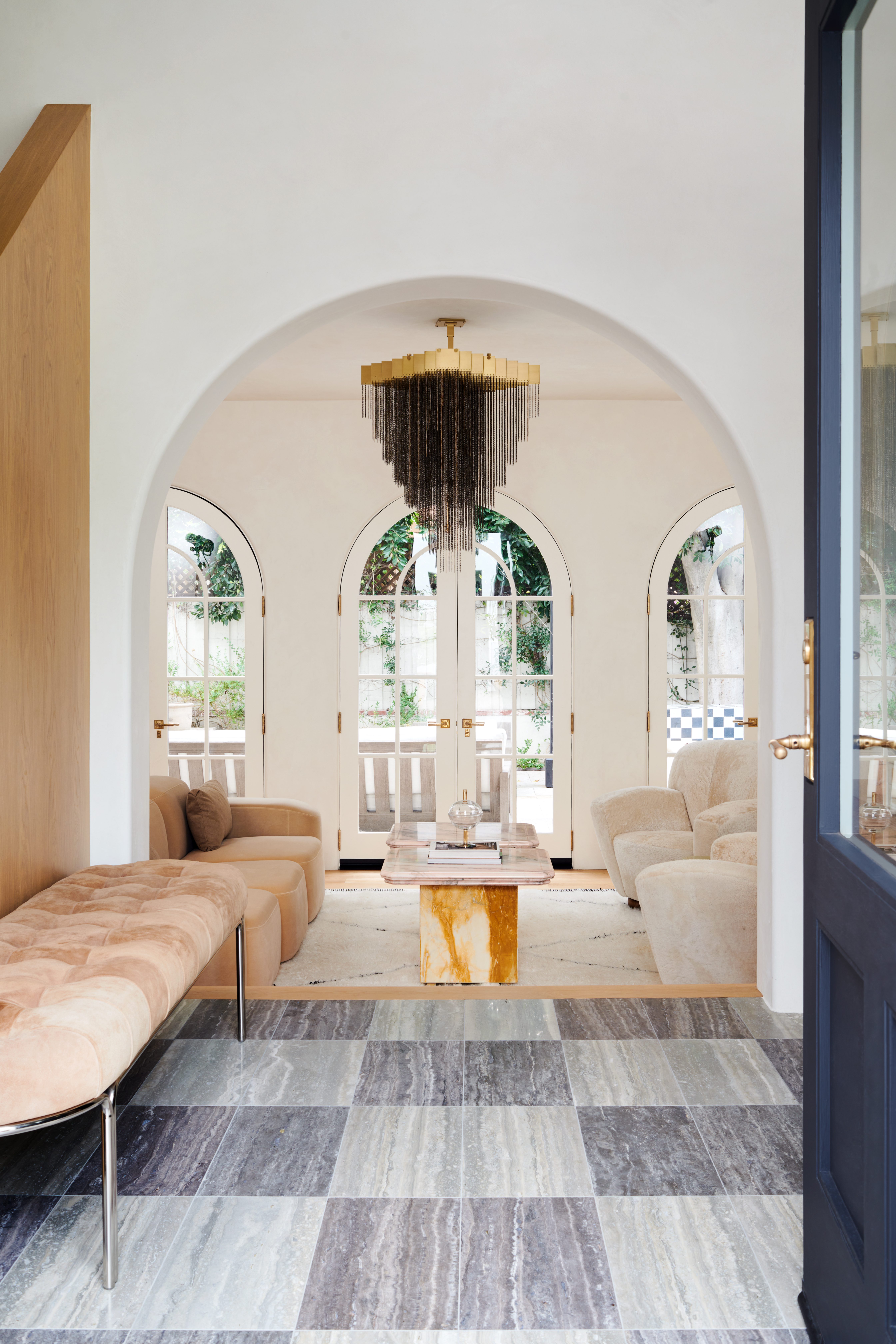
An Eclectic & Layered California Home
When designer Kim Lapin purchased her 2011 Spanish Home, she knew she wanted to brighten the dark and heavy spaces, replacing the granite and rod-iron work with a jaw-dropping airy interior set apart from the typical California-Coastal look and feel. After gutting the home and opening up some walls to reshuffle the layout, Kim re-designed every detail, from the staircase to the powder room.
Treating the project as an opportunity to showcase her ideal design aesthetic, Kim embraced bold decisions and took a few risks she’d been dreaming of implementing in her projects. Although you’d never guess this was only her second renovation, Kim used her own space as an opportunity to kickstart her design portfolio and share her vision with potential clients.
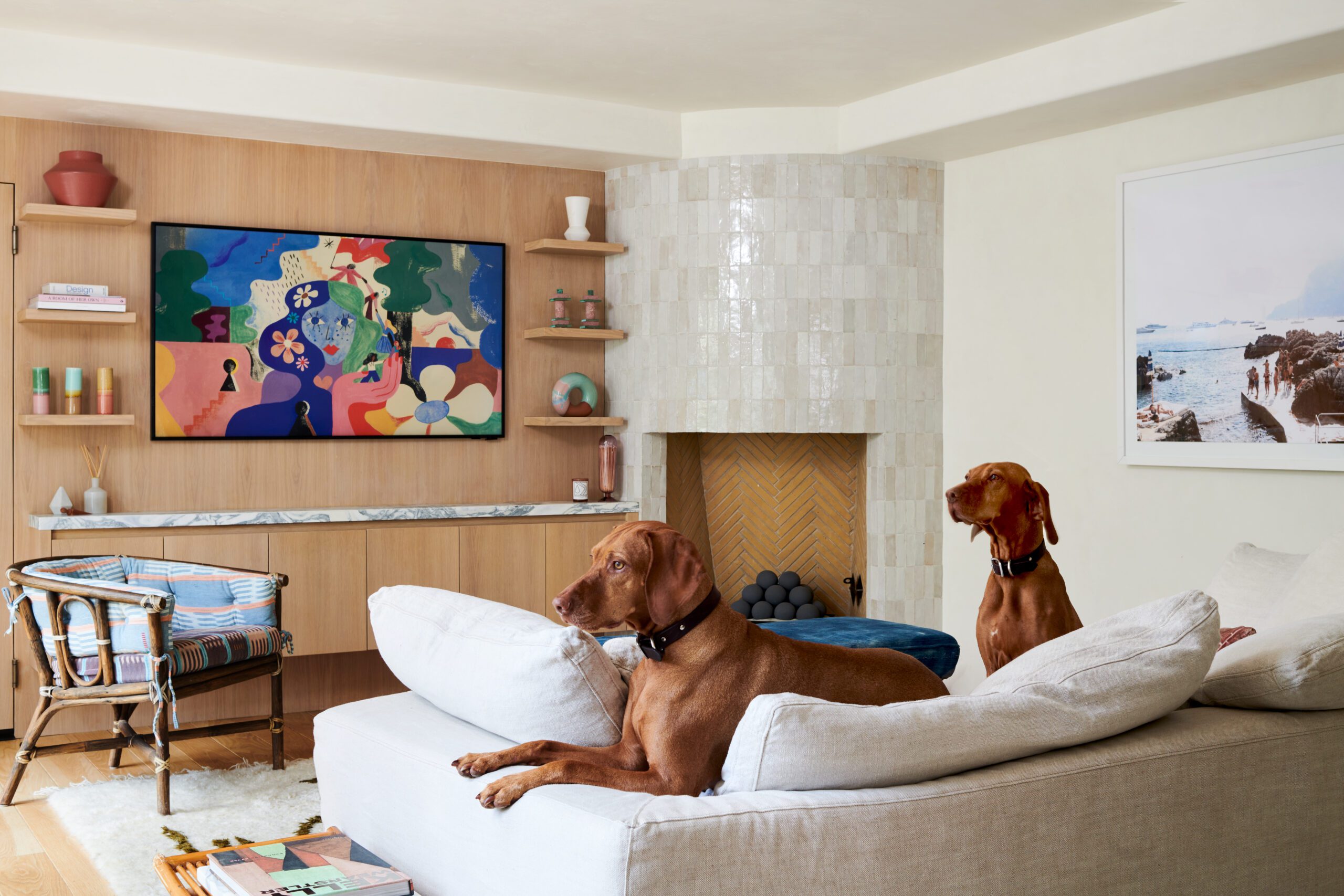
While the goal was to experiment with color, statement pieces, and bold materials, she still wanted the spaces to feel calming, neutral, and comfortable for her and her family’s lifestyle. The result perfectly balances an eclectic aesthetic with a lived-in material palette to achieve a mix of comfort and style. Scroll through to see the details of this stunning home and shop the look below.
Designer: Kim Lapin | Photography: Lauren Taylor
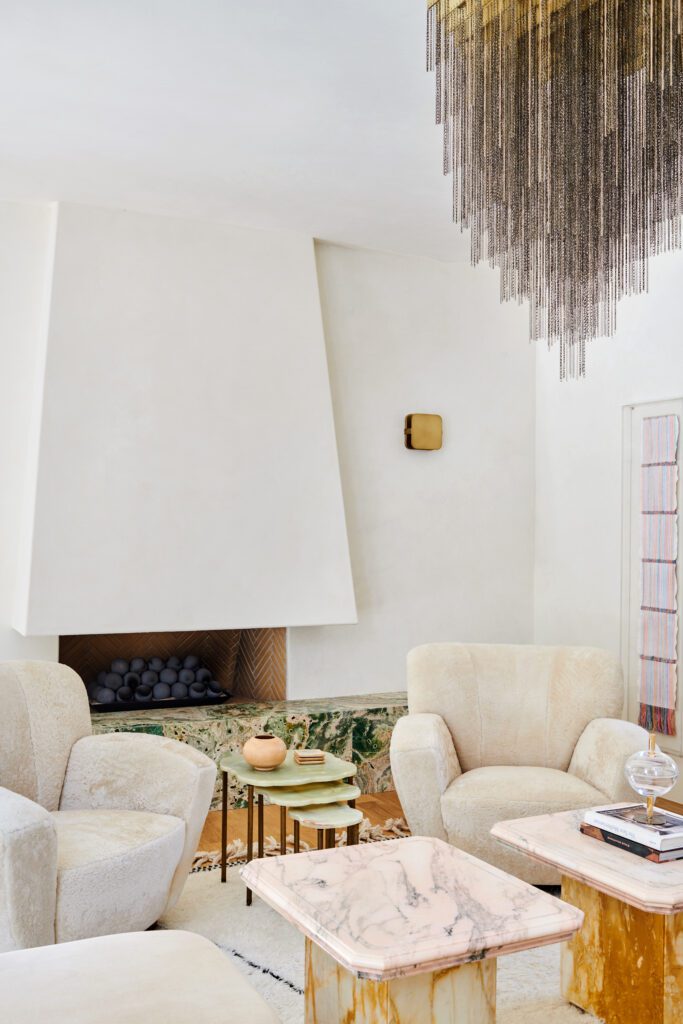
Statement-making pieces
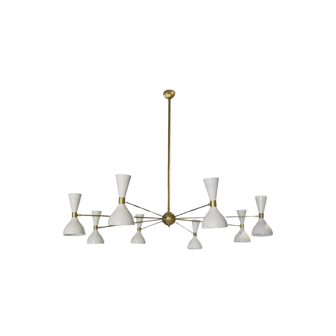
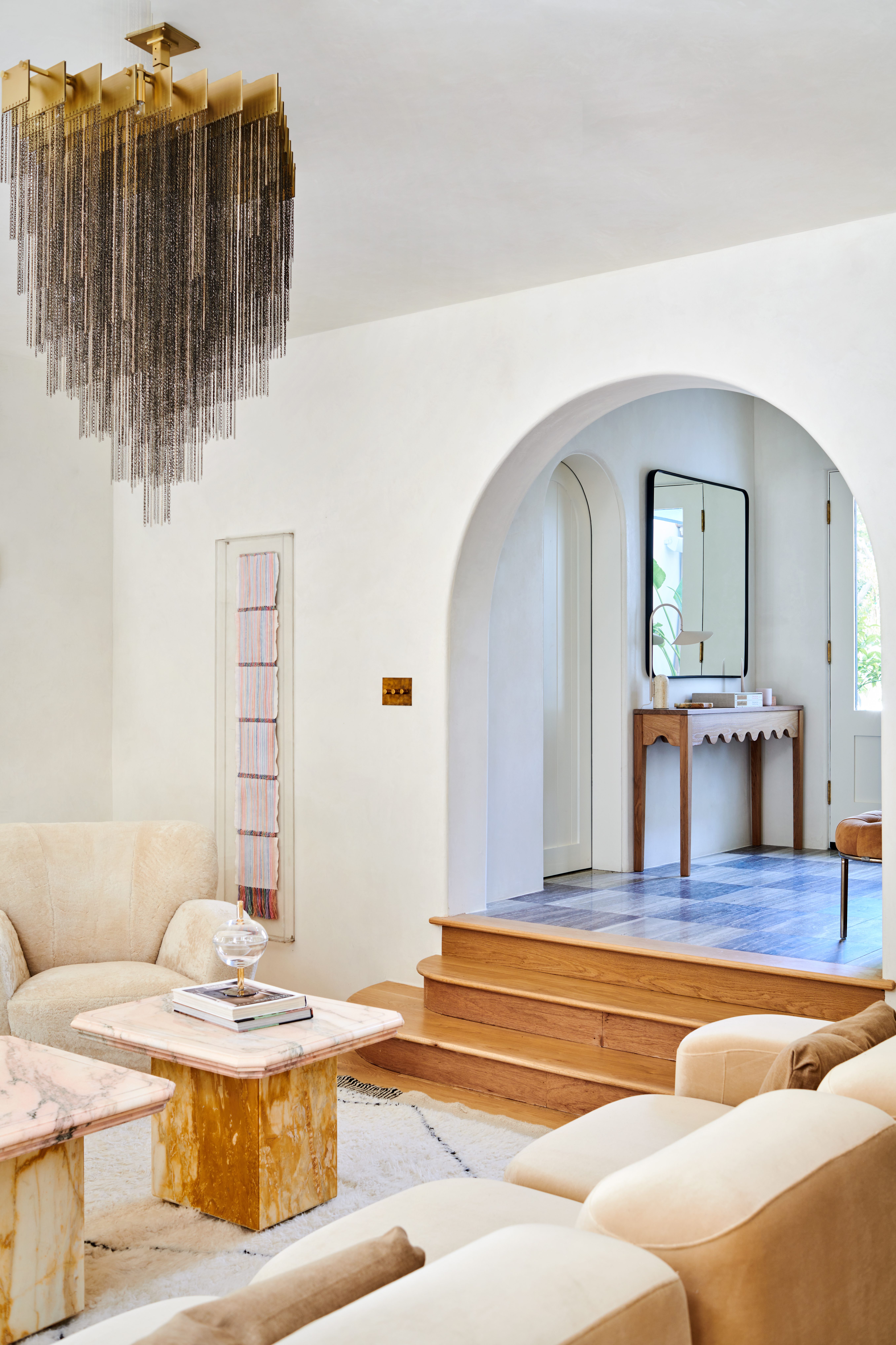
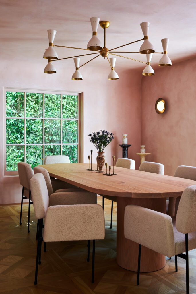
After coveting this Gabriel Scott light fixture for years, Kim found the perfect place for it in her living space. The light became the centerpiece of the room and dictated each decision throughout.
Pink plaster dining dreams
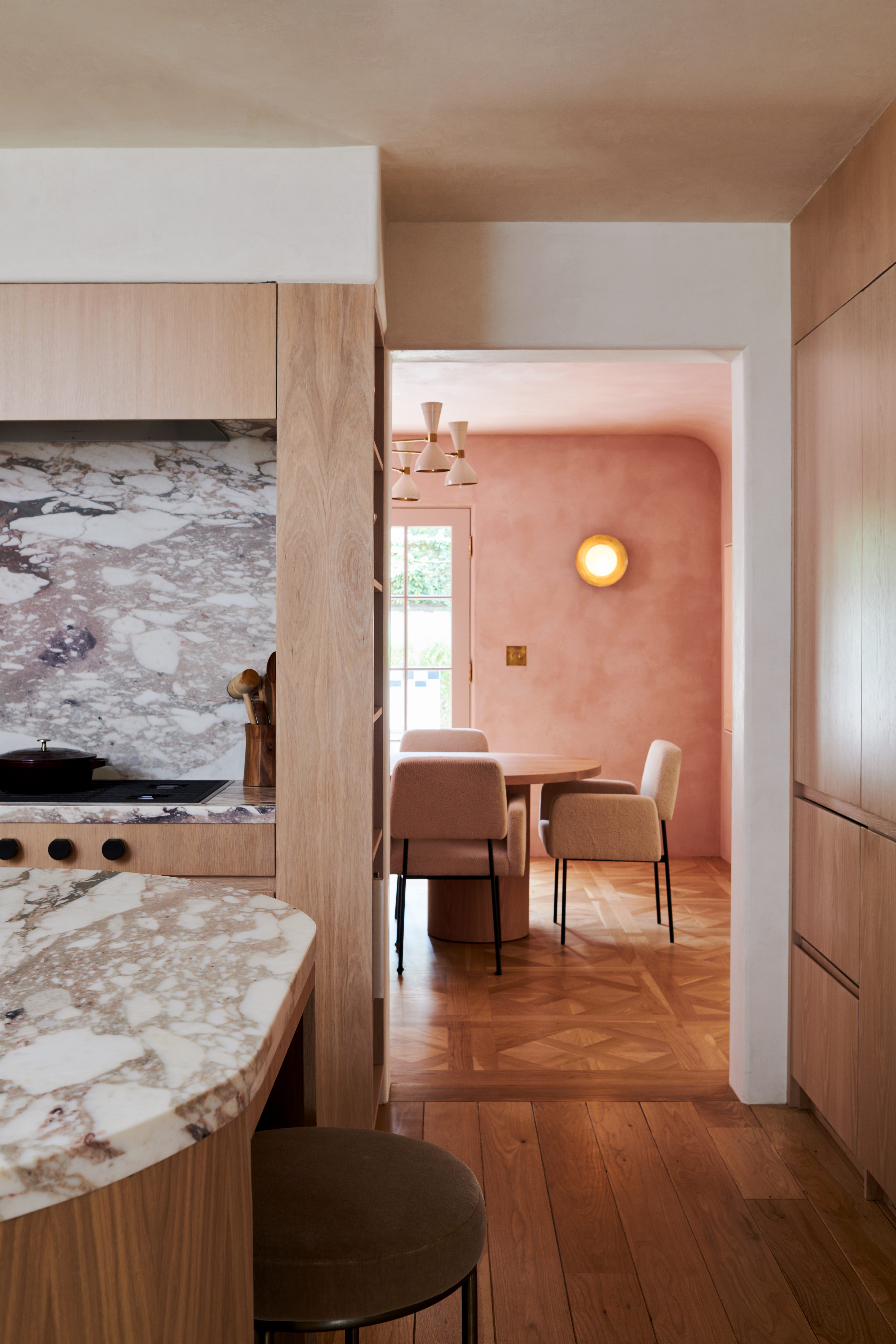
When Kim began this project, she knew it was time to bring one of her design dreams to fruition—the pink plaster dining room. She chose Marmorino plaster for its silky but textural impact and let the hue do the talking, bringing a soft glow to the room and adding life to every morning coffee and dinner party moment.
Small space impact
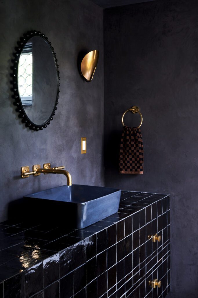
A powder room is always a great opportunity to go bold and create an experience. Since this particular space didn’t get a lot of natural light, Kim leaned into the moody feeling with a Charcoal plaster color, a cement sink, and a tiled vanity to bring in just the right amount of shine. Brass details add a touch of warmth while a playful mirror pulls the look together.
An unexpected primary suite
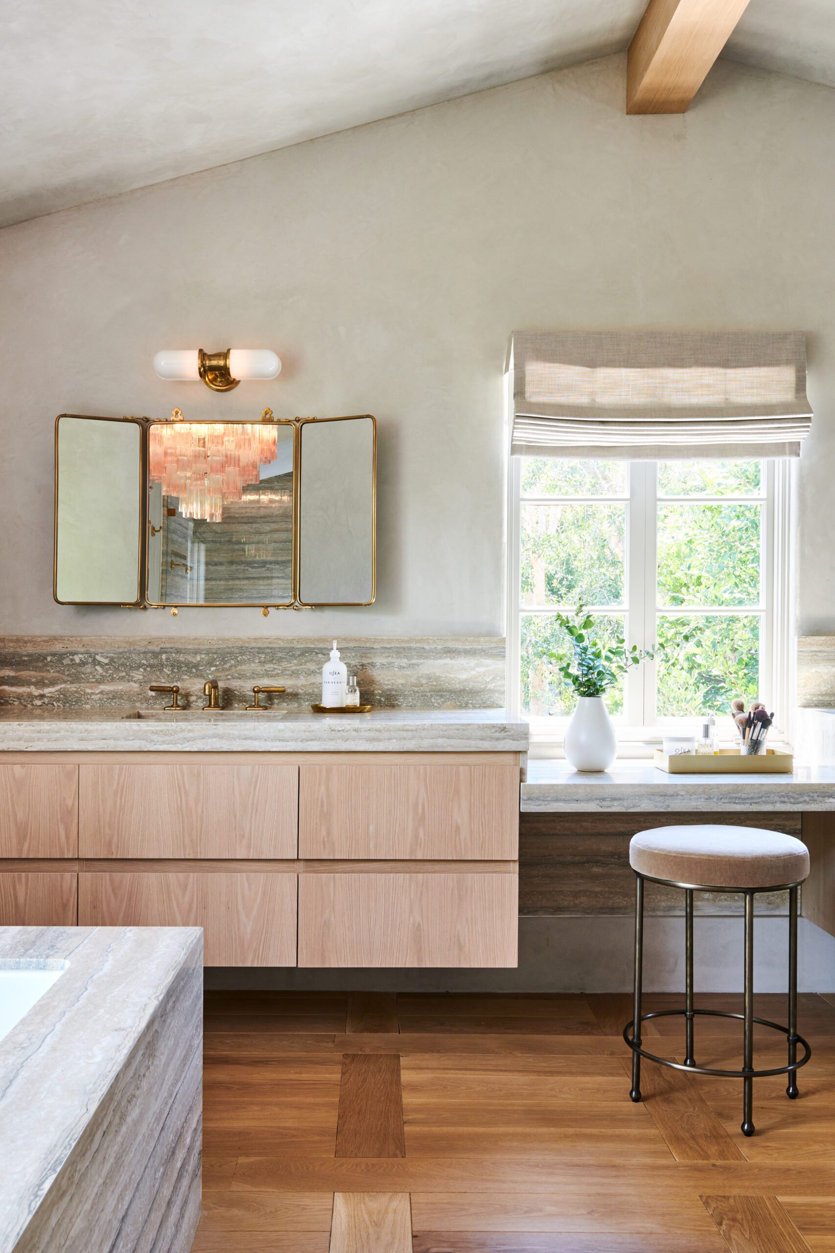
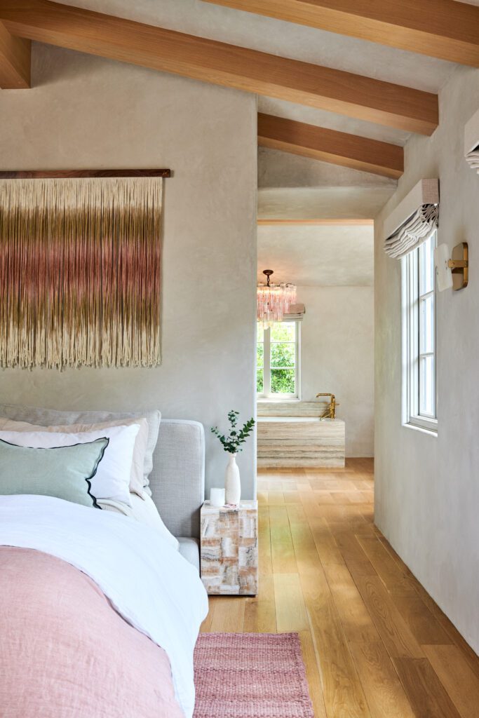
The plaster texture incorporated throughout the home continues in the primary suite, adding a warm grey dimension to the space to set the tone. An upholstered bed frame and pink-hued textile layers play into the project’s color story.
Scroll through to see more from this project and shop the look below!
BY: Jasmyne Muir


