A Historic English-Inspired Kitchen
Not one to shy away from a challenge, Alex Adamson was thrilled to come alongside her clients as they renovated a once deteriorating Victorian home in Salt Lake City. The goal was to bring new life to the space while honoring its history, and it all started with the kitchen. Luckily, Alex brought plenty of experience to the table, having honed her skills as a lead designer for Studio McGee. She managed every curveball throughout the project, drawing on her design chops and a keen eye for detail. The result? A true English-inspired kitchen that embraces the charming imperfections of old homes—layout challenges and all. Veronica Olson photographed the scene, and we’re thrilled to take a closer look.

Design: Alex Adamson and Madeline Beck | Photography: Veronica Olson
An English-Inspired Kitchen in Salt Lake City
Tell us about this project and the scope of work involved.
This project is a historic restoration of a Victorian home in Salt Lake City, and every inch needed major remodeling. The homeowners came to me with an eclectic English vision in mind which made for a dreamy collaborative design process.

“The historic roots of the home became the foundation of the design.”

What were some of the key pain points for this project, and how did you problem-solve with design?
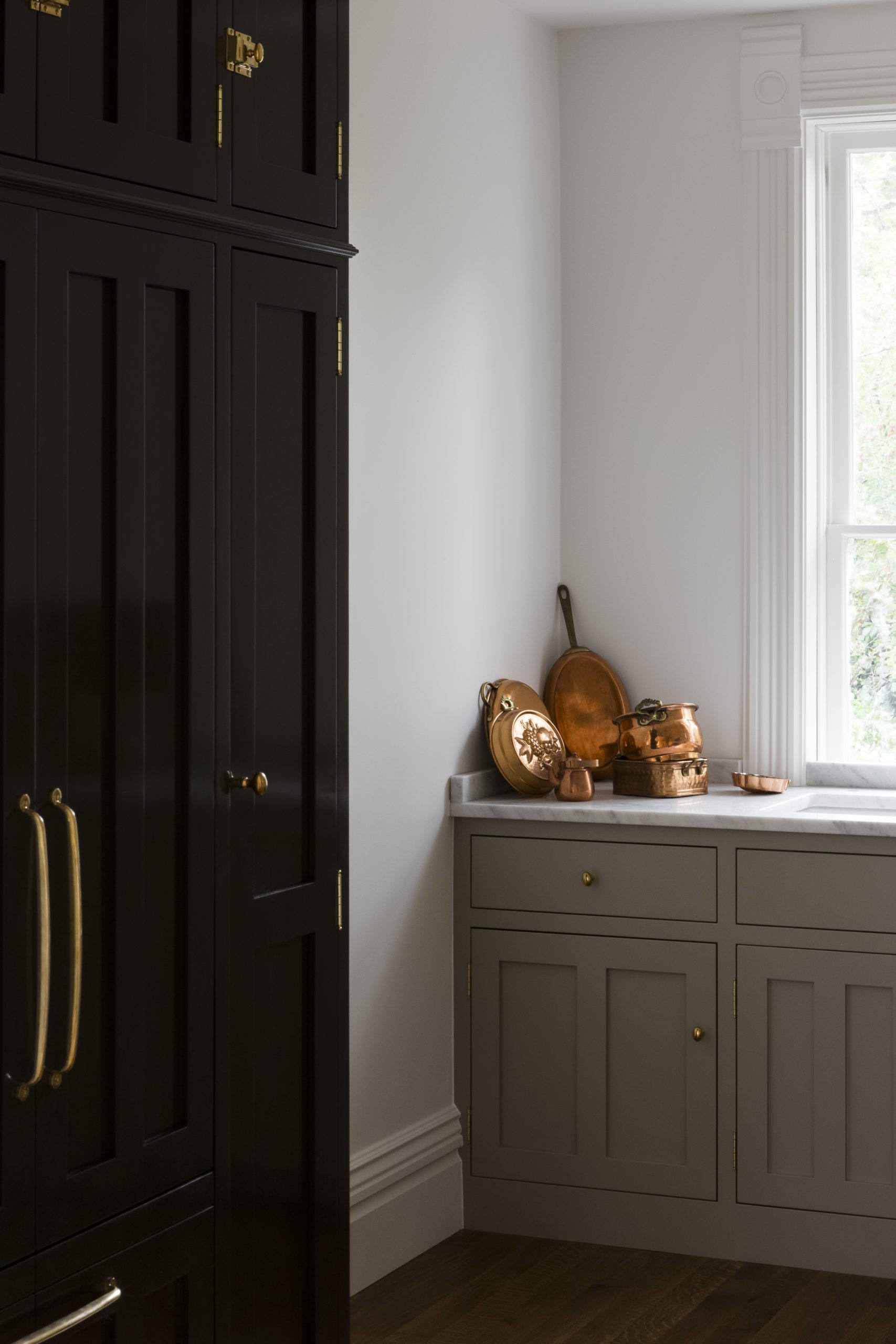
Our first pain point was the layout. When you first walk upstairs to the second story, you look down the hallway to a straight-on view of the refrigerator. The clients were a little concerned that this could be an awkward focal point but agreed this placement would work best for the kitchen layout. Instead of camouflaging the fridge, we decided to embrace it and have it act as a beautiful bold piece of furniture. This resulted in a high-gloss black paneled fridge which we’re all obsessed with.
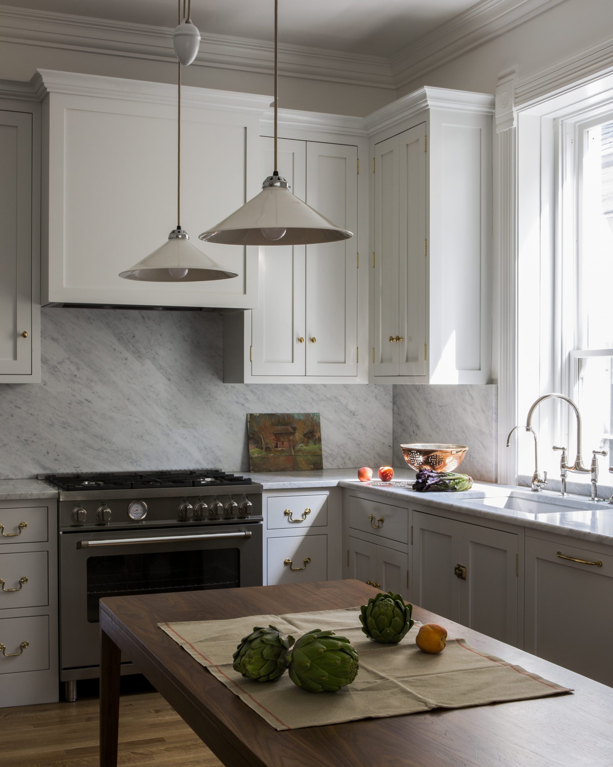
Secondly, because this home was a true restoration, we needed to keep things like the large uniform original windows which extend below the standard counter height. We embraced this issue by running the cabinetry and a small marble backsplash right in front of the kitchen windows! Unorthodox, but it ended up adding a lot of charm.
More to read: The Best Mushroom Paint Colors for Your Kitchen
Talk to us about the initial inspiration and the process of honing your vision?
The clients came to me wanting a classic English aesthetic sprinkled with a few bold contemporary accents, which perfectly suited the historic home. They brought me in to help bring that vision to life! We refined the design direction, color palette and carefully considered the balance of old versus new.
More to read: The Benefits of Having a Signature Style

Can you describe what went into designing the key spaces within this project?
The historic roots of the home became the foundation of the design. This resulted in some of the less expected elements of the house, like the decorative rosette molding, which we wouldn’t have otherwise chosen. We then layered modern details like glossy paint and the sleek rise and fall pendants.
More to read: The Best White Paint Colors in 2021

“It was so rewarding to see the original deteriorated structure come back with new life.”

Any favorite details to share?
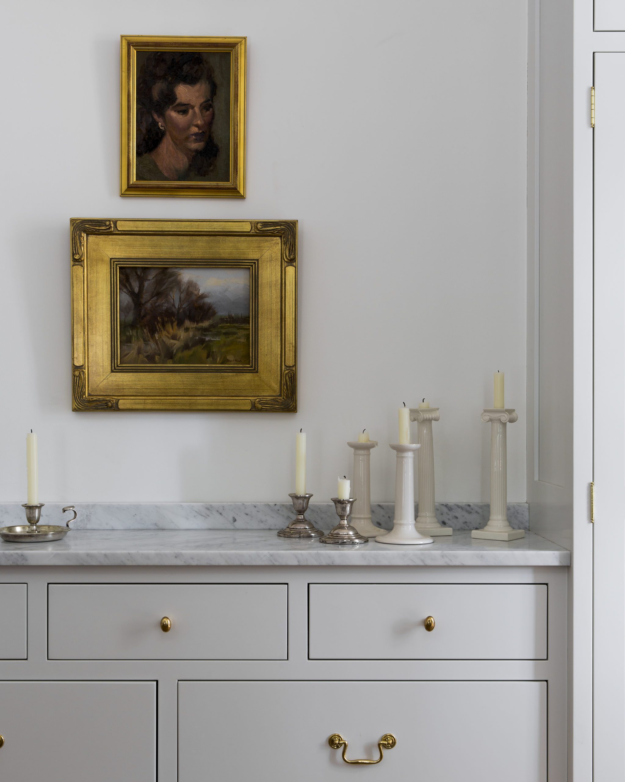
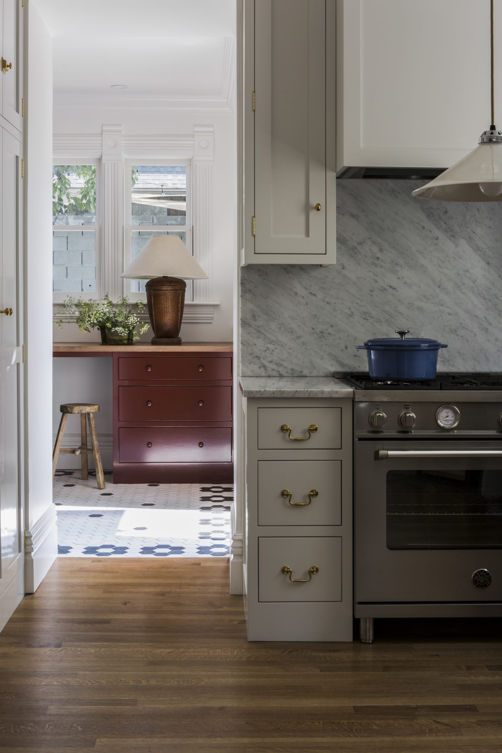
Too many! Researching all the elements of a true English kitchen as inspiration led to a lot of my favorite details, like the exposed brass hinges on all the cabinetry. Also, the glimpse of bold red mudroom cabinetry from the primarily white kitchen on the main floor is another favorite moment in the home.

Tell us what made working on this particular project so special?
The design was all done in close collaboration with the homeowners. It was a fun and easy process because we were nearly always on the same page! It was so rewarding to see the original deteriorated structure come back with new life.
BY: theinteriordev


