Tudor Living Room Reveal
The time has finally arrived to being revealing The Austin Tudor. To kick things off, we are starting with the Tudor living room reveal, with a little peek at the entryway. The Tudor home leans hard into cozy color and moody vibes–it really stretched my creativity as a designer. Nearly opposite of our first home or the lake house, I got to experiment in ways I’ve never had before. If you aren’t familiar with the project, catch up on our YouTube channel here for a deep dive.
Design: Anastasia Casey | Photography: Lindsay Brown
The Cliff Notes
- We purchased this Tudor inspired home September 1, 2022
- The Tudor living room is the formal entertaining space
- The property is located in South Austin, 1 mile away from our office at IDCO Studio
- The house is just over 3,000 SF and sits on half an acre
- We gutted the house, reconfigured the floor plan, and added a lot of historic character
- Almost everything we took out of this home was reused elsewhere, in a new way
- While we are not pregnant yet, family planning is definitely on the mind and this house will be great for a child

The Austin Tudor Inspiration
I’m often asked if I have a signature style. Its a difficult thing to put into words, because there certainly are similar elements that carry through every one of my spaces. However, I firmly believe that a house tells you what its signature style is. It guides you. It points you in the direction it needs to go.
The Austin Tudor had subtle historic Tudor elements sprinkled on the exterior, while the interior had been stripped of anything historically significant. The previous owners had done a lovely job updating the home to a more “modern” feel, but the floor plan lacked, the materials selected didn’t feel accurate, and the floor plan was quite challenging.
When I decided which direction to go, the inspiration for The Austin Tudor pulled heavily from Heidi Caillier, Jake Arnold, and Yond Interiors.
- Heidi Caillier is continuously my favorite designer, and this house had many similarities to projects of hers. Primarily, the 8 foot ceilings and lack of an open floor plan. I was able to source images of Heidi’s that taught me how to let one room flow to the other without matching it. Heidi taught me to add pattern and color and trim and texture.
- Jake Arnold’s portfolio is likely a less obvious inspiration. Jake’s designs are more discerning, minimal, and refined. I knew I wanted to evoke a similar emotion, in a way that made sense for a future family, in the heart of Texas. I’m super grateful for Jake’s practice of restraint to juxtapose Heidi’s more is most-likely more signature aesthetic.
- Finally, I pulled immense inspiration from Julia at Yond Interiors. Just this week, Julia’s personal home was revealed in The Wall Street Journal and it’s stunning. Maybe considered “Part II” of Julia’s personal home, this iteration of her already spectacular space has more nuance, layer, pattern and personality. I’ve been a fan of Julia’s since she attended our very first Design Camp and bought our very first Website Template at IDCO. It feels special to have so much of her design influence in The Tudor.

The Entryway
Welcome in! The Tudor doesn’t have a formal entryway, but I certainly knew we could carve one out of the little space we had. This transformation began with a floor plan pivot – gaining access to The Snug (formerly the primary bedroom) at the base of the stairs to the right. Next, we swapped the double entry door for a 36 inch four paned door with sidelights on either side. This centered the door, made the flow much more natural, and surprisingly, made the front door look larger.
We painted the front door Nantucket Gray by Benjamin Moore. The same color is carried throughout the house trim. When paired against Benjamin Moore’s Fossil, the house instantly felt more fresh, but also charming. A far cry from my usual bright white. When the painting process began, I was most impressed with the quality and durability of the Benjamin Moore paint. It was sourced from our local Benjamin Moore store which is locally owned and operated. Apparently all Benjamin Moore stores are locally owned, which feels really good, especially when we had so much paint to purchase.
The next big task was creating a “drop zone”. A drop zone is a place to place your keys as you walk in, sort the mail, throw a package, and keep organized. I particularly love a drop zone for keeping messes from trailing throughout the house.
To anchor this drop zone, I sourced this Early American Antique Primitive Cabinet from Litt Concept House in Los Angeles. Here’s a similar version! It was hand made in the 1820’s from locally harvested materials. The beautiful rich brick red paint was made of linseed and pigments, applied in layers and dried between coats. This technique created a durable and long-lasting finish that has aged perfectly over the last 200 years.
There is a small asymmetrical drawer in the upper right corner that is perfect for keys and sunglasses. Below, the two cupboards expertly hide away deliveries until I’m ready to unbox them. My favorite detail is the original hardware- this piece sets the tone for the entire house.
Above the cabinet, one of my most prized possessions hang. An original watercolor from my dear friend and renowned artist Aileen Fitzgerald. If you remember the lake house dining room, I have an another original of hers hanging there. It was important to me to support a living artist, a single mom, a female entrepreneur, and my dear friend. Walking in and being welcomed by a piece from her “Daughters of the Water” collection causes me pause and reflection every day. Thank you, Aileen, for this piece. I’m so grateful you sold the original to me. You can purchase the incredible reproduction here.
The final touch in this space was the incredible vintage rope lamp. I sourced this beauty on Facebook Marketplace. It was on the pricier side (I think I paid $560 for it), it really acts as sculpture. The perfect conversation piece, this lamp brings the fun, quirky, charm I knew I wanted The Austin Tudor to have. I did find a very affordable dupe for you here, but I’ll admit the vintage is better–finer rope for a more sculptural and floating feel.

The Tudor Living Room Transformation
I love the Tudor living room. This space feels so sophisticated, so swanky, so inviting to me. I designed this room to host our friends and family, and it’s already played the backdrop to many soirees. Originally, this room felt small and dark. The already low ceilings (just 8 feet) had angled coves on all sides, making the ceiling feel even shorter and losing valuable head space. There was a bay window that made furniture placement incredibly difficult. The off-center stone fireplace was painted in a white lacquer. There was a large AC split between the two windows, front and center.
To begin, my first task was to make the ceilings feel higher and the space feel larger. First, we removed the angled ceilings to make the ceilings universally eight feet. Then, we had our amazing contractors at Austin’s Home Renovation wrap the stone fireplace and concrete it – creating a sleek stucco feel. We then painted the fireplace and walls the same color–Fossil by Benjamin Moore.
The Windows
Next, we removed the bay window which was actually falling off the house and increased the window size by 20%. Because we actually never planned to replace the windows, we didn’t have the budget to invest in high-quality wood windows. We went with these in-stock vinyl windows from Lowe’s that are black on the exterior, white on the interior. We were able to make them look higher end with custom window treatments from Everhem.
Everhem is female founded and handmade in Los Angeles. I worked with their team to decide on the appropriate window treatments. They have become my go-to source for all custom drapery. With windows on both sides of the room, facing the street and facing the backyard, I wanted privacy without blocking light.
We settled on layering the Everhem sheers in Pebble behind their signature collection drapery in Fawn for the street facing window. I love keeping the sheers open in the day, just peeping out behind the solid drapery stacks. In the evening, we draw the sheers for the perfect amount of privacy and light filtering. The soft glow when you look at the house from the street makes my heart flutter!
To help keep costs down, we opted for roman shades in the Fawn Essentials on the other side of the living room. They give the windows the perfect finishing touch and add some softness on that side. Because these windows face the yard, we don’t need any privacy this direction, so the roman shades remain open all the time.
Furnishing the Living Room
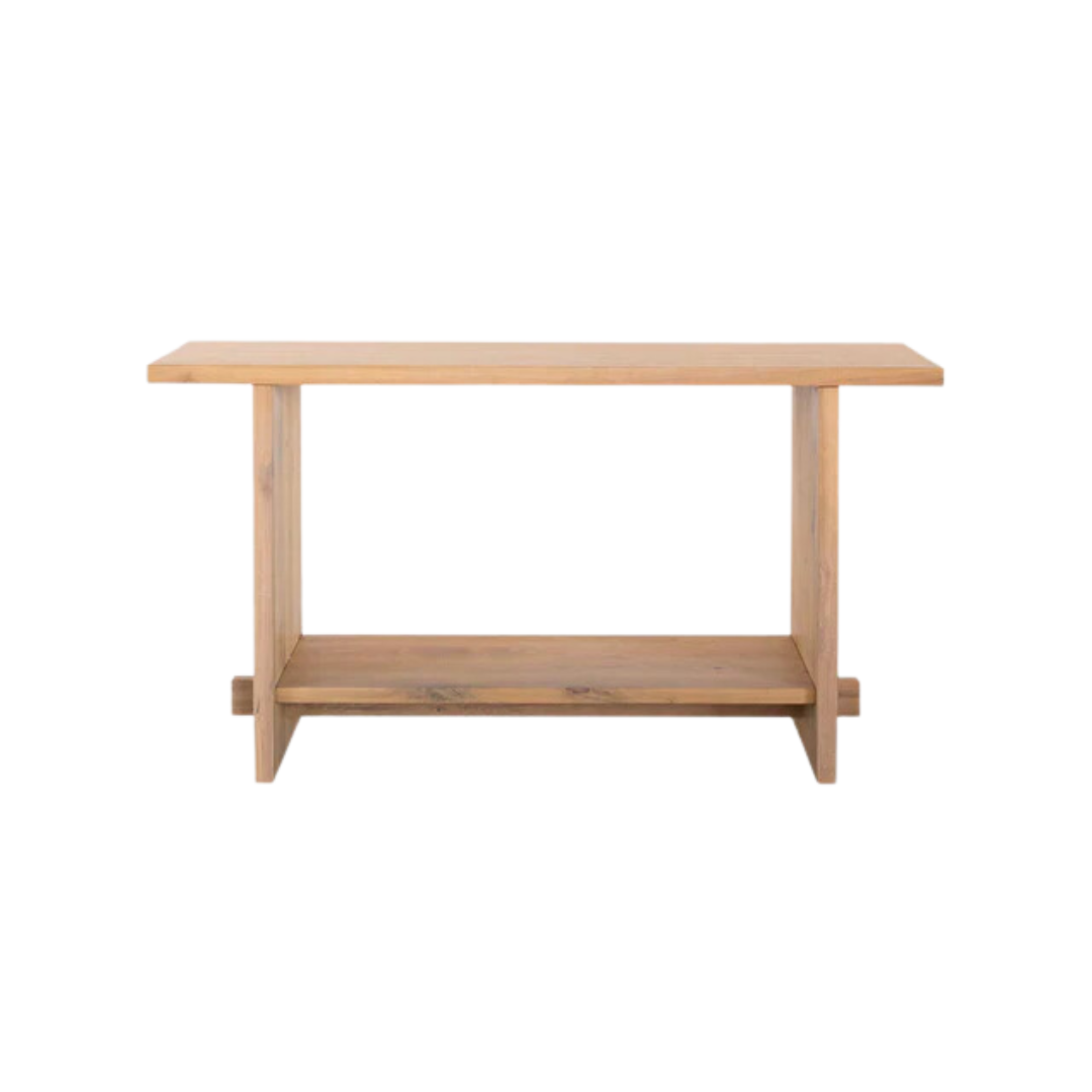
The Tudor living room is super asymmetrical. By redoing the fireplace, we took a bit of the focal off of it and let it blend into the space a bit better. To square things off, I used an open console to the left of it under the Frame TV with a library light above it. We used this console at our old house and it fit the space perfectly.
Opposite of the console I wanted a giant tree that didn’t’ read “olive” or “tropical”. This Natal Mahogany from Tillery Plant Co. is native to the riverbeds of Africa, often shaded by the canopy above. Making an excellent low-light plant, this beauty adjusted to our living room perfectly. The fabulous basket planter? It’s actually a vintage table base we dropped the pot into.

Designated Seating Areas
I divided the living room into three primary seating areas:
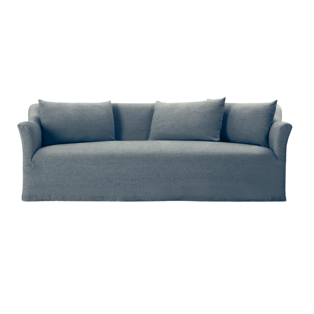
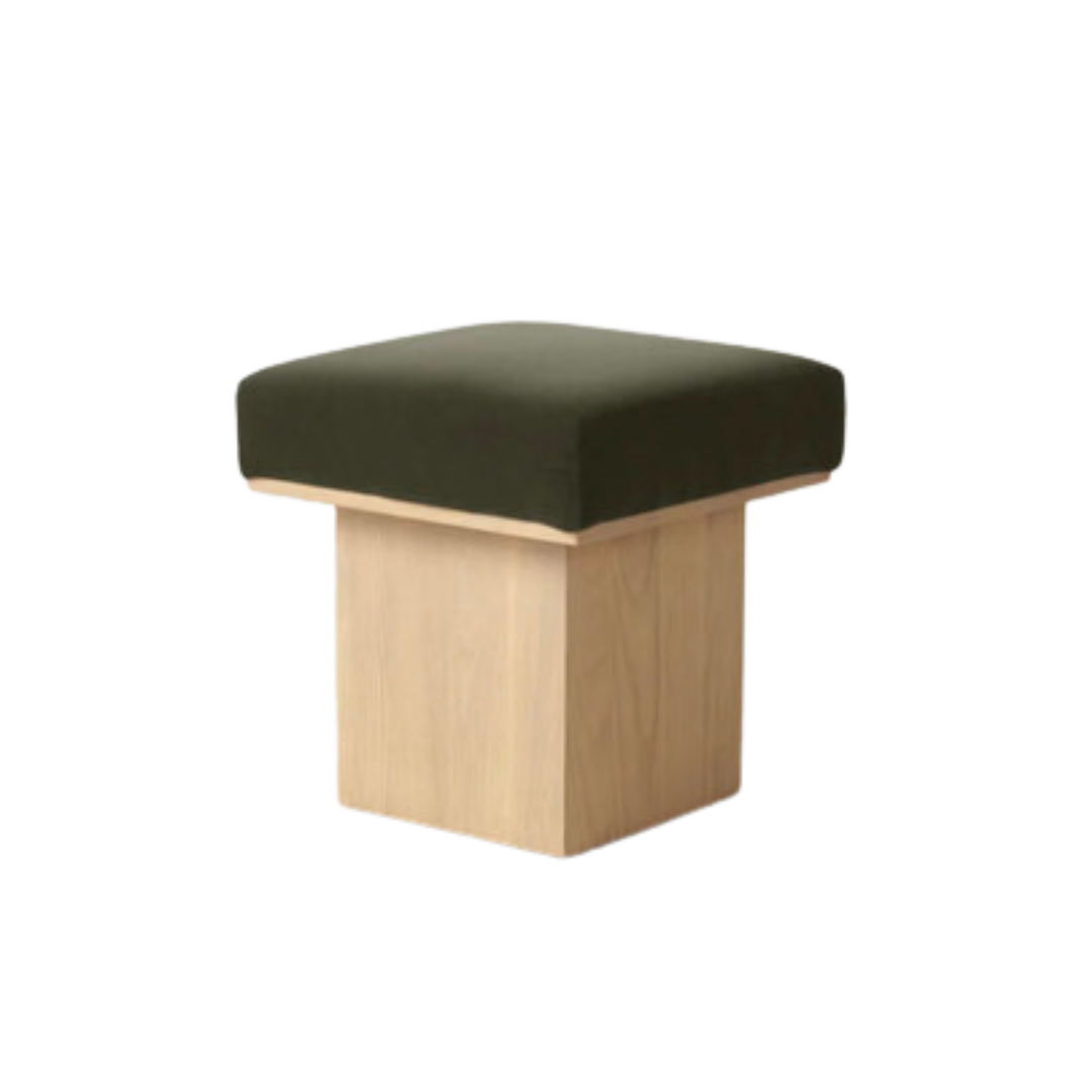
- The Sofa, Coffee Table + Mushroom Stool
- The 2 Antique Reclining Chairs
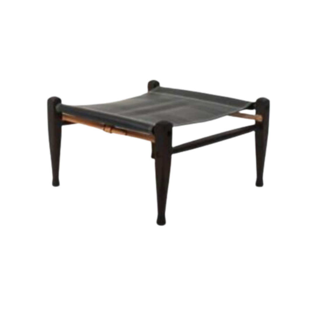
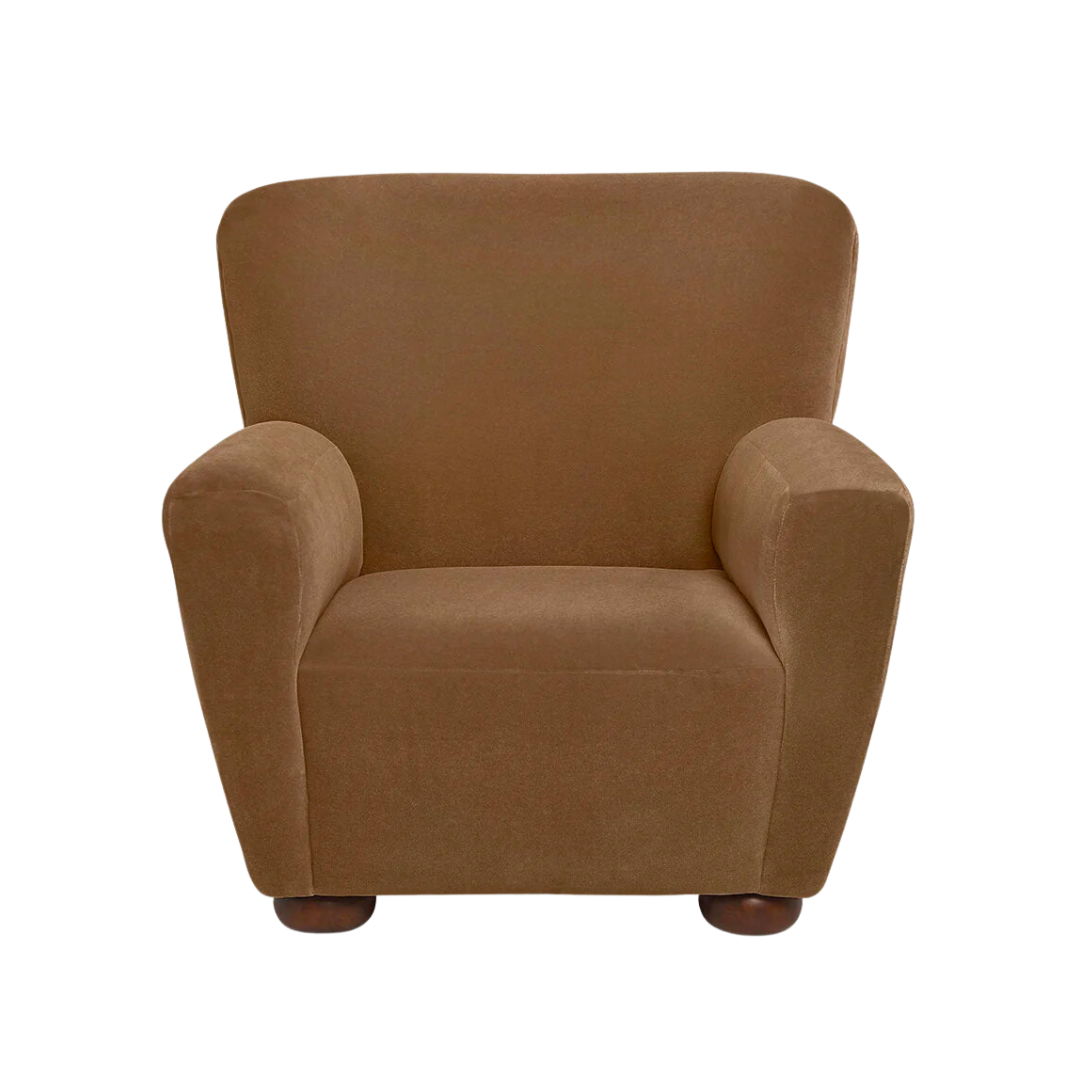
- The 2 Oversized Mohair Arm Chairs + Leather Footstool
The biggest thing I learned while studying Jake Arnold’s projects is that you don’t need huge open walkways in your living room. Cozy, unusual seating areas serve you much better and are more inviting to guests. By designating these individual areas, they work independently but also intertwine to welcome a large group.
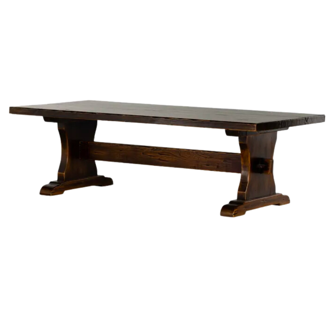
I love the antique Spanish coffee table (that was formerly a dining table) because it sits higher than a traditional coffee table. You can eat at it, play games at it, or just pull up a stool to have more intimate conversations. I find Quinn and I have casual dinners here more than we ever did before because it’s the perfect height.
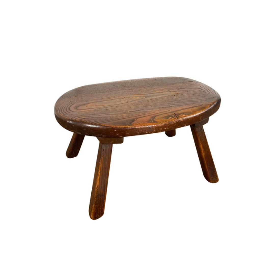
Mixing and matching the foot stools allow for people to truly recline and watch a movie, or add extra seating when we’re hosting. While they’re super functional, the true benefit to the three mismatched stools is that they fill the space floating in the middle of the room. Everything feels vibey and loungey, like they’ve been collected for years. As my taste matures, nothing is more important to me than that layered, collected feel.
It feels so good to finally share everything we’ve worked on over the last 9 months. I was quick to make decisions on this project, and after having lived here for a few months now, I can honestly say I’m so thrilled with how it turned out. Without having an infinite budget, I’m not sure I’d change a thing about it. Click here to see The Austin Tudor Kitchen Reveal!
BY: Anastasia Casey


