Color Crush: Oxblood Interiors
Warm reds like oxblood are bringing a moody elegance to the interior design landscape. This deliciously rich jewel tone is best described as a dark shade of red, marrying undertones of purple and brown. Unlike other shades of red, oxblood is highly adaptable, with its characteristic warmth and drama that works well on everything from furnishings to color-drenched walls.
Summer is synonymous with light, airy color tones, but interiors are taking a moodier turn this season. Color drenching has swept the design landscape, and one particular shade has noticeably dominated—oxblood. This deliciously rich jewel tone is best described as a warm red, marrying the undertones of purple and brown that characterize similar hues like burgundy and crimson.
Favored by everyone from Anne McDonald to Jake Arnold to Kelsey McGregor, oxblood interiors reflect a larger shift towards bold spaces with depth and character. Whether searching for inspiration or actively sourcing paint colors, these spaces will convince you to confidently take the plunge.
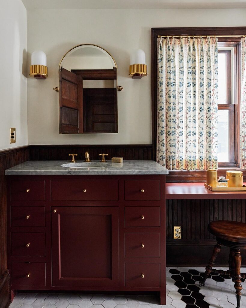

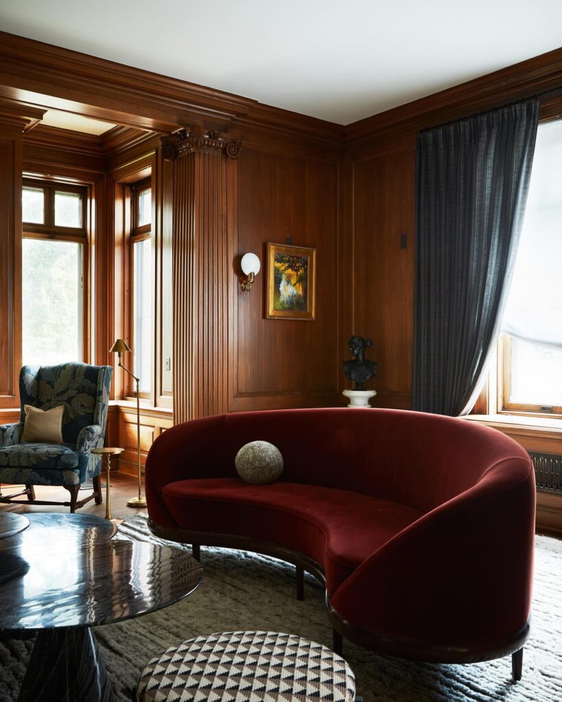
Design by Anne McDonald Design, Photography by Taylor Hall O’Brien, Canary Grey, Tim Lenz
Why Oxblood is the Jewel Tone of the Moment
Red is perhaps the most unexpected interior design trend in recent years. This primary color has reentered the conversation and demonstrated designers’ increased willingness to take risks in their work. Oxblood builds on the existing red trend but offers a richer, moodier interpretation. This sophisticated and versatile shade brings warmth and drama to any space, creating depth that makes color-drenched rooms feel more intimate and luxurious.
Oxblood, unlike other shades of red, is remarkably adaptable. It fits with a range of design styles, from modern to traditional. Anne McDonald, a designer who understands this versatility, uses shades of oxblood to breathe new life into historic Minneapolis homes. Whether through furnishings or wall-to-ceiling color, her projects like the Romanesque Victorian and 1800s Renovation are prime examples of this hue’s moody, modern appeal.
Another advantage of oxblood interiors is the hue’s ability to play well with other tones, metals, and natural materials. A complementary palette of creamy neutrals and luxe finishes like unlacquered brass look particularly striking alongside oxblood, adding sophistication to a space.

Design by Anna Knight Interiors, Photography by Ryan McDonald
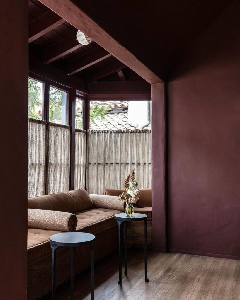
Design by Jake Arnold, Photography by Michael P. H. Clifford
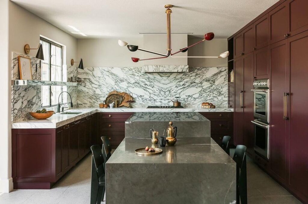
Design by Tatum Kendrick Design
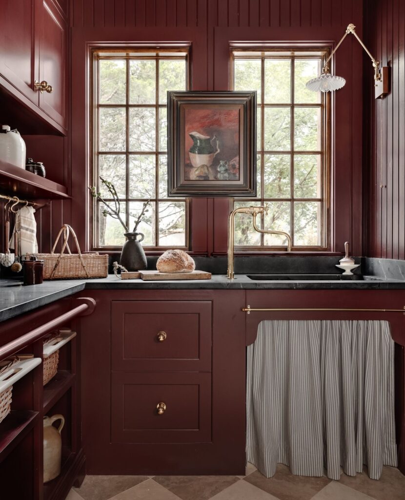
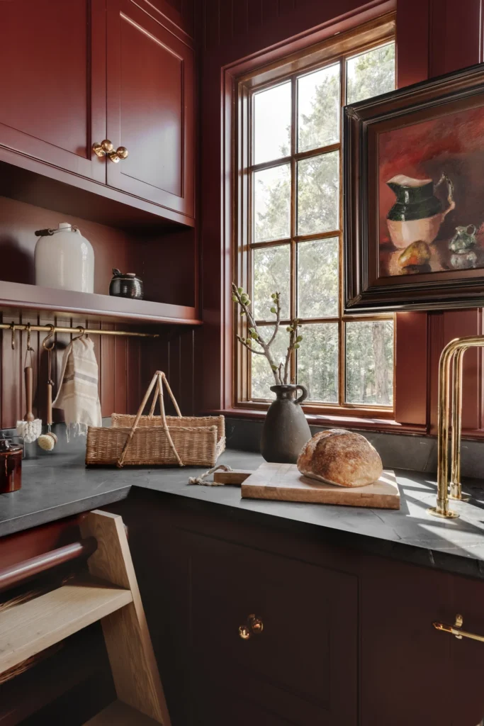
Design by Kelsey Leigh Design Co., Photography by Emily Hart
The Best Oxblood Paint Colors
Here are some of the best oxblood paint colors to consider for your interior spaces:
Deep Reddish Brown by Farrow & Ball
A deep, rich red that captures the true essence of oxblood—perfect for color drenching.
This shade combines deep red with hints of brown and purple, ideal for creating a cozy, inviting atmosphere.
A sophisticated, dark plum that leans towards oxblood, perfect for channeling a touch of luxury.
A classic oxblood hue that leans more red, less brown, and works well in both traditional and modern settings.
Described as a modern crimson, Radicchio is a bold, vibrant red with a hint of magenta that brings energy and warmth.
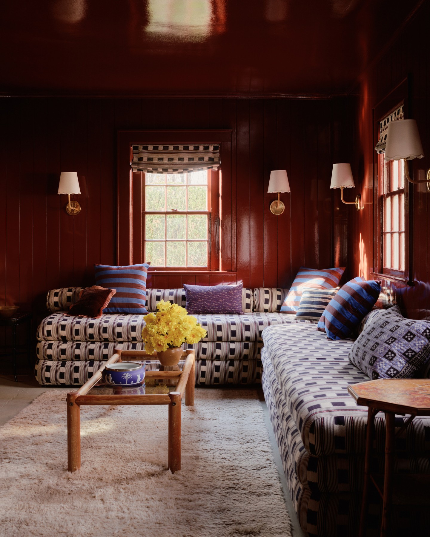
Design by Chused & Co., Photography by William Jess Laird
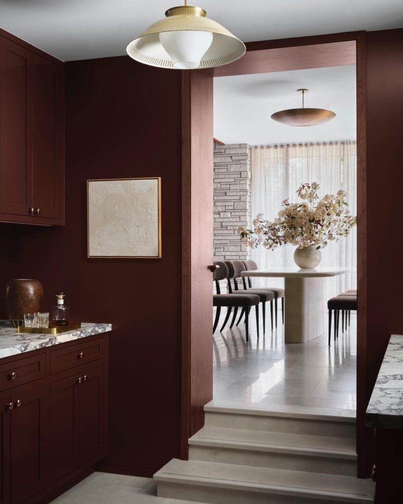
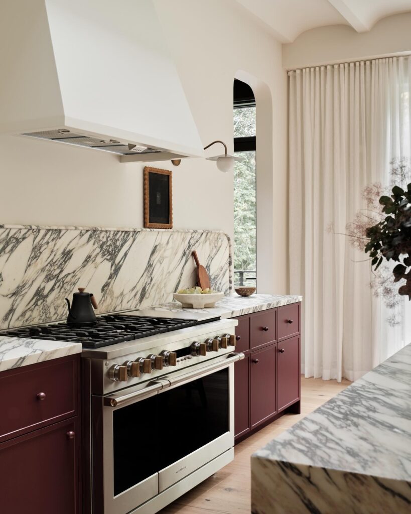
(L) Design by Lindsay Gerber Interiors, Photography by Douglas Friedman
(R) Design by Sarah Sherman Samuel, Photography by Joesph Bradshaw
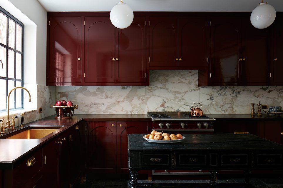
Design by Fernando Santangelo
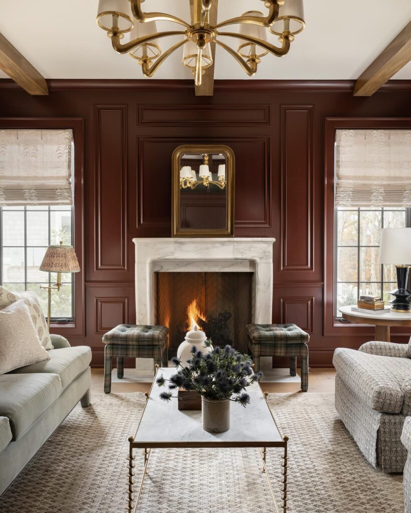
Design by Whittney Parkinson Design, Photography by Sarah Shields
Oxblood can bring drama to nearly any space. As this jewel tone continues to gain popularity, rest assured it also offers a timeless appeal that transcends the trend cycle. Whether through paint, furniture, or accessories, incorporating warm reds like oxblood will create an inviting environment that makes a bold, albeit tasteful, statement.
BY: Stephanie Weers

