

The Power of a Primary Color Pop
Much like Allison Bornstein’s “wrong shoe” method in fashion or TikTok’s “unexpected red” theory in design, strategically placed primary colors bring an undeniable cool-girl element to interiors. See how designers are reimagining primary hues to create dynamic and inviting spaces that reflect a modern sensibility while paying homage to timeless style.
Design and Photography by Nickey Kehoe
There was a time when primary colors were seen as a design faux pas—something to be talked about in hushed tones among those with good taste. Homes awash in neutrals were the be-all and end-all of interiors, and color was relegated to children’s spaces, written off as too bright or too audacious for the home. But those days are a thing of the past as primary colors have found their way back into interiors, albeit with more pared-back approach.
Think of it as Allison Bornstein’s “wrong shoe” method applied to interior design. Just as an unexpected shoe choice can elevate an entire outfit, a strategically placed primary color creates necessary visual tension in a space. It’s about disrupting the expected, injecting some playfulness, and sparking conversation.
Let’s delve deeper into the practicality of incorporating a primary color pop and see how designers put the principle into practice.
Design by Avery Cox, Photography by Lindsay Brown
Why Primary Color Pops Work in Interiors
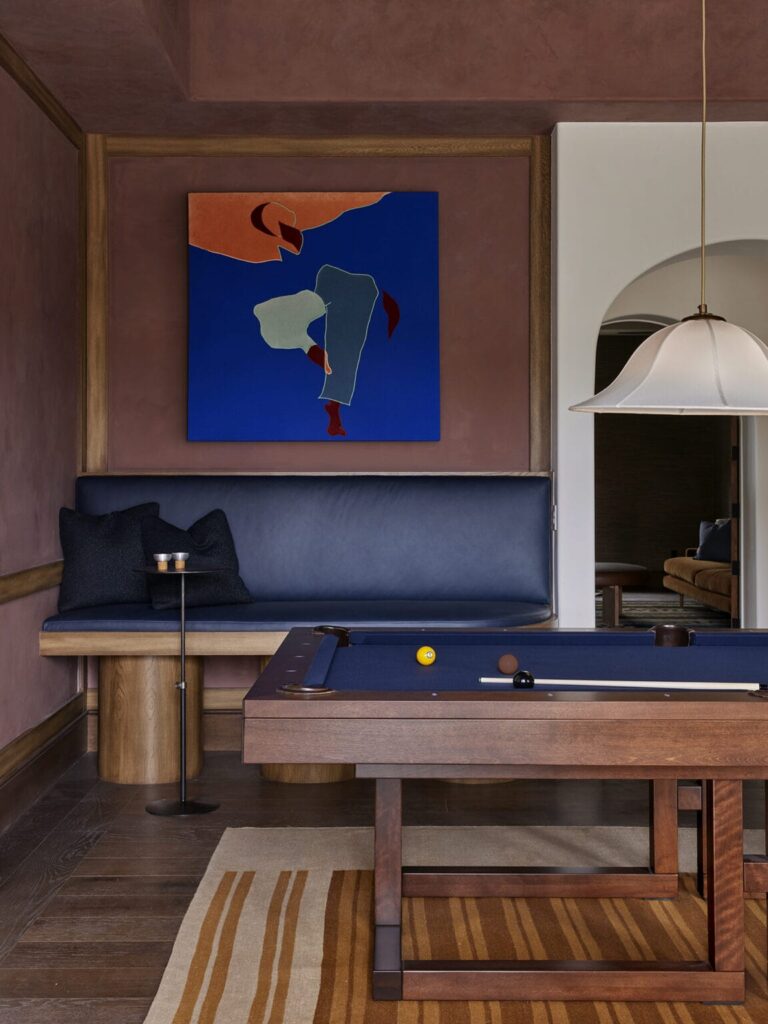
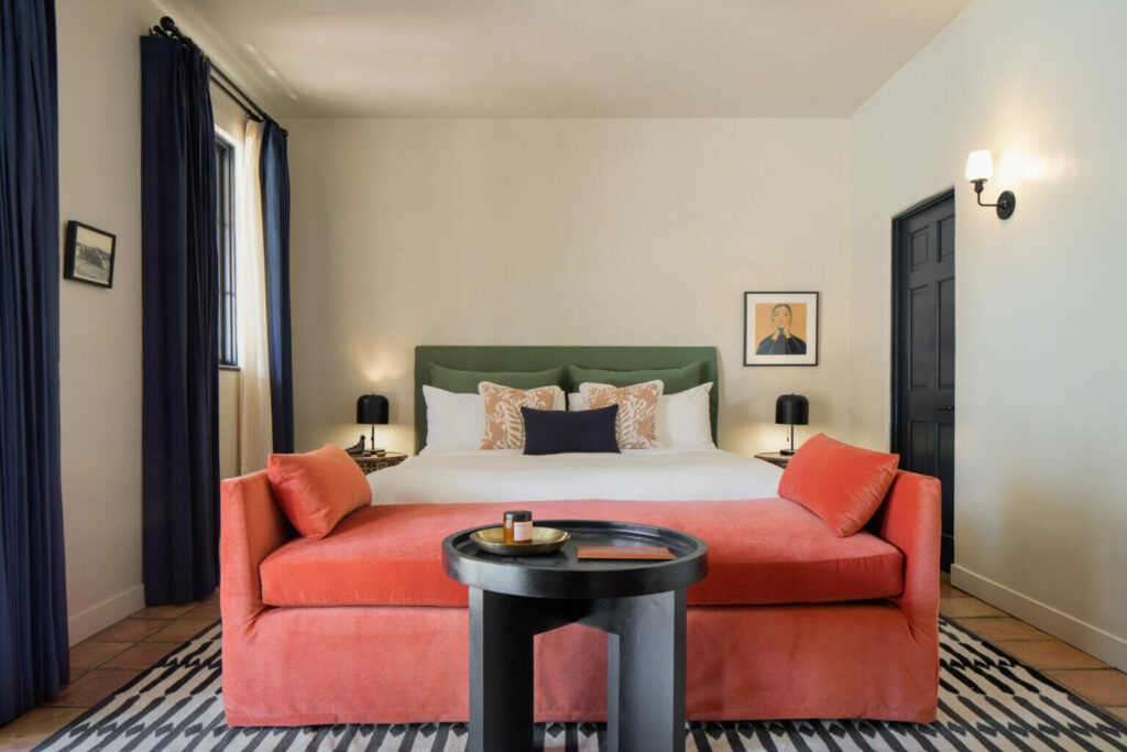
The reintroduction of color has taken hold of the design industry in recent years, marking a departure from the reign of neutrals. From the subtle contrast of trim colors to the bold statement of yellow kitchen cabinetry and the chameleon-like versatility of cornflower blue, designers have been exploring the spectrum of color tones with fresh enthusiasm. Among these vibrant options, primary colors are a bold yet sophisticated choice for infusing spaces with a tangible sense of energy. By incorporating strategic pops of primary color, whether through furnishings, light fixtures, or artwork, designers add a touch of playfulness to their interiors while maintaining a cohesive aesthetic. It’s all about balancing vibrancy and restraint, allowing primary colors to shine as “the wrong shoe” within a space.
Texas designer Avery Cox is a master of this method. Her recent project in Austin’s Lost Creek neighborhood demonstrates the power of using bold primary hues in a tasteful and understated manner. Each moment of color is intentional and a tool for layering depth and personality within the home.
Design by Electric Bowery, Photography by Laure Joliet
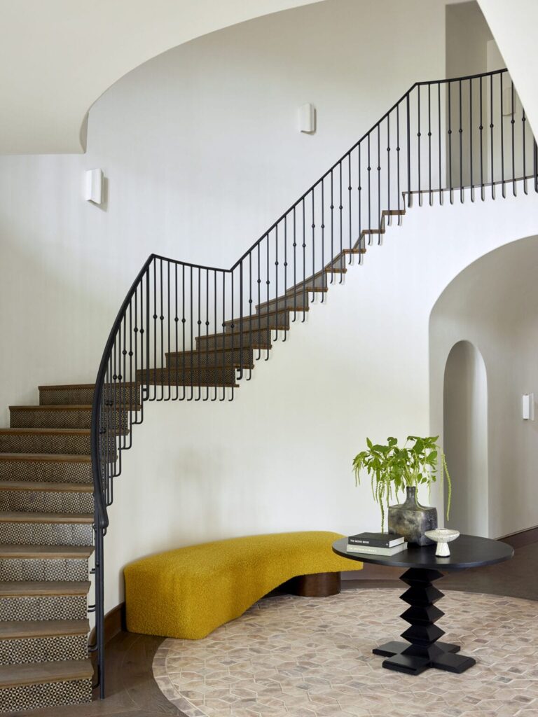
Design by Electric Bowery
Design by Studio Wu, Photography by Caitlin Beyer
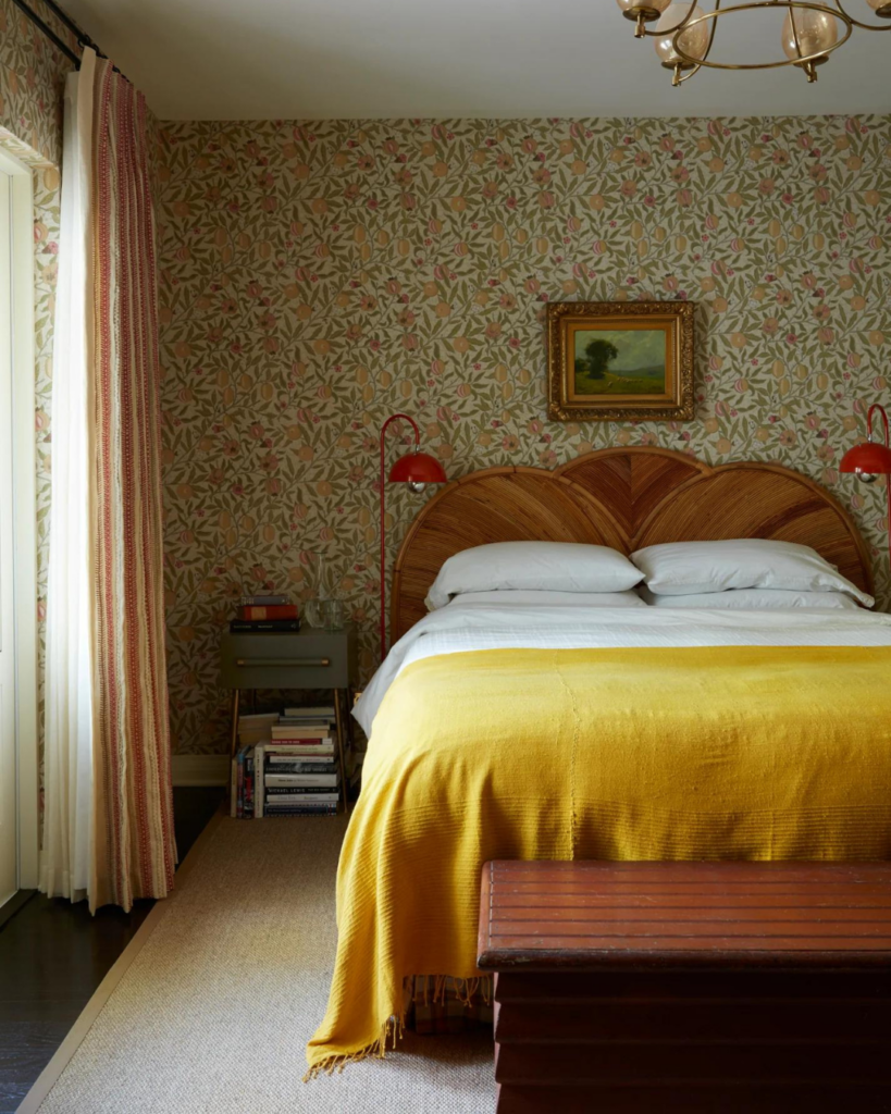
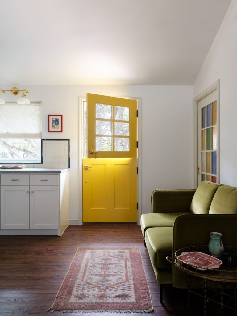
Design by Nickey Kehoe
A Few Guidelines to Try the Look
So, how do you go about incorporating a primary color pop without veering into overwhelming territory? Consider these loose guidelines:
- The 10% Rule: The key is moderation. Aim for the primary color pop to constitute no more than 10% of the room’s overall palette. This ensures that the color remains impactful without dominating the space.
- Strategic Placement: Opt for items that allow for controlled bursts of color. Light fixtures or lamps, dining chairs, side tables, trim colors, and artwork are all excellent candidates for introducing a primary color. These elements serve as focal points, drawing in the eye and livening up the surrounding space.
- Strike a Balance: Pair the primary color pop with complementary hues to create a balance. Neutral backdrops allow for vibrant accents without risking overwhelm.
- Take a Risk: Don’t be afraid to try something new. Whether you opt for a bold red (see TikTok’s favorite unexpected red theory), a cheerful yellow, or a serene blue, experimenting with primary colors is a low-risk, high-reward situation that has the potential to completely redefine a space.
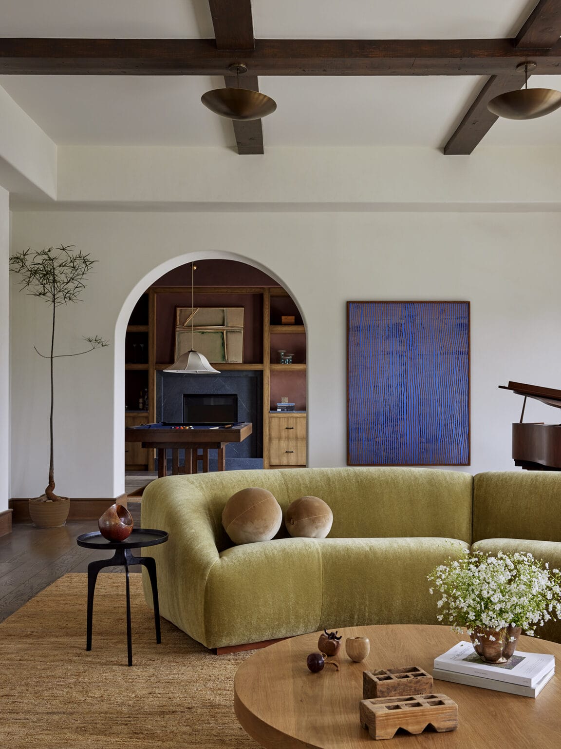
Design by Electric Bowery, Photography by Laure Joliet
Design by Nickey Kehoe
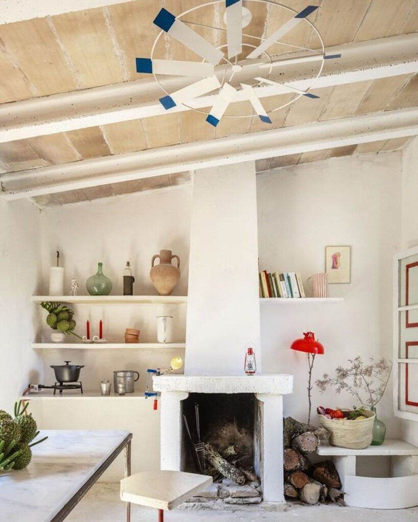
Design by Kelly Behun, Photography by Tomeu Canyellas
With no hue off-limits, there’s a good chance primary color pops are here to stay, and we’re excited to see where designers take this trend next. One thing is for sure: expect the unexpected.
BY: Anastasia Casey