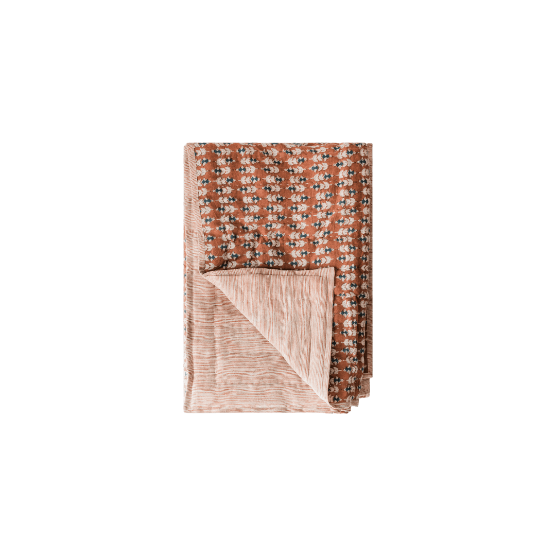
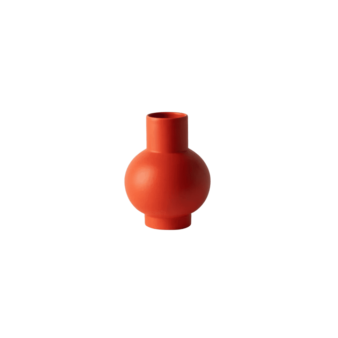
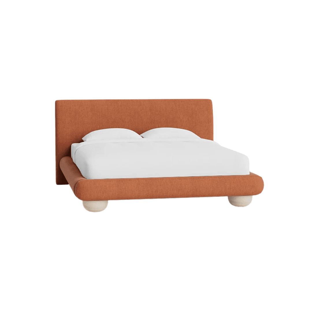
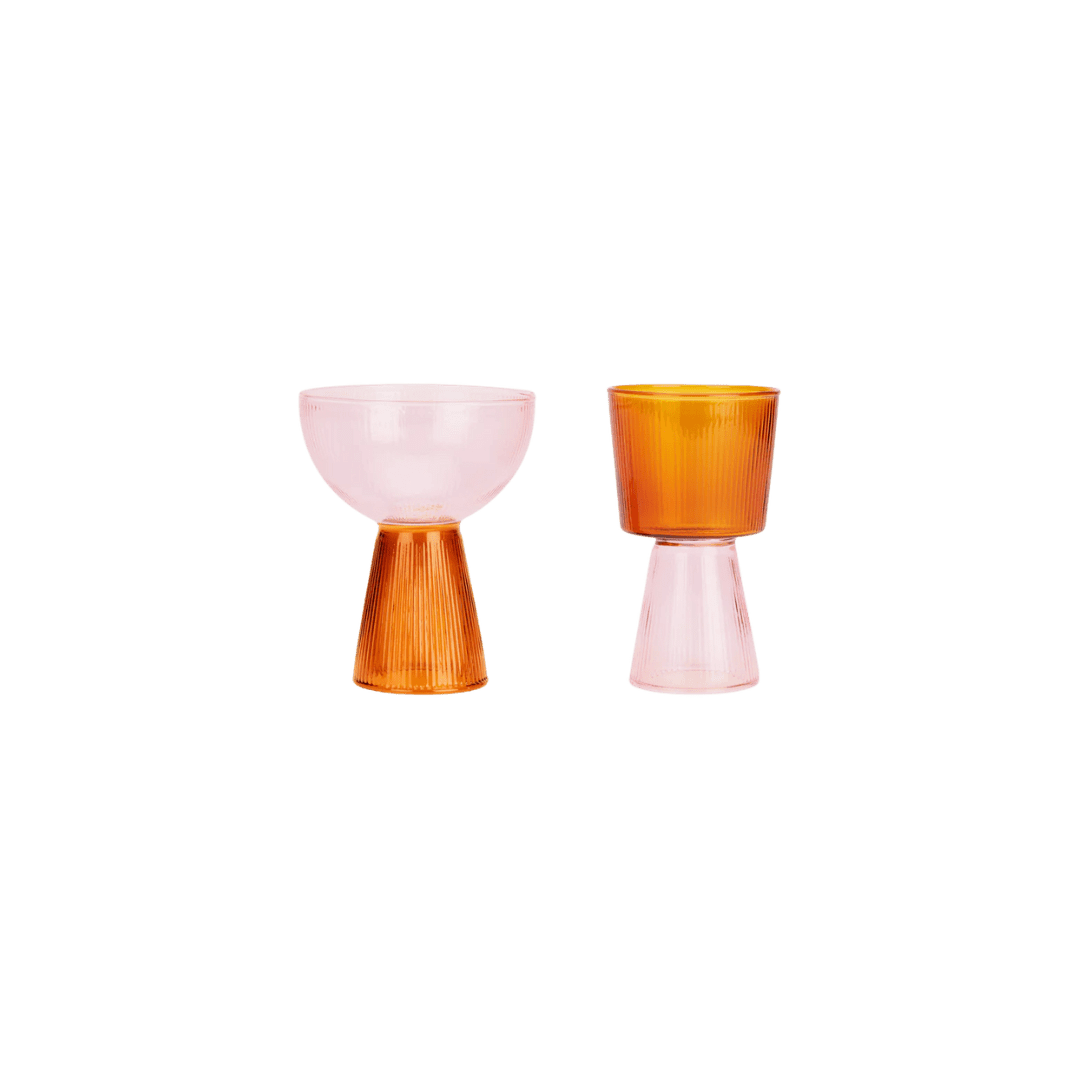
Shop


Orange Interiors: A Color Story in Warmth and Energy
Orange often gets a bad rap for being too loud, but its spectrum tells a different story. From earthy terracotta to juicy tangerine, orange interiors can be grounding and surprisingly refined. More than anything, it’s a color of optimism—warm, welcoming, and impossible to ignore. Here’s how designers are embracing it, and how you can bring the look home.
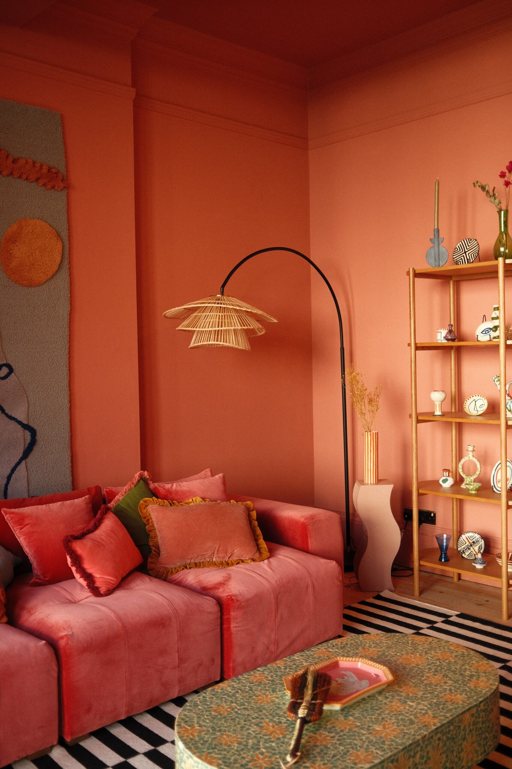
Once synonymous with ’70s rec rooms and retro palettes, orange interiors are quietly being reimagined on far more sophisticated terms. In the right context, it feels timeless and confident rather than kitschy or seasonal (read: Halloween). I even painted my own living room orange, and the response is always the same: delight.
The beauty of orange lies in its range. It doesn’t have to mean color-drenching every wall in pumpkin spice. It might be terracotta that grounds a space, a velvet chair in burnt orange, or a single citrus-bright accent that sparks life in a neutral room. Think of it as the bridge between red’s passion and yellow’s cheer. Orange has a way of bringing spaces to life, no matter the shade.
Here’s a look at the psychology behind it and how designers are making the color feel fresh today.
(Hero Image) Design: Osmose Design | Photography: Dina Ávila
The Psychology of Orange
In color psychology, orange is all about warmth, creativity, and connection. It’s the shade you want in the rooms where life really happens—kitchens, dining rooms, living spaces—anywhere people gather. Red can come on too strong, yellow can fade fast, but orange hits that happy medium: vital, optimistic, and genuinely welcoming.
And it’s not without history. In the ’70s, orange was all groovy optimism, while mid-century designers leaned into its earthier side. Fast-forward to today, and it feels less kitsch, more grounded, especially when paired with natural textures like wood or punchy colors like teal, as seen below.
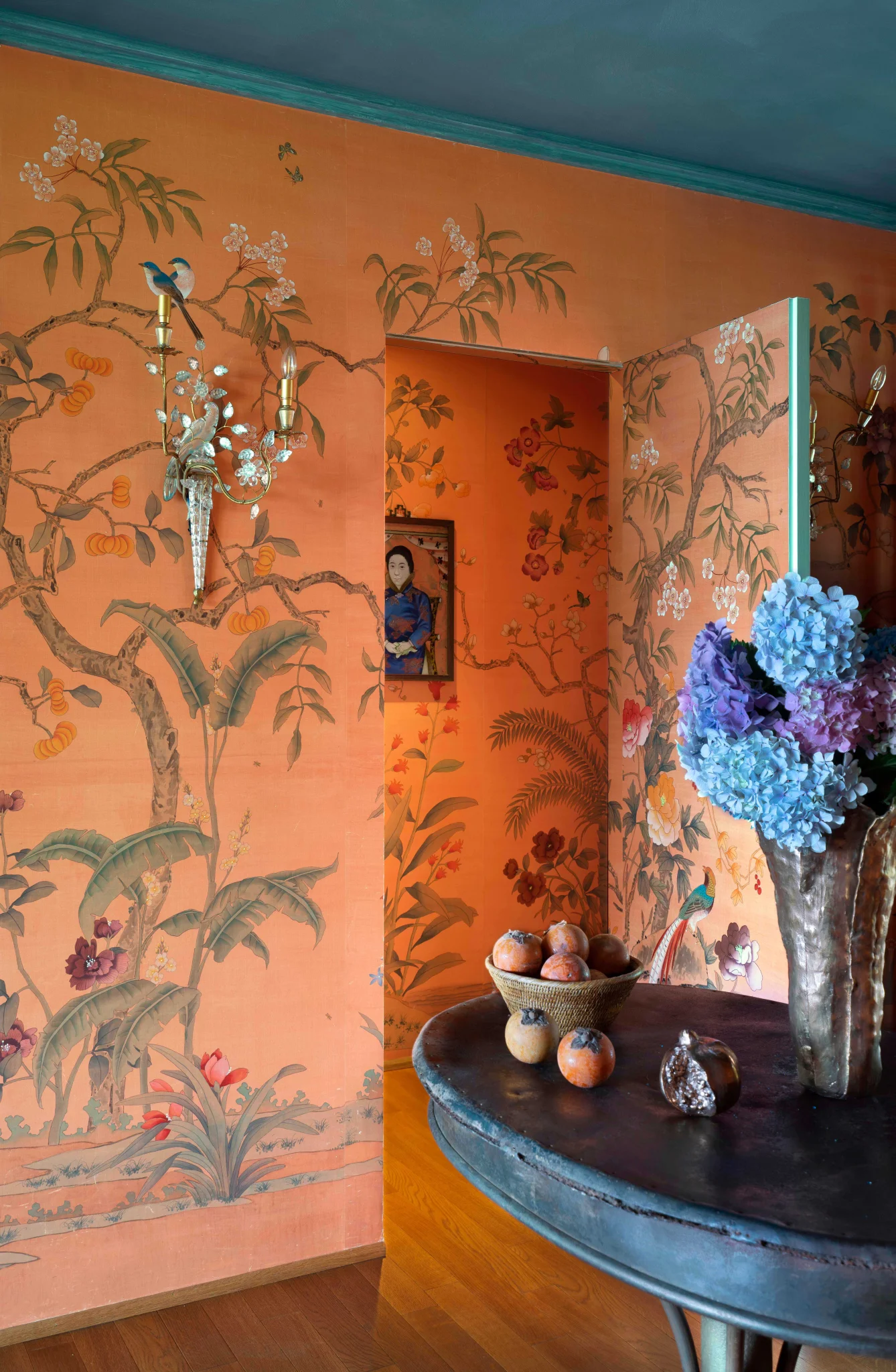
Design: Marta Ferri | Photography: Alexandra Shamis
How Designers Are Doing Orange Interiors
YSG Studio’s Plantasia is proof that orange doesn’t have to hit you over the head to make an impact. The kitchen runs on terracotta tile, cork floors layer in a caramel warmth, and burnt velvet upholstery pops up like little exclamation points against all the patterns. Even with bold wallpaper and shimmering mosaics in the mix, orange never feels like “too much.”
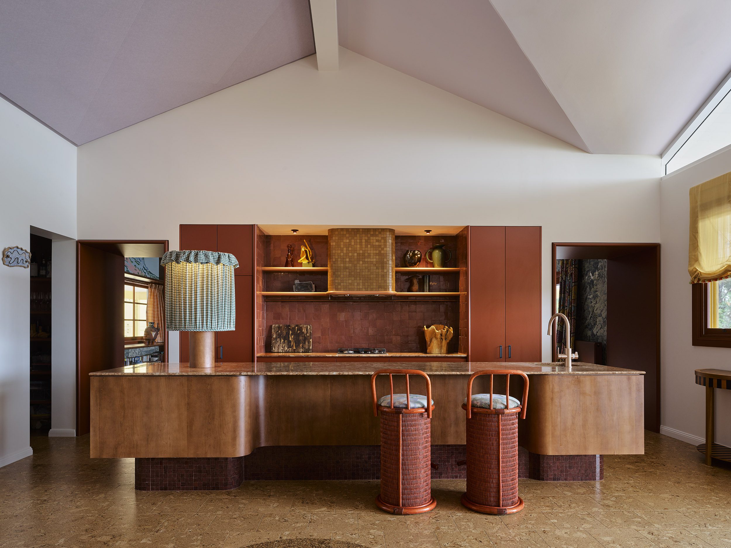
Design: YSG Studio | Photography: Anson Smart
At Groovy House in England, the Marrakech Room takes orange in a louder direction. Here, saturated tangerine walls serve as the backdrop for patterned textiles, carved wood accents, and jewel-toned props, all pulled straight from Morocco. This unapologetically bold room leans into orange’s maximalist side, proving the color can hold its own when done right.
Photos courtesy of Groovy House | Design: Alanna Doherty
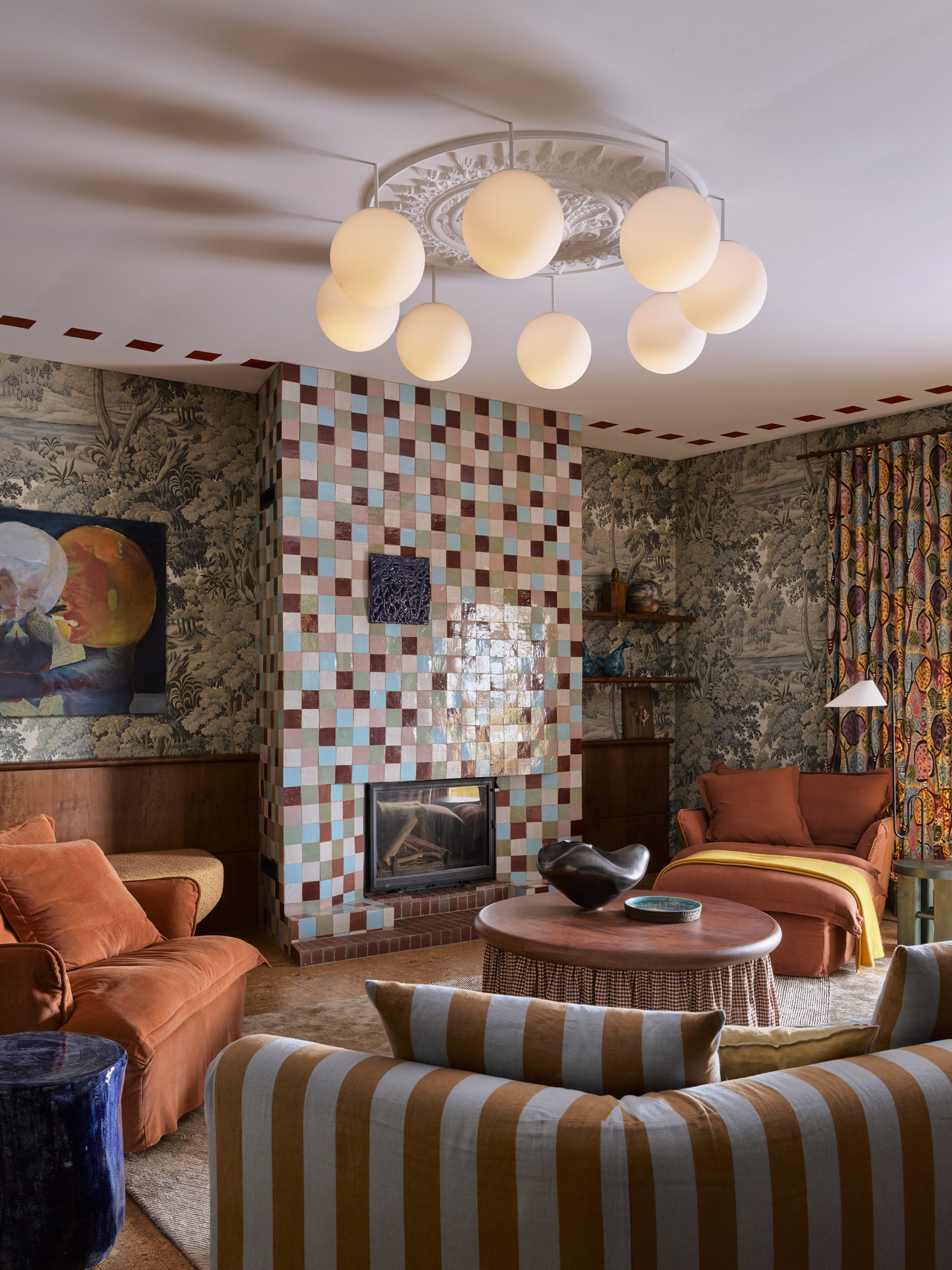
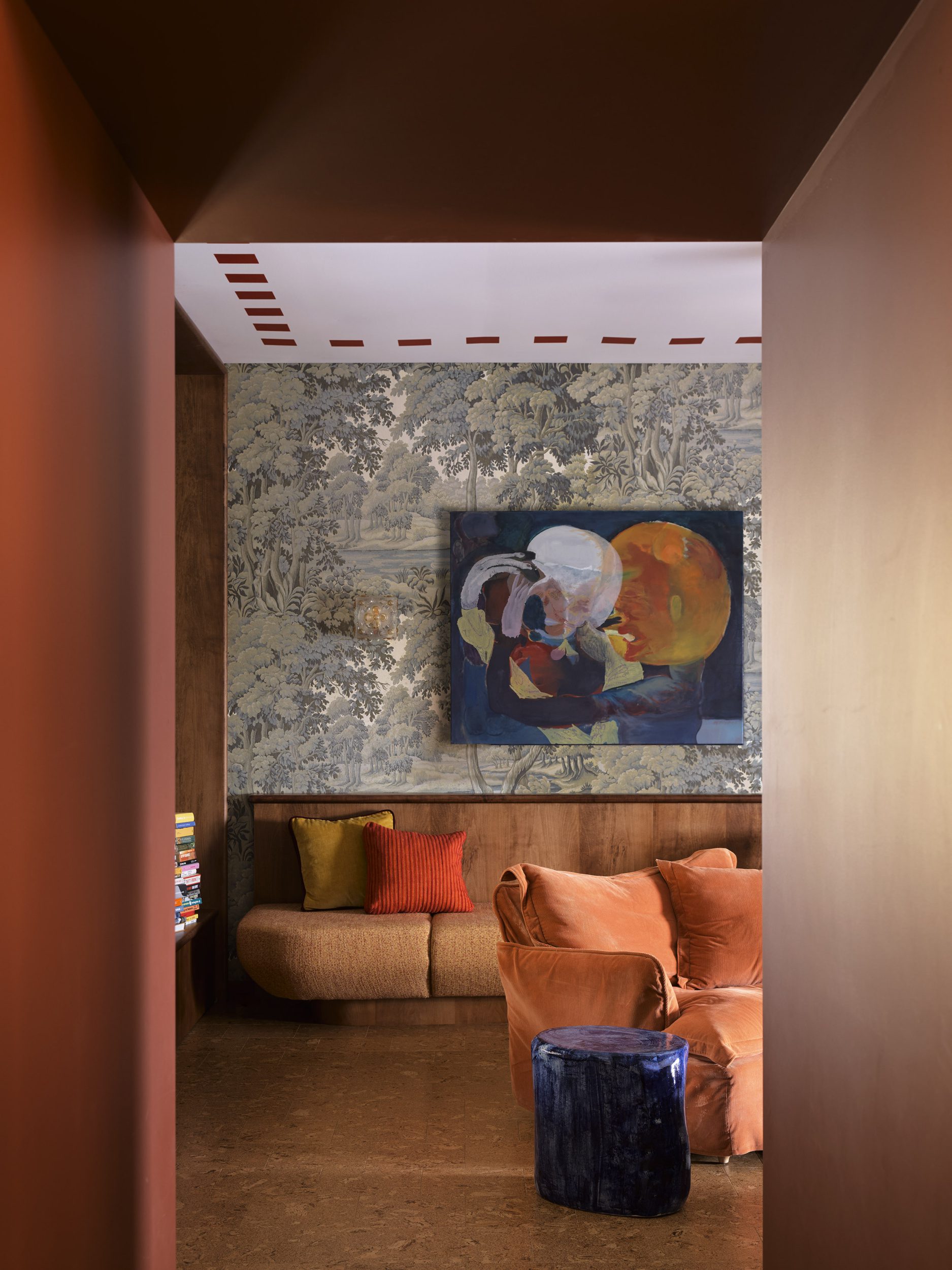
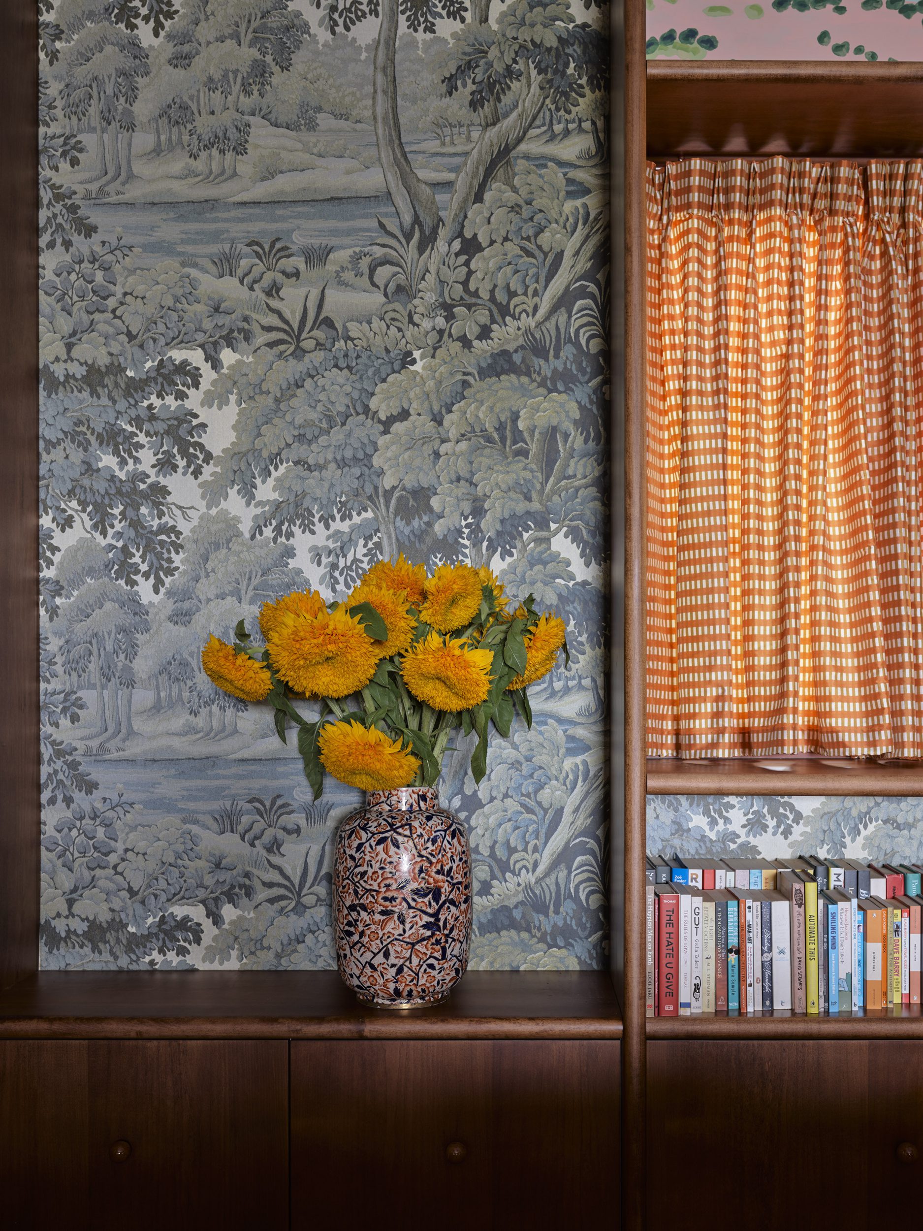
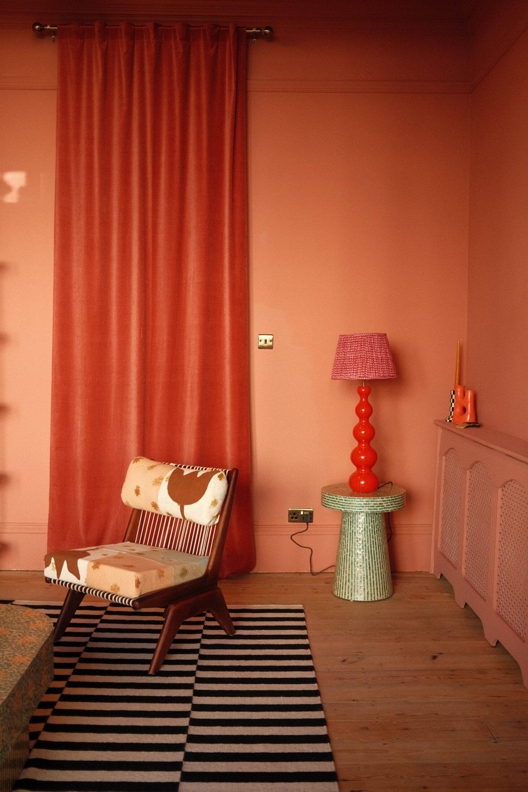
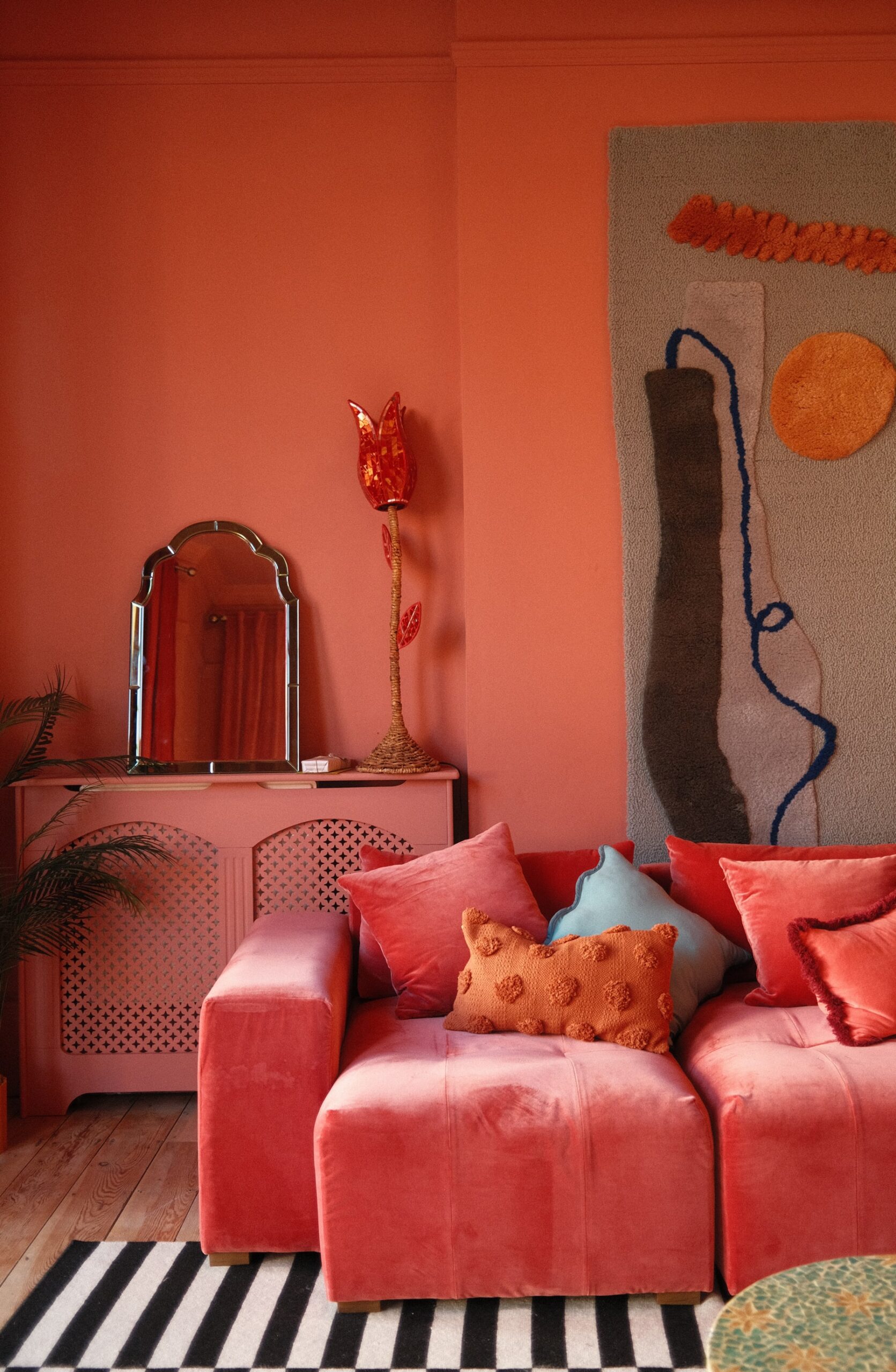
Osmose Design takes orange all the way in their Schmidt project, but it works because the color isn’t flat. The living room is drenched in shade—walls, ceilings, even furniture—yet it never feels overwhelming, thanks to the mix of textures and materials. It’s a full-on, immersive orange atmosphere that touches on all the senses.
Design: Osmose Design | Photography: Dina Ávila
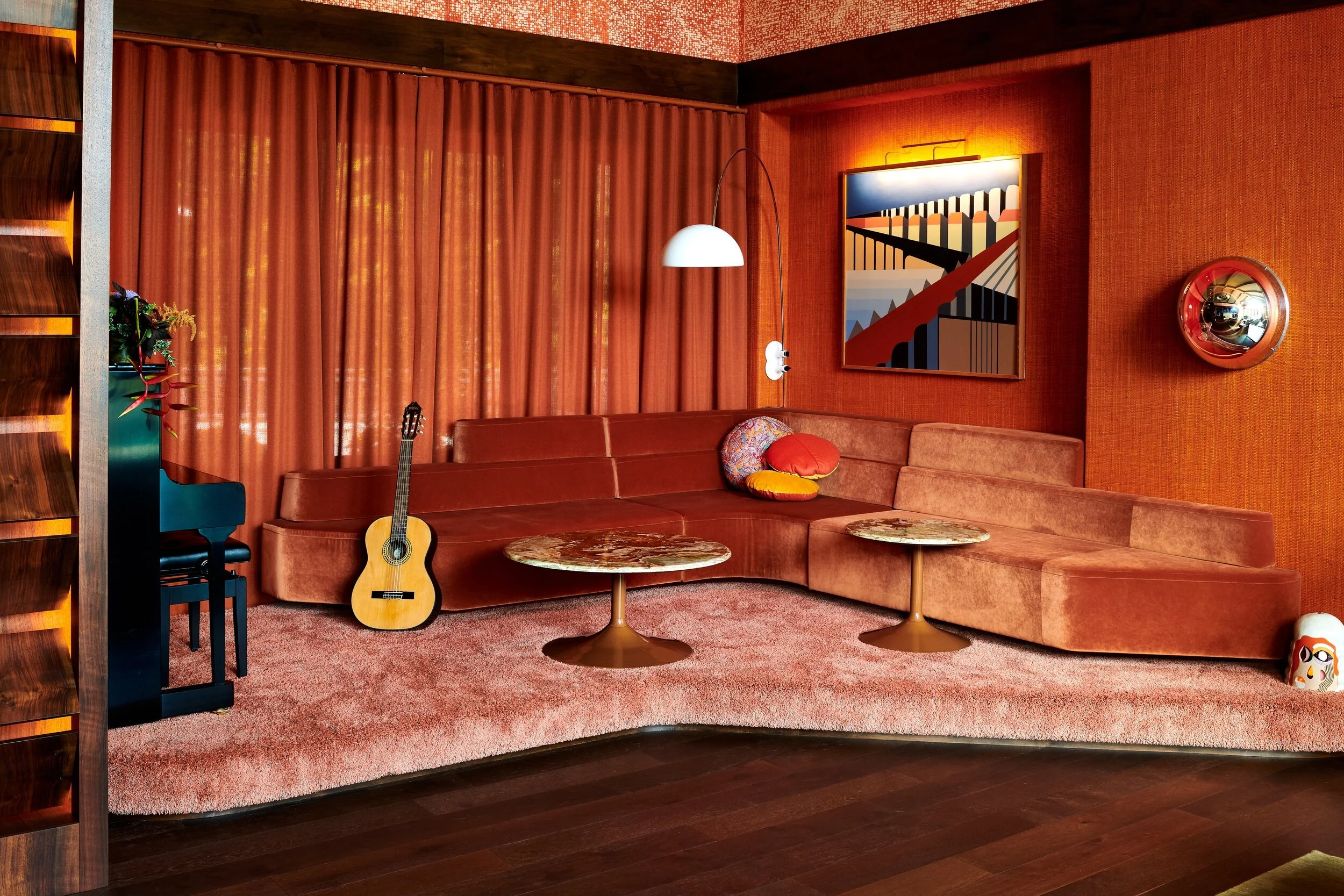
In Paris, Le Grand Mazarin, designed by Martin Brudnizki, leans full tilt into the flamboyant side of orange. Tangerine walls and coral upholstery are paired with patterned curtains and pops of color throughout one of the rooms. This makes a case for orange as a celebratory color, layered into a palette of carnival pastels and jewel tones for a look that’s eccentric, glamorous, and (so much!) fun.
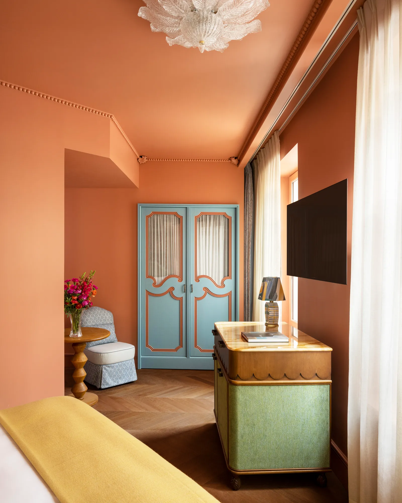

Design: Martin Brudnizki | Photography: Vincent Leroux
The Best Paint Colors for Orange Interiors
A softened terracotta with pink undertones, Red Earth reads warm without tipping too rustic. It’s the kind of shade that feels as cozy in a kitchen as it does in a library, especially paired with natural wood.
This one is unapologetically joyful and full of energy. Use it in smaller doses (a door, a bathroom, a bookcase) if you’re nervous, or go all in for a space that feels sun-soaked year-round.
Backdrop’s Color of the Year puts a contemporary spin on orange: earthy but still playful, it straddles the line between burnt spice and soft clay. It’s versatile enough to live in a dining room or an accent wall that needs just a little heat.
Think of this as a pared-back peachy orange: dusty, muted, and easy to live with. It leans more sophisticated than splashy, which makes it a smart pick for bedrooms or living rooms where you want warmth without overwhelm.
Cavern Clay by Sherwin-Williams
A classic desert hue, Cavern Clay has that sun-baked quality designers love. It’s rich, grounding, and instantly makes a space feel more connected to nature.
BY: Daniela Araya
« An Italian-Inspired Colonial Infused with Modern Edge in Washington, D.C. >
Shop