Warm, Rich Interiors That Capture a Fall Design Mood
As the season shifts, it’s the perfect time to explore how interiors can reflect their surroundings. These six designer-led projects capture a fall mood through rich textures, deep colors, and thoughtful layering. Each space shows how fall design features can evoke the warmth of autumn, creating environments that resonate with the season.
Good design doesn’t lean too heavily on seasonality. Instead, it’s about creating environments for comfortable, inspired living any time of year. That said, there’s something distinct about interiors that inadvertently embody the spirit of fall design—the warmth, the texture, and that cozy, inviting feel we all crave as the temperatures dip.
As a nod to the change of seasons, we’re highlighting six projects from design studios that encapsulate a September mood. From Ashley Montgomery’s Glengrove project to Blair Moore’s Belgian Mid-Century retreat, these spaces demonstrate how thoughtful layering, rich tones, and plush textures can evoke the feeling of autumn—all without a pumpkin in sight.
Project Glengrove
Designer: Ashley Montgomery Design
Notable Features: Pattern Play, Calacatta Monet Marble, Twist on Tradition
One could argue that Ashley Montgomery’s entire portfolio is a gorgeous love letter to the hues, textures, and warmth of autumn. But her studio’s Glengrove project is perhaps the strongest example of this concept. The space is grounded in rich, earthy tones and accentuated with features like the kitchen’s Calacatta Monet marble, which adds a layer of luxury. Ashley called this project “dramatic in all the right places,” and we couldn’t agree more.
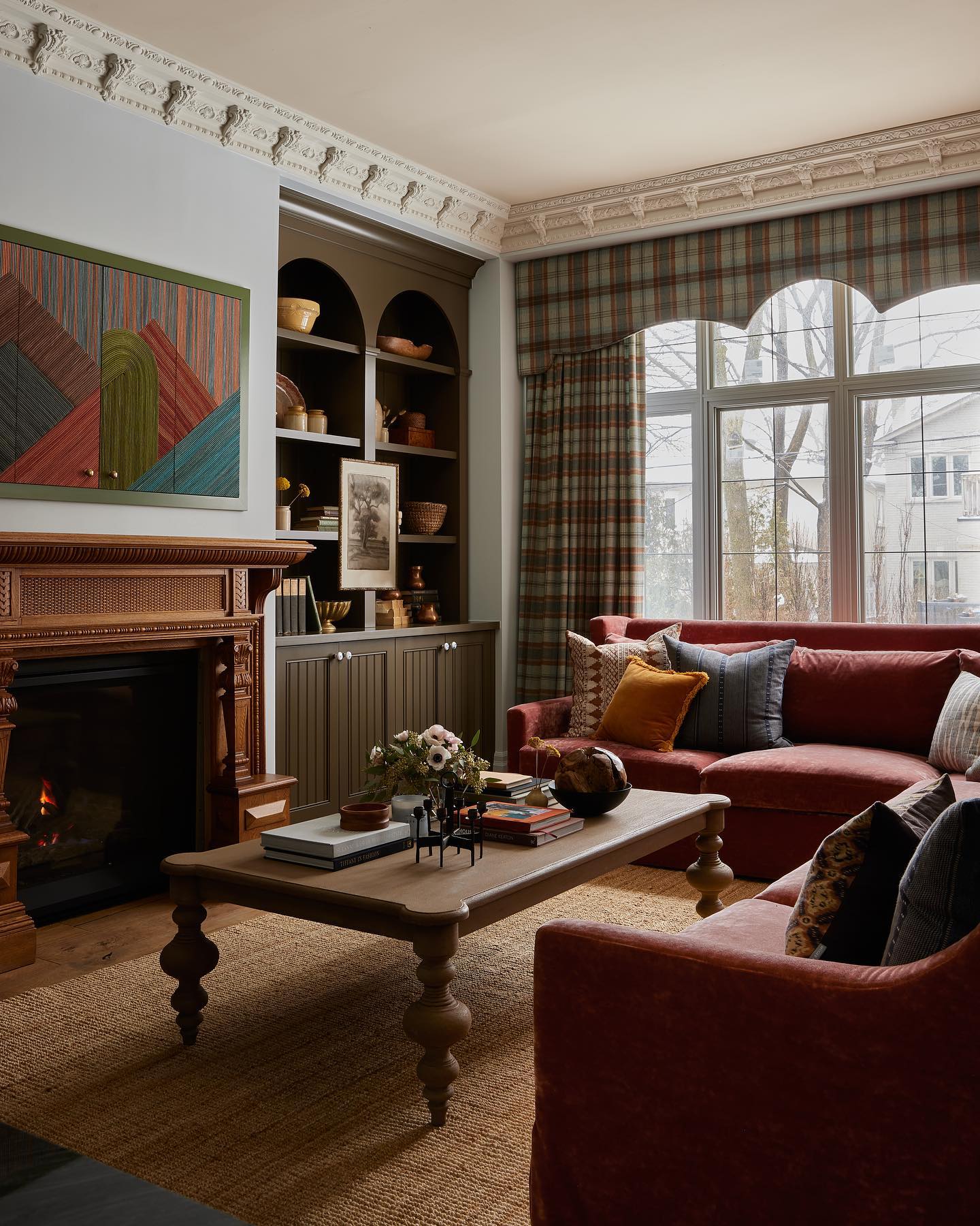
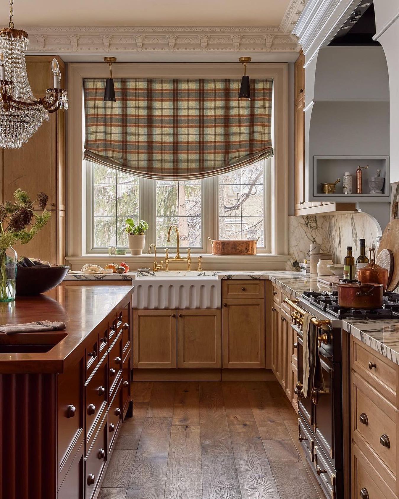
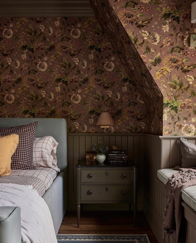
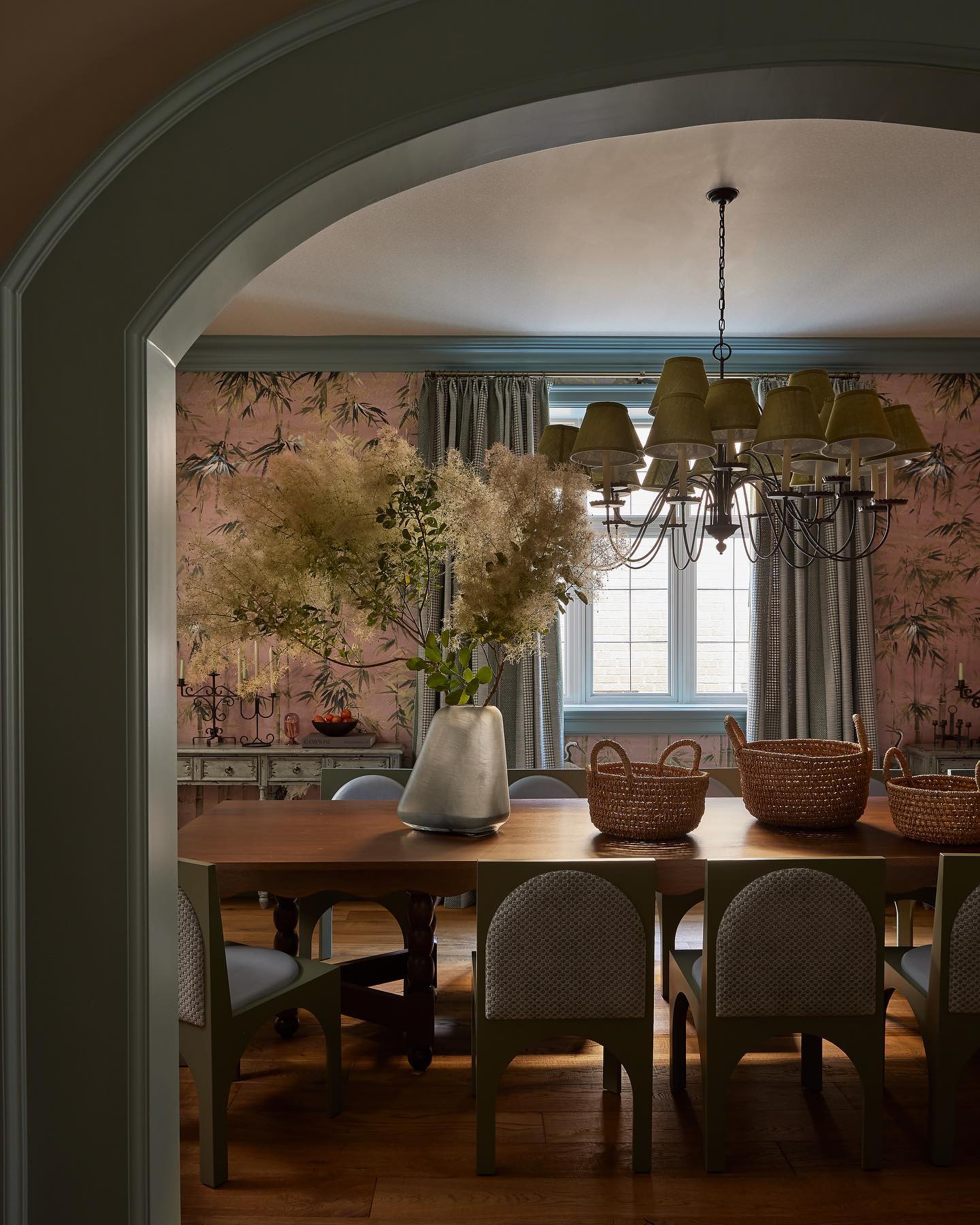
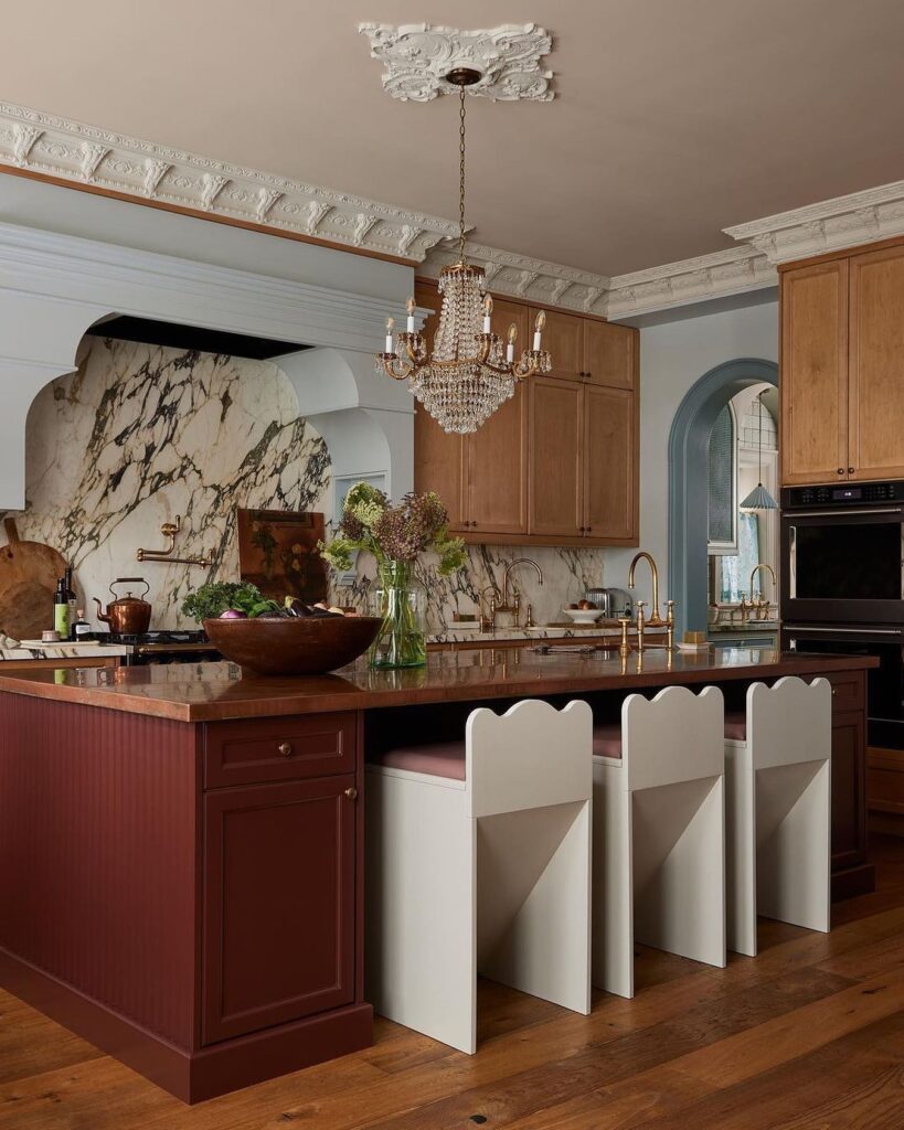
Photography by Lauren Miller
Project Belgian Mid Century
Designer: Moore House Design
Notable Features: Natural Materials, Muted Palette, Modern European Style
For a New England home that feels steeped in history, you’d never guess it was built in the 1980s. But that’s the effect Moore House Design tends to have—adding layer upon layer of character to any project they touch. In this instance, they channeled the feeling of fall with a pared-back color palette of muted browns and deep plums, evoking the natural hues of the season. By embracing simplicity in materials like natural wood and stone, and focusing on clean lines, this Belgian Mid-Century home exudes a quiet elegance that feels both timeless and undeniably autumnal.
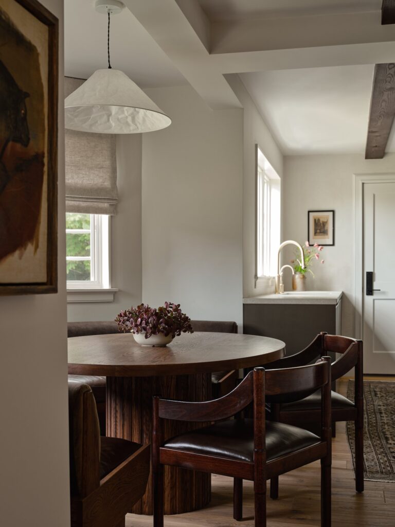
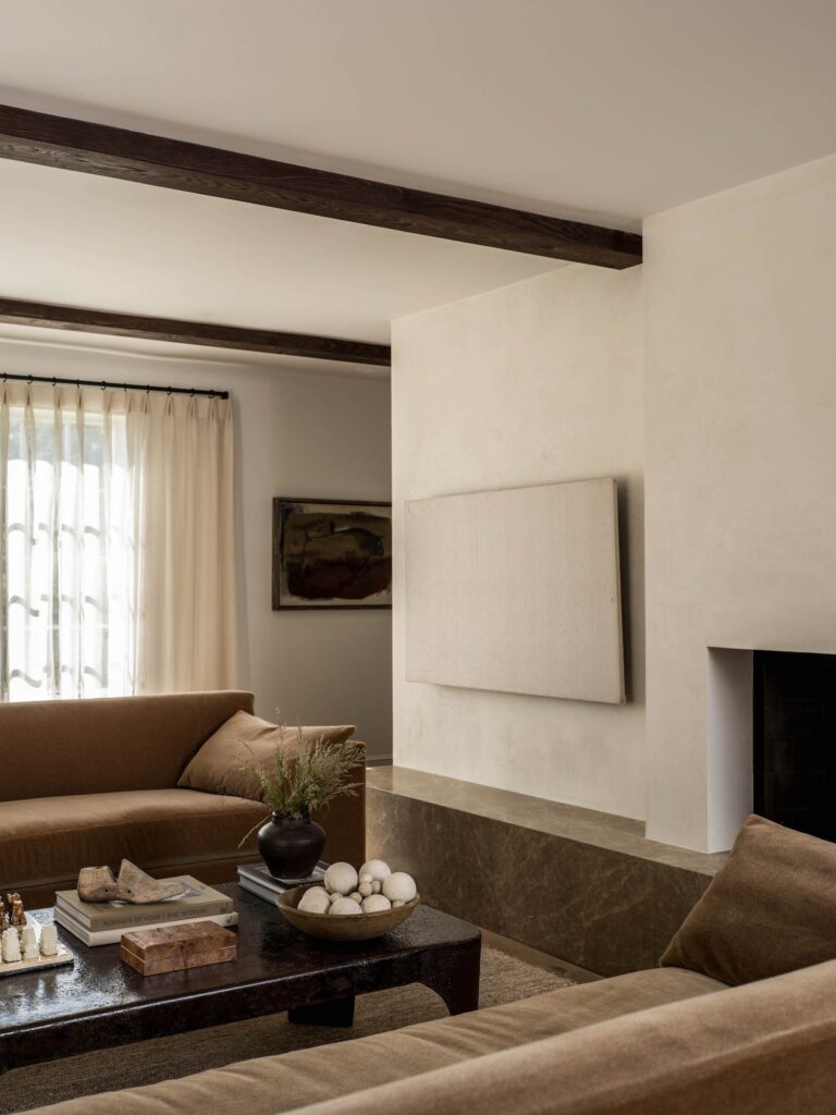
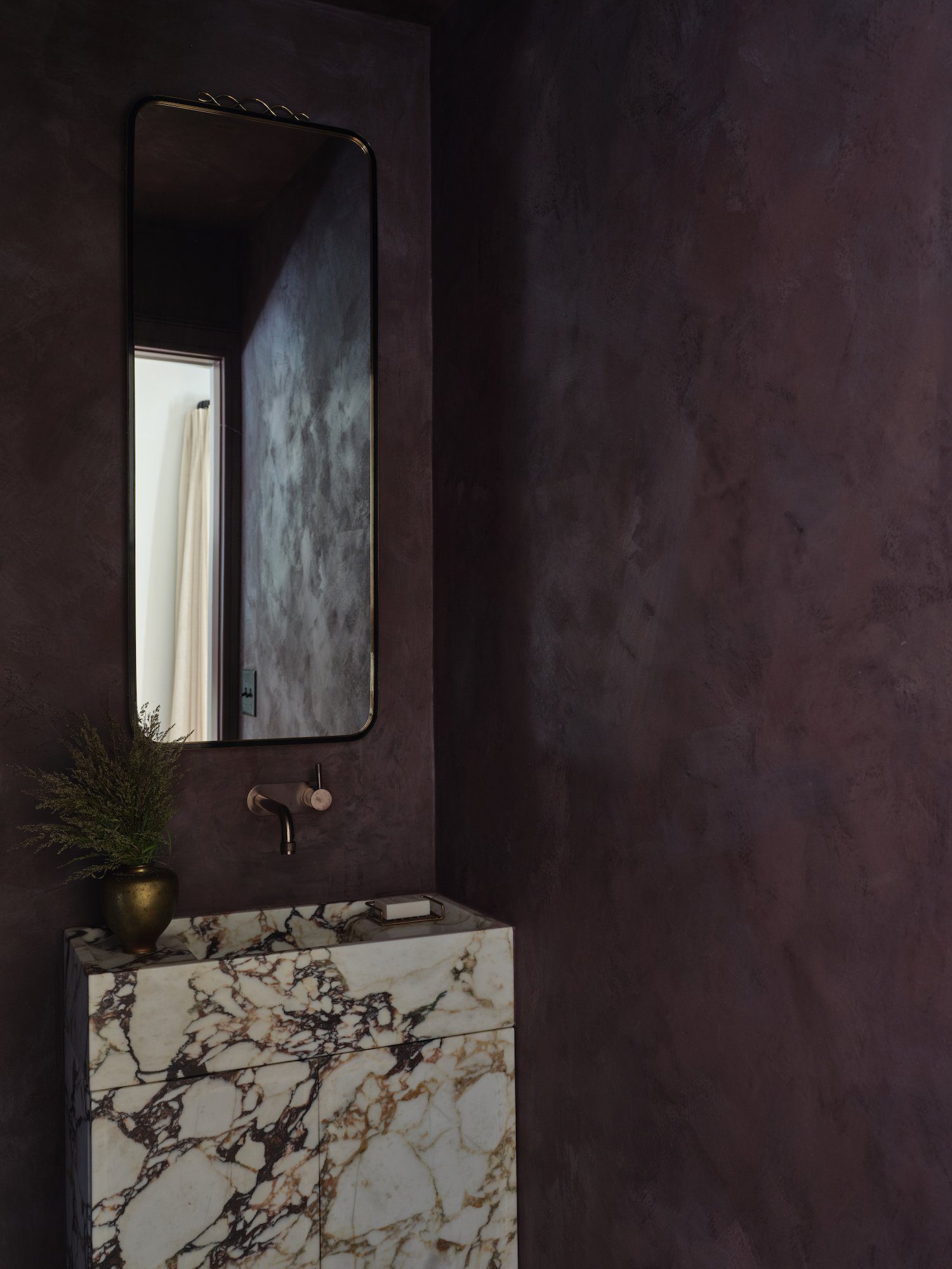
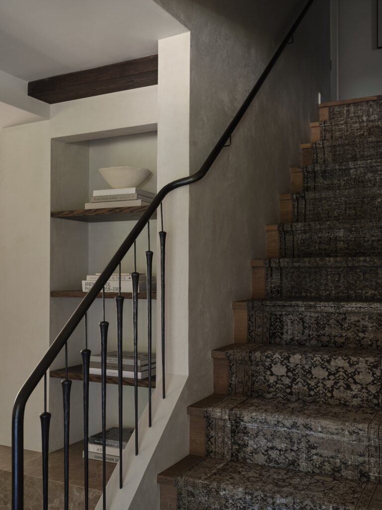
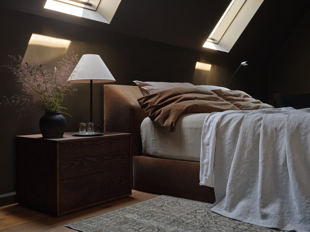
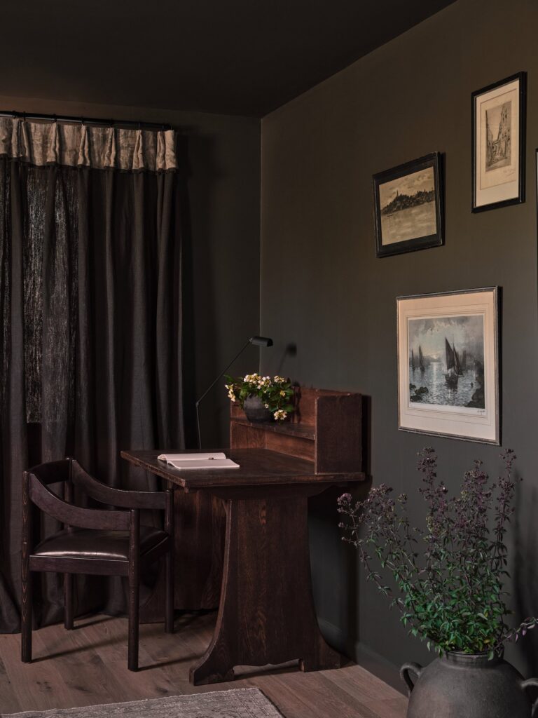
Photography by Erin Little
Project A Bit Brit
Designer: Lisa Staton
Notable Features: Warm Textures, Color-Drenching, Modern English Country
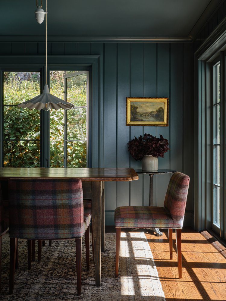
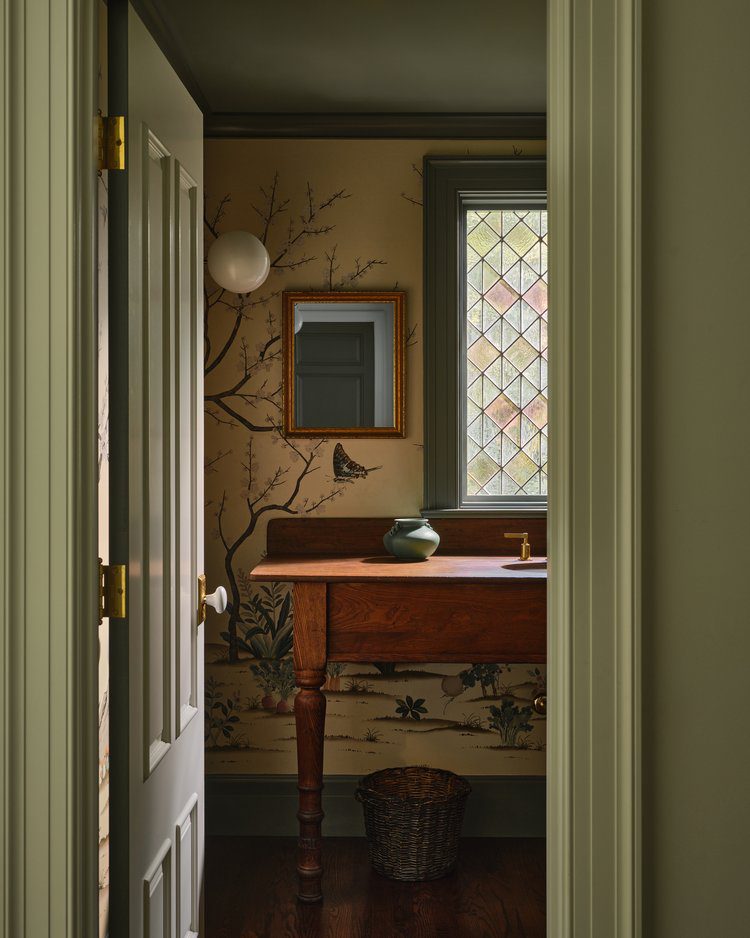
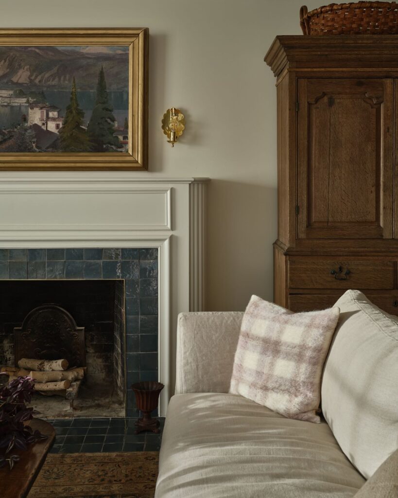
Tasked with reworking an entire main level floor plan, Lisa Staton and her team took incredible care embarking on this 1920s Colonial renovation. Stylistically, they drew inspiration from English country homes, hence the project name “A Bit Brit.” What makes this home feel particularly appropriate for fall is its secondary spaces, like the dining room. Color-drenched in Farrow and Ball’s Hague Blue, the room sets the tones for cozy, intimate gatherings all season long.
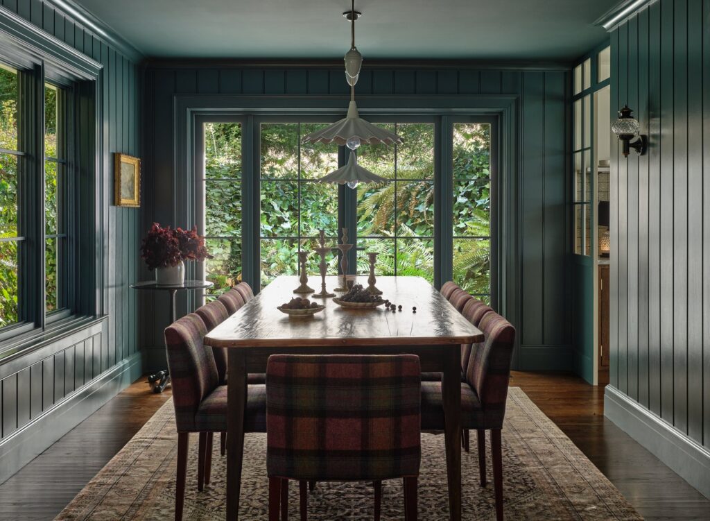
Photography by Michael Clifford
Project Fox Island
Designer: Heidi Caillier
Notable Features: Rich Jewel Tones, Plaid Textiles, Hints of Drama
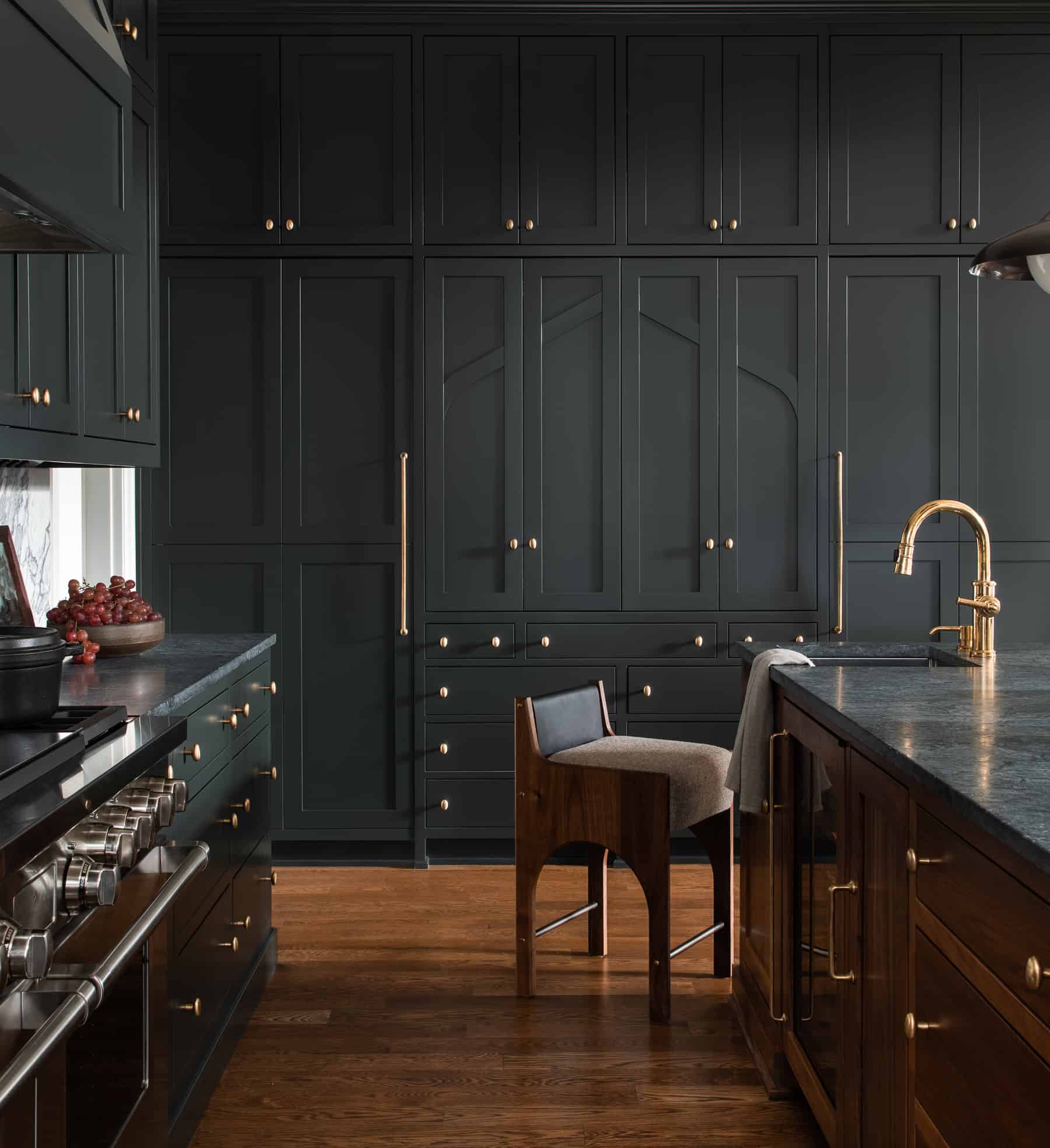
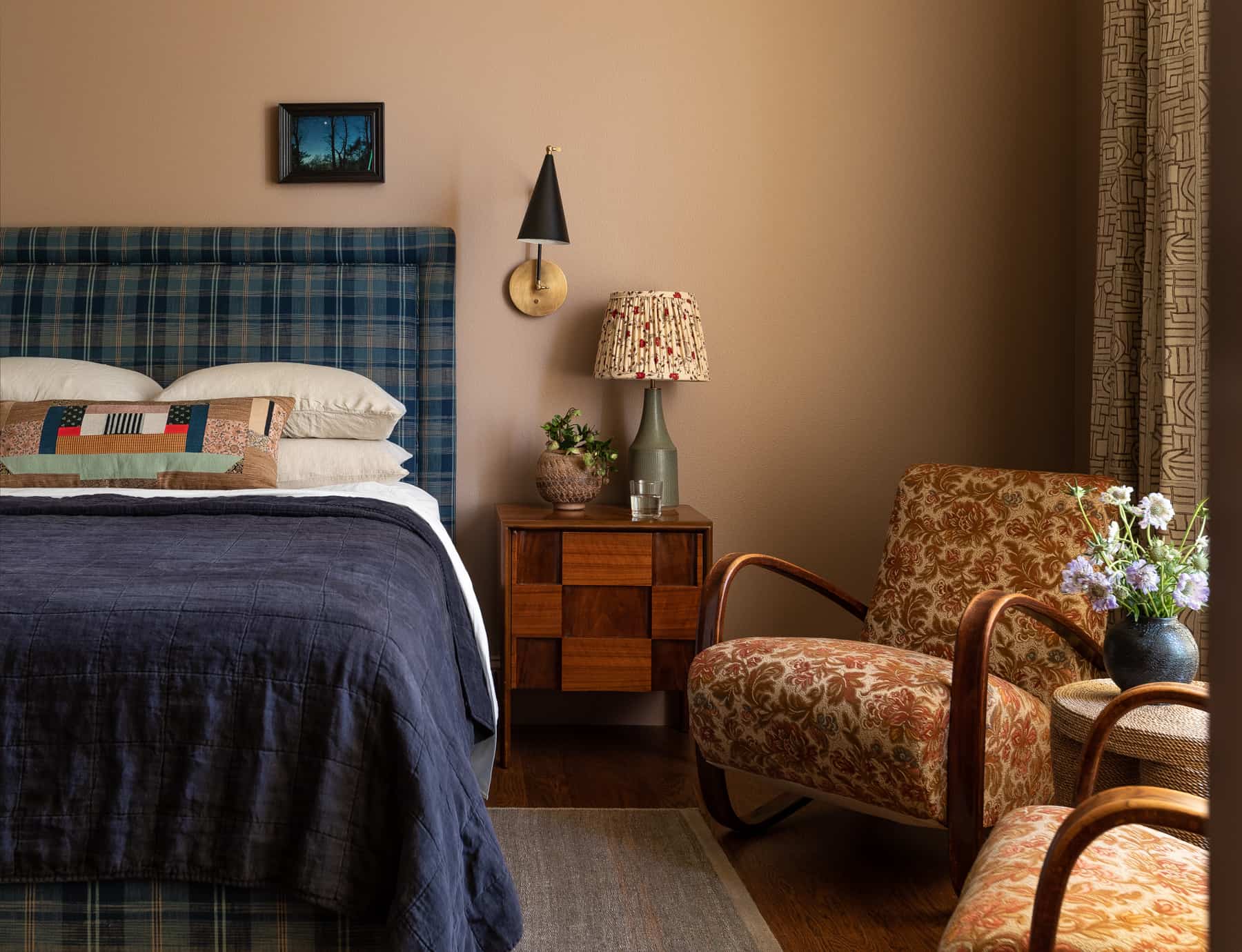
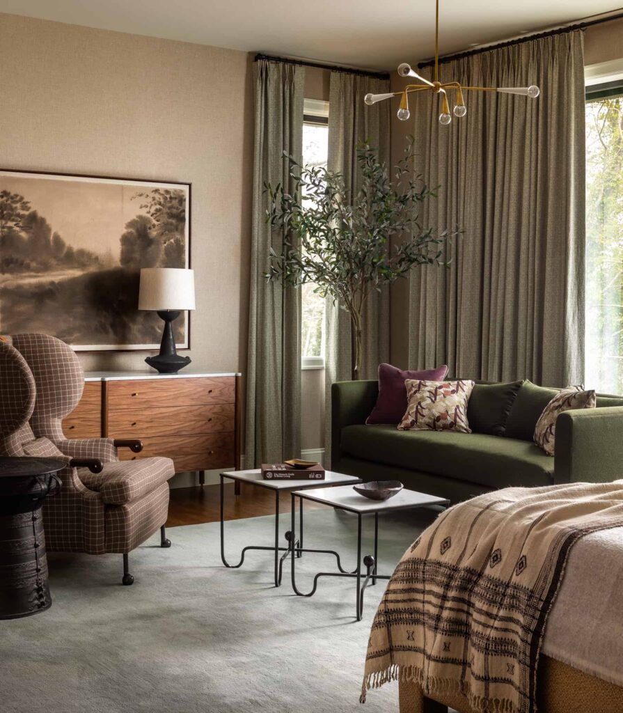
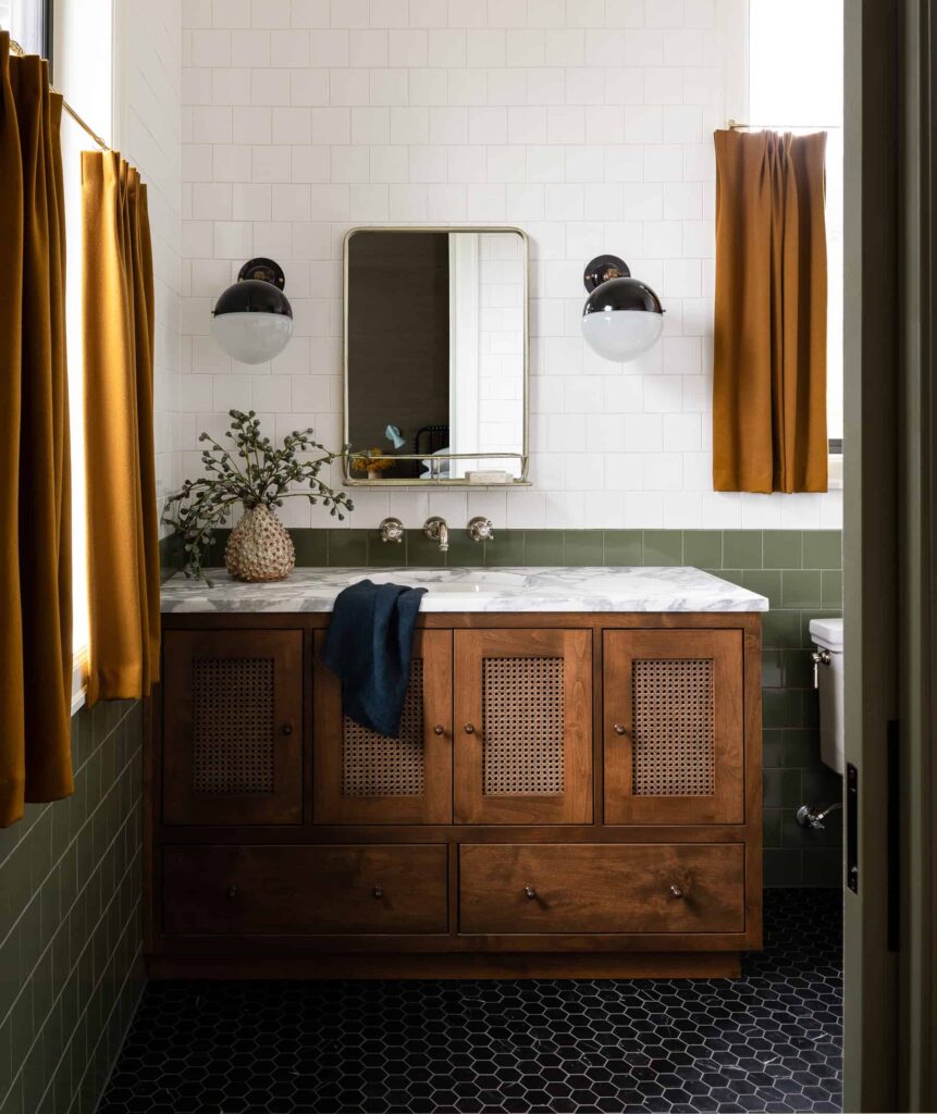
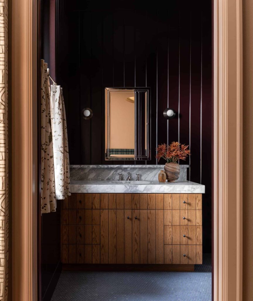
The Heidi Caillier aesthetic is synonymous with layers of pattern drenching and warmth. As is the case with her Fox Island project, this home effortlessly mixes plaids with florals and jewel tones with earthy neutrals. The result is a cozy, inviting space that feels like a warm hug. Vintage furnishings, rich textiles, and original artwork add to the lived-in charm, making it the kind of place where you want to curl up and stay awhile.
Photography by Haris Kenjar
Project West End
Designer: Heidi Lachapelle
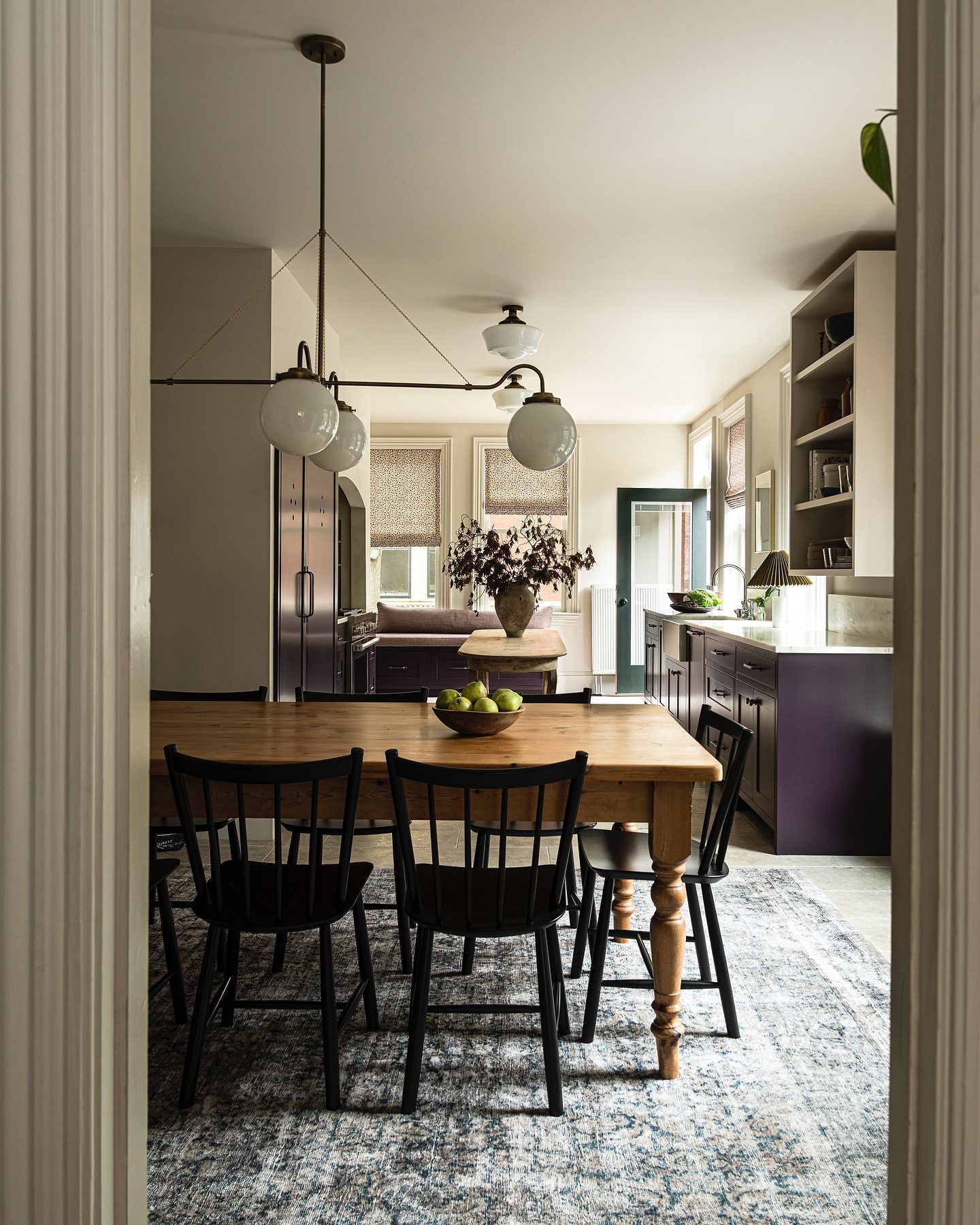
Notable Features: Plum Cabinetry, Glazed Tile Backsplash, Mixed Metals
A Heidi Lachapelle home is all about balance. Think modern but warm, luxe yet understated. In the studio’s recently revealed West End project, those design principles are put into practice with a kitchen renovation that commands attention with a quiet confidence. Its fall design features revolve around a fearless use of color, like the deep, drama-inducing plum cabinetry. Paired with stone countertops and floral roman shades, the space exudes a stunning richness that instantly feels like home.
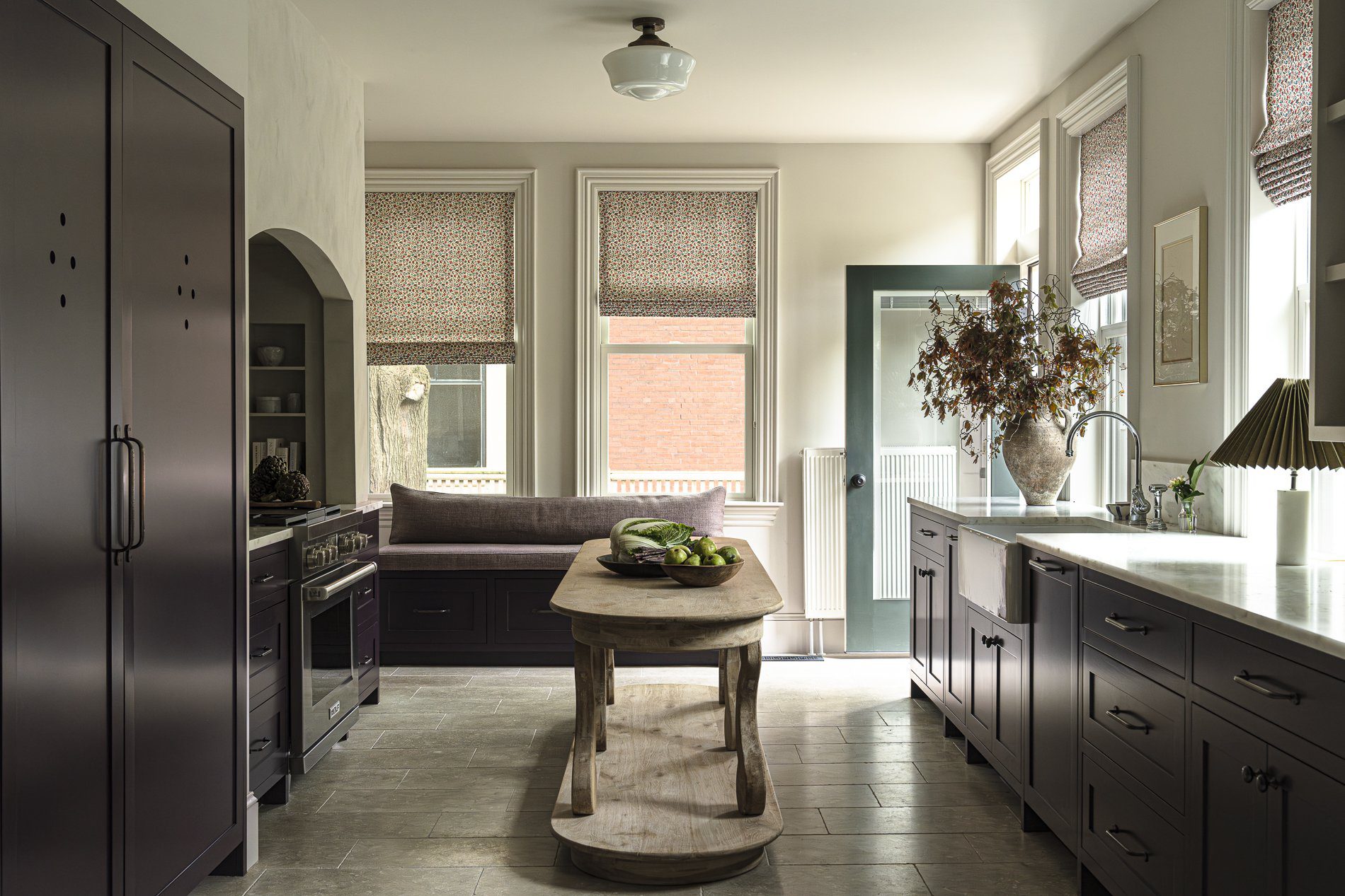
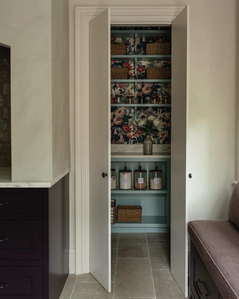
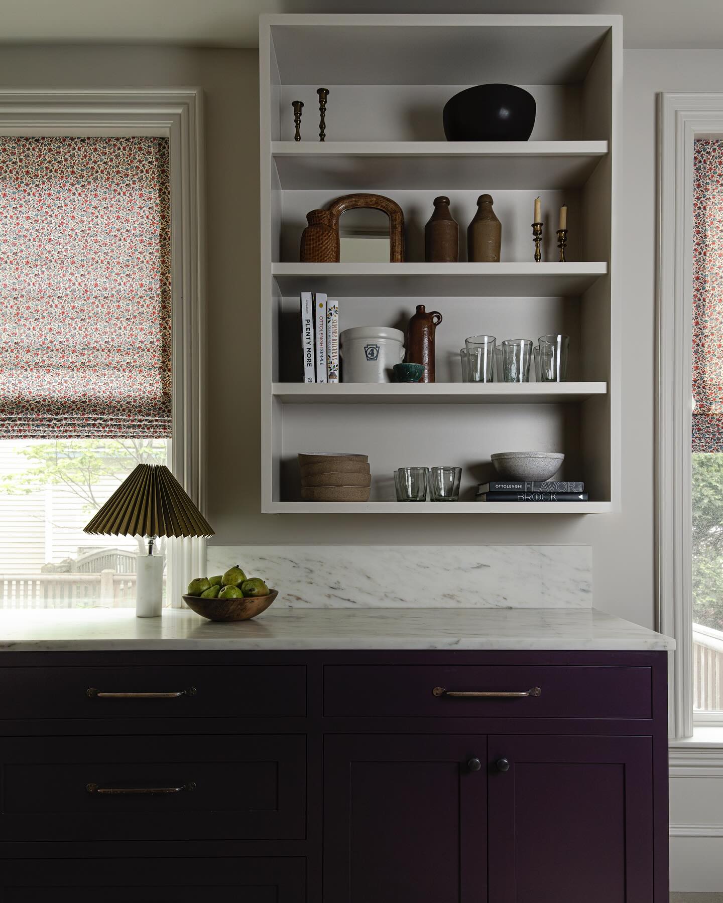
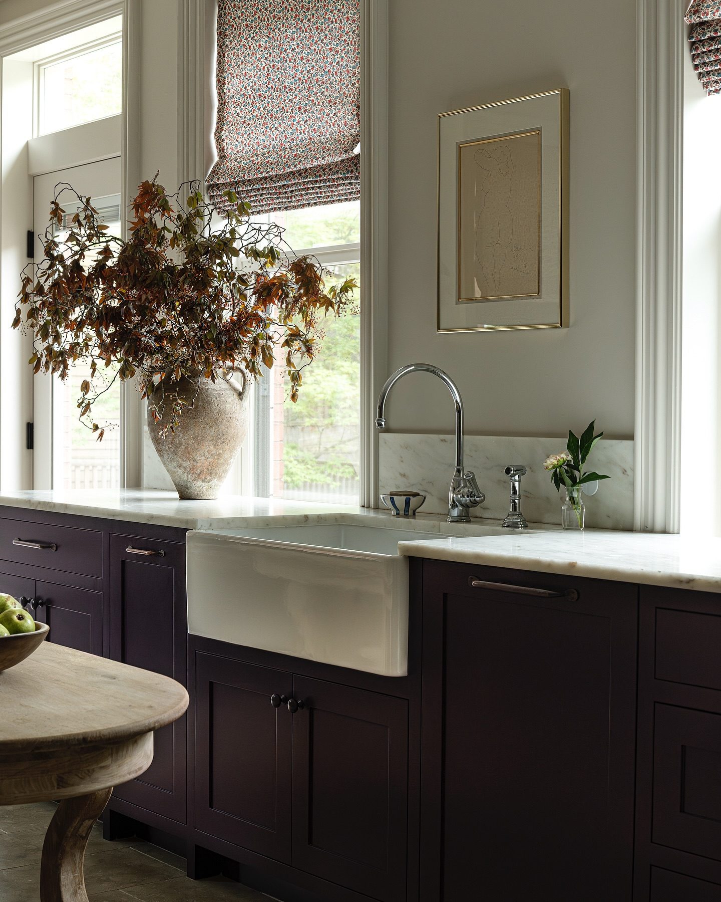
Photography by Ari Kellerman
Project Sun Valley Ski House
Designer: Yond Interiors
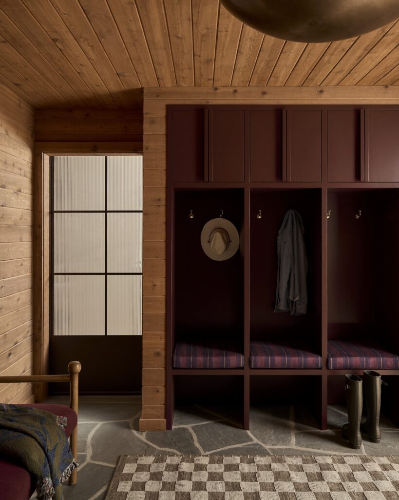
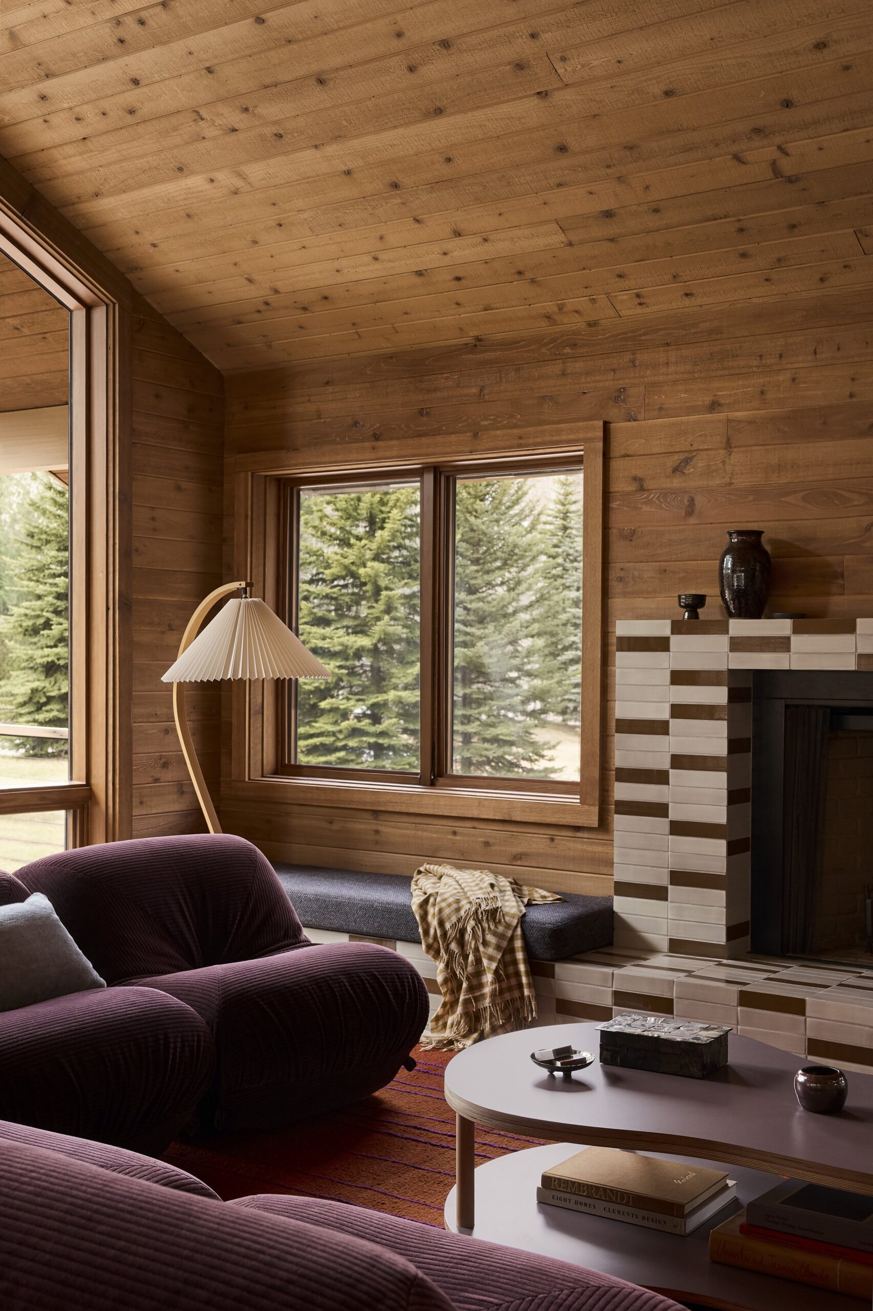
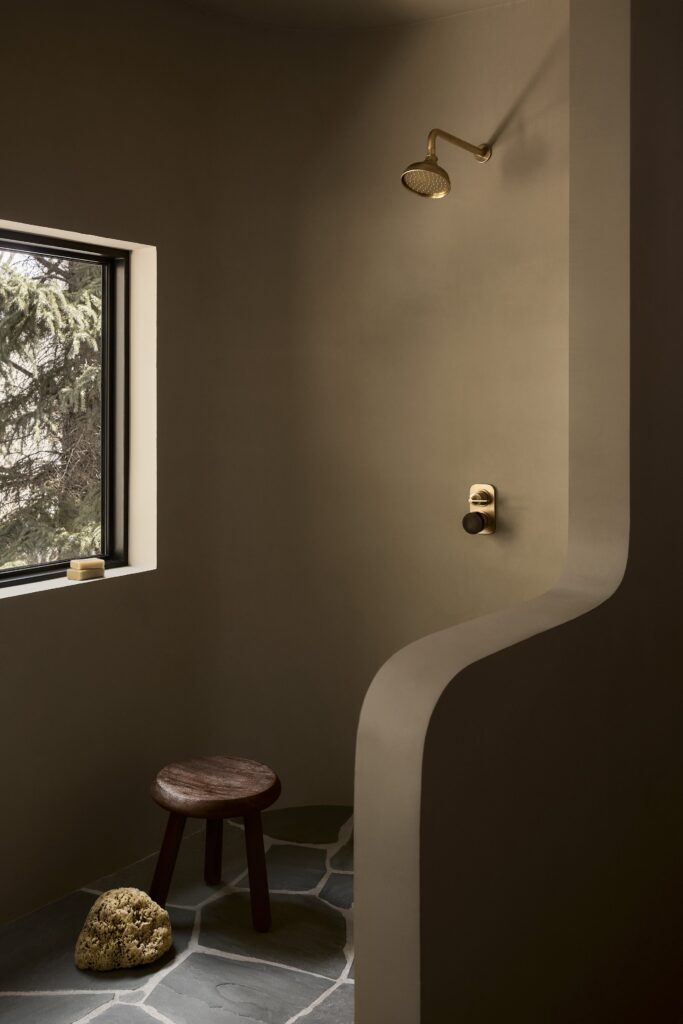
Notable Features: Warm Wood Tones, Rich Textures, Nature-Driven Palette
Nearly any project with Yond Interiors at the helm could earn a spot on this list. The studio excels at creating environments with a cocoon-like feeling, and The Sun Valley Ski House is a prime example of that signature warmth. Rich, earthy tones play alongside plush textiles while layered patterns add depth and comfort. The design seamlessly integrates natural elements and feels both grounded and indulgent—ideal for cozy nights by the fire.
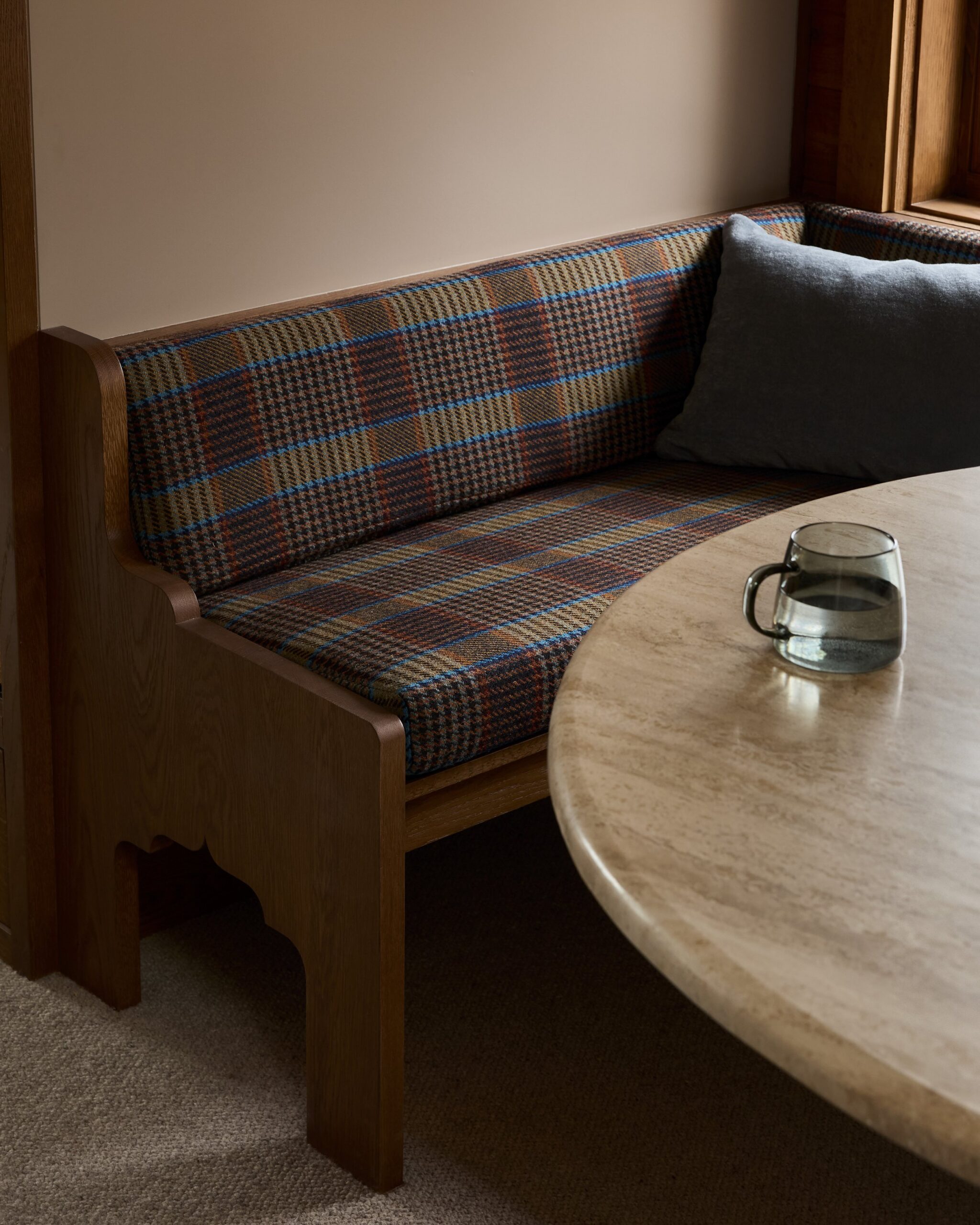
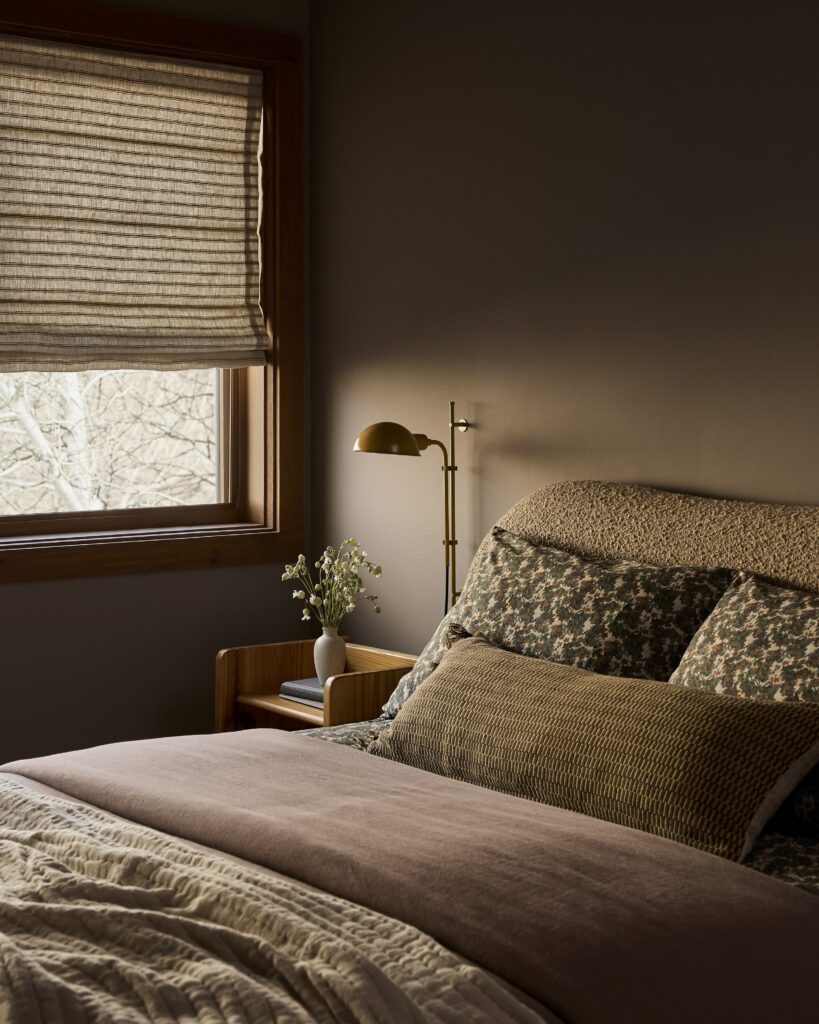
Photography by Malissa Mabey
BY: Stephanie Weers

