Shop


A 1920s Edwardian Rowhouse Designed for Modern Family Life
Angela Scaletta of Angela Grace Design updated this 1920s San Francisco rowhouse with a light touch, preserving its historic character while reworking the layout for a family of five. Along the way, historic details were thoughtfully preserved while key spaces—especially the kitchen—were reshaped for modern family life.
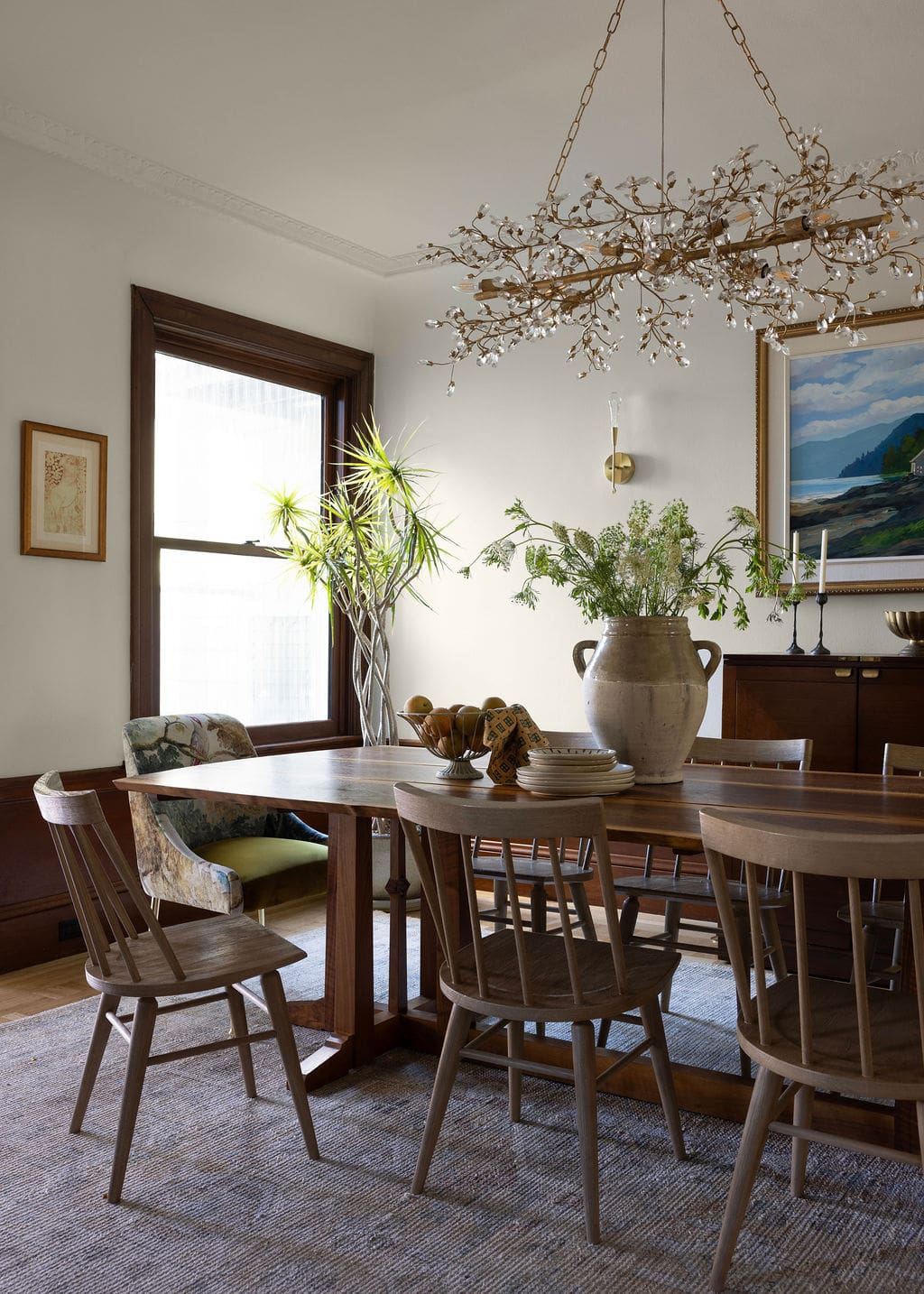
In San Francisco’s Outer Richmond neighborhood, this 1920s Edwardian rowhouse already had the architectural charm its owners loved. But for a young family with three daughters, the home needed thoughtful updates to better support daily life. The homeowners turned to Angela Scaletta of Angela Grace Design to help modernize the layout, particularly the kitchen, while carefully preserving the historic details that define the house.
Throughout the renovation, the team matched original millwork profiles, incorporated period-inspired tile and hardware, and introduced subtle updates that make the home more open, functional, and comfortable for a growing family. Ahead, we’re touring the reworked kitchen, the light-filled sunroom overlooking the backyard, the newly imagined primary suite, and the bedrooms designed with the couple’s three daughters in mind.
Design + Styling: Angela Grace Design | Photography: Jessica Brydson
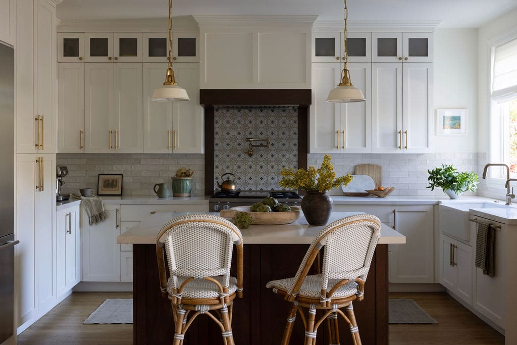
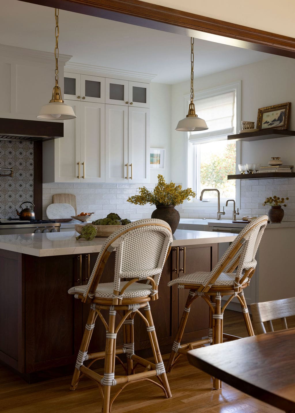
A Kitchen Reworked for Everyday Family Life
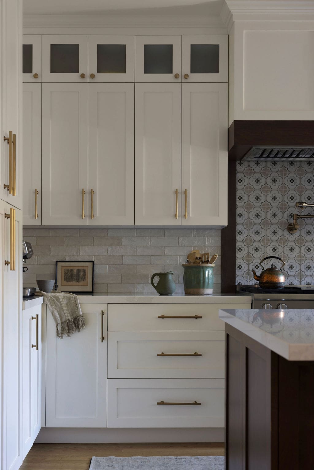
Reworking the kitchen was one of the most significant moves in the renovation. The layout was carefully adjusted to improve circulation and make the space work better for everyday family life, but the goal wasn’t to strip away the home’s character in the process. Instead, Angela looked for ways to layer in modern functionality while preserving the warmth of the original architecture. A deeply stained walnut island anchors the room and adds depth, while open shelving and statement pendants keep the space feeling relaxed and inviting. Updated appliances round things out, bringing the kitchen quietly into the present without disrupting the home’s historic rhythm.
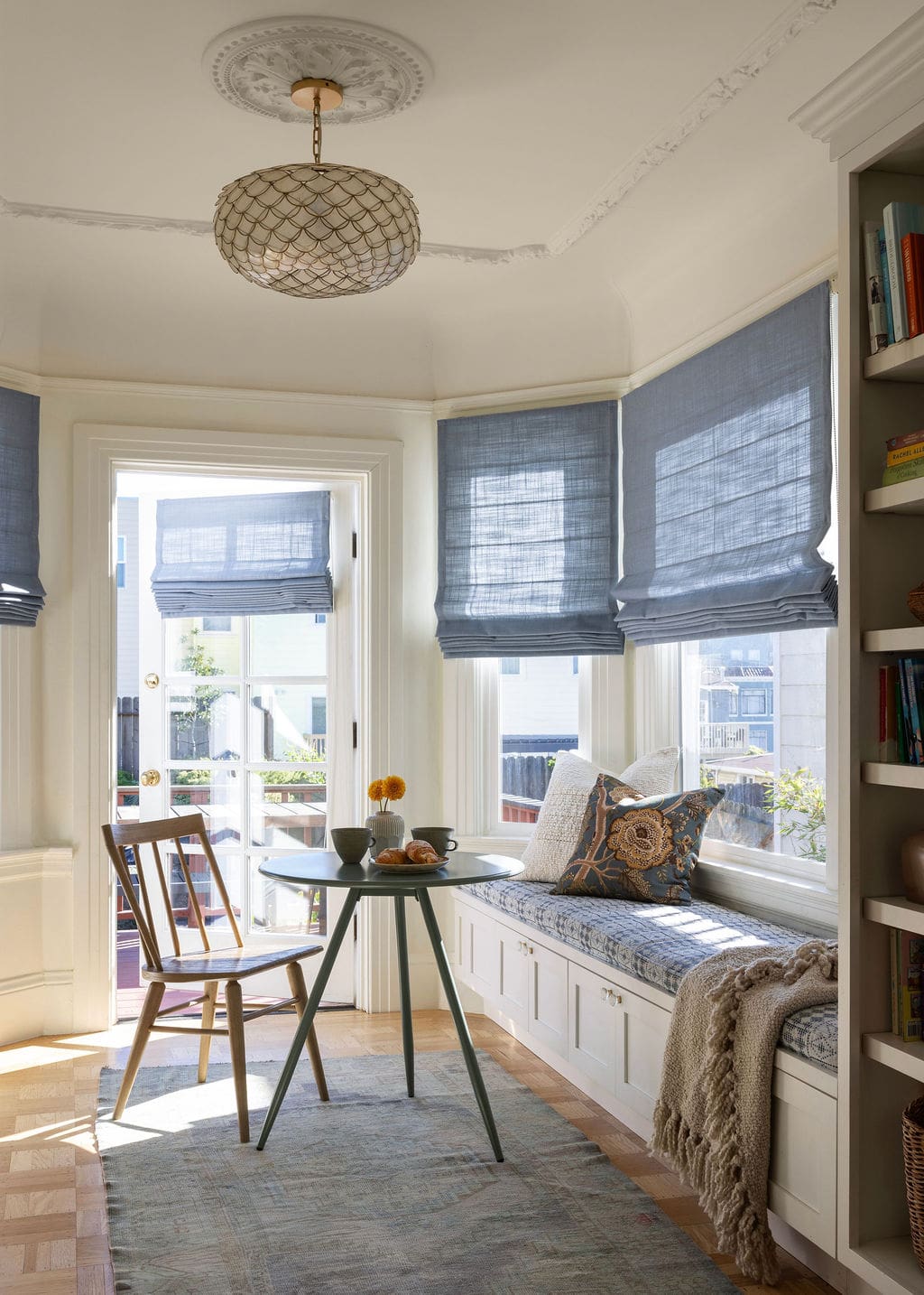
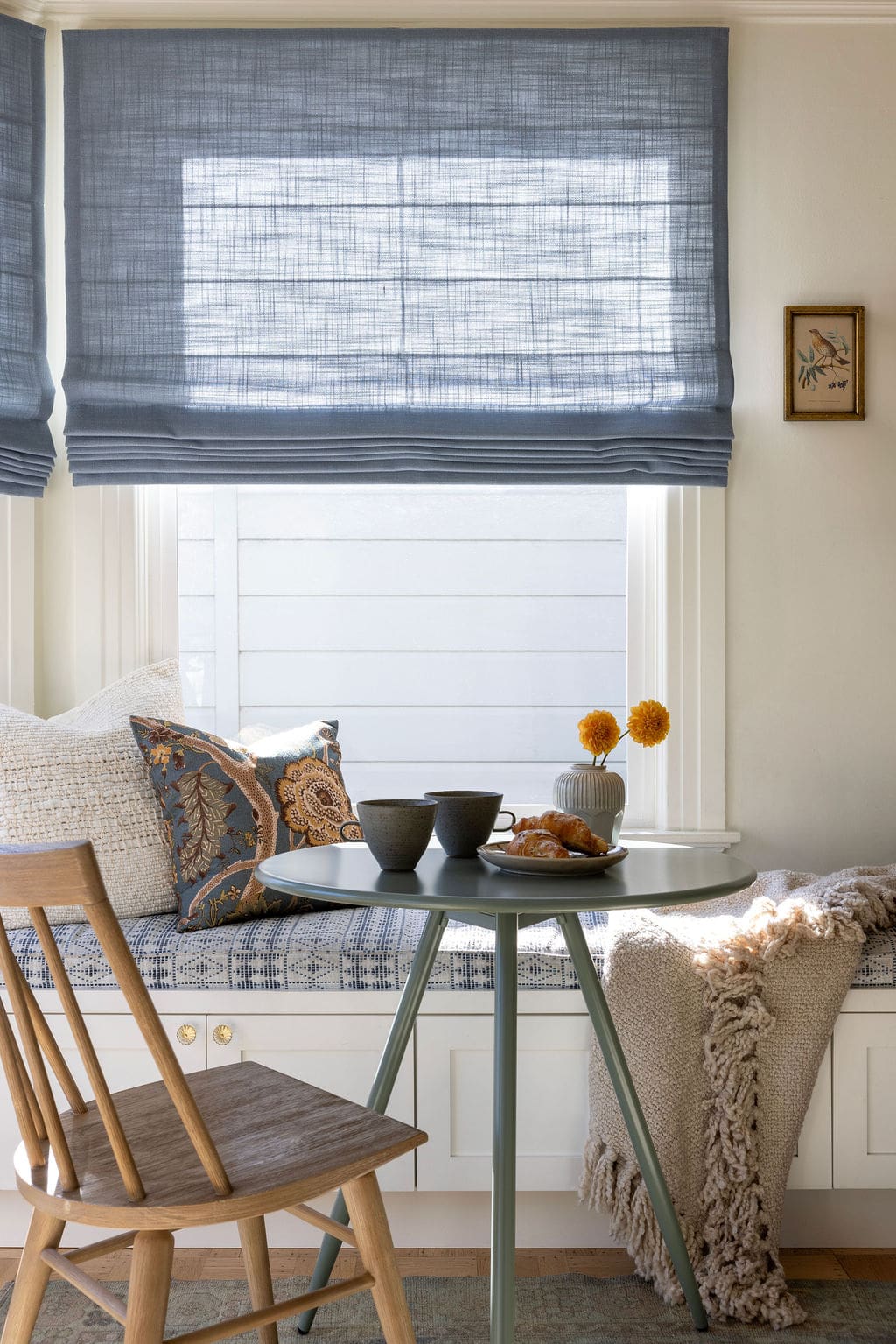
A Sunroom That Opens to the Backyard
Few things feel more special in San Francisco than a room that looks out onto a backyard, and this home’s sunroom makes the most of that connection. Positioned to capture natural light throughout the day, the space was designed to feel easy rather than overly formal. Angela added custom window treatments and a built-in bench cushion along the windows, turning the room into a delightful place to sit, read, or gather with family.
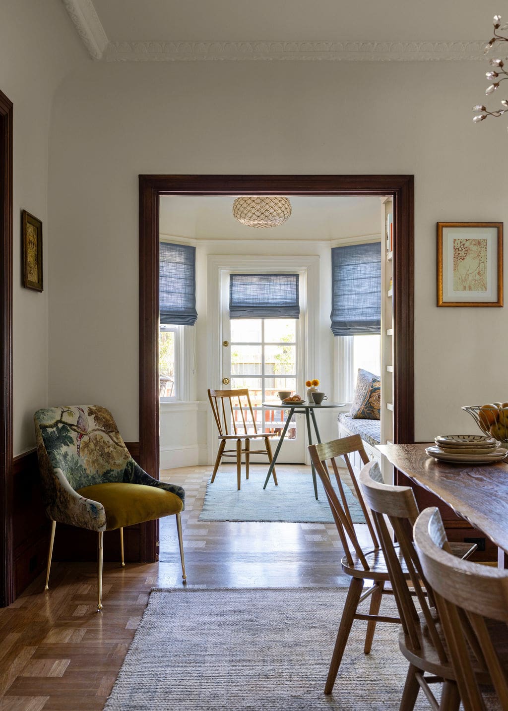
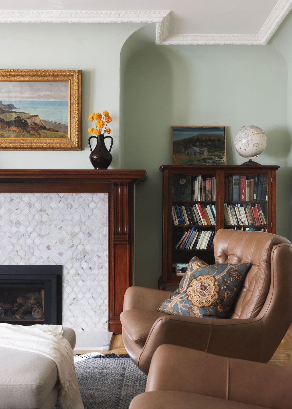
A consistent backdrop of Benjamin Moore’s White Dove runs throughout the home, allowing historic details and material choices to stand out without competing with them.
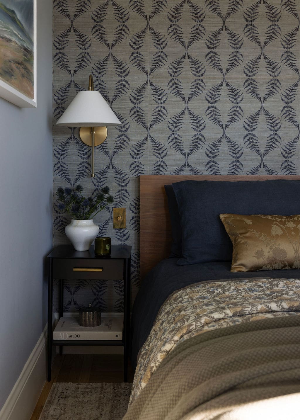
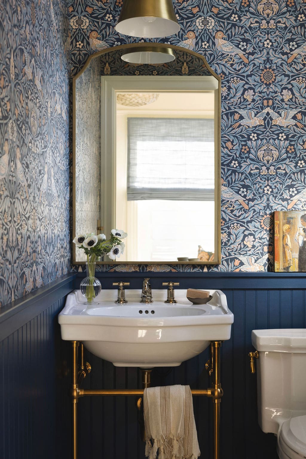
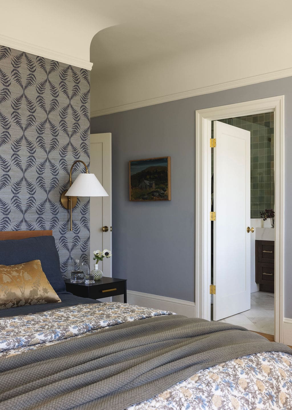
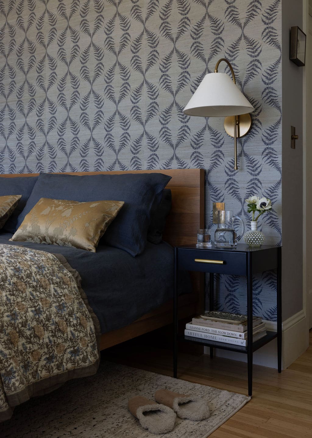
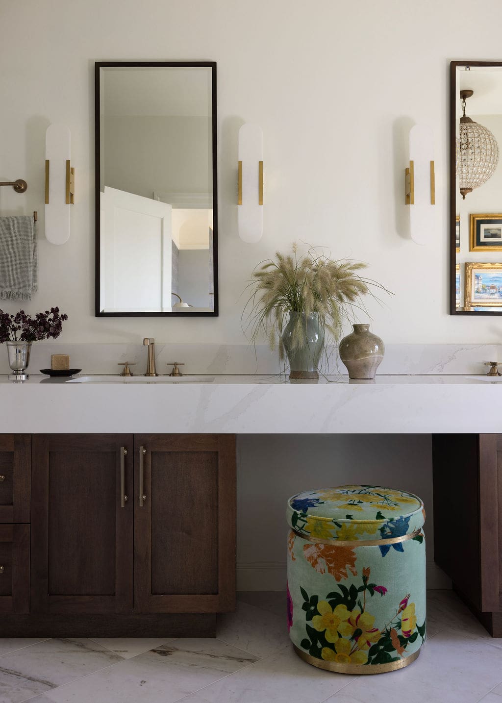
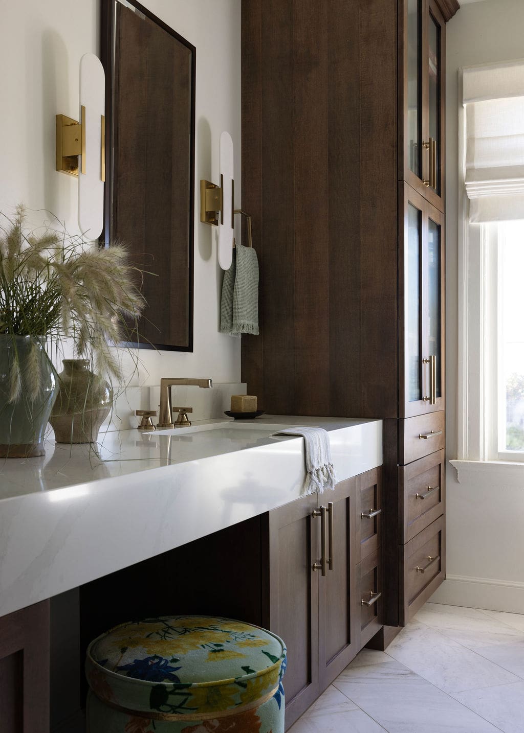
A Calm and Textural Primary Suite
A quieter palette and layered textures help define the primary suite, which was reimagined as a place to unwind at the end of the day. Grasscloth wallpaper by Serena & Lily in the bedroom introduces a subtle dimension, while the remaining walls are finished in Blue Springs (a soft blue-gray) by Benjamin Moore.
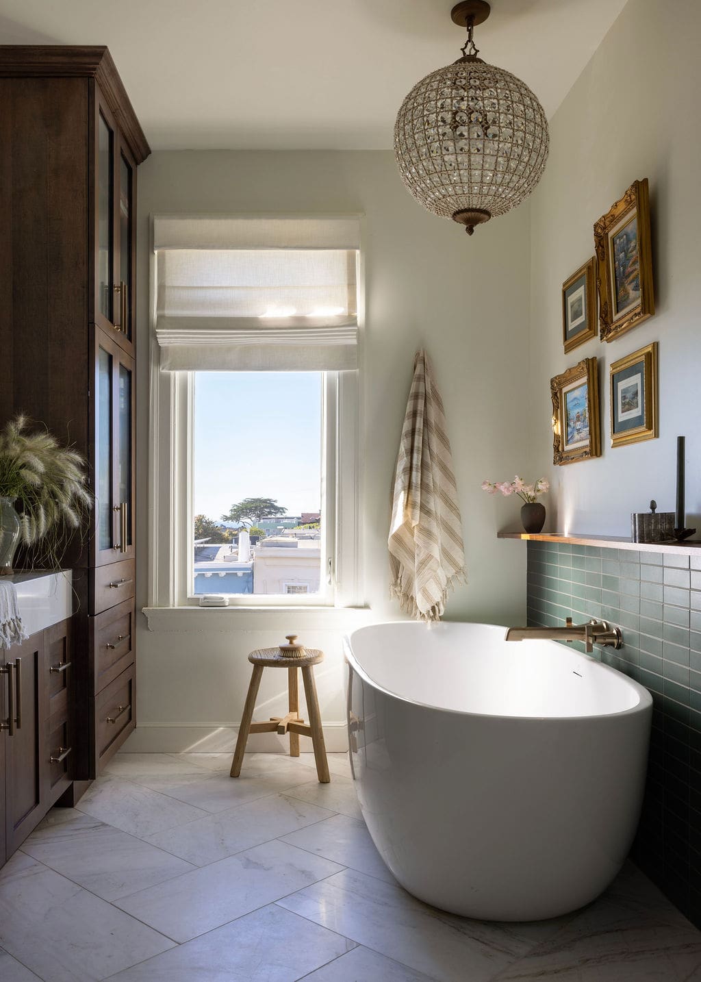
In the adjoining bathroom, a full renovation brought in Heath Ceramics tile, a long custom vanity, and warm walnut cabinetry. Together, the materials create a space that feels grounded and cohesive with the rest of the home. The soaking tub adds one more moment of calm to the daily routine.
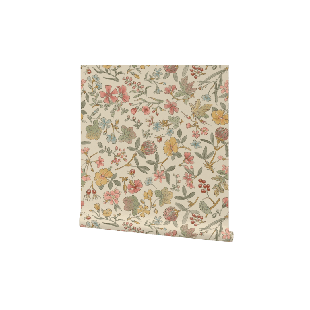
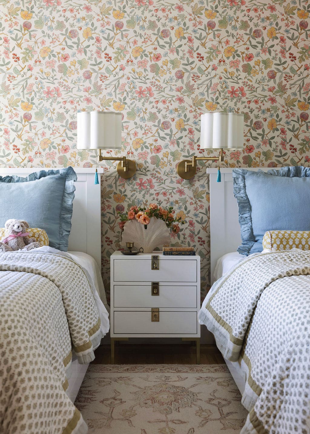
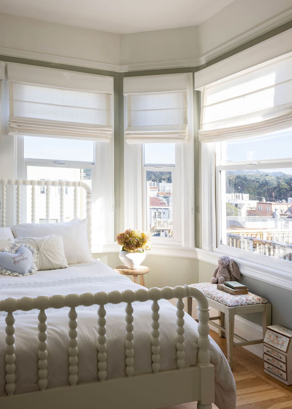
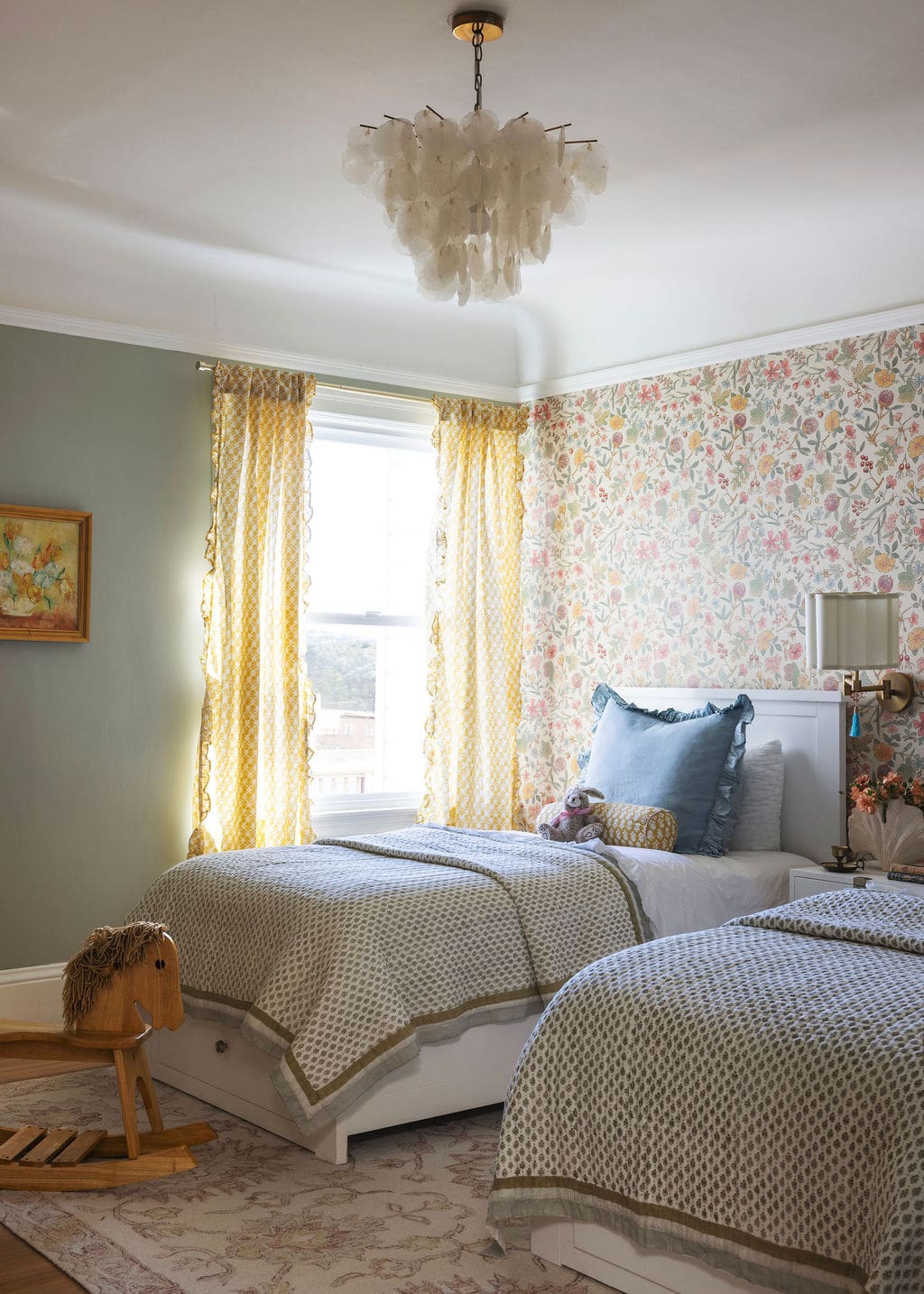
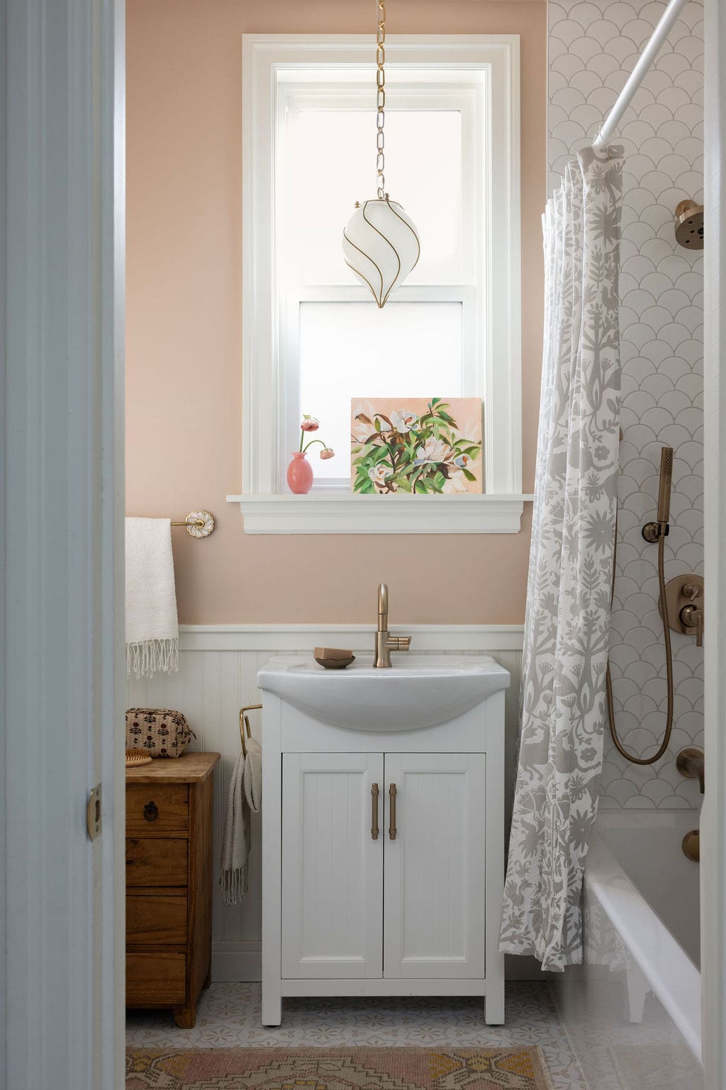
Bedrooms Designed for Three Growing Sisters
Designing bedrooms for children often means striking a balance between personality and longevity. Angela approached the homeowners’ three daughters’ rooms with that exact goal in mind. Wallpaper and charming bedside sconces bring a sense of playfulness, but the overall design remains simple enough to grow with them over time. The shared bathroom keeps the layout practical, while the individual rooms still feel really personal. It’s a thoughtful approach that allows the spaces to evolve naturally as the girls get older.
Scroll on to see more from this home and shop the look below.
BY: Daniela Araya
Shop