The Ranch Style Renovation With a Checkerboard Range
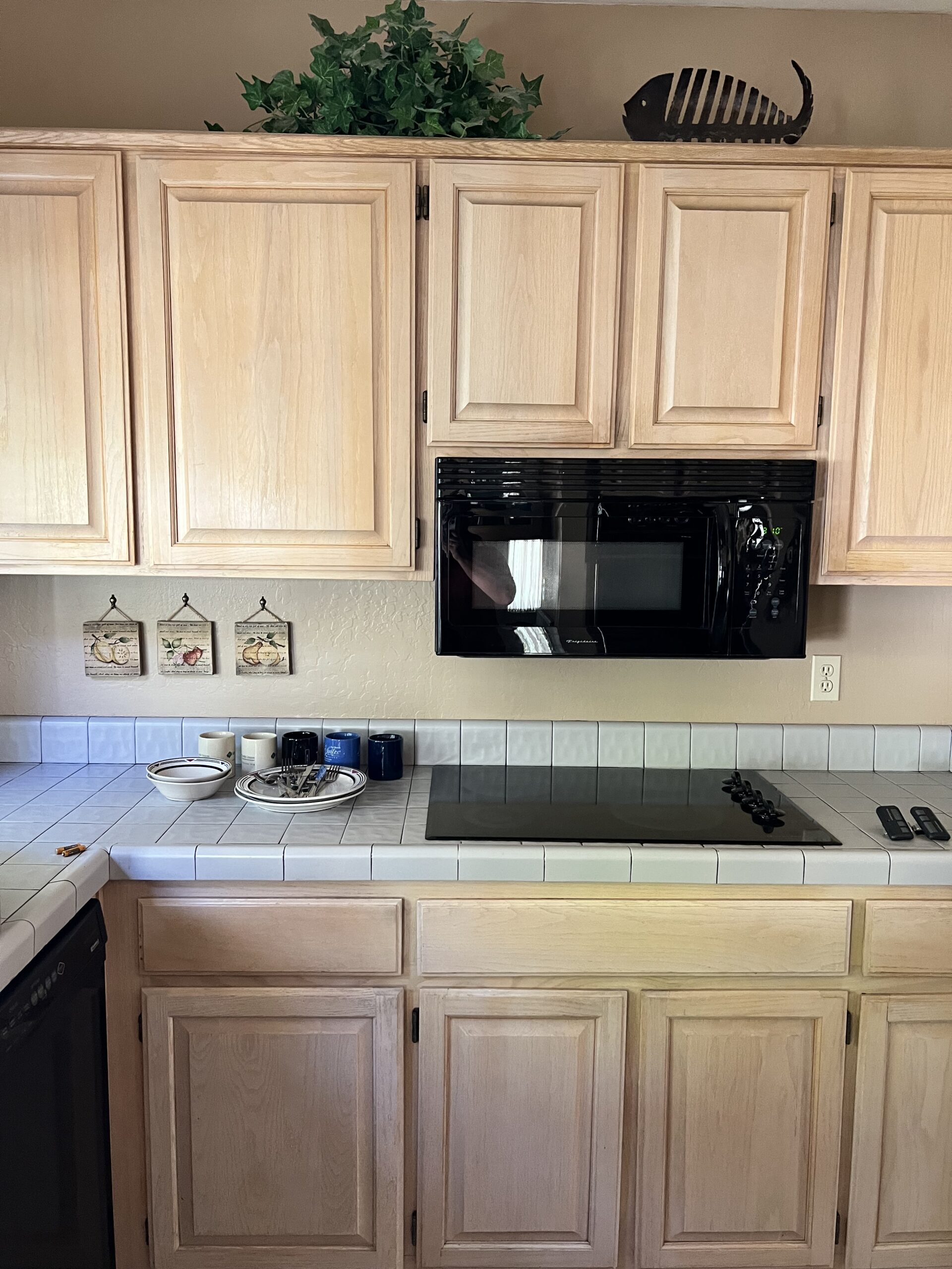
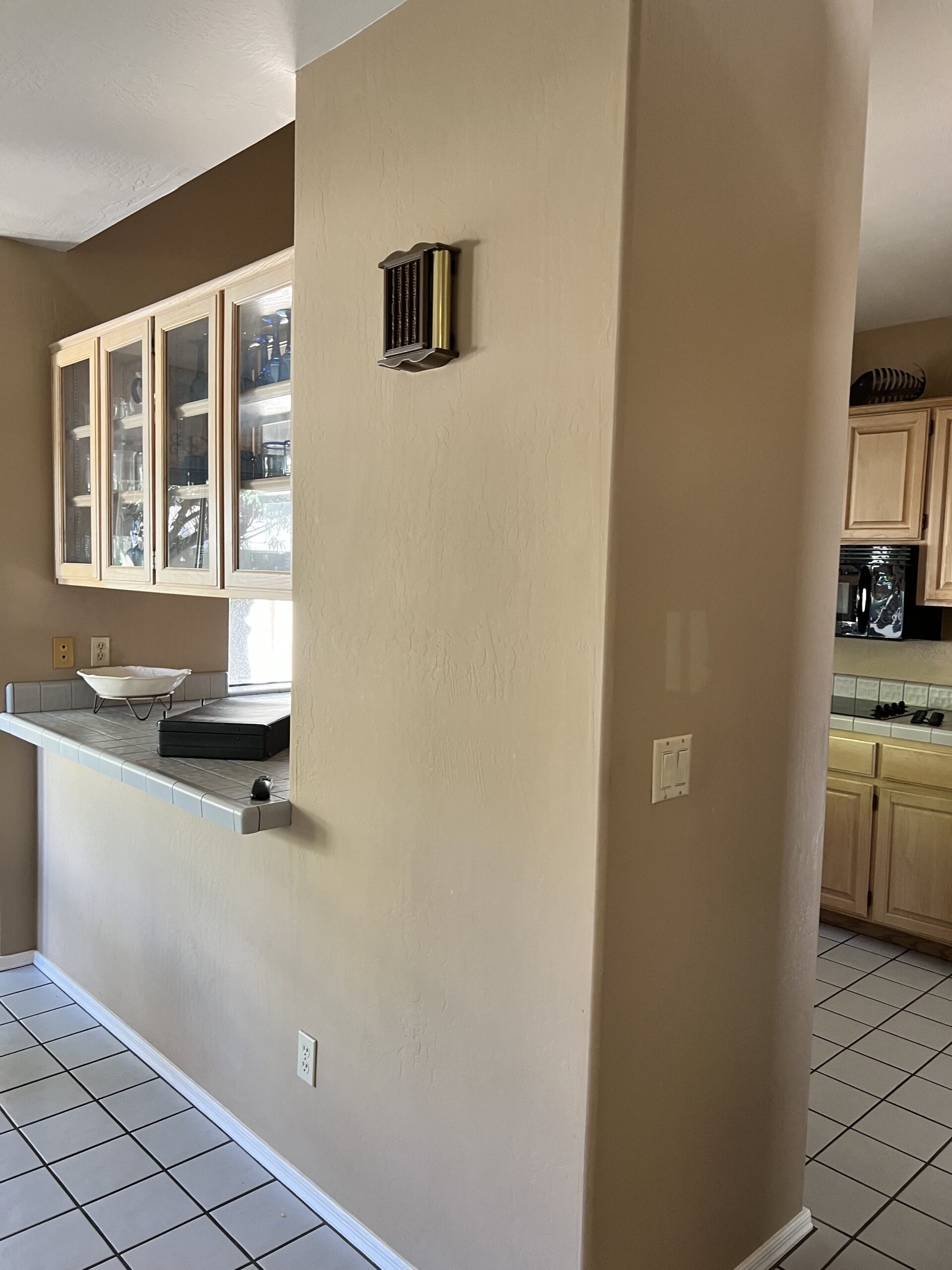
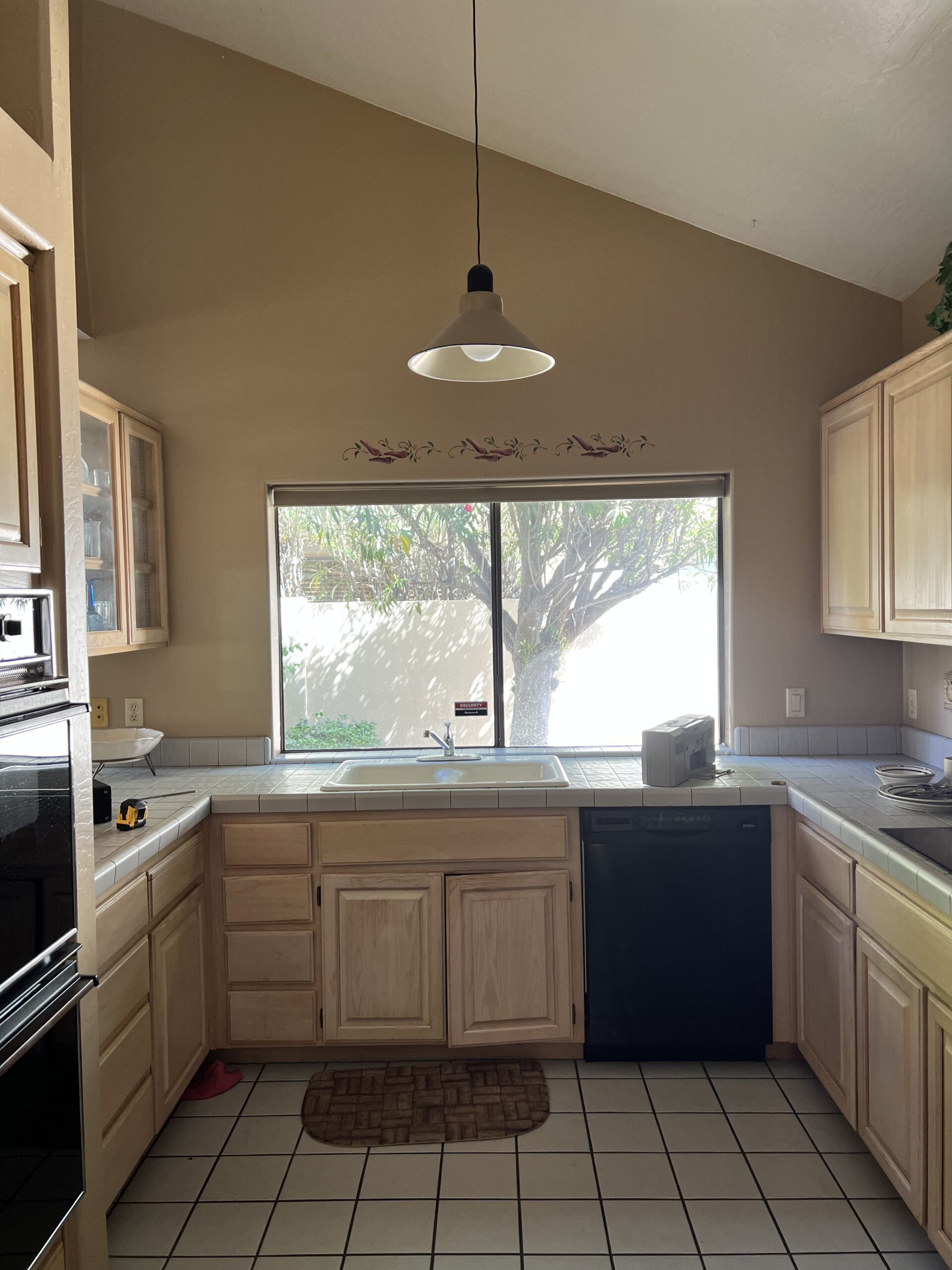
When designer Brittany Krupnik first saw this 1984 ranch-style home in the spring of 2023, the kitchen footprint was small and begging for a refresh. The goal was to create a beautiful space that felt equal parts playful and timeless, and because they needed more room to expand with the original kitchen, she decided to rip out the entire area from the get-go.
As with many kitchens built in the 80s, the original kitchen layout included a wall dividing the space from the rest of the home, which meant less functional square footage for the new homeowners. Brittany decided to rip out the original cabinetry and range wall from the get-go, creating a more open-concept space and breathing new life into the design.
Design: Brittany Krupnik | Photography: Elizabeth Lawlor Photography
The Playful Material Palette
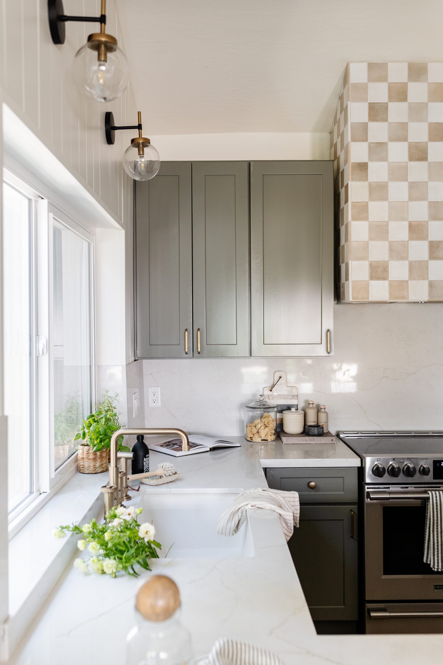
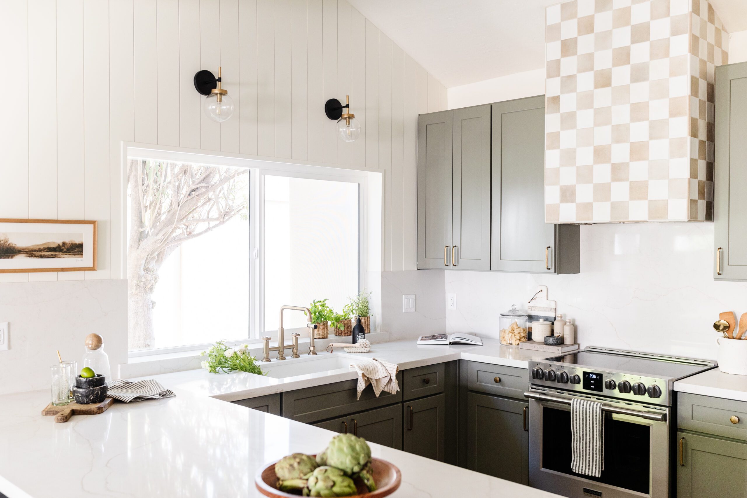
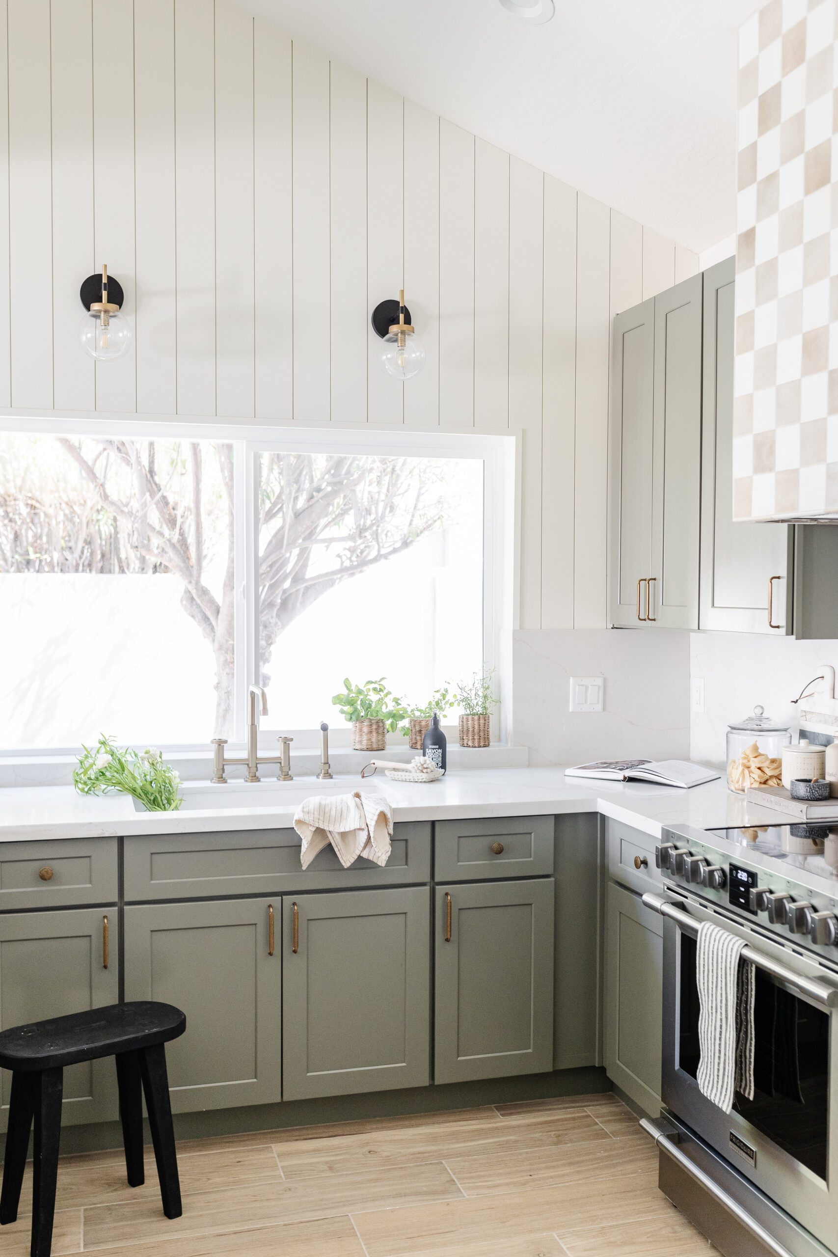
While material options are always top-of-mind when designing or remodeling a space from scratch, this project is a perfect example of how their use case can be just as important. It’s not every day that you see a patterned range hood, and we love how Brittany arranged the white and tan tiles to create a fun checkerboard moment.
While the hood serves as a focal point for the main living space, the subtle green cabinetry brings a calming feeling to the palette. Brittany chose a lighter green-gray paint color for the cabinets — Link Gray by Sherwin Williams, to feel both timeless and fresh at the same time.
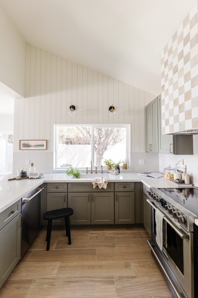
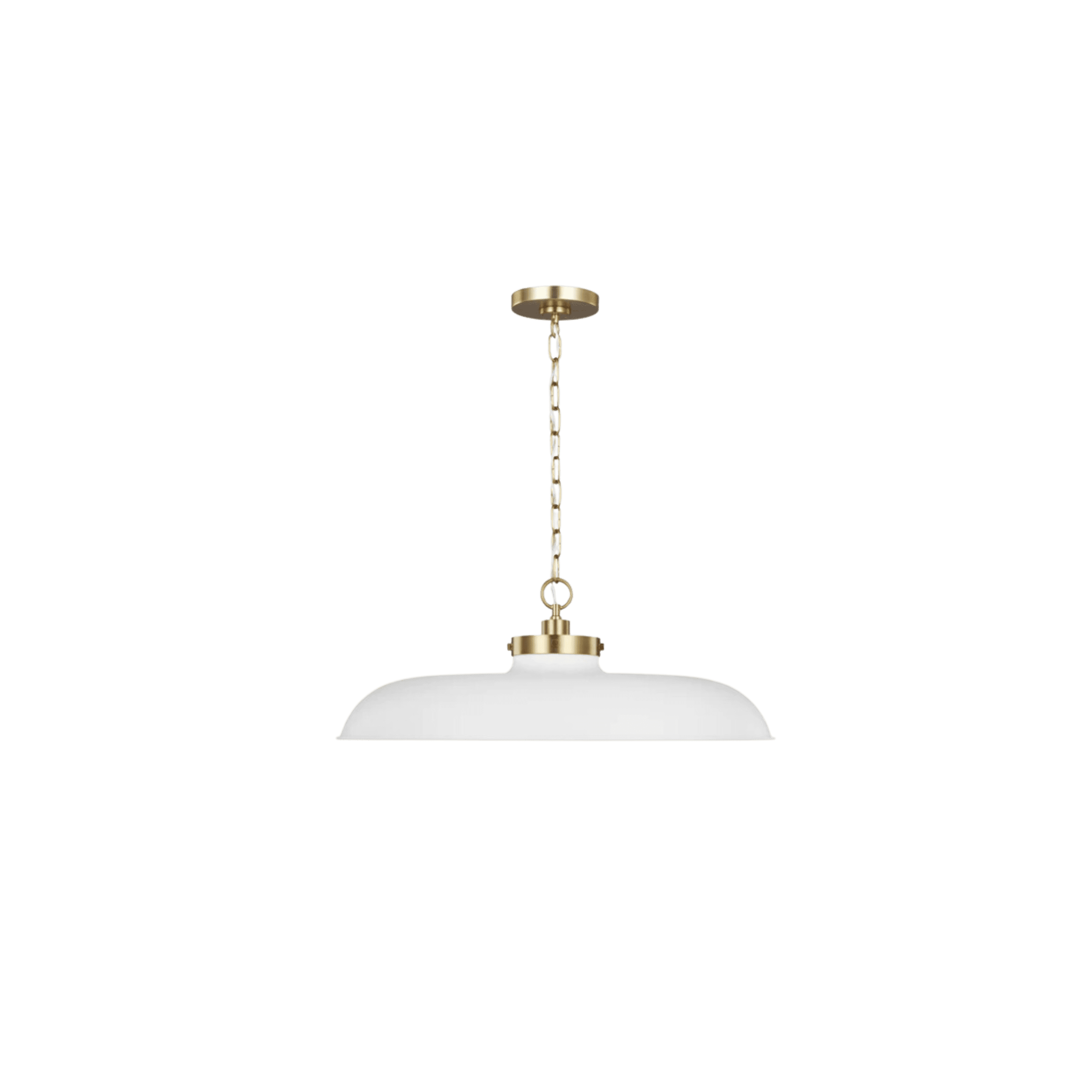
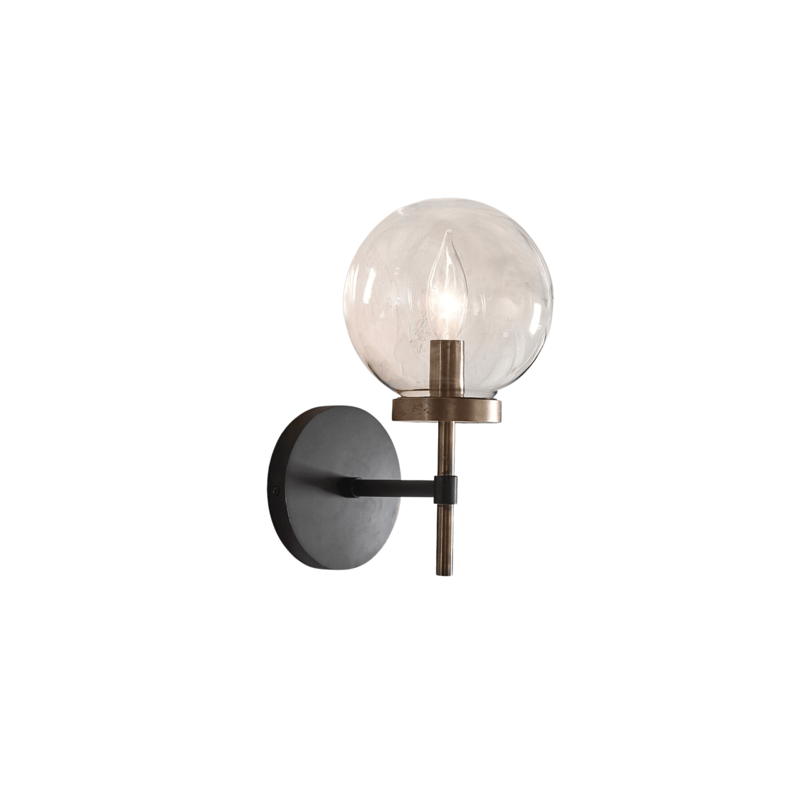
Shiplap from the top of the backsplash to the a-line ceiling creates a nice vertical line that draws the eye up and makes the space look more open and grand. Chic black & gold sconces frame the windows and add some charm and sophistication.
The Cozy Living Spaces
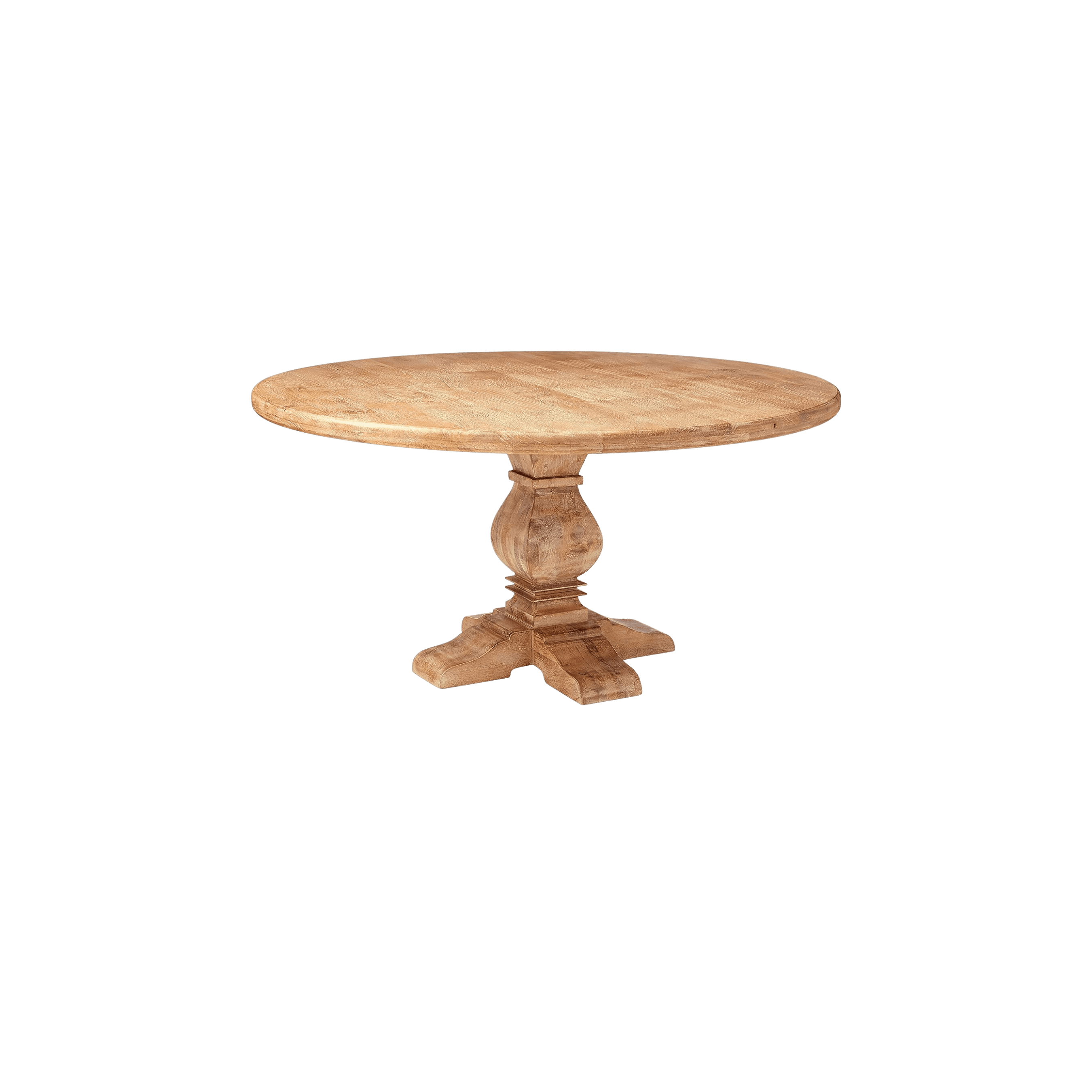
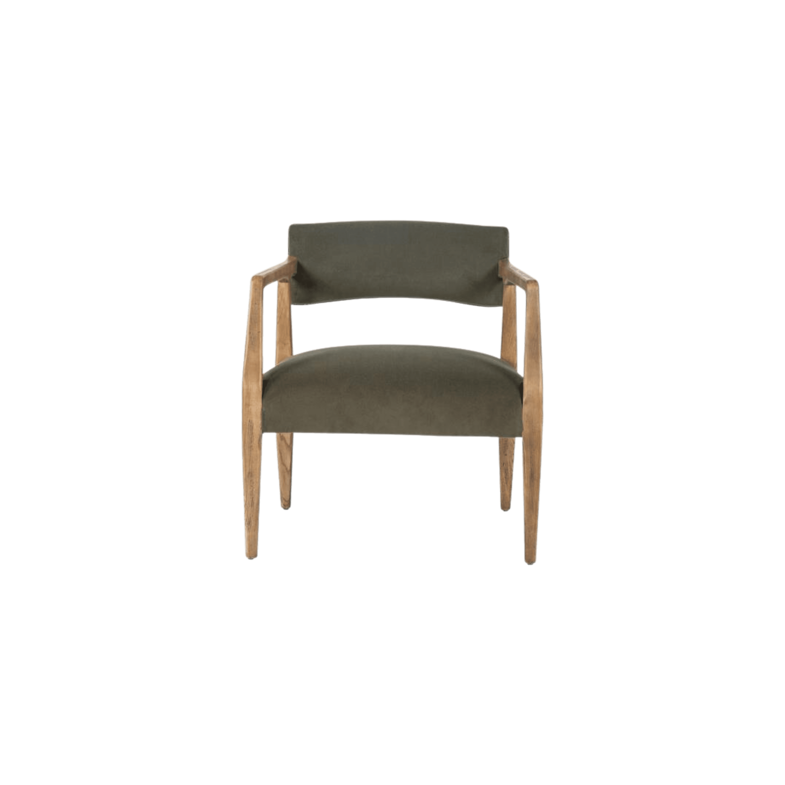
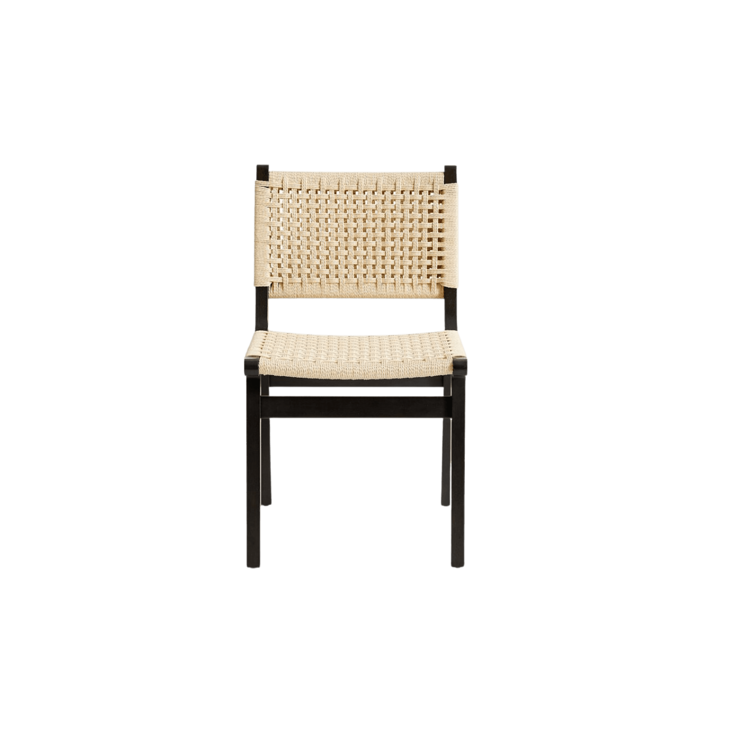
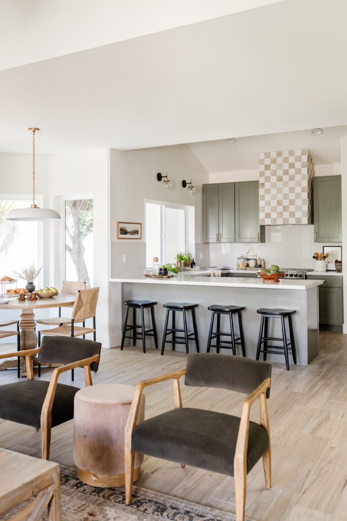
The kitchen opens up to a cozy living area and dining nook that flows together seamlessly and feels guest and hosting-ready. It’s always so satisfying to see a living space go from feeling stuffy and closed off to open and welcoming, and this remodel is no exception. With how naturally the areas interact, you’d never guess they weren’t always interconnected. A wooden round dining table and woven chairs nod to the hood-range tones, while green velvet living room chairs and a soft mauve ottoman compliment the earthy palette of the space.
If you’re anything like us and you love pouring over the before photos, be sure to scroll through the gallery and shop the look below!
BY: Jasmyne Muir
« Inside a Colorful Family Home Filled With Unexpected Tile >


