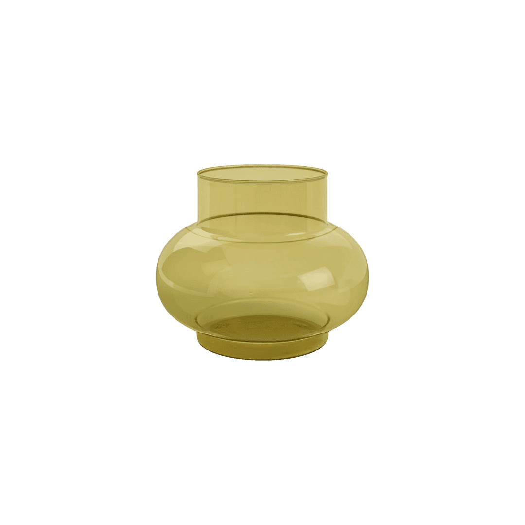
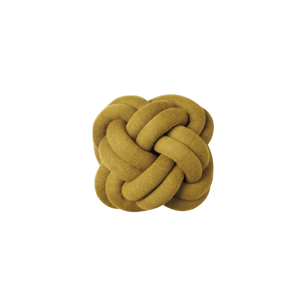
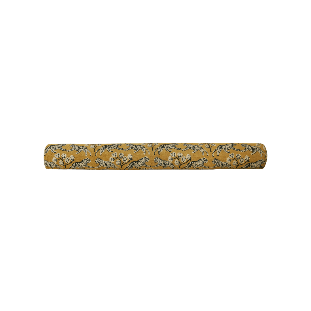
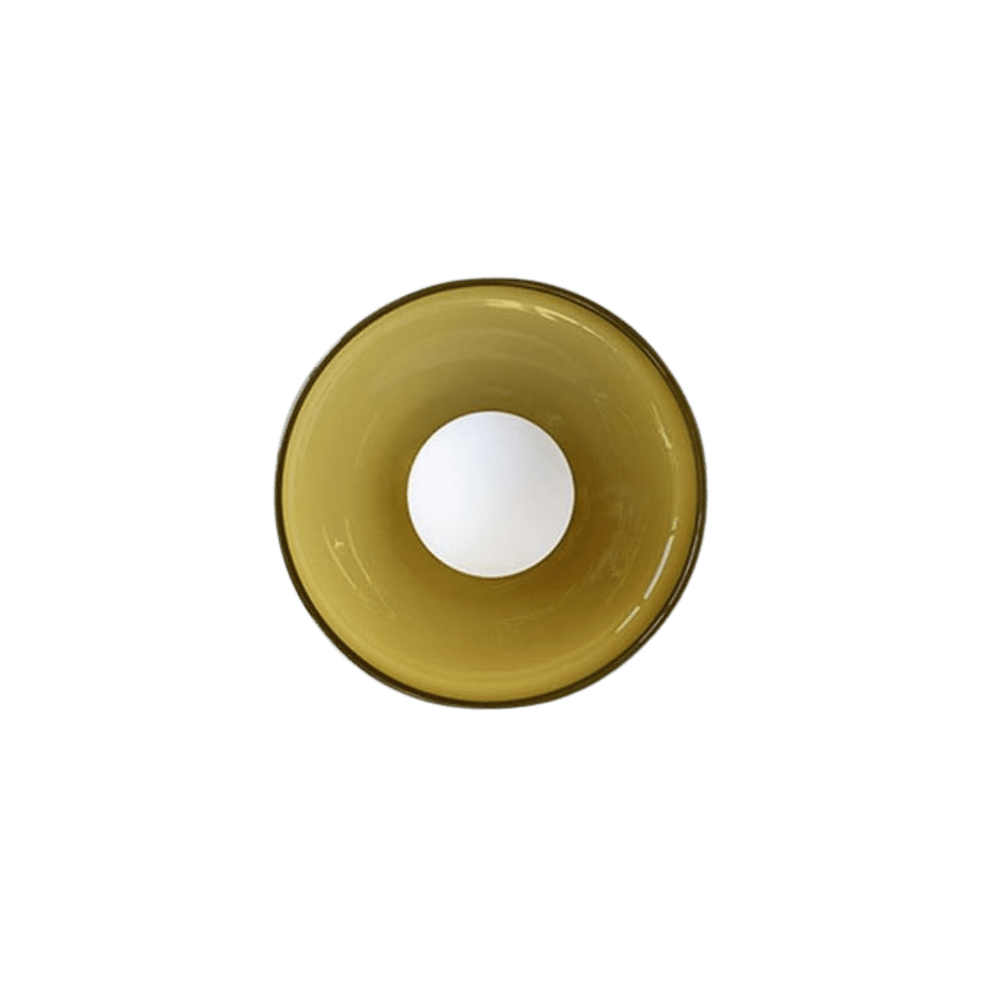
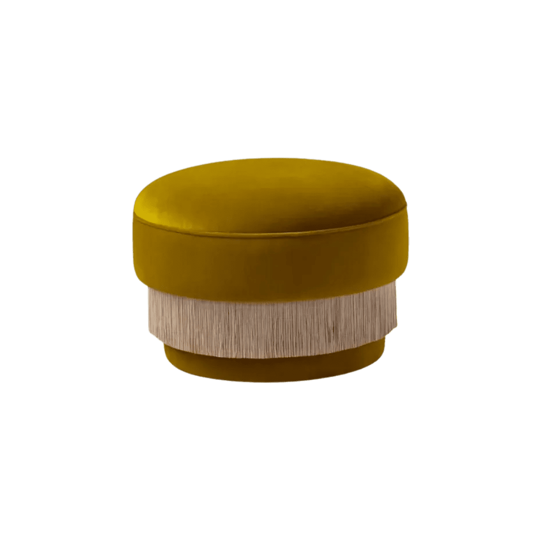
Shop


Olive Oil Yellow Is the Earthy Hue of Now
Mustard had its moment (and butter yellow, too), but designers are reaching for something with a little more depth. Olive oil yellow—a golden-green shade pulled straight from the bottle—is warm, earthy, and surprisingly versatile. Here’s why it’s the color to watch right now.
There’s a new shade stealing the spotlight, and it’s probably sitting in your pantry right now (spoiler: it’s not butter yellow). Olive oil yellow lives in that perfect in-between space—not quite green, not quite mustard, but a rich golden tone that feels both grounded and fresh. It’s less retro than avocado, less loud than chartreuse, and warmer than pistachio, which makes it very easy to use.
Part of its appeal is that it acts like a neutral, but with more bite. The undertones skew warm enough to pair with wood, yet vibrant enough to hold their own against statement-making colors like inky blues or purples. That balance makes olive oil yellow an ideal entry point for the color-curious: a hue that feels fresh and confident, but still totally livable.
Hero image courtesy of Laplace

Design: Heidi Caillier | Photography: Haris Kenjar
The Psychology of Olive Oil Yellow
On the color wheel, olive oil yellow straddles yellow and green, and you can feel both influences in the way it behaves.
Yellow is the attention-seeker:
It radiates optimism, sparks energy, and isn’t afraid of the spotlight.
Green is the anchor:
Steady, restorative, and tied to nature in a way that feels timeless.
Together, they create a shade that has edge without being brash. Olive oil yellow borrows yellow’s boldness but tempers it with green’s calm, which is why it reads less like an extra loud color and more like a mood—a sweet spot that makes it incredibly of the moment. This walk-in wardrobe by Atelier Karasinski makes the case beautifully: swathed in an olive oil yellow moiré, it reads more like a fashion moment than a “too-much” storage space.
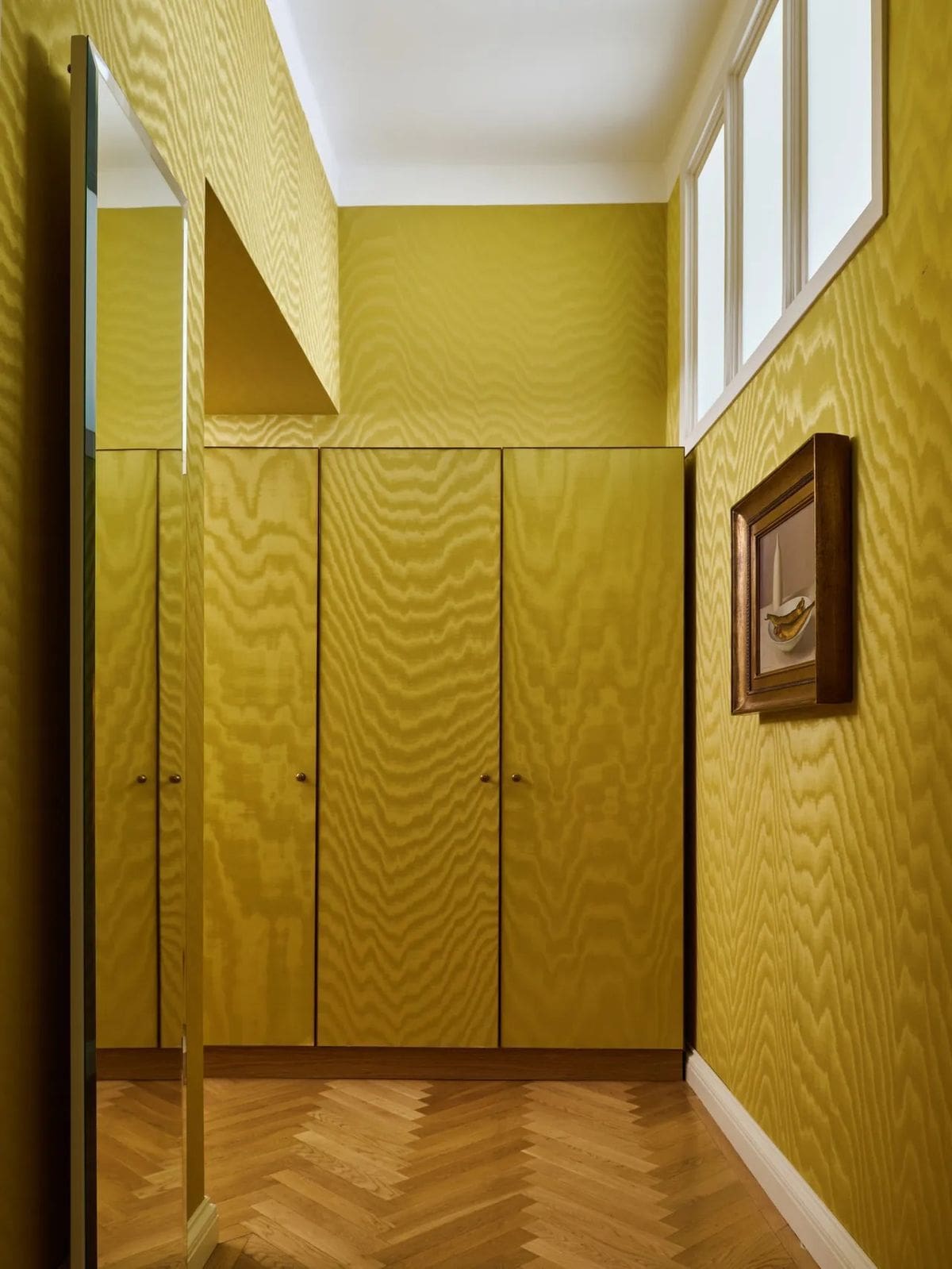
Design: Atelier Karasinski | Photography: Ana Sampaio Barros
How Designers Are Using Olive Oil Yellow
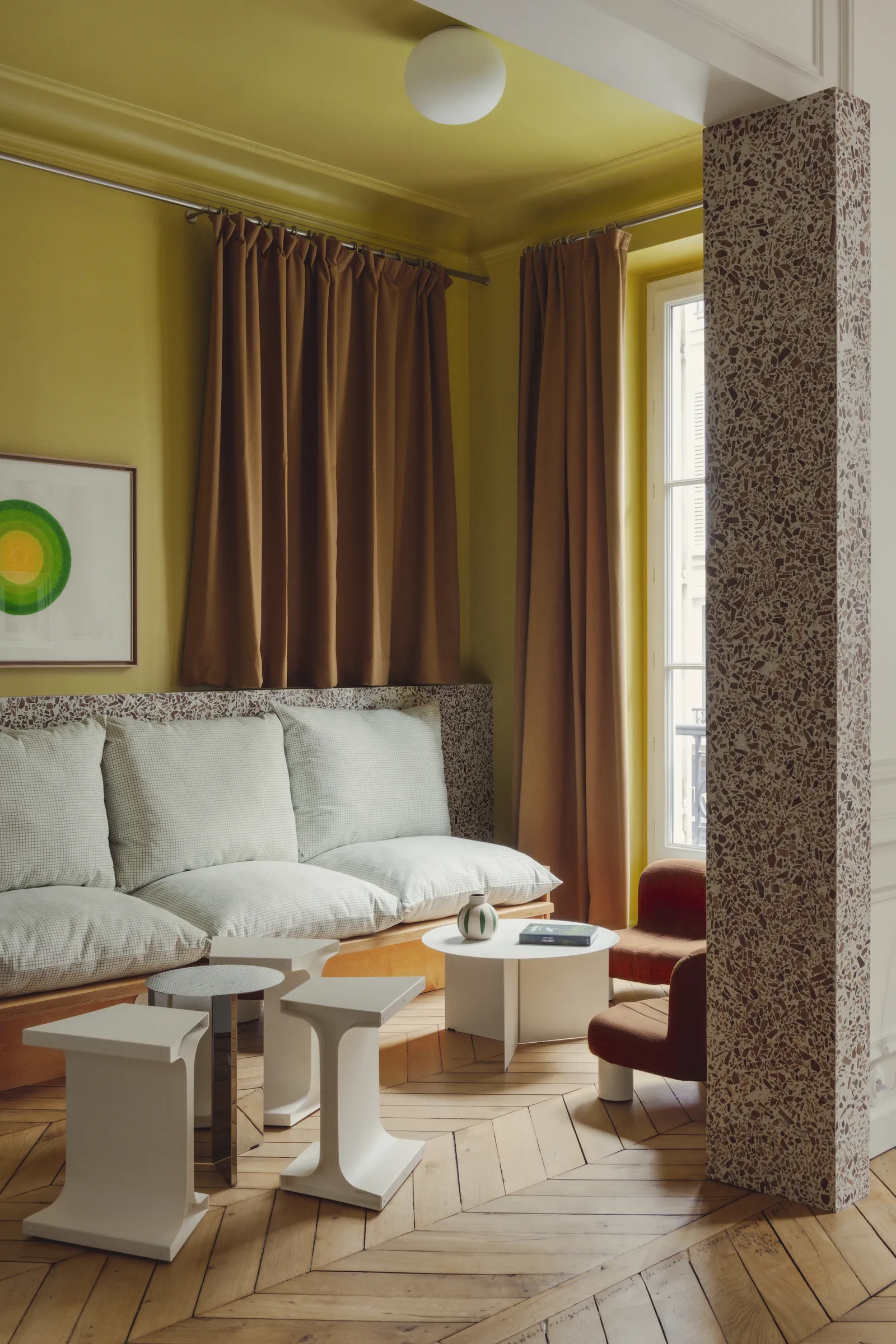
Designers are already experimenting with olive oil yellow in ways that show just how versatile it can be. Design & That Studio created contrast in a bedroom with deep olive oil yellow bedding against a neutral backdrop, letting the color’s warmth add calm rather than intensity. In Paris, Studio Asai went bolder, pairing it with burnt orange curtains for a living room that feels equal parts playful and punchy. Electric Bowery takes the shade in two different directions—using it as a backdrop in a dining room where it sharpens against deep red chairs, and in another project, letting a sofa in the color glow against crisp white walls with pops of cobalt blue.
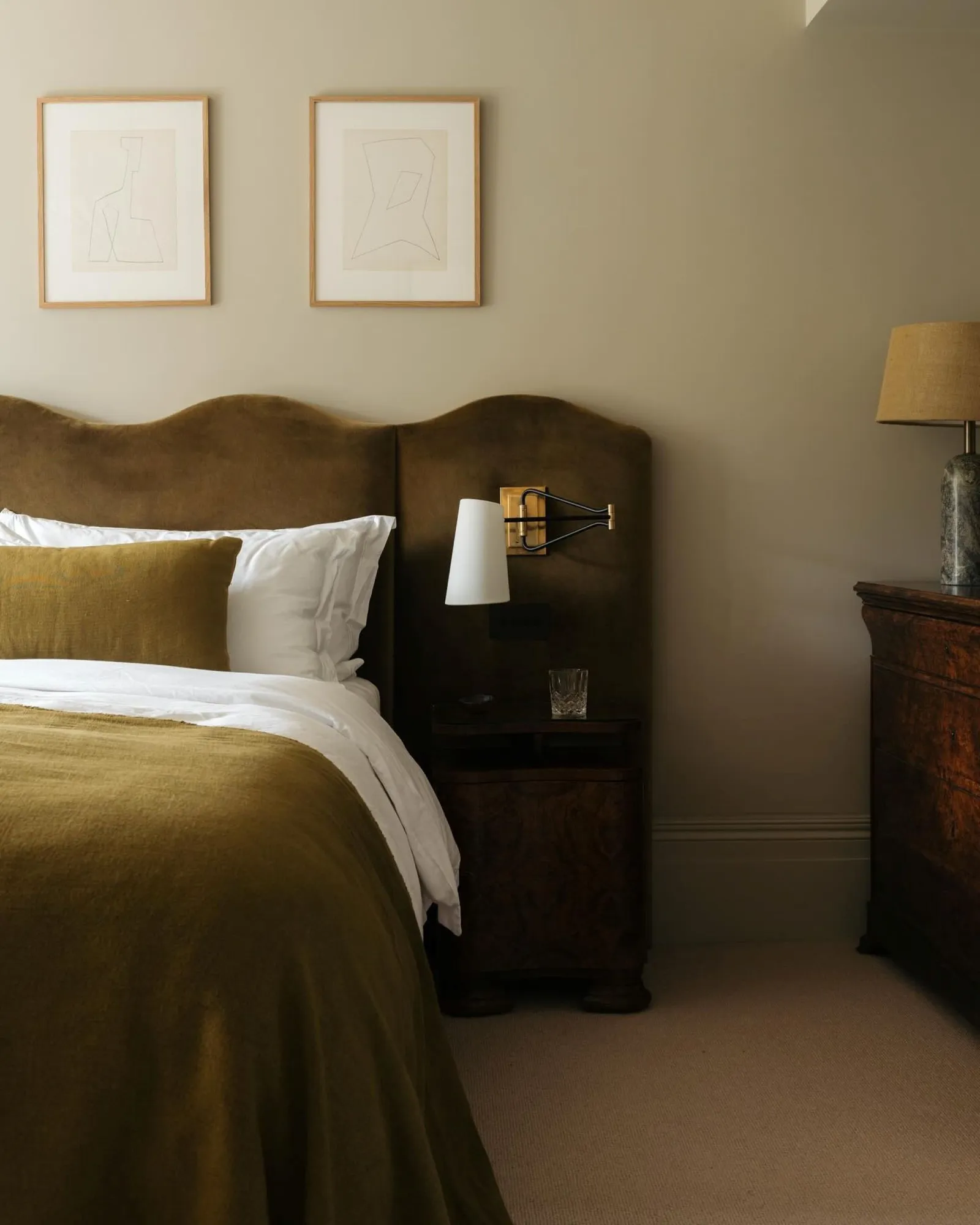
(Left) Design: Design & That Studio | Photography: Ellen Christina Hancock
(Right) Design: Studio Asai | Photography: Yannick Labrousse
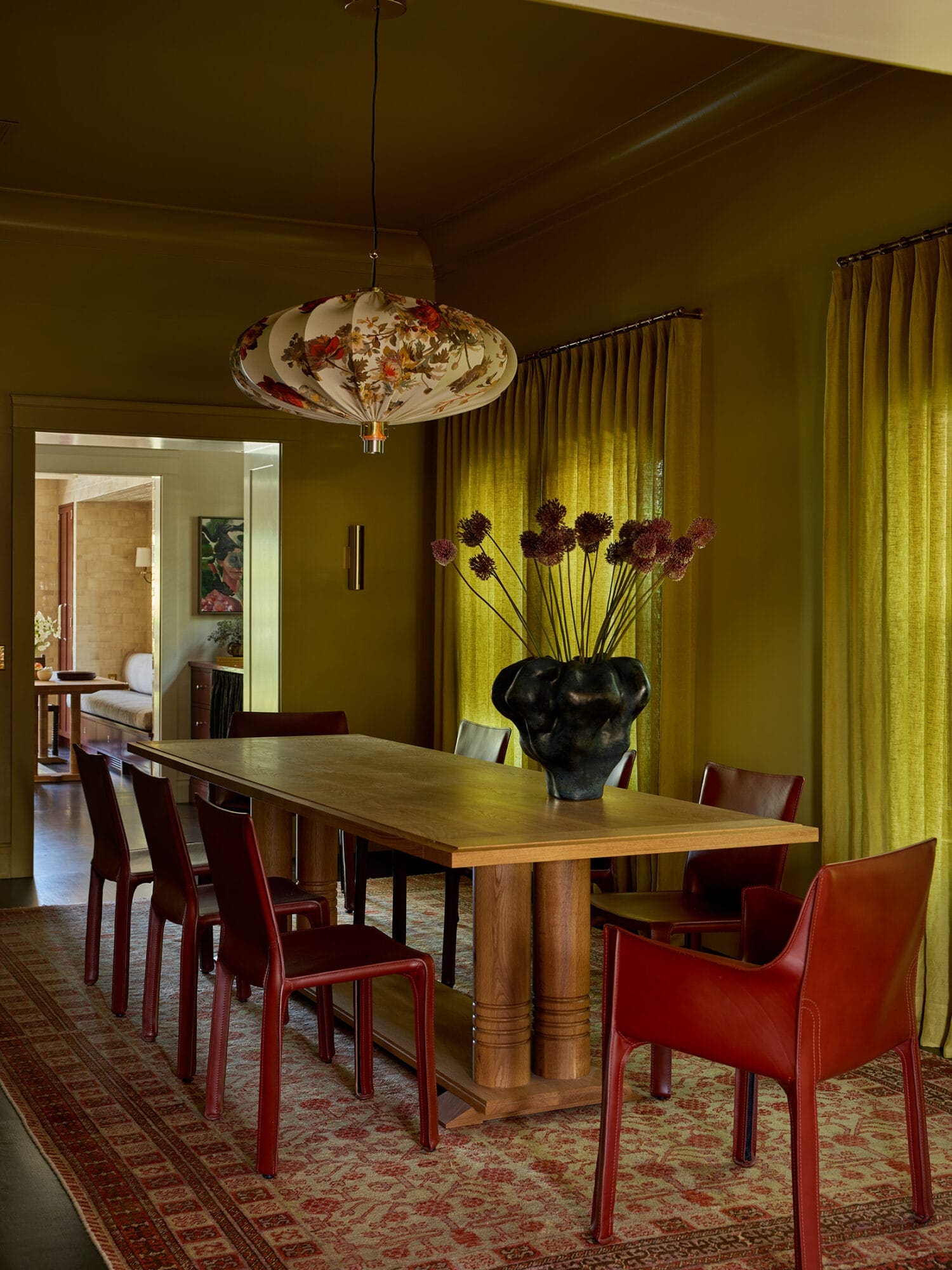
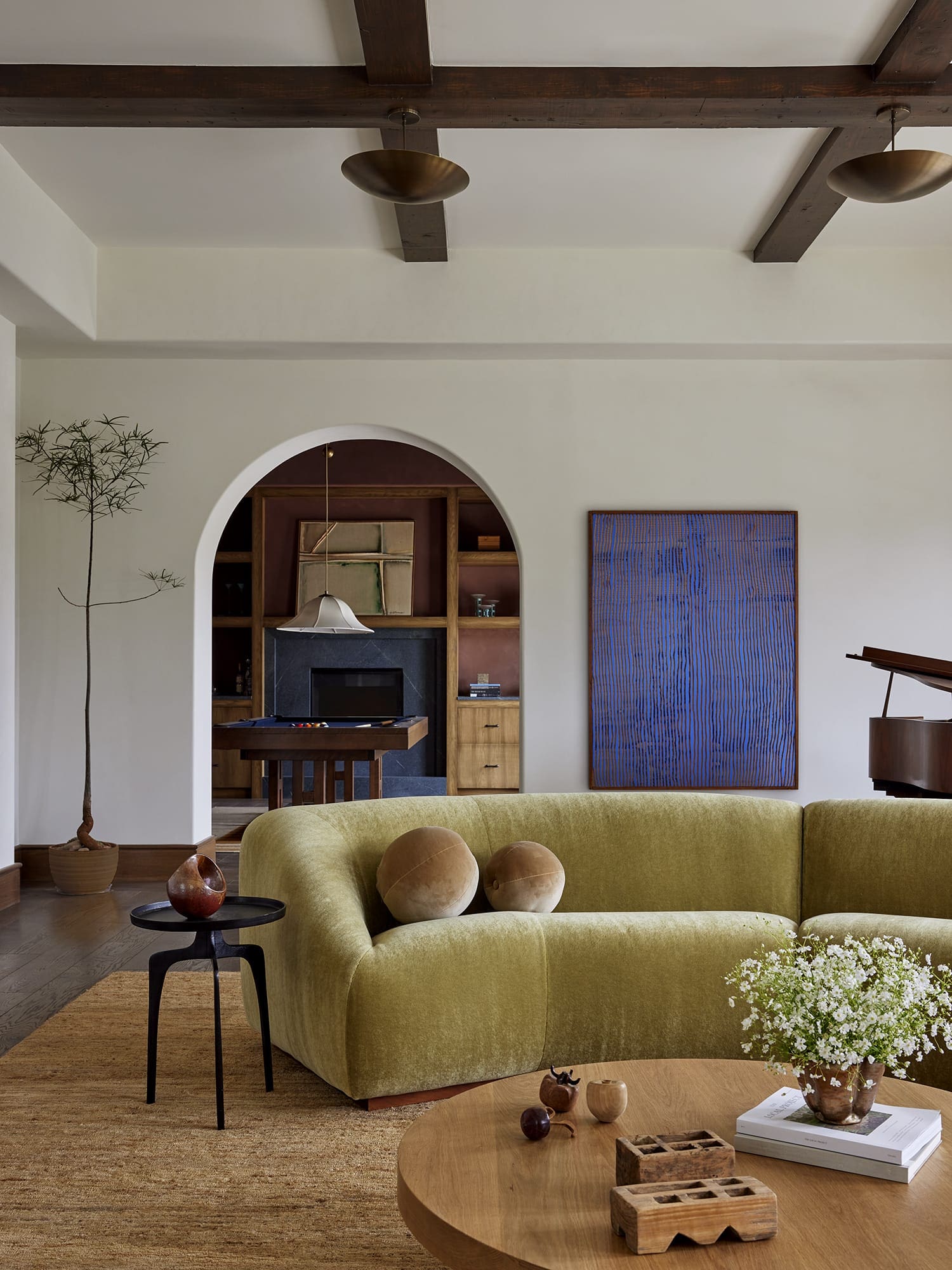
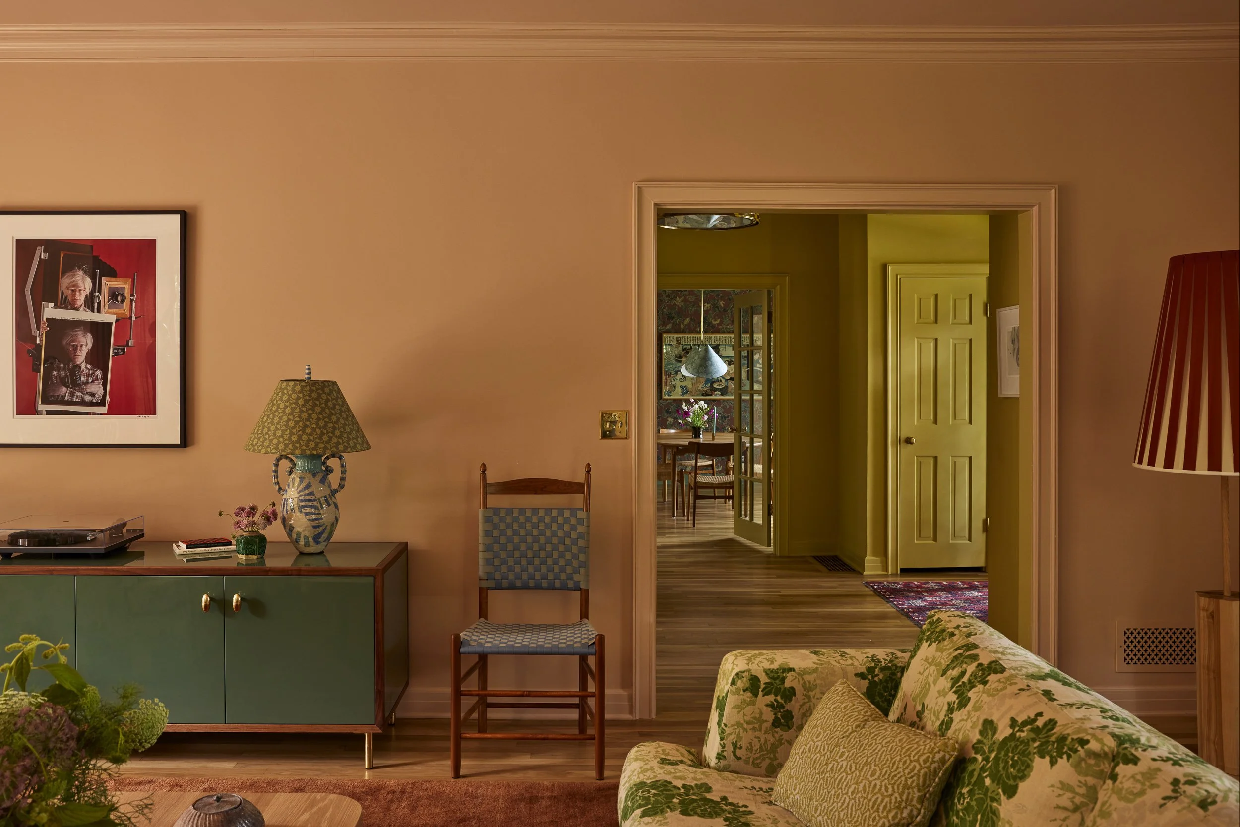
(Above Photos) Design: Electric Bowery | Photography: Laure Joliet
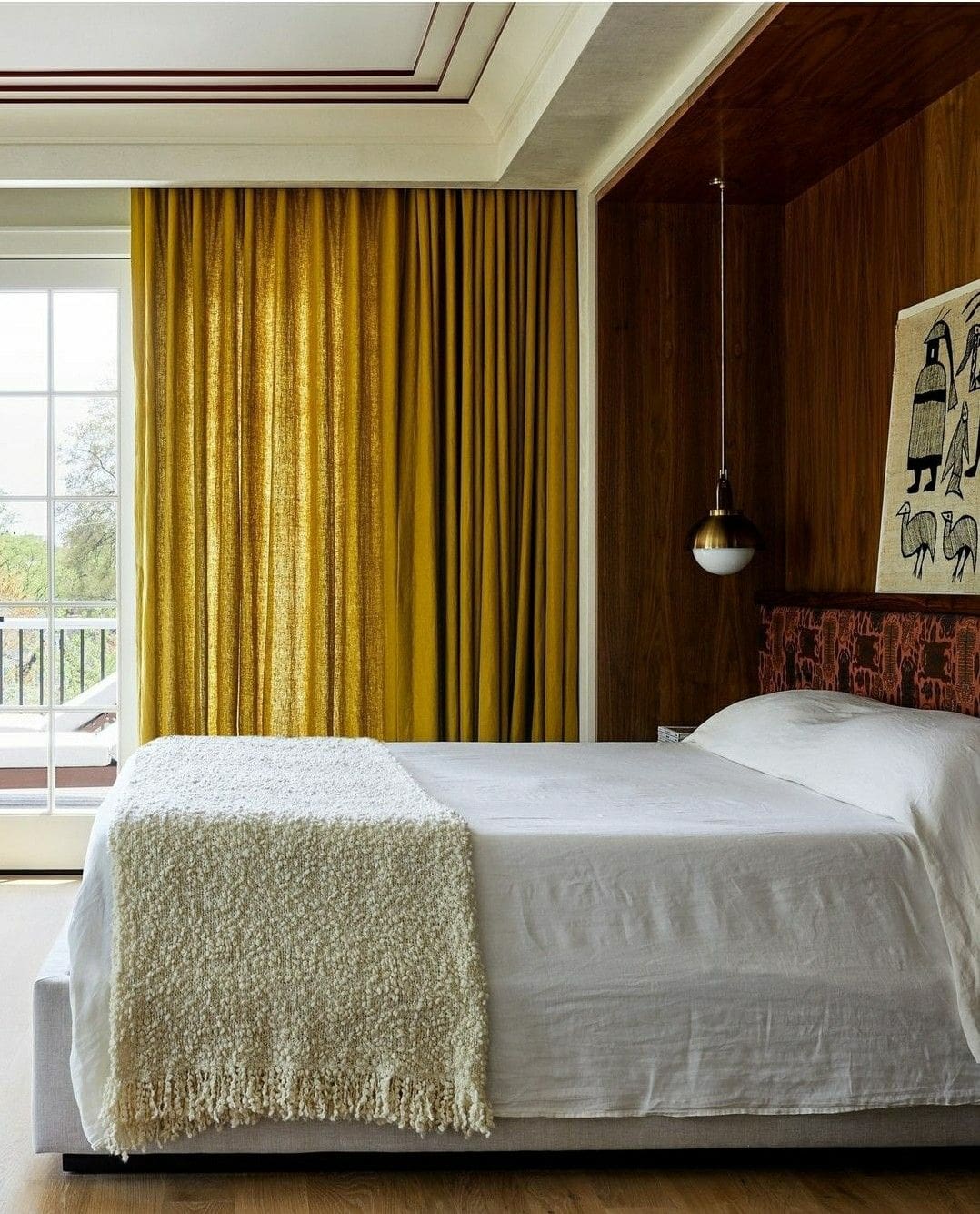
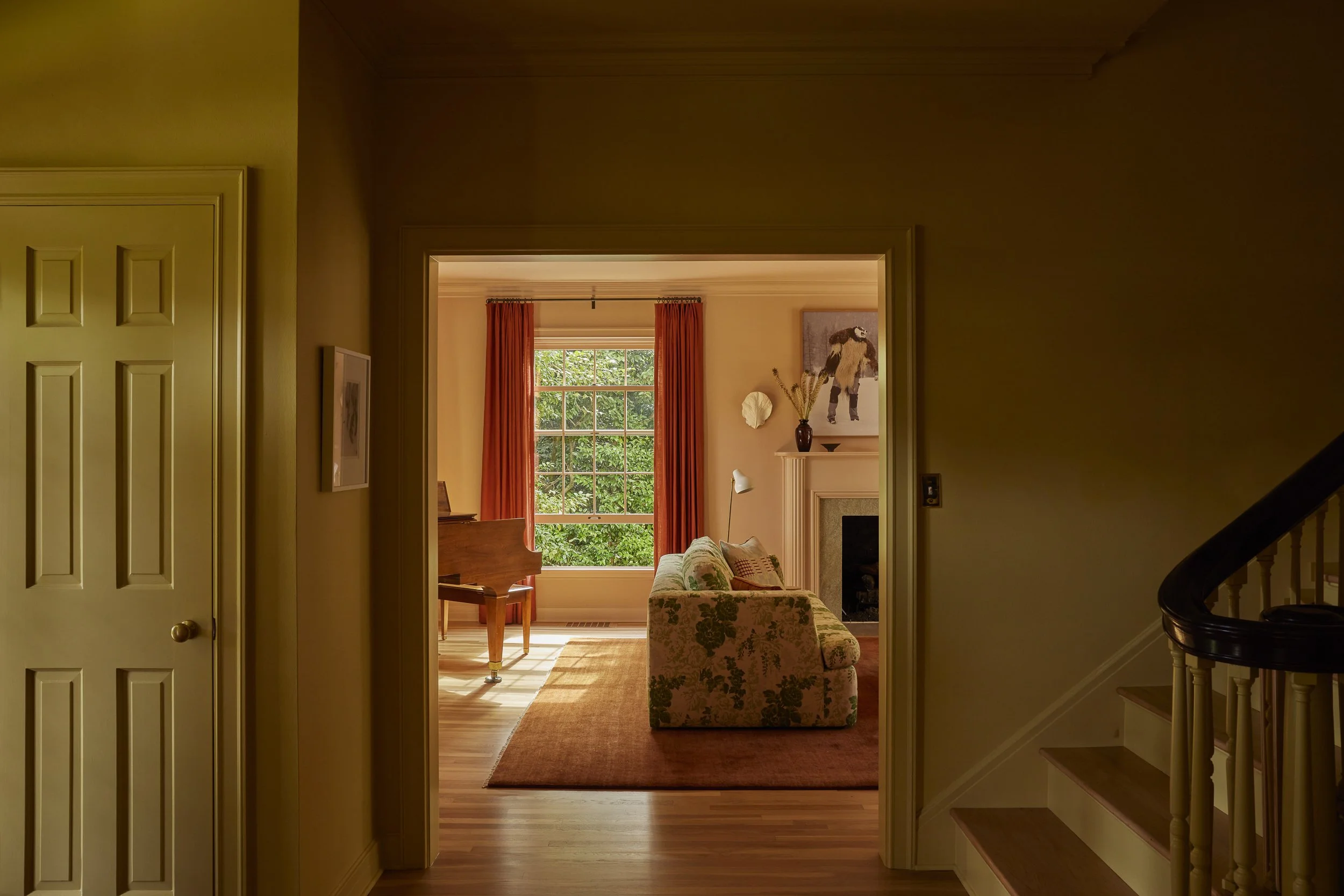
Others are leaning on textiles and transitions to bring the shade in more subtly. Designer Zoë Feldman opted for olive oil yellow curtains, a smart way to add the hue without overwhelming the space. And Reath Design has layered it into multiple projects—from a hallway that opens into a peach-toned living room to bedroom drapery that ties the scheme together, proving the shade works just as well as an accent as it does all over.
Design: Zoë Feldman | Photography: Stacy Zaringoldberg
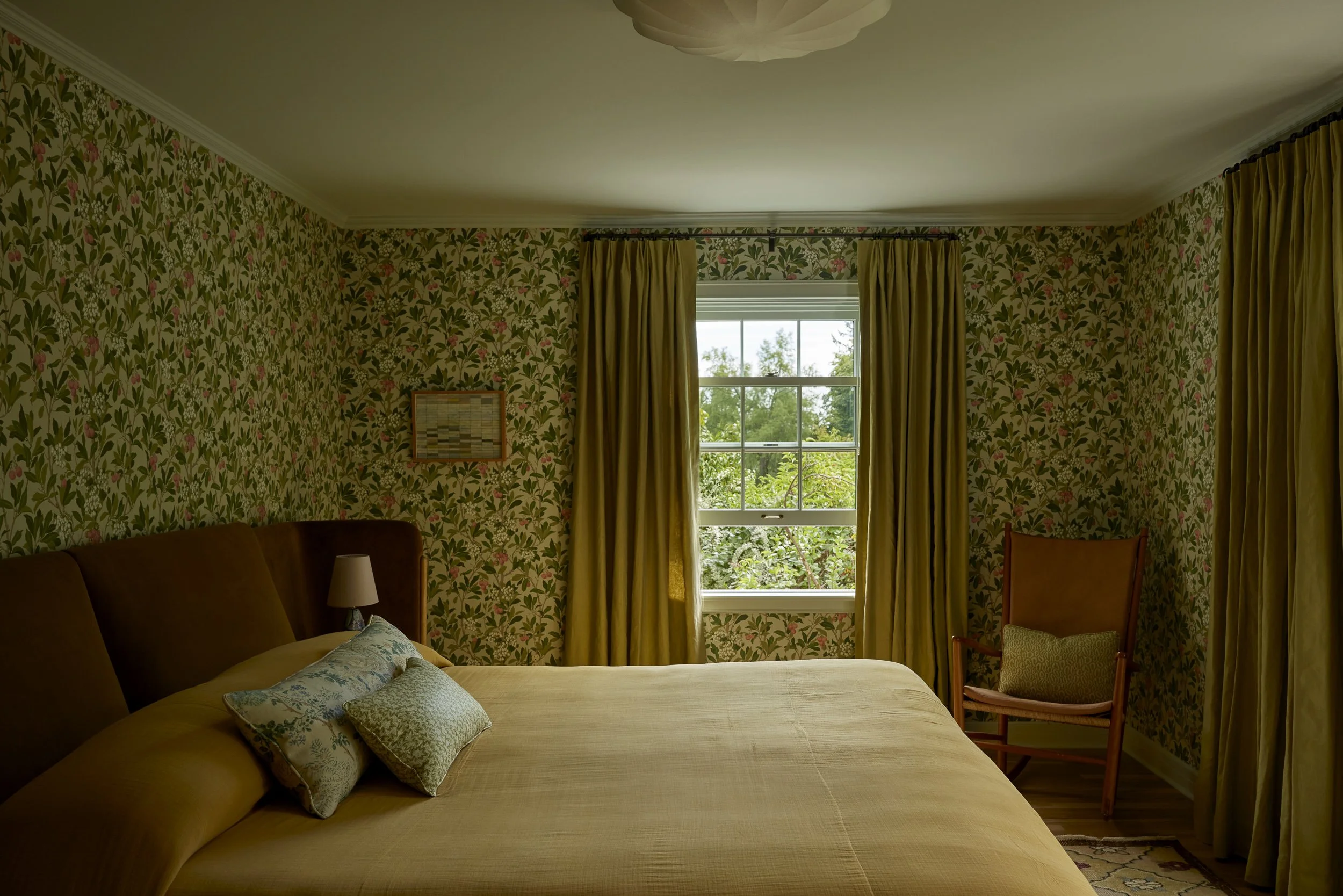
(Above Photos) Design: Reath Design | Photography: Laure Joliet
The Best Olive Oil Yellow Paint Colors
Here are some of the best olive oil yellow paint colors to consider for your interior spaces:
A deep yellow-green with olive undertones, bold enough to stand alone yet grounded enough to act as a neutral.
Savannah Green by Benjamin Moore
A golden-olive green with warm undertones, striking the perfect balance between earthy and luminous.
A bold yellow-green with a zesty edge, ideal for adding punch to kitchens, ceilings, or playful accents.
A deep golden-amber with hints of olive, offering warmth that feels both rich and grounded.
A muted golden-green that reads soft and chalky, perfect as a subtle twist on a neutral backdrop.
BY: Daniela Araya
« A Traditional 1910 DC Home Gets a Striking New Beginning >
Shop