

Project Reveal: A San Francisco Victorian Flat
Yesterday, Domino Magazine gave us the first look at this project. You can read that full article here. I am SO excited to share today’s reveal because it’s a project I got to assist on with my beloved little sister, Samantha Buckley. Before we kick things off, let’s begin with the backstory. This 1917 Victorian flat sits two blocks from San Francisco’s Union Square, nestled between the coveted Nob Hill and the Tenderloin neighborhoods. We lovingly refer to it as The Tender Nob. Ten years ago, both my sister and I were attending university in the city – me for advertising, her for architecture – and our incredible grandmother (who you’ll see pieces of sprinkled everywhere in our homes) helped us purchase the 2 bedroom, 2 bath 980 SF flat. It had just been beautifully “flipped”, sat just on the fringes in a walk-a-block-run-a-block type of neighborhood, and was a TIC (tenancy in common) which made it both a unique challenge, and the only way we could ever afford an apartment this beautiful.
Photography by Madeline Harper (except for the ugly befores. Those were on Sam’s iPhone)
Fast forward three years, I had met Quinn, he moved in with us, we fell in love while the three of us became the best of friends. After two years of dating, Quinn and I needed some more room as well as more privacy, and stretched our wings and landed in Austin. But my incredible sister stayed and launched her architecture career, deeply planting roots in her adored city. Over the years she’s had a small handful of fantastic roommates turned best friends turned family but never really shifted out of the “dorm room” furniture phase and into the “successful adult architect at the largest firm in the world” phase.
About a year ago she really began to lean into her desire to invest in the space as her forever home. 10 years ago, the kitchen had been flipped nicely aesthetically, but functionally horribly. One drawer, mostly corner cabinets, knobs that stuck out too far to let the oven open fully… I mean, really poor planning. Combining her need for a kitchen renovation with a desire for more substantial furniture, Samantha began design plans and elevations for her kitchen and I began dreaming up how to furnish her round living room.
It’s officially time to reveal her San Francisco Victorian Flat kitchen makeover and remodel.
THE FRONT ROOM
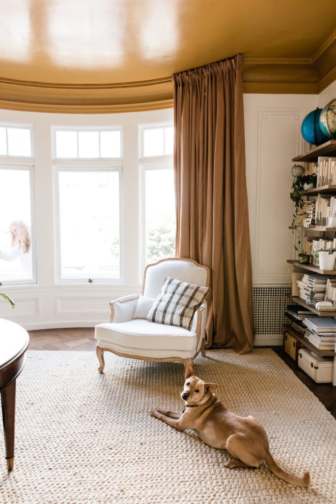
Samantha is the most effortlessly stylish person I know. She has a signature style. It’s been the same since she was born. She still wears clothes from middle school because what she bought and worn then, is exactly what she would buy and wear again today. Over time, it’s become more refined and structural, but fabulous none-the-less. Samantha’s signature style, is yellow.
In her bedroom, Samantha and I were torn over what to paint the walls. She wanted yellow, but loved the modern ease of white on white walls, both magnifying and camouflaging the incredibly intricate original plaster millwork. As you can imagine, I was holding steadfast on the team of matte white. After many late hours spent scouring over Pinterest, the idea of painting the ceiling yellow but keeping the walls white arose. Serving us major Carley Page vibes, we opted for a high-gloss paint in a custom color which we ran down to the bottom of the crown moulding on the 9 1/2 foot ceilings.
The butterscotch hue transformed everything. It was the perfect balance of orange and what my sister calls “socially acceptable yellow”. It was the jumping off point for the rest of her home. We went monochromatic with custom made linen drapes from an Etsy shop in the Roasted color. and hung them floor to ceiling on a cheap plastic ceiling mount track. Sam painted the track and butted it up against the trim so the curtains curve the round bay window perfectly.
She repurposed an old hand-me-down leather Louis chair that we’ve had since kids. It was completely rebuilt, repainted and reupholstered in a nubby white performance boucle. We softened the space with my favorite bleached jute rug (it’s under $400 for a 9×12 and soft underfoot!) from World Market which brightened things up and reflected more of that glowy peanut butter color.

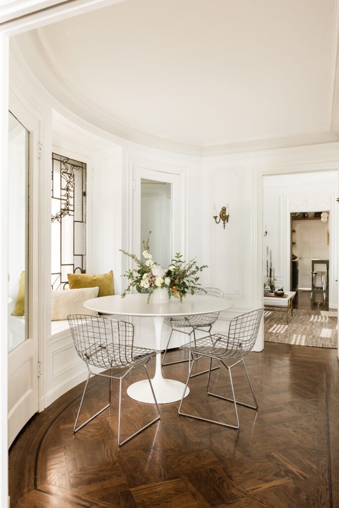
Entry Way + Dining Nook
You definitely read that correctly – we put a dining nook directly in the entryway of this apartment. When it was originally built, this unit was a one bedroom with a formal foyer, dining room and parlor. It would be a fantastic layout if we didn’t always need the two bedrooms – both of which have fantastic and spacious walk in closets. Over the years, Sam has used this space as a more formal entry with a console table, an office, a dining room, and a mud room of sorts. As we were really planning the new space plan, it made sense to give this space the most intentional purpose possible and defined it the dining nook. Utilizing the original window seat, we added an origianl Saarienen tulip table and a Facebook Marketplace set of Bertoia Side Chairs. We topped off the window seat with a boucle pillow paired with a silk velvet throw cushion. For the shoot, Sam’s dear friend and fellow architect Linzy Griswold designed the gorgeous sculptural floral arrangement.
AFTER
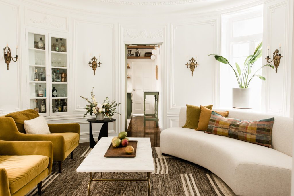
The Living Room
As we move further into the flat, you pass through another set of pocket doors that beautiful keep the spaces connected, while also providing privacy when needed. The foyer opens into the, what can only be described as magical, round living room. With it’s oval shape, original millwork, spectacular trim moulding, mirrors on four sides (the pocket doors have mirrors), hidden storage, a doorway to a bathroom, a doorway to the kitchen, eight original sconces, and two sets of windows that open to a small alley, there was a lot going on in here. But a lot of MAGIC.
We carried the white on white straight from the front bedroom through to here and it instantly transformed things. The bright white reflected so much more light and made things feel lighter and happier. The white paint is Kelly-Moore white tint base 1610-121. We stuck with her signature color yellow and gave it a sunset color wash – everything just slightly off and more muddied. Sam had recently purchased these velvet chairs from Article in Yarrow Gold. To bring in texture and a bit of the eclectic feel she was looking for, I sourced this handwoven, undyed rug from Revival. Use this link to save 10% off your entire purchase. It’s one of their own collection and I’ve used in in two spaces before and I’m using it again at the IDCO Lake House. The coffee table was an old brass base that she had a marble remanent made into a top for. And the biggest game changer in here was switching to a curved sofa. What has been such a trendy piece was actually the saving grace for Samantha’s living room. The curves hugged the wall, allowing a walkway through the living room while still connecting the two sides for conversation. I sourced this curved white sofa without arms to add some extra room and ease of traffic. We topped it off with a collection of velvet and linen pillows, and this one statement lumbar pillow that tied all the colors together. I loved it for its modern and geometric take on traditional woven textiles (and currently on sale!).
I’ve mentioned before how my favorite pieces of art were all from my grandmother’s collection – well my sister has a large chunk of that with incredible additions of her own hand and travels. We displayed them on Command hooks directly over the mirrors in the space making a gallery wall. It helped cozy the space up because the mirrors did that weird infinite reflection thing and creeped you out when sitting in there. It also allowed the walls and millwork to shine, without cluttering them up with different pieces of art. The art gallery walls give your eye something to focus on, and something to spark conversation.

BEFORE


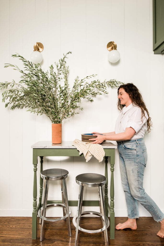
THE KITCHEN

The room that started it all. When we moved in 10 years ago, there were lots of tiny upper cabinets tucked in awkward nooks and crannies. There was only one drawer in the entire kitchen, and it only measured 6 inches wide. Even more so, a hallway ran right through it and ate up 30% of the kitchen. With careful planning, hours of Slack calls arranging and rearranging shelves and cabinetry, we finally came to a plan. As previously mentioned, Sam is a working architect, so space planning was made way easier with her incredible skillset drafting cabinetry plans in advanced design software I don’t even know how to open. She measured, calculated and recalculated every square inch of the kitchen to create the maximum amount of storage. Sam did a spectacular job bringing her vision to life and I am just so grateful to have been able to consult on the design.
Here’s what we changed:
Removed the upper cabinets
Replaced the cabinet doors
Painted the cabinets
Had custom shelves made by local San Francisco millworker Jasper Montgomery
Squared off the open corner that wrapped around the round living room
Built a counter to ceiling cabinet that used the depth of said awkward corner
Extended the wall of cabinets to the ceiling
Extended the cabinets from the fridge box over the kitchen door, creating a portal
Extended the two top shelves over the opposite door
Built a small eat-in bar
Shiplapped the walls
Installed sconces
Installed under shelf lighting
Built a hood surround
Installed a backsplash
Added two large countertop drawers
Increased the width of the lower “peninsula” cabinet
Added a drawer on the peninsula
Scraped, cleaned and opened the formerly inoperable window
Here is what we kept:
The carrera marble countertops
All cabinet boxes
The sink
The appliances
The floors

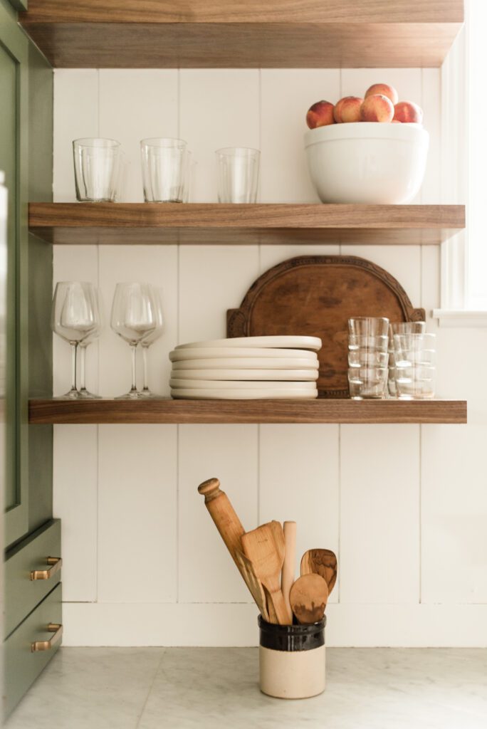
A few of my favorite details of this kitchen are the ones you probably don’t notice immediately. To ensure the oven opens fully, Samantha sourced an antique flush door pull for the awkward corner cabinet. The two countertop drawers that her woodworker Jasper Montgomery of The Meticulous Handiman custom built sit on their hardware, instead of having it side mounted, to accommodate extra weight and fully extend without scratching the marble surface. The Zeiliege tile backsplash brings in that handcrafted feel we’d carefully woven throughout her apartment without feeling too bohemian. I love that Samantha ignored my suggestion to paint the shelving white because the rich walnut color compliments the original parquet hardwood floors.

BEFORE


The end result feels true to the time period of the building, complimentary to the home, and representative of who Sam is as an architect, an incredible chef, and an overwhelmingly hospitable, gracious host. It was such a privilege to get to help Samantha design and furnish her home. It now feels so true to her as a bad ass, city dwelling, world traveling, architectural designer. Make sure to follow her on Instagram and get a better look inside this historic 1917 Victorian jewel box home. Also stay tuned because Sam may be a big part of IDCO sooner rather than later!
BY: theinteriordev