A Modern High Contrast Lake House Kitchen
While this wasn’t the first time we embarked on a major renovation, there was something uniquely special about designing our lake house kitchen. When we first toured the property, the kitchen’s potential was one of the main selling points, despite its less-than-ideal state. Behind the non-functional appliances, a rusted-out refrigerator, and that awkwardly placed peninsula, I could see a streamlined, modern lake house kitchen that looked the part of our “elevated camp” aesthetic.
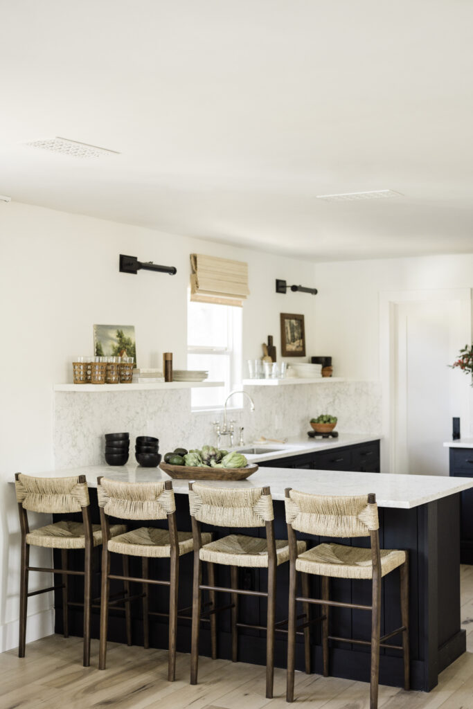
Overall, I wanted the vibe to lean a bit sleeker than our Austin home. The design concept was modern-meets-rustic with lots of clean lines and a hint of drama. The overall footprint remained the same, but the look completely shifted. Like most renovation stories, getting from start to finish was easier said than done, but the end result felt entirely full circle. Come on in, friends. I’d love to show you around.
WHERE WE STARTED
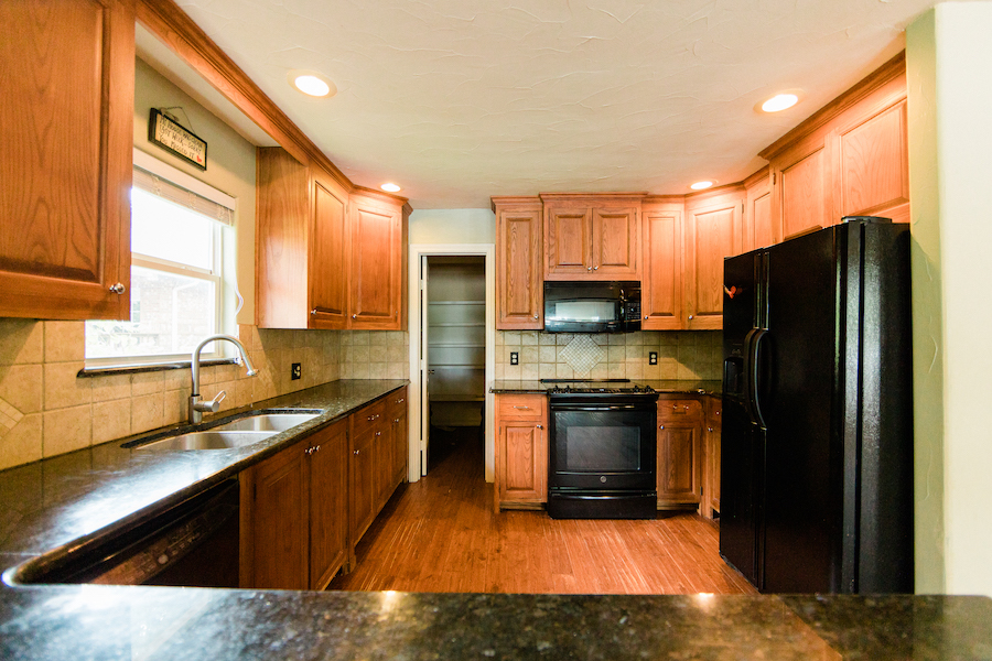
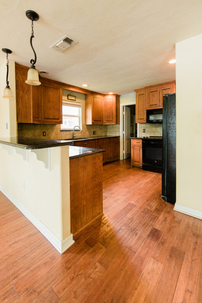
The existing footprint of our lake house kitchen gave me confidence that we could tackle this renovation. I knew reworking an entire layout could add significant costs, so we were thrilled to keep the bones more or less the same. That being said, there were some big projects to tackle right off the bat. For starters, none of the appliances worked. Not even a little bit. The refrigerator had rust running down the front, the dishwasher wouldn’t run a load, and the oven temperature maxed out at 180 degrees. This poor house hadn’t been cared for in at least ten years, and it really showed in the kitchen.
On the plus side, the existing cabinets were in pretty lovely shape. They were custom-built on-site with beautiful inlaid doors and nice hinges. When I first walked into the space, I knew these cabinets could work for us. The original plan was to re-stain the lowers, but there was too much red coming through despite our best efforts. In the end, we decided to paint the lowers black instead for a high contrast look. Another bonus to the existing kitchen was the spacious walk-in pantry. Much to our surprise, it came ready to go with great built-in shelves for ample food and small appliance storage.
Here’s a look back at the kitchen’s original state and the mock-up design plan I put together in the process:
THE DESIGN PROCESS
LAYOUT
Similar to our Austin kitchen, the lake house kitchen layout included a raised pony wall/bartop alongside the kitchen peninsula. It was not only visually awkward but managed to cut off the entire flow of the space. In addition to that raised bartop, a four-foot wall squared off the kitchen and allowed the upper cabinets to wrap around. As we made our initial renovation plans, reworking this area was a given and (lucky for us) a fairly easy demo.
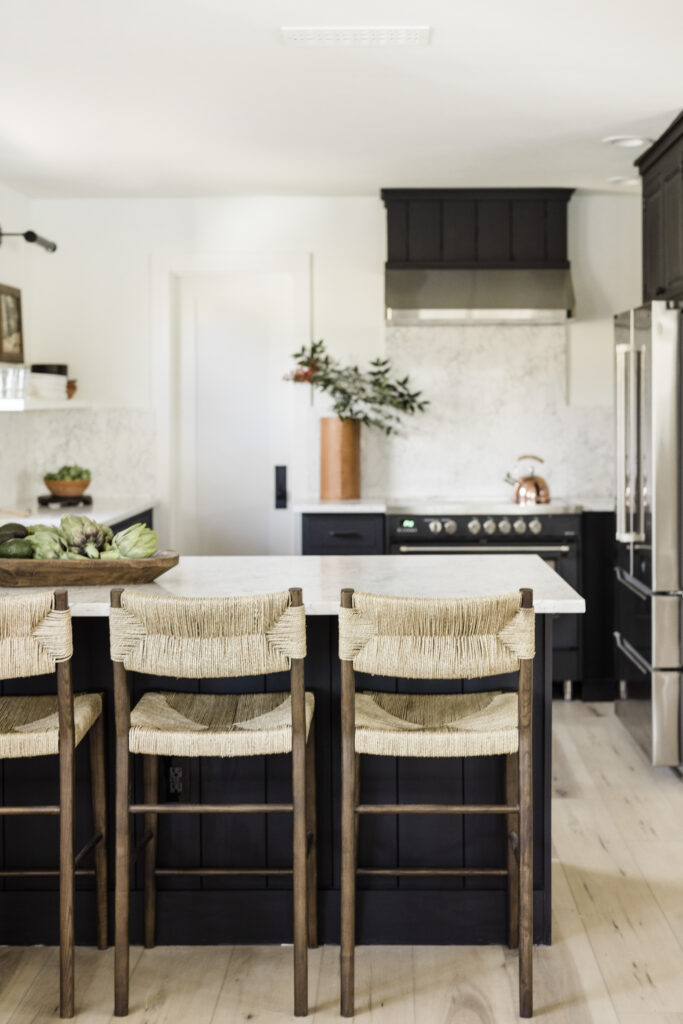
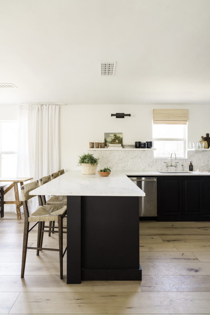
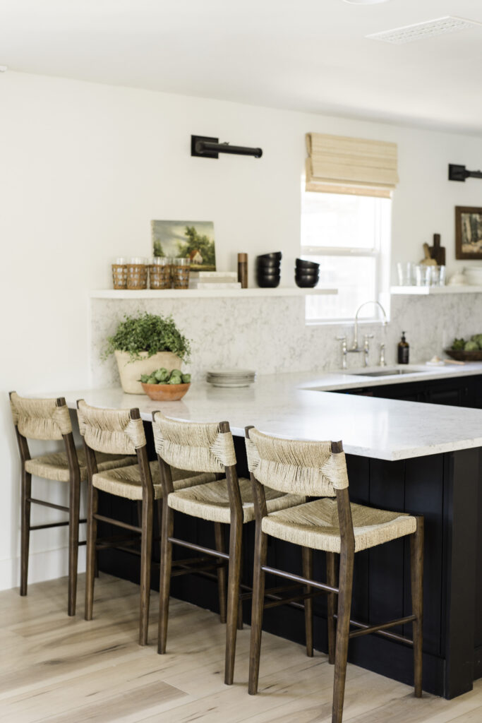
We started by ditching the four-foot wall and dropping the countertop to make one grand peninsula. I wanted to create a casual spot to hang with pretty bar stools to pull up, and a reworked peninsula did just the trick. It allowed the kitchen to flow more naturally with our living area and helped create better sight lines to the lake.
CABINETRY
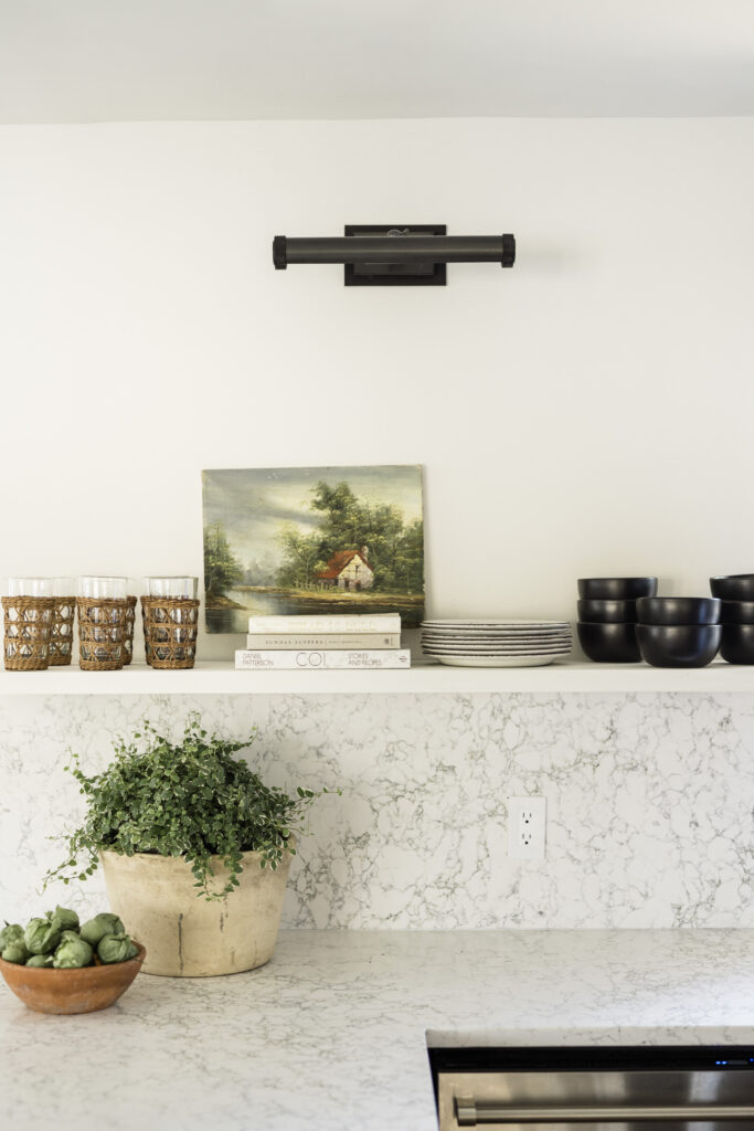
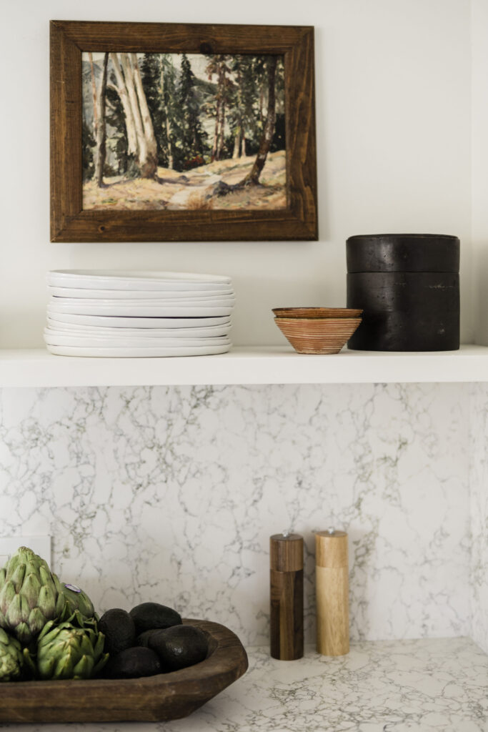
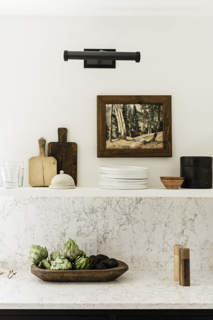
You know I love the look of open shelving, so ditching the upper cabinets was a no-brainer. This move also made the most sense for a rental home, when easy access to cups and plates is a necessity. More than anything, removing the wrap-around upper cabinetry allowed us to bring in so much additional light from the kitchen window and adjacent living room. I kid you not—that one design decision changed everything.
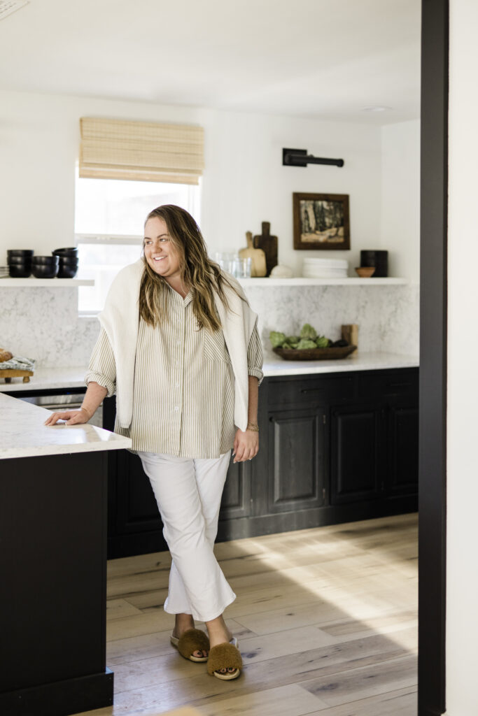
Against everyone’s advice, I chose to go super dark with Sherwin-Williams Tricorn Black SW 6258 on the cabinetry. I knew painting the original cabinetry black would feel clean, modern, and a little less expected at a lake house.
We also decided to wrap the peninsula in shiplap and add baseboards around the cabinets. Unfortunately, we had to eliminate the toe kick when replacing the existing floors with the Flooret Palka Signature because we couldn’t run them underneath the cabinetry. Adding the baseboards around the bottom solved that problem and gave the cabinets an unexpected furniture quality. I like to think of it as a subtle nod to English kitchens infused with our own contemporary twist.
“I knew painting the original cabinetry black would feel clean, modern, and a little less expected at a lake house.”
APPLIANCES
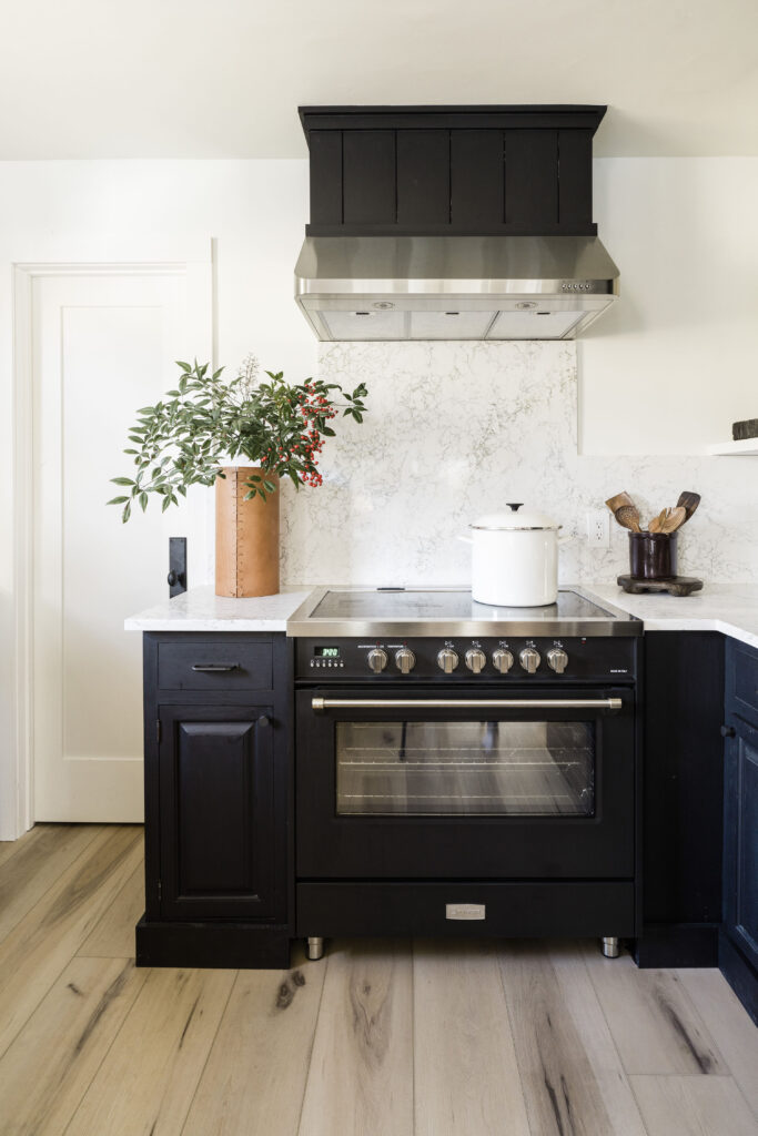
Our lake house doesn’t have gas, so we needed to source a beautiful electric range. The range faces straight into the great room and is the kitchen’s main focal point, and I was not willing to compromise aesthetics to fit the build specifications we were dealing with. After days and days of research, I came across this 36″ Freestanding Electric Range from Verona Appliances. It’s handmade in Italy and is the ultimate balance of form and function.
For proper ventilation, we sourced Verona’s 34″ Convertible Range Hood Insert. Luckily, we ordered our range hood well in advance, which gave me plenty of time to finalize the range hood design plans. I went with shiplap panels painted to match the lower cabinets for a seamless look above our beautiful stove.
The French Door Refrigerator from Verona perfectly fit in the existing space. We decided to simply build it in by reusing the upper fridge cabinet box, adding a faux side panel of pine plywood, and trimming everything in. Next, we painted with the same Tricorn Black SW 6258 as the cabinets. The 36-inch counter depth size is perfect to avoid “sticking out” but also gives us more than enough space for food and drink storage. We also went ahead and ordered the matching Verona Dishwasher. It feels like it’s straight out of a gourmet kitchen with straight lines and a stainless finish. There’s also a super handy light turns on whenever you open the dishwasher, and between you and me, it’s kind of my favorite feature.
I’ll be writing a more in-depth post about our appliances later this month and promise to delve into all the details.
COUNTERTOPS
My favorite design component to source for our lake house kitchen was probably the countertops. After reviewing dozens of samples, I was really drawn to the intricate and bold pattern of the new Caesarstone Abaretto 5171. We went with a 3cm thickness, and the project took three slabs in total. Low-maintenance countertops were a top priority for a vacation home, and Caeserstone was an easy choice. Besides their easy clean-up, I LOVE the countertop’s polished look within this space. We also chose to wrap the Caeserstone up the backsplash to meet a single floating shelf for an on-trend look that I’m super confident will stand the test of time.
FLOORING
We ran Flooret’s Palka Signature luxury vinyl plank throughout the entire home, kitchen included. The wide and long planks make our lake house feel so much larger, and the color tone creates a nice contrast against the black cabinetry. You can read more about why we chose Flooret LVP for the lake house right here.
The Finishing Touches
Shop the Lake House Kitchen
Bar Stools: Serena & Lily
Lighting: Hudson Valley Lighting
Floating Shelf Brackets: Etsy
Floating Shelf: Custom DIY
Wall Color: Greek Villa SW 7551
Lower Cabinets Color: Tricorn Black SW 6258
Drawer Pulls: Rejuvenation
Countertops: Caesarstone Arabetto 5171
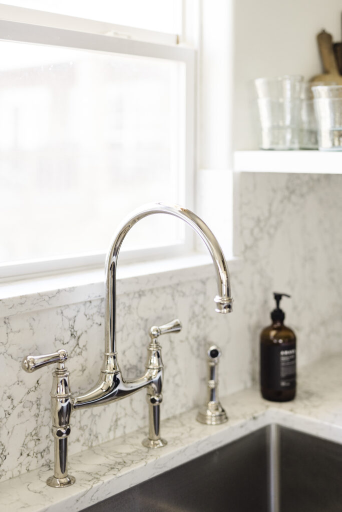
Faucet: Perrin & Rowe
Stove: Verona 36” Freestanding Electric Range (matte black)
Vent: Verona 34″ Convertible Range Hood Insert
Dishwasher: Verona 24″ Built-in Dishwasher
Refrigerator: Verona French Door Refrigerator
Woven Glasses: Jenni Kayne (code IDCO15 to save 15%)
Leather Vase: Amber Interiors (code Anastasia15 to save 15%)
Vintage Art: Etsy
Styling Books: Sunday Suppers + COI + Bread is Gold
HVAC Vent Covers: Stella Air
Bamboo Roman Shade: Amazon
Floors: Palka Signature by Flooret (code IDCO33 for 33% off samples)
For more IDCO Lake House content, have a look at these posts:
- Lake House Reveals: The Entryway + The Dining Room
- Paint Colors at the IDCO Lake House
- Why We Chose Flooret LVP
- My Lake House Serena & Lily Reviews
- The Exterior Design Plan
- The Entry Design Plan
- The Kitchen Design Plan
- The Living Room Design Plan
Photography: Madeline Harper for IDCO Studio
BY: theinteriordev

