Organic Modern IDCO Lake House Living Room
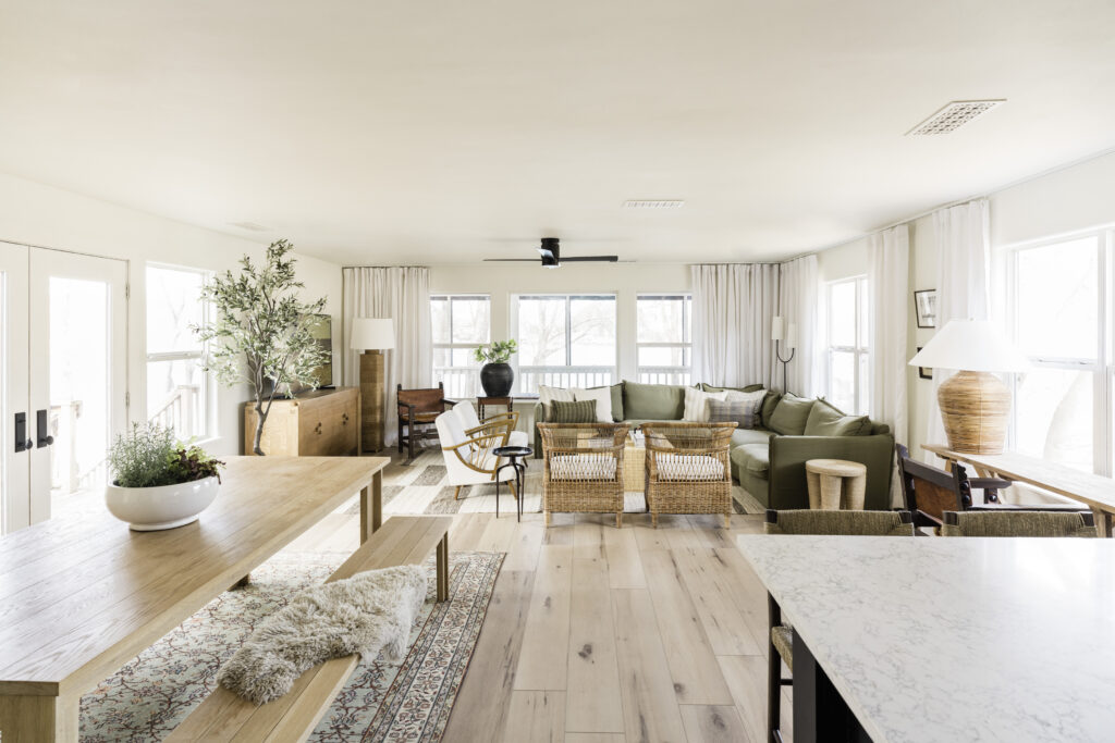
The IDCO Lake House living room is truly the heart of the home. It holds the main gathering and dining space and is adjacent to the kitchen. It opens onto the deck and has windows on three sides with views out over the property and the lake. Compared to the extensive renovations that we did in other spaces, this room didn’t need as much work. So after we created a blank slate with new flooring, freshly smoothed and painted walls and ceiling, and new fixtures, all of my energy went toward furnishing it to turn the clean, white space into a cozy, beautiful place to gather.

Overall, the lakehouse is more casual and more modern than our home in Austin, and it also feels like the right place to make some more riskier design choices. I wanted it to have a mix of timeless and more sculptural elements and to play with scale and texture.
Decorating open spaces like this one can be tricky. There’s a balance between making each area feel distinct and having the entire room feel cohesive, so I stuck to a pretty strict color palette of white and green and repeated the same decorative elements of black and rattan accents in each space. The flooring is a super light wood tone and the kitchen’s cabinets are black, so we used light-to-medium wood tones on the furnishings for balance.
THE BEFORE
But let’s go back in time a bit. When we got our hands on it, the room was an uninspired yellow box. The flooring was too damaged in other areas of the house to keep, so we replaced it all with Flooret’s Palka Signature luxury vinyl plank and painted all of the walls and new baseboards Sherwin-Williams Greek Villa 7551, a really pretty, creamy white. Just out of the frame of this photo was an oddly-placed wood stove, which we pulled out to make room for a dining table. Ceiling fans are just a fact of life in Texas, so we swapped these out for one with more sleek lines.
See my original Design Plan


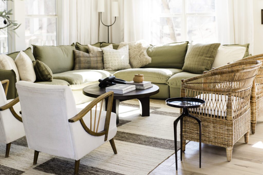
The starting point for the living space is the gorgeous green sectional from Sixpenny. I actually ordered it during their annual sale before we EVEN HAD FOUND A HOUSE, but I knew it was a quality piece that would work almost anywhere. Happily, it’s perfect and the dusky forest green shade inspired the palette of white and green in the rest of the house. I wanted something in here that would seat a crowd but also be super comfortable for lounging and this fits the bill perfectly.

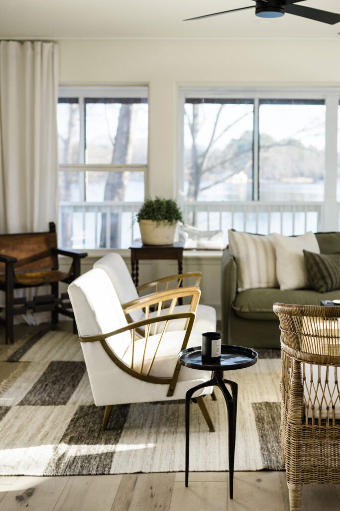
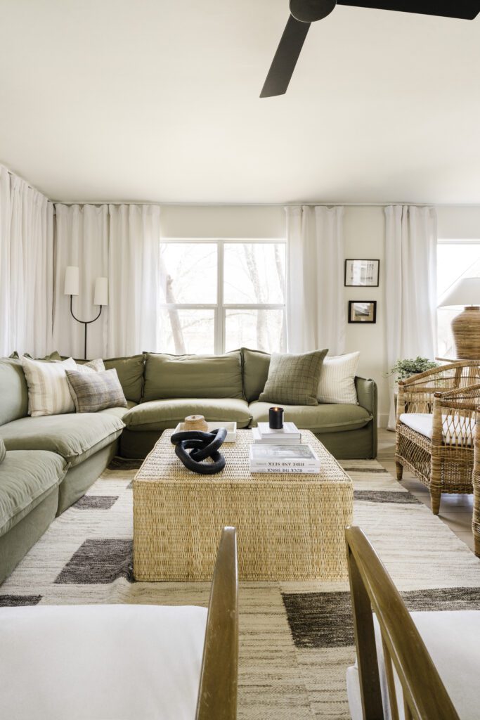
With so much color on the sofa, I wanted another neutral element on the floor and went with The Block wool rug from Revival to anchor the living space. It has an uneven hem that adds some movement and breaks up the massive space in a way I just love. Around the sofa, I added two pairs of chairs. One pair is rattan from Palecek that are shockingly comfortable and the other is super-sculptural with a mid-century feel and together they add that chic, collected element. I had been hoarding these vintage chairs for almost five years and they finally found their perfect home at the lake. The nearby kitchen has black-painted cabinets, so I carried the color over here with a few dark pieces that give a nice contrast to the lighter wood tones.
More to Read: The Modern High-Contrast Kitchen Reveal

In the center, I played with two different coffee table options. First, I placed a big square coffee table from Shoppe Amber Interiors. It was super affordable and felt like it made a big statement. After seeing it on camera, I swapped the coffee table for this beautiful, sturdy indoor/outdoor sculptural coffee table from Lulu & Georgia. I had originally pegged that for the deck, but it broke up all the woven elements we had and gave the room a bit of edge. Which do you prefer?
The room has a ton of windows on three sides that needed a lot of softening, but I didn’t want the curtains to be the focal point of the space. I chose simple linen panels (such a good price) that are similar to the color of the walls and took them all the way to the 8-foot ceiling to give the illusion of more height. I wanted to keep the hardware simple too, so the panels are installed on cheap ceiling tracks that are nearly invisible. Someday, we’ll add a white piece of trim over the track to really hide it, but, priorities. The results feel super custom on a major budget. Now, we can close them all if the sun is too harsh, and they give off major movie-theater vibes.


In such a big, open space, too many small items would get lost, so I wanted to play with scale a little bit. The console table from Lulu & Georgia doubles as an extra workspace, and holds a big (like, huge!) lamp from Serena & Lily. The oversized chain is from Bloomist is handmade and perfectly embodies my vision for a modern space filled with storied, meaningful pieces. I’ve had my eye on this cabinet from Crate & Barrel for a while and was so excited to have a spot for it here — the details on it are so cool and it feels really substantial underneath the delicate Samsung Frame TV.
For more IDCO Lake House content, have a look at these posts:
- Lake House Reveals: The Entryway + The Dining Room + The Kitchen
- Paint Colors at the IDCO Lake House
- Why We Chose Flooret LVP
- My Lake House Serena & Lily Reviews
- The Exterior Design Plan
- The Entry Design Plan
- The Kitchen Design Plan
- The Living Room Design Plan
Photography: Madeline Harper for IDCO Studio
BY: theinteriordev

