We all remember the early 2000s accent wall. While that trend has long since fallen out of favor, the concept of rich, mood-driven spaces has not. Today, designers are reclaiming the look by going bolder than ever with wall-to-wall color that exudes sophistication and nuance. We’ve rounded up some statement-making interiors with curated paint selections to get the look. It’s time to take a walk on the dark side.
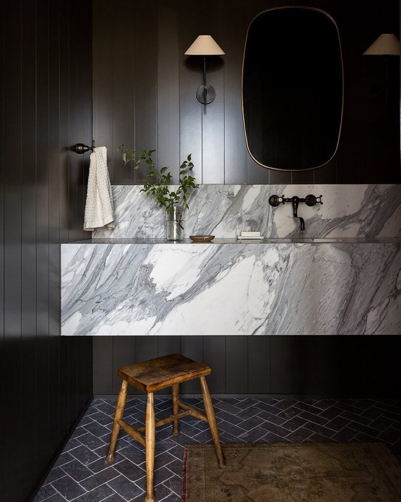
Design by Light & Dwell, Photography by Amy Bartlam
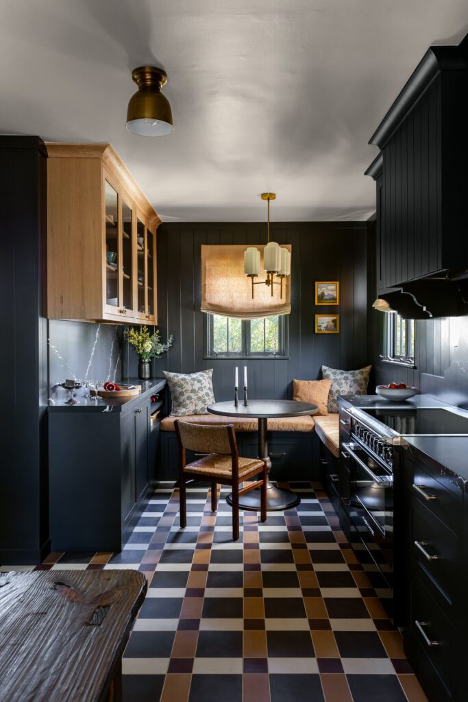
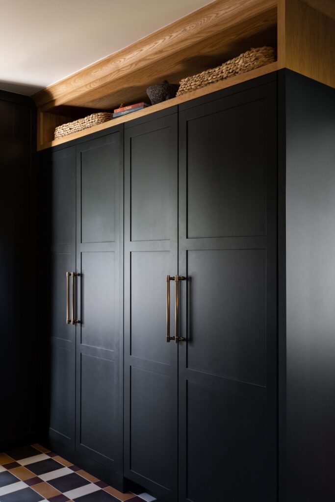
Design by Patrick Maziarski, Home of Kelli Lamb, Photography by Amy Bartlam
Paint Color: Greenblack by Sherwin-Williams
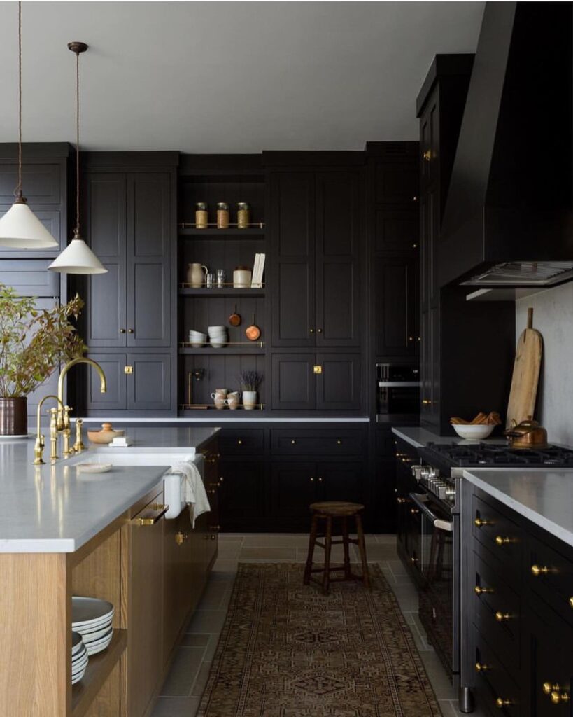
Design by Light & Dwell, Photography by Amy Bartlam
Black + Charcoal
TRY THESE PAINT COLORS
As far as dark paint colors go, black and charcoal represent the boldest of the bunch. These shades are sought-after for creating a moody vibe in more enclosed spaces like snugs and powder rooms, but are equally appropriate in primary spaces like the kitchen. Down Pipe by Farrow & Ball is a longtime designer favorite, but to take things a step further, Black Jack by Benjamin Moore is also a strong contender.
Wrought Iron by Benjamin Moore
Cheating Heart by Benjamin Moore
Greenblack by Sherwin-Williams
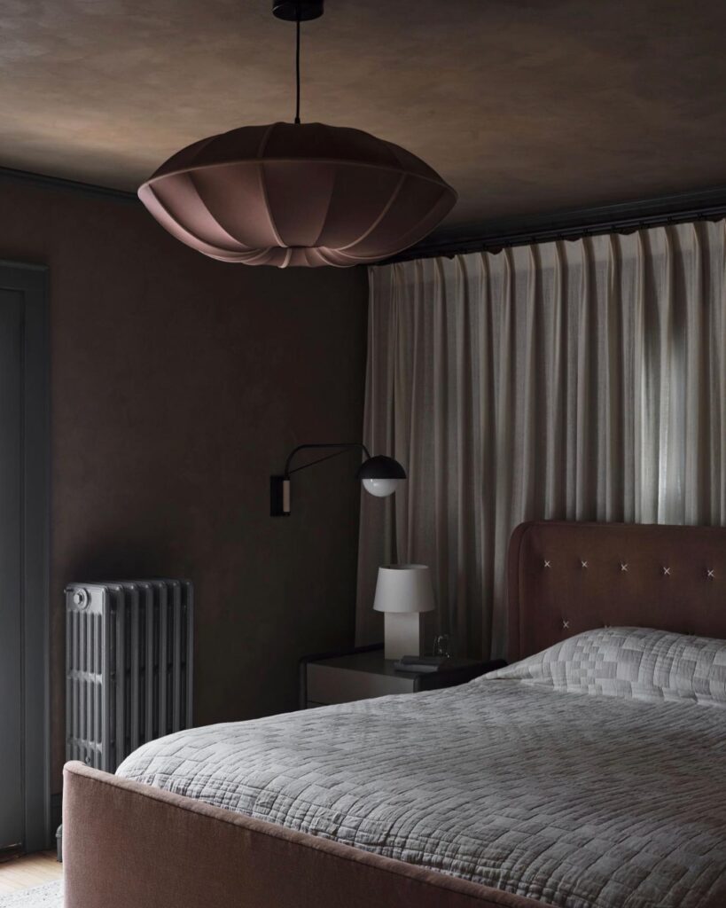
Design by Yond Interiors, Photography by Erin Little
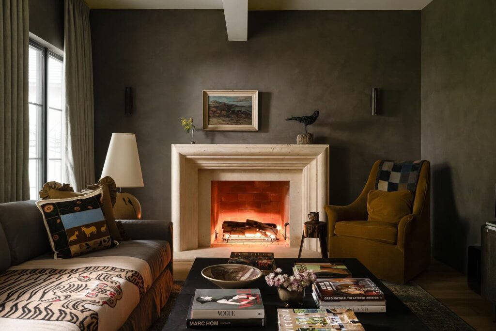
Design by Heidi Woodman Interiors, Photography by Sarah Shields
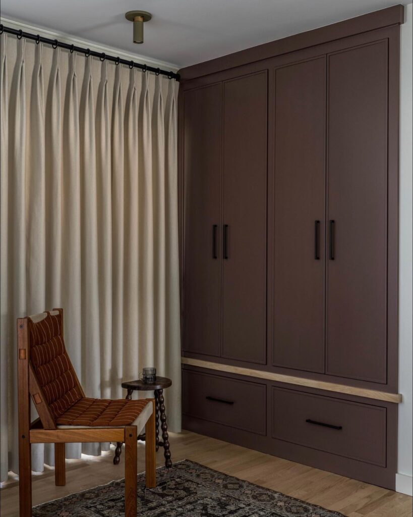
Design by Yond Interiors, Photography by Erin Little
Chocolate Brown
TRY THESE PAINT COLORS
There’s been a recent resurgence of brown in everything from flooring to upholstery to wall color. It’s the neutral everyone wants to get their hands on, and not without good reason. Chocolate brown is the perfect dark color for that cozy vibe, and it mixes and matches with just about everything. Townsend Harbor Brown by Benjamin Moore is a trusted choice for its burgundy-like undertones, while Tanners Brown by Farrow & Ball is an even deeper, drama-driven option.
Townsend Harbor Brown by Benjamin Moore
Mississippi Mud by Benjamin Moore
Tanner’s Brown by Farrow & Ball
Morning Coffee by Benjamin Moore
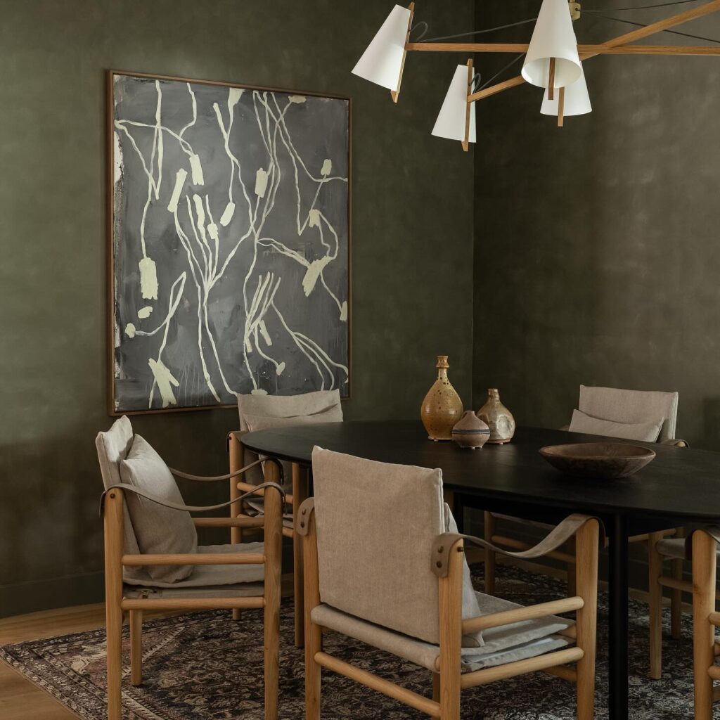
Design by Heidi Woodman Interiors, Photography by Sarah Shields
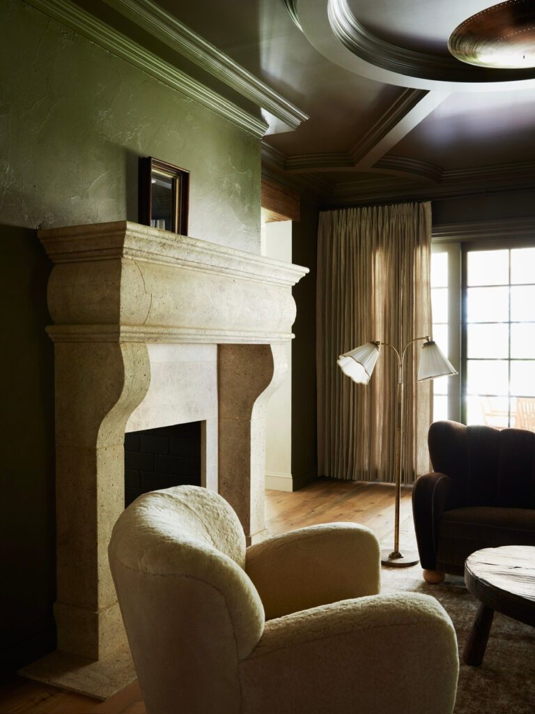
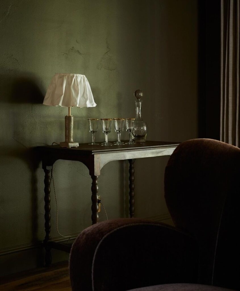
Design by Light & Dwell, Photography by Tim Lenz
Paint Color: Pantalon No.221 by Farrow & Ball
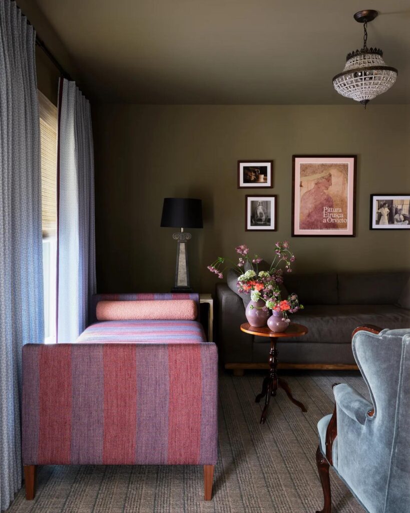
Design by Avery Cox, Photography by Lindsay Brown
Olive + Moss
TRY THESE PAINT COLORS
There are many variations of green, but muted olive shades are currently trending. In particular, Gloucester Sage by Benjamin Moore has captured attention with its moss-like tones and elegant adaptability. When applied wall-to-wall, shades of olive act like a neutral while delivering just the right dose of moody drama.
Pantalon No.221 by Farrow & Ball
Gloucester Sage by Benjamin Moore
Southern Vine by Benjamin Moore
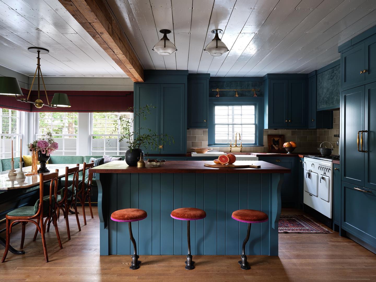
Design by Avery Cox, Photography by Lindsay Brown
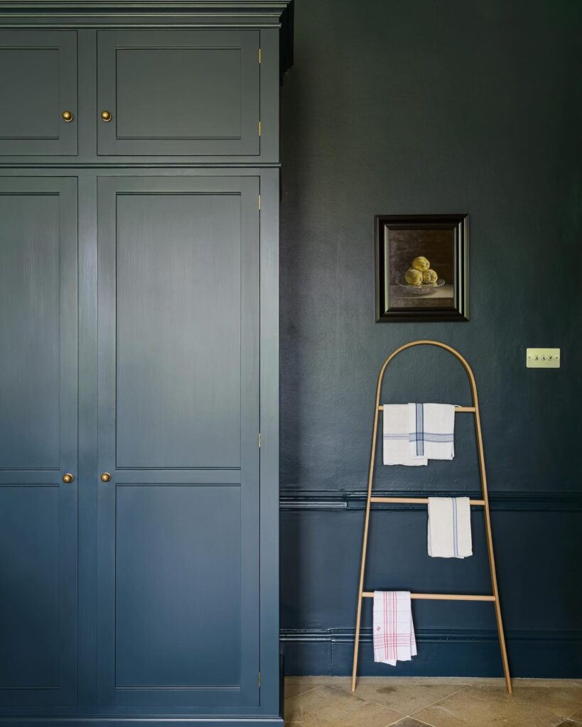
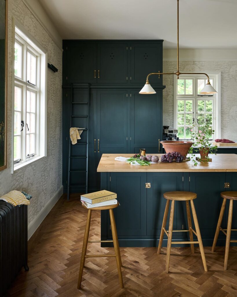
Design and Photography by deVOL Kitchens
Deep Blue
TRY THESE PAINT COLORS
For those looking to make a bold statement, embracing shades of blue-meets-green is a surefire way to capture a mood. Gale Force by Sherwin-Williams and Hague Blue by Farrow & Ball are favorites in this color spectrum. Both deep, dark blues really anchor a space and pair beautifully with a range of wood tones.
Gale Force by Sherwin-Williams
Aqua Via by the Paint and Paper Library
Homburg Gray by Sherwin-Williams
Newburg Green by Benjamin Moore
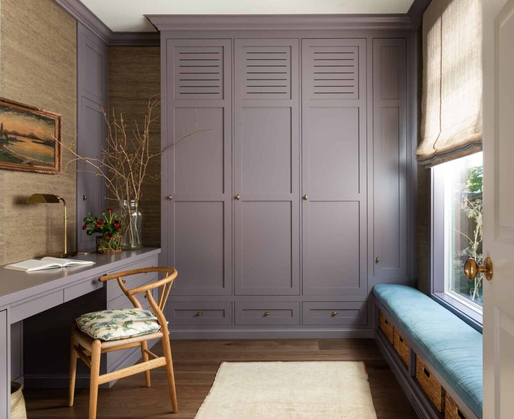
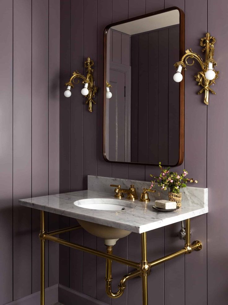
Design by Heidi Caillier Design, Photography by Haris Kenjar
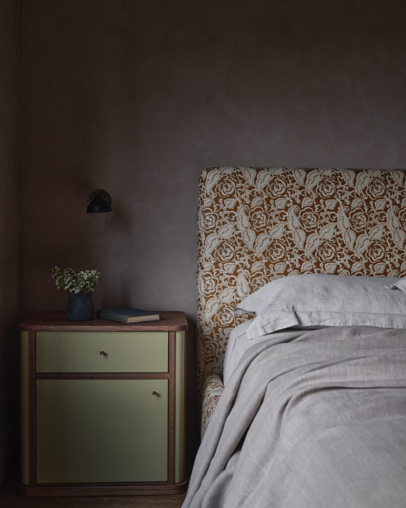
Design by Yond Interiors, Photography by Erin Little
Berry + Plum
TRY THESE PAINT COLORS
Dark paint colors in the purple category may seem unconventional, but they are emerging as a major trend in interior design. For those seeking a deeply atmospheric look, Camelot by Benjamin Moore is a winner, while Muskoka Dusk by Benjamin Moore also gives a moody vibe without the full commitment.
Expressive Plum by Sherwin-Williams
BY: Stephanie Weers
« This LA Home Is a Masterclass In Mixing Dark & Light Materials >

