Shop











A Western Springs Home with a Modern European Point of View
Just outside Chicago, in the village of Western Springs, Linden + Co. Interiors transformed a 1998 Colonial into a home that feels collected, personal, and rooted in its owner’s story. The house had the space the family needed, but dated finishes and an underused layout kept it from functioning at its full potential.
The client, who came to the studio through a previous referral, has strong ties to her Italian heritage. She travels to Italy each year and tutors students in the Italian language, giving the design team a meaningful starting point for the renovation. Rather than interpreting that influence too literally, they introduced it through enduring materials: honed marble, hand-carved stone, Venetian plaster, walnut, aged brass, and deep, earthy color.
The project became a full gut renovation, touching every level of the house and nearly every room. The result, appropriately named feels far removed from its builder-grade beginnings while still working naturally for everyday family life.
Design: Linden + Co. Interiors | Photography: Sarah Crowley | Styling: A la carte Studio
A Kitchen Reoriented Around the Range
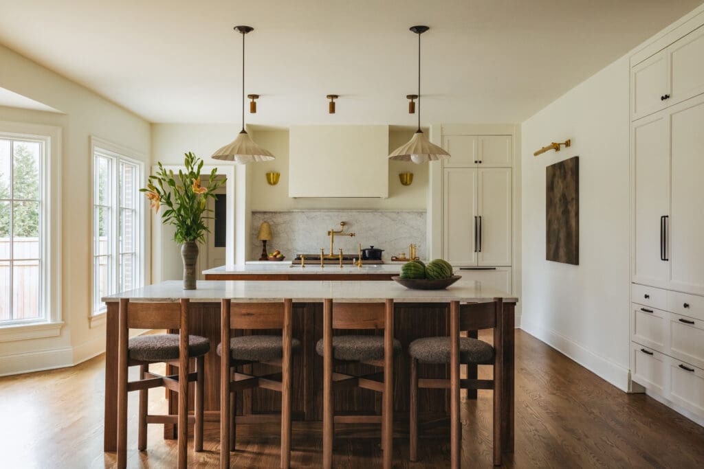
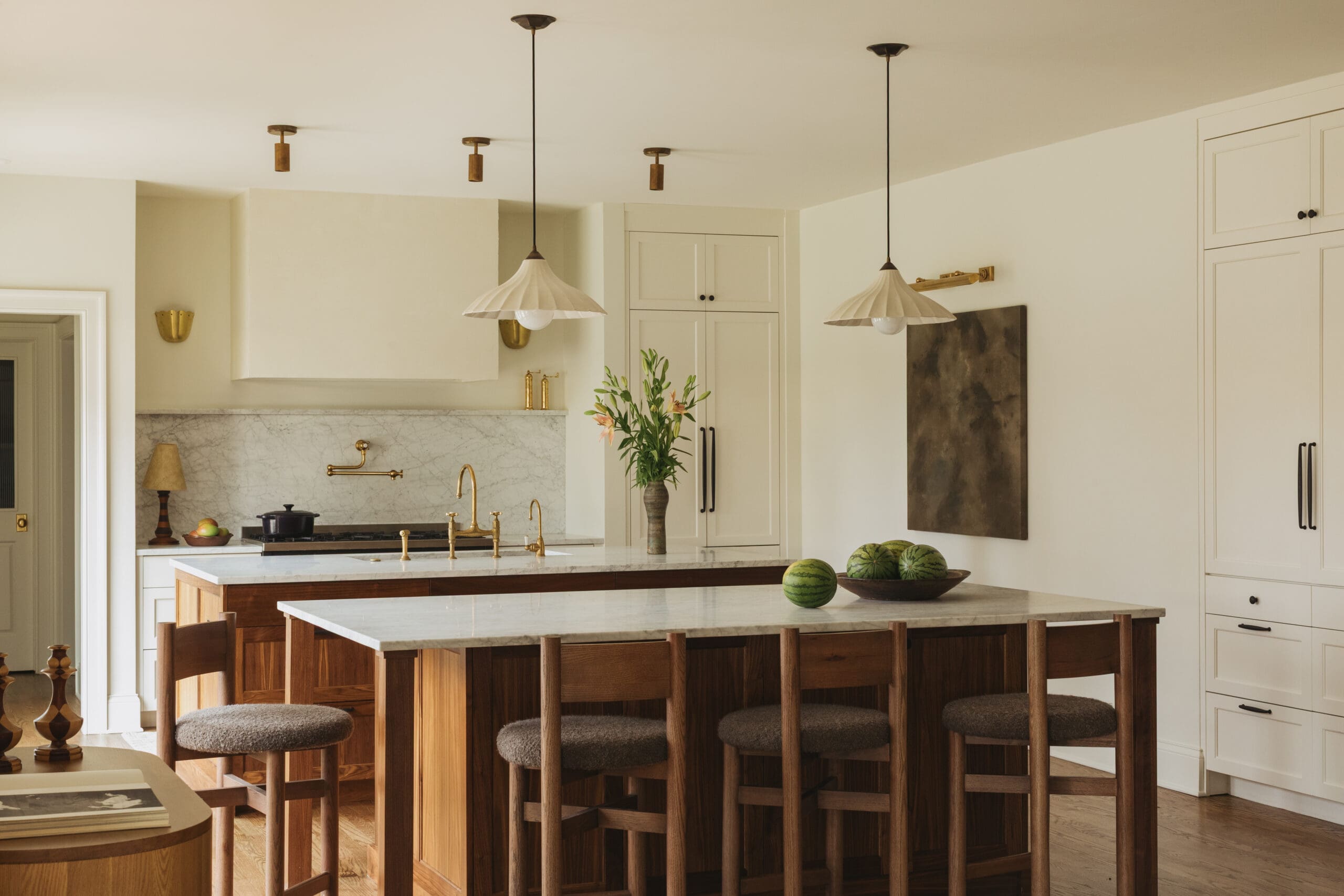
Reworking the first-floor layout allowed the kitchen to grow in both size and function. Linden + Co. Interiors rotated the room’s focal point, creating a new range wall that now anchors the entire space. A limestone-clad hood sits between a pair of brass sconces, bringing weight and character to the otherwise bright kitchen.
Two walnut islands extend through the center of the room, offering generous space for cooking, gathering, and casual meals without relying on one oversized structure. Marble countertops—an important request from the homeowner—carry the European influence through the space, while Swiss Coffee by Benjamin Moore keeps the surrounding cabinetry and walls warm rather than stark.
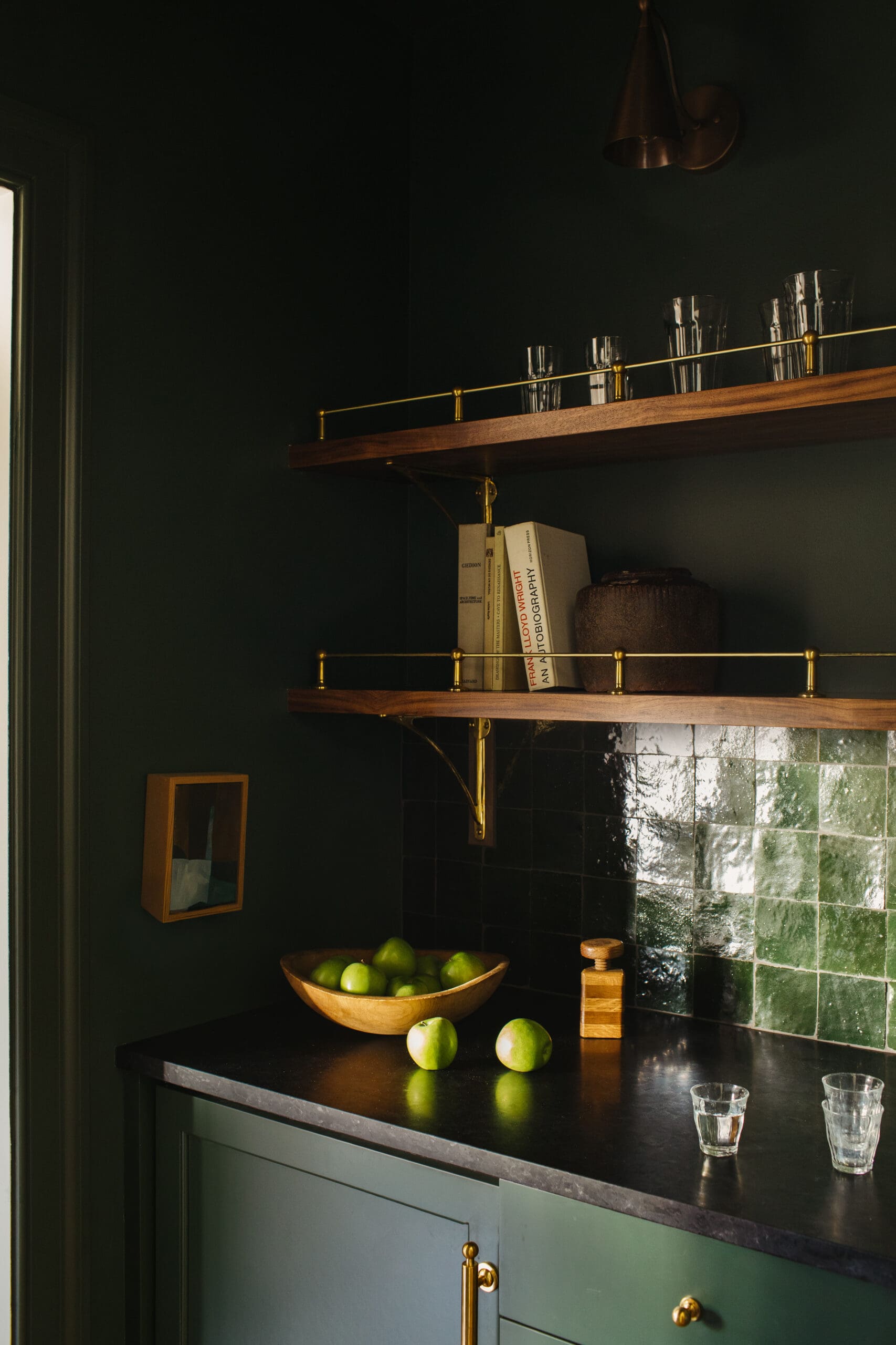
Just beyond the kitchen, the new butler’s pantry connects to the dining room. Though compact, it was designed to have its own presence. Cabinetry painted Sherwin-Williams Forestwood and a mix of saturated green finishes create a distinct moment between the two larger rooms. It is practical, but it also acts as a transition, offering a glimpse of color before entering the dining space.
A Family Room Built Around Stone and Plaster
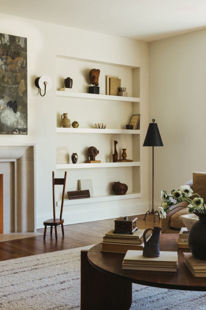
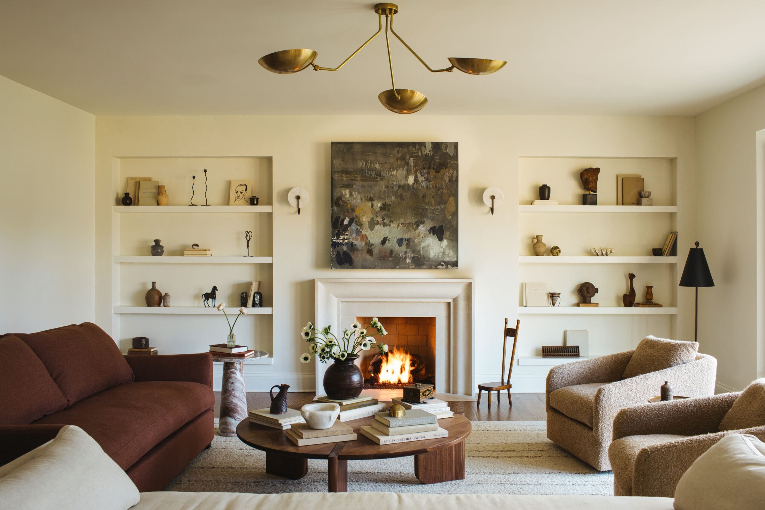
In the adjoining family room, the existing red brick fireplace was one of the clearest reminders of the home’s original era. Instead of removing the entire structure, the design team reworked it with Venetian plaster across the fireplace wall and recessed shelving.
A hand-carved Indiana limestone surround now serves as the room’s focal point. Its simple form and natural variation give the fireplace a sense of permanence, helping the relatively young home feel as though it has evolved over time.
The furnishings follow the same approach. A substantial wood coffee table grounds the seating area, while quieter side tables and upholstered pieces keep the room comfortable and unfussy. With the kitchen nearby, the family room needed to feel connected but not overly coordinated. Repeating stone, walnut, and warm neutral tones gives the two spaces a shared language while allowing each to stand on its own.
Color and Pattern in the Dining Room and Office
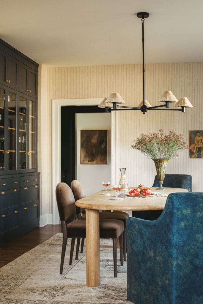
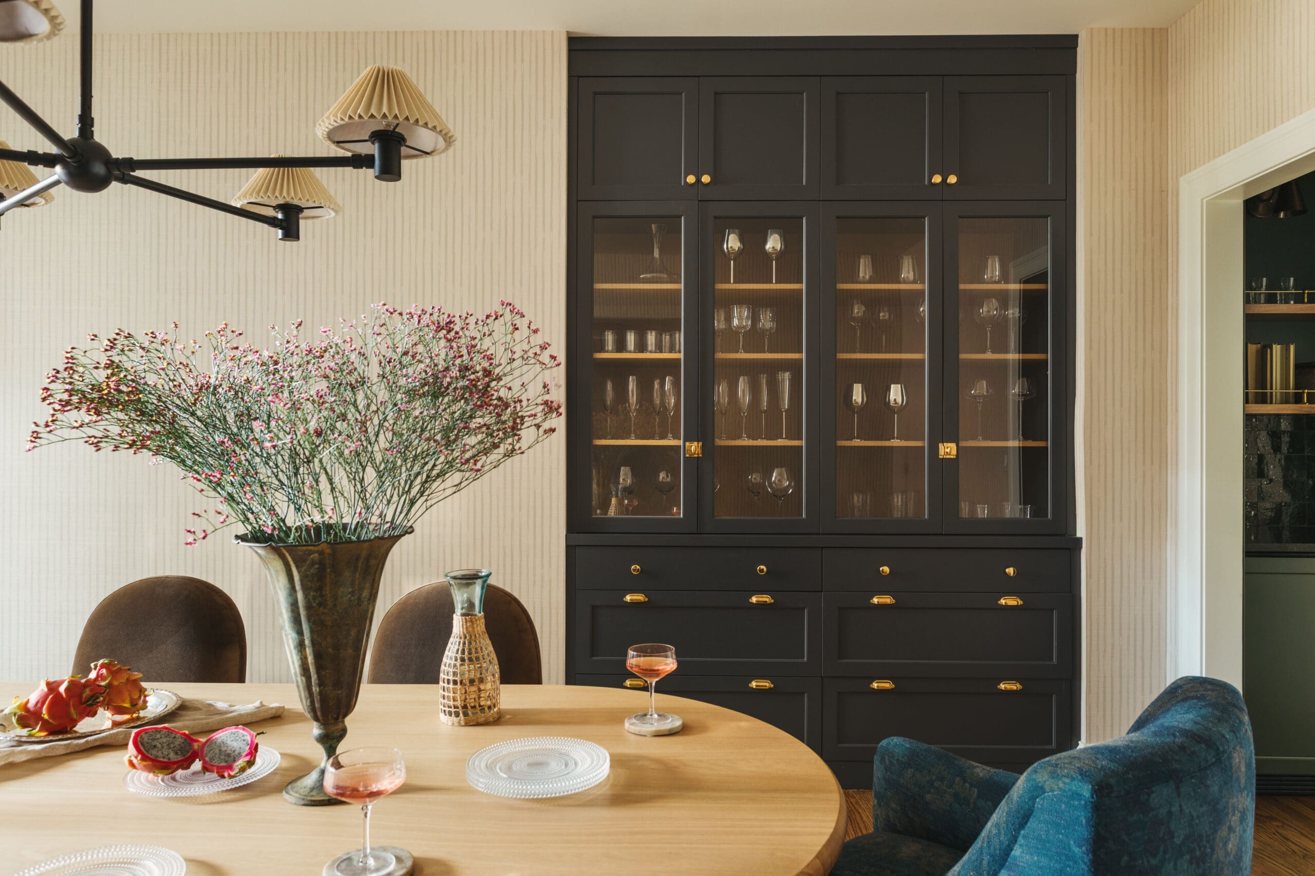
The dining room gained a stronger identity when the former kitchen entrance was closed and replaced with a custom built-in hutch. This change created a more intimate room while adding storage and a natural place to display serving pieces.
Striped grasscloth brings subtle pattern to the walls, and dining armchairs upholstered in a muted verdure fabric echo the greens found in the nearby pantry. The connection is noticeable without feeling overly matched, allowing the rooms to flow together through color rather than identical finishes.
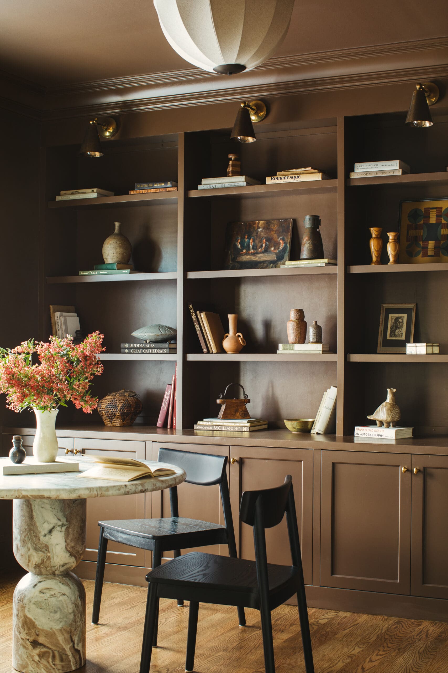
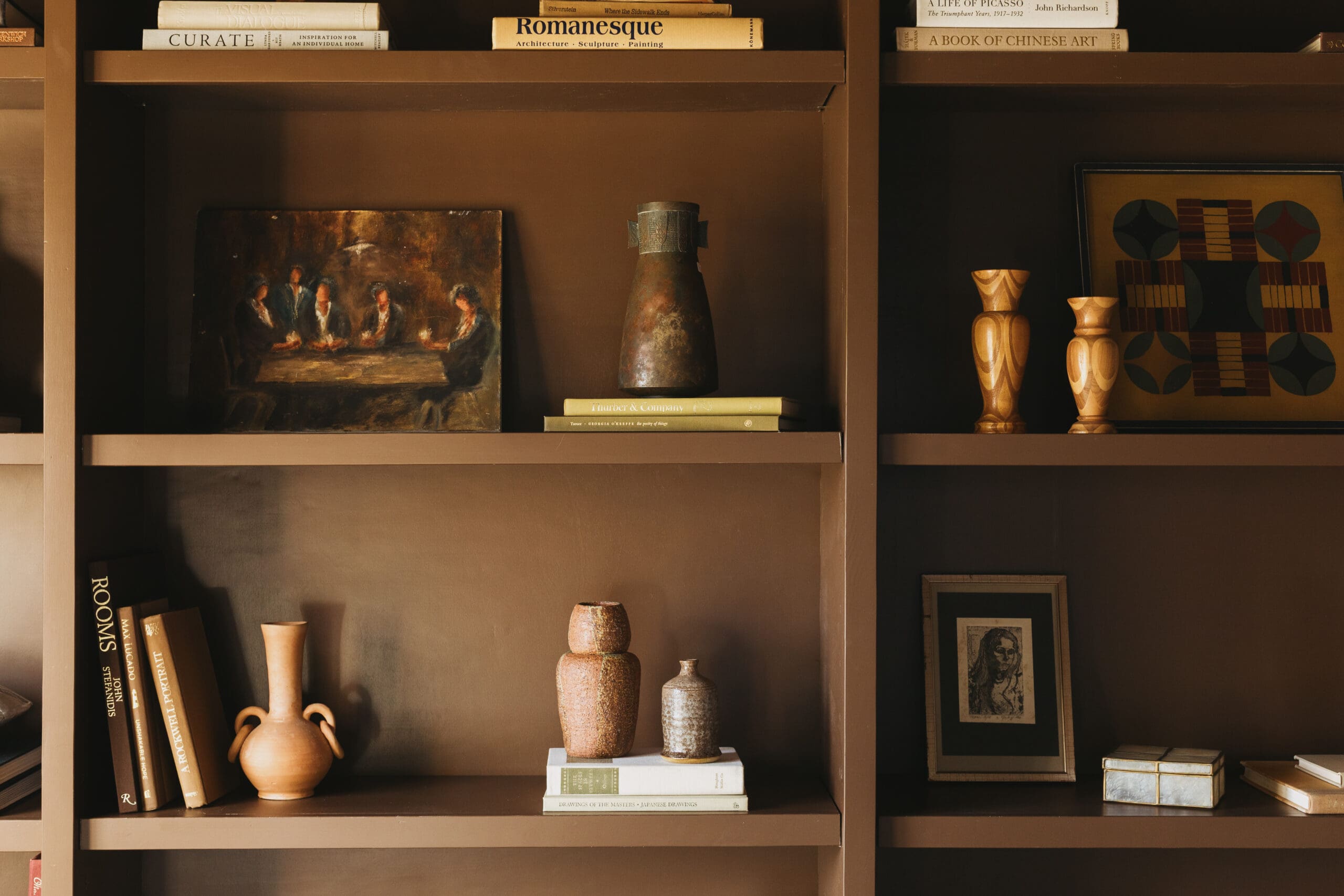
Across the foyer, the office takes a bolder approach. Because the room is visible from the entry, Linden + Co. Interiors leaned into the sightline rather than treating the office as a background space. Walls and built-in shelving painted Sherwin-Williams Sable wrap the room in a rich brown tone, creating a clear contrast with the lighter main living areas.
A Dark Bedroom and Light-Filled Primary Bath
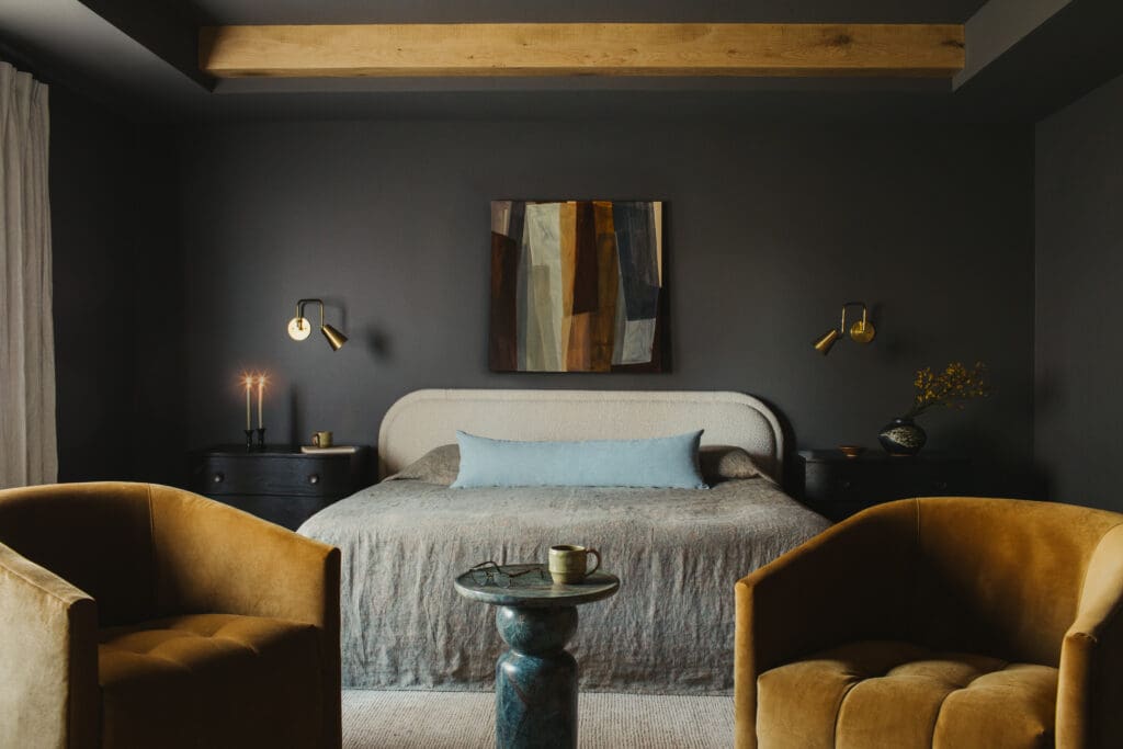
Upstairs, the primary suite required more than a cosmetic update. The team reduced the size of the bedroom to create additional space for the bathroom and closet, then moved the closet entrance into the bathroom. The revised plan opened up more furniture placement options in the bedroom and created a cleaner view from the doorway.
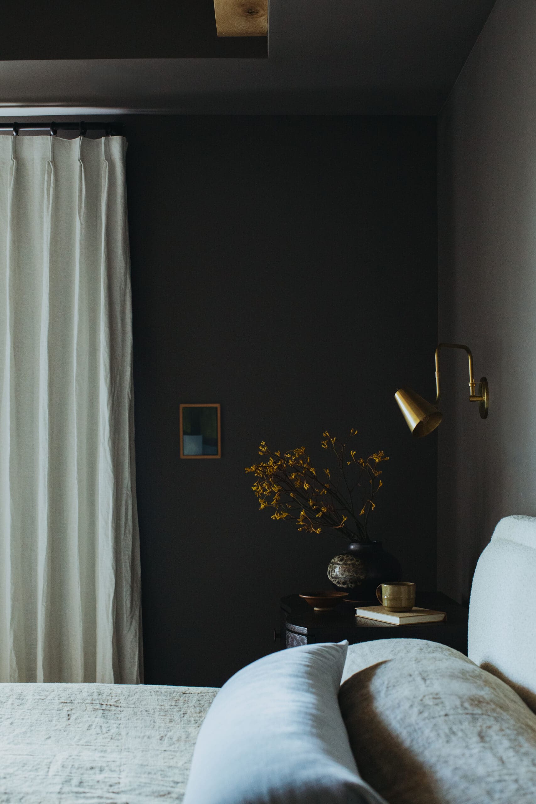
Benjamin Moore Kendall Charcoal sets a darker tone in the bedroom, while white oak beams were added to the existing tray ceiling to bring warmth and definition overhead. The room feels enclosed in a comforting way—a deliberate shift from the brighter spaces downstairs.
The adjoining bathroom offers the counterpoint. Honed marble flooring fulfills the homeowner’s primary request for the space, paired with a white oak vanity and softly irregular zellige tile. Natural finishes keep the palette from feeling too polished, while the lighter materials make the room feel open and calm next to the moody bedroom.
Scroll on to see more from this home and shop the look below.
BY: Jasmyne Muir
« A Beautiful Historic Washington, DC Townhome Found Its Charm Again >
Shop